« October 2008 »
S M T W T F S
1 2 3 4
5 6 7 8 9 10 11
12 13 14 15 16 17 18
19 20 21 22 23 24 25
26 27 28 29 30 31
You are not logged in. Log in
Entries by Topic
All topics  «
3D paperwork
A - Z challenge 5
A - Z challenge 7
A - Z challenge round 4
A to Z challenge round 3
A to Z round 2
A to Z round 6
A-Z round 1
Around the House
Art Challenges
Artist Trading Cards
Backgrounds
Beads
Bible Journaling
Books
Boxes
Collage
Color Challenge
Coloring
cookbook
Die Cuts
Digital Projects
Digital Stamps
Drawing
Dry Embossing
Fabric Stuff
Fantastic Folds
Field Trip
Home Decor
How Does Your Garden Grow?
Hymnal Art
In The Kitchen
In the studio
Jewelry
Lettering
Links
Multi-Technique
Music to Work By
Musings
Nail Art
New Work
Online Class
Other Hobbies
Other Projects
Painting
Paper Embroidery
Paper Piecing
Photo
Pretty Paper
Quilting
Random
reading
Scrap Recovery
scrapbooking
Sewing
Sketch Challenge
Some Backlog
Stamping
Stencils
Stickers
Supplies
Teabag Folding
Techniques
Testing
tips and tricks
Tutorial
Web resources
Welcome to my Blog
Work By My Friends
workflow
Writing
Blog Tools
Edit your Blog
Build a Blog
RSS Feed
View Profile
Group One
In & Out of Studio 3D
Tuesday, 21 October 2008
Blue Malibu
Topic: New Work

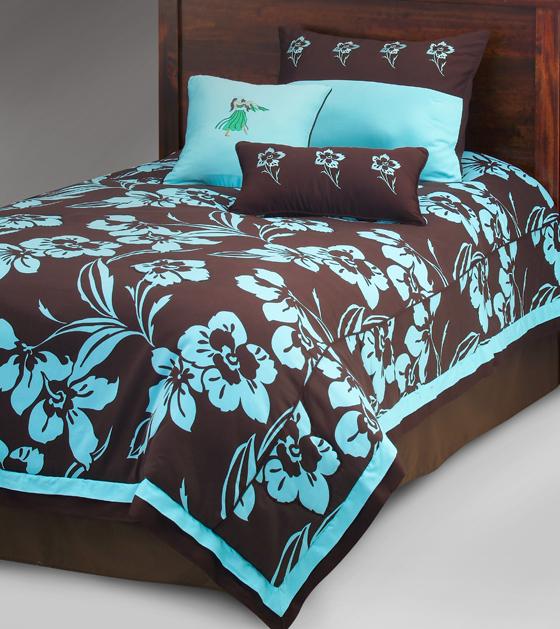
I love the color combination of light blue and chocolate brown. I've always thought it looked classy. So when I found this bedding set on HomeDecorators.com I immediately wanted to do a card with it. 

For this card I started with white cardstock, stamped the flower stamp in bright teal and Versamark then embossed with clear detail powder. I colored in the petals with teal marker and colored over that with embossing pen, then embossed again. Finally, I brayered over the whole thing with Espresso Adriondack ink pad. When dry the brown ink was wiped off the embossing with a cloth.
 

A ribbon was colored with marker to match the inks, chocolate cardstock cut into layering and the flower stamped twice on light blue using the Espresso Adtiondack pad. The flower is cut out and mounted 3D over the brown panel.

The greeting is a thick acrylic tile.

Ddd


Posted by studio3d@ccgmail.net at 6:00 AM PDT

Wednesday, 22 October 2008 - 6:12 AM PDT

Name: "Gabi"

It`s a good idea to look at such things and objects!

But isn`t it very difficult to change it into a motive for a card?

Grretings from Austria

Gabi

Wednesday, 22 October 2008 - 1:36 PM PDT

Name: "anonymous"

Gabi

 For turning inspiration pieces into cards I just focus on what attracted me to the piece in the first place. Sometimes it is the color combinations, sometimes the pattern. Then I draw on a lot of experimentation experience to figure out what method will come closest to making the vision come true. I rarely have exactly the right color of ink or the right floral stamp, so I change it to what I DO have. Finally, I try to bring in some of the minor elements from the inspiration piece - the trim, a stitching line, another color - to add the finishing touch.

 I just keep in mind that the inspiration piece is a way to kick-start the creative process. There's no problem if I don't do it exactly like I started out to as it is the generation of the idea not the comparison of the two that is important.

Debbie

Friday, 24 October 2008 - 12:27 PM PDT

Name: "Gabi"

Thank you for your answer...

You are right, nobody has exactly the same stamps for the pattern or the same ink colour. And it´s just an inspiration for the own creative work.

But: all in all you must have a special feeling to have an idea for a card only with a look at the pictures. And YOU have it! Congratulations!

Gabi

View Latest Entries