Topic: Sketch Challenge
Time for another sketch challenge from Operation Write Home

I found this to be a little difficult to work with as I kept feeling like the rectangles were too large. Maybe it is just that I stamped too large of image on them though. Anyway, I soldiered through (lol) and came up with 6 cards.
I'll start with my least favorite - The colors were fairly dull so I went over them with a yellow marker. Big mistake! The blues all turned green and the pink turned orange. I already had orange so that was not really an improvement. I rounded the corners to make the panels less stark and used some bright colors in the backing papers to help them blend in.

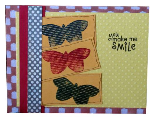
I stayed with the butterfly theme with this stamp composed of dots. I stamped in three colors but the blue and green are too close in hue to differentiate them much. I mounted these on a dot-textured cardstock and chose some scraps that echoed the colors and/or the dots. The greeting is stamped.
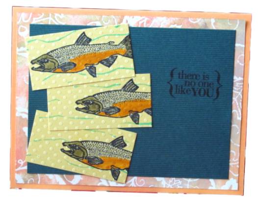
Since I had the dot-textured cardstock out I cut some into panels to stamp these fish. I think it looks like bubbles in the water and I added some blue swishes with marker for them to swim in. These are colored with watercolor markers as are the rest of the cards. I used some of the green background I had cut for the first butterfly card and added a ColorMe paper scrap behind that.
I used more of the ColorMe paper scrap tocreate a band to back this scene. These are three stamps from the same set and they seem most suited to this card layout. I used a fine-line marker to doodle lines around most of the panels and the card base then added a meandering line of stamped hearts to fill the right-hand space and reinforce the theme.

This is actually the first image I pulled out to stamp with but not the first I put together. That background is more of the ColorMe papers with a stamped greeting. I pulled out some old text-print scrapbook paper bor a backing strip.

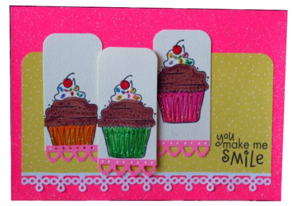
And, finally, my favorite... I messed with the layout and ended up with a different orientation. I colored with very bright markers and added Stickles to the cupcake papers and the sprinkles. Then I used glossy accents on the cherries. Rounding the top corners made them more casual and the snips of fancy borders bring it back to the girly side. A very bright, glittery cardstock base and a yellow accent strip make this an eye-popping treat.
Now I wish I had cheated with the orientation on all of them and I might have liked them better.
Ddd
