Topic: Pretty Paper
Hmmmm... I'm not sure distress papers come under the category of 'pretty' papers, but...
I had some of the papers from a pad of the Tim Holtz distress line and did some of that paper whacking and mix and matching. They ended up pretty bland because the papers are so similar so I mixed in some papers from other lines and solids for bordering.
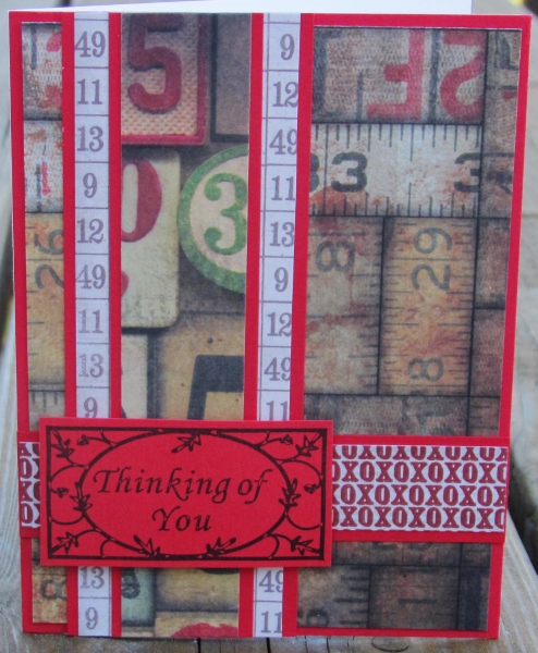
First I added a number strip and an XOXOX strip and red bordering. I had a sentiment stamed on matching red with a built in border and trimmed it with a thin border.
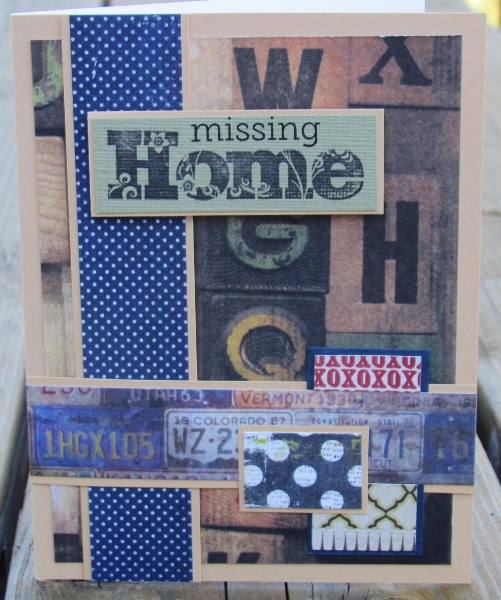
Two of the cards use the license plate paper and bordering in dark blue. With different paper scraps and colors of the same stamped sentiment I got quite different looks. On a blue one I used more muted colors of scraps.
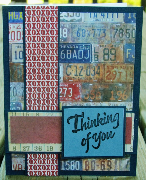
Red scraps pick up color from some of the plates for more pop.

The backing and bordering is more subdued on this one. It actually is more contrast in person. I used lots of tiny scraps for some interest and added the word 'missing' over the pre-stamped 'home'.
On both of the last two cards I added a strip of patterned paper with cookoo clocks and used the same stamped sentiment. I did one with brown bordering and a yellow-green sentiment block.
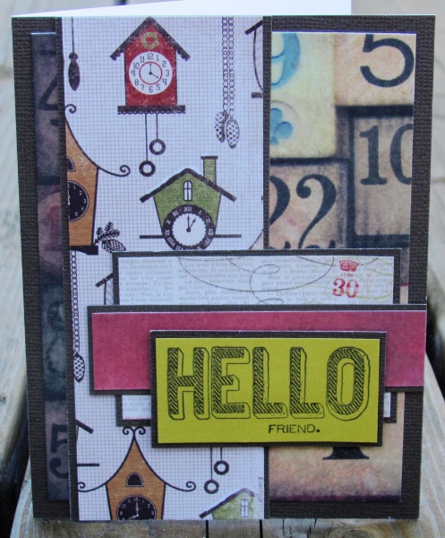
Then I used a lime green to echo colors in some of the clocks. The sentiment on this one was stamped on a redish brown that matches some of the clocks, too.
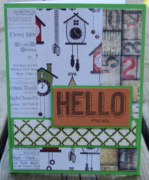
The sentiment on every one of these is popped up on foam tape.
Ddd
