Topic: Bible Journaling
When we toured the Getty Museum in L.A. recently I was inspired by the illuminated manuscripts and the hand-written codexes and prayer books. I took photos of many of them. SO beautiful.
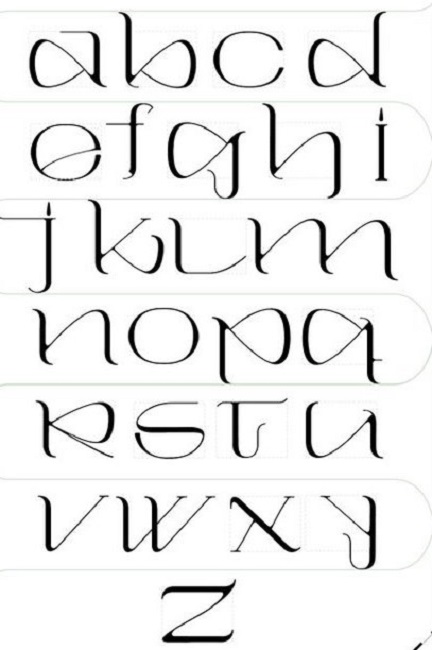
Then I ran across a font that intrigued me and I set out to develop my own set of letters based on this. Here is the font I found:
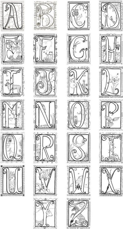
I liked that the letter forms are informal so not difficult to draw. I wrote notes to myself outlining what would become my process.
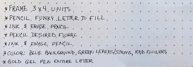
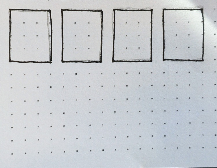
Here are those steps along the way:
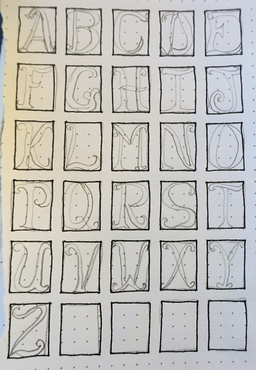
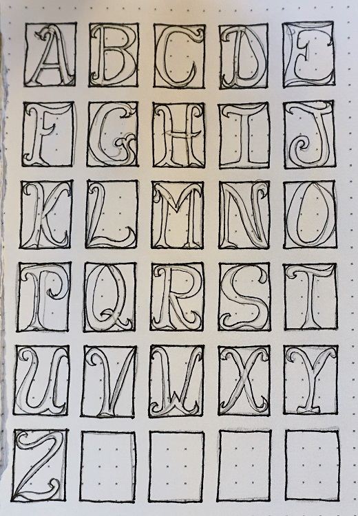

As you can see, I developed my alphabet with different flowers in the background. As they are used for a project the flowers from one can be substituted into another.
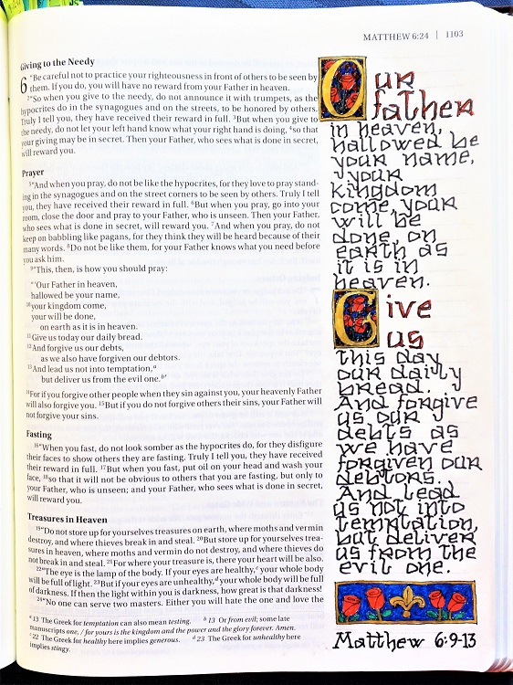
So, then I went looking for a font that could be used for the text and settled on this one. I simplified some of the lines so it could be written smaller and remain readable.
The result is this page in Matthew:
For the framed letters I colored the flowers red, leaves and stems green, checked background in blue/brown/purple, and used gold gel pen on the letter, the frames and the fleur-de-lis.
On those larger letters that match with the illuminated letters, I drew a thin shadow line on the right and filled with red pen.
Ddd
