Topic: Bible Journaling
Yep, it was still my turn for lettering lessons this week - and it will be for next week as well.
This time we worked on a novelty font. Here are the daily lessons:
MONDAY
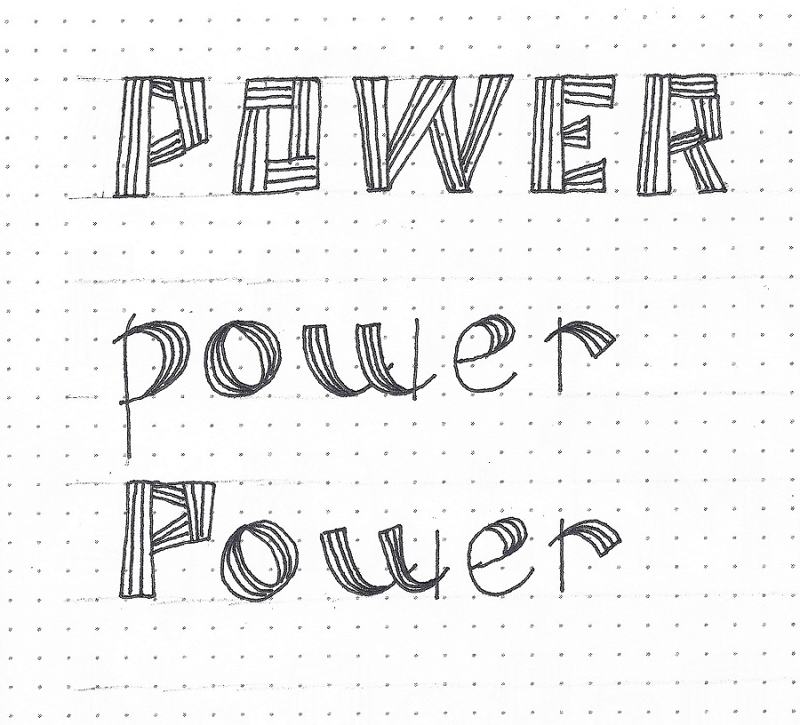
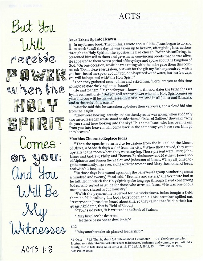
Today we begin a lettering style that is a combination of two alphabets – one for the upper-case (more squared) and one for the lower-case (with graduated swooshes). We’re using the focus word ‘power’ which we’re building with letters that resemble boards.
I sketch the outer shape of the letters in pencil and then define where the ‘boards’ will overlap and intersect. I wait until I have the whole word written and inked before I add the decorative lines.
You may have room for three lines internally or maybe only two. Just do what works without going down to one internal line – it just isn’t enough.
On the lower-case letters look at how the boards have become ribbons. Also notice the overlap extensions on their intersections.
I will say that this is NOT a complicated font, but it IS time-consuming. Just sayin’.
Are you ready for some POWER?
TUESDAY
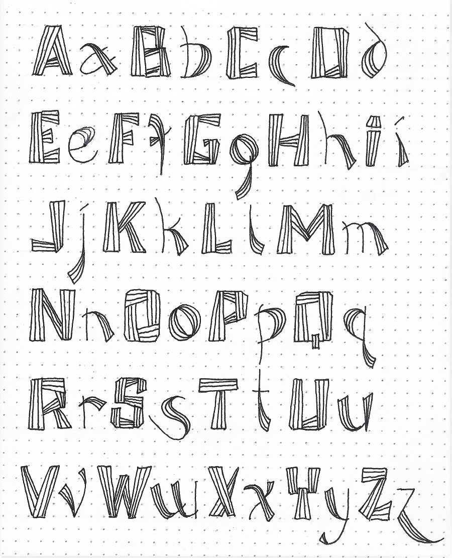
In the full alphabet you’ll begin to notice that some of the upper-case letters that are normally rounded have their corners chipped off to accomplish that shaping. The B and the S are the most complicated structures. If you can simplify them, you are welcome to do so as long as it still reflects the style. The most unique letters are the D, f, g, and Y.
Remember that the upper-case is all straight lines, the lower-case is all flowing lines.
How do you feel these two alphabets suit one another?
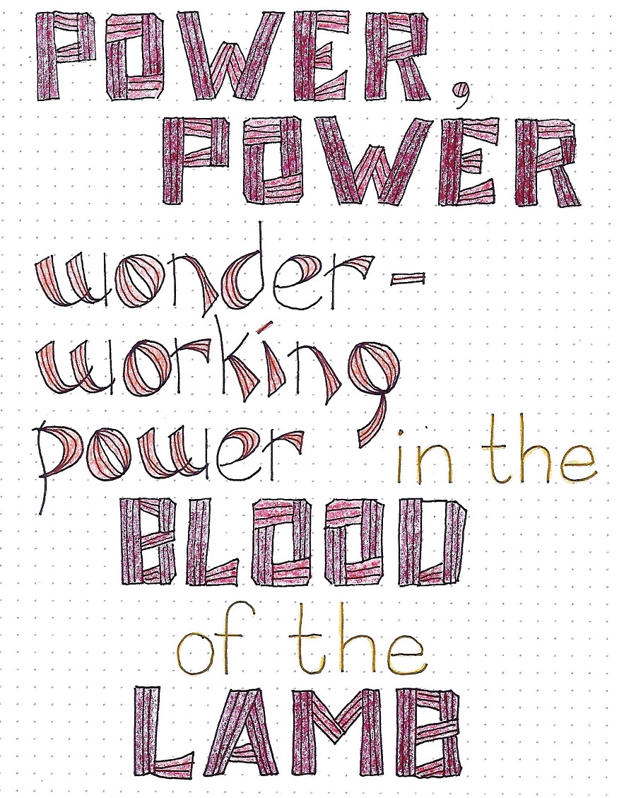
This old hymn kept playing through my head as I studied this lettering style.
I think the words look better if all the letters are either upper-case OR lower-case rather than mixing them. I threw in a few words in very basic printing, as well. Don’t be afraid to mix styles. Some are just too much for a long project and can be used as a ‘key word’ accent instead.
I also used colored pencils to add some zip to my letters – colors are separate for the cases.
Choose a ‘power’ful song lyric for your own practice piece.
We’ll use our new lettering style today to write a scripture in our workbook, journal or on a plain piece of paper.
I found that this style does not scale down easily as you need those spaces to be open to get the extra lines in.
(Am I the only one who doesn’t care for that upper-case ‘i’? I think I’m going to change it tomorrow)
1-2-3-GO!
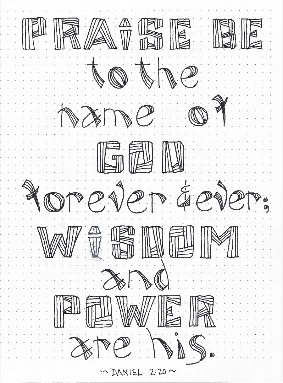
Well, it’s finally time to use the ‘power’ font in our Bibles.
I wanted to only emphasize a few words so I used the upper-case on those, then I surrounded those with the lower-case and completed the rest of the verse in a simple script. This script does not compete with our ‘power’ style but is still fancier than a basic print.
And, yes I did change up the letter ‘I’.
I went over all my script letters with colored pencil and colored in the upper-case of this week’s style.
Stay tuned for another lettering lesson next weekend.
Ddd
