Topic: Bible Journaling
And now another lettering tutorial prepared and taught by... me!
This week we tackled an art deco style that is very classy looking.
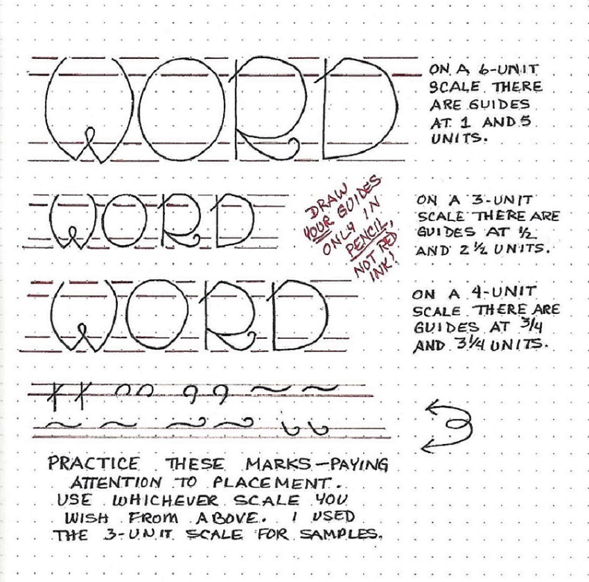
WORD FONT – DAY 1 – INTRODUCTION
I’ve started this font lesson with some guidelines. These are NOT in the finished lettering but they are important to set up as you begin so the defining marks are placed correctly. I also demonstrated the font in three scales so you get to see the proper placement of the guidelines in relation to each size. The guideline instructions are laid out on the right of each sample. Unlike mine, you will use pencil for your guides so they can be erased.
The next thing to do is to practice the marks at the bottom of the sheet and their position on the guidelines.
As you practice drawing the letters in each scale, try to identify the practice marks that appear. The other marks will show up in the alphabet tomorrow.
Note that I said DRAW the letters. Do this in pencil first so you can make any correction needed. Then trace over the pencil in ink and, when the ink is dry, erase the pencil. This is what we call P-I-E (pencil-ink-erase).
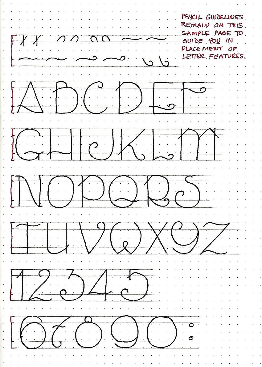
Before you start on your WORD alphabet, set up the guidelines for the scale you will be working in (select from yesterday’s lesson). Then practice the defining marks again. Watch for those marks as you carefully draw your letters.
This is a very round and upright font and it has no lower case.
I did draw up a number series to go with this font so it could be used for scripture references and remain in character.
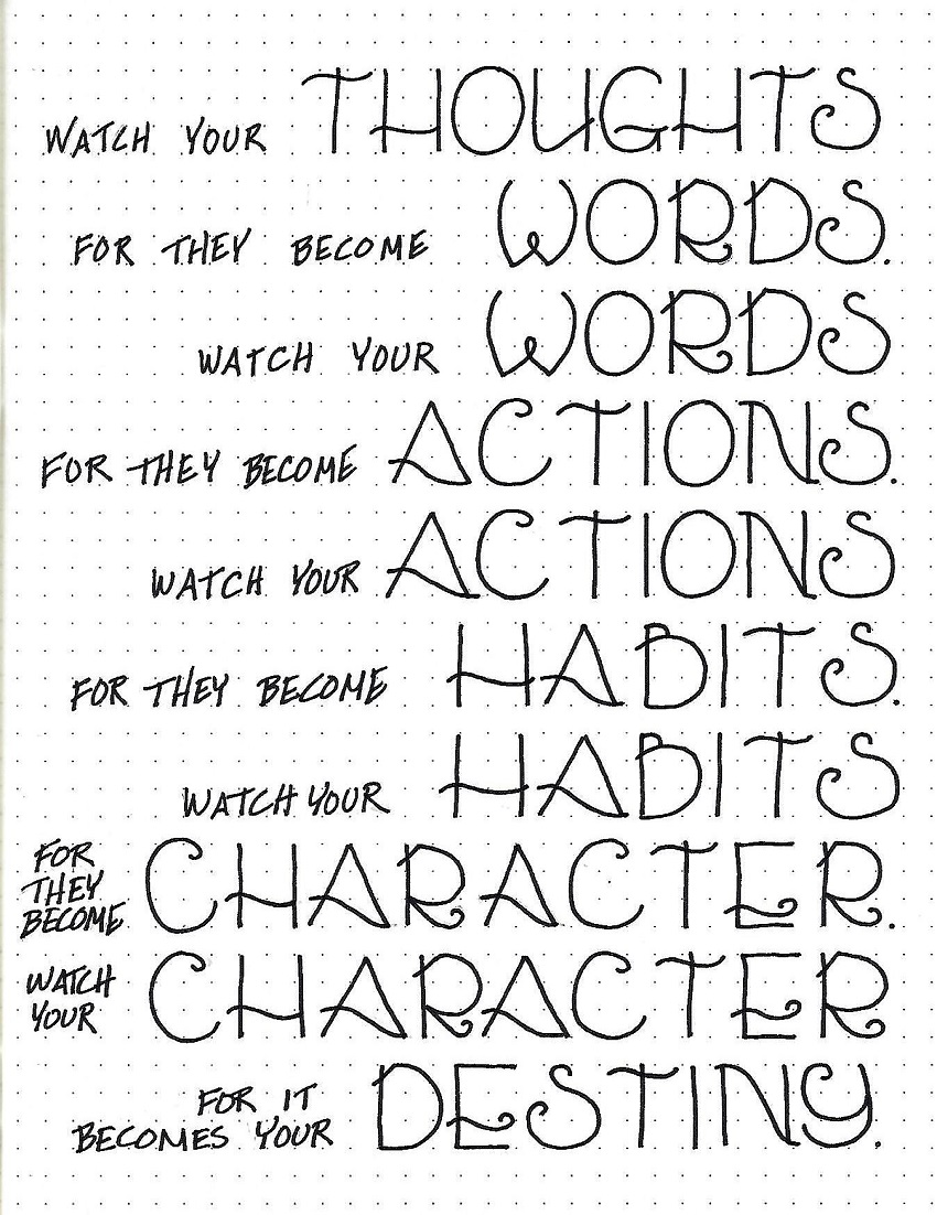
Today, use your font to write up a quote using ‘WORD’.
You will still make those guidelines to keep your letterforms consistent. Then ink the letters and erase the pencil. Note that the letters are compressed together but they do not touch.
Doesn’t this font just look beautiful when it is used naturally rather than in the alphabet?
Select a scripture with ‘WORD’ in it and write it out in your journal, notebook or on plain paper.
Depending on the length of the scripture you plan to use, you may need to drop to a smaller scale. Don’t forget to start with your guidelines.
P-I-E is on the menu again!
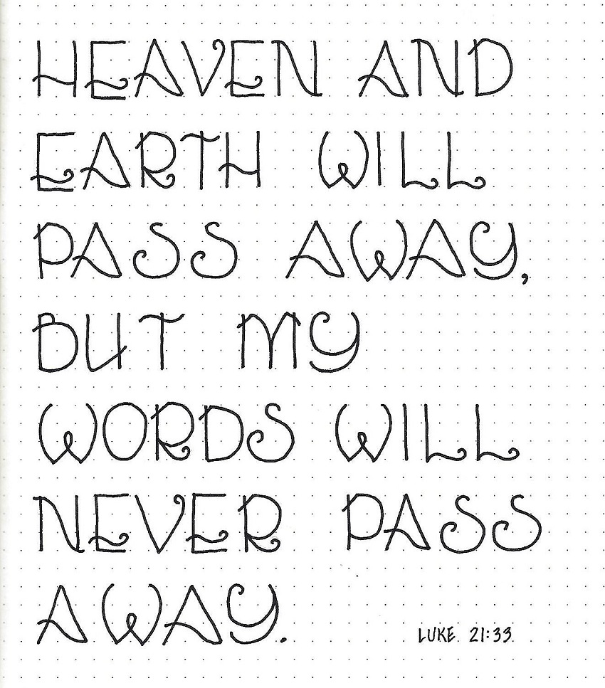
Today we take the WORD font to The Word. Select a scripture that uses WORD to letter into your Bible.
You will undoubtedly need to reduce the scale even beyond the smallest on your practice pages. But you should be able, by now, to figure out the relationship of the placement of the guidelines to your guide height.
P-I-E is especially important when working on your Bible pages to protect against errors in spelling and placement.
If your text won’t fit using only the feature font, by all means combine it with some other font(s). I had only one word that was going to be a little long so I adjusted the spaces between letters to condense the word package.
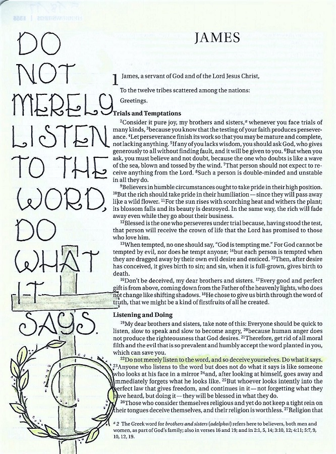
I used excerpts from James 1:22.
Ddd
