Lettering Lesson Series - Week 3
Topic: Lettering
Week 3 of the progressive lettering series:
Day 1 – Standard Serifs – Introduction
| The value to learning a basic round print first is that it can now become the jumping-off point for all sorts of fancier lettering styles. This week we will be exploring standard serifs. Serifs are the little caps and feet that appear on print letters. The standard serif is short, goes at the ‘exposed’ end of a letter and can be either a full serif or a half. A full serif sticks out on both sides of a line and a half serif sticks out only on one side. Remember that we follow the P-I-E steps: Pencil the basic letter shapes and add serifs – Ink the letters – Erase the pencil marks when the ink is dry. 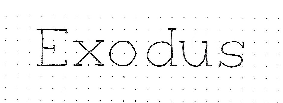
Day 2 – Standard Serifs – Alphabet One | Type styles, unless they are ‘novelty styles’, are generally described as ‘serif’ or ‘sans-serif’. The term sans-serif means without serifs. So, the basic round font we learned in week 1 is a sans-serif. By simply adding the head and foot marks to the ends of the lines we turn it into a serif style, just like that. Easy-peasy! So, find your alphabet reference sheet from the basic round print and copy it out again. Then refer to the alphabet below to see where the full-width and half-width serifs are to be placed. Remember to follow the P-I-E steps: Pencil the basic letter shapes and add serifs – Ink the letters – Erase the pencil marks when the ink is dry. 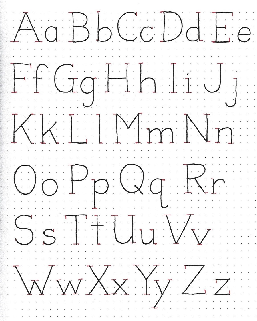
Day 3 – Standard Serifs – Alphabet Two | Serifs come in different ‘flavors’ and today we introduce the triangle, based on the serifs we learned yesterday. You can simply make a copy of yesterday’s alphabet if you wish or you can copy it out again, including the short line serifs on the letters. Then, refer to the alphabet below to see how, making a little angled line to connect your short serif back to the base letter makes a triangle. Note that letters that end in an open curve get a little teardrop instead of a triangle. See the ‘c’, ‘e’, ‘g’, ‘J’, ‘j’, ‘q’, ‘r’, ‘y’. Also, note the single anomaly with the ‘t’ which has a curved triangle at the intersection instead of at the top. These serifs are filled in when you ink. The triangle serif looks better on a letter drawn with a thicker pen. We’re still using the P-I-E steps: Pencil the basic letter shapes and add serifs – Ink the letters – Erase the pencil marks when the ink is dry. 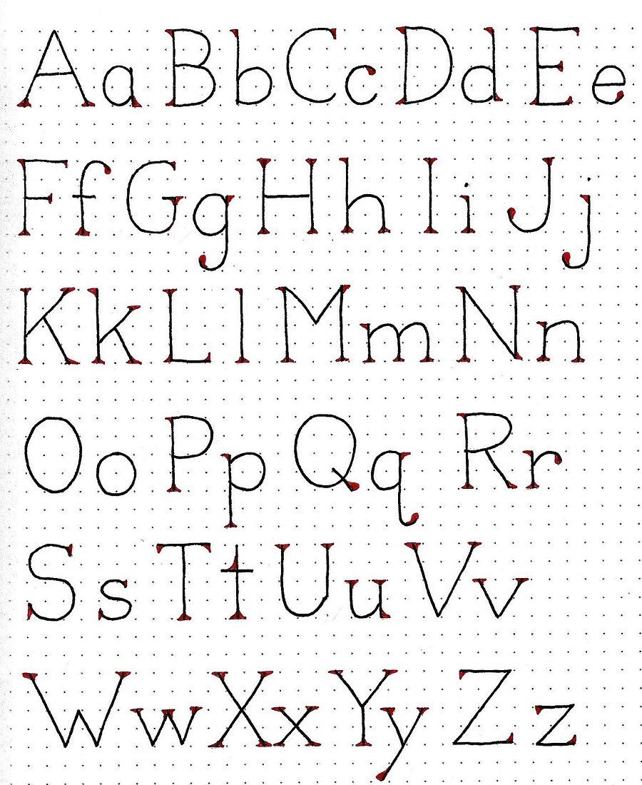
Day 4 – Standard Serifs – Word Play | We’ll practice both styles of standard serifs today. I made mine into a list of the plagues of Egypt. The left column has single line serifs and the right column has triangle serifs. Side by side this way you get a better feel for the ‘flavor’ of each one which can help you decide which to use when you move into a new project. You’ll also note that I made the lines heavier in the word ‘PLAGUES’ to illustrate the difference line weight makes. 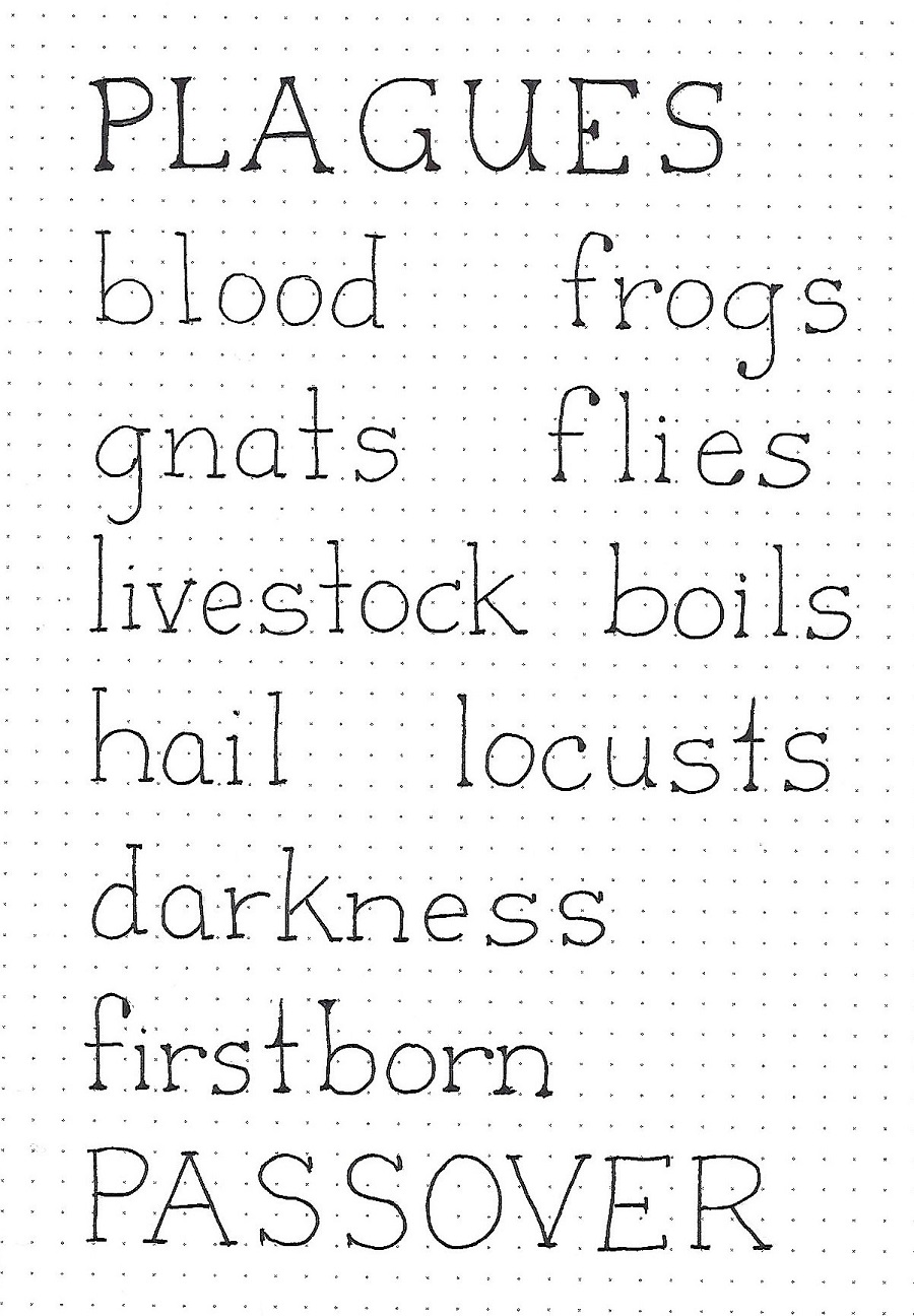
| Day 5 – Standard Serifs – In Your Bible | I’ve been gradually illustrating the plagues of Egypt in my journaling Bible.For today’s exercise I used the short-line standard serif style to write the introductory scripture to the account of these disasters. On print this small, the triangle serifs were much too heavy. I made the numbers in the scripture reference match the serif style by adding little marks to the ends of the digits! Exodus 7:5 says “And the Egyptians will know that I am the LORD when I stretch out my hand and bring the Israelites out of it.” Using the P-I-E steps, Pencil the basic letter shapes and add serifs – Ink the letters – Erase the pencil marks when the ink is dry, add a scripture to your Bible in the book of Exodus. 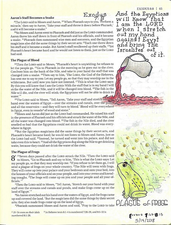
And so ends week 3. Ddd |
| |
|
Posted by studio3d@ccgmail.net
at 1:55 PM PST
