| In week 1 we learned a basic round print with letter shape options. Week 2 we built on that alphabet by introducing a looser styling. Week 3 saw the introduction of two basic serifs. Now here we are at week 4 and we are going to look at some less conventional serifs. These serifs are used in a more casual manner. We are working through the cover2cover journaling program with CBJ and find ourselves in Leviticus. If there is any book in the Bible that could NOT be described as ‘casual’, this is it! So, I wanted to lighten things up a bit with the lettering – not be so ‘rule’ oriented. The first style begins, again, with the basic round print. But when we get ready to add the serifs, they are a angled stroke and a little longer than the standard short-stroke serif. In keeping with the lighter feel of this style, it is a good one to let the letters vary a bit in size and/or bounce them up off the baseline. Let them play. We’ll continue using the P-I-E method of lettering. If you have forgotten that, please go back and read the introductory materials in the Lettering Unit. 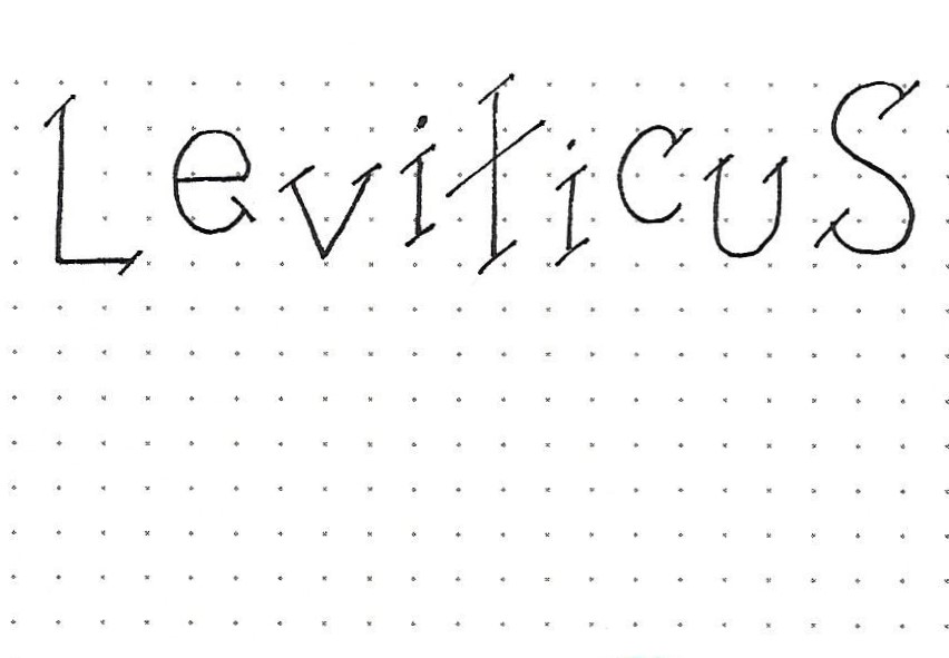
Day 2 – Serif Options – Alphabet 1 | This is the full alphabet for the first casual serif option, based on the basic round print from week one. This casual style is comprised of a single slash in place of the straight short-line serif. You’ll note the informal look of this alphabet. Here’s some good news; the placement of the slashes is entirely your choice! If you think I’ve used too many, just eliminate the ones you don’t care for. Experiment! If you want to go even more informal, try using double slashes in place of the singles. Although we talked about this being a good font to let the letters play a bit, in your reference alphabet sheet, it is best to use standard sizes and keep them sitting in a row. Continue to use the P-I-E method of lettering: Pencil-Ink-Erase. 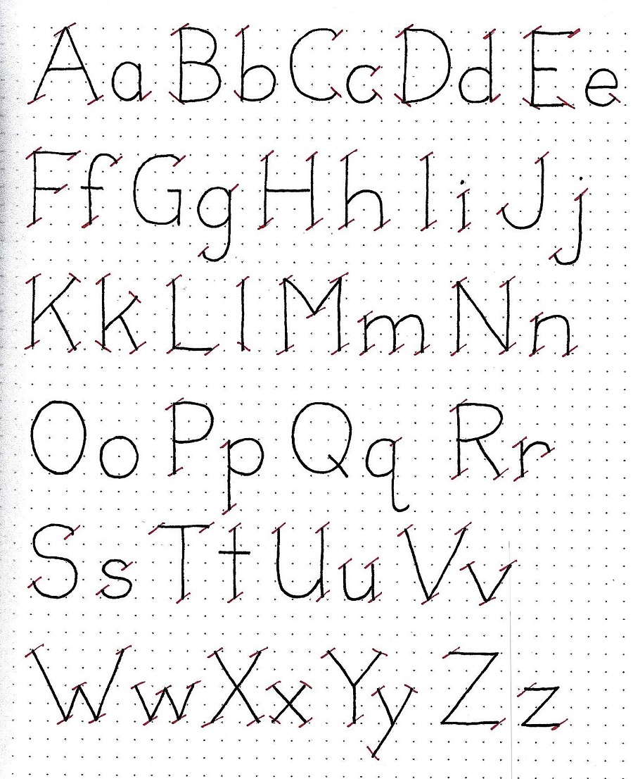
Day 3 – Serif Options – Alphabet 2 | Here is another casual style of adding serifs to your basic round print. These look like little bird wings. You’ll note that there are some places that have only one wing (‘B’, ‘b’, ‘D’, ‘d’, ‘E’, ‘F’, ‘g’, ‘L’, ‘M’, ‘m’, ‘N’, ‘n’, ‘P’, ‘p’… you’ll find the rest. Just start by writing out the basic round print alphabet and then use this reference to place your full or half bird wings. 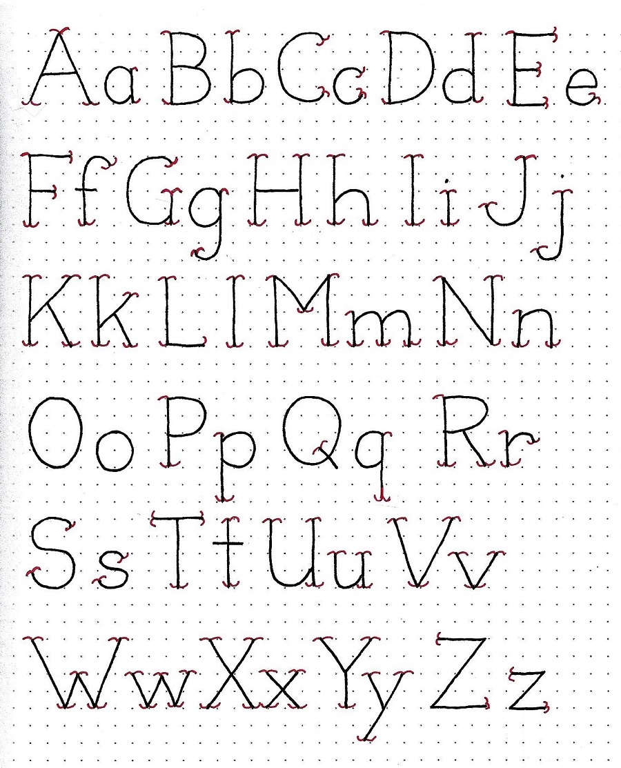
Day 4 – Serif Options – Word Play | Today I used a crossword-style layout to write up words that cover the main themes of Leviticus. I used the bird-wing serif on the vertical word ‘regulations’ and the slash serif for all the words describing what is being regulated. Find a way to play with your lettering, too. Often, I do sheets like this because they allow me to get a lot of practice with the upper-case. In normal writing, we spend a lot more time on lower-case so this kind of practice is valuable. This also help in training yourself to get your letter sizes consistent. I did mine in a single space (unit) wide and two spaces (units) high. 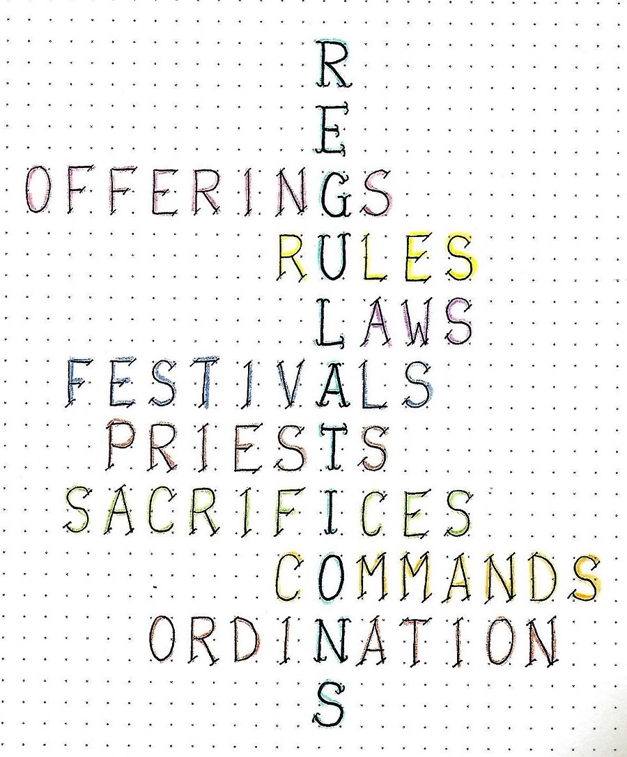
Day 5 – Serif Options – In Your Bible | In my Bible journaling I tend to gravitate toward commands, prayers and promises. Today is no exception. In the midst of ‘laying down the law’ to the Israelites, God made promises to them on what they could expect if they kept the law (Leviticus 26:12) and if they disobeyed. His promise to walk with the obedient is framed on my page with the ‘Stone Footpath’ from the Drawing Room. For most of it I used the slash version of the serif options from this week’s lesson. Just the words ‘GOD’ and ‘PEOPLE’ use the bird-wing style. Select a scripture in Leviticus to journal and use one (or both) of the serif option styles for your lettering. 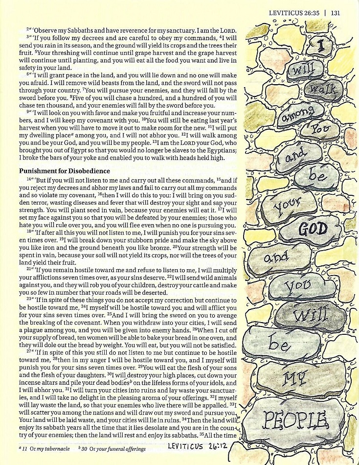
End of week 4 Ddd | | | . | |
