Topic: Bible Journaling
Now on to some lettering in the Psalms - this one is FUN!
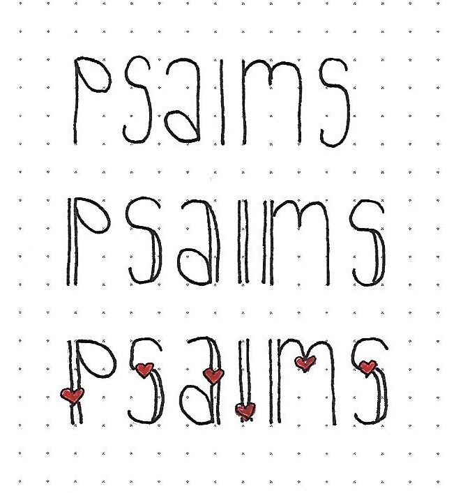
PSALMS: Day #1 – Stretched Novelty Oval – Intro
Now we will be reaching back into the archives for lettering styles taught in 2017 and investigating their roots and the things that make them unique. This week’s font had its roots in the basic oval font. However, the letters are skinnier and taller than the parent style.
Things to note about this style: 1) this is a mixed upper/lower case. 2) all of the elements of style take place in the upper third or lower third of the letters. Nothing happens in the center third. 3) the ‘bowls’ of the letters look like party balloons – an oval with a point where it attaches. 4) the letters are fully upright – no italics here. 5) some possible enhancements can be one set of double lines per letter and/or addition of hearts or other simple elements.
Work on these samples today and we’ll take it further tomorrow.
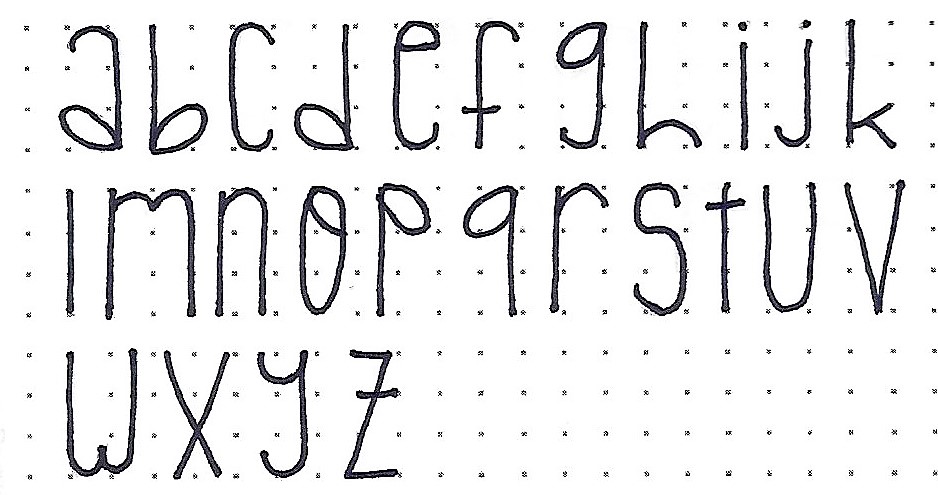
PSALMS: Day #2 – Stretched Novelty Oval – Alphabet
This is the full alphabet for the stretched oval novelty print. Here’s a review of the things to watch for that were pointed out yesterday: 1) this is a mixed upper/lower case. 2) all of the elements of style take place in the upper third or lower third of the letters. Nothing happens in the center third. 3) the ‘bowls’ of the letters look like party balloons – an oval with a point where it attaches. 4) the letters are fully upright – no italics here. 5) some possible enhancements can be one set of double lines per letter and/or addition of hearts or other simple elements.
If you do use the double lines, you can elect to fill them solid, fill with color or leave them open, as shown.
A set of numbers in the same style are included. These will come in handy when writing scripture references.

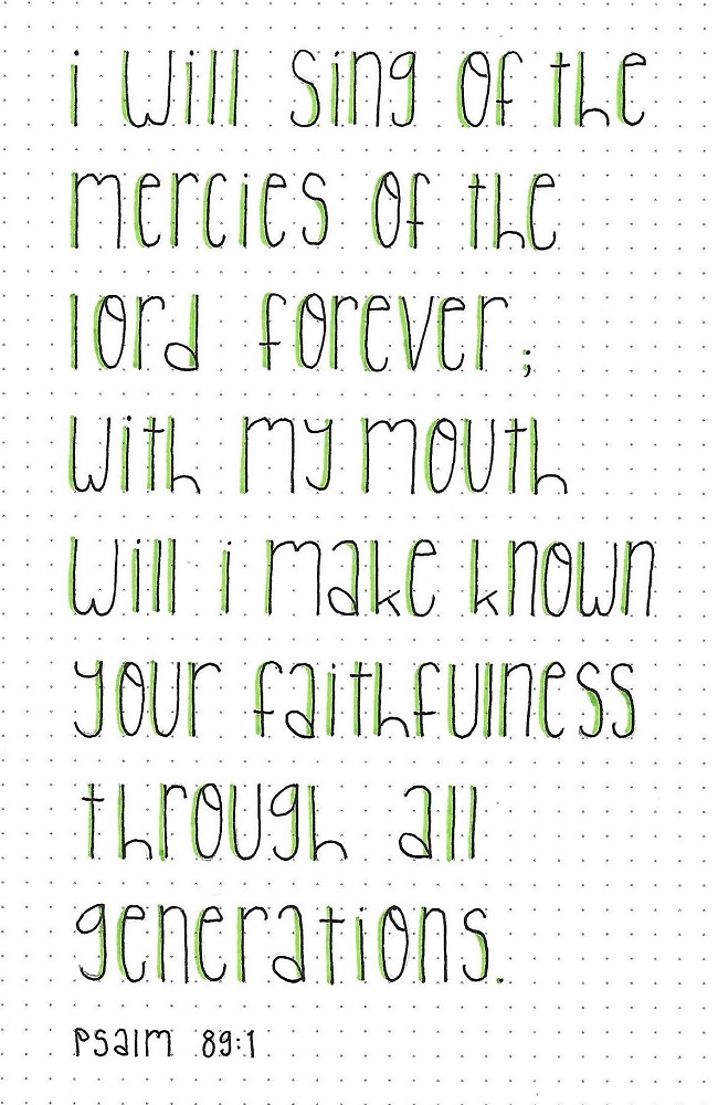
PSALMS: Day #3 – Stretched Novelty Oval – Text Block
Select a portion of the Psalms to write out using the font you’ve learned this week. Remember to pencil everything first, then ink the letters and, finally, erase your pencil. Check for spelling, missed letters, or wrong forms while you’re at the pencil stage!
I used a bullet tipped colored marker to draw a line right up against the left side of the tallest vertical on each letter.
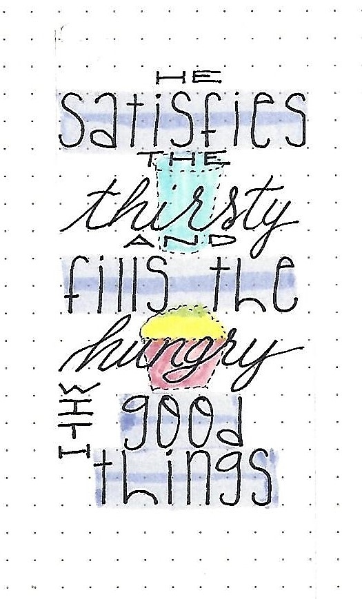
PSALMS: Day #4 – Stretched Novelty Oval – Combo
Select another scripture from the Psalms and use your new font in a ‘word art’ piece by combining one to two other fonts with it. I have used an all-caps print, stretched horizontally and a basic script. These three fonts do not compete with one another.
I included a couple of simple illustrations in dashed lines that, with color, guide the eye through the text. Simple color blocking on the feature font ties it all together.
PSALMS: Day #5 – Stretched Novelty Oval – Bible Page
The final activity for the week is to use the new font in your bible. I chose to use a section of scripture in Psalms with a repetitive style and used the same fonts for the same parts of the phrases to build continuity.
When I got done lettering this, there were no natural places for the eye to make the change to a new thought. So, I thickened the letters on the featured font and then used a rainbow color-blocking to break the text into the separate sections.
I combined this scripture and text with the stone tablets from this week’s Drawing Room tutorial.

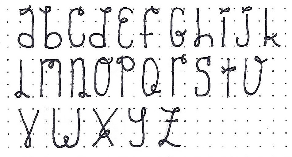
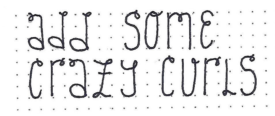
PSALMS: Day #6 – Stretched Novelty Oval – BONUS 1
I was having too much fun with this font to stop so I dreamed up a couple of further options. Make a copy of your original alphabet and add little curls to dress up the letters. This will give them an even more casual feel. Go for the unexpected like that changed up E and G. What fun is that unique X?
When you have it all figured out, ink it and erase the pencil. Then have some fun writing out a phrase with it.
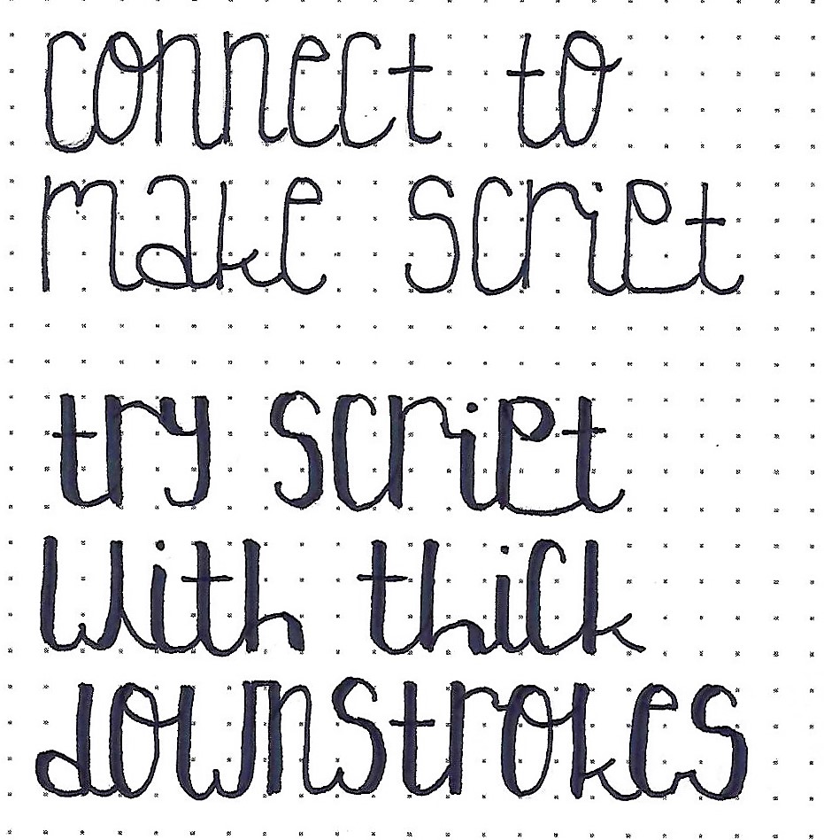
The last variation I thought of for this font was changing it to a script by introducing letter connections. Start with your basic alphabet and design connections that make sense. Keep in mind that these will probably change as you write phrases with them.
If you want to play further, try adding thickened downstrokes!
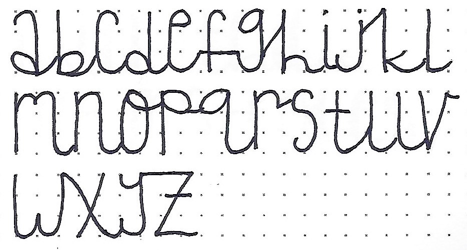
This is obviously a font with a LOT of possibilities!
Ddd
