Topic: Bible Journaling
This week, the lettering lessons are from the book of Daniel.
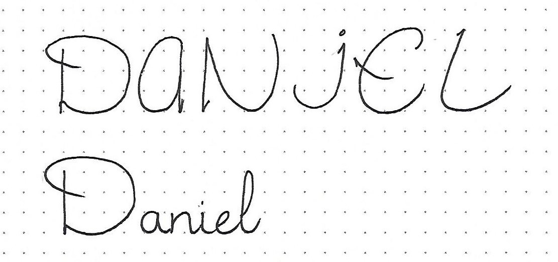
DANIEL: Day #1 – Jubilant Script – Introduction
The lettering this week is a combination of styles, including some invented forms! The lower-case is a fairly straight-forward upright round script (at least in the letters in our sample word.) A few more creative forms will appear in the full alphabet tomorrow.
The upper-case is a very carefree, casual style in which some letters are wide and some narrow. The one thing the all have in common is the little ‘hook’.
The relationship between the cases is extreme. Upper-case is four units while lower-case has an x-height of one unit, an ascender of three units and a descender of one unit.
Somehow it all works!
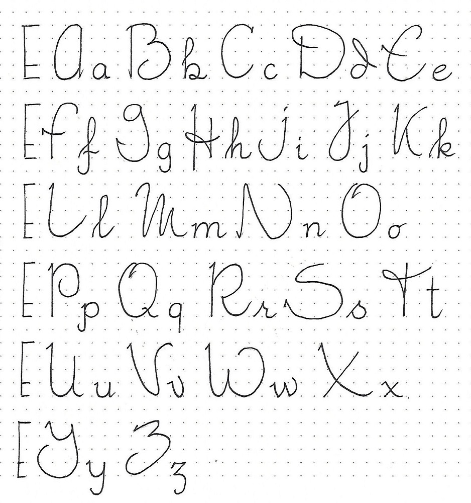
DANIEL: Day #2 – Jubilant Script – Alphabet
| The markings on the left side of the sample graphic are a reminder of the relative letter sizes in this combination of script letters. The letters in the upper-case are so casual that there are very few common elements to watch for, other than the little hook. Some are wide letters and some narrow. You’ll just have to study each letter and get a feel for the shape of it. In the lower-case, you’ll find mostly standard script formations. The ‘d’ does have a pronounced backhand as does the ‘v’. When using the lower-case in projects, do as with any other script in designing your own letter connections. |
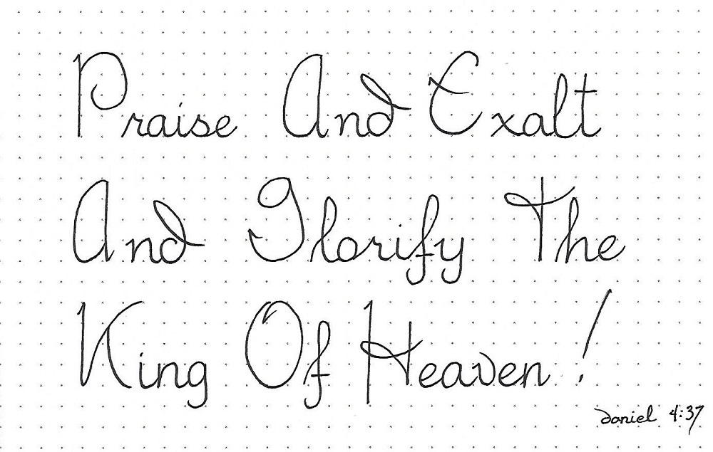
DANIEL: Day #3 – Jubilant Script – Writing Practice
The best way to become comfortable with this lettering style is to just use it. This gives practice with letter formation, letter and word spacing, and letter connections.
Since the casual style of the upper-case is really the feature, when you are writing out blocks of text, use capitals to begin all words.
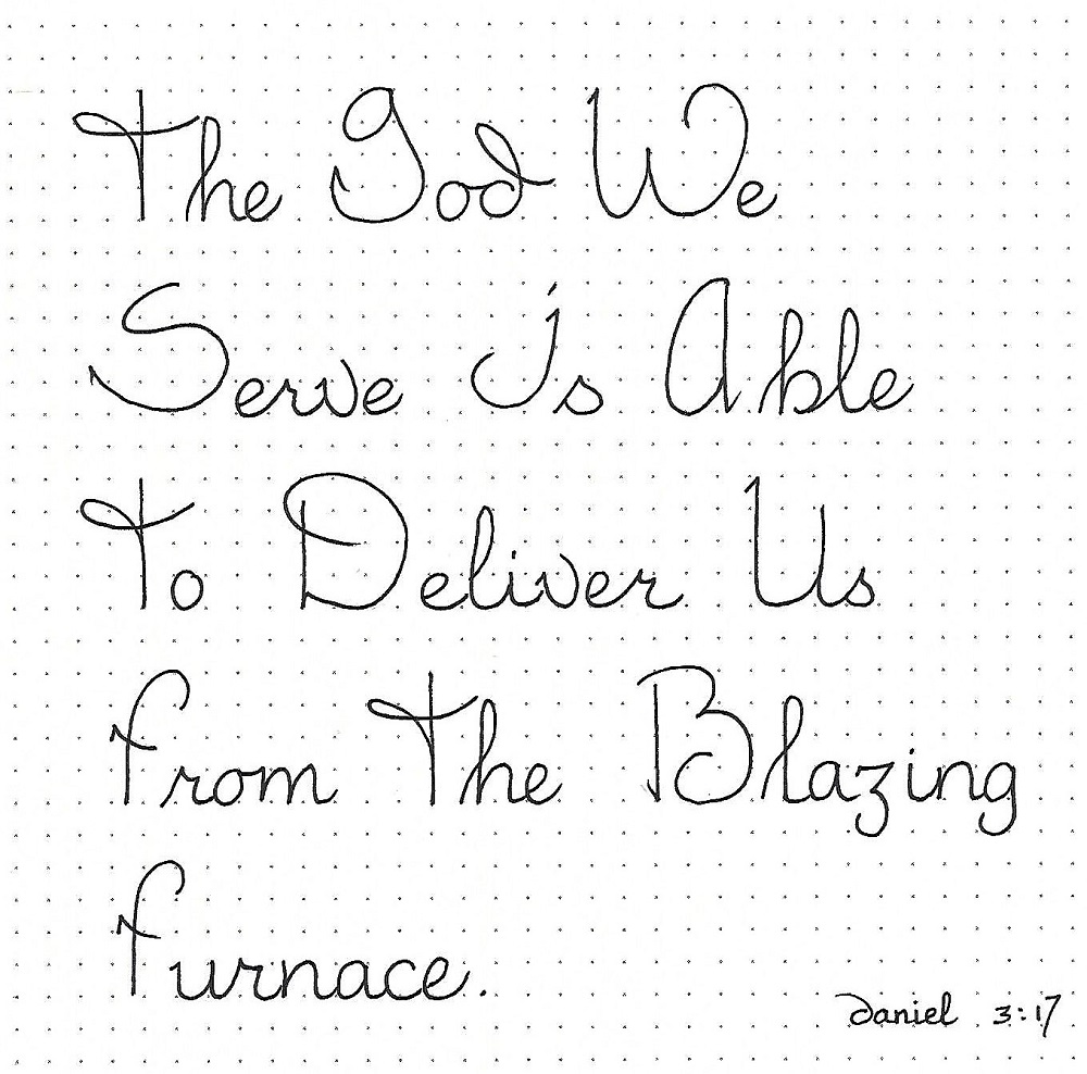
DANIEL: Day #4 – Jubilant Script – Scripture Writing
This alphabet usually calls for lots of practice before it starts feeling natural. Are you remembering our lettering mantra: Pencil-Ink-Erase? Drawing (sketching) the letters in pencil first lets you make adjustments and corrections in the forms and the spacing until it is just like you want it. Inking over the penciled lines trains your eye and brain to learn the forms and write them more naturally. Erasing the pencil makes your work ready for presentation.
Choose a scripture from Daniel to write using this week’s ‘Jubilant’ script.
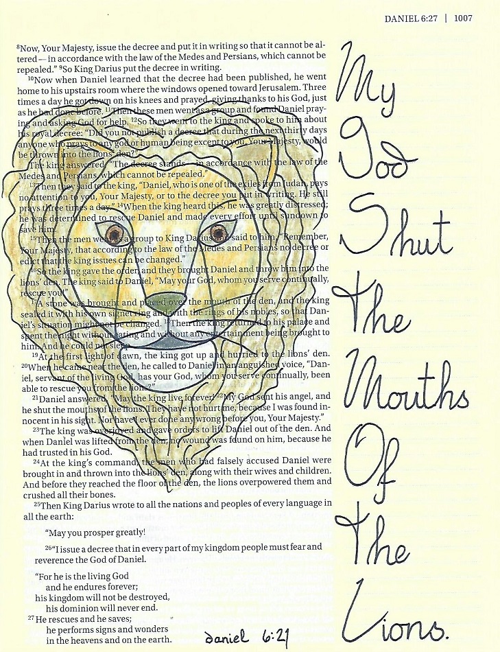
DANIEL: Day #5 – Jubilant Script – Bible Page
This lettering style makes a good choice for a quotation because it looks more like personal handwriting. It is that mix between the overstated casualness of the upper-case and the slightly more formal lower-case. It just looks spontaneous!
I used a paraphrase of Daniel’s declaration in my Bible, along with this week’s Drawing Lesson of the ‘lion’.
Another week completed.
Ddd
