Topic: Bible Journaling
Another week of lettering lessons is up for posting today! Let's just jump right into it:
MONDAY
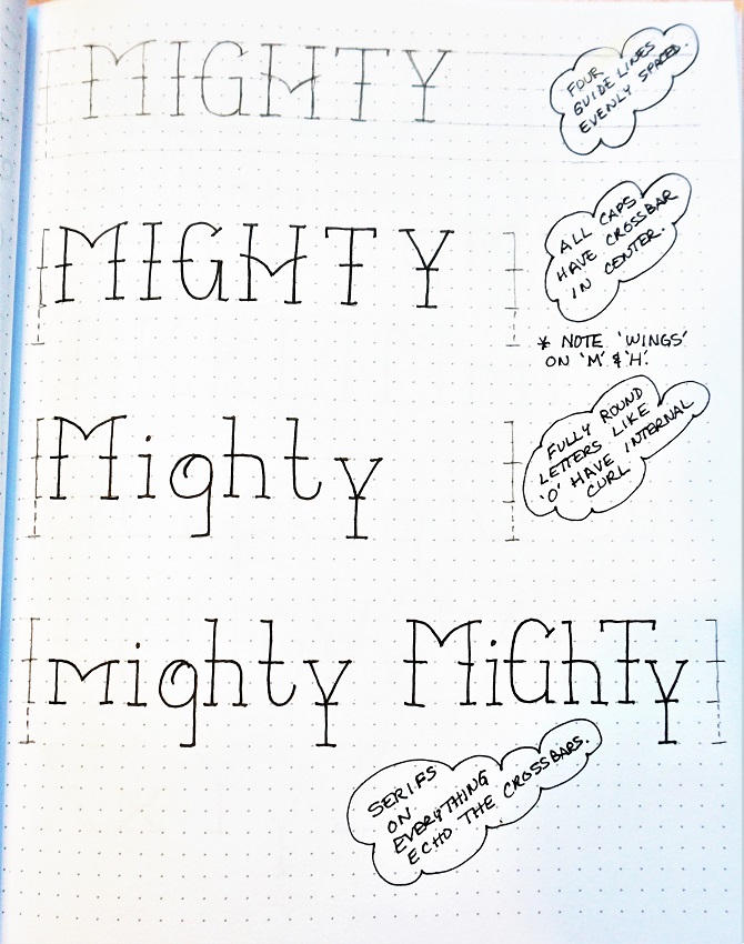
The font this week is a cross between a standard serif print and a novelty print. It has clean upright letters. There are notations on the sample sheet to give you some additional guidance.
Start with four horizontal guide lines, evenly spaced. From top to bottom these will be ascender, x-height, base and descender lines.
All the capitals have a crossbar at the x-height line (The H is an exception as it has that beautiful wing shape that matches the top of the M)
Letters with a fully rounded bowl (like the o, g) have a small internal curl.
The serifs on everything echo the crossbars. Watch to see which serifs are full-width and which are only half-width (extending only to the right or the left).
I’m not really fond of the mixed upper and lower case like in the last sample. But I know some who like that sort of thing, so I included it.
TUESDAY
I first drew out this alphabet and then I asked my hubby what it reminded him of and he said ‘Samson’s hands on the pillars he was going to crumble’. So, after discussion we decided to go with ‘Mighty’ as the theme!
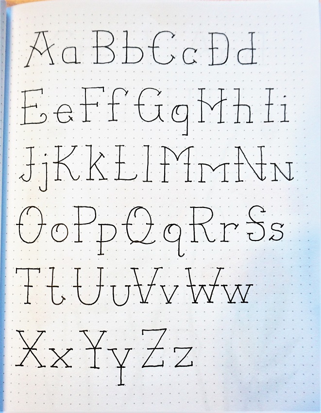
Common elements to watch for: WING SHAPES on A, H, M, m. INTERNAL CURLS on g, O, o, Q, q. Make note of which serifs are full (go to both sides of the letter) and which are half-width (just extend either left or right).
Make sure your letters stand nice and tall.
Remember to Pencil-Ink-Erase (PIE) as you write out your Mighty Alphabet.
WEDNESDAY
This is a great font to use for some Mighty hymn or chorus lyrics.
I find that I like ‘display’ pieces best when every word is capitalized. I also did some in all-caps as feature words.
I drew some poppies with a very thin-point pen and colored with pencils. When doing art in this style, I stop just short of crossing over the letters with the drawing lines and I leave a slight space around the color so it does not touch the letters. This maintains the readability of the text.

THURSDAY
On Thursdays we write out a scripture using the font of the week This is also done in a notebook or journal or on plain paper.
Although one could use the index inside their Bible, mine does not have one. So, I use www.biblegateway.com/ to find scriptures. There you can type in the focus word of the week and it will show you every verse it appears in! You can even select the Bible version you want to search. The scriptures will be listed AND written out for you. How handy is that? (You can also type in a reference and get the full scripture or you can click ‘in context’ and get the surrounding scriptures as well)
For the Mighty font I chose Psalm 150:1. Once again, all the first letters have been done in upper-case.
Look at the bottom of my page and you will note that I took very simple numbers and added enough of the serifs and crossbars to make them look like the lettering!
I drew over top of my letters using colored pencils, with a different color (blue, green, yellow, pink) for each phrase.

FRIDAY
Today you’ll choose a scripture reference in your Bible that uses the word ‘Mighty’. On this page you will journal that verse using the font of the week.
I had to scale back the size of my letters quite a bit for this and you’ll see that I have condensed the vertical spacing so the descender line on one row also serves as the ascender line on the next row.
As you are penciling your letters in you may want to move the words/letters left or right a smidge so no serifs sit directly on top of one another. I only had to do this in two places with descenders. You’ll see that I stayed with my use of upper-case on the first letter of every word and that I used all-caps to feature selected words.
I did a hand-drawn image with colored pencils added for my page. You can choose to decorate your page any way you wish (or not at all).

This week we were having a 'guided tour' for new members to the CBJ facebook group. Beacuse this was such an easy font to draw we had more participation than we usually do. There were a total of 16 who shared their work with us!
Ddd
