« October 2008 »
S M T W T F S
1 2 3 4
5 6 7 8 9 10 11
12 13 14 15 16 17 18
19 20 21 22 23 24 25
26 27 28 29 30 31
You are not logged in. Log in
Entries by Topic
All topics  «
3D paperwork
A - Z challenge 5
A - Z challenge 7
A - Z challenge round 4
A to Z challenge round 3
A to Z round 2
A to Z round 6
A-Z round 1
Around the House
Art Challenges
Artist Trading Cards
Backgrounds
Beads
Bible Journaling
Books
Boxes
Collage
Color Challenge
Coloring
cookbook
Die Cuts
Digital Projects
Digital Stamps
Drawing
Dry Embossing
Fabric Stuff
Fantastic Folds
Field Trip
Home Decor
How Does Your Garden Grow?
Hymnal Art
In The Kitchen
In the studio
Jewelry
Lettering
Links
Multi-Technique
Music to Work By
Musings
Nail Art
New Work
Online Class
Other Hobbies
Other Projects
Painting
Paper Embroidery
Paper Piecing
Photo
Pretty Paper
Quilting
Random
reading
Scrap Recovery
scrapbooking
Sewing
Sketch Challenge
Some Backlog
Stamping
Stencils
Stickers
Supplies
Teabag Folding
Techniques
Testing
tips and tricks
Tutorial
Web resources
Welcome to my Blog
Work By My Friends
workflow
Writing
Blog Tools
Edit your Blog
Build a Blog
RSS Feed
View Profile
Group One
In & Out of Studio 3D
Tuesday, 28 October 2008
More Fall Friends
Topic: New Work

The fall leaves are back. This time I used a burgundy card base instead of the brown used before. After cutting the oval with the Coluzzle I liked this layout better on the horizontal. I had a lovely sticker for text but it was large and square. So I took the Coluzzle to it as well and cut it to fit in the oval frame window. 

Ddd


Posted by studio3d@ccgmail.net at 6:00 AM PDT
Monday, 27 October 2008
Enchanted, I'm Sure
Topic: New Work

A local activity center sent out advertising with these beautiful leaves on a glossy white background. Now how could I NOT use them? This is a simple mounting on orange card base and addition of a puffy acrylic sticker that says "enchanted". 

Ddd


Posted by studio3d@ccgmail.net at 6:00 AM PDT
Sunday, 26 October 2008
Nesting
Topic: New Work

I've had this advertising page of eggs in a nest for years. I tore out a frame using my handmade paper and mounted both on scrapbook paper and a golden card base. A raffia tie finishes off the bottom. 

The text is provided on a thick acrylic tile.

Ddd


Posted by studio3d@ccgmail.net at 6:00 AM PDT
Saturday, 25 October 2008
Fruit For a Friend
Topic: New Work

A kitchen decorating catalog yielded up these painted tiles which I mounted on a blue panel. The printed background is scrapbook paper to mimic the backet on the tiles. a gold-toned ribbon is knotted at the left and held in place with square rhinestone brads. 

Everything is then mounted on a green card base and a thick acrylic tile sticker provides the text.

Ddd


Posted by studio3d@ccgmail.net at 6:00 AM PDT
Friday, 24 October 2008
Making Stuff From the Scrap Pile
Topic: New Work

The other day I needed a punched square for a project. So I punched it out of the front of this card base leaving an aperture card. From the scrap drawer I used an advertisement from a frame company and mounted it on the back wall of the card leaving these two ladies showing in the window. 

The text is a clear sticker and the two side panels plus the circle are also stickers.

Ddd


Posted by studio3d@ccgmail.net at 6:00 AM PDT
Thursday, 23 October 2008
Falling For You
Topic: New Work

Giant fall leaves of paper were advertising of some sort I saved years ago. I glued them around the edges of a card base and then used the Coluzzle to cut an oval in the front cover. This was mounted on a folded card with 3D dots. I added some tags and ribbon as accents. 

Ddd


Posted by studio3d@ccgmail.net at 6:00 AM PDT
Wednesday, 22 October 2008
Blocked Leaves
Topic: New Work

As soon as I saw this set at Linen & Things I was attracted to the leaves and thought of the skeleton leaves in my stash. The random color blocks that set them off seemed like a reasonable element to replicate. 

I started with a piece of vellum that has very light gold roses printed on it. I ran this through the Xyron for overall adhesive and applied blocks of mulberry paper in four colors to it. I burnished it from the back to make the texture of these papers show through better. After cutting to size and mounting on a cream card base, I glued three metallic skeleton leaves on the front.

The grey background is for viewing contrast only and is not part of the finished card. The double square in the lower right is a thick acrylic sticker.

Ddd


Posted by studio3d@ccgmail.net at 6:00 AM PDT
Tuesday, 21 October 2008
Blue Malibu
Topic: New Work

I love the color combination of light blue and chocolate brown. I've always thought it looked classy. So when I found this bedding set on HomeDecorators.com I immediately wanted to do a card with it. 

For this card I started with white cardstock, stamped the flower stamp in bright teal and Versamark then embossed with clear detail powder. I colored in the petals with teal marker and colored over that with embossing pen, then embossed again. Finally, I brayered over the whole thing with Espresso Adriondack ink pad. When dry the brown ink was wiped off the embossing with a cloth.
 

A ribbon was colored with marker to match the inks, chocolate cardstock cut into layering and the flower stamped twice on light blue using the Espresso Adtiondack pad. The flower is cut out and mounted 3D over the brown panel.

The greeting is a thick acrylic tile.

Ddd


Posted by studio3d@ccgmail.net at 6:00 AM PDT
Monday, 20 October 2008
White Out
Topic: New Work

I was cruising blogs the other day and was struck by a piece that was all white in multiple layers. Just stunning. Unfortunately, when I put my piece together I did not like it as I thought I would.  I took out some of the white layers and replaced them with silver, then finished it off with the white, silver, and pink pop-up flowers.

The text is clear embossing powder with Versamark stamping.

I wish the photo did not turn out so blue as it looks much better in real life.

Ddd


Posted by studio3d@ccgmail.net at 6:00 AM PDT
Sunday, 19 October 2008
Blue Willow
Topic: New Work

It is difficult to see the details of this inspiration piece, but I was working from a better photo from an advertising flyer in the Sunday paper. This is a bedding set by Jaclyn Smith called Today Willow. 

What inspired me was the combination of blue and brown and the three tones of blue used. I started with medium blue cardstock and stamped a leafy pattern with bleach to create the lighter branches. Then I stamped with dark blue to create the second tone. I recreated the blue and brown branches on cream cardstock for the pillow case, banded both pieces with brown for the brown teim on pillows and sheets and layered them. That lovely stitching on the coverlet was interpreted with... stitching! Actually, I stitched with the sewing machine and no thread then drew between the holes with brown brown marker.

Blue greeting stamped on cream cardstock was bordered in brown and layered on the front and, finally, the whole is layered on the front of a brown cardstock base.

Ddd


Posted by studio3d@ccgmail.net at 6:00 AM PDT
Saturday, 18 October 2008
Can't Let Summer Go
Topic: New Work

Don't you love this Flip Flop Doormat from Bed Bath & Beyond? I knew it would be fun to recreate it on a card and hold summer here just a little bit longer. 

I started by running 4 colors of cardstock thru the Cuttlebug for lines of texture. Then I used darker inkpads of the same color direct-to-paper to color just the raised parts of the stripes. I cut the shape of the flip-flop from each piece. Contrasting colors were used to cut out straps and a darker version of these were used to stripe the strap and stamp a flower for the toe.

The back of the straps were glued directly to the base but the toe portion was raised with a pop-dot. Then the flower was mounted with a second pop-dot and a glittery acrylic flower applied on top.

All the flip-flops were glued to a sage green base card using the alternating alignment from the inspiration piece. The text block "Sunny Days" is a puffy acrylic sticker.

Ddd


Posted by studio3d@ccgmail.net at 6:00 AM PDT
Friday, 17 October 2008
Nothing Could Be Simpler
Topic: New Work

This bathroom accessories set from Bed Bath & Beyond is by DKNY. I was attracted to the simple graphic quality of these pieces and wanted to recreate that in my card. 

I started with white glossy card and used multiple clear stamps from a variety of sets to build a background of florals. I used Versamark and black ink followed by clear detail powder and heat embossed. I did each flower style completely through the process before starting on the next stamp.

After mounting on black I added a band of black card at the bottom to mimic that on the inspiration pieces. Then a white ribbon was tied and white rub-on text echoes the graphic brand-name on the originals. I added a text sticker at the top to balance the piece.

Ddd


Posted by studio3d@ccgmail.net at 6:00 AM PDT
Thursday, 16 October 2008
Dreaming of Inspiration
Topic: New Work

This duvet from Pottery Bard drew my attention because of the combination of golden daisy clusters and the graphic multi-valued blue background. 

My stock of inks limited my interpretation of the background to a more varied range of blues and greens, but the daisy clusters worked great!

I stamped them in color and embossed with clear detail powder. Then I hand-colored them with watercolor marker, applied embossing pen and again used clear powder. After stamping the blue background plants, I used the embossing marker to reserve some whites and embossed in clear. Then the whole background was brayered with two tones of blue.
 

I used the watercolor marker along the edge of white cardstock to recreate the stripes in the sheets and pillowcases. These were embossed in clear powder for texture. The background card base was run through the Cuttlebug for texture and assembled. The text is a Tim Holtz 'ticket' which I colored with the same watercolor marker as the daisies and the stripes.

Ddd


Posted by studio3d@ccgmail.net at 6:00 AM PDT
Wednesday, 15 October 2008
Reversals
Topic: New Work

This inspirational piece is called Song Bird and is from Pottery Barn. I was intrigued by the sage on cream and cream on sage patterns and had no problem getting inspired by it.

I used my newest Cuttlebug folder to impress both cream and sage cardstock. The sage was colored with white ink and the cream was colored with sage ink. Both were done with pigment ink and a brayer to color just the raised portions of the pattern.

A simple layering on a cream card base is enhanced with a green and gold ribbon. I cut a piece of the sage cardstock with a stamp-edge Cuttlebug die and layered with a clear sticker for the message.

Ddd


Posted by studio3d@ccgmail.net at 6:00 AM PDT
Tuesday, 14 October 2008
Poppin' Poppies
Topic: New Work

My second inspiration piece was this Jonathan Adler 'Poppies' bedroom set from Bed Bath & Beyond. I was inspired by the graphic quality of the flowers and the great use of white space.

I used glossy white cardstock and placed a single drop of three colors of alcohol ink and let them combine as they wished. When they were dry I used black Sharpie and drew in graphic centers and stems.

Note on the bedding that there are chains of colored dots as well as small poppies with black bars. I combined these by creating strings of colored dots using each color from the large poppies and then connected them together with black lines and dot centers.

A watercolor marker was used to write in the greeting and I shadowed it with a black permanent fine-tip marker. Both the poppy panel and the strings panel were outlined with marker before mounting on a dark yellow card base. 

Ddd


Posted by studio3d@ccgmail.net at 6:00 AM PDT
Monday, 13 October 2008
Navy Grid
Topic: New Work

This is the beginning of another new series. I have been reading a lot of blogs where one person challenges another or a group of others to create cards or other art based upon an inspiration piece that is posted.

I decided to find pieces to inspire myself and, after gathering quite a few, set about making cards from the ideas they presented.

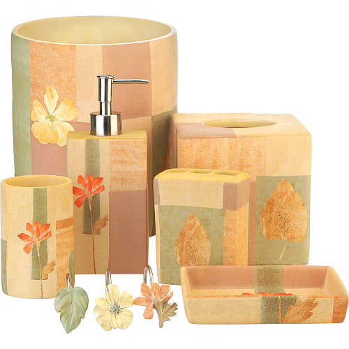
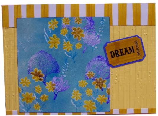
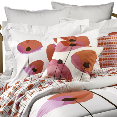
This is the first - a  set of bedding called Chantal Navy from Bed Bath & Beyond.

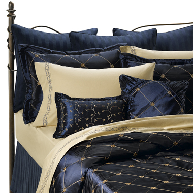
I was inspired by the gold grid on the rich blue and the vines on the pillow sham. This is the card I made:

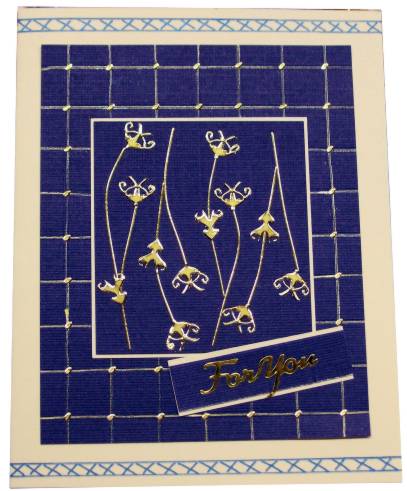
I changed the grid to be square rather than diagonal on the card and made it first with scoring and then with a gold gel pen. Tiny bits of gold peel-offs mark the intersections of the grid lines. Then I used more peel-off waste to make the vines imitating the pillow sham.

The trim on the sheets and pillow cases was copied using a blue gel pen on each end of a cream-colored card base. Then the plue parts were mounted on top and a tag made to mount the gold peel-off greeting.

Ddd


Posted by studio3d@ccgmail.net at 6:00 AM PDT
Sunday, 12 October 2008
Oh Baby
Topic: New Work

Advertising sometimes comes in the cutest packages! These are from a spring flyer from a local store. How adorable!

I layered on green card run through the Cuttlebug, on white for a border, and then on a pink card base. 

Organza ribbon is knotted and held in place with a green flower brad. The text is added with stickers - pink with dots.

Ddd


Posted by studio3d@ccgmail.net at 6:00 AM PDT
Saturday, 11 October 2008
Makeup Mice
Topic: New Work

TODAY WE ARE CELEBRATING A MILESTONE - 500 POSTS ON THIS BLOG! 

This is another stamped image sent by a friend. I've used watercolor markers again and couldn't resist adding a little lipstick and nail polish to the little beauty at the mirror!

I used the Coluzzle to cut ovals in brown and in red for framing. 

I picked up more colors with knotted ribbon, cardstock tag and brads. The final step was to mount on white card base.


Posted by studio3d@ccgmail.net at 6:00 AM PDT
Updated: Sunday, 28 September 2008 1:59 PM PDT
Friday, 10 October 2008
Color Blocking
Topic: New Work

I used my square punch to cut this flower into a grid. Then I glued it on to brown cardstock. Since part of the flower had a green background and part a cream background I used a cream card base and aligned a green overlay on the right side to work on opposites with the photo colors (they actually match in real life). 

The bottom features a knotted grosgrain ribbon and a clear sticker.

Ddd


Posted by studio3d@ccgmail.net at 6:00 AM PDT
Thursday, 9 October 2008
Pretty Girl
Topic: New Work

Those of you who actually own stamps of this little girl or have seen it before already know that she has no nose and no mouth. It kind of creeps me out so I finished her face with eyelids, nose and mouth after coloring with watercolor markers.

She has been cut into an oval with the Coluzzle and layered on pink with the corners rounded. This is overlaid on a fold of a blue that matches the coloring in her pants. It has been run through the Cuttlebug on the front of the card only.

A text sticker was added to the front and brads set at each end. Then I didn't like the brads showing on the inside so I lined both sides of the inside with pink, corneres rounded. Then I rounded the corners of the base card. 

Ddd


Posted by studio3d@ccgmail.net at 6:00 AM PDT

Newer | Latest | Older