« September 2011 »
S M T W T F S
1 2 3
4 5 6 7 8 9 10
11 12 13 14 15 16 17
18 19 20 21 22 23 24
25 26 27 28 29 30
You are not logged in. Log in
Entries by Topic
All topics  «
3D paperwork
A - Z challenge 5
A - Z challenge 7
A - Z challenge round 4
A to Z challenge round 3
A to Z round 2
A to Z round 6
A-Z round 1
Around the House
Art Challenges
Artist Trading Cards
Backgrounds
Beads
Bible Journaling
Books
Boxes
Collage
Color Challenge
Coloring
cookbook
Die Cuts
Digital Projects
Digital Stamps
Drawing
Dry Embossing
Fabric Stuff
Fantastic Folds
Field Trip
Home Decor
How Does Your Garden Grow?
Hymnal Art
In The Kitchen
In the studio
Jewelry
Lettering
Links
Multi-Technique
Music to Work By
Musings
Nail Art
New Work
Online Class
Other Hobbies
Other Projects
Painting
Paper Embroidery
Paper Piecing
Photo
Pretty Paper
Quilting
Random
reading
Scrap Recovery
scrapbooking
Sewing
Sketch Challenge
Some Backlog
Stamping
Stencils
Stickers
Supplies
Teabag Folding
Techniques
Testing
tips and tricks
Tutorial
Web resources
Welcome to my Blog
Work By My Friends
workflow
Writing
Blog Tools
Edit your Blog
Build a Blog
RSS Feed
View Profile
Group One
In & Out of Studio 3D
Monday, 12 September 2011
Over the Top Words
Topic: Stamping

OK, so only two of today's cards have stamping. But since the general technique is the same I am lumping a couple of others in with them.

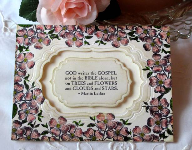
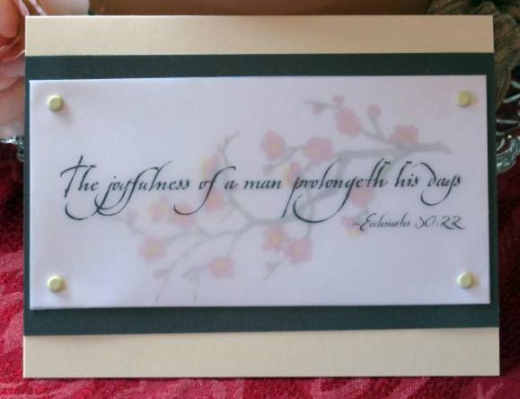
This is going back to the technique of layering printed vellum over an image to create a focal piece. In this first case I used a stamped and colored image of a blossoming branch. The vellum is wrapped to the back and adhered. I then used brads to attach it to the brown backing panel and glued this onto the folded card base.

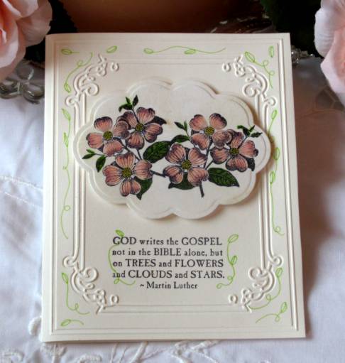
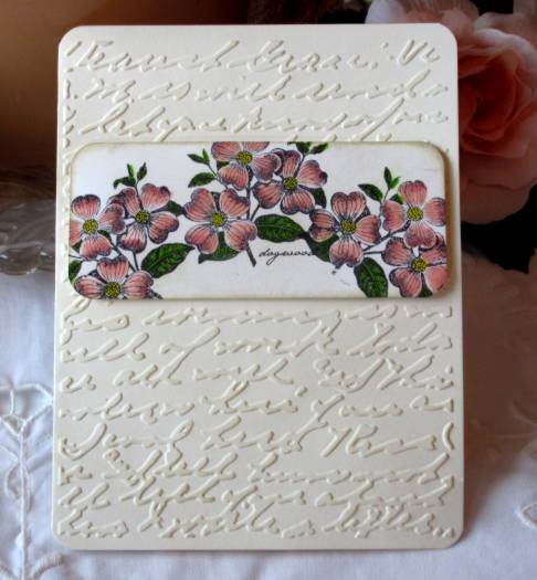
Then I stamped and colored another of the dogwood images and layered a vellum panel over it in the same way. This was ahdered to a double layer of colored backing panels. I punched two holes in the backing panels and tied sheet ribbon through. Then these were all layered onto a speckled folded card base.

Next are a couple that use the printed vellum but do not use stamped panels behind them. These use printed tissue that has been wrinkled, flattened and adhered to cardstock. (I bought a couple of packages of floral printed tissue paper just to use on making cards.)

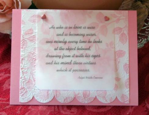
This first card uses heart brads to attach the vellum to the panel before mounting on the pink folded card base.

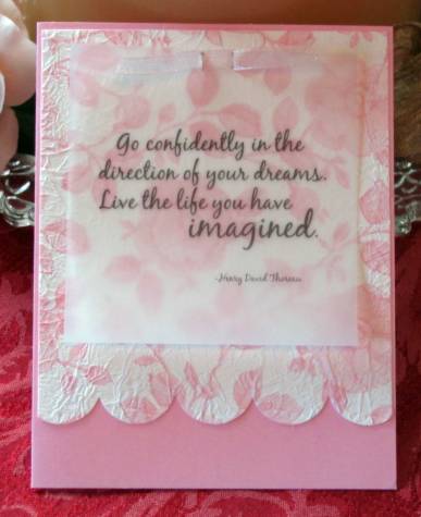
Then, working in the opposite orientation I created slits in the vellum and floral panel to weave ribbon through for a faux bow. These are then attached to the card base.

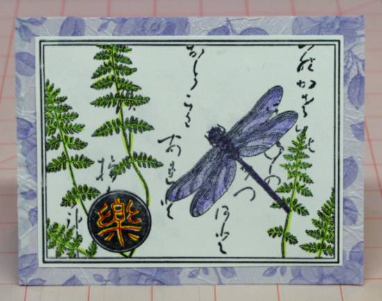
I love the variety of looks you can get using these printed vellum overlays.

Ddd


Posted by studio3d@ccgmail.net at 6:00 AM PDT
Sunday, 11 September 2011
Are You Chicken?
Topic: Stickers

I designed these two cards to use the stickers of the roosters. Since they faced in opposite directions I made the cards to be exact flip-flops of each other to make the rooster face inward.

The paper the roosters are mounted on is the last of the border paper to which I added a red doodle line. The striped cardstock is table scraps. After layering on a yellow card and the green folded card base I created the floral accents. These are two felt flowers and a folded scrap of red raffia held together with a red flower brad.

The greeting is stamped.

Ddd


Posted by studio3d@ccgmail.net at 6:00 AM PDT
Saturday, 10 September 2011
What Can You Do With Silver and Blue
Topic: Supplies

ASSIGNMENT: Make a card using only Silver and Blue

I started with a piece of silver cardstock and a new star punch. I took the randomly punched stars and popped them up on foam tape. Then I backed the holes with blue paper and bordered the sides with more blue. I've had a piece of silver mesh for years (from a supplies swap) and tore out a strip to weave behind the stars. The rest is accessorizing with two tones of blue rhinestones and lots of silver peel-off stickers.

Little folds of silver sheer ribbon peek out from each of the punched silver stars and the whole is mounted on a shiny silver folded card base.

What a party!

Ddd


Posted by studio3d@ccgmail.net at 6:00 AM PDT
Friday, 9 September 2011
Blue Jeans Baby
Topic: 3D paperwork

Well, this is a bit different interpretation of the topic 3D paperwork, but it applies in an oblique sort of way.

I started with a piece of printed scrapbook paper that looks like denim. Then I used copic markers to add shading that would create seams, folds, and top-stitching. Voila! A jeans pocket! I added three antique silver brads to serve as rivets and then sliced along the top edge of the large pocket. By placing a lining paper behind and raising the two side edges on foam squared the pocket actually stands out from the jeans (actual 3D).

I had a sticker that matched the color and look of leather so I placed that on the 'waistband' to serve as both text and the jeans label. The jeans are mounted on a printed cardstock with antique script and this is what appears on the back of the card as well. The inside of the card matches the inside of the pocket lining.

I created a tag out of mulberry paper to look like a hankie in the pocket.

However, it is reversible and has some of the text cardstock on the back so it can also look like there is a note in the pocket.

This was actually used for a Father's Day card and a gift card was tucked into the pocket behind the tag.

Ddd


Posted by studio3d@ccgmail.net at 6:00 AM PDT
Updated: Friday, 9 September 2011 9:07 AM PDT
Thursday, 8 September 2011
The Beauty of Scallops
Topic: Stamping

I started with one of the 'leftover' dogwood stamped images and layered a parchment text panel over it. This was accomplished by wrapping it to the back and adhering it with dry adhesive.

I had purchased a new pad of printed cardstock and selected three pages to combine. I made scalloped edges with my new punch and stacked until I liked the arrangement. 

Then I mounted the image panel with foam tape and added two ribbon flags using glue dots.

This was the card I gave my Mom for Mother's Day.

Ddd


Posted by studio3d@ccgmail.net at 6:00 AM PDT
Wednesday, 7 September 2011
Joy of Reading
Topic: Other Projects

ASSIGNMENT: Bookmark - THEME: Joy of Reading

I had a 'kit' with book circulation cards, date stamp, book pockets, etc. I used one of the circulation cards and stamped a range of dates down the left side. I hand wrote an author, title, and 'signed' funny names that had 'checked out' the book. I used old paper distress ink to shade it and a distress tool to rough up the edges. I colored a suitcase image (from the stamp catalog) and glued that to the front and mounted the whole thing to patterned cardstock.

The top corners were rounded with a punch and I used a small hole punch in the center to thread with a thin ribbon.

Ddd


Posted by studio3d@ccgmail.net at 6:00 AM PDT
Tuesday, 6 September 2011
Hoo Likes Owls?
Topic: Paper Embroidery

ASSIGNMENT: Make a paper embroidery card on the theme "Owls"

I found this pattern in a book I own and it was perfect for this swap. I stitched the window grame in copper metallic thread, the window grid in gold metallic and the owl in silver metallic - on black cardstock.

I mounted on shiny gold metallic cardstock over a white folded card base. I like this pattern as it is more realistic than most of the 'cute' owls one sees in patterns.

Ddd


Posted by studio3d@ccgmail.net at 6:00 AM PDT
Monday, 5 September 2011
Act of Kindness
Topic: Backgrounds

A friend sent the colored/stamped panel in a swap of stamped images. She created the background with distress inks and stamped over it with a silhouette flower. I simply layered it over a cardstock with a blue jeans print. Added to a moss green card base, the blue jeans panel was then stamped with a quote stamp.

Ddd

Posted by studio3d@ccgmail.net at 6:00 AM PDT
Sunday, 4 September 2011
Forest Walk
Topic: Scrap Recovery

If you look in the right catalog you will find a picture of a print you can buy to hang on your wall. If you cut out that picture with an oval nestability die and layer it on a beaded oval diecut of printed cardstock you will have the feature for today's card. I chose to layer it using foam tape over a brown plaid paper and a brown folded card base.

What a serene scene.

Ddd


Posted by studio3d@ccgmail.net at 6:00 AM PDT
Saturday, 3 September 2011
Seven Up
Topic: Stamping

A while back I was using a shadow stamp on card projects and stamped up a bunch extras in a variety of pastel colors on white cardstock. So, in a push to use them all up, I pulled out some other stamps and treated them in similar ways.

First I stamped over all of them using a script background in coordinating colors. Then I used a tall flower stamp on the right side of the blocks. I have a set that offers 4 different flowers. So I used each of them twice, except for the lily. Then each of them was colored with watercolor markers and cut out with a nestabilities die - using a variety of them. Finally, each got a text stamp.

I then pulled out base cards, background papers, and ribbons in suitable colors and set about assembling the following--

With the lily stamp I colored in yellow, layered with green, yellow and blue and added a sheer blue ribbon:

This Iris was colored with light purple, cut with a scallop die, layered with dark purple, lime green and light purple. It got a sheer purple bow:

The second iris was colored with a blue-violet marker and has a darker shadow stamp background. A faux bow on the purple cardstock layer balances out the image panel which is popped up on foam tape. The green layer is torn on the right to soften the layout and this is finished off with a violet card base:

Next is the Allium. The first is a blue-violet version which has a thin green border peeking out from the image panel. This is popped up on foam tape over a blue panel and bordered with a glitter-green strip on the left. The base card is pastel violet:

The secons Allium was colored with a raspberry coloring so I added a shimmery pink torn panel behind it to reinforce the palette. A sheer ribbon is knotted through slits on either side of the stems before popping it up over the pink/green layer. Dark red-violet card base on this one:

These final flowers are labeled paperwhite narcissus which one presumes would mean they should be 'white'. However, that would be boring! So I made them yellow and orange. The first I gave a simple layout since the flower itself is more detailed. A borl text stamp adds some weight to the panel to anchor it. Both the backing and the base card are in tones of spring green:

The second paperwhite also got a horizontal treatment (it just worked out that way). I got a new nestabilities die with a cool 'beaded' edge that the ovals die fits precisely. I used it on a shimmery yellow cardstock and popped both on foam tape over a grass-green card base and a strip of playful plaid:

Isn't it fascinating how much the look changes from one card to another with different shapes and colors?

Ddd


Posted by studio3d@ccgmail.net at 6:00 AM PDT
Friday, 2 September 2011
Asian Stitches
Topic: Paper Embroidery

ASSIGNMENT: Make a stitched card with the theme GLOBETROTTING. I chose to make my card Asian in support of Japan.

I used a collage rubber stamp on white cardstock and colored in a few areas with watercolor markers. Then I pricked out areas as I went along and stitched in with the appropriate threads.

For the medallion I stitched in red over the yellow coloring. Then I stitched heavily in the ferns with lime green. The dragonfly is stitched with irridescent violet in two tones.

I used a printed tissue, crushed and flattened, over light purple cardstock base and added the stitched panel on top.

Here is a close look at the stitching on the dragonfly. You can see I did just a few lines on each wing and then stitched sections into the body.

And off it went to its new home in England, so I guess the card itself is a globetrotter!

Ddd


Posted by studio3d@ccgmail.net at 6:00 AM PDT
Thursday, 1 September 2011
Four Dogwoods
Topic: Stamping

ASSIGNMENT: make cards illustrating what you like best about SPRING in your home area. (Yes, I am very late in posting these, though they were completed in April!)

For me, the best thing about Spring is the flowering of the trees. I love the magnolias, the plums, and the dogwoods most of all. As it happens, I have a dogwood clear stamp and I chose to use it four ways (because I don't like being repetitive) because I don't like being repetitive (LOL).

For the first I stamped three times on white cardstock, blocking out the text on two of them. They were colored with watercolor markers and then I used a square punch to cut them out, changing the orientation so they would look like different branches. Then I rounded two corners of each and hit all the edges with Old Paper distress ink on a foam applicator. These were then attached to a butter yellow cardstock strip. I selected a cream base card and stamped over the whole face using a flowering branch stamp and Old Paper distress ink. It was a little stark so I used an aquabrush to color in the blooms and branches which melted the ink color into these areas. I mounted the image strip and then rounded the two outer corners. Here's the result:

Yes, it IS yummy! But I kept going. I selected another white cardstock and stamped all around the outside with the dogwood stamp to create a frame and then colored it with watercolor markers. I used a nestabilities labels die to cut out the center and the next larger one to emboss a frame around the cutout. I used Old Paper distress ink to tint the whole frame and mounted it to a cream card base using 3d glue dots around the inside and regular glue dots at the outer edges. I stamped text onto white cardstock and cut this with the next smaller nestability die and tinted it with the same distress ink. Here's a look:

Ooooh! Aaaaah! But we're not done yet.

Next I stamped the dogwood only twice onto white cardstock and blocked the text out on both. Then I colored with the watercolor markers. This I cut with a large scallop oval Nestability dieand tinted with Old Paper distress ink on a foam applicator. I selected a cream card base and used a Cuttlebug embossing frame folder on the front of it. I stamped the text and used a watercolor marker to add vines all around the edges. Then I mounted thedogwood panel using foam tape. Are you ready for this???

Lovely, no? And one more...

This time I stamped the dogwood three times in an arch and colored with watercolor markers. I cut this into a panel and rounded the corners before using the Old Paper distressink on the whole thing. I chose another cream card base and ran this thru the Cuttlebug with the Script foldes. I burnished it lightly to flatten the embossing a bit and then used the distress ink to very slightly color the raised portions. I added the stamped panel with foam tape and then rounded all four corners of the card.

So there you have it. One image stamp, one background stamp, four markers, one distress ink pad, two nestabilities sets, two embossing folders, two punches, four cream card bases, one yellow strip.... four awesome cards for Spring.

Ddd


Posted by studio3d@ccgmail.net at 6:00 AM PDT
Wednesday, 31 August 2011
J is For Jazz
Topic: Paper Embroidery

Another card for the alphabet paper embroidery series...

J is for Jazz because I couldn't think of anything else for J that I had a pattern for! I embossed the white paper first and then pricked out the design (by Joke de Vette) onto it. I stitched in a variety of bright colors to illustrate the jazz theme.

After rounding two corners I mounted it on a background of green glitter cardstock using foam dots and glued this to a yellow-orange card base.

I found some acrylic button letter stickers to spell out JAZZ and used a Sharpie marker to turn them into musical notes for the text.

Ddd


Posted by studio3d@ccgmail.net at 6:00 AM PDT
Tuesday, 30 August 2011
Life Is Sweet
Topic: Scrap Recovery

I liked that sentiment so much yesterday that I used it again today - this time on bee hives instead of a jar of honey.

The se hives were colored with watercolor markers and cut with Nestabilities. I used the next larger die to cut a backing of shimmery gold and mounted on foam tape over the green background paper. The greeing is stamped at the upper right shich requires that the image be offset from center.

A pink shimmery card base matches the flowers and rounded corners lighten the mood.

Ddd


Posted by studio3d@ccgmail.net at 6:00 AM PDT
Monday, 29 August 2011
Simply Layered
Topic: Scrap Recovery

When the image is complicated or includes the greeting in the image it is often wise to just do some simple layering with plain or patterned papers. This is how today's cards were constructed

This seed package image is large enough to stand on its own as a card front. I simply layered onto yellow card then a purple glittery card base. The flowers in the center are sticky-backed punchouts I received as a gift.

This image featured a placard being held up by the bear. I stamped the text inside. The image was then close-trimmed and the corners rounded. After layering onto shimmery green cardstock I tied a ribbon knot around it. This is layered onto a cream card base.

Finally, This image and greeting stamp just seemed to go together! I used a Nestability to cut out the image and then trimmed the top and bottom points off. It looks a little more playful like this than with the points which looked formal. The striped paper matches the heart and is also whimsical. Rounded corners on the pink stripe and the green card add to the casual feel. The yellow card base matches the flowers.

Ddd


Posted by studio3d@ccgmail.net at 6:00 AM PDT
Sunday, 28 August 2011
A Little Bit of Focus
Topic: Scrap Recovery

Some stamped images are pretty small. These can be trimmed out with a punch or a Nestabilities die to create a small focal point. This is the case with today's cards, both colored with watercolor markers.

The iris image was received in a swap. I cut it with Nestabilities and embossed the edges. Two simple panels and a cardbase create layering and the simple greeting is stamped.

I used a square punch to trim out the sunflowers below and rounded the corners with a punch. Mounted at the top of a long panel I then stamped a greeting added a silk flower and tied a ribbon knot. The panel, with its rounded corners, was popped up on foam dots over a glittery blue cardstock and then added to a bright yellow card base.

Ddd


Posted by studio3d@ccgmail.net at 6:00 AM PDT
Saturday, 27 August 2011
Cutouts
Topic: Scrap Recovery

The three cards today all use edge cutting to make the focal image stand out. All are colored with watercolor markers.

First up is a lily. I made a background element with sticky-backed cardstock by using the border punch on two adjacent sides. I stamped on the left corner and mounted the flower on the right before adhering all to a green card base.

The purple birdhouses also got a scalloped edge panel and a stamped greeting. Changing the text to a script makes a big impact on the feel of this card. I used a fine line black marker to give both of the birdhouses a post to stand on and then colored them in with marker.

The wheelbarrow image was split along the top edge to separate the front from the back of the cart. The front layer is on foam dots and the back layer is glued flat to the background. I used glue dots to adhere paper flowers in and around the cart and gave them rhinestone centers. The greeting at the top is stamped.

Ddd


Posted by studio3d@ccgmail.net at 6:00 AM PDT
Friday, 26 August 2011
Special Features
Topic: Scrap Recovery

I wanted to work on shading techniques and chose three specialty images from the catalog to work with. These all use copic markers.

The first is a Halloween image featuring two jolly pumpkins. I kept the setting very simple, a torn green paper at the bottom of a dark brown card base. The pumpkins needed something to anchor them so I stamped grass clumps on the green. The text greeting is also stamped.

Next up is a card for New Years! Simple coloring and layering. It does use some awesome glittery yellow cardstock, though.

More of the glittery yellow cardstock in this wedding card, too. I really like how the shading came out on this image. It was a challenge to make the suit look black and the dress look white while shading both and adding dimension.

Ddd

Posted by studio3d@ccgmail.net at 6:00 AM PDT
Thursday, 25 August 2011
Shapely Stamps
Topic: Stamping

The things linking these two cards is that they are both stamped and both cut with Nestabilities and I didn't like how they started!

This first image was stamped on white cardstock. That was much too stark so I used copic marker to tint it yellow. Then I colored in the metallic base. After I cut it out with Nestabilities the birdhouse seemed to just float so I toned the edges with distress ink. I layered over printed cardstock with a scalloped edge and stamped the greeting at the bottom (love how the scrolly brackets mimic the swirls on the cage). Finally, I used a fine line marker to draw a chain for the cage to hang from.

That was certainly easier than this next one. I started this image with the 'thumping' technique but chose colors too far apart to look right (wine and purple) and the leaves were too bright. I tried to recover it by coloring over the whole flower head with a pink marker but it was too close to the original wine so I lost a lot of definition. I colored over the leaves with a softer green with the same effect. Hmmm, now I have overall color but few lines - so I used the stamp positioner to line up the image and stamped with black over the top and it now looks like it would have if I had just stamped the image and colored it in!

Well, not one to waste an effort, I used the Nestability die to cut it out and layered over a green card with rounded corners and over a shimmery white card with an embossed texture. A purple card base links back to the original 'thumping' even though it is a distant memory by now.


Ddd

Posted by studio3d@ccgmail.net at 6:00 AM PDT
Wednesday, 24 August 2011
Border Paper Trio
Topic: Scrap Recovery

Look, it's more of the borders from the fun floral/grid paper. I used it as backing for three cards with images from the stamp catalog.

First up is a charming teapot and teacup set. I colored them to match using watercolor markers and trimmed with a craft knife. The greeting is stamped onto the backing paper (that grid background is wonderful for keeping the text straight). This got a yellow card base.

Next up is a sweet little angel on the wing. She looks so lighthearted it was logical that her greeting would just say 'enjoy'. A red card base matches he dress as well as the rick-rack border on the printed paper.

Finally, the little garden lady. The scrap of paper was smaller for this so I stamped a greeting at the top and offset it behind the lady. paper flowers across the bottom add balance and interest. Each of them got a little red heart center. The blue and red layers of the background pull colors from the patterned paper.


Ddd


Posted by studio3d@ccgmail.net at 6:00 AM PDT
Updated: Wednesday, 24 August 2011 6:49 AM PDT

Newer | Latest | Older