« November 2011 »
S M T W T F S
1 2 3 4 5
6 7 8 9 10 11 12
13 14 15 16 17 18 19
20 21 22 23 24 25 26
27 28 29 30
You are not logged in. Log in
Entries by Topic
All topics  «
3D paperwork
A - Z challenge 5
A - Z challenge 7
A - Z challenge round 4
A to Z challenge round 3
A to Z round 2
A to Z round 6
A-Z round 1
Around the House
Art Challenges
Artist Trading Cards
Backgrounds
Beads
Bible Journaling
Books
Boxes
Collage
Color Challenge
Coloring
cookbook
Die Cuts
Digital Projects
Digital Stamps
Drawing
Dry Embossing
Fabric Stuff
Fantastic Folds
Field Trip
Home Decor
How Does Your Garden Grow?
Hymnal Art
In The Kitchen
In the studio
Jewelry
Lettering
Links
Multi-Technique
Music to Work By
Musings
Nail Art
New Work
Online Class
Other Hobbies
Other Projects
Painting
Paper Embroidery
Paper Piecing
Photo
Pretty Paper
Quilting
Random
reading
Scrap Recovery
scrapbooking
Sewing
Sketch Challenge
Some Backlog
Stamping
Stencils
Stickers
Supplies
Teabag Folding
Techniques
Testing
tips and tricks
Tutorial
Web resources
Welcome to my Blog
Work By My Friends
workflow
Writing
Blog Tools
Edit your Blog
Build a Blog
RSS Feed
View Profile
Group One
In & Out of Studio 3D
Monday, 21 November 2011
CHRISTMAS CARDS - Bitty Red Snowflakes
Topic: Scrap Recovery

OK, technically the paper is red and the bitty snowflakes are white... I combined this paper with a vintage-look paper of kids playing in the snow.

From a page-a-day scrapbooking calendar I got these cute stocking images. There were two of them so I made use of both. They are trimmed close with a craft knife and mounted to a rectangle of golden-tone paper. I rounded the corners and drew doodle lines around the edge before mounting.

Since I had no more of the stockings I cut this greeting block from the front of an old card, rounded the corners and mounted it up on foam tape.

Ddd


Posted by studio3d@ccgmail.net at 6:00 AM PST
Sunday, 20 November 2011
CHRISTMAS CARDS - Snowman Season
Topic: Scrap Recovery

I've had this printed text paper hanging around for years - gleaned from the inside of a large mailing envelope. It was a little too stark for the printed paper so I used Old Paper distress ink on it. Then in the country painting pattern book I found three snowman images to use, cut them out, colored with watercolor markers and applied with a golden border paper underneath for contrast.

You can see that, on these cards, the pieces were cut with the original grid measurements, but I sometimes arranged them differently.


Ddd


Posted by studio3d@ccgmail.net at 6:00 AM PST
Saturday, 19 November 2011
CHRISTMAS CARDS - Blue Snowflakes
Topic: Scrap Recovery

Yes, the Christmas Card Parade is starting already!

I really liked the recent Operation Write Home sketch (83) and thought it word work well for creating a variety of card bases out of all the scraps of Christmas cardstock I had left over from last year. These could be embellished in various ways - stickers, cutouts from old cards, stamped images, etc. Some of the pieces were even cut to different dimensions to create a symetrical grid instead of the original off-center one. I sometimes left space between the papers and sometimes butted them together. When I had used up the big pieces I combined the scraps to make more cards with different layouts. So, I think I have enough to show from now til Christmas - but I have to show several each day to fit them all in. I'll combine similar projects together to do this.

Let's begin!

I got 4 cards out of this combination of gold-on-gold print and blue stamped snowflakes. These were all cut with the grid pieces even and butted together. The first was decorated with a trio of holly leaves cut from an old card front. Then, from a pattern book on painting country decorating, I clipped and colored these mittens using watercolor markers. They did not have enough contrast from the background so I punched a square of colored paper and mounted it on angle behind.

From the same pattern book I gleaned these two angel images, colored with watercolor markers and affixed one to each of the remaining cards.

Because of the text print in the gold cardstock I did not add any greeting to these cards.

Ddd


Posted by studio3d@ccgmail.net at 6:00 AM PST
Friday, 18 November 2011
U is for Up
Topic: Paper Embroidery

Up, Up and Away!

I had this wonderful piece of printed cardstock with swirls and shimmer and it just called out to me to be the sky backdrop for a hot air balloon. The shimmery thread is so close to the card color that it makes a very subtle image. I used a matching folded card base.


I ran across these awesome glittered letters in my stash and they just lent a touch of class to the card.

Ddd


Posted by studio3d@ccgmail.net at 6:00 AM PST
Thursday, 17 November 2011
T is for Tools
Topic: Paper Embroidery

More of the stitching through the alphabet...

Today we're up to 'T' so I stitched up my Tool pattern. I used a dotted cardstock with a diecut edge. I roughed up the edges with adistressing tool and applied distress ink with a foam applicator to all the edges. The stitching is doen with re, brown and gray threads and a slate blue folded card base was added.


I used bubble letter stickers to spell out TOOL TIME.


Ddd


Posted by studio3d@ccgmail.net at 6:00 AM PST
Wednesday, 16 November 2011
His and Hers
Topic: Scrap Recovery

Two totally different cards from the scrap bin today.

One of the Goodwill books I bought to cut up had oodles of clip art designed for re-use. I clipped out this bunny and set it on a printed tag that I trimmed down to look like a couch. Crumpled printed tissue over Xyron covered cardstock forms a center panel which is bordered with silver peel-off stickers to separate it from the lavender shimmery background paper. I also added a greeting in silver peel-off stickers.


A travel brochure netted me this lighthouse picture and I worked to echo its colors in borders and panels. I mounted a clear text sticker onto a dark red that was used in the photo border and trimmed it out for use.

Ddd

Posted by studio3d@ccgmail.net at 6:00 AM PST
Tuesday, 15 November 2011
Sticker Stacker
Topic: Stickers

In a supplies swap I was sent these brightly colored vellum stickers. I ran across a scrap of super-shiny tissue paper and decided to pair the two. I started with a folded card base to match the stickers, crinkled the tissue and it pressed flat onto a cardstock piece covered with Xyron adhesive. This was trimmed up to fit the card base and glued in place. I added the stickers to make it look like they were haphazardly stacked. Each one has an added flower sticker in the bow. The gold peel-off greeting echoes the gold on the packages.


Ddd


Posted by studio3d@ccgmail.net at 6:00 AM PST
Monday, 14 November 2011
Serendipity Duo
Topic: Scrap Recovery

I can't remember how long ago I made these serendipity squares, but it may have been years. I ran across them recently and laid them out to work into cardmaking at some point. Today is the day!

I had four of the one-inch squares so I laid them out on a silver metallic cardstock to create a unified piece. Then I created a panel by layering printed tissue paper over a colored cardstock covered with Xyron adhesive. This was trimmed up and layered over a reddish panel and a lilac folded card base. I added silver peel-off bordera and greeting words to complete it.


I also had three serendipity squares about 1 3/4 inches across. I gave these a purple backing and layered with ColorMe papers I had spritzed with color. Two irridescent foil butterfly stickers and a clear text scripture are featured on the right and the whole is mounted to a purple folded card base.


Ddd


Posted by studio3d@ccgmail.net at 6:00 AM PST
Sunday, 13 November 2011
Three In Stitches
Topic: Paper Embroidery

I had some assignments for swaps and sat down to do them all at one time.

First swap was for a 'masculine' card. Though I know of no men specifically that yearn for boats or the ocean my tendency is to gravitate to these themes. I designed this lighthouse stitching many years ago and stitched it up on cardstock that was run through the Cuttlebug with a Happy Birthday folder. I kept the colors in the primary range and gave the card a blue folded base to match the lighthouse.

The next swap was for 'Autumn Flowers". Other than cattails I think this sunflower is the only pattern I have that suits the theme. This was a pattern drawn up by someone on one of the lists I belong to but I always stitch it up differently than the pattern indicates. I stitched it on a 'ledger print' cardstock and added a cardstock sticker text. I rounded the corners of the stitched panel and mounted on a chocolate brown card base.


And finally, for the assignment of "Ethnic" I went with this Eiffel Tower that I patterned after a string art pattern from a library book. It is simplified greatly from the string art but maintains the overall feel. I stitched on a shimmery printed cardstock with a copper thread and added a copper metal text plate.

Ddd

Posted by studio3d@ccgmail.net at 6:00 AM PST
Saturday, 12 November 2011
I Went Jewelry Chopping
Topic: Scrap Recovery

Yes, chopping, not shopping. I chopped up a jewelry catalog, cutting out really neat pins to feature on cards.

For this lovely I cut out a dragonfly with my craft knife and layered it on a ColorMe tag and a lively striped cardstock. The words are from a sticker sheet of mix and match phrases.


I selected a black cardstock backing for this and made Cuttlebug distressed stripes on it. A keyboard from the cover of a cardstock pad and a line of musical tissue tape form a backdrop for the flower from the jewelry catalog. The piece is mounted on foam tape. One petal and the center of the flower had rhinestone settings so I added some over the top of those in the picture. I used a deep red card base.

A dragonfly pin was my next inspiration. I set it on a square of printed card from the cover of a cardstock pad. Then, from table scraps, I compiled a collection of like-minded colored papers and cut stripes from them for a background. The feature panel is popped up on foam tape. I added golden stickles to all the rhinestones on the pin and a gold peel-off greeting.


The owl pin was added to a tag from my recent purchase of 'booklets' of tags, though I cut off the bottom for another use and re-rounded the corners with a punch. Because of the black eyes I selected a black accent strip and the black ribbon tied onto the tag. The burgundy printed background is a carker tone of the tag and the bright folded card base picks up the gold in the pin. I added stickles to all the rhinestone spots including black stickles for the eyes. The greeting is a gold peel-off.


I pulled another ColorMe tag as the background for this bird-of-paradise pin. Thr rich colors of the bird are echoed in the blue brocade background paper and the emerald green card base. I added a burgundy strip to anchor the tag and a gold peel-off greeting to the upper left. The rhinestones were again colored with stickles.

Ddd

Posted by studio3d@ccgmail.net at 6:00 AM PST
Friday, 11 November 2011
Sketch #83 - Operation Write Home
Topic: Sketch Challenge

Not ONE of the 5 cards I did fit the scketch exactly but they do all use the proper size blocks in the background plus at least one embellishment or focal element. Here is the sketch:

To start with I pulled out some patriotic papers and cut them into the right sizes for the blocks. Then the blocks looked too regimented so I added some other color strips to relax the design a little. For this one I actually used a circle like the design showed but added little ribbon tails and then a definition sticker to it. I also make red doodle lines around the circle to integrate the color better into the rest of the design.


Then I used the same base color blocks but added different accent strips. For this one I used a scarecrow from my parts and starts drawer as the focal element and added a sentiment sticker to the lower block.


I still had small pieces of the original blocks but not enough to make the whole card. So I tossed in some solid color blocks and added a new patterned paper into the mix. This uses a cardstock sticker that looks like a sewn patch.

And in trying to use up the last of those scraps I added in still more patterned papers from the scrap bin and cut an image from a scrapbooking page-a-day calendar for the focal.

With the pattern in my head I went looking for more papers to play with. From the scrap bin I pulled this shimmery printed cardstock and found that it was exactly the right size to create the assigned blocks. The challenge for this was finding matching papers for the backing card and the rest of the elements. I found these vellum butterflies and applied them... good, not great. So I pulled out the silver outline butterflies and placed them as well... getting better, not quite there. Aha! When all else fails, add Stickles! I filled in all the outline butterflies with this glitter glue and added three silver "Happy" greetings to the right edge. Perfect!

Ddd

Posted by studio3d@ccgmail.net at 6:00 AM PST
Thursday, 10 November 2011
Baby Books
Topic: Books

When I was looking in the drawer for my metal foil tape for yesterday's projects I ran across a bunch of kits I had made up for a workshop. They were to make 1 1/2 x 2 inch sticky note pads into tiny books.

I pulled out a couple of them and threw them together to put in my box of "quick things to give to someone". They use thin chipboard for the front and back covers and the spine, pieces of giftwrap to wrap the covers, colored paper tape for the spine, and a lining of a different gift wrap. 


This picture shows them pretty close to life sized. I have instructions on making these over on my website.

Ddd


Posted by studio3d@ccgmail.net at 6:00 AM PST
Wednesday, 9 November 2011
Many Mini Quilts
Topic: Multi-Technique

So I was quilting the other day. Actually I had designed a quilted wall hanging and had to work out the assembly as I was going along. I must have been more absorbed in it than I realized because I ended up dreaming up other quilting projects in my sleep.

But the projects I dreamed about were not quilted and they were extremely tiny. In fact, they were made up of 1/4 inch squares of fabric. Some of these squares were even to be cut in two to make itty-bitty triangle pieces. As many of my 'dreamed up' projects do, these worked out exactly like I envisioned. Here are the three projects I ended up with:

A necklace: squares of fabric were backed with Steam-a-Seam 2 then cut into 1/4 inch squares. These were laid out on a backing fabric along with those that needed to be cut into triangles plus a stem piece. They were ironed into place and a brown thread was used to stitch a grid where a real quilt would have had seams. I used more Steam-a-Seam 2 to adhere a backing fabric and trimmed the block down to 1 1/4 inches. This was sandwiched between two pieces of microscope slide glass and the edges sealed with silver foil tape. I adhered a bail with E6000 glue and added a rhinestone on the back of the bail.


A Pin: I used the same technique to adhere the fabrics but started with 1/4 inch strips of color and arranged them in a reversing pattern. Then I turned the block 1/4 turn and cut strips of varying widths. These were arranged from the center out using equal widths on each side and moving them up or down one color block to create a baragello design. I covered the back of a Tim Holtz 2-inch fragment with Glossy Accents and pressed it onto the fabric. When the glue was dry I cut around the piece, attached a silver cardstock to the back and bound the entire thing with silver foil tape. I used E6000 glue to attach a pin back.

A Card: For the last one I just played with strips and tiny blocks to create a fabric block. I created a backing by gluing fabric to a square of cardstock and attached the quilt block to it. This was popped up on foam tape on a scrapbook paper over a folded card base. A sticker text greeting was the finishing touch.

Now back to quilting in real size.

Ddd


Posted by studio3d@ccgmail.net at 6:00 AM PST
Tuesday, 8 November 2011
In the Spotlight
Topic: Stamping

Months ago I ran across a card using this technique and made a sketch and notes to refer back to... scratch paper set aside and lost under other papers... suddenly unearthed... diligent attempts to decipher my scribbles... this is my best effort to replicate what I think I saw way back when.

I first stamped the focal image on the lower left of white cardstock. I then shielded the image with a sheet of paper at an angle and used a foam applicator to apply faded jeans distress ink to the lower right corner. This was repeated on the upper left corner. I used watercolors to color the image and trimmed to size. I backed the image with a thin band of black, bright yellow, and another thin black band. These bright bands enhance the illusion of a shaft of sunlight on the image.

I then used more of the yellow to stamp a sentiment and band it with black. This was glued to the panel front and a sheer green ribbon was knotted over it.

The feature panel was mounted on a folded white cardstock base.

I have no idea if this is what all the scribbles were really about, but I like the effect. In fact, I liked it so much I made a bunch more.

For these two, made with the same stamp, I moved the bordered sentiments on the right margin where I noticed the notes I made really had it. I kept it as a bordered item and matched them to the bright backing. I also colored the smaller flowers brighter than that first one I did and like this better.

I kept going with this stamp and coloring but mixed the sentiment colors to match the ribbons.

Then I went in a whole different direction, looking for other stamps in my collection that might be nicely featured with this technique. I started with a couple of vases of flowers. For these I stamped the sentiment directly onto the bright backing.

Then I found a great floral stem and stamped multiple times to make it look like it was in the garden. I colored them differently for a little variety.

And finally, I used a berry stamp, again stamping multiple times to place it in a garden setting. I also tied the ribbon with two colors for added interest.

I think this is a technique I will definitely use again as I really like the effect.

Ddd


Posted by studio3d@ccgmail.net at 6:00 AM PST
Updated: Thursday, 18 August 2011 5:35 PM PDT
Monday, 7 November 2011
In the Shadows
Topic: Stamping

One thing that is fun about cruising so many blogs daily is the reminders of techniques that I haven't used for a long time and some that I have never got around to trying. Such is the case with today's cards.

First, I used a stamp that I have had for years but never used - the 6x shadow block stamp. Just inked this with extremely pastel pink and stamped on white cardstock. It made the perfect backdrop for the second technique that I had never done. It is called 'thumping'. You do this by inking a stamp with a dye ink and then tapping on the stamp with a darker tone of the same color using the side of a watercolor marker. The ink dries out as you do this so you breathe on it and then stamp.

AWESOME!

You don't get the full effect here but there are two tones of green in the leaves and stems and there are two tones of muted purples in the blossoms. I used a Nestabilities die to cut them out and chose the same soft green for the main background. The scalloped edge is a new punch I picked up on special. It cuts the scallop and indents dotted marks. I placed them on a piece of foam and used a piercing tool to prick through the indentations.

Then they diverge...  I used printed papers for the left edge of both, but one is a faux dictionary print and one is a script. Both use color blocking. I chose a shimmery purple card base for one and a wine card base for the other.

Ddd


Posted by studio3d@ccgmail.net at 12:01 AM PDT
Updated: Tuesday, 16 August 2011 10:32 PM PDT
Sunday, 6 November 2011
Tone On Tone
Topic: Stamping

I had a dream...

No, nothing so earth-shattering as what comes to mind at those words! I just had a dream about making a particular card.

I used a new stamp set that I picked up at JoAnne Fabric and Crafts where they are stocking MANY more products from Tim Holtz. I  used Versamark to stamp the bicycle repeatedly over the background of a kraft colored cardstock. Then I stamped a single image in brown chalk ink and stamped the text with the same ink. I used a brown marker to draw a double base line and then used a black fine-line marker to create some drop-shadow lines on the image and the text. AWESOME!


I liked this treatment so much that I did the same thing with another image from the same stamp set. The major difference is that I used brown fine-line marker to add the accent lines to the text and vehicle on this one. Just as awesome as the first!

I love it when a dream becomes reality.

Ddd


Posted by studio3d@ccgmail.net at 7:00 AM PDT
Saturday, 5 November 2011
Inch By Inch
Topic: Collage

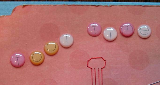
When I won a challenge online a couple of years back I was given, as part of the prize, a wee little packet of miniature scraps which was labeled 'inchies kit'. It got tossed in the parts and starts bin as I was not inspired by it at the time.

I recently ran across that kit and decided to challenge myself to create as many inchies as I could from it. I added only a couple of things from my own stash (button, punchouts, gold trim) and made 5 little miniature works of art, each one inch square.

That was step one. Then I set them aside for a couple of weeks until I challenged myself to make cards with each of them. This is the set I ended up with...

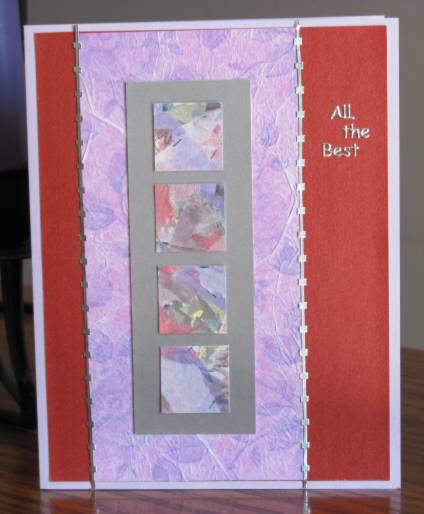
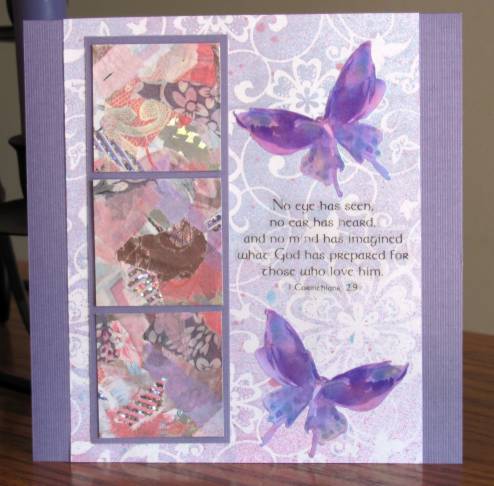
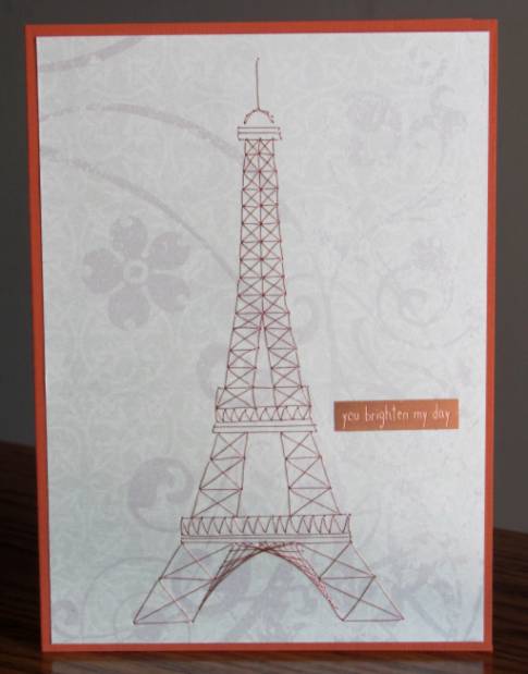
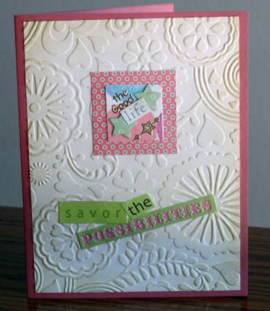
Inchie includes: doll image, ribbon scrap, paper flower, button, text sticker.  Card includes: printed cardstock square, cardstock strip, printed cardstock strip, Cuttlebug embossed background, cardstock text sticker, butterscotch folded card base.


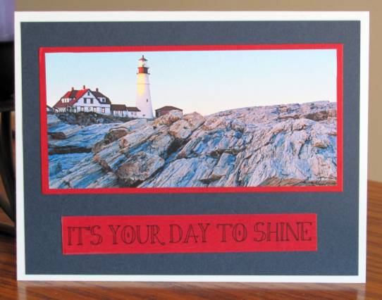
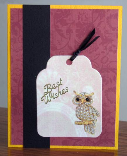
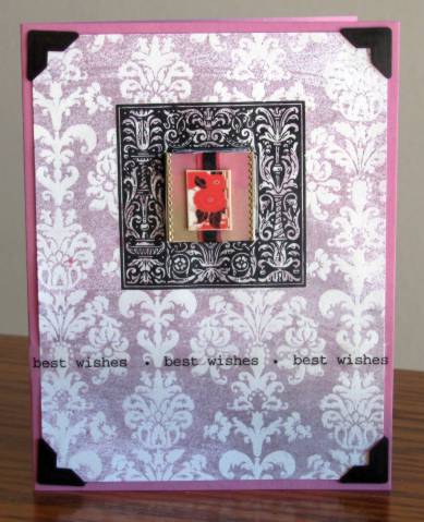
Inchie includes: printed cardstock background, star punchouts, text block, gold peel-offs. Card includes: printed cardstock square, Cuttlebug embossed background,'old paper' distress ink, three cardstock stext stickers, rose folded card base.


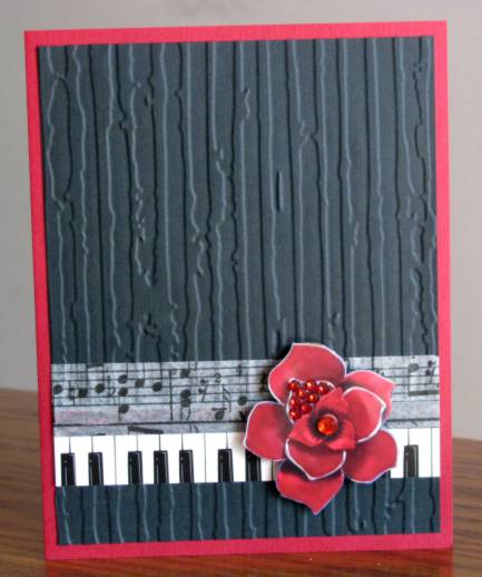
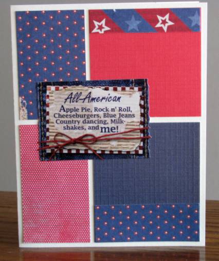
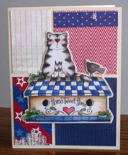
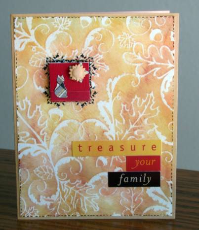
Inchie includes: Textured cardstock, sheer ribbon scrap, cat punchout, star punchout, sunflower button with shank removed. Card includes: ColorMe paper treated with chalk ink direct to paper, A rub-on frame element, three cardstock text stickers, apricot folded card base, black fine-line marker faux stitches.


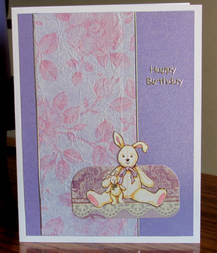
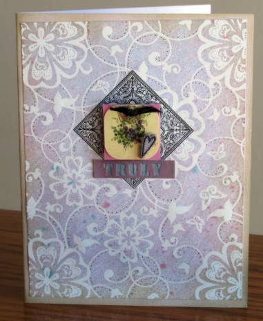
Inchie includes: violet cardstock base, graphic of violets with corners rounded, black ribbon snippet tied through punched holes, purple shrinky-dink stamped heart. Card includes: ColorMe paper background with sprayed coloration, fine-linemarker dots within pattern, rub-on frame element, cardstock text sticker, 'old paper' distress ink on edges.


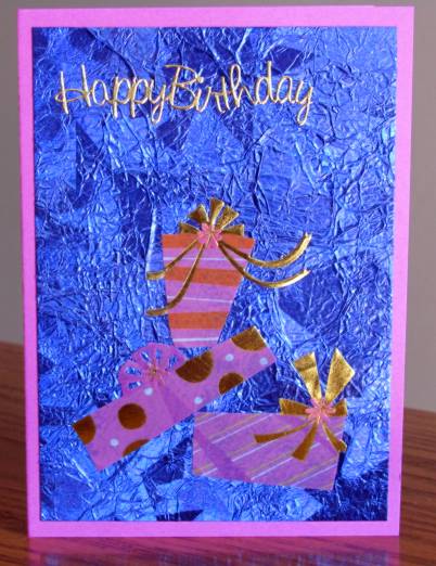
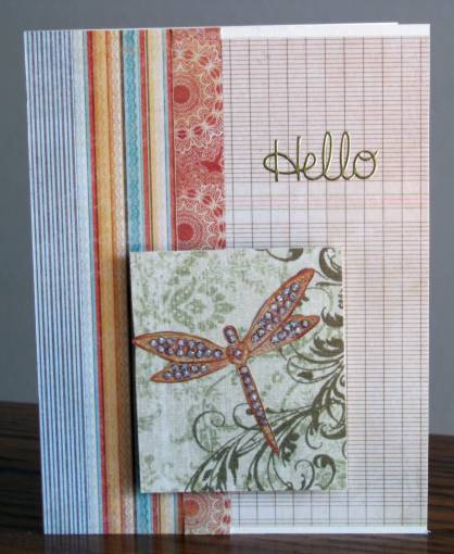
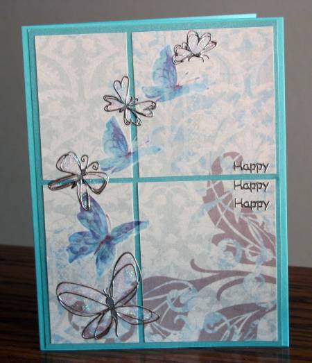
Inchie includes: glossy color gradation background, two ribbon snippets layered, gold peel-off borders, shrinky-dink floral image. Card includes: ColorMe paper with sprayed coloration, Rub-on frame element, photo corners, clear text sticker strip, violetfolded card base.


These are all truly one of a kind as I will never have an inchies kit like that one again and many of the scraps I used to complete the cards were also one of a kind or last of the supply.

Ddd


Posted by studio3d@ccgmail.net at 6:00 AM PDT
Friday, 4 November 2011
Dimensional Cardinals
Topic: Stamping

When I was making the embossed card to enter in the fair I stamped and embossed a second copy of the cardinal image in case I messed up one. Since I didn't mess it up I set the second one aside to color up later - and later finally came!

I used watercolor markers to do the coloring - three reds, three greens, and gold for the beaks. Then I cut it out with the craft knife leaving a white border all around. This was adhered over a ColorMe tag which was sprayed with a shimmery color spray. I used foam tape for this mounting. For backgrounds I selected a green folded card base and some printed cardstock in a flourish and a woodgrain.


At the end I decided it needed a finishing touch so I added rub-on corners to two sides.

Ddd


Posted by studio3d@ccgmail.net at 6:00 AM PDT
Thursday, 3 November 2011
Oh for Ornaments
Topic: Paper Embroidery

That probably should read "O is for Ornaments". This is the next entry in the stitching through the alphabet project.

I worked only in metallic threads (red, green, gold and copper) in outline stitch. This took me forever as I kept trying to stitch in the car and the lighting was too bright for that. I have to keep reminding myself how hard it is to stitch on dark backgrounds.

I punched the scalloped border and then backed it with a shimmery yellow cardstock and shimmery blue folded card base.

The text is a gold peel-off greeting sticker.

Ddd


Posted by studio3d@ccgmail.net at 6:00 AM PDT
Wednesday, 2 November 2011
Carving Board
Topic: Stamping

I was working on an assignment to use hand carved rubber stamps and made three cards. These are the two that I did NOT select for the assignment - not that there's anything wrong with them, I just chose the other one.

First up is my carvings of a hummingbird and a flower. I stamped on glossy cardstock and colored with watercolor markers, doing quite a bit of blending with the pens. I added golden stickles to the bird throat and gave him an eye of glitter dot. The sky is colored in as well with a very light blue that does not show much at all. I used distress ink on all the edges and mounted to orange cardstock. The greeting is stamped.

Next up is the carved llama. He is also colored with watercolor markers. I used a nestabilities die to cut the shape and distressed the edges with ink. He is mounted with foam tape. I added a stamped greeting, a pen-stitching line, and three paper flowers with glitter dot centers.


His nose is NOT blue as it appears in the photo.

Ddd


Posted by studio3d@ccgmail.net at 6:00 AM PDT

Newer | Latest | Older