Vision Check?
Topic: Supplies
In a recently recieved gift package I got a card 'kit'. There were 5 envelopes, 4 folded white cards and 3 cello packets of silver, white and pink snippets. I pulled some light pink checked paper from another packet and - for one card - also added some burgundy table scraps. I came up with 4 cards but they are very sparse on the decor and, due to the coloring of the elements, really freaked out the camera. It was like taking pictures of a white rabbit eating cotton balls in a snow bank.
If you can manage to see any detail on these, consider yourself fortunate!
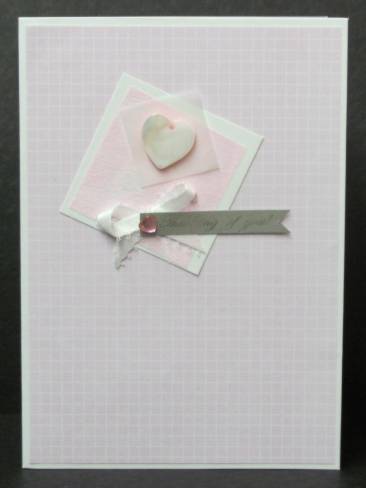
This uses the pink background paper, a square of white cardstock (part of the packaging), a square of pink non-woven mesh, a square of vellum, a mother-of-pearl heart charm, a white bow (not part of the kit), a silver paper imprinted 'thinking of you', and a single heart rhinestone.
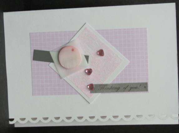
This card was turned on its side and border punched throught the front layer. It uses the pink background paper, a square of white cardstock (part of the packaging), a square of pink non-woven mesh, a square of vellum, a mother-of-pearl circle charm, a strip of silver cardstock, a silver paper imprinted 'thinking of you', and three heart rhinestones.
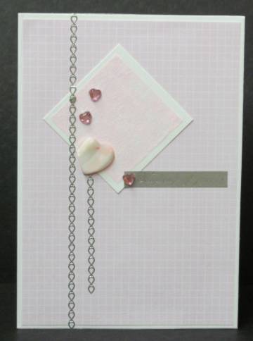
I went back to the original orientation for the rest. This uses the pink background paper, a square of white cardstock (part of the packaging), a square of pink non-woven mesh, a mother-of-pearl heart charm, a silver paper imprinted 'thinking of you', three heart rhinestones, and a couple of strips of silver peel-off borders (not part of the kit).
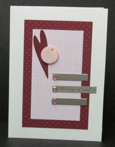
Running short on the provided bits I added some burgundy dotted cardstock for more impact. To this I added the pink background paper, a mother-of-pearl circle charm, two strips of silver cardstock, a silver paper imprinted 'thinking of you', three heart rhinestones, and a diecut burgundy heart (not part of the kit).
I guess it is OK that the 5th folded card was not in the kit as I only have a single pink rhinestone heart to decorate it with. THAT would be understated!
Ddd
Posted by studio3d@ccgmail.net
at 12:01 AM PDT