« April 2012 »
S M T W T F S
1 2 3 4 5 6 7
8 9 10 11 12 13 14
15 16 17 18 19 20 21
22 23 24 25 26 27 28
29 30
You are not logged in. Log in
Entries by Topic
All topics  «
3D paperwork
A - Z challenge 5
A - Z challenge 7
A - Z challenge round 4
A to Z challenge round 3
A to Z round 2
A to Z round 6
A-Z round 1
Around the House
Art Challenges
Artist Trading Cards
Backgrounds
Beads
Bible Journaling
Books
Boxes
Collage
Color Challenge
Coloring
cookbook
Die Cuts
Digital Projects
Digital Stamps
Drawing
Dry Embossing
Fabric Stuff
Fantastic Folds
Field Trip
Home Decor
How Does Your Garden Grow?
Hymnal Art
In The Kitchen
In the studio
Jewelry
Lettering
Links
Multi-Technique
Music to Work By
Musings
Nail Art
New Work
Online Class
Other Hobbies
Other Projects
Painting
Paper Embroidery
Paper Piecing
Photo
Pretty Paper
Quilting
Random
reading
Scrap Recovery
scrapbooking
Sewing
Sketch Challenge
Some Backlog
Stamping
Stencils
Stickers
Supplies
Teabag Folding
Techniques
Testing
tips and tricks
Tutorial
Web resources
Welcome to my Blog
Work By My Friends
workflow
Writing
Blog Tools
Edit your Blog
Build a Blog
RSS Feed
View Profile
Group One
In & Out of Studio 3D
Thursday, 26 April 2012
I've Learned My Lesson
Topic: Quilting

Every time I set out to make a quilt I try to learn a new technique or lesson from it. I learned FOUR things from making this quilt:

ONE: If a pattern is designed to be paper pieced, don't ssume you can short-cut it and make yards of stripes to set together. It is nearly impossible to make the strips piece accurately enough and you have to calculate in the 'takeup' of the bend of the fabric of every seam. The result of this experiment is a poorly pieced wall hanging from the center motif that I will finish up someday for my OWN wall.

TWO: I learned how to paper piece. Very time consuming but oh-so accurate and satisfying when all the seams match perfectly.

THREE: I tried out a new block construction for the wide border that is called a 10-minute block and goes together like magic. I can see myself making a whole quilt out of these blocks someday.

FOUR: I learned how to make and quilt a smaller quilt and then attach batting, backing, and borders to expand it to a larger size. This was necessary because the throat of my sewing machine is small and this way I could work on a smaller size for the quilting and then quilt the borders after they were attached.

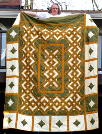
I made this quilt for my son and daughter-in-law for their anniversary. They are lovers of all things Celtic.

So, here is the wide view of the queen-sized quilt I call Celtic Dreams:


Here is a closeup of the paper-pieced section:


And a closeup of the 10-minute block border:


I got the pattern for the feature part of the quilt from www.QuiltersCache.com. It is a pattern she calls Irish Plaid (http://www.quilterscache.com/I/IrishPlaidBlock.html). The 10-minute block is from Design Originals and I learned how to make it on youtube here: http://www.youtube.com/watch?NR=1&feature=endscreen&v=sgAZ3_xdkGw


I am SO pleased with this project... and glad it is done!

Ddd


Posted by studio3d@ccgmail.net at 12:01 AM PDT
Wednesday, 25 April 2012
A New Angle
Topic: Fantastic Folds

One group challenged a 'star card' and another challenged a 'triangle' card. I decided that a star card has so many triangles in it that I would use it for both challenges.

I've never done this structure before and now I can say I have done it many times. However, this is the only card that resulted as I had so many problems with the measurements that the rest of the papers were creased every-which-way and ended up in recycling. I STILL didn't get them quite right on this as you can see at the edges underneath the blue triangles. Those should be perfect 60-degree corners not open holes. 

One other result was that this made the card too large to fit in a 6 x 6 envelope for mailing. I'll have to make my own envelope if I want to send this to someone.

Over all, I kinda like it. I'll have to dig out some truly ugly papers to fuss with until I can get those measurements right. THEN I can make one that doesn't need patchwork on the front to cover up the mistakes and it will fit in the envelope.

Here is a view of the card when it is opened. I did not do any decorating here.

Yes, you can see inside where I double-creased, trying to fix those measurements. Sigh. Back to the drawing board.

Ddd


Posted by studio3d@ccgmail.net at 12:01 AM PDT
Tuesday, 24 April 2012
The Spotlight's On You
Topic: Stamping

Challenge: Make a card with the 'reverse spotlight' technique. I had to go look this one up as I had never heard of that technique. Turns out that it means you stamp the frontpiece of your card and then punch out portions of it that overlap the stamped images. Then you stamp the same images on contrasting paper and mount them underneath to align with the frontpiece.

OK, I'm game. I stamped with several individual images from a new set I picked up, to create a little scene. Just the birds and nest were stamped on this step. Then I punched and mounted those images underneath. It still didn't look quite complete so I pulled the cloud stamp from another set and added three of those.

It was pretty large so I trimmed it to a more standard size and chose some printed papers for framing.

The paper colors were a little too different so I used 'old paper' distress ink on the edges of all, including the frontpiece. I even used a bit of it inside the punched areas. Unfortunately, now they were all too similar in tone so I dragged the edges across a black ink pad to add definition.

This is pretty busy so I may not add any text. Blank cards are very useful to have on hand.

Ddd


Posted by studio3d@ccgmail.net at 12:01 AM PDT
Monday, 23 April 2012
Pockets Inside and Out
Topic: Fantastic Folds

Need a card with two pockets? Neither did I, but I saw a neat tutorial for one and I had to go try it out. 

I can't figure out how to make a link to a video 'clickable' so I'll just put the URL here and you can cut and paste if you want to go watch the tutorial for yourself. Patty is using the scoring board from Stampin' Up but it was easy to follow the same measurements and make the card on my Martha Stewart scoring board as well as my ScorPal. If you have none of these, you could easily score with a ruler and stylus. Here's the video link: http://www.youtube.com/watch?feature=player_embedded&v=b6WlQbBXUKY 

And here's the card I made:

If you don't go to watch the video I'll summarize - this is made from a single sheet of 8 1/2 x 11 reversible cardstock. It requires 4 folds, no cuts, and a bit of glue. I filled my two pockets with pre-made tags mounted back to back so they are also reversible. The front decoration is made with some table scraps and I glued a bit of picot-edge trim to the pocket edge.

Ddd


Posted by studio3d@ccgmail.net at 12:01 AM PDT
Sunday, 22 April 2012
Embossed and Embellished
Topic: Dry Embossing

I love the graphic effect of dry embossing folders and sometimes just want them to be the center of attention. Especially this folder from a Cuttlebug set which included the folder as well as a diecut set of several phrases.  The 'front' of the folder is marked but if used that way it makes the image indented. I really like it with the image raised so I always use the folder backwards. That's just how I roll.

For this first one I used a tan linen-texture paper. After embossing I used Copic markers to color the raised parts a light green. Then I attached sticky-back garnet colored rhinestones to some of the dots at the end of the 'branches'. I stamped the greeting directly onto the face and cut the panel to mounto on a light green card base.


I embossed again on the tan cardstock but this time I used light brown Copic for the coloring. The decorative dots here are gold 'nail head' stickers. I stamped the sentiment the same as before and used a medium brown card base.


Then I wanted to create the color in the background and leave the image light so I applied milled lavender distress ink direct to the inside of the folder before making the embossing on cream cardstock. This was too pastel for what I had in mind. So I used the brown Copic on the stems and dots again. I used ruby colored nail head stickers this time, stamped the greeting and adhered to a pinkish card base.


Still trying to get that background color I went with a darker purple distress ink on the folder before embossing. Much better. I used the light green Copic for the stems and left the dots uncolored. Digging into the stash of supplies I found these bitty purple flowers someone sent in a swap (thank you, whoever you were). I cut off their stems and glued in clusters to the stems to make real flowers out of the image. Oh, yes! I cut some of the cream cardstock to stamp the greeting and layered it over purple to match the flowers. The whole piece is attached to a light purple card base.


Now THAT is one yummy card!

Ddd


Posted by studio3d@ccgmail.net at 12:01 AM PDT
Saturday, 21 April 2012
Drunken Acetate
Topic: Dry Embossing

So, this was a challenge on one of my groups: Dry emboss acetate and use Sakura Lacquers to color in the image. Ummm, I don't have any of those. So I'll try out other products and see what works.

First, I tried using Copic markers. They look sketchy as they don't spread like the liquids would do. I ended up using two colors for the stems (green and brown) and two in the buds (yellow and blue). I stamped the text on a ledger paper and used a dry adhesive around the edges to mount.


Then I decided to try out alcohol inks. I put a drop out on an acrylic block and picked up with a water-brush filled with blending soluton. This was painted into the indentations of the embossing. On this one I used the inks to wet and they ran up the sides of the indentations. I let them dry and then used a sanding block to clean up the edges a bit. This scratched up the acetate so I just went with it and sanded it to a satin finish.

I stamped text on a printed cardstock and mounted the acetate over that. a red border sets it off from the very similar colored card base.


I kind of got the hang of it with this one. This technique does not lend itself to neat, clean edges but gives more of a watercolor effect. I used only green ink and mounted over a blue paper. This was such a nice pattern I didn't want to cover it up so I just added a single strip of cardstock with a rhinestone border and three satin bows.


I can't see myself spending a LOT of time with this technique. I do have a couple more made up that I have to turn into cards someday, though.

Ddd


Posted by studio3d@ccgmail.net at 12:01 AM PDT
Friday, 20 April 2012
Patriotic Trio
Topic: Digital Projects

I sat down to work with three patriotic digital images and had a lot of fun with them.

First up is the stitched star. I used markers in a sketchy style and added a variety of Stickles and Liquid Pearls to enhance the stripes and the stars. This panel was rounded and backed with matching blue. I created a card base from blue star cardstock and layered with a red stripe and a strip of gold tissue tape.

I like how simple it is.

Next was this little guy hugging his bunny. I got a new set of markers that are all flesh tones. There are two shades in several color ranges that allow for selection in how pink/peach/gold the skin will be. For the baby I decided to go very pink. 

I used a Nestability die to cut the image, allowing it to cut off the edges of the picture. Layering with the same colors, each banded in black, makes for a very graphic presentation. I trimmed the end of the text stamp (also a digital stamp) into a flag shape and popped it up on foam tape.


Finally, I colored up this little soldier and flag. It is such a large image that it fills up a good deal of the card. I rounded two colors to pull it back in a bit. By backing with red and banding in the bright blue it left me wanting to see some of the gold from the pole and the uniform blue so I punched some stars, added some faux stitching with a pen and attached them in a scatter.I also tied some neutral scrapper's floss around the end of the greeting banner.

The buttons, belt buckle, hat band, and environmental stars have gold Stickles. The stars on the flag have silver Stickles.

Ddd 


Posted by studio3d@ccgmail.net at 12:01 AM PDT
Thursday, 19 April 2012
Tin Man's Flower Can
Topic: Digital Projects

The challenge on coloring up this digital image was to make the watering can look like metal. To do this I used three shades of cool grey markers and really worked on rendering the curve of the shape. I think it turned out really well. I used more cool grey to create a shadow pool for it to rest in. Three flowers were colored up in purples in two shades for each bloom. They got yellow centers.


When I stamped the text it disappeared into the image so I traced over those areas with white gel pen to make them pop out.

All the layers are banded with black and there is a dark green card base.

Ddd


Posted by studio3d@ccgmail.net at 12:01 AM PDT
Wednesday, 18 April 2012
Huuummmmmm-er
Topic: Stamping

A stamping buddy and I traded impressions of out favorite images from out stamp collections. One of my favorites of those she sent was this hummingbird. I like the way it includes double framing.

I colored using Copic markers and then covered the bird with Glossy Accents. This really intensified the color. I used color blocking with tones pulled from the image and framed up each piece with black borders.


MUCH bolder colors in real life.

Ddd


Posted by studio3d@ccgmail.net at 12:01 AM PDT
Tuesday, 17 April 2012
Impressed - Not Impressed
Topic: Die Cuts

I bought a couple of new sets of Spellbinders dies called 'Piercabilities' that I thought had promise for cutting card edges. This is the first one I used. They have a cutting edge, scrolls or other shapes that emboss, and little holes that I thought might emboss or even I could pierce through them and do stitching.

The edge cuts fine.

The embossing is faint.

The holes embossed so little that it looked tacky. So I left the die in place and pierced through the holes. Looked pretty lame. I decided to do faux stitching with a purple fine-line marker. Still looks tacky.

I decided to back it with purple to match the stitching lines and to cover up the pierced holes on the other side. Then I added a pyramid 3D illustration that I had backed with more purple.


I am not impressed with how this is impressed. I will try out the other 3 dies but don't hold out much hope for them. They may end up in my 'gift stash' to send of with a swap to someone.

Ddd


Posted by studio3d@ccgmail.net at 12:01 AM PDT
Monday, 16 April 2012
Three Digital Images
Topic: Digital Stamps

I started a new topic category for this post because I started a self-challenge to use some of the free digital images I've found around the net. I print them out on my inkjet printer which means I have to use alcohol-based markers (Copic, Bic, Spectrum, Promarkers) for coloring. I use brands interchangeably because it is a particular color I am aiming for, not support of any product line.

All the cards I made for this post were printed on white cardstock, colored, cut with Nestabilities Frame dies, bordered in black and layered on coordinating papers, also bordered in black.

I love this little puppy in the wagon. I used somber papers to keep it on the masculine side but also to give it a little nostalgia. I popped up the puppy panel and the text on foam tape. The sentiment is produced digitally, as well, using a little pun.


This one also has a digital sentimen, but with a little creative trimming. I also added some yellow punched flowers with red pearl centers to echo the flowers in the illustration. I used a diedut that allowed the image to bleed off the frame so it puts you right in the picture.


For this last one, I cut it to let the illustration run off the bottom only. I found some printed paper that used the pink and blue from the illustration and then added the brown panel to match her hair. To brint the focus to the tray of hearts, I chose a rose-pink panel (that looks too red in the photo) to stamp the text. This text is made up of a set of separate words that allows you to create and stamp phrases as desired.

On the tray of hearts, the darker ones are covered in Liquid Pearls.

Ddd


Posted by studio3d@ccgmail.net at 12:00 AM PDT
Sunday, 15 April 2012
Rock-a-Bye Baby
Topic: Paper Embroidery

Both of the paper embroidery groups I belong to issued a challenge to make a baby card. I chose different patterns for them and non-traditional colors to make them uni-sex.

Fot the first I chose some of my favorite dotted cardstock and stitched a onesie in purple. I happened to have a matching purple bow from a swap and I used Liquid Pearls for the snaps. A purple tone-on-tone makes the card base and a sentiment is created with a gold peel-off sticker.


The second card is stitched with cream thread on cream cardstock. I added text with a white gel pen. A border of tan sets it off from the textured white background (recycled from a commercial greeting card). Another tan border and a white card basecomplete the layering. I used distress ink in 'old paper' to enhance the texture of the white paper and tone the edges of thebaby panel.


Ready for the babies...

Ddd


Posted by studio3d@ccgmail.net at 12:01 AM PDT
Saturday, 14 April 2012
Little Girl's Dream
Topic: Paper Embroidery

I created this pattern for my granddaughter who is learning ballet. She is having a recital and I wanted a special card for her. I am making the pattern available on my free pattern site at http://mystudio3d.com/StitcheryDoDodd.htm

I had a pad of paper that is all about music and selected this black tone-on-tone with a piano keyboard border. I used metallic copper for her hair, cream for the arms and legs, and shimmery lavender for the dress.


I mounted on a tone-on-tone purple card base and added a greeting in gold peel-off stickers.

Ddd


Posted by studio3d@ccgmail.net at 12:01 AM PDT
Friday, 13 April 2012
Bzzz-z-z-z
Topic: Paper Embroidery

If I get a challenge to make a card with an insect you will most likely see a dragonfly on it. I've always loved them. As a kid I called them helicopter bugs (truthfully, I still do).

I selected a ColorMe paper of swirls and used Glimmer Mist to give it a silver shine background. The weed is stitched with purple and green metallic threads and the helicopter bug is stitched with gold and copper threads. I used a black shimmer mat and a purple folded card base.


Won't be long and they'll be flying around for real.

Ddd


Posted by studio3d@ccgmail.net at 12:01 AM PDT
Thursday, 12 April 2012
At the Cross
Topic: Paper Embroidery

For an Easter card assignment I selected a fairly simple pattern and stitched with a verigated bright thread which makes it look more complicated. I decorated inside the branches with gold peel-off elements and bordered the panel with peel-off borders. The background is printed cardstock which contains all the same colors as the cross and kind of looks like stained glass. This anchors the front panel. I used a blue folded card base.


Simple elements - dramatic impact.

Ddd


Posted by studio3d@ccgmail.net at 12:01 AM PDT
Wednesday, 11 April 2012
Four For Christmas
Topic: Paper Embroidery

I've been stitching again, trying to 'get ahead' on swaps and challenges that I know will be taking place on two of the lists I belong to. Today I have Christmas Cards - 2 for April and 2 for May.

For the April cards I made two from the same pattern of tree. This one is on a shimmery paper that is finely dotted. I chose light/bright threads for it but the dots still make it blend in more than I would like. I used lime green for the tree and sunshine yellow for the ornaments and star. I mounted with a very fine line of yellow and a green folded card base. An off-center mounting maintains the whimsy introduced by the pattern style and colors.


For the second tree I also started with a dotted background but found thecontrasting threads to be much more effective. I selected dark green for the tree, burgundy for the ornaments and metallic gold for the star. A fine band of cream sets it off from the burgundy folded base.


For the cards for May I selected two different snowman patterns. This first is pretty straightforward so I stitched it onto a background embossed with a holly branch. I used a shimmery blue thread for the snowman so he would stand out from the white background. Makes him look icy, I think. I mounted on a printed blue paper over an orange folded base which picks up color from his carrot nose.


Finally, is this very whimsical snowman on skates. How adorable! I placed him on a printed blue cardstock and used bright colors for his mittens, scarf and hat. The buttons are actually brads. This is mounted off-center to expose more of the lacy pink cardstock and the card base is lime green to match the trims of his outfit.I left room on the left for a greeting if I decide to add one later.


That adds up to 10 Christmas cards completed in stitching already!

Ddd


Posted by studio3d@ccgmail.net at 12:01 AM PDT
Updated: Wednesday, 11 April 2012 8:00 AM PDT
Tuesday, 10 April 2012
Stitch and Stamp
Topic: Paper Embroidery

Assignment: Make a paper embroidery card with stamping on it.

I started with the stitching by choosing this border pattern and then selecting the background paper for it. The thread choice was nest and when all the stitching was done I decided on the stamp to use and settled on the brown chalk ink for it. Because the sentiment is embedded in the stamp image no additional text was needed.

Since the stitching was so low-contrast with the background the image is the real focus of this. I reinforced that by swiping the chalk ink on the panel edges before mounting on a golden backing. I selected a brown and a gold ribbon and knotted them together around the golden panel and mounted all on the chocolate brown folded card base.

Ddd


Posted by studio3d@ccgmail.net at 12:01 AM PDT
Monday, 9 April 2012
Signs of Spring
Topic: Stamping

I haven't worked much with 'digital stamps' (also known as 'digis') because 1) there haven't been many free ones I have been impressed with 2) I don't have a printer at the ready so I have to save, move to a thumb drive, take to another computer, and print 3) I have a lot of stamps already and should use them since I paid for them!

However, I did download and print some free digis from the OWH Stars and Stamps site and have started coloring up a few. Because the printer is inkjet I have to use Copic or other alcohol markers to keep from smearing the ink when I color.

This is the first I have colored up and I also tried an alternate shading method that I saw done on a blog. This method uses a light neutral (I used warm grey) to color the shadow areas FIRST then color over the image areas with the feature color. This way I used only four pens: a light warm grey, a medium warm grey, one pink, one green.


I used one of my own card sketches for the layout and layered green and yellow over a light pink base. The image was cut close around with a craft knife and a pink ribbon tied onto the stems.

Fine-line pen doodles adorn the edges of the diagonal sash and a layered block provided a place to stamp the sentiment.

Ddd


Posted by studio3d@ccgmail.net at 12:01 AM PDT
Sunday, 8 April 2012
Stitching Stickers
Topic: Paper Embroidery

One one group I signed up for a swap of cards made with 'stitching stickers'. These are generally an outline in clear with a silver or gold design and pre-marked holes. One affixes the sticker to a background cardstock, pricks out the designated holes, and stitches through them to enhance the sticker design. I also have some in sparkly white and a matte gold finish.

I chose four sticker sets to work with:

This is actually multiple stickers from a single sheet, arranged to form a blooming vine. Very small number of holes to stitchso I chose bright threads in order for them to show up. The little flowers are decorated with a single french knot in the center hole. I rounded two corners, stamped a greeting in chalk ink and mounted to a coordinating folded card base. (all the photos today have the image sharpened a LOT so the clear stickers with their fine detail can be seen)


This next is also multiple stickers (4) arranged to form a wreath. The larger flowers have 6 hole, allowing for a starburst stitching. The smaller ones have only that center hole again so they have only the french knot in them. Knowing that I was going to use this specific pyramid image I selected the thread color accordingly. Then I layered on green and rust cardstock, echoing the pyramid image with rounded corners.


I chose a circle sticker for this card and added the corner stickers from the same sheet. Very few holes to stitch but it suits the delicacy of the 3D foil image that I intended to use. (all three of these cards use stickers from the Dazzles line available from Paper Wishes)


The last sticker is left over from a kit I designed cards for (CardMaker Kit of the Month Club) several years ago. It has much more holes for stitching. I used a verigated thread on this one, cut the stitched medallion out and mounted it on a maroon dotted cardstock. The bow on this card is the first I have tied with my new Bow-Easy which I won online as blog candy. Several coordinating card layers bring this all together. THis is the one I sent for the group swap.


Sorry it is so hard to see these clear stitching stickers.

Ddd


Posted by studio3d@ccgmail.net at 12:01 AM PDT
Saturday, 7 April 2012
The Thinker
Topic: 3D paperwork

I made up this little 3D image at least a year ago and kept setting it aside over and over. I finally decided to MAKE myself use it.

I first cut it out using a scalloped die and in the process flattened all the self-stick pearls I had placed on it. Now they are little colored disks, but it will mail better (LOL). I used fine line marker to doodle the scallops as they did not stand out enough from the background.

Speaking of the background, this is make up of strips of table scraps.

I stamped the greeting onto the background and used a soft golden folded card base.

Ddd


Posted by studio3d@ccgmail.net at 12:01 AM PDT

Newer | Latest | Older