« May 2012 »
S M T W T F S
1 2 3 4 5
6 7 8 9 10 11 12
13 14 15 16 17 18 19
20 21 22 23 24 25 26
27 28 29 30 31
You are not logged in. Log in
Entries by Topic
All topics  «
3D paperwork
A - Z challenge 5
A - Z challenge 7
A - Z challenge round 4
A to Z challenge round 3
A to Z round 2
A to Z round 6
A-Z round 1
Around the House
Art Challenges
Artist Trading Cards
Backgrounds
Beads
Bible Journaling
Books
Boxes
Collage
Color Challenge
Coloring
cookbook
Die Cuts
Digital Projects
Digital Stamps
Drawing
Dry Embossing
Fabric Stuff
Fantastic Folds
Field Trip
Home Decor
How Does Your Garden Grow?
Hymnal Art
In The Kitchen
In the studio
Jewelry
Lettering
Links
Multi-Technique
Music to Work By
Musings
Nail Art
New Work
Online Class
Other Hobbies
Other Projects
Painting
Paper Embroidery
Paper Piecing
Photo
Pretty Paper
Quilting
Random
reading
Scrap Recovery
scrapbooking
Sewing
Sketch Challenge
Some Backlog
Stamping
Stencils
Stickers
Supplies
Teabag Folding
Techniques
Testing
tips and tricks
Tutorial
Web resources
Welcome to my Blog
Work By My Friends
workflow
Writing
Blog Tools
Edit your Blog
Build a Blog
RSS Feed
View Profile
Group One
In & Out of Studio 3D
Friday, 18 May 2012
Stars, Stripes, Stitches
Topic: Sketch Challenge

Another great sketch challenge from Operation Write Home. This is their 121st sketch!


I immediately thought of the patriotic papers I cut into for the lighthouses and cut strips out of them to mix and match for seven cards. For some I added a tiny strip up the center on the bottom part and for some I added a smaller strip at the top. I had a couple of different sticker sets with patriotic and/or 4th of July materials and selected from these as the focals. I also punched large stars from a matching blue cardstock. After putting all the pieces together I used a white gel pen to add stitching dashed lines around selected portions.


Aren't these fun?

Ddd


Posted by studio3d@ccgmail.net at 12:01 AM PDT
Thursday, 17 May 2012
Simple Summer Pleasures
Topic: Digital Stamps

This very delightful digital stamp cried out for a very light touch. I used colored pencils in pastel tones for coloring and gave it a simple mounting. I distressed the edges of the piece, mounted to green and roughed the edges of that as well. I used 'old paper' distress ink to mute the overall tone. The sentiment is stamped on a yellow card, distressed edges and backed with green like the main panel. This is the last line only of a larger sentiment block.


I used three blue rhinestones above the text. The butterfly in the upper left was added for design balance. It is actually two gold peel-off stickers colored with blue Copic marker. Then I layered them for more dimension.

Ddd


Posted by studio3d@ccgmail.net at 12:01 AM PDT
Wednesday, 16 May 2012
Let There Be Light
Topic: Other Projects

Occasionally I will run across things at the craft store on such a sale that I can't leave them there. For instance, little wooden birdhouses for fifty cents each could NOT be left alone. I've had them for a couple of years - along with two other sets in different styles.

From the time I saw these birdhouses styled after lighthouses I wanted to decorate them for summer with red, white and blue. I did all the solid coloring with Distress Inks. The papers are from a 12 x 12 patriotic cardstock pad. The pieces were rough-cut and attached with Scor-Tape around the edges. Then I used a sanding block to file away the overhang.


I used a gold Krylon paint pen to color the top pegs and inside the edges of the holes.

There is a 4-sided one:


There is a 5-sided one:


And a 6-sided one:


It makes me want to get busy making up the other two sets. They will be for different seasons (most likely Spring and Christmas)

Ddd


Posted by studio3d@ccgmail.net at 12:01 AM PDT
Tuesday, 15 May 2012
A Little Sketchy
Topic: Sketch Challenge

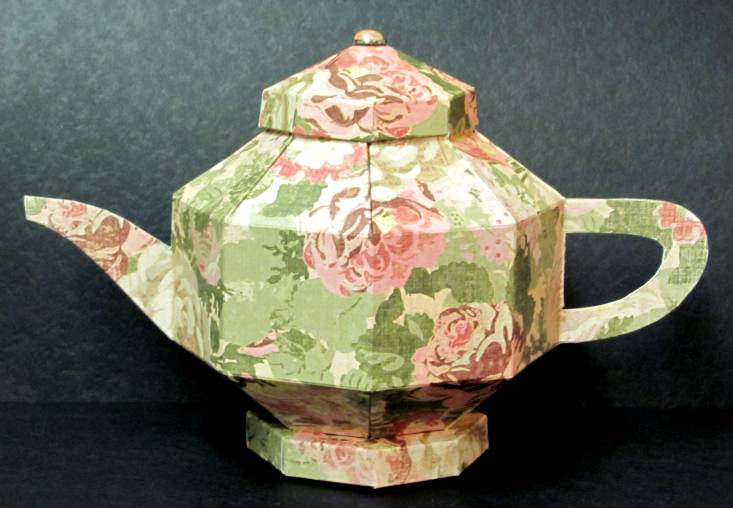
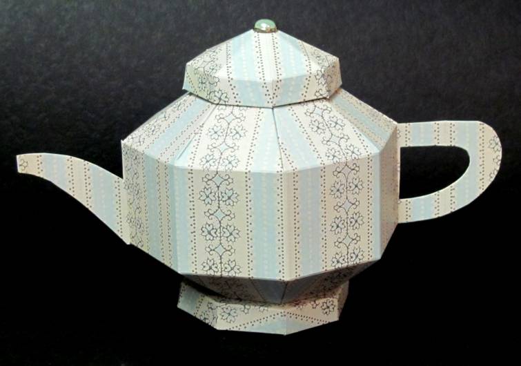
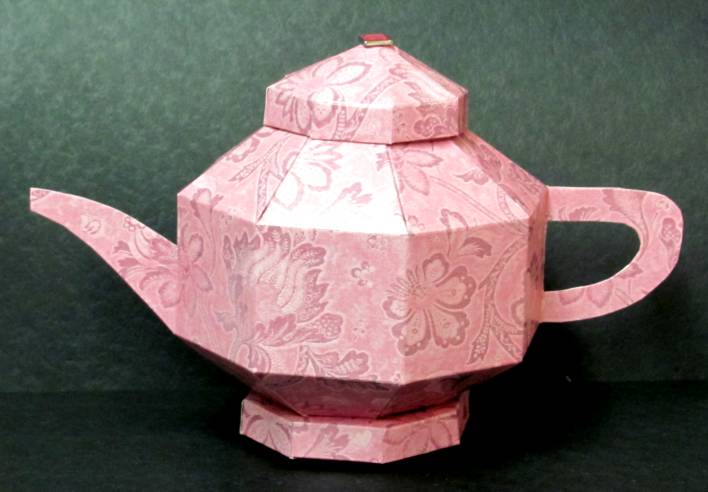
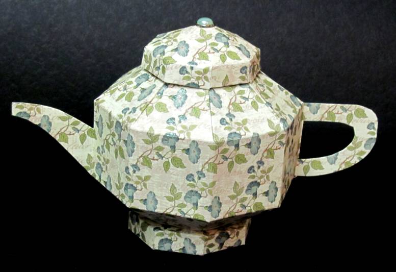
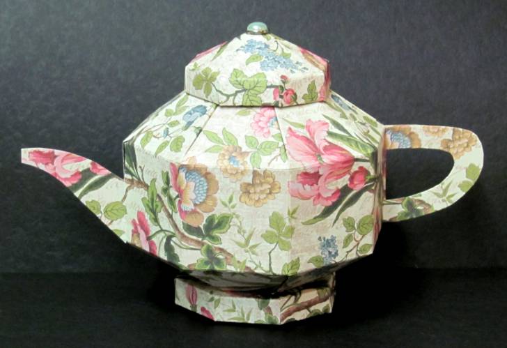
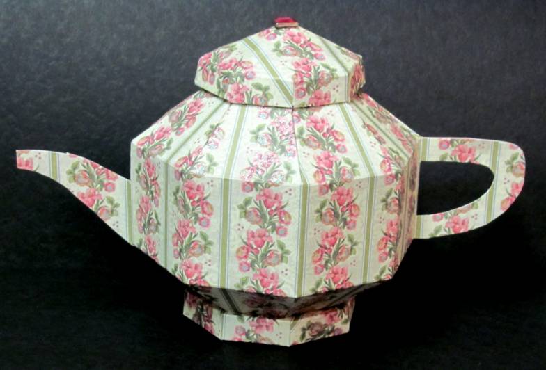
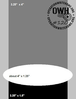
Three things were accomplished with this one group of cards. 1) use up a pile of scraps I created when making the teapots 2) try making a pinwheel element I saw on another blog 3) use OWH sketch 120 (which is here:)


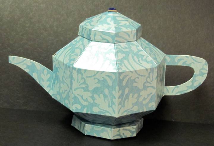
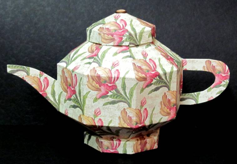
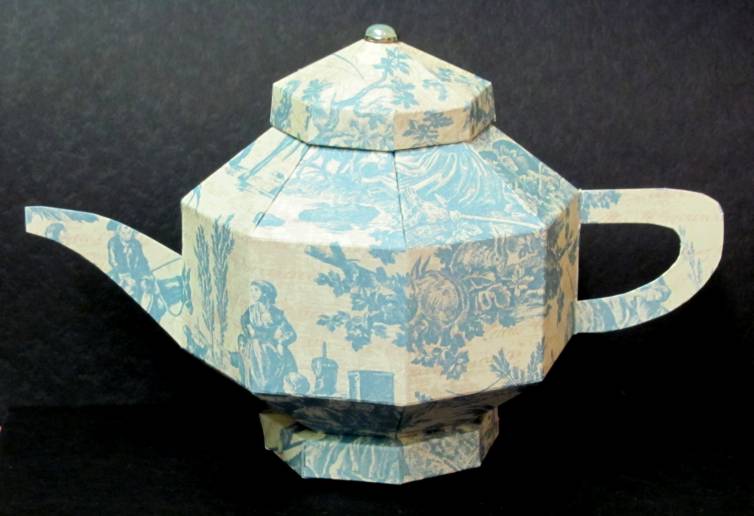
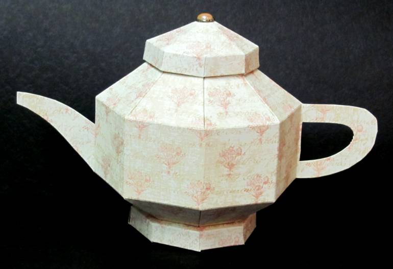
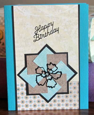
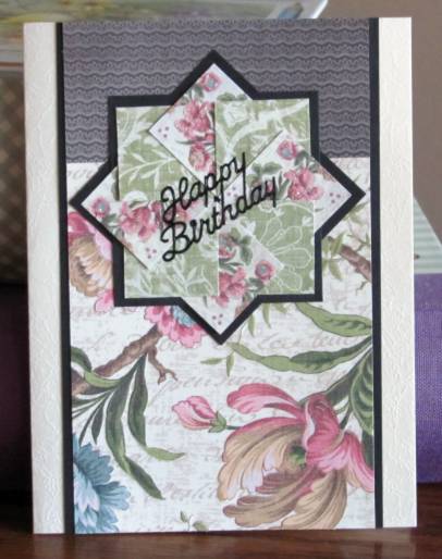
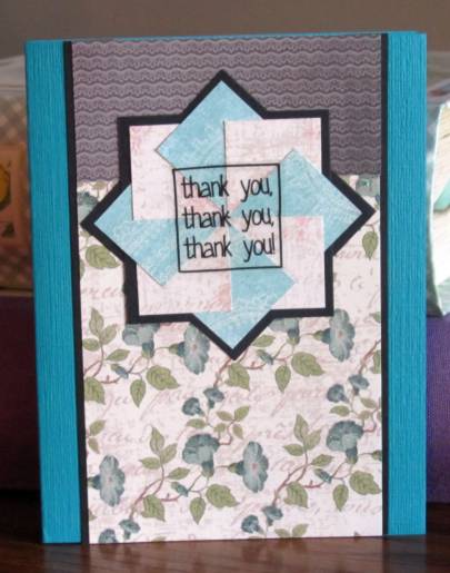
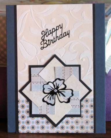
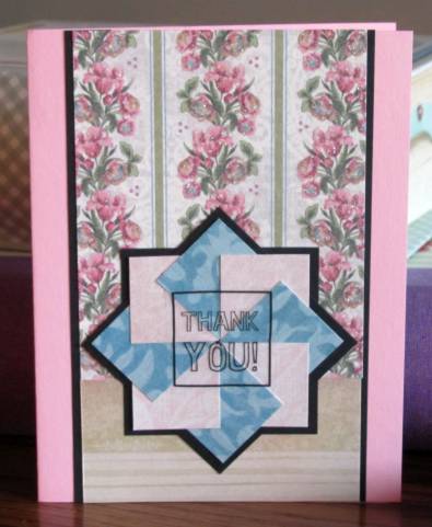
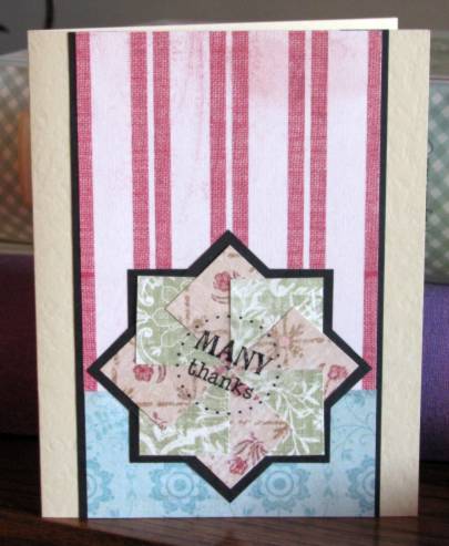
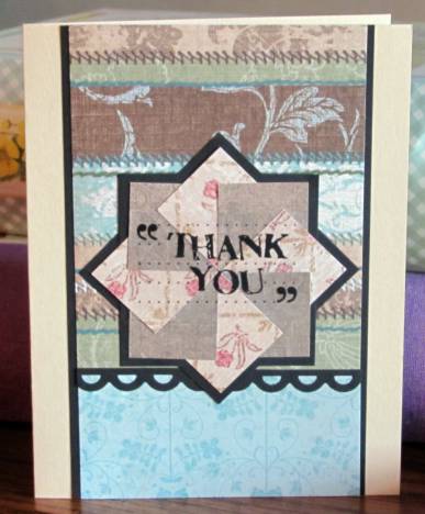
The 1" blocks used for the 'pinwheels' are from the scraps created from making the teapots. Some of the papers were reversible so it gave me more options to combine them. The first step was to match up the papers, using two for each of the pinwheels. Then I glued each of the pinwheels together and selected a complementary small strip then an acceptable large block. Black borders for the pinwheels and the sides of the blocksgot them ready for installation and then I selected colored card bases that would suit each one.

I ended up making 12 of these cards. This one is decorated with a black peel-off greeting and outline flower.


I flipped this one on its head because of the 'weight' of the floral paper. It also got a black peel-off greeting


This one, also upside down has a clear text sticker over the pinwheel


I used more of the brocade paper for the background on this one. More black peel-offs to decorate


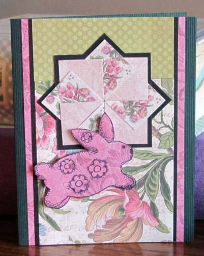
I had bunnies cut out that I had started to use for the paper piecing for kids challenge the other day. Once I changed my mind on that I laid them out on the able top and this one jumped onto the card. He is popped up on foam tape. I also added matching pink strips down each side.


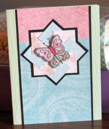
The butterfly for this one is left over from the paper piecing session. The colors went well with this pinwheel combination


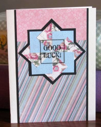
This paper of fine diagonal stripes really changes the look. The text is a clear sticker.


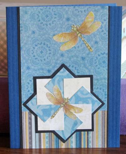
Back to the original orientation. I found these golden dragonflies in my sticker stash and they really go well with the stripes on the bottom paper.


The decor for this pinwheel is a sticker left over from a long-ago cruise craft card project.

I think this pink striped paper looks like wallpaper on the card. The text is a clear sticker.


Another clear text sticker... love these on the pinwheels. The red and white stripes make this look vintage.


With the use of striped paper for the large block this looked like the whole card was striped. I added a black scallop border to create a break between the two. The text is again a clear sticker.


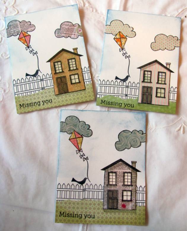
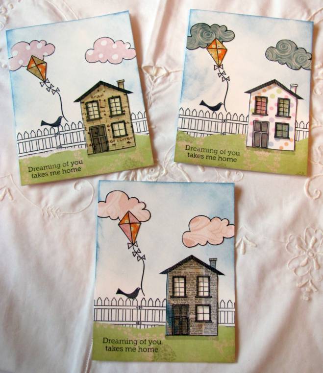
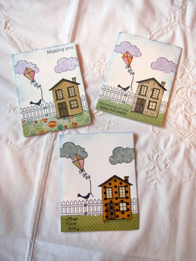
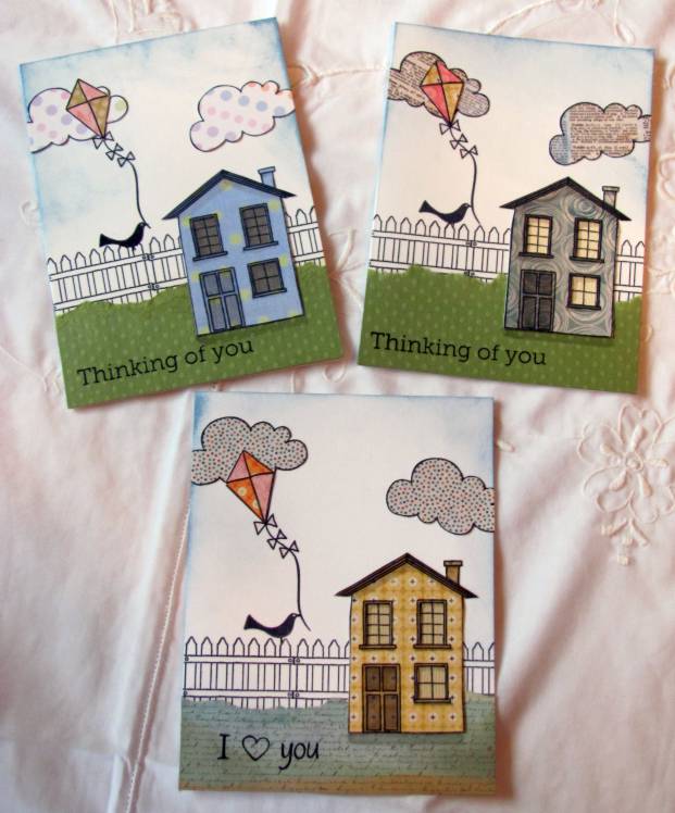
And off they go to OWH for soldiers to write  home on.

Ddd


Posted by studio3d@ccgmail.net at 12:01 AM PDT
Monday, 14 May 2012
I'll Take a Dozen, To Go
Topic: Fantastic Folds

I offered to make a dozen of my paper teapots for a Mother's Day event. It had been so long since I made any that I had to reprint the instructions to follow!

I try to select designs that look like they might actually be china. The event colors were pinks, blues, and purples but I had no luck finding suitable cardstock in purple, violet, plum, lavender... So I settled on a range of pinks and blues.

It takes a bit over an hour to make one pot. But I did these assembly line (step one on all of them, then step two...) hoping to cut that down. No luck. It takes the same amount of time.

Here are the final 12:

An overall muted rose floral

a blue and cream stripe

solic bright pink with glossy flower imprint

a shimmery two-toned blue

a diagonal pink iris on text background

a blue toile

subtle pink nosegays on text background (this one is identical to my own)

blue glittery morning glory vines

an overall floral print on text

delicate pink lace with shimmery finish

glittery floral stripe


These were used as table centerpieces with small pots of blooming plants inside. 12 ladies got to take them home as gifts.

Ddd


Posted by studio3d@ccgmail.net at 12:01 AM PDT
Sunday, 13 May 2012
Coloring Book
Topic: tips and tricks

I love coloring. I always have (just ask my mom). Now days I rarely use crayons, though. Instead, I use watercolor pencils, watercolor markers, distress inks with a water brush, or alcohol markers.

By far the most expensive of these options is alcohol markers, especially when you get into the 'Cadillac' of the medium, the Copic markers. I started out with a basic set of Copics (36, I think) that I got on sale. When I wanted more options I found the Bic Mark-It set of 48 filled in nicely at a very reasonable price. Then I picked up a few Prismacolor pastels on clearance. And, finally, I bought a small set of Spectrum Noir pens with flesh tones. All of these markers play nicely together. They can be blended just like they were all the same brand. The big difference for me is that they have different types of tips - some wide, some brush, some hard point, etc. You just have to make do with what you've got.

I found it was impossible to tell what a color was from the color of the cap, the dot on the end, or the color name on the label. So I separated all my pens into color groups and started scribbling little color swatches. This allowed me to place the pens in gradation order for choosing blending ranges. I then made 3 x 5 cards into color swatch cards by coloring the pens in order and labeling with the color name or number. There is a card for each color family.

When I want to color something I take out the swatch cards, select three shades of a color range and use them to color highlights, mid-tones and shading. 

Here are the cards I use:


Some of the colors appear on more than one card when they cross between ranges. A reddish-orange might appear on the brown card, a dark red might be included on the purple card, etc. There is one card just for blacks and shades of gray, also.

I got the Prismacolors last so their colors are out of order. I need to do the cards over with these moved over and intigrated into their range.

Ddd


Posted by studio3d@ccgmail.net at 12:01 AM PDT
Saturday, 12 May 2012
One, Two, Three, Four, Five
Topic: Dry Embossing

Next up in the series of Rebel challenges was to make a card with 5 different elements.

Element One: Embossed Acetate colored with Alcohol Ink

Element Two: Tissue Tape strip (with musical print)

Element Three: Bird Stamped on green paper, trimmed with thin border and mounted on foam tape

Element Four: Red Nail Head dot stickers

Element Five: Cardstock Text Sticker, mounted on black, teimmed with thin border, popped up on foam tape


This is one of the acetate background I did a few weeks ago and set aside while waiting for inspiration on how to finish it. Here's the inspiration and the finish and I love it.

Ddd


Posted by studio3d@ccgmail.net at 12:01 AM PDT
Friday, 11 May 2012
Eye-Popping Color
Topic: Stamping

Next challenge for the OWH rebels: Use bold colors.

I went right to some Halloween papers I picked up after the season. They have no seasonal elements on them, I just bought them for the awesome colors. I had the digital image of flowers in a watering can and I pulled bright colors of markers to coordinate with the feature paper. The striped strip is the tear-away edge from the dot paper.


I added three rhinestones along the top to coordinate with the flower centers and used a black peel-off greeting in the open space of the image panel. This panel is mounted on foam tape.

Ddd


Posted by studio3d@ccgmail.net at 12:01 AM PDT
Thursday, 10 May 2012
Playing With Food
Topic: Stamping

Third challenge for OWH rebels was to focus on food.

This stamp of a birthday cake was part of a grab bag from Goodwill. This is the first time I have inked it up. I colored the cake and plate following the illustration on the wood mount and then did my own thing with the confetti surrounding it. It was 'reading' overall as a plum color so I used black and plum to create a frame for it. I mounted this on a folded white card base and then found the matching vellum package stickers in my stash. I stuck them to black paper and cut out with a thin border. AWESOME! Now, it's a party!


The flowers around the edges are from the same sheet as the packages. Then I popped on a black peel-off greeting as the final touch.

Ddd


Posted by studio3d@ccgmail.net at 12:01 AM PDT
Wednesday, 9 May 2012
Let It Go
Topic: Stamping

For the OWH Rebel challenges the second assignment was to use something you had been hoarding. I broke loose my death grip of this awesome piece of brocade paper. I reminded myself that, with my Cuttlebug folders and a little pastel ink, I could replicate this closely. So it was time to let go and create something with it.

I stamped on pink patterned paper with a dogwood branch (twice) and cut out closely around everything. Then I used the same paper and stamped the nest and two birds from a new(ish) set. These were all layered in a pleasing arrangement over the feature paper.


I used markers to color the branches, flowers and eggs, layered the panel over black and plum.

Ddd


Posted by studio3d@ccgmail.net at 12:01 AM PDT
Tuesday, 8 May 2012
I'd Rather Be Coloring
Topic: Stamping

For National Scrapbooking Day (last weekend) OWH had a weekend of challenges for those uf us being 'rebels'. Our rebellion? We were making cards instead of scrapbook pages.

The first challenge was to make cards for kids with paper pieced stamping. I got this stamp as a prize in a challenge last year and had never used it. It is much cuter than I thought it was! I got the butterfly stamp in a grab bag of craft supplies at Goodwill.

For the girl I stamped on 5 scrapbook papers and cut out the hair, the stuffed bunny, the dress, the pinnafore, and the boots. I stamped her again on a white card base with an oval flower wreath embossed on it, having first glued a green paper strip at the bottom for grass. I colored her face, arms and legs with Copic marker and then layered the cut pieces over top. Then I stamped the butterfly on 4 papers and cut our various parts to layer. A piece of scrappers floss was glued from the hand to the sky and then placed the butterfly at the end. The butterfly is glued at the back and raised at the front on foam tape. Finally, I tied some knots in 1/8" ribbon and trimmed tiny ends. Three of these were glued to the strings to turn the butterflies into kites. The last step was to stamp a text sentiment at the bottom.

Here is the first with rather bright colors:


And here is version two, with pastels:


And the title of the blog post? This paper piecing is SO time consuming that it took hours to make these two cards. I would much rather use a fraction of that time coloring with markers and getting more production for my efforts. However, the final effect is nice.

Ddd


Posted by studio3d@ccgmail.net at 12:01 AM PDT
Monday, 7 May 2012
I Got the Blues
Topic: Paper Embroidery

For a paper embroidery swap I had to make a blue and white card. As usual, this brought to mind blue delft china. So I got out this coffee set pattern and stitched it out on white cardstock with two tones of blue thread. I used a scallop border punch to create some layers for the bottom of a blue folded card base and popped the stitched panel up on foam tape.

I will most likely stitching this over and over - every time someone calls out a challenge for combining blue and white.

Ddd


Posted by studio3d@ccgmail.net at 12:01 AM PDT
Sunday, 6 May 2012
Puttin' On the Glitz
Topic: Jewelry

On the way from the fabric side of the craft store to the papercrafting side I walked right through the beads and jewelry area. Oh, BIG MISTAKE! They had a bunch of stuff on clearance. I got sucked right in.

I picked up several packages of coordinating styles and sorted them into two equal piles of beads. I had also picked up a beading design board on sale at the same time and I used it to lay out double rows of symetrical strands. Since they did not have two of the same 'charms' I got slightly different looks. I used the leftovers to create dangle earrings for them, each quite different.

Here is the first one I made:


And here it is laid out with the earrings


This is the second one


And with its earrings

I had fun making these jewelry sets. Now I have to decide which one to keep and which to put aside for a a gift.

Ddd


Posted by studio3d@ccgmail.net at 12:01 AM PDT
Saturday, 5 May 2012
Not Your Mother's Easter Basket
Topic: Photo

....because it is MY mother's Easter basket! It's been a while since I did any photography just for the artistic sake of it and this made such a great subject. I thought if I had some good photos from this session I could print them out for use on cards.

The basket contained fresh flowers and a butterfly on a pick. I added the little nest and bird that I had on the window sill.


I took these in the natural light of the garden window.

Ddd


Posted by studio3d@ccgmail.net at 12:01 AM PDT
Friday, 4 May 2012
Hey, What's In the Box?
Topic: Supplies

Since I do quite a bit of paper embroidery I wanted a set-up of supplies that would keep everything together and be portable. I take mine in the car, on the plane, to waiting rooms, and when I'm at home it is handy in a drawer by my favorite chair.

I got the box on sale at the craft store and here is how I have it set up:

On top is a stack of already pricked papers, still taped to their patterns. If they are for a specific occasion they have a sticky note with a date and are arranged in order of stitching rotation. The lid is flexible and has a good latch so I can stack 4 to 5 projects in here. While I am working on a project the others get moved to the open lid, out of the way of thread selection. Completed pieces get moved to the bottom of the stack until I get home when they are moved to the studio for assembly into a card.


On the right side of the box I have all my threads. The brand I buy (Sulky) will fit 4 to a section. I group them by thread type (metallics, shimmers, verigated, and solids) The solids are grouped by colors so I can easily choose from 3 greens, 4 pinks, 3 browns, etc. I move the spool I am working from over to the left side tool section so I don't lose track of it.

So, what's in the tool section? First of all I used a sharp knife and cut out the divider in the left section so it would run the full width of the box, to fit longer tools inside. From upper left: roll of regular scotch tape. This is used to hold the loose thread ends to the back of the cardstock at the beginning and end of each length of thread. To the right is a tiny box of wax. This is used to condition threads that have a tendency to twist, knot and fray. Next row from the left: I use a Clover thread cutter. It has no sharp or pointed parts to I can take it on the plane without any problem. The thread is pulled into any one of the slots around the edge where there is a razor blade that slices through it. To the right is my needle case. This is actually the container that replacement leads for a mechanical pencil came in. Then there is a needle-threader. I seldom need this but it is a handy place to wind more tape and I use the rounded ends to burnish the back of the finished project to close up the holes around the threads. I keep a pen (and usually a mechanical pencil) in the box to make notations on patterns. I have two piercing tools. The one that looks like a pen is newer and, like a pen, comes with it's own cap. The older one on the bottom is just a 'needle on a stick' type so I devised this set-up to make it safe. The plastic tube is off of a fresh flower from the florist. It includes the rubber cap with a cross-cut opening to slide the stem through. I placed a sponge grip meant for a pencil inside. This way I just push the tool through the rubber cap and it slides into the foam sleeve. Keeps it from rattling around and protects the tip from breaking.


I put a little piece of packing material in the bottom of each well to keep everything from clacking around when I carry it.

....now back to stitching!

Ddd


Posted by studio3d@ccgmail.net at 12:01 AM PDT
Thursday, 3 May 2012
Color Spot Masking
Topic: Stamping

A blog called bits and pieces uses a lot of masking to create color spots to stamp in. I thought I would try this technique. I used a Nestabilities Labels 18 die to cut a shape in some masking paper. This was then applied to the front of a white card base. I used a foam blending tool to apply old olive distress ink to the opening. Then I used the same ink to stamp some grasses and stems in the opening. I then removed the mask and stamped more of the green followed by the grasses in black. The last step was to stamp a dragonfly in black and color it in with blue.


I put the same mask on another white card and this time inked with broken china ink. I used the same stamping sequence but colored the dragonfly with yellow. On top of the blue background the yellow made the dragonfly green.


I was having so much fun with this that I decided to combine the colors to create a sky and ground. Instead of stamping with branches I switched to the little grass stamp. I stamped inside the aperture and after removing the mask I stamped it all along the bottom edge. I used brown cardstock to cut a couple of poles and strung scrappers floss between them. I stamped a onesie on three pieces of printed cardstock and cut them out. They are then glued over the floss clothesline.tiny cardstock clothespins are glued to the shoulders.

Even though this uses a baby onesie stamp I didn't want it to be a baby card. So I gave it a 'summertime' greeting to make it a generic greeting card.

Ddd


Posted by studio3d@ccgmail.net at 12:01 AM PDT
Wednesday, 2 May 2012
It's In The Script
Topic: Stamping

The stamp I used today has such a vintage feel I wanted to use techniques that would enhance that.

I used distress ink pads pressed to acrylic blocks to create pools of color that I then used like watercolors. I used two purples, two pinks and one green. Then I used old paper distress ink to tone the edges.

These first two were stamped on regular white cardstock. Both of them are mounted over ColorMe papers misted with a color spray.


I stamped the other two on watercolor paper and treated them the same as thefirst ones. On one of them I tore and bent the edges for more distressing. These both got a black and cream brocade background.


All four of these are on lavender card bases.

Ddd


Posted by studio3d@ccgmail.net at 12:01 AM PDT
Tuesday, 1 May 2012
Roy G Biv
Topic: Stamping

Technique featured on another blog last week... make stripes of color with distress ink pads on a craft sheet. Press large stamp into it, move up a bit and ink again, and down to ink again, smooshing in the ink each time. This blends the colors. Mist with water and stamp onto cardstock. Result is a rainbow background (thus the Roy G Biv title - Red Orange Yellow Green Blue Indigo Violet) I only used the top half of the rainbow though.

First I used the technique on a brocade type stamp. I trimmed it down and stamped over the top with some flora, grass and a bird. Layering with black over a white base card and finished up with a stamped sentiment.


Then I switched to a dotted background stamp and stamped quite a few. Some are stamped directly onto a folded card base like these two. I stayed with the flora, grass and bird. I colored lightly in the flora and drew a doodle line around the top and sides.


Another one stamped directly on the card base got an arrangement of cupcakes. I added a hand-drawn cake plate and three strips of gold peel-off borders along the left.


I used an arrangement of sketchy flowers on the last of the direct-to-card backgrounds and again on a single piece that I cut down so it could get a black frame with one side punched with a scallop. These were colored with different selections of watercolor markers. Which to you like best?


I finished up stamping without reinking - just misting with water - and it created much softer dots. I turned one upside down to change the orientation of the colors. I stamped both of these with the bottle image and used very pastel watercolor markers on them. These were both backed with black panels.


I don't have a lot of background stamps and I'm pretty much done with these dots so I can't see using this technique again soon. It was a nice day of play though.

Ddd


Posted by studio3d@ccgmail.net at 12:01 AM PDT
Monday, 30 April 2012
Bird+House
Topic: Stamping

Fifteen of 'this', fifteen of 'that', fifteen of the 'other' and then mix them all together for fifteen finished cards. I started with a Hero Arts stamp set (a partnership stamps set with Operation Write Home) cheated a bit on the OWH sketch 119 to create this set. Here is the sketch


From the stamp set I selected the house, the cloud, the fence, and the kite. I stamped each of these (except the fence) on a variety of table scraps and cut them out. Then I Mixed and Matched pieces for a kind of patchwork look. Here's one 'close up'.

Each cloud was stamped twice on matching paper. Each house got the windows cut out and a contrasting piece was stamped and mounted behind. I used warm grey Copic markers to create shadows on them, too. The kites were cut into quarters and opposing pieces matched up to create whole kites. To create each card I stamped three fences on the lower portion of a white card, mounted a piece of green patterned paper over the lower edge with a torn edge. A bird was stamped on the fence and the kite stamped with the string in the bird beak. I used distress ink in 'stormy sky' around the top and sides of the sky and 'old paper' around the sides and bottom of the ground. I adhered the clouds in the sky with one overlapping the kite. Then the kite was assembled on top of the cloud, the house adhered on the grass and a shadow added at its base. Now ain't that cute? I just stamped them with a variety of text phrases to finish them off.

Here are all of them:


Cute, huh?

Ddd


Posted by studio3d@ccgmail.net at 12:01 AM PDT
Updated: Monday, 30 April 2012 7:53 AM PDT
Sunday, 29 April 2012
Bottle Bouquets
Topic: Stamping

Sometimes when I buy a new stamp it will sit for a long time before I get around to inking it up. This one, though, I had inked within 48 hours. I loved it that much - so much that I actually paid full price for it. Now THAT is noteworthy!

It is one of the designs that have a sketched look to them. I like every one of these designs that I have, and this is no exception. I stamped some of these fully inked and then stamped some as second generation so they would be a little lighter. This enhances the sketched look even more. I used a waterbrush and distress inks to paint the images in a watercolor style.

All of them were then bordered and mounted to colored cardstock with bordered paper scraps as backgrounds.

The card on the left uses three strips of patterned papers and I used distress ink (old paper) to tone the edges of the image. The sentiment is cut with a flag end and popped up on foam tape.

The one on the right turns the strips to the other orientation, I changed the text and left off the distress ink.

For the card on the left below I moved the sentiment and added tinted paper flowers over the top of the stamped blooms. I gave these rhinestone centers.

The one on the right below got the rhinestone centers applied directly to the blooms and I changed up the sentiment and applied it on an angle for a more casual look. I used pink Liquid Pearls in the center of the heart image.

These last two are the second generation images. Both of them use the same sentiment with blue Liquid Pearls in the heart. The image on the left is left 'natural' and the one on the right has the rhinestones in the flower centers.

Yep, I'll be stamping this image again.

Ddd


Posted by studio3d@ccgmail.net at 12:01 AM PDT

Newer | Latest | Older