« May 2012 »
S M T W T F S
1 2 3 4 5
6 7 8 9 10 11 12
13 14 15 16 17 18 19
20 21 22 23 24 25 26
27 28 29 30 31
You are not logged in. Log in
Entries by Topic
All topics  «
3D paperwork
A - Z challenge 5
A - Z challenge 7
A - Z challenge round 4
A to Z challenge round 3
A to Z round 2
A to Z round 6
A-Z round 1
Around the House
Art Challenges
Artist Trading Cards
Backgrounds
Beads
Bible Journaling
Books
Boxes
Collage
Color Challenge
Coloring
cookbook
Die Cuts
Digital Projects
Digital Stamps
Drawing
Dry Embossing
Fabric Stuff
Fantastic Folds
Field Trip
Home Decor
How Does Your Garden Grow?
Hymnal Art
In The Kitchen
In the studio
Jewelry
Lettering
Links
Multi-Technique
Music to Work By
Musings
Nail Art
New Work
Online Class
Other Hobbies
Other Projects
Painting
Paper Embroidery
Paper Piecing
Photo
Pretty Paper
Quilting
Random
reading
Scrap Recovery
scrapbooking
Sewing
Sketch Challenge
Some Backlog
Stamping
Stencils
Stickers
Supplies
Teabag Folding
Techniques
Testing
tips and tricks
Tutorial
Web resources
Welcome to my Blog
Work By My Friends
workflow
Writing
Blog Tools
Edit your Blog
Build a Blog
RSS Feed
View Profile
Group One
In & Out of Studio 3D
Monday, 28 May 2012
Time For a Card
Topic: Backgrounds

I used a new-to-me folder with a clock-works pattern for this background. Then when I got ready to make a card with it I realized that one of the new Hero Arts stamp sets that partners with OWH has two clock images. Tah-dah! I stamped the images over the appropriate colored areas and added the clock hands to show random times. The dots down the right are cut from a Halloween paper and the tiny stripes bordering the text strip is the reverse of it. I backed the dots with an orange table scrap and the stripes with a piece of brown.


The same stamp set with the clock images also had the text for the greeting.

In my metallic miscellany bin I found the clock face and the big arrow. I layered them and attached to the card with a brad.

Ddd


Posted by studio3d@ccgmail.net at 12:01 AM PDT
Sunday, 27 May 2012
Waxy Herringbone
Topic: Backgrounds

This card may seem familiar, but it is just the same image stamped on the same block as yesterday's card. I did, however, add some extra partial-fish around the edges and lightly brushed the center one with liquid pearls for some shine.

For this herringbone background I wanted to emphasize the blues and browns so I bordered all the elements with chocolate brown. I cut the bottoms of the strips at angle to echo the pattern and tied scrappers floss around the strips.


The vertical strips are striped paper that just happened to have all the colors of the background. I didn't add a greeting to this card.

Ddd


Posted by studio3d@ccgmail.net at 12:01 AM PDT
Saturday, 26 May 2012
Two Argyles in Wax
Topic: Backgrounds

For today's entry I used both of the argyle waxed paper backgrounds that I had created.

The first is made with the pastel version. I combined with dark grey patterned paper for layering and a strip of definitions scrapbook paper. I used some sticker letters that look like postage stamps and a silver peeloff to create the text greeting. I cut out another of those bunnies and popped it up on foam tape. Then I filled in all his flowers with Liquid Pearls in colors to match the background paper.


The second argyle background uses brighter colors. I pulled out lots of table scraps with coordinating colors and layered strips, scallops, a tag and a star. The star got faux stitching in gold pen, the tag was stamped with a greeting, the block was stamped with a fish image and then all three elements were mounted with foam tape. I added a tied piece of scrappers floss and placed gold 'nail head' sticker dots along the scallop.


I put this one on a blue base card to match the star.

Ddd


Posted by studio3d@ccgmail.net at 12:01 AM PDT
Friday, 25 May 2012
Double Rainbow
Topic: Backgrounds

I couldn't wait to start using the waxed paper backgrounds I made the other day. This bright rainbow was my favorite.

I matched scraps of patterned papers to the bands of color in the rainbow. For the first one I cut a section of the rainbow paper about 3 inches wide. The patterned papers were laid out along the right side and a separator stripe was installed along their meeting edges. This was mounted to a bright gold folded card base and I made a text block with layered purple and red.

The bunny is left over from that recent paper piecing adventure. I attached some tiny purple paper flowers over the stamped ones on the bunny.

For the second card I started with the left over strip of rainbow background and the same set of table scraps. I did add a blue strip in this set. Before mounting to the moss-green card base I attached a piece of moss-green sheer ribbon and knotted it over the green area.


For this one I stamped a greeting on the left and a small bouquet silhouette on the lower right.

Ddd


Posted by studio3d@ccgmail.net at 12:01 AM PDT
Thursday, 24 May 2012
Purple Posy Ring
Topic: Paper Embroidery

Another paper embroidery group is having a swap of cards with only purple and white. I started with purple cardstock, stitched with darker purple and white threads and mounted two layers of white flowers with a white pearl brad.


Very clean and simpl, which I think makes it look refreshing.

Ddd


Posted by studio3d@ccgmail.net at 12:01 AM PDT
Wednesday, 23 May 2012
Polly Want a Card
Topic: Paper Embroidery

On assignment for a 'tropical' paper embroidery swap I stitched up my pattern for a parrot. I haven't done this one for quite a while and it goes in a different direction than most might do - a beach scene.

I used a scrapbook paper with subtle tone-on-tone flowers in a diamond grid.

This makes a large card - about 5 x 8 - so the impact is great.

Ddd


Posted by studio3d@ccgmail.net at 12:01 AM PDT
Tuesday, 22 May 2012
Stitches In Stitches
Topic: Paper Embroidery

For a swap we were directed to make a paper embroidery card that tells 'something about you'. I chose to feature my fascination with quilting and selected this pattern with a thimble and needle and thread. I think the flower is supposed to represent doing embroidery, but I'm using it for quilting anyway.


Other than the tools which are done with silver and gold metallic threads, I focused on using green and orange.

Ddd


Posted by studio3d@ccgmail.net at 12:01 AM PDT
Monday, 21 May 2012
Stand Back
Topic: Backgrounds

When I ran across this technique for the third time in a week (on separate blogs) I decided to take a run at it myself. I had before made waxed paper backgrounds by crinkling waxed paper, flattening it, sandwiching between two pieces of glossy white cardstock, and ironing it to melt the wax. When this is colored with inks the wax resists the color leaving a lovely pattern.

The twist in this technique is running the waxed paper through the Cuttlebug using an embossing folder. Then, rather than having a random crackled pattern in the finished colored cardstock, you get a coloring with the design of the folder. Awesome! 

I cut a huge stack of cardstock, a big stack of waxed paper and got out several of my folders. Working in assembly line I impressed each of the selected folders 2 to 3 times. (Each will make two finished cards) Then I sandqiched them till I ran out of cut cardstock and then ironed the whole stack.

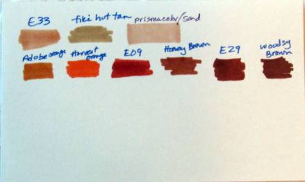
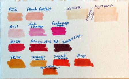
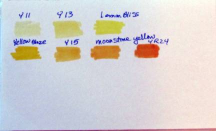
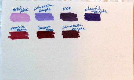
After this I got out the distress inks and started coloring up the backgrounds. I used two to four inks for each panel, applying them with a blending tool. After covering the surface I buffed with a paper towel to reveal the pattern.

I didn't use up all the prepared cards but here is what I have so far:

A soft argyle that will make a great background for a baby boy card

A brighter argyle for a masculine card

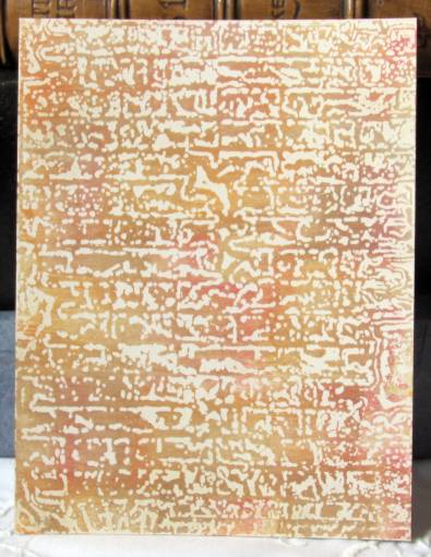
A brick texture with very warm tones

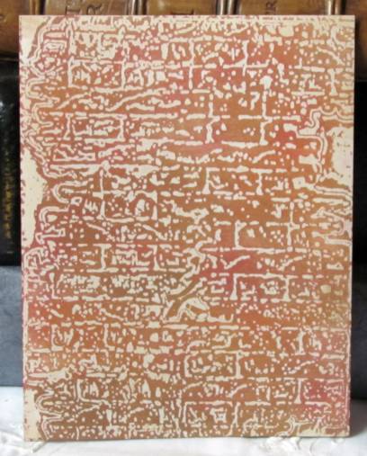
more brick with redder coloring

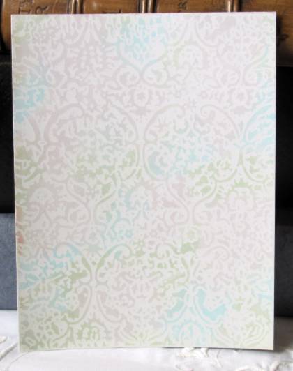
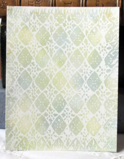
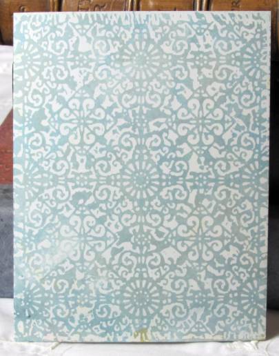
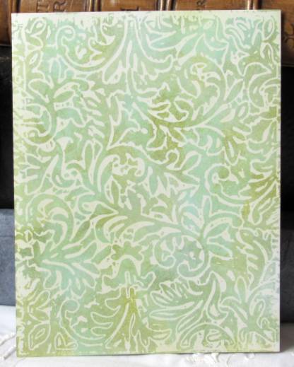
brocade with extremely pastel inks

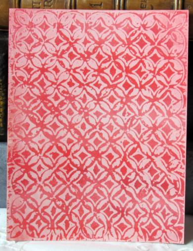
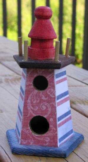
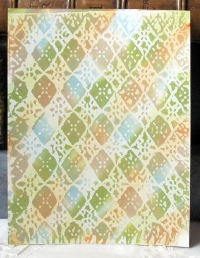
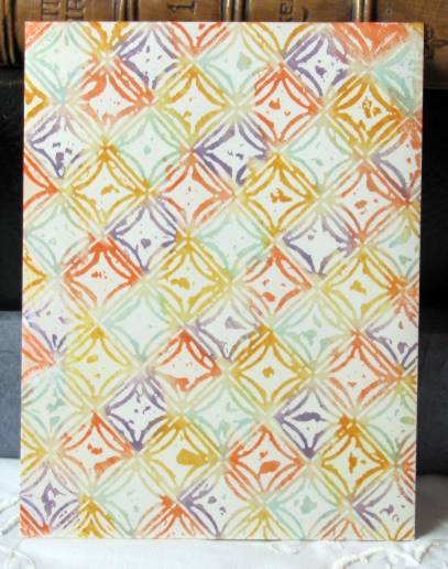
reds and pinks on a circle/diamond pattern

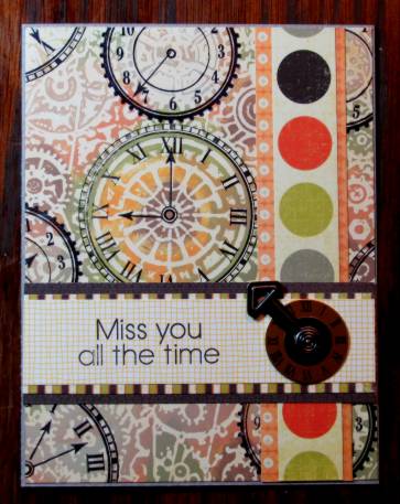
clockworks on which I tried to color individual elements differently to define them

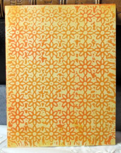
daisies in a blend of oranges

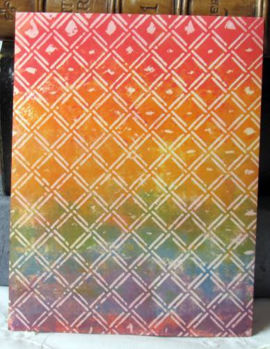
small diamonds in a rainbow

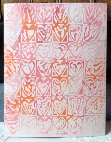
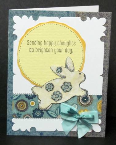
hearts in pink and orange

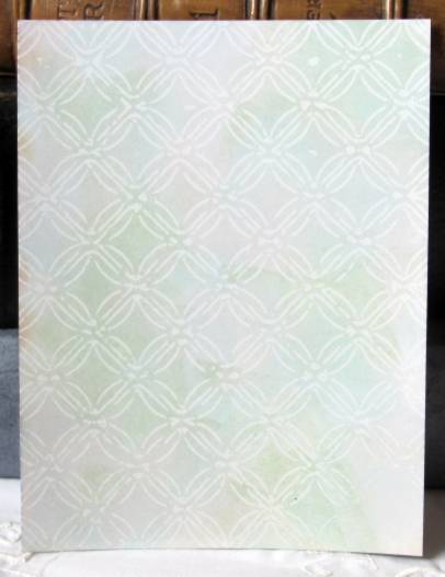
interlocking circles in a pastel blue/green

the same pattern with some brights in intentional placement

ornamental iron folder in greys and blues
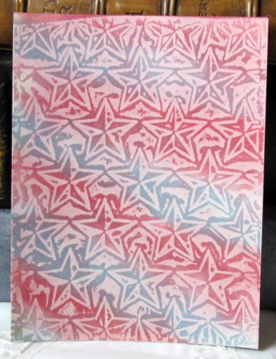
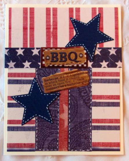
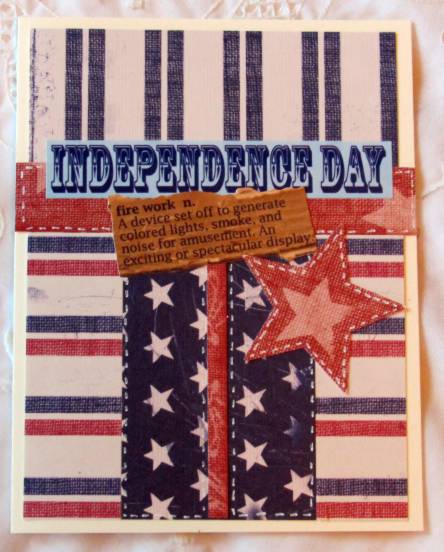
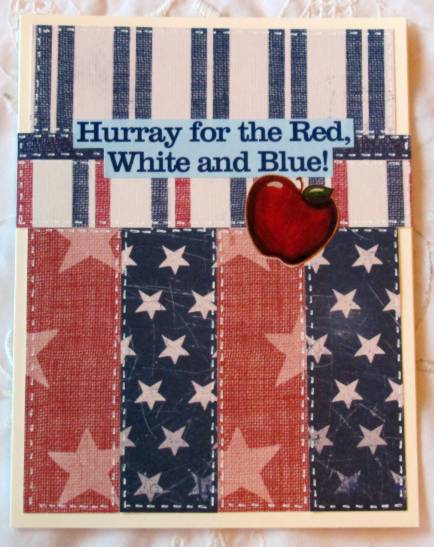
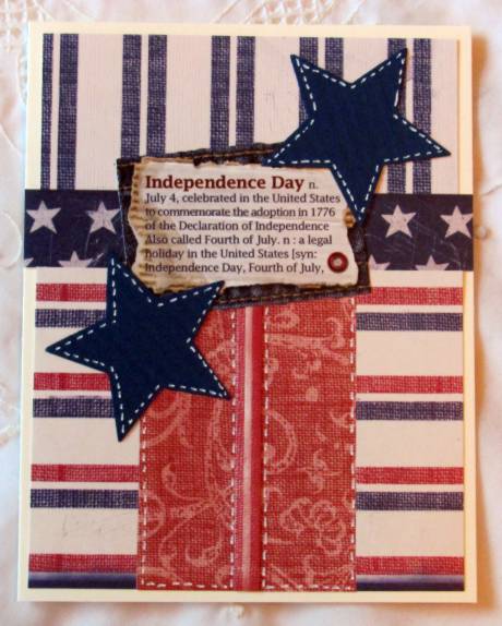
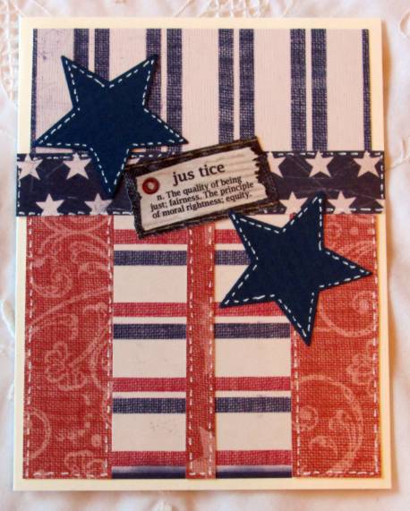
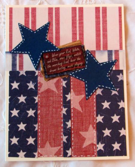
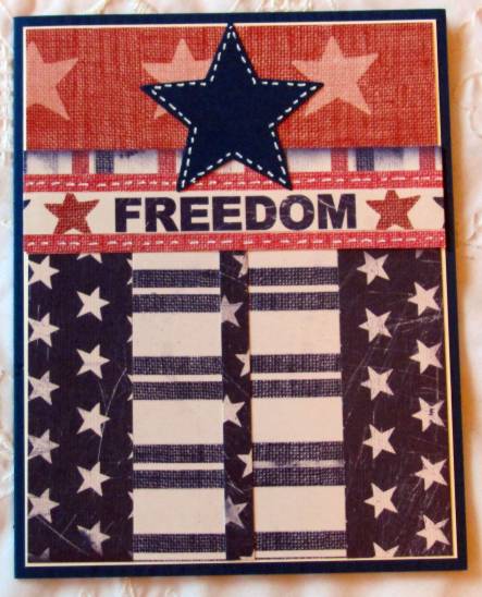
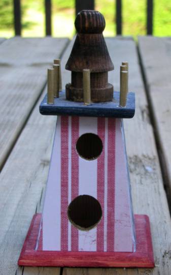
stars in stripes

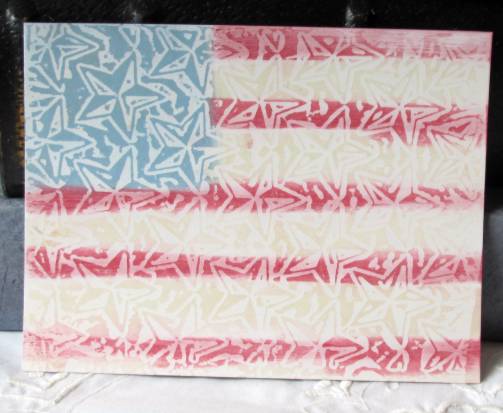
star background with flag coloring

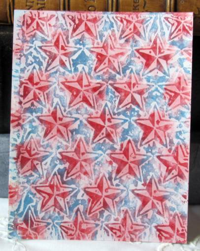
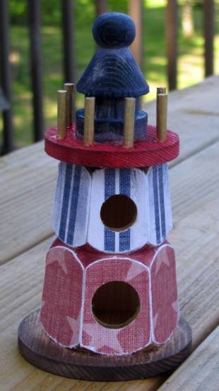
stars with spot coloring

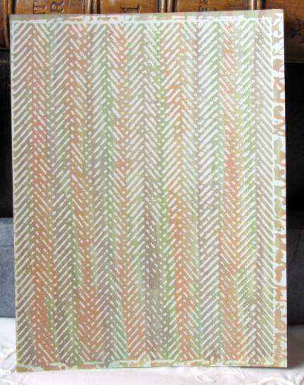
herringbone in muted masculine stripes

vines in blues and greens. notice how the vines appear as outlines on this one

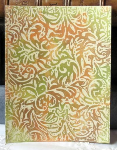
vines in browns and greens. notice that this one has the vines a solids. every folder has an indented pattern and a raised pattern. the card will come out of the 'ironing' phase as either the negative or the positive image depending on which side of the waxed paper sandwich it is on.

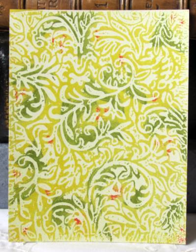
vines with yellow and green plus a few red 'berries'

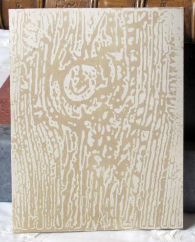
woodgrain with light brown ink

I still have LOTS of waxed backgrounds I have not colored yet. I might try some other types of coloring agents to see what neat effects I can create.

In the meantime, I have some inspirational backgrounds calling out for me to get busy.

Ddd


Posted by studio3d@ccgmail.net at 12:01 AM PDT
Sunday, 20 May 2012
Signs of the Times
Topic: Other Projects

I did lettering for the Vacation Bible School banners again this year. The came with the lettering on the left and the kids in the car.

To do these I measure the open space and draw a full-size block on the computer in CorelDraw. Then I look for fonts that suit the theme and type in the information. To print it full-scalee I have to move the text bit by bit over the 'page' on the screen, printing after each move. Then the pages are all taped together into a big sheet. I tape this to the patio windows and tape the plastic banner over the top of it using clear packing tape. Everything is then drawn on the banner using "Marks-a-Lot' permanent black markers.


I wanted to set off the information for the Kickoff Festival so I drew in a strip of 'tickets'. These I colored with 'lettuce' alcohol ink using a piece of felt on my blending tool. This has to be done very carefully because the alcohol ink will 'melt' the black marker and smear it.

I made two of these and always make them with materials that will allow them to be displayed out of doors without being in danger of the weather.

Ddd


Posted by studio3d@ccgmail.net at 12:01 AM PDT
Saturday, 19 May 2012
Bunny With Happy Thoughts
Topic: Stamping

I had some table scraps that had been set out for a specific purpose and then never got used. While shuffling them back into the mix of other table scraps I kept coming up with matchups I liked and finally put together this card.

The bunny is left over from the recent paper piecing session. I can't remember where the yellow circle came from but I cut the golden backing for it for this project. The floral band is the back side of a recently used cardstock and the shaped white piece is from my stash of die-cuts. I ran across it while looking for something else entirely! Two patterned strips in the background were the table scraps I started with.


I used a fine-line marker to add some fauz stitching and then tied two coordinating ribbons together for the bow.

Ddd


Posted by studio3d@ccgmail.net at 12:01 AM PDT
Friday, 18 May 2012
Stars, Stripes, Stitches
Topic: Sketch Challenge

Another great sketch challenge from Operation Write Home. This is their 121st sketch!


I immediately thought of the patriotic papers I cut into for the lighthouses and cut strips out of them to mix and match for seven cards. For some I added a tiny strip up the center on the bottom part and for some I added a smaller strip at the top. I had a couple of different sticker sets with patriotic and/or 4th of July materials and selected from these as the focals. I also punched large stars from a matching blue cardstock. After putting all the pieces together I used a white gel pen to add stitching dashed lines around selected portions.


Aren't these fun?

Ddd


Posted by studio3d@ccgmail.net at 12:01 AM PDT
Thursday, 17 May 2012
Simple Summer Pleasures
Topic: Digital Stamps

This very delightful digital stamp cried out for a very light touch. I used colored pencils in pastel tones for coloring and gave it a simple mounting. I distressed the edges of the piece, mounted to green and roughed the edges of that as well. I used 'old paper' distress ink to mute the overall tone. The sentiment is stamped on a yellow card, distressed edges and backed with green like the main panel. This is the last line only of a larger sentiment block.


I used three blue rhinestones above the text. The butterfly in the upper left was added for design balance. It is actually two gold peel-off stickers colored with blue Copic marker. Then I layered them for more dimension.

Ddd


Posted by studio3d@ccgmail.net at 12:01 AM PDT
Wednesday, 16 May 2012
Let There Be Light
Topic: Other Projects

Occasionally I will run across things at the craft store on such a sale that I can't leave them there. For instance, little wooden birdhouses for fifty cents each could NOT be left alone. I've had them for a couple of years - along with two other sets in different styles.

From the time I saw these birdhouses styled after lighthouses I wanted to decorate them for summer with red, white and blue. I did all the solid coloring with Distress Inks. The papers are from a 12 x 12 patriotic cardstock pad. The pieces were rough-cut and attached with Scor-Tape around the edges. Then I used a sanding block to file away the overhang.


I used a gold Krylon paint pen to color the top pegs and inside the edges of the holes.

There is a 4-sided one:


There is a 5-sided one:


And a 6-sided one:


It makes me want to get busy making up the other two sets. They will be for different seasons (most likely Spring and Christmas)

Ddd


Posted by studio3d@ccgmail.net at 12:01 AM PDT
Tuesday, 15 May 2012
A Little Sketchy
Topic: Sketch Challenge

Three things were accomplished with this one group of cards. 1) use up a pile of scraps I created when making the teapots 2) try making a pinwheel element I saw on another blog 3) use OWH sketch 120 (which is here:)


The 1" blocks used for the 'pinwheels' are from the scraps created from making the teapots. Some of the papers were reversible so it gave me more options to combine them. The first step was to match up the papers, using two for each of the pinwheels. Then I glued each of the pinwheels together and selected a complementary small strip then an acceptable large block. Black borders for the pinwheels and the sides of the blocksgot them ready for installation and then I selected colored card bases that would suit each one.

I ended up making 12 of these cards. This one is decorated with a black peel-off greeting and outline flower.


I flipped this one on its head because of the 'weight' of the floral paper. It also got a black peel-off greeting


This one, also upside down has a clear text sticker over the pinwheel


I used more of the brocade paper for the background on this one. More black peel-offs to decorate


I had bunnies cut out that I had started to use for the paper piecing for kids challenge the other day. Once I changed my mind on that I laid them out on the able top and this one jumped onto the card. He is popped up on foam tape. I also added matching pink strips down each side.


The butterfly for this one is left over from the paper piecing session. The colors went well with this pinwheel combination


This paper of fine diagonal stripes really changes the look. The text is a clear sticker.


Back to the original orientation. I found these golden dragonflies in my sticker stash and they really go well with the stripes on the bottom paper.


The decor for this pinwheel is a sticker left over from a long-ago cruise craft card project.

I think this pink striped paper looks like wallpaper on the card. The text is a clear sticker.


Another clear text sticker... love these on the pinwheels. The red and white stripes make this look vintage.


With the use of striped paper for the large block this looked like the whole card was striped. I added a black scallop border to create a break between the two. The text is again a clear sticker.


And off they go to OWH for soldiers to write  home on.

Ddd


Posted by studio3d@ccgmail.net at 12:01 AM PDT
Monday, 14 May 2012
I'll Take a Dozen, To Go
Topic: Fantastic Folds

I offered to make a dozen of my paper teapots for a Mother's Day event. It had been so long since I made any that I had to reprint the instructions to follow!

I try to select designs that look like they might actually be china. The event colors were pinks, blues, and purples but I had no luck finding suitable cardstock in purple, violet, plum, lavender... So I settled on a range of pinks and blues.

It takes a bit over an hour to make one pot. But I did these assembly line (step one on all of them, then step two...) hoping to cut that down. No luck. It takes the same amount of time.

Here are the final 12:

An overall muted rose floral

a blue and cream stripe

solic bright pink with glossy flower imprint

a shimmery two-toned blue

a diagonal pink iris on text background

a blue toile

subtle pink nosegays on text background (this one is identical to my own)

blue glittery morning glory vines

an overall floral print on text

delicate pink lace with shimmery finish

glittery floral stripe


These were used as table centerpieces with small pots of blooming plants inside. 12 ladies got to take them home as gifts.

Ddd


Posted by studio3d@ccgmail.net at 12:01 AM PDT
Sunday, 13 May 2012
Coloring Book
Topic: tips and tricks

I love coloring. I always have (just ask my mom). Now days I rarely use crayons, though. Instead, I use watercolor pencils, watercolor markers, distress inks with a water brush, or alcohol markers.

By far the most expensive of these options is alcohol markers, especially when you get into the 'Cadillac' of the medium, the Copic markers. I started out with a basic set of Copics (36, I think) that I got on sale. When I wanted more options I found the Bic Mark-It set of 48 filled in nicely at a very reasonable price. Then I picked up a few Prismacolor pastels on clearance. And, finally, I bought a small set of Spectrum Noir pens with flesh tones. All of these markers play nicely together. They can be blended just like they were all the same brand. The big difference for me is that they have different types of tips - some wide, some brush, some hard point, etc. You just have to make do with what you've got.

I found it was impossible to tell what a color was from the color of the cap, the dot on the end, or the color name on the label. So I separated all my pens into color groups and started scribbling little color swatches. This allowed me to place the pens in gradation order for choosing blending ranges. I then made 3 x 5 cards into color swatch cards by coloring the pens in order and labeling with the color name or number. There is a card for each color family.

When I want to color something I take out the swatch cards, select three shades of a color range and use them to color highlights, mid-tones and shading. 

Here are the cards I use:


Some of the colors appear on more than one card when they cross between ranges. A reddish-orange might appear on the brown card, a dark red might be included on the purple card, etc. There is one card just for blacks and shades of gray, also.

I got the Prismacolors last so their colors are out of order. I need to do the cards over with these moved over and intigrated into their range.

Ddd


Posted by studio3d@ccgmail.net at 12:01 AM PDT
Saturday, 12 May 2012
One, Two, Three, Four, Five
Topic: Dry Embossing

Next up in the series of Rebel challenges was to make a card with 5 different elements.

Element One: Embossed Acetate colored with Alcohol Ink

Element Two: Tissue Tape strip (with musical print)

Element Three: Bird Stamped on green paper, trimmed with thin border and mounted on foam tape

Element Four: Red Nail Head dot stickers

Element Five: Cardstock Text Sticker, mounted on black, teimmed with thin border, popped up on foam tape


This is one of the acetate background I did a few weeks ago and set aside while waiting for inspiration on how to finish it. Here's the inspiration and the finish and I love it.

Ddd


Posted by studio3d@ccgmail.net at 12:01 AM PDT
Friday, 11 May 2012
Eye-Popping Color
Topic: Stamping

Next challenge for the OWH rebels: Use bold colors.

I went right to some Halloween papers I picked up after the season. They have no seasonal elements on them, I just bought them for the awesome colors. I had the digital image of flowers in a watering can and I pulled bright colors of markers to coordinate with the feature paper. The striped strip is the tear-away edge from the dot paper.


I added three rhinestones along the top to coordinate with the flower centers and used a black peel-off greeting in the open space of the image panel. This panel is mounted on foam tape.

Ddd


Posted by studio3d@ccgmail.net at 12:01 AM PDT
Thursday, 10 May 2012
Playing With Food
Topic: Stamping

Third challenge for OWH rebels was to focus on food.

This stamp of a birthday cake was part of a grab bag from Goodwill. This is the first time I have inked it up. I colored the cake and plate following the illustration on the wood mount and then did my own thing with the confetti surrounding it. It was 'reading' overall as a plum color so I used black and plum to create a frame for it. I mounted this on a folded white card base and then found the matching vellum package stickers in my stash. I stuck them to black paper and cut out with a thin border. AWESOME! Now, it's a party!


The flowers around the edges are from the same sheet as the packages. Then I popped on a black peel-off greeting as the final touch.

Ddd


Posted by studio3d@ccgmail.net at 12:01 AM PDT
Wednesday, 9 May 2012
Let It Go
Topic: Stamping

For the OWH Rebel challenges the second assignment was to use something you had been hoarding. I broke loose my death grip of this awesome piece of brocade paper. I reminded myself that, with my Cuttlebug folders and a little pastel ink, I could replicate this closely. So it was time to let go and create something with it.

I stamped on pink patterned paper with a dogwood branch (twice) and cut out closely around everything. Then I used the same paper and stamped the nest and two birds from a new(ish) set. These were all layered in a pleasing arrangement over the feature paper.


I used markers to color the branches, flowers and eggs, layered the panel over black and plum.

Ddd


Posted by studio3d@ccgmail.net at 12:01 AM PDT

Newer | Latest | Older