« July 2012 »
S M T W T F S
1 2 3 4 5 6 7
8 9 10 11 12 13 14
15 16 17 18 19 20 21
22 23 24 25 26 27 28
29 30 31
You are not logged in. Log in
Entries by Topic
All topics  «
3D paperwork
A - Z challenge 5
A - Z challenge 7
A - Z challenge round 4
A to Z challenge round 3
A to Z round 2
A to Z round 6
A-Z round 1
Around the House
Art Challenges
Artist Trading Cards
Backgrounds
Beads
Bible Journaling
Books
Boxes
Collage
Color Challenge
Coloring
cookbook
Die Cuts
Digital Projects
Digital Stamps
Drawing
Dry Embossing
Fabric Stuff
Fantastic Folds
Field Trip
Home Decor
How Does Your Garden Grow?
Hymnal Art
In The Kitchen
In the studio
Jewelry
Lettering
Links
Multi-Technique
Music to Work By
Musings
Nail Art
New Work
Online Class
Other Hobbies
Other Projects
Painting
Paper Embroidery
Paper Piecing
Photo
Pretty Paper
Quilting
Random
reading
Scrap Recovery
scrapbooking
Sewing
Sketch Challenge
Some Backlog
Stamping
Stencils
Stickers
Supplies
Teabag Folding
Techniques
Testing
tips and tricks
Tutorial
Web resources
Welcome to my Blog
Work By My Friends
workflow
Writing
Blog Tools
Edit your Blog
Build a Blog
RSS Feed
View Profile
Group One
In & Out of Studio 3D
Friday, 13 July 2012
Billowing Sails
Topic: Backgrounds

Although not much of it shows, I started this card to feature the waxed paper background with woodgrain. Then I chose the three background strips. Thr dark red and the green both match stripes found in the center strip.

I pulled out my new Distress Markers and selected colors that were found in the other elements to color the ship (which was stamped and sent to me by a friend). I rounded the corners with a punch and used 'old paper' Distress Ink to tone the edges. Then I mounted it on a burgundy background and rounded those corners as well.


One of the pre-stamped sentiments was trimmed down and backed with burgundy before placement. Then I popped up the ship on foam tape.

Ddd


Posted by studio3d@ccgmail.net at 12:01 AM PDT
Thursday, 12 July 2012
Candied Poinsettia
Topic: Paper Embroidery

My friend who visited from The Netherlands brought me two spools of thread for paper embroidery. I decided to use both on this card and it looks like the poinsettia is made of spun sugar.

The flower portion is a verigated thread from white to burgundy in short repeats. For the leaves I used the thread that is made up of multiple pastels in yellow, green, blue and pink. I used a solid burgundy to stitch the greeting.

I mounted this on a burgundy card base and trimmed it with a scalloped gold peel-off sticker strip. Then I added Liquid Pearls dots in the flower center.

Ddd


Posted by studio3d@ccgmail.net at 12:01 AM PDT
Wednesday, 11 July 2012
We Three Trees
Topic: Paper Embroidery

I've stitched this set of trees up several time and I like it every time. I decided to place them on a patterned background this time and that required stitching with dark threads. I first stitched the stars  with a deep yellow and found they did not show up so I touched their threads with red marker which turned them into orange stars.

I used liquid pearls to make snowcaps on the branches and the ground (hard to see in the photo).

I hand-lettered the text on the background, using the pattern like a grid.

Ddd


Posted by studio3d@ccgmail.net at 12:01 AM PDT
Tuesday, 10 July 2012
Butterfly Kisses
Topic: Backgrounds

When I needed to make a background for round one of a serial swap card I fell back on the waxed paper technique. This time I worked directly on the surface of the folded card base. As each pressing creates two pieces I got to keep one for myself. This is what I used for today's card.

I inked it up with Mustard Seed distress ink. This rich yellow needed strong colors so I added a bold stripe and a block of patterned walnut brown. I rounded the corners to take the harsh edge off of all this color.

The little mouse sleeping in the tulip was trimmed close so he would fit with the background but not disappear. 


When I decided on the sentiment stamp the card called out for the adding of 'friends' so I chose three clear butterfly stickers with one resting on the mouse's nose.

How sweet.

Ddd


Posted by studio3d@ccgmail.net at 12:01 AM PDT
Monday, 9 July 2012
Sugarplum Wreath
Topic: Paper Embroidery

Oh My! I just fell in love with this printed scrapbook paper. When I ran across this pattern for a paper embroidery wreath I knew it would pair well with the paper if I used rich, dark colors. I was so right.

The pattern also calls for beads to stand in for the berries so I selected some with a candy-like finish.


I kept a long-card format and added sheer green ribbon, a cranberry folded card base and used a bit of cranberry to back the thick acrylic text sticker.

Perfect!

Ddd


Posted by studio3d@ccgmail.net at 12:01 AM PDT
Sunday, 8 July 2012
Same Colors - Different Day
Topic: Stamping

Yesterday's set was supposed to start with 8.5 x 11 cardstock but I had 12 x 12 on hand and cut them down. That meant I had blocks of those same colors left over but none large enough to use as card bases. I got out three cream card bases to build upon and chop, chop, chopped parts to use on them for cards.

First I stamped across the biggest piece with a floral silhouette. Then I used a large silhouette of a daisy on the square piece.This stamp is actually only 1/3+ of the flower so there was some judicious arranging to make a full flowerhead. Another of the small silhouettes was added to the extension backing and this was popped up on foam tape. I stamped a greeting on the long slip and tucked it behind the feature block.


I dropped the center block entirely from this next card and just went nuts with stamping the daisy silhouette including adding it to a contrasting piece. I used the same sentiment and really like this card.


When I saw how much 'chocolate' there was going to be in this arrangement I grabbed some sets of cupcake stamps to make a birthday card. YUM! I had a set of four little cupcakes and arranged them on the block to stamp all in a line. I stamped the group twice to reach all the way across the card. I stamped a larger cupcake on the big block and layered it with the apricot. Rounding the top corners sets off the sentiment. I used chalk ink to tint the edges. Then I created a multi-layer block to stamp the greeting and rounded the top corners of that, too. This layer is popped up on foam tape.


Scrappy, scrappy, scrappy and awesome, awesome, awesome!

Ddd


Posted by studio3d@ccgmail.net at 12:01 AM PDT
Saturday, 7 July 2012
Tri-Color With Sketch
Topic: Sketch Challenge

I went with a sketch for this set of cards (OWH#28) and a plan (from ClubScrap) that uses three 8.5 x 11 papers to plan-cut and mix and match. I started with a yellow/white dot, a brown antique print and an apricot fabric print. Here is the sketch:


By using the cutting diagram it allows for the large block and the long strip to be backed with an opposing color.

For the first one I started with the apricot base. The big strip in yellow dots was just too much so I turned it over and revealed a floral print! On the big block I used a brown chalk ink to stamp a silhouette daisy off the edges and added in some leaves from the same set. The same brown ink was used for the sentiment and this layer was popped up on foam tape. I added stamped leaves to the right ends of the skinny strips to tie them into the design.


For the second one I started with the brown card base. The skinny strips did not stand out from the big strip enough so I popped up all of them on foam. The brown center block had a round element on it so I stamped in that area with a clock face. This called for a particular sentiment and I kept it simple. I added foam tape so this piece would float over the skinny strips.


Then I got tired of the arrangement and used the skinny strips to band the big block. I also un-stacked the long strips and placed them side by side. This covers up a lot of the yellow dot paper and keeps it from taking over. I used brown chalk ink to stamp the house and added details with brown fine-line pen. These include bricks on the chimney, wood grain on the door and sills and clapboard siding.A stamped sentiment is the finish.


Three more done!

Ddd


Posted by studio3d@ccgmail.net at 12:01 AM PDT
Friday, 6 July 2012
Nine For The Troops
Topic: Collage

I ran across a multi-cut plan for using 3 sheets of 12 x 12 cardstock and 3 sheets of 8.5 x 11 cardstock (all coordinating) to mix and match parts and create 9 cards. I chose from a patriotic 12 x 12 pad for all the papers and just cut three of them down to meet the 8.5 x 11 size for half of them.

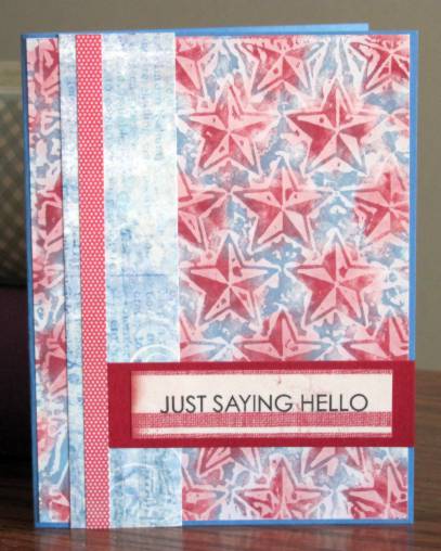
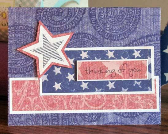
For this first one I used the blue paisley as the card base and added a red swirl and a blue and white star papers. I banded all of them with a white shimmer paper and also used my big star punch to create an added feature. I backed it with some of the red and stamped the striped star in the center. The star and the sentiment strip are raised up on foam tape.


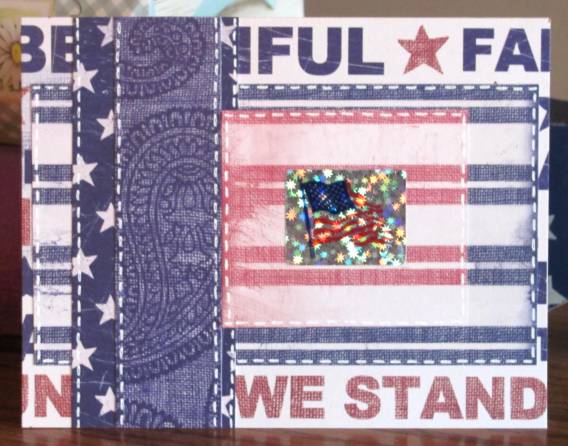
On the next one I used a text background as the card base. Red and blue striped papers are mixed with the blue star and blue paisley. I added a holographic flag sticker to the largest block and used white gel pen to add stitches around the pieces.


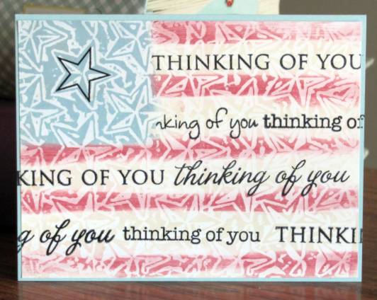
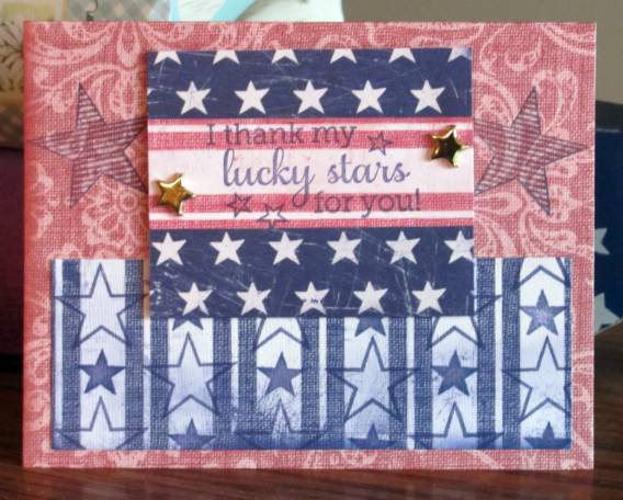
Next up is a red card base on which I stamped blue striped stars. Then I used the same ink to stamp open and solid stars to the blue striped paper to totally change the look of it. I layered the red stripe over the blue star paper and used it as a place to stamp the sentiment. A couple of goldstar brads grace the sides and this layer is popped up on foam tape.


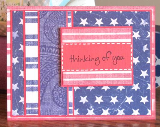
This one is more subdued and with all of the blue papers they just melted into each other. So I mounted all the pieces on red backing to define the edges. I used more of the red backing to stamp the sentiment and set it off with some white faux-stitching.


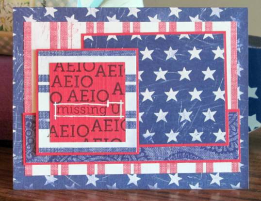
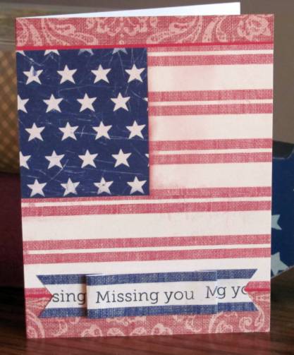
The blue star cardstock makes a great base card. I defined most of the decorative pieces with more of the red backing and reserved another red piece for stamping. For this I used a stamp that says "AEIO missing U". I stamped this once then masked multiple times to stamp just the AEIO part. The 'missing U' then got set off with white gel pen.


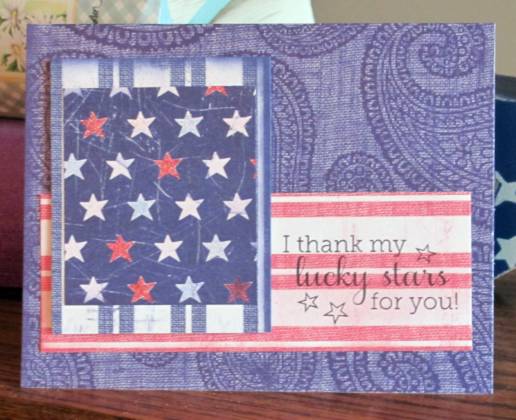
The blue paisley makes another appearance with stars and stripes. I used the blue star paper and colored in various stars with 'Spica' glitter pens in red, white, and blue. A sentiment stamped on the red stripe paper finished it.


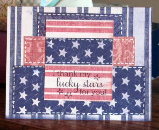
With a blue striped base card I stacked varying lengths and widths of strips and outlined them with faux stitching in white gel pen. There's that sentiment again.


Busy, busy, busy - that is the look of this card. I started with the text background and added the blue star paper and a red swirl paper. I wanted to use more of the star paper so I punched big stars out of it and banded them in red to give them contrast. I popped them up on foam tape for more definition.


And finally, the super-simple one. I started with the red swirl base and added red stripe and blue star in a traditional flag arrangement. I had one long strip of the blue stripe so I trimmed it down to have only one stripe on each side, cut flag ends, stamped the sentiment repeatedly and then folded it into a banner. The center section is raised on foam tape while the flag ends attach directly to the background.


So there you have it. Nine cards from one cutting session with coordinating cardstocks. Every one is an original but they go together very quickly.

Ddd


Posted by studio3d@ccgmail.net at 12:01 AM PDT
Thursday, 5 July 2012
Christmas in July
Topic: Paper Embroidery

Another free pattern I snagged to make one of my 'two Christmas cards per month' in paper embroidery. Love this, but what a thread hog!

I kept the colors traditional for the holiday parts but had to make the goose in gray so it would show against the white background. I guess there really are grey geese, even though I have never seen one personally, so it is realistic enough.


I didn't put a greeting or sentiment on it but I suppose if a card arrives in mid-December sporting a goose with two wreaths, the recipient will probably figure out the occasion it is celebrating. LOL!

Ddd


Posted by studio3d@ccgmail.net at 12:01 AM PDT
Updated: Tuesday, 26 June 2012 11:07 PM PDT
Wednesday, 4 July 2012
Stars, Stars, Stars and Stripes, Stripes, Spots!
Topic: Backgrounds

HAPPY INDEPENDENCE DAY!

For today's entry I used the three waxed paper backgrounds with stars to make patriotic cards.

For this background I swiped the red and blue inks on in wide stripes at an angle. This makes a subtle pattern with movement. I added a strip of checked paper and a strip of ledger paper, both backed with dark red. A sentiment from the pre-stamped bin with corners rounded with a punch was added. Then I stamped a row of open stars on the ledger paper.

Then I pulled out the background on which I had spot-colored the stars with red ink and filled in the background with blue. This makes a much more iconic background. I used a similar layout to the last one but made the vertical stripe double layered and made the horizontal stripe go only partway across the width. This also became the place for the sentiment, which was ctamped specifically for this card (not pre-stamped)

This last background was my least favorite... to begin with. But after I stamped "thinking of you' with 4 different stamps I began to LOVE it!. The placement of the stars within the blue area made it so a single stamped star wal 'almost' centered. I just could not add any decoration to this that would make it better, so it is just the background and the stamping. I did learn my lesson from the day I stamped with ink that did not want to dry on the waxed paper background. So this has been stamped with Staz-On which is made for non-porous surfaces.


SALUTE!

Ddd


Posted by studio3d@ccgmail.net at 12:01 AM PDT
Tuesday, 3 July 2012
Fireworks Fingernails
Topic: Nail Art

The biggest problem with the Dollar Store nail polishes is their lack of 'staying power'. They began chipping off the nail ends at about 5 days and I just lived with the raggy look too long. But that means I get to play with nail art sooner than if I had used more 'expensive' polish.

I decided to stay with the red, white, and blue theme but this time I painted every other nail red or blue. I also had picked up a nail stencil kit from the discount bin at the store and thought I'd give that a whirl.

The stencil I chose to use looks a little like fireworks to me and has one large and two small bursts on the design. I used white nail art polish for the stamping and then added a dot of gold glitter polish to the large burst and a dot of silver glitter polish to the small bursts.


It's kind of like rubber stamping on your fingernails, but with polish. If you mess up with the stamping there is no way to fix it but to strip that nail and add all the layers from the base coat through the two coats of color, let it dry and stamp again. I had only one that could have used it but I'm just going to live with the two tiny smudges. After all, this polish does not last that long so I will get to play again soon!

Here's a closeup of a couple of nails.


Now I have my own Fireworks for the 4th!

Ddd


Posted by studio3d@ccgmail.net at 12:01 AM PDT
Monday, 2 July 2012
Twist And Shout
Topic: Quilting

I recently sorted out all the scraps in my fabric stash, setting together pieces that went together and bagging them up with labels. This way I can grab a bag and have an instant 'kit' to play with. Some will need supplemented to have enough for a whole quilt and others will be fine for small projects.

In one of these gallon ziplock bags I had bright pink floral (leftover backing for a grand-child's quilt), bright green (leftover from my current project, and a black with circle flowers in bright colors (backing from my first quilt). I went to a quilt retreat and, in need of a break from a loooonnnngggg project, I dug out this bag and sorted through my collection of quilt ideas for inspiration.

I chose a stripe with a twist (impossible to describe so I'll just show it) to make a wall hanging for my fireplace wall.


The green and pink are sewn together in stripes and folded on the seam. Then the raw edges are sandwiched between wider polkadot stripes. All of the stripes are ironed one direction and the edges stitched down flat. After binding the stripes are all pressed in the opposite direction and a wave is stitched through them to keep them in place. This becomes a 3-dimensional piece.


Awesome, yes???

Ddd


Posted by studio3d@ccgmail.net at 12:01 AM PDT
Sunday, 1 July 2012
Dots and Dashes
Topic: Techniques

When a friend visited from The Netherlands recently, she brought me a gift of a new craft from her country. It is called Hobby Dots. There is a pattern that is placed over your cardstock and you pierce holes through it. Then you have sheets of itty-bitty stickers in different shapes which you transfer to your cardstock, aligning them over the pierced holes. I used the end of my piercing tool to transfer the sticker bits.

I pierced out several from the book she brought me and then realized that the stickers were different shapes than the ones in the book patterns. OK, I just used the same layout and chose on my own which shapes to use. This is my first one:


I did the pattern on a printed cardstock and then used a foil 3D image to fill the frame it created.

Ddd


Posted by studio3d@ccgmail.net at 12:01 AM PDT
Saturday, 30 June 2012
Pastel and Parchment
Topic: Backgrounds

Again with the waxed paper backgrounds! This is the super-pastel brocade one, though you can;t see much of it after mounting the image.

The image is a digital that I colored with my new Distress Markers. I didn't like how 'streaky' it turned out so I layered a scripture printed on vellum over the top. I just wrapped the edges to the back to adhere it.

There was not enough contrast between the background and the focal so I placed a couple of strips of that yummy coral stripe behind the edges.

Ddd


Posted by studio3d@ccgmail.net at 12:01 AM PDT
Friday, 29 June 2012
Long-Legged Beauties
Topic: Backgrounds

This blue and green swirl waxed paper background perfectly suited the digital image I had colored with my new Distress Markers. I added one strip of patterned paper and a greeting stamped on another pattern. All of the pieces are banded with a thin black border.

The floral panel and the sentiment are popped up on foam tape. I added three pearls under the sentiment and another three in the upper left.

Ddd


Posted by studio3d@ccgmail.net at 12:01 AM PDT
Thursday, 28 June 2012
Sand and Sea
Topic: Paper Embroidery

I've been working on this card off and on for months! I started it with no specific swap or challenge in mind and would set it aside to work on one for which I had an assignment. Then I got a swap signup for 'beach/seaside' and I set to work to finish it up.

The shimmery, textured background was sent to me in a supplies swap and suited well for a sandy look. I stitched with rayon threads in bright green for the trees, taupe for the coconuts and tree trunks, and white for the sand and boat. Then I selected irridescent threads in blue for the water and purple for the hills.

I selected one of my pre-stamped phrases on an irridescent green scrap and matted it with irridescent blue to match the folded card base.

Ddd


Posted by studio3d@ccgmail.net at 12:01 AM PDT
Wednesday, 27 June 2012
Slinky
Topic: Paper Embroidery

The next color challenge in paper embroidery was purple and black. I chose to handle this one opposite of the yellow one by stitching with the black thread on the color. I backed it with black dotted cardstock and then used the same purple for the folded card base.


This is really not as blue as it appears. Crazy camera!

Ddd


Posted by studio3d@ccgmail.net at 12:01 AM PDT
Tuesday, 26 June 2012
This Little Light of Mine
Topic: Paper Embroidery

On assignment to make a card with only yellow and black I dug out this pattern for a candle on a stand.

I used a golden tone for the stand. light yellow for the candle and bright yellow for the flame. I used gold Stickles to add a little shine in the flame.


I mounted this on a bright yellow cardstock in keeping with the theme. Surprisingly, for a card with so much black, it does not look really dark.

Ddd


Posted by studio3d@ccgmail.net at 12:01 AM PDT
Monday, 25 June 2012
Clock On A Wall
Topic: Backgrounds

The waxed paper background used today is made with the 'brick' embossing folder. It loses a little bit in the translation with this technique but makes a nice backdrop just the same.

I added some table scrap strips to it and one of them was covered with clocks. So I pulled out a clock stamp and then bordered it up with a decorative die-cut and backed it with a scalloped circle. These are popped up on foam tape.


The sentiment is stamped directly on the background. This is a bit of a risk as the wax resists some inks and causes others to dry very slowly, increasing the danger of smearing. Lucky break when it turned out so well.

Ddd


Posted by studio3d@ccgmail.net at 12:01 AM PDT
Updated: Monday, 25 June 2012 10:02 AM PDT
Sunday, 24 June 2012
Fancy Pants
Topic: Die Cuts

I was going for simple and elegant on this card but I don't think it turned out that way.

Love the background paper. Love the diecut flower. Loved the corner brackets but they may be too large. Loved the pink swirls but they didn't stand out enough so I added white dashed lines and now they stand out too much and the casual lines don't match the formal character of the card. Like the bow - don't love it, just like it.


Possible fixes: use the white pen to turn the dashed lines into solid lines, change up the bow for something more elegant like a rhinestone. Other suggestions?

Ddd


Posted by studio3d@ccgmail.net at 12:01 AM PDT

Newer | Latest | Older