« November 2012 »
S M T W T F S
1 2 3
4 5 6 7 8 9 10
11 12 13 14 15 16 17
18 19 20 21 22 23 24
25 26 27 28 29 30
You are not logged in. Log in
Entries by Topic
All topics  «
3D paperwork
A - Z challenge 5
A - Z challenge 7
A - Z challenge round 4
A to Z challenge round 3
A to Z round 2
A to Z round 6
A-Z round 1
Around the House
Art Challenges
Artist Trading Cards
Backgrounds
Beads
Bible Journaling
Books
Boxes
Collage
Color Challenge
Coloring
cookbook
Die Cuts
Digital Projects
Digital Stamps
Drawing
Dry Embossing
Fabric Stuff
Fantastic Folds
Field Trip
Home Decor
How Does Your Garden Grow?
Hymnal Art
In The Kitchen
In the studio
Jewelry
Lettering
Links
Multi-Technique
Music to Work By
Musings
Nail Art
New Work
Online Class
Other Hobbies
Other Projects
Painting
Paper Embroidery
Paper Piecing
Photo
Pretty Paper
Quilting
Random
reading
Scrap Recovery
scrapbooking
Sewing
Sketch Challenge
Some Backlog
Stamping
Stencils
Stickers
Supplies
Teabag Folding
Techniques
Testing
tips and tricks
Tutorial
Web resources
Welcome to my Blog
Work By My Friends
workflow
Writing
Blog Tools
Edit your Blog
Build a Blog
RSS Feed
View Profile
Group One
In & Out of Studio 3D
Tuesday, 20 November 2012
So Close
Topic: Stamping

I wanted to create a stamped card with a fall theme and relating to Oregon in some way. I pulled out a couple of my hand-carved stamps to make this little scene.

Why is this Oregon? Well, we have plenty of these little bandits in our back yard. We call them out of the brush and when they come we toss marshmallows to them (also the heels of bread and bowls of table scraps). Our favorite thing is when the Mommas bring their kits out to play on the lawn.

Anyway... I stamped the raccoon with black and then colored over it with a tan distress marker and cut it out. I stamped the fish on grey and colored it with three distress markers before cutting it out. For assembly I stamped the trees on a blue scrapbook paper. I tore a hill along the top of a grass print scrapbook paper and tore a lower arc as well. The lower arc was filled with a water print paper. These were all layered and the raccoon and fish added in their places.

I used distress markers to blotch fall colors in the trees, sketched ripples on the water and banded the two sides with dotted papers.

Ddd


Posted by studio3d@ccgmail.net at 12:01 AM PST
Monday, 19 November 2012
Sparkle and Shine
Topic: Paper Embroidery

The assignment for this swap was to make a paper embroidery card with sparkle and shine. I call this one 'night on the town' because of the dark background. Whacko that I am, I again tried stitching on dark paper and, to make it even more difficult for myself, the back of the paper has a busy pattern on it. Sigh...

All of the stitching is done with metallics and irridescent threads. I trimmed the stitched panel down, rounded the corners and mounted on a white folded card base.

As you can see, this is another 'difficult to photograph' card that does liik better in real life.

Ddd


Posted by studio3d@ccgmail.net at 12:01 AM PST
Sunday, 18 November 2012
Swirls of Best Wishes
Topic: Paper Embroidery

I had a challenge on one list to make a paper embroidery 'get well' card and on another list had a swap assignment to make a card in red and green. So I combined the two to come up with this card.

The background is some ColorMe paper sprayed with silver mist. I pricked out a pattern I've had for a long time but never liked the way the blossoms were designed. So I edited the bottom holes to a different configuration and stitched them up to make them into fuschia.


I used two reds for the blooms and two greens for the leaves and stems to give a little dimension. I cut the panel down and rounded the corners before adhering to a red card base. I added a silver peel-off sentiment as a last step.

Ddd


Posted by studio3d@ccgmail.net at 12:01 AM PST
Saturday, 17 November 2012
Clock-a-Block
Topic: Backgrounds

The last of the clock-printed background was carved up into 4 individual clock faces. All were treated the same with some variety in the color combinations to coordinate with the clocks.

I impressed all the backgrounds with the clocks and gears Cuttlebug folder and used Distress Ink to enhance the texture. The clock blocks  got rounded corners, borders, stamped hands, and a center brad.


The all also got bordered sentiments with rounded corners, popped up on foam tape.


Can't wait to see what's next? Me too!

Ddd


Posted by studio3d@ccgmail.net at 12:01 AM PST
Friday, 16 November 2012
Clocks Collage
Topic: Collage

One of the 12 x 12 papers I wanted to use was covered with rows and rows of clock faces. I took a 12 x 6 area and cut into 1 inch strips then rearranged them, mixing together the clock faces but keeping their alignment. After this mix I cut the other direction into 1 inch strips and mixed these up as well. The result was a 12 x 6 piece with a 1 x 1 grid of clock faces. LOVE THIS!

The one on the left I ran through the Cuttlebug with a clocks and gears folder. I enhanced the embossing by using Old Paper Distress Ink and popped up a bordered sentiment.

On the right I did not emboss. I added a bordered sentiment with a flag end and used a copper brad to anchor it. 

Here, on the left, I added two arrows as clock hands under a bordered sentiment popped up on foam tape. For the one on the right I left the clock background whole and just added a stamped sentiment with slots through which I threaded a twill ribbon.

As you can see...miss you all the time.

Ddd


Posted by studio3d@ccgmail.net at 12:01 AM PST
Thursday, 15 November 2012
Pansies and Posies
Topic: Backgrounds

Here is another large botanical with a glittery-shiny finish. It took up so much space on the card fron that I cut along the blossom edges so I could tuck the sentiment underneath.

The sentiments both got rounded corners. They are popped up on foam on the upper-right corner only and then the top blue bloom is also popped up.


I used different colors of sentiments to pick out differing colors from the background.

Ddd


Posted by studio3d@ccgmail.net at 12:01 AM PST
Wednesday, 14 November 2012
Botanical Blocks
Topic: Backgrounds

A few days back I made a stack of cards using the botanical tiles. They're back! I found three more of the medium size.

The one at the left and bottom are the same yellow print. I bordered them in yellow with a green under that. The sentiments were both printed on yellow and bordered in the same green. I used a green diamond lattice as the background.


The one on the right got 'photo corners' on opposing corners. I added a sentiment cut like a tag and tied with scrappers floss. this one got a pink diamond-lattice background.

This one looks very Victorian.

Ddd


Posted by studio3d@ccgmail.net at 12:01 AM PST
Tuesday, 13 November 2012
Lady Slippers
Topic: Backgrounds

Today's cards use a botanical print that is covered with a shiny glittery finish. I'm not sure they ARE lady slippers but I'm calling them that anyway!

I treated these both the same by adding the green borders on each side and mounting a rosy sentiment over yellow and popping them up on foam tape. On the left I mounted the sentiment higher than the one on the right.


Simple but effective.

Ddd


Posted by studio3d@ccgmail.net at 12:01 AM PST
Monday, 12 November 2012
Painted Dogwoods
Topic: Backgrounds

Because the dogwood print was presented with multiple corners printed and with a variety of tones in the green background stripes there were LOTS of cards to make. Eight in fact.

For all of these I used Distress Markers as watercolor ink and tinted all the blooms and leaves. I gave all the centers a wash of yellow.

For these two I added bordered green sentiments. I used burnt orange for the borders and then used the same color of rhinestones for the centers. The one on the left I used small rhinestones in clusters. On the right the centers each got a single larger rhinestone.


These two got yellow sentiments bordered with rust colors, popped up on foam.

I went vertical with these two because of the way the blossoms laid. On the left I tied a double wrap of bakers twine and covered it with a pink bordered sentiment, popped up on foam. On the right I left off the twine and added two banner-ended paper scraps.


The last two went back to the landscape format. Both of these got a strip of dotted paper on the left. On the left I added a golden sentiment with slightly rounded corners. For the one on the right I used a dusty pink sentiment and cut deeper rounding on the corners.


Eight beauties!

Ddd


Posted by studio3d@ccgmail.net at 12:01 AM PST
Sunday, 11 November 2012
Watercolored Daisies
Topic: Backgrounds

One of the botanical designs was presented in pastel design over medium toned stripes. I was able to get 4 card fronts from this design.

I used Distress Markers scribbled on an acrylic block and picked up with an aquabrush to paint over all the petals. For these I painted the petals orange and distressed the corners of the page with Old Paper Distress Ink. Each got a golden sentiment bordered in cream and popped up on foam tape. On the left, I dotted the centers with Stickles and sealed them with Glossy Accents. On the right I gave the centers dots of Liquid Pearls.

The one on the left here I used purple on the petals which was too dark. I covered it with some of the orange. Too blotchy looking so I took a fine-line marker and sketched around all the petals and added some curly marks in the centers. I added some Liquid Pearls to the centers and mounted an orange sentiment bordered in purple and popped up on foam tape.

On the right, I went back to the orange petals and added nothing to the centers (besides brown marker). A simple knot of scrappers floss underscores a bordered sentiment popped up on foam.

So, is simpler better or is it better with some pling?

Ddd


Posted by studio3d@ccgmail.net at 12:01 AM PST
Saturday, 10 November 2012
Gooseberries
Topic: Backgrounds

These large illustrations from the corners of 12 x 2 scrapbook sheets are really nice for using as card backgrounds. In this case it was a bird perched in gooseberries and featuring a diamond lattice.

I used a craft knife to cut around the bird head so I could tuck the sentiment underneath. I used a blue sentiment on the left and a yellow on the right.

I used Stickles on the lower left of each berry and, when dry, sealed it with Glossy Accents.

Ddd


Posted by studio3d@ccgmail.net at 12:01 AM PST
Friday, 9 November 2012
Gotta Love Butterflies
Topic: Stickers

From a 12 x 12 pad of Martha Stewart cardstock I gleaned some pages of silver butterflies printed on white. Creative cutting gave me 9 card fronts. I decorated all of them with stickers.

All three of these are decorated with blue fractal butterfly stickers in the center of each printed silver butterfly. I punched silver cardstock and applied a silver peel-off script sticker to it ('friend' on one and 'hello' o the other two. This square is popped up on foam tape.

These two got three copper butterfly peel-off stickers and silver peel-off script reading 'thank you'.

The next three got gold butterfly stickers on which the wings fly free as well as a medium and small gold peel-off stickers. A gold 'Happy Birthday' peel-off is applied to the lower left.


The last one has the landscape orientation and uses three irridescent blue butterfly stickers in an arc. The open space on the left side got a 'hello friend' silver peel-off sticker.

Ha! I just noticed the date - 9 on the 9th!

Ddd


Posted by studio3d@ccgmail.net at 12:01 AM PST
Thursday, 8 November 2012
Tons of Tiles
Topic: Supplies

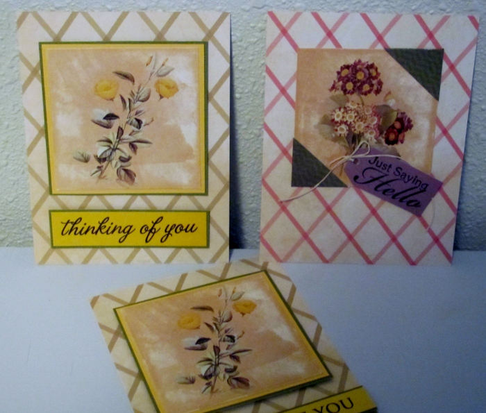
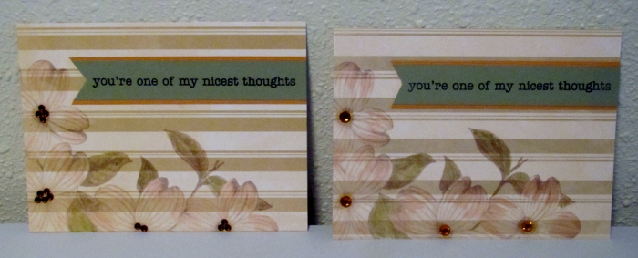
If you start with two 12  x 12 pages that are covered with botanical tiles and do some creative cutting you can come up with LOTS of cards. Some of the tiles are small and some are medium - the size of 4 small tiles.

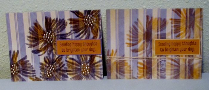
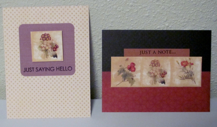
On the left I used a single small tile popped up on foam over a dusty purple panel stamped with a sentiment. I rounded the corners and placed on a tone-on-tone dotted cardstock. On the right I used a strip of three tiles and scored between them. A sentiment strip peeks out from the top and I've mounted on a 1/2 and 1/2 printed background.

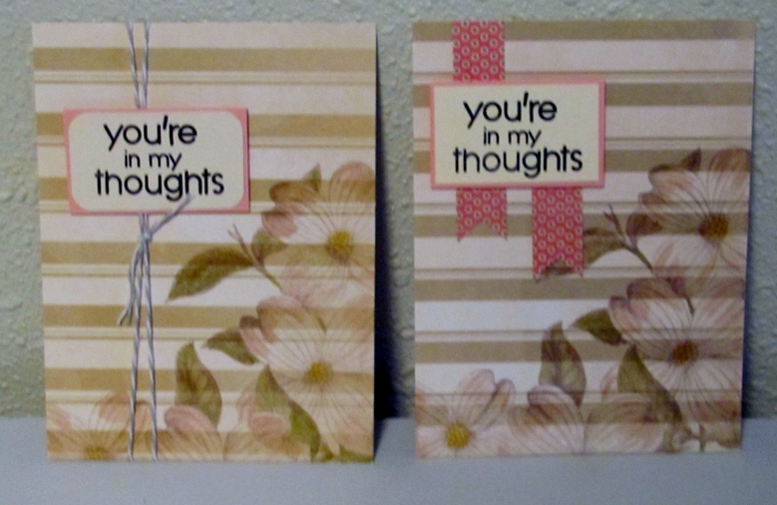
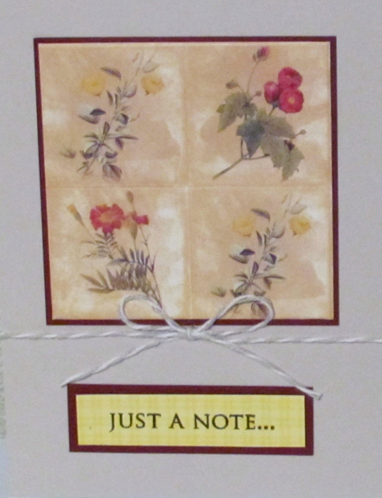
This next one ses a grid of 4 small images, scored and banded n burgundy. I used the same color to mount the stamped sentiment. Both are adhered to dove gray cardstock and tied with a gray and white bakers twine.

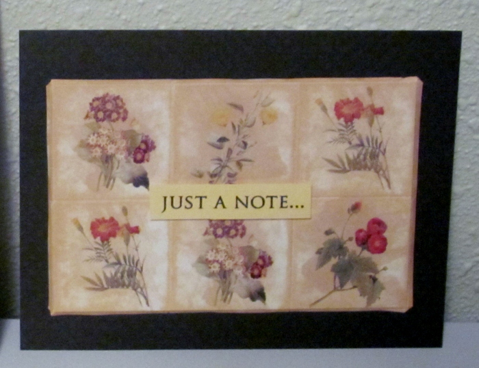
A grouping of 6 tiles, scored, are mounted on a dark dotted cardstock using foam tape. a small sentiment is raised on foam tape in the center, as well.

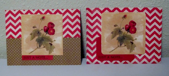
Both of these next ones use one of the medium images. On the left I used a combination of red and white chevron and a tone-on-tone dot. A small red sentiment peeks out from under the image. On the right I used a full background of the chevron and rounded the corners of the sentiment and image. Both are popped up on foam tape.

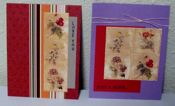
On the left, I used a vertical strip of three small images. A vertical stamp was used on the right on sage cardstock. I backed the image with a striped paper over a patterned rust cardstock. On the right is a grid of four small images where I used a white gel pen to reinforce the creases in a sketchy line. The sentiment block is dropped to the left over purple cardstock. A wrap of scrappers floss is knotted at the top.


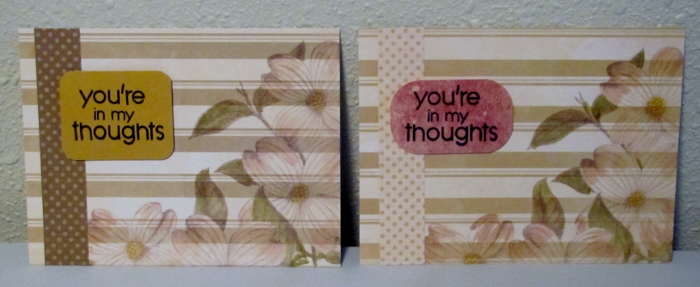
Here on the left I used a single small image, backed it with a dark dotted card over a golden sentiment block. A simple dotted background finishes it. The card on the right uses a strip of three small images and features a vertical sentiment on the right. The purple cardstock base is enhanced with gold peel-off stickers in the corners.


The card on the left features two small tiles with rounded corners as well as a small stamped sentiment with rounded corners. Both are popped up on foam over a die-cut oval tinted with distress ink. The dark green card base has deep rounded corners.


Last, but not least, the card on the right uses two small images linked with a sage sentiment strip. Two die-cut scrolls in golden cardstock are used to enhance the raspberry background.

12 cards from 2 12 x 12 sheets!

Ddd


Posted by studio3d@ccgmail.net at 12:01 AM PST
Wednesday, 7 November 2012
Grapes of Wrap
Topic: Backgrounds

This large botanical is of luscious grapes with a glittery finish. I had two of these prints and treated them exactly the same.

I used a dusty purple sentiment strip and wrapped bakers twine around three times before tying a knot.

Little juicy bites!

Ddd


Posted by studio3d@ccgmail.net at 12:01 AM PST
Tuesday, 6 November 2012
Just Peachy
Topic: Backgrounds

Well, it's back to the botanical 12 x 12 cardstock pad.

Today I used one of the big prints with glittery finish - of Peaches! For the one on the left I cut a sentiment strip with a flag end and used one copper brad on the right end.

For the one on the right I made the sentiment go all the way across and placed three copper brads underneath.

Ddd


Posted by studio3d@ccgmail.net at 12:01 AM PST
Monday, 5 November 2012
Punch JUNK - Product Review
Topic: Supplies

My large circle punch started chewing the edge and will not punch plain paper at all. So I went looking for another and decided to get the Fiskars Everywhere Punch to give myself more versatility. Unfortunately, the round punch is an 'add on' and you have to buy the 'starter kit' to use it. OK, I did it - I bought them both. The starter kit comes with a square Everywhere Punch.

The starter kit is the black base ring and the clear alignment ring. Half of the punch drops into the base and then the clear alignment ring is placed on the paper and both are laid on the base. They hold together with the embedded magnets and then the punch is placed on top and depressed to punch out the shape.

Here's the bad news - you CANNOT use the part that is punched out! WHAT???? All I get is a shaped hole and a piece of scrap paper? Yep!

See those three prongs in the center of the punch? They poke three holes in the paper before they punch out the shape!


Well, frankly that makes it pretty much useless to me. The worst part? There is no hint of this on the packaging anywhere. And to get into the product you have to totally destroy the packaging so there is no returning it.

Extremely disappointing all around.

NOT RECOMMENDED.

Ddd


Posted by studio3d@ccgmail.net at 12:01 AM PDT
Sunday, 4 November 2012
What's Your Impression of this!
Topic: In the studio

When you work in a library for 38 years you have a tendency to want to organize and catalog things. Just because you retire, that tendency does not go away.

I've been just keeping my embossing folders in a drawer and rummaging through them to find one that might suit the project I have in hand. So, I got them ALL out and made an impression of each on plain white cardstock. On the back I wrote the manufacturer and the folder name. Then I hole-punched them all and strung them on ball-chain.


I have them sorted by the style: dots, swirls, fabrics, grid, borders, oversize, mini, and many more categories.


I have these hanging over my work area so I can quickly find an appropriate design and then go find the folder to mak it on my project.

Ddd


Posted by studio3d@ccgmail.net at 12:01 AM PDT
For Future Reference
Topic: Books

YAY! I was gifted with a new book on making mini-books! I haven't made any for quite a while but I am definately inspired to get back to it. Here is the new title:

LOVE the tiny necklace book, leather covers, a book of cards, and SO much more.


I actually have quite a number of books on making books in my collection. Here are my favorites:


Hmmm, I need to go make books now.

Ddd


Posted by studio3d@ccgmail.net at 12:01 AM PDT
Friday, 2 November 2012
Ah One, and a Two
Topic: In the studio

Here is another way I have gathered together inspiration for myself. I have great intentions of doing scrapbooking but other things always take first place and it gets set aside over and over.

But I have collected lots of scrapbook sketches and transfered them to 3 x 5 cards. I file these by how many photos they will display and keep them in a file box.


Here's one for 7 photos (see the number above the sketch so I can file it back in the right place.


and here's one for 4 photos


Someday I will be ready to scrapbook.

Ddd


Posted by studio3d@ccgmail.net at 12:01 AM PDT
Thursday, 1 November 2012
Picture This - On a Card
Topic: In the studio

We're back to 'inspirations' today. I have collected many photos that I use (or plan to use) as inspiration for cards. I chose them for their patterns, colors, layout, or just because I like them. Sometimes I get inspired by a single element in the photo and sometimes try to replicate the design as closely as possible. Some of these I have shown along with their resulting cards on this blog.


Whew! That's a lot of inspiration!

Ddd


Posted by studio3d@ccgmail.net at 12:01 AM PDT

Newer | Latest | Older