« August 2013 »
S M T W T F S
1 2 3
4 5 6 7 8 9 10
11 12 13 14 15 16 17
18 19 20 21 22 23 24
25 26 27 28 29 30 31
You are not logged in. Log in
Entries by Topic
All topics  «
3D paperwork
A - Z challenge 5
A - Z challenge 7
A - Z challenge round 4
A to Z challenge round 3
A to Z round 2
A to Z round 6
A-Z round 1
Around the House
Art Challenges
Artist Trading Cards
Backgrounds
Beads
Bible Journaling
Books
Boxes
Collage
Color Challenge
Coloring
cookbook
Die Cuts
Digital Projects
Digital Stamps
Drawing
Dry Embossing
Fabric Stuff
Fantastic Folds
Field Trip
Home Decor
How Does Your Garden Grow?
Hymnal Art
In The Kitchen
In the studio
Jewelry
Lettering
Links
Multi-Technique
Music to Work By
Musings
Nail Art
New Work
Online Class
Other Hobbies
Other Projects
Painting
Paper Embroidery
Paper Piecing
Photo
Pretty Paper
Quilting
Random
reading
Scrap Recovery
scrapbooking
Sewing
Sketch Challenge
Some Backlog
Stamping
Stencils
Stickers
Supplies
Teabag Folding
Techniques
Testing
tips and tricks
Tutorial
Web resources
Welcome to my Blog
Work By My Friends
workflow
Writing
Blog Tools
Edit your Blog
Build a Blog
RSS Feed
View Profile
Group One
In & Out of Studio 3D
Saturday, 24 August 2013
The Nautilus
Topic: Paper Embroidery

I needed a quick card with a 'beach' theme and turned to this pattern for a sea shell. It takes literally 20 minutes to stitch!

I started with a cardstock in light teal with a pearlized finish. This became the 'water' in the theme. I used a sand thread which becomes the 'beach'. Some houndstooth printed cardstock picked up both of these colors and I bordered the stitched panel with sand cardstock to set it off from the background.

Rounded corners on the main piece soften it in keeping with the shell image.

Sorry the colors are off as the camera does not like the shimmery paper.

Ddd


Posted by studio3d@ccgmail.net at 12:01 AM PDT
Updated: Wednesday, 14 August 2013 3:31 PM PDT
Friday, 23 August 2013
Feeling a Little Flakey
Topic: Paper Embroidery

I took a little time to use some more stitching stickers to build up Christmas card stock. I had a strip of soft pink cardstock and three silver stitching stickers. A little dark pink thread was used for the details. Nice!

So while I was already running along that track I pulled out some cardstock with a pink lace print and bordered my stitched strip with dark pink to match the thread.

While not the usual winter colors, this really came together well. It won't get a sentiment either as it can then be a Christmas, winter or 'hello' card.

Ddd


Posted by studio3d@ccgmail.net at 12:01 AM PDT
Thursday, 22 August 2013
In Distress
Topic: Pretty Paper

Hmmmm... I'm not sure distress papers come under the category of 'pretty' papers, but...

I had some of the papers from a pad of the Tim Holtz distress line and did some of that paper whacking and mix and matching. They ended up pretty bland because the papers are so similar so I mixed in some papers from other lines and solids for bordering.

First I added a number strip and an XOXOX strip and red bordering. I had a sentiment stamed on matching red with a built in border and trimmed it with a thin border.


Two of the cards use the license plate paper and bordering in dark blue. With different paper scraps and colors of the same stamped sentiment I got quite different looks. On a blue one I used more muted colors of scraps.


Red scraps pick up color from some of the plates for more pop.


The backing and bordering is more subdued on this one. It actually is more contrast in person. I used lots of tiny scraps for some interest and added the word 'missing' over the pre-stamped 'home'.


On both of the last two cards I added a strip of patterned paper with cookoo clocks and used the same stamped sentiment. I did one with brown bordering and a yellow-green sentiment block.


Then I used a lime green to echo colors in some of the clocks. The sentiment on this one was stamped on a redish brown that matches some of the clocks, too.


The sentiment on every one of these is popped up on foam tape.

Ddd 


Posted by studio3d@ccgmail.net at 12:01 AM PDT
Updated: Monday, 5 August 2013 8:57 AM PDT
Wednesday, 21 August 2013
Three Little Roses
Topic: Pretty Paper

Four pieces of patterned paper with polka-dots and a trio of tiny roses were the jumping off point for the cards today. I pulled some papers to support them along with some embellishments and made four very different finished projects.

For the first one the support papers are a teal stripe and a beige  number strip that support the colors of two of the tiny roses. I chose a light teal card base and bordering paper. From a sheet of clear stickers I chose a little hedgehog in a watering can and a bumblebee. These were placed on the bordering paper and trimmed out with a thin border. A stamped sentiment was bordered, too, and it as well as the stickers were popped up on foam tape.


For the next one I went with a much brighter base card and bordering color. The patterned papers I used in the background were smaller pieces so I added black line borders to help everything pop out more. I had the sticker with the sentiment and popped up roses on it but the roses were cream colored. I used an alcohol marker to change them to yellow to match the roses in the feature paper.

For the third card I pulled out a gold peel-off sticker of a grouping of roses. I placed them on blue cardstock with green under the leaves and trimmed along the outside. This maked a feature of roses that match the tiny ones in the designer paper. The color theme is continued with the teal patterned paper (with dots) and bordering color of dark green which is the same paper used behind the leaves. The sentiment is stamped on a coordinating kraft paper and it as well as the feature roses are popped up on foam tape.


The final card keeps the dark green base card and bordering but the background papers are too small to cover the entire surface. This leaves some nice blocks of solid color to work with. I had these dragonfly stickers where only the bodies stick down. They are gold but the wings are transparent. I stuck them to some of the dark green and trimmed them out along the wings. On the green I used a gold gel pen to trace the wings and then stuck them down to the card front. The gold wings are then folded up to float over the surface.


I sat around one day and got out bunches of my sentiment stamps and stacks of small scraps in all colors. A marathon stamping session ensued after which I filed them with dividers for easy access.

One of these stamped sentiments was trimmed out for this card, getting a banner end and a thin green border.

Ddd


Posted by studio3d@ccgmail.net at 12:01 AM PDT
Tuesday, 20 August 2013
Four-Square
Topic: Pretty Paper

Bits and pieces of some of the 6x6 pads I worked with a while back. As I flipped back and forth between the faces of the reversible papers I came up with this arrangement that I liked best. they are all popped up on foam tape. I used yellow as the base card as a nod to the tiny bits of it appearing in the upper right and lower left blocks.

In a supplies swap I got a sheet of floral elements in multiple tones of pinks. I selected these as the best to used andused Glossy Accents to seal the glitter they had used for the centers.


I pulled a pre-stamped sentiment and trimmed it to fit in the space at the bottom. As a last-minute thought I cut two flag ends and tucked them underneath to make it look like a banner. The center in popped up on foam tape while the ends are glued to the card base. I used a little grey marker to add a shading at the ends of the sentiment.

Ddd


Posted by studio3d@ccgmail.net at 12:01 AM PDT
Monday, 19 August 2013
Bunches of Hearts
Topic: Pretty Paper

I took the last of the 6x6 pad cutups from the hearts and romance lines and they were these strips. I lined all 5 up and attached them to a red card base.

I started out using just a sentiment, bordered in red and popped up on foam. Then I looked at the strip with the multi-patterned hearts and had the idea to add even more hearts.I pulled these from my bin of punched out items, some of which I got in swaps years ago. I sorted out blue, teal, pinks and reds, layered some of them and scattered them across a diagonal line.


Two of the hearts are on the same level as the popped up sentiment.

Ddd


Posted by studio3d@ccgmail.net at 12:01 AM PDT
Sunday, 18 August 2013
A Pattern of Thanks
Topic: Pretty Paper

More of the 6x6 cutup papers today!

I had never used this sentiment stamp so wanted to give it a run. It is just wonky enough to make it look like it is stamped with individual letters. I had the doilies on grey paper which went with it and pulled the red hearts to offset it. I had the scrap heart from an old sheet of printed images and loved the way it looked with the combination.


The use of red borders unifies the whole thing on the grey background paper.

Ddd


Posted by studio3d@ccgmail.net at 12:01 AM PDT
Saturday, 17 August 2013
Hangin' On The Line
Topic: Pretty Paper

I had some leftover sets of papers from my giant 6x6 pad cut-up session a while back. One featured this cute paper of little banners hanging from lines.

I got out some bird stamps and made 5 little impressions before adding their little legs with a fine-line pen. I added some complimentary strips of paper and then a simple bordered stamped sentiment.

The sentiment is popped up on foam tape as a little added interest.

Ddd


Posted by studio3d@ccgmail.net at 12:01 AM PDT
Friday, 16 August 2013
First Fruits (Or Second, Or Third)
Topic: How Does Your Garden Grow?

We've actually had lots from the garden already thid year but these are the first carrots I pulled up (back in mid-July). They are coming along nicely and are very sweet and tender.


We've also consumed a single turnip, lots of lettuce, spinach, a dismal few radish, and a few strawberries. By the time you read this we will have added to that potatoes, beets, beans, and peas. There is a possibility that corn and tomatoes may be on the menu by now as well.

Yummy summer bounty!

Ddd


Posted by studio3d@ccgmail.net at 12:01 AM PDT
Thursday, 15 August 2013
Paws and Reflect
Topic: Quilting

I've been working bit by bit on this quilt for many months, sometimes setting it aside to work on something else when I needed to contemplate the best way to tackle the next step. I had been collecting fabrics and ideas for about a year before I started, picking up some prints with labrador puppies on black and on cream, some paw prints, on black and on toast, some bones on black, and other supporting fabrics in gray/black, golden/brown, and an appropriate backing.

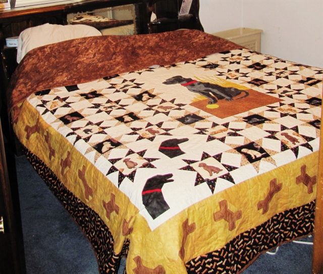
First, a look at the final product (do you realize how hard it is to photograph a king-size quilt all by yourself?)

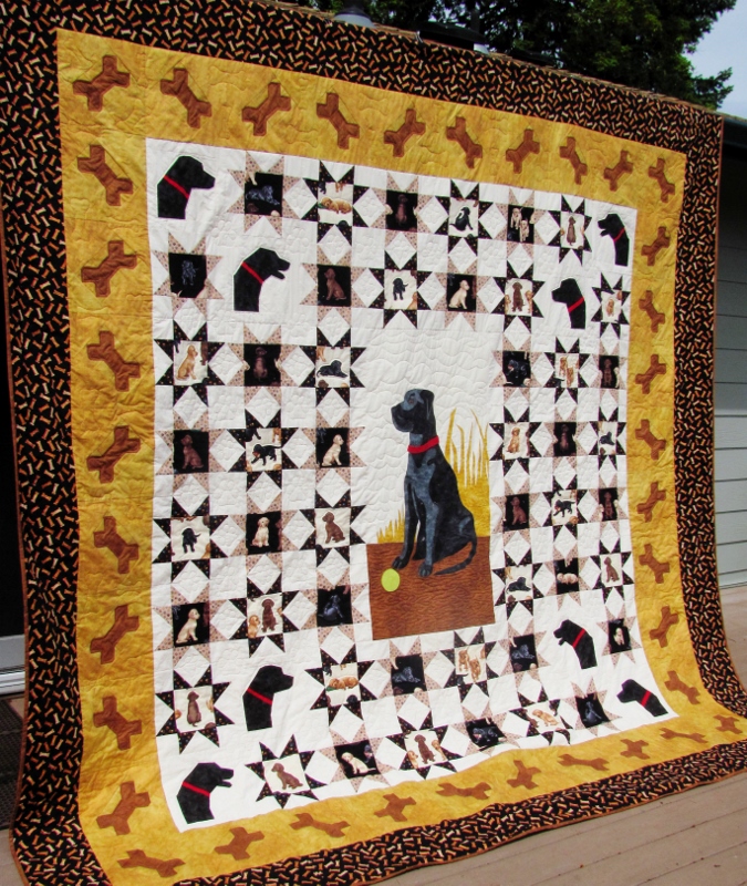
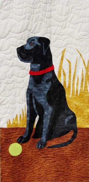
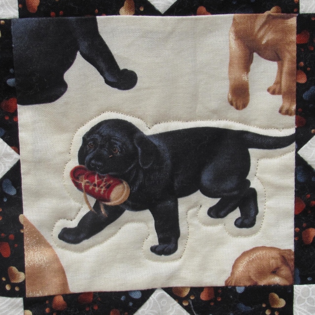
One day I finally had a plan in place but still had a lot of work to do in designing the blocks.  I found the pattern for the appliqued centerpiece (20" x 40") at http://www.quilterscache.com/B/BlackLabBlock.html although it is for a 9" block and I had to seriously enlarge it! I also added a true-color tennis ball and red collar because that's what our dog had. Quilting for this section was all free-motion fill.

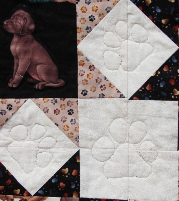
Then I wanted some dog heads for corner pieces and, finding none, I designed paper-pieced patterns myself. I made two versions, one with the mouth open and one closed. Some were reversed so every corner has one of each head and they all face inward. These were quilted with echo lines just outside the black heads.

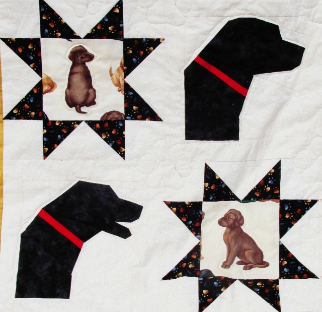
The adorable puppy fabric was fussy-cut so there was one puppy featured in each block. I built star blocks around them using black paw-print triangles around the light blocks and toast paw-print triangles around the black blocks.

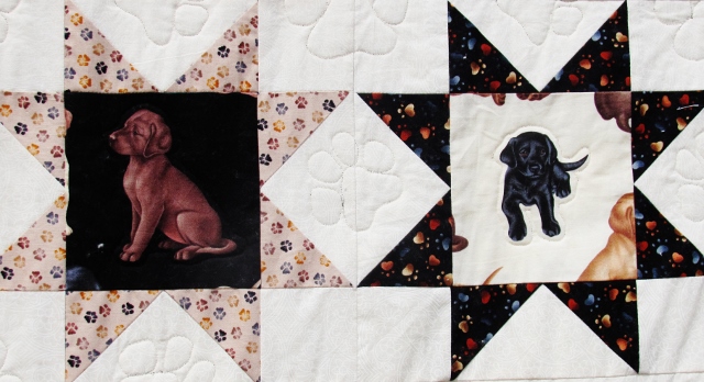
These are all quilted with echos around the featured puppy with thread to match the background.

In all the white diamonds and squares created by the joined stars I did free-motion quilting of paws.


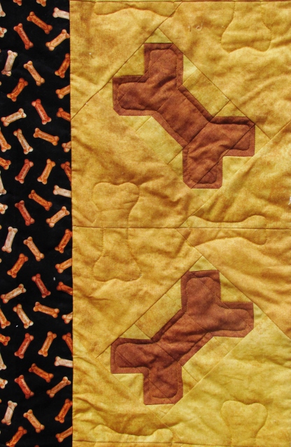
The first border is a pieced block of dog bones. The quilting is a combination of echoing inside the pieced bones and free motion bones in two sizes.


The final border is a nifty bone print (see left above) that is quilted with script listing all the goofy commands we taught Chuck the Dog. These include:

- take a lap (whereupon he would race down the stairs and run warp speed around the perimiter of the one-acre yard and return)

- car (he would go to the side of the road and lay in the ditch until the car had passed)

- speak

- whisper (would get a very soft woof)

- roll-roll (he would bat a tennis ball to you with his nose and wait for you to roll it back to him)

- cheese (he would sit patiently with a slice of cheese balanced on his nose until he got this command that he could toss it in the air and carch it to eat)

- up Chuck (the command to get in the back of the truck to go for a ride)

- window (when riding in the cab of the truck he would put his leg on the armrest to stick his head out)

- wood Chuck (if you wanted him to go get a chunk of firewood off the pile)

- sit, down, and stay

- shake (yep, he would shake all over)

- take a bath (he would run down to his wading pool and get soaked in the water)

- meow (the OK to chase stray cats out of the yard)

- gently (if you wanted him to take something from your hand with just his lips instead of his teeth)

- table (the OK to get up on the picnic table on the deck)

- get your ball (he would take off immediately and always knew exactly where he had last left it)

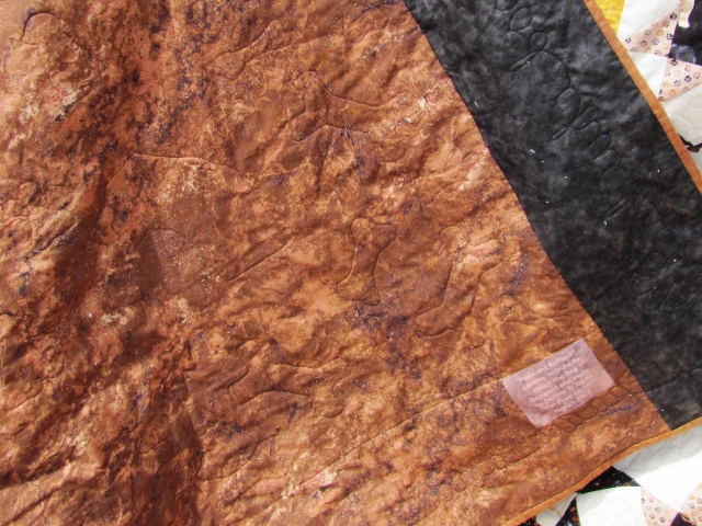
What a goofball he was! In keeping with the spirit of his sense of humor I found the perfect print to use as a quilt backing. You guessed it, it's 'bark'. LOL!

Because I have only a small throated sewing machine I had to construct and quilt this project in stages. I started by joining and adding the star blocks to each side of the center panel. Working with the backing kept whole, I sandwiched this section with its batting in the center of the backing. This section was quilted in full. Then I spliced on batting for the top and bottom section of stars, joined these sections on and quilted them. Then the pieced bones were added to the sides along with their batting and then the same with the top and bottom bones. After quilting these I added batting for the printed borders at the top and bottom and, while adding the side borders, I spliced on side extentions to the backing. These borders were all script quilted and the binding applied.

And now, after all these years, Chuck the Dog gets to be up on the bed.

This quilt was truly a labor of love - for both my hubby and the great dog who inspired it.

Ddd


Posted by studio3d@ccgmail.net at 12:01 AM PDT
Wednesday, 14 August 2013
Ball On A Stick
Topic: Coloring

When I was choosing stamped images to color I finally broke down and just tossed a lot of them that I was sure I never wanted to see again. Hard for me to do, too, but I kept out the best ones. Today I selected a remaining pair of topiary images and colored them with alcohol inks.

First, I cut the image with a diecut, using it half on each side so the result was narrower. I used distress ink on the image to tone down its stark whiteness. Then I backed with complementary patterned papers all banded in green to echo the bush. The stamped sentiment in brown balances the color of the pot.


I left the white background on the second tree and changed up the backing papers. I kept the green borders and changed up the sentiment. I highlighted the illustration a bit more by adding two sizes of red rhinestones where the 'fruits' were.


On the first card the illustration is up on foam tape while on the second card it is used under the sentiment.

Ddd


Posted by studio3d@ccgmail.net at 12:01 AM PDT
Tuesday, 13 August 2013
Love That Flag
Topic: Coloring

Today I'm featuring a couple of patriotic digitals that I colored with alcohol markers.

The first is a patchwork heart flag on which I blended three blues and three reds. I added a touch of golden yellow in the bottom of the stars. I selected three patriotic papers and bordered everything in denim blue. I added a square sentiment and popped it and the heart up on foam tape.


The second digi is a standard flag presentation. I used three reds and two blues to color it and used two yellows for the flagpole. I used only two of the patriotic papers and arranged a tab to contain the sentiment.


The illustration, with rounded corners is popped up on foam tape.

Ddd


Posted by studio3d@ccgmail.net at 12:01 AM PDT
Monday, 12 August 2013
Hello, I'm Your Mummy
Topic: Coloring

I set aside this little guy for about two years because I wasn't sure how to color him successfully nor if he was strong enough to be a feature. Once I got the coloring done with two cool greys and just the hint of light blue I knew I had been successful on the first front.

The secret to keeping him as a feature was to stay with mostly black and white as the background papers. Upon finding just a hint of green in the dotted paper I decided to use that as the bordering color. Some blank space in the upper right called to mind to fill it with a bit of foliage.


There's another good use for the "Hello Handsome" sentiment.

Ddd


Posted by studio3d@ccgmail.net at 12:01 AM PDT
Sunday, 11 August 2013
Cupcake Sitter Critters
Topic: Coloring

Another stamped image from a swap is featured today. I used alcohol markers and did no shading so the colors are pure and bright. I tried to keep that brightness going byusing hot pink as the bordering color to a stripe and a bright orange tone-on-tone paper.


I diecut the illustration and popped it up on foam tape over a tie of yellow twine.

As a last step I used a multitude of Liquid Pearls to fill in the cupcake sprinkles.

Ddd


Posted by studio3d@ccgmail.net at 12:01 AM PDT
Saturday, 10 August 2013
Oh, You Devil!
Topic: Coloring

This stamped illustration that I got in a swap was embossed in black which made it easy to color without fear of smearing the ink. I used alcohol markers and used two warm grey for her and two cool grey for him. Each got some brown for hair and then I decked her out in red accessories.

I used a diagonal cut for the decorative paper background. Grey doilies and pink/red hearts suit the theme beautifully and I bordered everything with maroon.


That saucy sentiment made me giggle when combined with this card front.

Ddd


Posted by studio3d@ccgmail.net at 12:01 AM PDT
Friday, 9 August 2013
Love Bunnies
Topic: Coloring

I'm pretty sure these cute little bunnies are a digi stamp and I have NO idea why I waited so long to color them. Aren't they adorable?

I colored them with alcohol markers using just two tones for each bunny. Afterward, I selected some patterned papers with complementary colors to place over a salmon card base. Bordering with yellow pulled in some lightness from the illustration and some diecut swirls hold it all together.

The simple sentiment was really the only logical choice for this card. I flag cut it, bordered it, and popped it up on foam tape.

Ddd

Posted by studio3d@ccgmail.net at 12:01 AM PDT
Thursday, 8 August 2013
Orange You Glad To See This
Topic: Coloring

Back again with some image coloring. Today the image is one I received in a swap and I colored it with alcohol markers. I wanted to skew the theme toward fall so I used an orange coloring for the bird.

I cut around the leaves on the branch and then cut the rest of the panel down to a rectangle and rounded three corners. I dropped a scrap of ColorMe paper behind the leafy area and a greeting stamped on a rusty cardstock. All these elements are bordered with a green to echo the leaves.


The background is a leftover of a project from LONG ago and I am not entirely sure which one! LOL! It is possible it is a portion of a geletain print. Then again, maybe not.

Ddd


Posted by studio3d@ccgmail.net at 12:01 AM PDT
Wednesday, 7 August 2013
Out Of The Stashes
Topic: Scrap Recovery

I ran across some 'kits' of card bits and pieces that I had put together about a year ago. WHAT? Unfinished projects? Can't have that!

First, I had put together a striped background paper and a colored crayon box image out of a scrapbooking page-a-day calendar. I added a couple of strips of leftover patterned paper from other projects and a blue card base. I also had a blue diecut swirl.

I just brought them all together by using blue as a border to each piece and layering them in a pleasing arrangement.


The next kit had a red card base, checked paper, a tag, a printed circle and a diecut word. Since so much of the red base was exposed I chose blue as the bordering color. I tied red and blue twine around the base of the tag and popped the word circle up on foam tape.

Next up was a dark yellow card base with a strip of text scrapbook paper, a checked strip from the scrapbooking page-a-day calendar and one of those sundresses made from a large scalloped circle. I had run the dress through a Cuttlebug folder for texture. bordered the dress and the checked strip on dark yellow and added ribbon to the dress for straps and a belt before mounting on foam tape. I pulled a stamped sentiment out of the file and bordered it with blue.

Last project was a mix of patterned strips and a couple of blocks. I also had an illustration from the scrapbooking page-a-day calendar and a couple of diecut swirls. When I mounted the strips to form a background I ended up with that bold red stripe down the right side. I used this as a color key to breate borders for the blocks. Then I cut my illustration to the same size as the blocks and bordered it too. I pulled a stamped sentiment from the file and bordered it with the red before arranging and mounting all the elements. The sentiment and illustration are popped up on foam tape.

Just a few more sessions like this and I will have all these old 'kits' used up. THEN what will I do?

Ddd


Posted by studio3d@ccgmail.net at 12:01 AM PDT
Tuesday, 6 August 2013
Multi-Purpose Word Frame
Topic: Stamping

I have a set of clear stamps that is strictly text - individual words. These can be mounted on a single acrylic block to form sentiments and phrases. I had an idea to use multiple words to make a frame for joyous occasions.

I placed the words with three corners being made of two word phrases. After I stamped this it wasn't clear that it was not one big run-on sentence so I used markers to color block them. I also used marker to frame the center sentiment which is from a different set entirely.

On two of the cards I used two clock images to do second generation stamping in brown ink to create a background, rounded the corners and distressed the edges with old paper distress ink. The last card has no distressing or background stamping.

After that it was just the mounting. I cut a 6" paper apart so I could spread it to go to the ends of my 5x7 card base (with a thin border exposed). Then I cut and bordered an accent strip to cover this gap. I tied colored twine (on two of them), mounted the bordered sentiment on foam tape and added some bling to finish it off.

This first one I sent as a graduation card for a young lady:


And the second one was a birthday card for a man

The third one was also a birthday card but for a woman. I used a different center sentiment on this one, too.


I think this makes a good mix of masculine/feminine, non-specific celebration occasions, and vintage/modern.

Ddd


Posted by studio3d@ccgmail.net at 12:01 AM PDT
Updated: Friday, 28 June 2013 1:51 PM PDT
Monday, 5 August 2013
Hop-a-Long
Topic: Coloring

Well, this has been a looooo-o-o-n-g stretch of coloring images. But today marks the end of those so we will move on to something else after today.

For this last round I stamped and colored with alcohol markers some little green frogs. I have no idea why they are wearing crowns. I think they might be companions to some other stamps with a castle, a carriage and something else I've forgotten. If so, they would represent fairy tales and this must be the frog prince.

On the first I used some distressed papers and green ribbons over a taupecard base. The sentiment suits the 'kiss the frog' under-message.


More busy papers on this one with embellishments of crocheted trim, ribbon and twine. I stamped the sentiment words onto separate strips of striped paper.


I love this fine blue dot paper and decided to add just a bit of zing with the green chevron paper. A little green twine ties into the frog and a sentiment stamped on white echoes the border on him.


I used the same papers as before but with a different balance. the same sentiment was used and this, again, uses a blue card base.

Actually, I am more than ready to move on to a new focus.

Ddd


Posted by studio3d@ccgmail.net at 12:01 AM PDT
Updated: Monday, 5 August 2013 8:58 AM PDT

Newer | Latest | Older