« September 2013 »
S M T W T F S
1 2 3 4 5 6 7
8 9 10 11 12 13 14
15 16 17 18 19 20 21
22 23 24 25 26 27 28
29 30
You are not logged in. Log in
Entries by Topic
All topics  «
3D paperwork
A - Z challenge 5
A - Z challenge 7
A - Z challenge round 4
A to Z challenge round 3
A to Z round 2
A to Z round 6
A-Z round 1
Around the House
Art Challenges
Artist Trading Cards
Backgrounds
Beads
Bible Journaling
Books
Boxes
Collage
Color Challenge
Coloring
cookbook
Die Cuts
Digital Projects
Digital Stamps
Drawing
Dry Embossing
Fabric Stuff
Fantastic Folds
Field Trip
Home Decor
How Does Your Garden Grow?
Hymnal Art
In The Kitchen
In the studio
Jewelry
Lettering
Links
Multi-Technique
Music to Work By
Musings
Nail Art
New Work
Online Class
Other Hobbies
Other Projects
Painting
Paper Embroidery
Paper Piecing
Photo
Pretty Paper
Quilting
Random
reading
Scrap Recovery
scrapbooking
Sewing
Sketch Challenge
Some Backlog
Stamping
Stencils
Stickers
Supplies
Teabag Folding
Techniques
Testing
tips and tricks
Tutorial
Web resources
Welcome to my Blog
Work By My Friends
workflow
Writing
Blog Tools
Edit your Blog
Build a Blog
RSS Feed
View Profile
Group One
In & Out of Studio 3D
Sunday, 1 September 2013
Applying the Lesson Learned
Topic: Stamping

As proof that I had learned my lesson, here are three more cards using the same embossed image from two days ago. That one I had colored using alcohol markers and found that they melted the embossing powder. It also removes the shine from the embossing so the image does not have a finished look.

I had stamped and embossed three other times - once on regular cardstock and twice on watercolor paper - when I created the original card. So I colored them up with watercolor markers this time. In each case I used three values on the petals, two on the leaves, and one on the stems.

This first one uses oranges for the blooms. This is the closest to the one I did with alcohol markers and it is on regular cardstock like that one, too. I used an aqua-brush to blend the colors. I bordered with neon green and black before popping up on foam tape over a patterned paper.


The next one is on watercolor paper and I used three bright pinks on the flowers. This got borders of hot pink and black and is popped up on foam tape over a houndstooth paper. I used a bright red-violet for the card base. Love the graphic look of this.


The last one is also on watercolor paper. I used dark pinks and burgundy for this image and darker greens for the leaves. A green and a black border were applied and popped up on foam tape over a third border of burgundy. I placed this all on a latice background so ithad a more formal feel than the others.

I left these all without sentiments to let the illustration remain the center of attention.

Ddd


Posted by studio3d@ccgmail.net at 12:01 AM PDT
Saturday, 31 August 2013
Here Comes The Sun
Topic: How Does Your Garden Grow?

This is the first time I have grown sunflowers. I thought I'd give them a try so we could leave the dried heads out for the squirrels to munch on.

These things shot up like Jack's beanstalk. The second week in August they started to flower.


I am 5'3" and this plant is HUGE! I would say this was a garden success.

Ddd


Posted by studio3d@ccgmail.net at 12:01 AM PDT
Friday, 30 August 2013
Lesson Learned
Topic: Stamping

I needed a card for a swap that used wet embossing. This background stamp is one that I picked up for the online class 'Stretch Your Stamps' last year and I hadn't used it since. But I remembered how awesome it looked when embossed in black and colored with markers.

What I did NOT remember was that I had done the coloring before using watercolor markers. The lesson I learned doing this was that Copics, Sharpies, and other alcohol markers will melt the embossing powder and smear that color into the image.

I was fortunate that I noticed it as soon as I started the first bloom (lower left one) and after that I avoided letting the markers come into contact with the black powder.


I used three oranges, two greens, and a stem brown. Then I bordered the trimmed image in neon green, black, and pumpkin orange. This was popped up on foam tape over a black diamond background on an orange card base.

Ddd


Posted by studio3d@ccgmail.net at 12:01 AM PDT
Thursday, 29 August 2013
Flitting Around Fall
Topic: Scrap Recovery

When I was cleaning up, sorting out, purging stuff in the studio I ran across three strips of paper trimmed from a fall paper. I had thought to make three cards using these as an element but suddenly had the idea to use them together. NICE! I placed them on a red-brown backing card and went looking for other elements to use.

I had in the scraps this round punch-out and a yet-unused dragonfly punch. After punching the dragonflies it leaves a peek-a-boo rim around the bug. This required a backing so I chose a scrap of shiny gold cardstock and trimmed it to a square. A little red-brown bordering it worked perfectly. I popped this up on foam and saw no need to add a sentiment.


I think this has a little asian feel to it.

Ddd


Posted by studio3d@ccgmail.net at 12:01 AM PDT
Updated: Wednesday, 14 August 2013 3:34 PM PDT
Wednesday, 28 August 2013
More Stars In Your Eyes
Topic: Pretty Paper

I just couldn't relax knowing all those papers were cut up and waiting for final design and assembly. So the final session happened much sooner than I had anticipated - the next day in fact!

So here we are, back with the patriotic star papers in some new configurations.

The first set features what I call the bandana paper - red background with multi-sized circles and stars. On the first card I bordered a full strip of this with shorter strips of a white one. I added a few holographic star stickers to the star centers and popped up a large word stamp on foam tape.


The other one got larger borders of white paper and from a cleaner part of the design as well. I punched one star from the red star paper and bordered it with blue to match the sentiment.


Speaking of red star paper, I have three cards with this background. The first got partially covered with solid blue from the set of papers and then I mounted two strips of the blue star paper on foam tape. The sentiment is bordered in red to stand out from the blue strips.


Then I used the blue star paper directly on the red stars and aligned the block so the stars match up. one narrow strip of a flag print leads into the sentiment.


Similar to the last one, this one adds a vertical patterned strip. I changed to a kraft color for the sentiment.


I struggled with the design for this flag paper. I finally decided to place some of the blue star paper over the printed stars. On the first one I stamped different versions of the same sentiment in all the red stripes. I also used a blue pen to define the red/white breaks with faux stitching.


The two remaining ones are identical so I'm only posting one photo. I popped a bordered sentiment up on foam tape inside the blue field and then outlined all the stripes with gold peel-off sticker.


The next set features a paper that doesn't even belong with this set. But then they both use the same accent paper and wide central bordering strip. On the first, I added some small holographic stars in the blue border and double-bordered the sentiment.


The other got a large sentiment stamped on red as a bright focal piece.


The least patriotic paper in the set is the red with white and blue dots. On the first card I accented it with some of the bandana paper and a bit of distressed stripe. The sentiment got double borders.


On the other, more of the dotted paper shows along with a faint star in the background. I kept the accent strips narrow and added a scripture stamp.


This striped paper looks clean and fresh. It has a printed element in the corner so I tried to leave that visible. On the first card a single strip of bandana paper was added and then mostly hidden by the red sentiment.


I covered some of the stripe with large dot paper for this one but left that printed element exposed. A strip of printed script mimics the style of the sentiment block.


The stripes on this one were oriented the other way. I added some blue star paper, a strip of script paper and a large sentiment block. I did little bordering so the papers would blend rather than standing out.


This card uses some of the paper I featured yesterday with the script and large circle element. I added a small bit of dot paper to back the large sentiment block.


At this point, I had used up all the 'kits' I had set up but still had bits that I had pulled out and set aside along the way. When I shuffled them around I came up with coordinated scraps to turn out three more cards.

The first had a lot of wide open blue space. So I punched some red stars and did the distress, score and crease to create three-dimensional elements. I added a silver peel-off star sticker to the center of each. The sentiment block got its edges distressed, too.


The last two each use 5 strips of printed paper in a kind of window shade arrangement. On the first, I added silver peel-off star stickers to the center of some of the printed stars. The sentiment is light to separate it from the background.


And for the last one, which has lighter papers, I punched three stars from a script paper and bordered them in blue. The sentiment got a red border and it is popped up on foam tape along with the stars.


Now I have to go back to creating one card at a time from scratch as the 'kits' have all been used up. Whew!

Ddd


Posted by studio3d@ccgmail.net at 12:01 AM PDT
Tuesday, 27 August 2013
The Stars Are Out
Topic: Pretty Paper

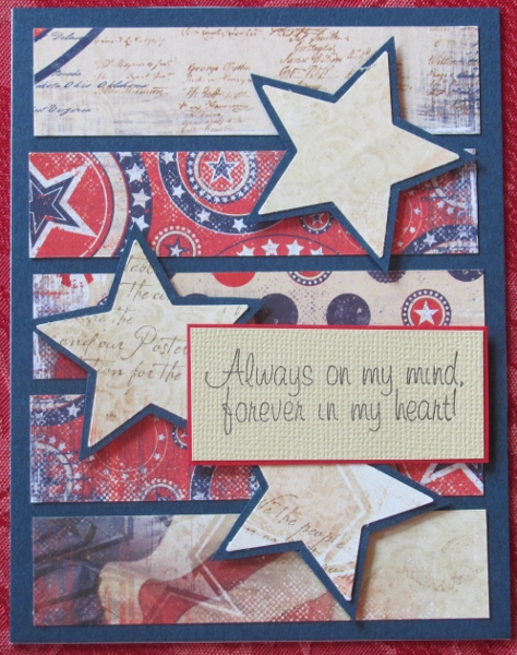
I had a marathon session the other day with a lot of papers from a 6x6 patriotic pad. It was a challenge because all of the papers are very busy prints. I unified them and also defined them by using red, cream or blue bordering papers.

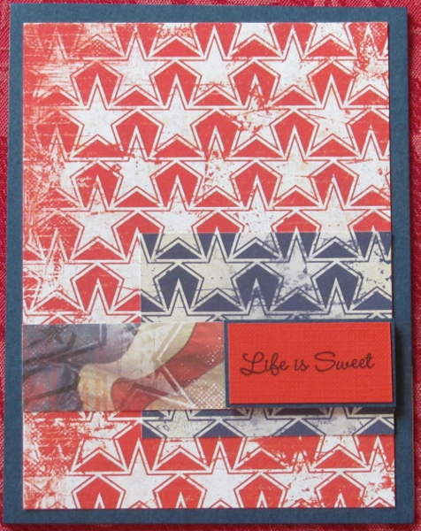
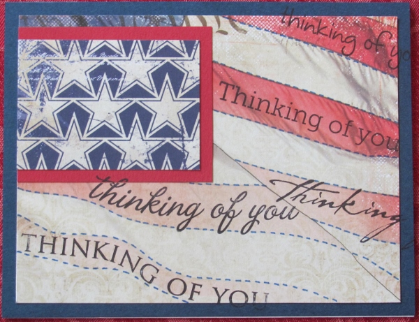
The overall theme element in these papers is the use of stars. I added even more stars on many of the designs and they all got a stamped sentiment.

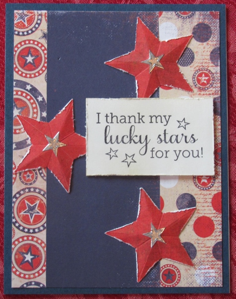
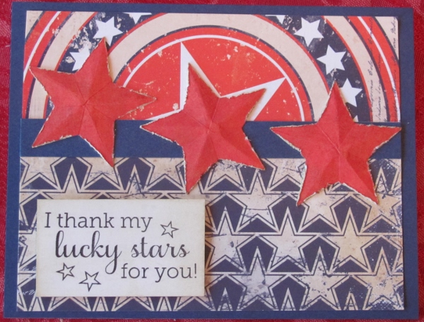
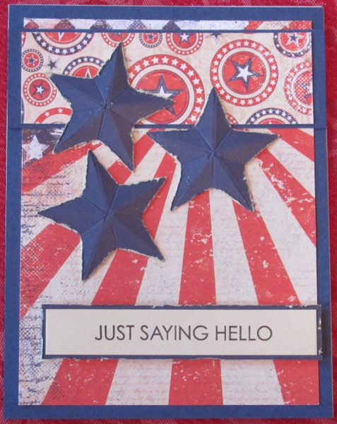
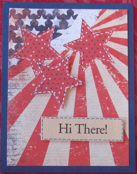
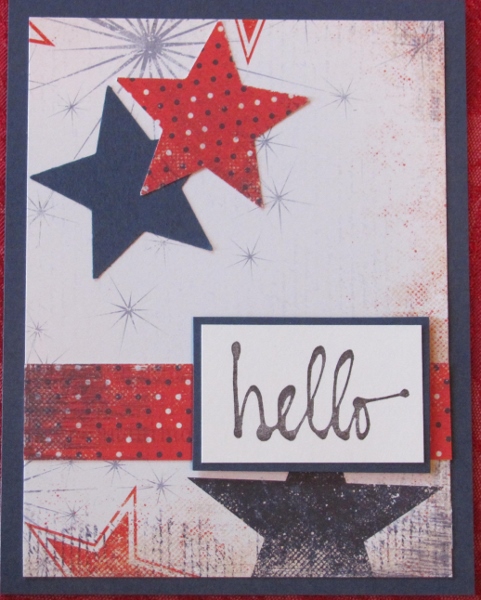
I decided the easiest way to present these was to group them by the most prominent paper design. First up is a set of three with a large-scale circular pattern with a big center star. On the first of these I added blue star paper. I used a large punch to make three red stars and then scored them so they could become three dimensional. I roughed up the edges of the stars and used distress ink to darken the edges.


This one was combined with a paper with patriotic dots. I kept this one pretty simple by just letting the sentiment strip be the only horizontal element.


The combination of papers on this one was just too overwhelmingly busy so I used a whitewash of Picket Fence Distress Stain over the entire surface to mute it. I also used the large star punch to open up the central star and back it with a dot paper that was not part of this set of papers.


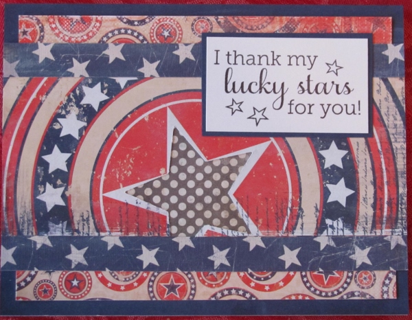
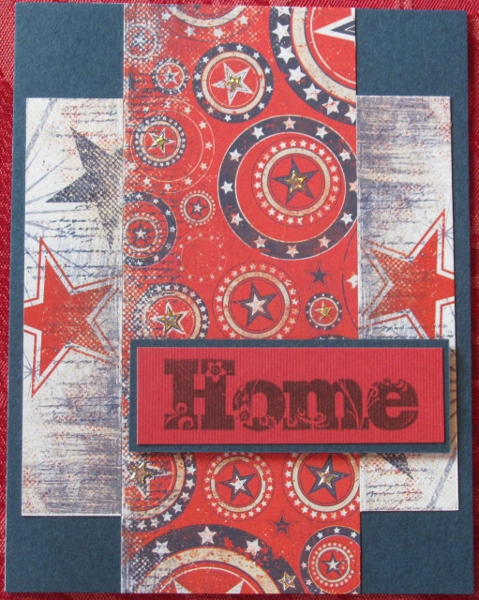
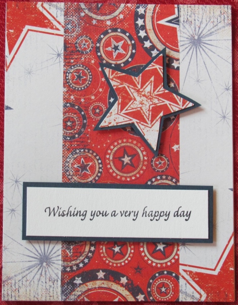
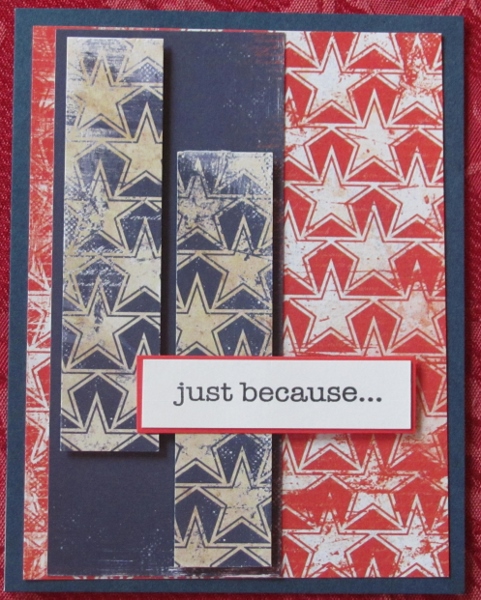
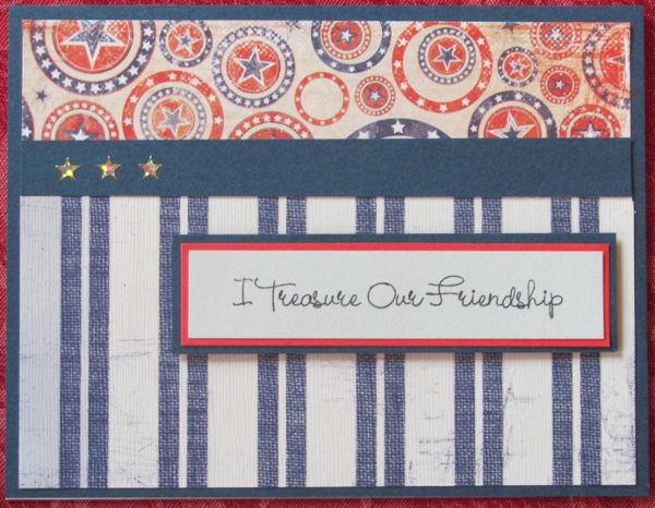
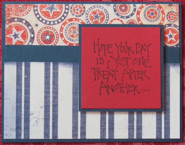
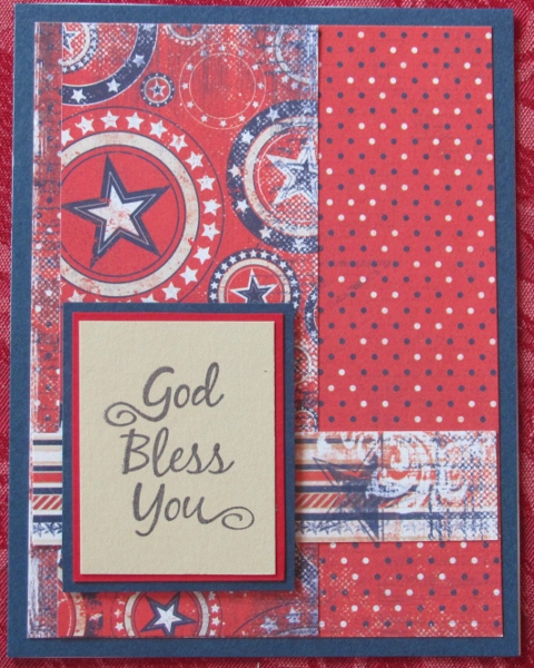
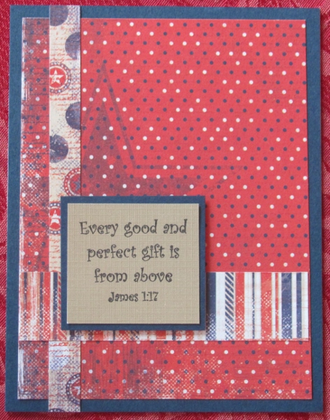
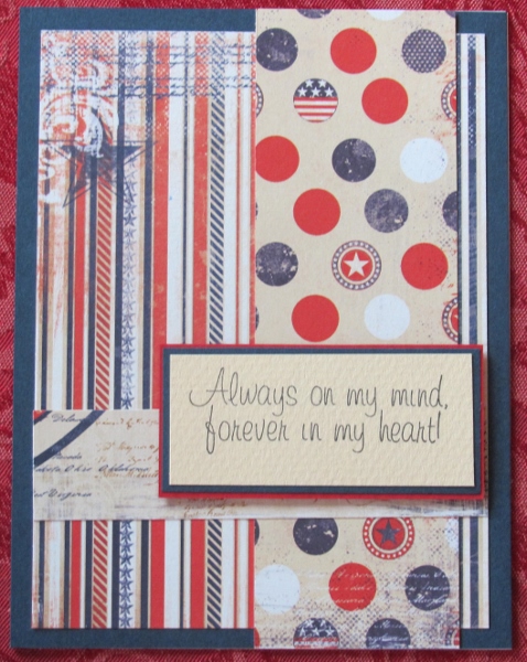
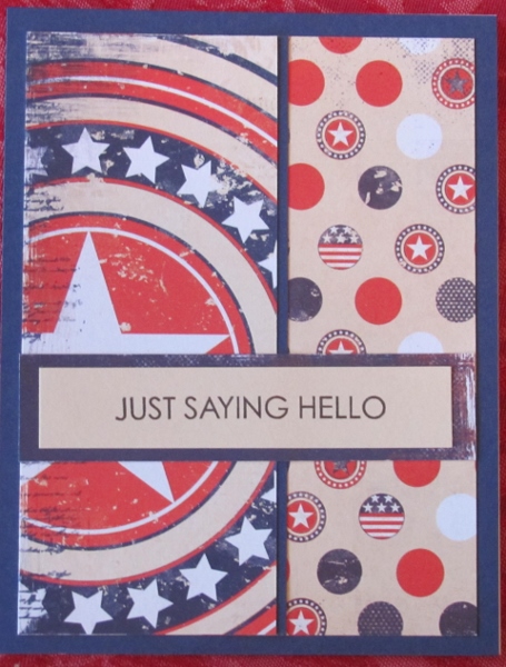
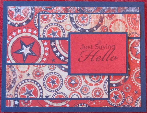
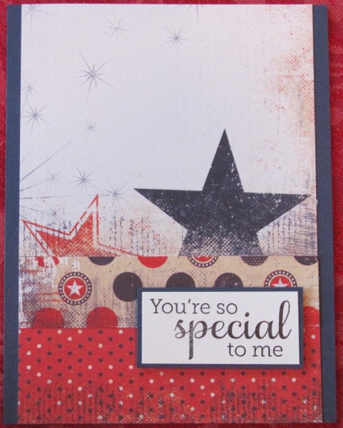
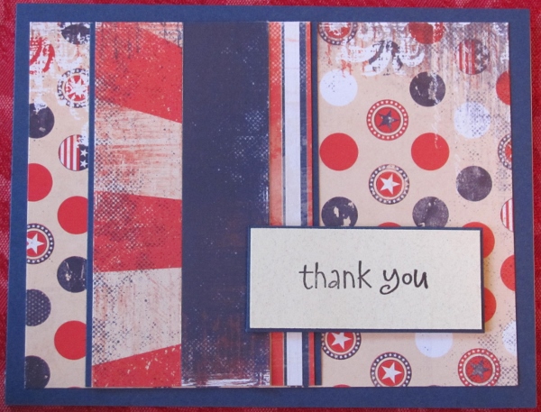
The next grouping uses similar papers of multi-sized circles. Some are on a red background and some on the beige.

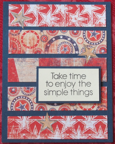
The first card got a couple of strips of repeated star papers and I alighed the stars on them so the color changes but the pattern repeat does not.


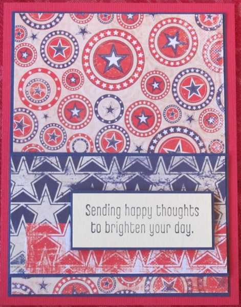
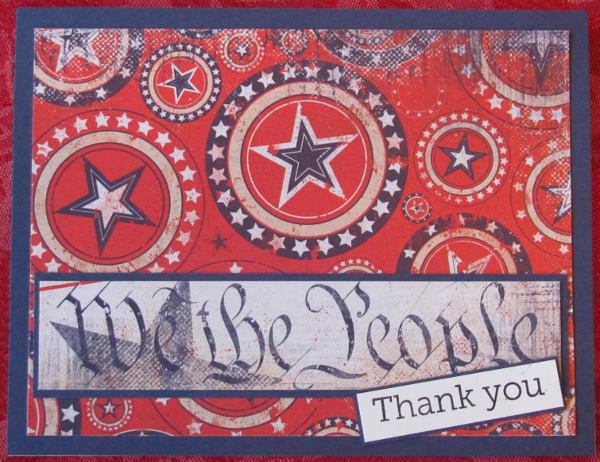
The paper with the red background has larger circles on it. One of the other papers had the word graphic so I used it as a part of a humerous sentiment.


And for the thrid one I used both of the circle papers together. This one reminds me of a bandana. I used a red sentiment block to give the eye a place to rest without creating so much contrast that it would detract from the background design/layout.


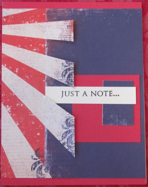
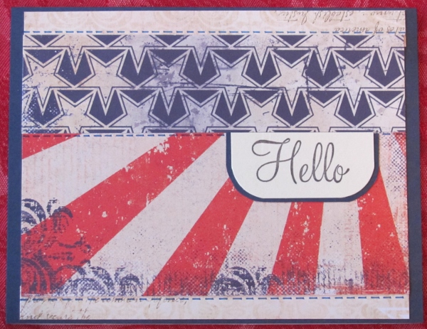
Then I did a group of cards featuring a red and white burst element. On the first card I kept it simple by adding a distressed blue paper from the pad. I sliced the burst paper along the stripes and wove the edge of the blue through it. The ends of the white strips are popped up on foam tape. I added a little graphic element to the right side for the sentiment to rest in.


For the next one I gave the bursts some circle paper to emerge from. I needed more blue for balance so I punched and created more of those three-dimensional stars with distressed edges. To unify the sentiment with the stars I distressed the edges of the bordering strip and popped it up on foam, too.


The burst on this paper emerges from the left corner. I used the large star punch on it twice and mounted red dot paper behind. A third red dot star was puched out and popped up on foam tape. All three of these stars are finished off with dashed lines in white gel pen.


Compared to the rest of the cards today, these three are plain jane. The featured paper is a large open white space with some printed bursts and a couple of stars at the bottom. For the first card I punched out a star shape so the background blue could show through and then added ared dot star popped up on foam. These are the echoes of the printed stars at the bottom. The strip of red dot unifies the elements and is the base for the sentiment block.


For this one I added some patterned papers at the bottom of the card and then raised the feature paper upward to keep the printed stars intact.


The last one is designed exactly the same way with a different mix of papers.


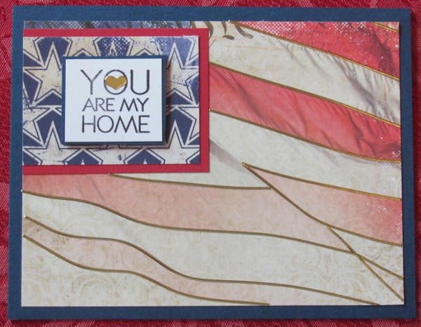
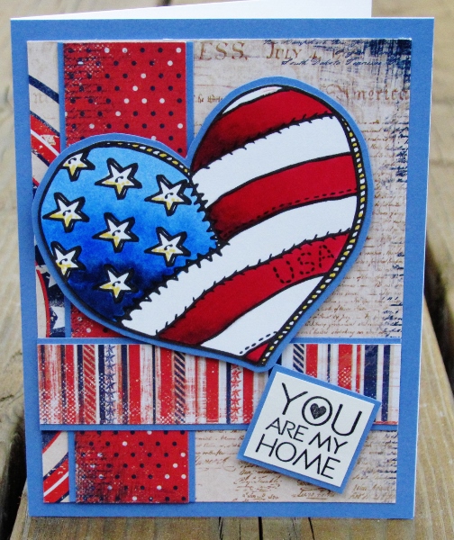
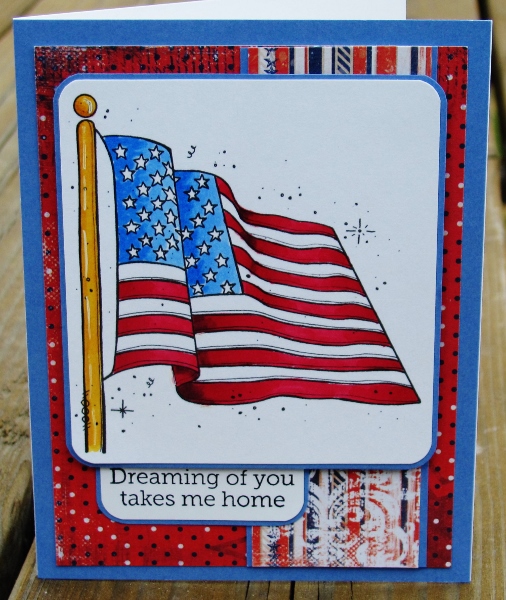
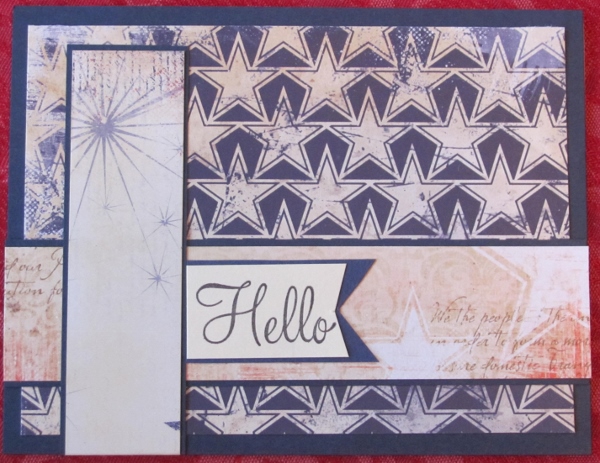
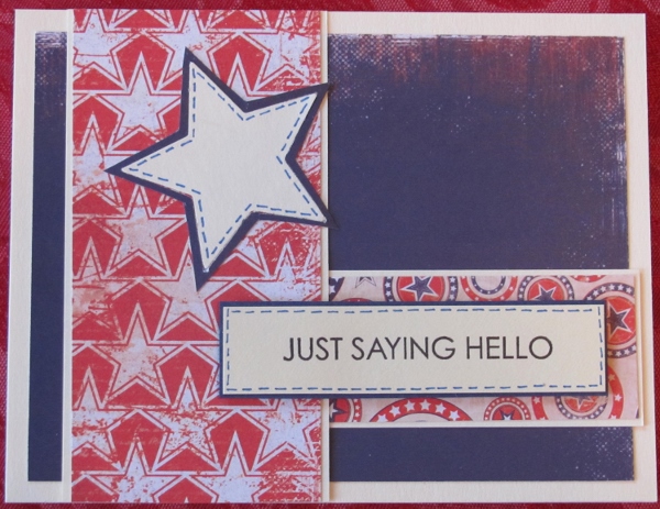
I next have a couple that feature blue star paper. Technically, the first of these could have been included with the burst cards but I like it here. The blue stars with the red and white burst is a clever representation of a flag. I included blue pen stitching along the top, bottom and center as an added nod to the flag construction.


The luck of the draw and the quirk of cutting left this card with no red. Interesting!


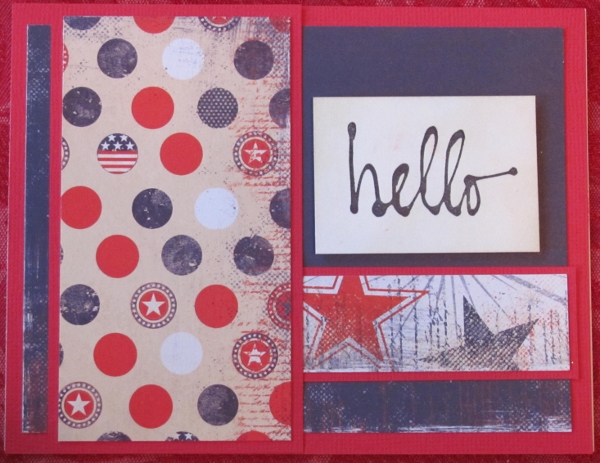
Lotsa Dots. This paper is covered with them and they look to me like little military buttons. I used a solid distressed blue from the pad and this is also one of the few that I used red for the bordering color.


For the next one I used supporting papers with a lot of red in them. I wanted an element for where the strips cross so I used the staar punch on some of the burst paper, bordered it and popped it up on foam tape. A single star from the blue star paper was cut out and added to the middle.


Strips of simple patterns were added to cover a lot of thefeature paper. this takes away a lot of the busy-ness.


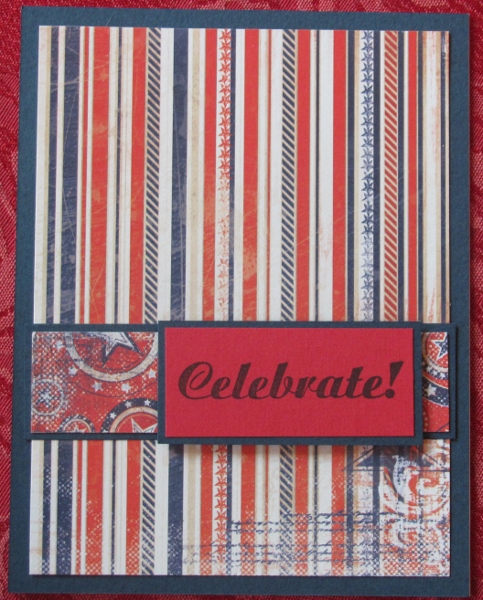
The last three are not really a group as they each feature a different paper. The first uses the solid blue distressed paper as the feature paper. A swath of red star paper adds a little zip and then the use of a cream punched star with faux stitching echoes the treatment of the sentiment. This is the only card that uses cream as the bordering color.


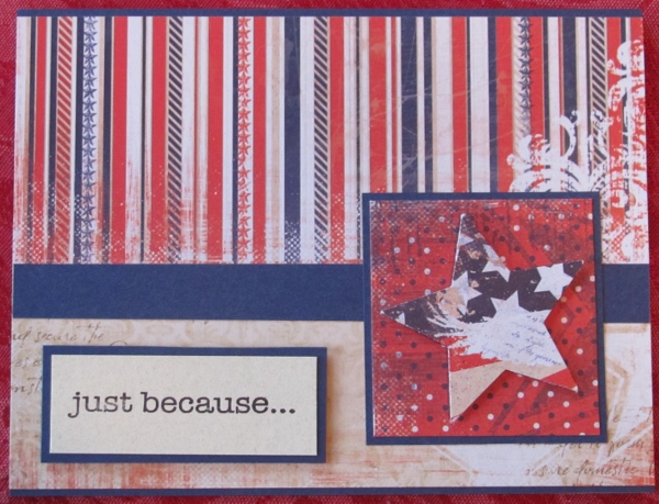
I really like this striped paper in the set. The way it is used here mimics wallpaper so I added a 'chair rail' and a little 'flooring'. I guess that makes the framed star element the chair and the sentiment gets to play the part of a little rug!


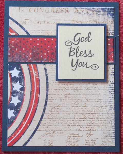
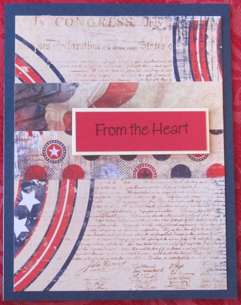
And last, I used a paper that included a text background of the Constitution and a large circle element on the left. I had a scrap of circle element that I had trimmed off when making a different card and added it to the upper right for this one. A couple of strips with designs across the center blend in nicely without bordering them. this allows the red sentiment to stand out when bordered with cream.


And that is all. Yes I really did create all these cards in one session. I had already matched up which papers would be combined on each card and selected the bordering paper. That final session was spent in actual design, assembly and finishing of all 20 of them.

I do still have a lot of this paper pad cut into elements and matched with bordering papers. So another session is being planned.
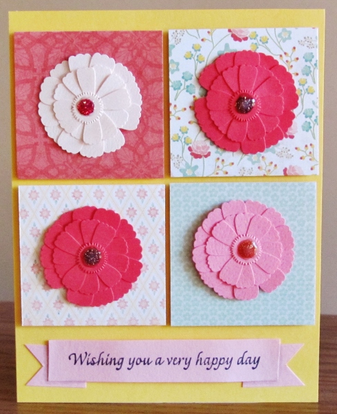
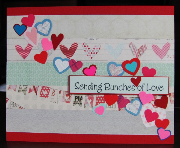
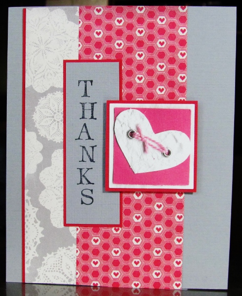
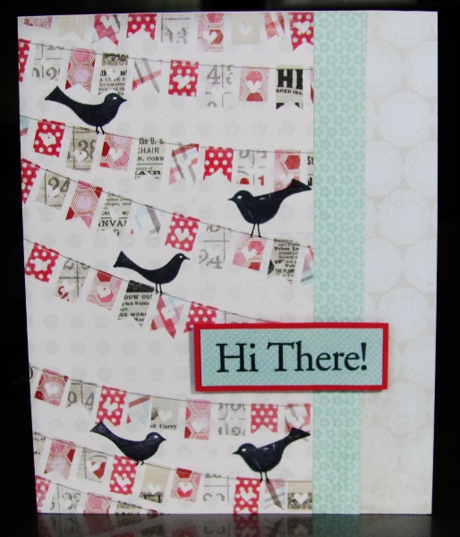
Ddd


Posted by studio3d@ccgmail.net at 12:01 AM PDT
Monday, 26 August 2013
I'm Looking Over a Four-Leaf Clover
Topic: Paper Embroidery

Assignment: Make a paper embroidery card with an Irish theme. I immediately gravitated to clover and shamrock. This is a combination of two patterns I designed for CardMaker Kit-of-the-Month a few years ago.

I stitched with two tones of green thread on a greenish woodgrain paper. This was then layered over a green/white chevron paper and all placed on a white card base.


Wow! My camera really warped this photo. It looks like I used a fish-eye lens. I had a hard time keeping it from washing out the colors to almost white all over.

Ddd


Posted by studio3d@ccgmail.net at 12:01 AM PDT
Sunday, 25 August 2013
Finding the Right Words
Topic: Pretty Paper

I had a big stack and whack session with a 6x6 pad featuring denim prints. When I was done I had enough bits and pieces to create 15 cards using light grey and buff card bases and some browns and dark blue as bordering.

I first went through and built all the card fronts and then went through the stamped sentiments on blues and browns to select sentiments for each one. The results are cards that feature only papers and words. A few also use faux brads and some fine-line pen work.


These would make a good set to box for a gift.

Ddd


Posted by studio3d@ccgmail.net at 12:01 AM PDT
Saturday, 24 August 2013
The Nautilus
Topic: Paper Embroidery

I needed a quick card with a 'beach' theme and turned to this pattern for a sea shell. It takes literally 20 minutes to stitch!

I started with a cardstock in light teal with a pearlized finish. This became the 'water' in the theme. I used a sand thread which becomes the 'beach'. Some houndstooth printed cardstock picked up both of these colors and I bordered the stitched panel with sand cardstock to set it off from the background.

Rounded corners on the main piece soften it in keeping with the shell image.

Sorry the colors are off as the camera does not like the shimmery paper.

Ddd


Posted by studio3d@ccgmail.net at 12:01 AM PDT
Updated: Wednesday, 14 August 2013 3:31 PM PDT
Friday, 23 August 2013
Feeling a Little Flakey
Topic: Paper Embroidery

I took a little time to use some more stitching stickers to build up Christmas card stock. I had a strip of soft pink cardstock and three silver stitching stickers. A little dark pink thread was used for the details. Nice!

So while I was already running along that track I pulled out some cardstock with a pink lace print and bordered my stitched strip with dark pink to match the thread.

While not the usual winter colors, this really came together well. It won't get a sentiment either as it can then be a Christmas, winter or 'hello' card.

Ddd


Posted by studio3d@ccgmail.net at 12:01 AM PDT
Thursday, 22 August 2013
In Distress
Topic: Pretty Paper

Hmmmm... I'm not sure distress papers come under the category of 'pretty' papers, but...

I had some of the papers from a pad of the Tim Holtz distress line and did some of that paper whacking and mix and matching. They ended up pretty bland because the papers are so similar so I mixed in some papers from other lines and solids for bordering.

First I added a number strip and an XOXOX strip and red bordering. I had a sentiment stamed on matching red with a built in border and trimmed it with a thin border.


Two of the cards use the license plate paper and bordering in dark blue. With different paper scraps and colors of the same stamped sentiment I got quite different looks. On a blue one I used more muted colors of scraps.


Red scraps pick up color from some of the plates for more pop.


The backing and bordering is more subdued on this one. It actually is more contrast in person. I used lots of tiny scraps for some interest and added the word 'missing' over the pre-stamped 'home'.


On both of the last two cards I added a strip of patterned paper with cookoo clocks and used the same stamped sentiment. I did one with brown bordering and a yellow-green sentiment block.


Then I used a lime green to echo colors in some of the clocks. The sentiment on this one was stamped on a redish brown that matches some of the clocks, too.


The sentiment on every one of these is popped up on foam tape.

Ddd 


Posted by studio3d@ccgmail.net at 12:01 AM PDT
Updated: Monday, 5 August 2013 8:57 AM PDT
Wednesday, 21 August 2013
Three Little Roses
Topic: Pretty Paper

Four pieces of patterned paper with polka-dots and a trio of tiny roses were the jumping off point for the cards today. I pulled some papers to support them along with some embellishments and made four very different finished projects.

For the first one the support papers are a teal stripe and a beige  number strip that support the colors of two of the tiny roses. I chose a light teal card base and bordering paper. From a sheet of clear stickers I chose a little hedgehog in a watering can and a bumblebee. These were placed on the bordering paper and trimmed out with a thin border. A stamped sentiment was bordered, too, and it as well as the stickers were popped up on foam tape.


For the next one I went with a much brighter base card and bordering color. The patterned papers I used in the background were smaller pieces so I added black line borders to help everything pop out more. I had the sticker with the sentiment and popped up roses on it but the roses were cream colored. I used an alcohol marker to change them to yellow to match the roses in the feature paper.

For the third card I pulled out a gold peel-off sticker of a grouping of roses. I placed them on blue cardstock with green under the leaves and trimmed along the outside. This maked a feature of roses that match the tiny ones in the designer paper. The color theme is continued with the teal patterned paper (with dots) and bordering color of dark green which is the same paper used behind the leaves. The sentiment is stamped on a coordinating kraft paper and it as well as the feature roses are popped up on foam tape.


The final card keeps the dark green base card and bordering but the background papers are too small to cover the entire surface. This leaves some nice blocks of solid color to work with. I had these dragonfly stickers where only the bodies stick down. They are gold but the wings are transparent. I stuck them to some of the dark green and trimmed them out along the wings. On the green I used a gold gel pen to trace the wings and then stuck them down to the card front. The gold wings are then folded up to float over the surface.


I sat around one day and got out bunches of my sentiment stamps and stacks of small scraps in all colors. A marathon stamping session ensued after which I filed them with dividers for easy access.

One of these stamped sentiments was trimmed out for this card, getting a banner end and a thin green border.

Ddd


Posted by studio3d@ccgmail.net at 12:01 AM PDT
Tuesday, 20 August 2013
Four-Square
Topic: Pretty Paper

Bits and pieces of some of the 6x6 pads I worked with a while back. As I flipped back and forth between the faces of the reversible papers I came up with this arrangement that I liked best. they are all popped up on foam tape. I used yellow as the base card as a nod to the tiny bits of it appearing in the upper right and lower left blocks.

In a supplies swap I got a sheet of floral elements in multiple tones of pinks. I selected these as the best to used andused Glossy Accents to seal the glitter they had used for the centers.


I pulled a pre-stamped sentiment and trimmed it to fit in the space at the bottom. As a last-minute thought I cut two flag ends and tucked them underneath to make it look like a banner. The center in popped up on foam tape while the ends are glued to the card base. I used a little grey marker to add a shading at the ends of the sentiment.

Ddd


Posted by studio3d@ccgmail.net at 12:01 AM PDT
Monday, 19 August 2013
Bunches of Hearts
Topic: Pretty Paper

I took the last of the 6x6 pad cutups from the hearts and romance lines and they were these strips. I lined all 5 up and attached them to a red card base.

I started out using just a sentiment, bordered in red and popped up on foam. Then I looked at the strip with the multi-patterned hearts and had the idea to add even more hearts.I pulled these from my bin of punched out items, some of which I got in swaps years ago. I sorted out blue, teal, pinks and reds, layered some of them and scattered them across a diagonal line.


Two of the hearts are on the same level as the popped up sentiment.

Ddd


Posted by studio3d@ccgmail.net at 12:01 AM PDT
Sunday, 18 August 2013
A Pattern of Thanks
Topic: Pretty Paper

More of the 6x6 cutup papers today!

I had never used this sentiment stamp so wanted to give it a run. It is just wonky enough to make it look like it is stamped with individual letters. I had the doilies on grey paper which went with it and pulled the red hearts to offset it. I had the scrap heart from an old sheet of printed images and loved the way it looked with the combination.


The use of red borders unifies the whole thing on the grey background paper.

Ddd


Posted by studio3d@ccgmail.net at 12:01 AM PDT
Saturday, 17 August 2013
Hangin' On The Line
Topic: Pretty Paper

I had some leftover sets of papers from my giant 6x6 pad cut-up session a while back. One featured this cute paper of little banners hanging from lines.

I got out some bird stamps and made 5 little impressions before adding their little legs with a fine-line pen. I added some complimentary strips of paper and then a simple bordered stamped sentiment.

The sentiment is popped up on foam tape as a little added interest.

Ddd


Posted by studio3d@ccgmail.net at 12:01 AM PDT
Friday, 16 August 2013
First Fruits (Or Second, Or Third)
Topic: How Does Your Garden Grow?

We've actually had lots from the garden already thid year but these are the first carrots I pulled up (back in mid-July). They are coming along nicely and are very sweet and tender.


We've also consumed a single turnip, lots of lettuce, spinach, a dismal few radish, and a few strawberries. By the time you read this we will have added to that potatoes, beets, beans, and peas. There is a possibility that corn and tomatoes may be on the menu by now as well.

Yummy summer bounty!

Ddd


Posted by studio3d@ccgmail.net at 12:01 AM PDT
Thursday, 15 August 2013
Paws and Reflect
Topic: Quilting

I've been working bit by bit on this quilt for many months, sometimes setting it aside to work on something else when I needed to contemplate the best way to tackle the next step. I had been collecting fabrics and ideas for about a year before I started, picking up some prints with labrador puppies on black and on cream, some paw prints, on black and on toast, some bones on black, and other supporting fabrics in gray/black, golden/brown, and an appropriate backing.

First, a look at the final product (do you realize how hard it is to photograph a king-size quilt all by yourself?)

One day I finally had a plan in place but still had a lot of work to do in designing the blocks.  I found the pattern for the appliqued centerpiece (20" x 40") at http://www.quilterscache.com/B/BlackLabBlock.html although it is for a 9" block and I had to seriously enlarge it! I also added a true-color tennis ball and red collar because that's what our dog had. Quilting for this section was all free-motion fill.

Then I wanted some dog heads for corner pieces and, finding none, I designed paper-pieced patterns myself. I made two versions, one with the mouth open and one closed. Some were reversed so every corner has one of each head and they all face inward. These were quilted with echo lines just outside the black heads.

The adorable puppy fabric was fussy-cut so there was one puppy featured in each block. I built star blocks around them using black paw-print triangles around the light blocks and toast paw-print triangles around the black blocks.

These are all quilted with echos around the featured puppy with thread to match the background.

In all the white diamonds and squares created by the joined stars I did free-motion quilting of paws.


The first border is a pieced block of dog bones. The quilting is a combination of echoing inside the pieced bones and free motion bones in two sizes.


The final border is a nifty bone print (see left above) that is quilted with script listing all the goofy commands we taught Chuck the Dog. These include:

- take a lap (whereupon he would race down the stairs and run warp speed around the perimiter of the one-acre yard and return)

- car (he would go to the side of the road and lay in the ditch until the car had passed)

- speak

- whisper (would get a very soft woof)

- roll-roll (he would bat a tennis ball to you with his nose and wait for you to roll it back to him)

- cheese (he would sit patiently with a slice of cheese balanced on his nose until he got this command that he could toss it in the air and carch it to eat)

- up Chuck (the command to get in the back of the truck to go for a ride)

- window (when riding in the cab of the truck he would put his leg on the armrest to stick his head out)

- wood Chuck (if you wanted him to go get a chunk of firewood off the pile)

- sit, down, and stay

- shake (yep, he would shake all over)

- take a bath (he would run down to his wading pool and get soaked in the water)

- meow (the OK to chase stray cats out of the yard)

- gently (if you wanted him to take something from your hand with just his lips instead of his teeth)

- table (the OK to get up on the picnic table on the deck)

- get your ball (he would take off immediately and always knew exactly where he had last left it)

What a goofball he was! In keeping with the spirit of his sense of humor I found the perfect print to use as a quilt backing. You guessed it, it's 'bark'. LOL!

Because I have only a small throated sewing machine I had to construct and quilt this project in stages. I started by joining and adding the star blocks to each side of the center panel. Working with the backing kept whole, I sandwiched this section with its batting in the center of the backing. This section was quilted in full. Then I spliced on batting for the top and bottom section of stars, joined these sections on and quilted them. Then the pieced bones were added to the sides along with their batting and then the same with the top and bottom bones. After quilting these I added batting for the printed borders at the top and bottom and, while adding the side borders, I spliced on side extentions to the backing. These borders were all script quilted and the binding applied.

And now, after all these years, Chuck the Dog gets to be up on the bed.

This quilt was truly a labor of love - for both my hubby and the great dog who inspired it.

Ddd


Posted by studio3d@ccgmail.net at 12:01 AM PDT
Wednesday, 14 August 2013
Ball On A Stick
Topic: Coloring

When I was choosing stamped images to color I finally broke down and just tossed a lot of them that I was sure I never wanted to see again. Hard for me to do, too, but I kept out the best ones. Today I selected a remaining pair of topiary images and colored them with alcohol inks.

First, I cut the image with a diecut, using it half on each side so the result was narrower. I used distress ink on the image to tone down its stark whiteness. Then I backed with complementary patterned papers all banded in green to echo the bush. The stamped sentiment in brown balances the color of the pot.


I left the white background on the second tree and changed up the backing papers. I kept the green borders and changed up the sentiment. I highlighted the illustration a bit more by adding two sizes of red rhinestones where the 'fruits' were.


On the first card the illustration is up on foam tape while on the second card it is used under the sentiment.

Ddd


Posted by studio3d@ccgmail.net at 12:01 AM PDT
Tuesday, 13 August 2013
Love That Flag
Topic: Coloring

Today I'm featuring a couple of patriotic digitals that I colored with alcohol markers.

The first is a patchwork heart flag on which I blended three blues and three reds. I added a touch of golden yellow in the bottom of the stars. I selected three patriotic papers and bordered everything in denim blue. I added a square sentiment and popped it and the heart up on foam tape.


The second digi is a standard flag presentation. I used three reds and two blues to color it and used two yellows for the flagpole. I used only two of the patriotic papers and arranged a tab to contain the sentiment.


The illustration, with rounded corners is popped up on foam tape.

Ddd


Posted by studio3d@ccgmail.net at 12:01 AM PDT

Newer | Latest | Older