« December 2013 »
S M T W T F S
1 2 3 4 5 6 7
8 9 10 11 12 13 14
15 16 17 18 19 20 21
22 23 24 25 26 27 28
29 30 31
You are not logged in. Log in
Entries by Topic
All topics  «
3D paperwork
A - Z challenge 5
A - Z challenge 7
A - Z challenge round 4
A to Z challenge round 3
A to Z round 2
A to Z round 6
A-Z round 1
Around the House
Art Challenges
Artist Trading Cards
Backgrounds
Beads
Bible Journaling
Books
Boxes
Collage
Color Challenge
Coloring
cookbook
Die Cuts
Digital Projects
Digital Stamps
Drawing
Dry Embossing
Fabric Stuff
Fantastic Folds
Field Trip
Home Decor
How Does Your Garden Grow?
Hymnal Art
In The Kitchen
In the studio
Jewelry
Lettering
Links
Multi-Technique
Music to Work By
Musings
Nail Art
New Work
Online Class
Other Hobbies
Other Projects
Painting
Paper Embroidery
Paper Piecing
Photo
Pretty Paper
Quilting
Random
reading
Scrap Recovery
scrapbooking
Sewing
Sketch Challenge
Some Backlog
Stamping
Stencils
Stickers
Supplies
Teabag Folding
Techniques
Testing
tips and tricks
Tutorial
Web resources
Welcome to my Blog
Work By My Friends
workflow
Writing
Blog Tools
Edit your Blog
Build a Blog
RSS Feed
View Profile
Group One
In & Out of Studio 3D
Sunday, 22 December 2013
Leaping Away
Topic: Pretty Paper

This is from another 12 x 12 sheet, this one with a border print. I would have prefered the reindeer to be leaping toward the tree instead of away, this is how the layout worked out.

I only added chocolate borders to the top and bottom and a vinyl sticker greeting before bordering with sage green.


Like yesterday, my embellishing spirit wants to add ornaments to the tree with tiny rhinestones - or at least a star on top. We'll see.

Ddd 


Posted by studio3d@ccgmail.net at 12:01 AM PST
Saturday, 21 December 2013
Happy Holidays, Deer
Topic: Pretty Paper

Some of the 12 x 12 papers I bought in closeout a couple of years ago had such large elements printed on them that they weren't really suitable for cards. I though this was going to be one of those but with judicious trimming it works pretty well.

It may be difficult to tell but the only thing added is the Happy Holidays greeting and the striped paper at the base. Everything else is printed on the chocolate background with glossy ink. 


I am sorely tempted to add a red rhinestone to the end of the nose on the reindeer. What do you think?

Ddd


Posted by studio3d@ccgmail.net at 12:01 AM PST
Friday, 20 December 2013
Fields of Birches
Topic: Pretty Paper

While searching for just the right background papers for all the colored images I made lately I came across two sheets of 12 x 12 that were printed with a photo of birch trees. I cut them both down to include some of the snowy ground and the stand of trees behind.

Snippets and strips of the scraps of papers I had laying on the desktop became the simple decor and I went through stickers and stuff for small items to embellish with.

The first for a teddy bear image I had colored eons ago. After the photo I added a faux stitching line around the image, so you'll have to use your imagination on that.

With the same layout I added a simple cup of steaming coffee.


Another part of the winter scene was large enough to cover the whole card. A simple holiday greeting of thick acrylic is the only added element other than the paper strip - one plaid, one stripe.


The last set uses the same plaid and stripe trims. They each for a cardinal acrylic sticker high in the tree. Then one got a Noel sticker and one a larger cardinal above the stripe.


I used the same taupe for bordering on all of these to call attention to the coloring in the trees. After doing so many where the focus was on the stamped element it was not easy to let the background be the focus. This called for restraint in the embellishment stage.

Ddd


Posted by studio3d@ccgmail.net at 12:01 AM PST
Thursday, 19 December 2013
Polar Expressions
Topic: Coloring

The bear is back! And he brought the Christmas trees with him!

I used the same formula for stamping these scenes as I did when I stamped them on watercolor paper before. These three stamped on plain cardstock were colored with alcohol markers, though. I colored all of them at the same time until I was ready for the scarves. Blue for the bear and snow blended with a colorless blender, then the trees and ornaments. The noses and feet got a little cool gray.

For the first bear I gave him a scarf of yellow and orange. He was diecut and backed with a text paper of winter words. I added a strip of coordinating plaid and bordered everything with rust. I cut a couple of the words from the same background and used it as the sentiment.


The next bear's scarf was orange and green. this led to a green background and more of the rust bordering. I chose a dotted paper strip to echo the ornaments on the trees and added a gold peel-off greeting.


And then we get really chilly! With a two-toned purple neckscarf thish guy wanted some cooler colors for bordering and backing. I used some of the snowflake paper with purple borders and added just a small strip of green to pick up color from the trees. A clear sticker provides the sentiment.


All popped up on foam tape, these little bears look quite at home in the snow.

Ddd 


Posted by studio3d@ccgmail.net at 12:01 AM PST
Wednesday, 18 December 2013
Brrrrrrr
Topic: Coloring

There is so little coloring on the images today I probably should have found a different topic label for them. I did get lots of practice coloring white, though!

A very small image of a snowman was stamped on plain white cardstock. He had shading marks drawn in so I used those as a guide for adding some light blue. I used a colorless blender to soften the edges and then used soft pink and green to color the hats and scarves. A little brown for the twig arms was next. On some of them I colored blue for the snow and on a couple the snow has melted off the ground and he stands on grass.

I found some awesome snowflake paper for a background and added pink punched snowflakes and green bordering. I used a variety of diecuts, greeting styles and layouts for 4 cards.


For the ones with grass underneath I switched to green holly backgrounds. The first uses a mint teal bordering and pink snowflakes.


And the last uses shimmery rust bordering on the card base, mint teal on the feature and some patterned snowflakes. I added a sticker sentiment that has a little glitter on the text.

All of the features are popped up on foam tape and the snowflakes are all only glued at the center for some dimension.

Ddd


Posted by studio3d@ccgmail.net at 12:01 AM PST
Tuesday, 17 December 2013
A Trio Of Good Tidings
Topic: Coloring

Oh, those little singing girls are back! This time, though, they've come in watercolored velvet and all in matching outfits. They really are a choir.

I used the ink from Distress Markers to watercolor these three images. Then I used a black marker to turn their 'smirking' mouths into singing mouths and each of them came out a little different. Guess they're all singing different parts.

The first girl is on the 'Mer' part of her Merry Christmas greeting (LOL). I used a coral 'bubble' background paper and a single strip of a solid.


I changed up the diecut shape for this one and lightened the background color. It was too busy for a peel-off greeting so I went ot a plastic sticker. This girl is singing the 'son' part of her message.


This little girl is obviously singing 'JOY'. A coral floral paper with some of the 'bubble' paper frames up the dircut perfectly.


With the background papers allfeaturing the coral side of the coloring duo I used a muted purple as the bordering on all three cards to match the trims on her outfit.

Ddd 


Posted by studio3d@ccgmail.net at 12:01 AM PST
Monday, 16 December 2013
Here We Come A Caroling
Topic: Coloring

This little 'caroling' girl came with a Chrismtas set, though she does not have a single element on her to identify her with the season. Apparently children are not expected to sing at other times of the year!

I created three cards with her colored in alcohol markers. The first uses a not-traditional color palette of gold and coral pink. I used a diecut for the feature and added a thin border of shimmer coral. What a miracle when I found this gradient dot in one of my recently used 6 x 6 pads. The color was perfect! I just added a golden strip and a gold foil greeting.


The next coloring moves more toward the traditional but with a touch of lime in the green and a touch of orange in thered. Very close to fall colors so maybe she is caroling for Halloween. This coloring allowed me to use these variants in the background as well and I even used a mint green in the bordering. I finished this one with a gold peel-off greeting.


Yes, I finally did go strictly traditional in coloring: Christmas red and Christmas green. All the bordering is srtaight-up red and I even found an old paper that was red and green plaid. A red foil greeting with an antique font is the finisher.


THAT should appease the traditionalists!

Ddd 


Posted by studio3d@ccgmail.net at 12:01 AM PST
Sunday, 15 December 2013
In The Pink
Topic: Coloring

I like a little variety in my poinsettias so I decided to do up a set in pink. On the other hand, I'm not fond of the faded yellowed look of those petal tips so mine are not realistic - prettier, just not realistic!

I started out with a pale to medium range of pinks and some leaf to lime greens for the leaves. A pale blue was the way to go for the background. I I used a strip of pink stripe over the greenand added a sentiment in clear sticker.


After that I upped the intensity of the darkest pink and showed more of the lime green in the leaves. This called for more lime in the background green. I kept the pink stripe but used a rub-on for the sentiment.


I went back to the original set of pinks but drew the darkest out further from the center. Yeah, I'm liking this. I kept the same layout but freshened it up with a stripe that echoes the colors and makes me think of ribbon candy. The sentiment on this one is also a rub-on.


Anc, finally, the coloring just as the last one (since I found what I really liked) with a little pink plain background. As I was bordering and trimming the feature block I suddenly stopped before the last trim and realized it would be the perfect place for a silver peel-off sentiment!


Now this big block of four stamps can go back into storage until next Christmas.

Ddd


Posted by studio3d@ccgmail.net at 12:01 AM PST
Saturday, 14 December 2013
Velvety Petals
Topic: Coloring

Three rich reds make up the velvet petals of this poinsettia. I controlled the bleeding of the red by not coloring up to the borders until the very last when all the other ink was dry. Both cards use the same two greens for the leaves but sport different values of blue background.

The first is the lighter blue. I found a scrap of red cardstock that had been run throught the Cuttlebug with the distressed stripes folder. This matched the lightest red from the image so well I fairly makes the blooms glow. I used blue bordering pieces and added a red foil greeting.


The second card is even simpler. I used a green background to echo the leaves and a yellow strip to pull out color from the flower centers. Blue bordering echoes the background in the feature and a red foil greeting nods to the flower colors.


Next time we'll be 'in the pink'.

Ddd


Posted by studio3d@ccgmail.net at 12:01 AM PST
Friday, 13 December 2013
Drunken Birds
Topic: Coloring

You've probably noticed by now that the cards you saw earlier in watercolor painting are now appearing in alcohol marker coloring. I have a limited number of Christmas stamps so I did a little marathon stamping session and made multiple impressions of each on a watercolor pad with Archival black ink and then on plain cardstock with Momento Tuxedo Black. The two inks are each designed to work with a specific coloring medium with out smearing or bleeding.

I colored up most of the watercolor images first and now I'm working on the multiple images in alcohol inks. As usual, I am using a combination of Copic, Bic Mark-It, Spectrum Noir and PrismaColor.

For the shading on this first set of cardinals I tried a method I had used before hoping to control bleeding with the reds. To do this type of shading you use a pale blue first to color the shaded areas. Then you color over the whole image with the feature color and get automatic shading. I used the same method in the pines but I should have used a color from the opposite side of the color wheel like a light orange. 

I used a diecut for the image and this one got plaid paper and a foil red greeting.


Back to the regular coloring method for the birds, using three reds. I used a different die cut shape and a striped background with glitter. The sentiment is a cardstock tag from who-knows-where and I covered the hole with a puffy acrylic sticker.


The coloring on this one is the same as the last. I fancied it up with a different diecut and a more solid background. A single strip of the glittered stripe and three sentiment pieces ( clear sticker, puffy acrylic, and clear thick acrylic sticker) finish it off.


The borderin on all of these is sage to match the coloring of the pines.

Ddd 


Posted by studio3d@ccgmail.net at 12:01 AM PST
Thursday, 12 December 2013
All I Want For Christmas
Topic: Coloring

I bought this stamp several years ago thinking I would like it a lot. I like it very little! I never know how to color it but it looks so lame left in black and white. Many elements do not 'read' well unless they are colored to define them.

So I used pale alcohol markers to color the tree and other greenery and then do spot coloring throughout the rest of it.  I trimmed it out and bordered it in black.

Then I selected a very pale batterned paper for the backing and bordered that with black as well. It was still a little plain so I added a casual smappeting of gold stars along two borders and one in the panel (J*Y).


I was not happy with the definition in the tree image with gifts on the left side so I covered it over with a 'Frost Fairy' shimmer sticker. Much Better!

Ddd


Posted by studio3d@ccgmail.net at 12:01 AM PST
Wednesday, 11 December 2013
Encore Edition
Topic: Coloring

I used the same stamp as yesterday but on watercolor paper. This time I colored it with Distress Markers and an aquabrush. I colored both panels at the same time to allow the paint to dry. the main difference is the first one did not get as dark of impression so it has a more casual look to it.

I took advantage of the casual look and found some patterned paper with a yellow burst on it. With careful centering and cutting I was able to make it look like the sun streaming in behind the window. I bordered with glimmer mauve and added a rub-on sentiment.


The next uses a printed paper with a watercolor look to it that echoes the colors in the feature. I added a single strip of mauve glimmer paper and bordered it all in pale blue. The sentiment is a clear sticker.


Both cards have the feature popped up on foam tape.

Ddd


Posted by studio3d@ccgmail.net at 12:01 AM PST
Tuesday, 10 December 2013
Back To My Roots
Topic: Coloring

This stamp is one of the first I owned when my daughter bought the set of four seasonal stained glass for me. For today's cards I stamped on regular cardstock and colored with alcohol markers.

I did not do any shading on these as I wanted them to look like flat glass rather than 3-dimensional objects. This one was done in 2 reds, 2 yellows, 2 greens and 2 browns. I trimmed the panel and bordered it in black. The base card is also trimmed in black and features a large diamond in two-tone green. The sentiment is metallic red stickers.


For the next I changed some of the colors. One of the blues is lighter and I swapped out orange for one of the reds in the border. I used a rust-colored base card and left bands of it showing downthe sides. Wide strips of yellow and green patterned paper form the background and are bordered in black along the outside edges. I popped the feature up on foam tape and added a peel-off greeting.


The coloring on the last one swaps 2 yellows out for the reds in the border and it certainly changes the character of the piece. I chose to change the orientation for this card and made use of brown and black bordering. The colored background strips were decorated with a gold foil sentiment and gold peel-off stickers.


Stay tuned for an encore....

Ddd


Posted by studio3d@ccgmail.net at 12:01 AM PST
Monday, 9 December 2013
Snowflakes and More Snowflakes
Topic: Coloring

Snow is forecast for today but I'm hoping today's cards are all I see of it!

Last week I showed some cards stamped with the 4-way Christmas stamping block - one day the poinsettia and another the pinecones. I didn't use the side with the holly this year but did stamp several of the snowflakes. These are stamped on regular white cardstock and colored with the palest values of alcohol markers. I did the flakes themselves in yellow, peach and pink and then filled in the swirly background with blue.

These were cut out and all of them matched up with a snow-covered glossy cardstock. It is hard to match up blues but these worked together so beautifully.

For the first card, I used a dark blue shimmer card base and a pink shimmer border on the feature. Then I added a sentiment sticker.


Next I did two identical ones (I KNOW! Right?) by using Sizzix dies to cut the block into a shape and backing it with a larger version of the same die shape. The base border is glimmer white and the shape border in glimmer mauve. These got a plastic sentiment sticker. I'll just show one of them:


I then repeated the style using different border colors. The first uses the same glimmer white for the base and a bright glimer yellow for the shape. The second uses blue glimmer for the base and a pale yellow for the shape. Both got a gold peel-off greeting:


Finally, I used a cream glimmer for both borders and made the block border thinner. This got a couple of penguin stickers and a peel-off sentiment on the feature block.

All of the cards have the feature block popped up on foam tape.

Ddd


Posted by studio3d@ccgmail.net at 8:27 AM PST
Updated: Monday, 9 December 2013 8:47 AM PST
Sunday, 8 December 2013
Window On My World
Topic: Quilting

When life gives you scraps, make stained glass.

WHAT???

I saw a photo of a quilt for which a pattern was being sold and it was SO simple I knew I could graph it out easily and save the cost of a pattern. And it would be in the size I wanted instead of having to convert from the prescribed measurements.

I decided on a rather large block size - 15 inches - composed of sub-units of one 9 x 9, one 6 x 6, and six 3 x 6. Each piece needed to be in the same color family with similar values.

So, I pulled out all my scraps and sorted them into those color families and then into values. I ended up with 10 divisions so I used two groups to make two blocks: 2 orange, 2 dark purple, 1 dark blue, 1 medium blue, 1 teal, 1 pale yellow, 1 bright yellow, 1 pink, 1 dark green, 1 lime green. From each of these I used the largest scrap to cut the 9 x 9 unit (plus seam allowances of course), then selected a largish scrap for the 6 x 6 unit, and on down. If I did not have enough variety I used some fabrics twice as some fabrics could be repeated in the same block but not placed next to each other (this will all make sense when you see the block). Speaking of that, here is my favorite block - in rich dark purple:

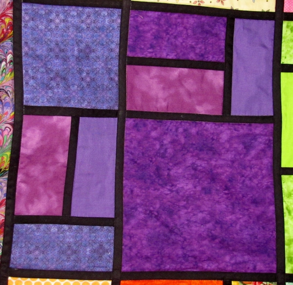
Ah yes, you noticed that black line between each unit. That is 1/2 inch single fold bias tape. I used 1/2 inch Steam-A-Seam2 to attach it after the top was assembled.

The quilt was laid out in a 3 x 4 grid with the center row of blocks rotated one quarter turn.

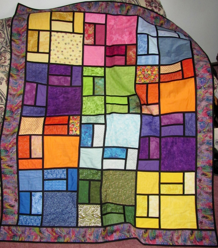
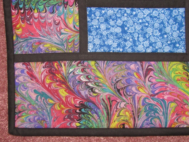
I wanted a border that would not compete with the blocks and found this marbled print that echoes all of the colors. I used it for the backing as well.

Before binding I quilted by stitching close along both edges of every bit of black 'leading'. I stitched in a particular order so that the ends of sewing that butted up to an edge would be locked in by later stitching over it. Here you can see a little of the stitching:

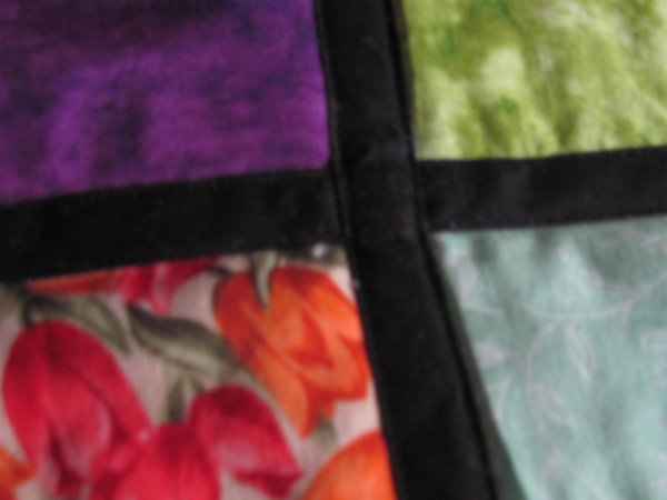
This quilting also makes a lovely grid of double lines on the quilt back.

The final touch was to bind with black.

This quilt finished at 53 x 68 inches and will be donated to the hospital's Passages program.

Ddd


Posted by studio3d@ccgmail.net at 12:01 AM PST
Saturday, 7 December 2013
Poinsettia Patchwork
Topic: Pretty Paper

I always make a Christmas card for our quilting group leader that has a 'quilted' look to it.

This year I went BIG with a 6 x 6 inch card. I used scraps from some of the recent Christmas papers I had on my desktop and started cutting lots of strips from them. Then I used the plaid and cut a 1 inch square. I used the strips around the squares to create a log cabin block - 9 times. 

These were arranged in a grid with a quarter turn between each placement. The seams between the blocks were then covered with a striped band to make a faux sashing and borders.


I used some plastic stickers of poinsettias to create a little focal area and then applied a gold peel-off greeting to some of the brown and trimmed it out. The greeting is popped up on foam tape and I added a gold star to the center of each flower.

Ddd


Posted by studio3d@ccgmail.net at 12:01 AM PST
Friday, 6 December 2013
Piney Woods
Topic: Coloring

From the same big block of Christmas images as the poinsettias I used the pinecones and branches. This is an overall image and works well when stamped continuously as a background.

I used very simple watercoloring on this with one brown and two greens. Since there was so much stamping (9 times) I just did one piece of this and kept as much as possible for the card.

I selected a piece of cardstock with a plaid stripe and some supporting trims already printed on it. I used red bordering to pick up on the plaid.


The plastic sticker for the sentiment has a little edge of pines that makes it blend in with the background.

Ddd


Posted by studio3d@ccgmail.net at 12:01 AM PST
Thursday, 5 December 2013
Mmmmm, Chocolate
Topic: Coloring

One of my dollar purchase stamps had this image of a cup of hot chocolate. You can't mistake it for coffee because of the mini-marshmallows on top!

I wanted this scene to be a cup shared with friends so I used masking to add a second serving.

For the first one I used a snowflake background. Chocolate brown is the bordering and I combined two stickers for the greeting.

I kept everything the same for the second except for the background which is now a plain blue embossed with circles.


So, here's to a cup of cheer!

Ddd


Posted by studio3d@ccgmail.net at 12:01 AM PST
Wednesday, 4 December 2013
The Bloom of Christmas
Topic: Coloring

The stamp used on the card today is one of 4 on a large cube. They are all Christmas images: poinsettia, pinecones (showing later this week), holly, and something I've forgotten now. The poinsettia works best as a self-contained unit so I stamped once on the watercolor paper for coloring. I used the Distress marker ink in three reds, two greens, and a yellow.

The first impression did not stamp very darkly so is not as well-defined.

The other got a better inking and is much easier to 'read'.

I decorated both the same - glittered strip, red borders on card base and strip and then an acid green border on the rounded cornered feature panel. It is also popped up on foam tape.

Both got the same gold peel-off greeting.

Ddd


Posted by studio3d@ccgmail.net at 12:01 AM PST
Tuesday, 3 December 2013
Cardinal Colors
Topic: Coloring

Continuing with the watercoloring on stamps I went back to the image of the two birds in the pines. I have colored these up as bluejays before since that is what we have locally, but for Christmas I decided to go with the cardinals as the stamp is designed for.

I used the ink from Distress markers again, three reds and two greens. I used a dark yellow directly from the marker for the beaks.


The first one got sage bordering and a strip of glittered stripe as an accent. I used aplastic sticker for the sentiment.

The second one uses the same background paper and strip but I bordered with dark green and added a gold peel-off sentiment.

These birds are very time consuming to paint but the result is very regal.

Ddd


Posted by studio3d@ccgmail.net at 12:01 AM PST

Newer | Latest | Older