« February 2014 »
S M T W T F S
1
2 3 4 5 6 7 8
9 10 11 12 13 14 15
16 17 18 19 20 21 22
23 24 25 26 27 28
You are not logged in. Log in
Entries by Topic
All topics  «
3D paperwork
A - Z challenge 5
A - Z challenge 7
A - Z challenge round 4
A to Z challenge round 3
A to Z round 2
A to Z round 6
A-Z round 1
Around the House
Art Challenges
Artist Trading Cards
Backgrounds
Beads
Bible Journaling
Books
Boxes
Collage
Color Challenge
Coloring
cookbook
Die Cuts
Digital Projects
Digital Stamps
Drawing
Dry Embossing
Fabric Stuff
Fantastic Folds
Field Trip
Home Decor
How Does Your Garden Grow?
Hymnal Art
In The Kitchen
In the studio
Jewelry
Lettering
Links
Multi-Technique
Music to Work By
Musings
Nail Art
New Work
Online Class
Other Hobbies
Other Projects
Painting
Paper Embroidery
Paper Piecing
Photo
Pretty Paper
Quilting
Random
reading
Scrap Recovery
scrapbooking
Sewing
Sketch Challenge
Some Backlog
Stamping
Stencils
Stickers
Supplies
Teabag Folding
Techniques
Testing
tips and tricks
Tutorial
Web resources
Welcome to my Blog
Work By My Friends
workflow
Writing
Blog Tools
Edit your Blog
Build a Blog
RSS Feed
View Profile
Group One
In & Out of Studio 3D
Tuesday, 25 February 2014
Operation Write Home sketch 34
Topic: Sketch Challenge

There's some confusion over on the OWH site on what sketch 34 really is. The individually listed ones have one picture and the collective pdf file has another. I decided to just pick one and go with it. Here is the sketch I chose:

I'm still working out of the envelopes of sorted scraps (that's why these are starting to look a lot the same) and here is what I came up with:

I added the striped background from a 6x6 pad and used a lot of bordering. The framed sentiment is not in the sketch but looks good there, don't you think?

Ddd


Posted by studio3d@ccgmail.net at 12:01 AM PST
Monday, 24 February 2014
Operation Write Home sketch 33
Topic: Sketch Challenge

Forced compliance... when you take two papers that really have nothing in common and force them to work together. This is the story of OWH sketch 33:

I started in the scrap bin envelopes with the red patterned paper and the slightly violet script paper. Nothing in common whatsoever. they are different in color, in style, in value, everything!

So I introduced yet another color with a vibrant background cardstock, keeping it un-patterned to provide 'white space'. I layered up the two feature papers even though the central piece was not as large as the sketch.

Needing something to provide focus, I punched a sentiment on gray paper with a round punch and then used Distress Ink in Milled Lavender to bring the color into the same color family as the script paper. A lavender ribbon trapped underneath reinforces this.

I used faux stitching on the backbround and the punched circle to tie these elements together.

Ddd


Posted by studio3d@ccgmail.net at 12:01 AM PST
Sunday, 23 February 2014
Operation Write Home sketch 32
Topic: Sketch Challenge

Time for a change! Watch for it in OWH sketch 32:

Change 1 - background paper was not big enough to cover the whole area so I just covered the top of the card front with it.

Change 2 - Moved the sentiment block down to extend into the exposed base.

Change 3 - Added floral element to balance the empty space left at the top.

Change 4 - Added three rhinestones to the lower corner to keep the eye moving.

I added some doodle lines to the feature panel to set it off from the background without bordering it.

Ddd


Posted by studio3d@ccgmail.net at 12:01 AM PST
Saturday, 22 February 2014
Operation Write Home sketch 31
Topic: Sketch Challenge

Close enough - that's what I call it when the measurements of the parts and pieces a just a smidge off but you can still recognie the sketch that was used. Here is OWH sketch 31:

Right away you can see that the sketch has been rotated a quarter turn to the right. this was because I wanted to use a salvaged embossed metal piece with that orientation. the scrap bin held all different shades of green so I chose a chevron paper that had gray to echo the silver in the feature block.

The silver block I used was not the correct size but 'close enough'. I used one of the scrap bin greens to border it.

My camera was having some issues with all the greens and really 'flattened' them They are really much more vibrant that this.

Ddd


Posted by studio3d@ccgmail.net at 12:01 AM PST
Friday, 21 February 2014
Operation Write Home sketch 30
Topic: Sketch Challenge

Wow! Look how quick we got to OWH sketch 30!

And this time I really did follow the sketch, scraps and all! Aren't you proud of me?

I did add the dotted paper that was not in the scrap bin and cut it slightly smaller than the base card to show a border. The paper patterns were such an eclectic mix - chosen strictly on color blending. I added the rub-on birds, which are glittery, instead of going with a sentiment.


I added two bits of gold peel-off to provide grounding for the birds.

Ddd 


Posted by studio3d@ccgmail.net at 12:01 AM PST
Thursday, 20 February 2014
Operation Write Home sketch 29
Topic: Sketch Challenge

Still working from the scrap envelopes for these OWH sketches. Here is sketch 29:

And I almost followed the sketch, too! Changes include cutting down the main panel to allow the base card to act as a border, adding a border to the feature panel and adding a sentiment block, also bordered.

The background paper was not in the scrap bin and it was chosen for the color echoed in the clock block. The harlequin paper was paired with the clocks because of both the color and the shape in a couple of the clocks.


The sentiment really plays off the clock paper, tool.

Ddd 


Posted by studio3d@ccgmail.net at 12:01 AM PST
Wednesday, 19 February 2014
Operation Write Home sketch 28
Topic: Sketch Challenge

BLAST FROM THE PAST!

Well, today is the day to finally decide how to handle the sketches that I have already worked from in the past. I decided I will show the sketch and at least one of the cards I made from it before. I will also reference the original date of the post. In other words, I will not be doing an additional card from these sketches.

So, what does OWH sketch 28 look like?

Look familiar? You have to think all the way back to July 7, 2012 for the original post (http://www.mystudio3d.com/blog/index.blog/2273719/tricolor-with-sketch/).

I actually made a couple of cards on that date - here is the one I liked best:


Now that makes for a quick blog entry - and little work involved!

Ddd


Posted by studio3d@ccgmail.net at 12:01 AM PST
Tuesday, 18 February 2014
Operation Write Home sketch 27
Topic: Sketch Challenge

Hooray for scraps - this way of working through the sketches is really going well. Today we're up to OWH sketch 27:

I decided to do some bordering on this one since the papers I selected were so similar in tone. The large dot paper was also not as large as the sketch so I made its 'bordering piece' the size indicated and used the dot paper as an added element.

The month block is from a page of random elements in a 6x6 pad I have used recently. It was not the same size as the sketch. Oh well.

I added a stamped sentiment block, popped up on foam tape, to unify the elements.

Ddd


Posted by studio3d@ccgmail.net at 12:01 AM PST
Monday, 17 February 2014
Operation Write Home sketch 26
Topic: Sketch Challenge

Scraps and embellishments... that was the key to a great card for OWH sketch 26, shown here:

In this case the lace paper was not wide enough for the sketch so I added some supplemental strips to the outer edge. The scrap I wanted to use for the crossbar was not wide enough but I used it anyway, just as it came.

I chose a salmon for the base card and layered the elements on it and then found this really great scrap I peeled off of another item as an embellishement. I think it might be lead as it is heavy and very pliable. I stuck it down with super-sticky glue dots.

The center block was way too plain, even with the embossed dots, so I used a silver peel-off sentiment.

Ddd


Posted by studio3d@ccgmail.net at 12:01 AM PST
Sunday, 16 February 2014
Operation Write Home - sketch 25
Topic: Sketch Challenge

I cleaned out the scraps I had been throwing in a bin for the last couple of weeks and sorted them into 'things that go together' and put each set in an envelope. Then as I came to a new sketch I went through the envelopes and chose a set of papers to use with it. Sometimes the scraps were not the exact size called for in the sketch so I just adjusted the sketch and went merrily on my way.

So, here is sketch 25 from OWH:

I thought it looked a lot like one I did recently but took it a whole other direction.

I had two scraps of paper that would make two of the blocks but not large enough to do all 4 with one pattern. So I decided to play with it that way. I had some in a different color of the same pattern to use for background and a couple of strips I threw in, not in the sketch, to add some continuity.


I added paper flower embellishments to each of the blocks, pink on pink and white on blue, to create focus.

Ddd


Posted by studio3d@ccgmail.net at 12:01 AM PST
Saturday, 15 February 2014
Logan's Lanterns
Topic: Quilting

It all started with a piece of green and pink fabric in the clearance bin. I had to have it! Do I have anything to go with it? No, I do not. I think it has an asian feel to it, though. So, over the next two years, whenever I see a fabric with that same 'feel' to it, even though not overtly asian, I ask myself, "How would this go with that pink and green?"

Eventually, I had added a black and green circle, a pink dot, a green vine, a taupe flowering branch, and a metallic copper with a tiny 'fish scale'. The final touch was a stylized floral that incorporated everything except the black and metallic. 

Now, they sit for a year because I can't find a pattern that speaks to me. It must incorporate all of the fabrics and it must have that asian influence. 

Then, one day it all came together. One of the quilting magaines I read had a full page ad from Wilmington Fabrics featuring BIRDSONG, a Japanese lantern quilt using their fabric line (http://www.wilmingtonprints.com/projects.aspx). LOVE IT! With only two reservations... 1) I don't have their fabric line 2) It is a queen-size quilt. That should be no problem, I have my own fabrics to use and I don't follow patterns anyway!

So I used the motifs from the quilt pattern, made my own layout with my own fabrics and ended up with a large lap quilt.

Let's have a peek at the fabrics first. This is the pink and green that started everything:

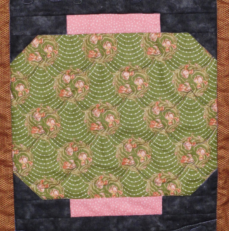
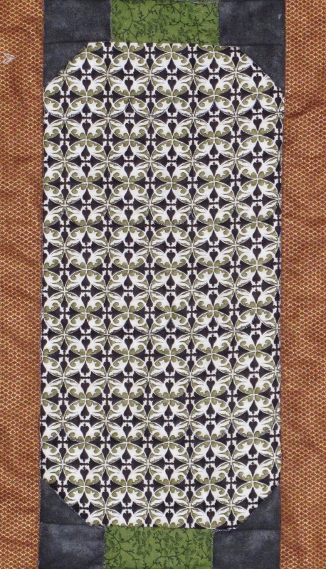
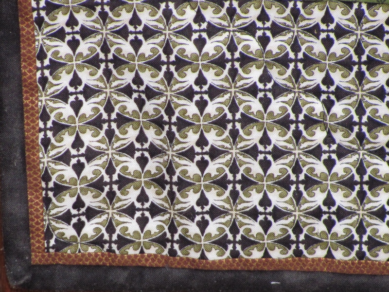
Here is the black and green I chose next. I liked that the circle motif was carried over from the pink and green:

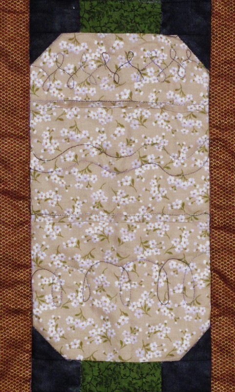
I chose the taupe branches just on their asian feel and that the pattern was quiet enough to read as a solid if I chose:

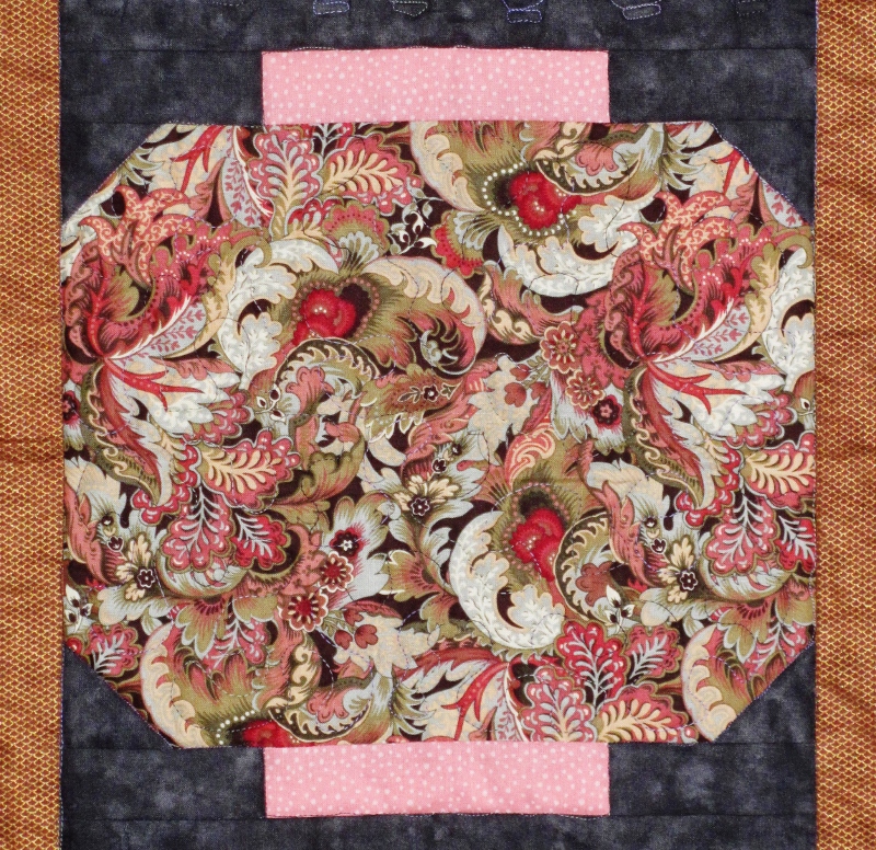
I selected the pink dot and the green vine that have been used a caps on the lanterns next. And then I brought it all together with the stylized floral:

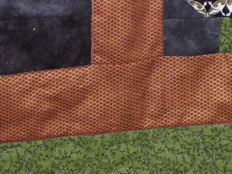
The metallic copper fish scale was the final touch to unify these all into a Japanese collection. You can see I was careful to make sure the scales were always going in the same direction:

Here is the final result:

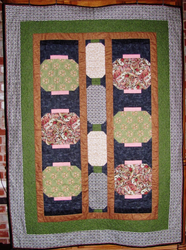
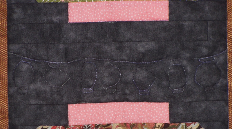
I quilted it with free-motion, using different motifs in the lanterns. The pink and green got swags following the lines. The floral got meandering. The green and black got small scallops following the underside of every third row. The taupe lanterns got multiple free-form patterns. In the black block areas I quilted tiny lanterns strung up on wire:

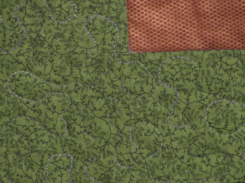
The outer border got some serpentine diagonals along the edges of the circles, the green border got meandering, and the copper was stitched in the ditch.

I did a different kind of binding on this, too. Just the day before I was set to do the binding I ran across this blog entry: http://sweetgrassdesigns.wordpress.com/category/tutorials/bindings/ and knew I wanted to do that myself. I used the copper for the inset and black marble for the binding:

I just love everything about this and it used the asian fabrics to perfection. In fact, I was using so little of my fabrics during the initial cutting session that I cut all the parts for a second one at the same time. I stitched them up together and only changed out the two borders. I haven't quilted or bound it yet... but soon.

Ddd


Posted by studio3d@ccgmail.net at 12:01 AM PST
Friday, 14 February 2014
Give Me a Hint
Topic: Sketch Challenge

On one of the groups I participate in we were given... a sketch challenge! Imagine that!

This time the sketch selected was #117 from Freshly Made Sketches (http://freshlymadesketches.blogspot.com/2013/12/freshly-made-sketches-117-sketch-by-amy.html) that looks like this:

Well, I am totally up for a sketch challenge, as you know by now. I knew I wanted to use washi tape for the little flags but all that I had were printed with horizontal pattern. So I simply turned the sketch on the side for my layout. That's allowed!

I placed each tape on the same creamy backing cardstock and cut the sides of them. I used a square punch to create the flag ends. Then I stamped and cut out the sentiment strip and backed it with black. 

The pieces were blending too much with one another so I used black ink pad to smudge the edges of all. Then I layered them, lightly tacking them together, working over a non-stick craft sheet. Then I moved over and prepared the card base which is more of the creamy crdstock. 

I lightly blacked the edges with the ink pad, layered blask over this and then placed on the feature paper - a black, white and yellow from a recently used 6x6 pad - on which I had blacked the edges, also. Then I was able to lift the decorative tape off the craft sheet as a unit and attach it to the card face.


My feature design is larger than on the sketch but that is a function of the scale of the washi tapes I was using to make it.

I'm happy with this result and that's all that matters - making my happy. LOL!

Ddd


Posted by studio3d@ccgmail.net at 12:01 AM PST
Thursday, 13 February 2014
Operation Write Home sketch 24
Topic: Sketch Challenge

I found inspiration to make OWH sketch 24 twice:

For the first one I played it straight with layout and measurements... almost. I knew I was going to use a shaped image instead of the foremost rectangle shown in the sketch so I elongated the layer behind it for better balance.


I added a violet sentiment block upper left.

I used the same base card color for the other verion of this sketch. But because of the more romantic feel of the 3D image I went to softer papers. The pink harlequin paper has script on it for a vintage impression. Instead of a single block on top of that I split it in two and moved each half to opposite corners. This balances out the oval feature element.

I added definition to all the blocks by making doodle lines with purple fine-line pen.

Ddd


Posted by studio3d@ccgmail.net at 12:01 AM PST
Wednesday, 12 February 2014
Operation Write Home sketch 23
Topic: Sketch Challenge

I've flipped out! Here is OWH sketch 23:


As for the flipping out, because of the 3D image I had made I needed to flip this sketch top to bottom.

I used two papers with two-tone greys putting the chevron on top in a small strip and a harlequin pattern with script on the bottom in a wider block. These were cut down to leave a border of the coral base card. I added the vertical strip in coral and added coral as the circle element.

The foil 3D rose centered on the coral circle just makes me happy.

Ddd


Posted by studio3d@ccgmail.net at 12:01 AM PST
Tuesday, 11 February 2014
Operation Write Home sketch 22
Topic: Sketch Challenge

On to OWH sketch 22 shown here:

I selected a very different 3D image to use on this one. It has a little bit of a steampunk look to it and I wanted to stay with that vintage feel. So I selected a base printed with vintage postcards, documents and postage. Then for the vertical blocks I chose a dotted paper overprinted with script. All of these got sponged on the edges with Distress Ink to define thrie outline.

A tone-on-tone brown dotted paper matched the color of the illustration exactly, over which is mounted to 3D image with the line of sprockets extended off the left.


The little butterfly in the upper right is 'bonus artwork' from the same sheet. there were two of them so I layered them in 3D fashion.

Ddd 


Posted by studio3d@ccgmail.net at 12:01 AM PST
Monday, 10 February 2014
Operation Write Home sketch 21
Topic: Sketch Challenge

I decided to play with 3D images for a while and worked them into several of the OWH sketches. I did two for sketch 21:


I started out by making up the two 3D images I wanted to use with this sketch. For the first card it was a bouquet with roses and violets. I selected a couple of lace print papers - one for the background and one for the blocks. Each of these was sponged around the edges with Distress Ink before mounting in place.

I added a violet sentiment block banded with green.

For the second card I had selected and prepared an image with a built in frame. Because of the foil finish on the image I wanted to use metallic finish cardstocks. I chose silver for the base and green for the blocks.

I added a single silver peel-off sticker border around the outer edge.

Ddd 


Posted by studio3d@ccgmail.net at 12:01 AM PST
Sunday, 9 February 2014
Floral Birthday Scroll
Topic: Paper Embroidery

The same group that challenges us to build our Christmas card stash monthly has started a monthly challenge to build stock for birthdays (and other holidays).

The design I used for this card is a free one from PinBroidery.net. I used very dark blue, red and green, trimmed, and rounded two corners to reinforce the scroll look.


I found some floral paper with the same colors as the stitching and used that bor a background. An additional dark blue border and then the Light blue card base bring it all together.

Ddd 


Posted by studio3d@ccgmail.net at 12:01 AM PST
Saturday, 8 February 2014
Winter Wonderland
Topic: Paper Embroidery

One of my groups put up the challenge to make a paper embroidery Winter card.

This village scene is my favorite to stitch in white or silver over a dark color to create a night scene or a snow scene. This time I used white thread over navy blue cardstock.

I mounted this on a background of knitted sweater print to warm it up.


I wanted to reinforce the framed picture concept so used a card base the same color as the stitched panel.

Ddd 


Posted by studio3d@ccgmail.net at 12:01 AM PST
Friday, 7 February 2014
Snowflakes KeepFallin' On My Head
Topic: Paper Embroidery

To add to the stock of Christmas cards I combined a snowman stitching sticker with some snowflake stitching stickers.

I wanted to give it a cold feel so I placed them all on blue cardstock. For contrast and a little whimsy I stitched everything in pink thread. To continue this color plan I backed the card with tone on tone pink dot paper. I think this makes it look like pink snow.


I added a clear sentiment sticker on the right side.

Ddd 


Posted by studio3d@ccgmail.net at 12:01 AM PST
Thursday, 6 February 2014
Tis NOT the Season
Topic: Paper Embroidery

I'm going to continue with the practice of making two Christmas cards a month to either add to my stash or send to OWH.

I started out with stitching stickers - this time the little gingerbread people. I placed the stickers on cookie-colored cardstock and used pink thread for the girl and blue thread for the boy. Then I trimed them out with scissors.

I chose the same color for the base card and added a Christmas print paper to the left and some tone-on tone dots to the right.

The stickers have a gold line on them so I used a gold peel-off greeting sticker.

Ddd 


Posted by studio3d@ccgmail.net at 12:01 AM PST

Newer | Latest | Older