Thursday, 25 September 2014
Stretch Your Stamps 2 - Day 5 - Outlines (d)
Topic: Online Class
Well, I like this technique much more than the two previous from day 5.
I stamped the hydrangea on woodgrain paper with a very light ink. Then I used colored pencils on the leaves. I used violet ink to stamp the flower three times on text printed cardstock. One layer was cut out in its entirety and glued to the card at the leaf end and raised on rolled up glue dots at the top edge. The next layer had the back flowers cut away and then the blooms were placed on a foam pad and a ball stylus was used to shape them. This was layered on with rolled glue dots. The final layer is just three blooms treated like layer two.
Each of the little blooms got a lavender pearl in the center.
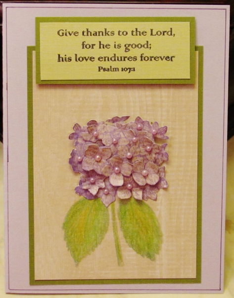
The card was finished with layers, pen borders and a bordered scripture raised up on foam tape.
Ddd
Posted by studio3d@ccgmail.net
at 12:01 AM PDT
Wednesday, 24 September 2014
Stretch Your Stamps 2 - Day 5 - Outlines (b/c)
Topic: Online Class
I made two cards from the second technique on day 5. There are actually two different lessons taught for this.
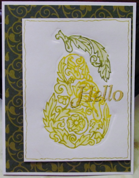
First, the stamp is impressed on chipboard and cut out with a 1/8 inch border. this is glued to another chipboard and cut out again. When run through the Cuttlebug with a rubber mat underneath the chipboard creates a debossed shape on the white heavy cardstock (the lesson used watercolor paper but mine kept tearing).
Second lesson is the inking. The stamp is inked with Distress and stamped into the debossed area. when the ink is dry an aquabrush is used to blend the colors on the image.
For my first card I used a pear image in scrollwork. I inked it in three tones of yellows and greens. This was mounted on printed green background using thick glue dots. I stamped a sentiment in gold pigment ink and embossed in clear. Then I used a Distress marker to shadow the letters and a gold gel pen to border the panel.
For the second card I used an oak leaf stamp and four Distress Inks in greens and golds. After blending the colors with the aquabrush and drying them I used my finger to pat on some gold pigment ink over the leaf. I used the gold gel pen to border the panel on which I had rounded the corners. I adhered a white diecut word and shadowed the letters with a Distress Marker.

Interesting concept but I can't see myself using it much (the debossing). The coloring is something I might actually use.
Ddd
Posted by studio3d@ccgmail.net
at 12:01 AM PDT
Tuesday, 23 September 2014
Stretch Your Stamps 2 - Day 5 - Outlines (a)
Topic: Online Class
Day 5 of the Stretch Your Stamps 2 class focused on different ways to use outline stamps. The instructors used a set of florals for all of them. I chose to use a variety of outline stamps.
I started with a Tim Holtz cupcake stamp for the lesson on embossing in multiple colors. Two methods were instructed but I have a very limited selection of colors of embossing powders so I used the 'alternate' method.
On white cardstock the image was stamped in very light pink. This was used with a stamp positioner to align all the following steps. Distress Markers were used to ink up a single area and stamp it before moving on to the next color until the entire image was in color. Lastly, the whole stamp was covered in Versamark ink and stamped over the top. Clear embossing powder was heat set on over all the individual colors.
I used Distress Ink to sponge on color over the whole background then colored in various areas with Distress Markers.
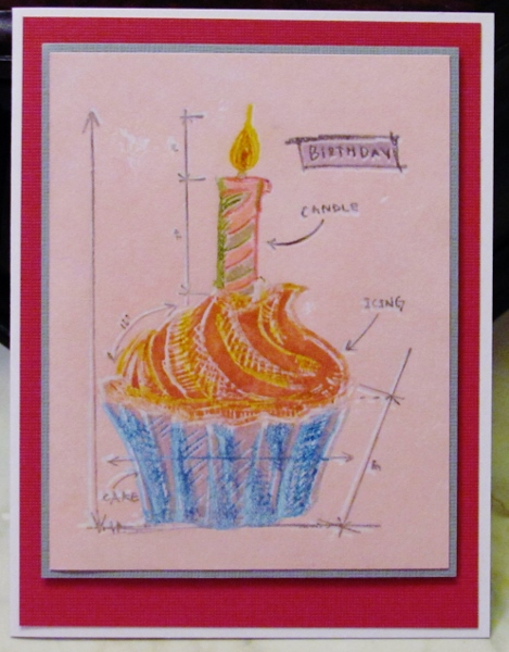
I used foam tape to mount the bordered feature panel on the bordered background.
Ddd
Posted by studio3d@ccgmail.net
at 12:01 AM PDT
Monday, 22 September 2014
Stretch Your Stamps 2 - Day 4 - Alphabets & Sentiments (2)
Topic: Online Class
I only made cards from two of the four lessons on day 4.
This second one is only 'inspired by' the lesson but not really following through on all the instructions and methods. The instructor used many random words to create a pattern on her block so the same word-art could be stamped on a background and on a raised diecut and they would align.
I did not have a bunch of words I wanted to use together so I chose a stamp that had a single word repeated in lots of fonts. It would have been nearly impossible to align it over and over so I only attempted to align the central one where it stretches from side to side of the circle and runs off the edges. The rest of the background and the diecut are just stamped repeatedly wherever they fit. I used different inks on the two layers.
The diecut is bordered with red faux stitching and popped up on foam tape.
I aligned a diecut sentiment over a punched butterfly so the dot on the 'I' aligned with the head. A second punched butterfly was cut in half and the wing was raised off the surface.
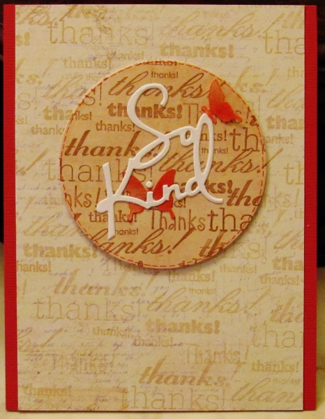
I cut the panel to allow a border of the backing red to show only on the sides.
Ddd
Posted by studio3d@ccgmail.net
at 12:01 AM PDT
Sunday, 21 September 2014
Stretch Your Stamps 2 - Day 4 - Alphabert & Sentiments
Topic: Online Class
Our first lesson of day 4 was on using alphabet letters as 'objects' on our card. For example, the instructor used an umbrella image and had letters 'raining' onto it.
I chose to use my letters as leaves.
I first inked the background of an embossing folder with blue chalk ink. When I used the Cuttlebug to impress this on white cardstock it inked the sky while making the embossing of the tree. I then used brown chalk ink direct-to-paper to color the raised surface of the tree and green chalk in to color in some grass.
I stamped the letters of AUTUMN randomly in the tree, falling through the air and piled on the ground. then another brown ink was used to stamp the sentiment which was then shadow-inked with a brown marker. I used this same marker to doodle around the panel.
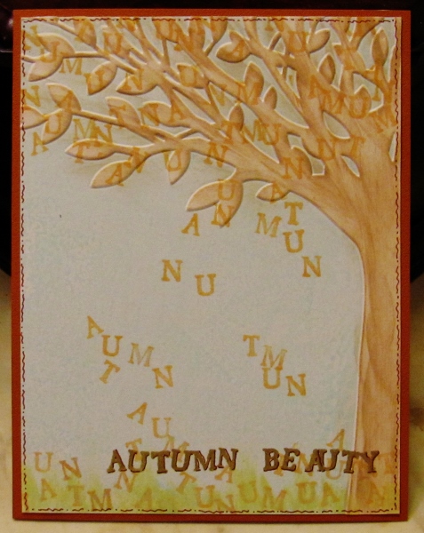
I mounted the panel on brown cardstock with an exposed border.
Ddd
Posted by studio3d@ccgmail.net
at 12:01 AM PDT
Saturday, 20 September 2014
Stretch Your Stamps 2 - Day 3 - Alphabets & Sentiments-c/d
Topic: Online Class
The technique used today is similar to yesterday with a few twists.
First, I changed to a stencil of trees. Then I changed to a stamp of 'unreadable script' and stamped that in brown. I used a lighter ink to shade in the voids then removed the stencil. I then shaded the left and bottom of the trunks and branches with a W1 Copic marker (warm grey). I cut the panel into two pieces to use on separate cards.
For the first card I drew a faux stitching line around the panel and mounted it on tone-on-tone brown dot paper. I diecut text and adhered it to the card, then used fine marker to add faux stitching to the center of the letters.
The other panel was attached to a leafy background. I used a perforating tool to create dashed cut lines around the panel. I diecut text and pressed Versamark onto it. This was embossed with clear. I repeated this to create three layers, making a raised shiny surface.
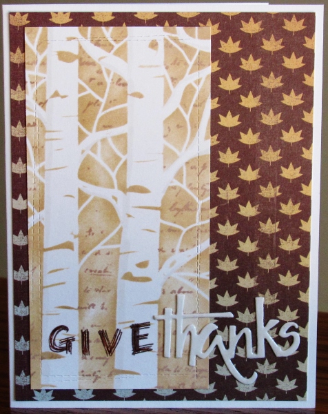
The word 'give' was stamped in brown ink using individual letter stamps.
Ddd
Posted by studio3d@ccgmail.net
at 12:01 AM PDT
Friday, 19 September 2014
Stretch Your Stamps 2 - Day 3 - Alphabets & Sentiments - a
Topic: Online Class
Day three of class began a focus on using alphabet and sentiment stamps. The first technique is for creating a 'word search' look for a card front.
I arranged my main message in individual letters on a gridded block. This was stamped in black and embossed in clear. Then those letters were removed from the block and a string of random letters were arranged. These were stamped on the left and the right of every other line using a golden yellow ink. Different letters were arranged on the block and the voids filled in with the golden yellow ink.
I masked out 'thinking of you' on a sentiment stamp and inked up the remainder with black ink. Removed the mask and stamped 'all the time'.
Stamped the clock image in the upper left using black. Used a sponge dauber to apply golden yellow ink to the clock image.
I trimmed the panel and wrapped it with yellow twine.
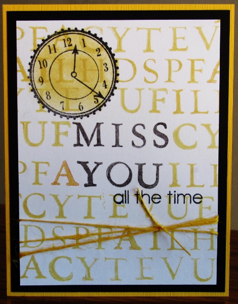
Bordering with yellow and black finishes off this card.
Ddd
Posted by studio3d@ccgmail.net
at 12:01 AM PDT
Thursday, 18 September 2014
Stretch Your Stamps 2 - Day 3 - Alphabets & Sentiments-b
Topic: Online Class
I don't use stencils all that much but this uses them to good impact.
I taped the cityscape stencil to white cardstock. Then I used a rust ink to stamp a sentiment repeatedly in the void. A sponge dauber was used to apply more of the rust ink to the voids while allowing the stamped text to show through.
The stencil was removed and the sentiment was stamped once in black.
I punched a hole in the sky and mounted a shimmer yellow cardstock behind. The panel was then trimmed and bordered with black.
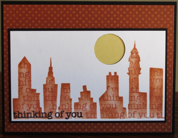
Backed with a tone-on-tone rust dot and bordered in black for a finish.
Ddd
Posted by studio3d@ccgmail.net
at 12:01 AM PDT
Updated: Thursday, 18 September 2014 12:08 AM PDT
Wednesday, 17 September 2014
Stretch Your Stamps 2 - Day 2 - Backgrounds - Resist
Topic: Online Class
For my last card with backgrounds I wanted to try a resist. I selected a plaid stamp and inked it with Picket Fence Distress Stain and stamped on white cardstock. I heat dried it.
I used four Distress Inks and applied them with foam daubers. Afterward I used a damp towel to wipe away excess ink from the Stain.
I cut down the panel and bordered it with brown. Fall Dazzles in brown and cardstock word stickers created the decor.
Concept: A+ Result: B
Ddd
Posted by studio3d@ccgmail.net
at 12:01 AM PDT
Tuesday, 16 September 2014
Stretch Your Stamps 2 - Day 2 - Backgrounds - Brocade and Lace
Topic: Online Class
The technique taught next was SO elegant looking. The stamp is inked with Versamark on black cardstock. In the class they used Perfect Pearls but I only had Pearl-Ex powders. I applied them like instructed by pounding them on with a soft brush and then using the brush to dust away the excess. Clear detail embossing powder still sticks over this and it is heated to melt it.
For the first card I used the brocade stamp and selected Pearl-Ex in interference blue/green and interference green/yellow. I layered with yellow and green shimmer cardstock and black. These were wrapped with ribbon and cord. three gold Dazzles words were added on the right.
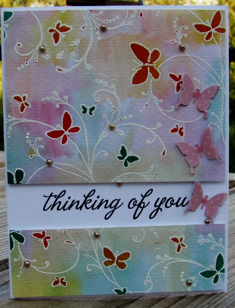
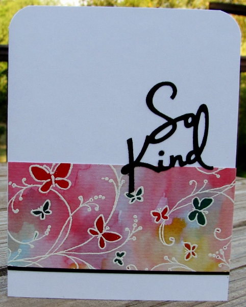
For my second attempt I stamped with four doilies and used duo-gold Pearl-Ex. A doodle-bordered strip and stamped diecut circle break up the mass of laciness. I had already watercolored a scrolled butterfly and fussy cut it with a thin white border. Then I covered it with Versamark ink and embossed it with clear powder. This was repeated for a thicker glassy surface.
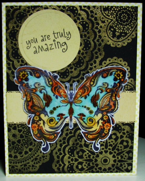
I used a yellow tone-on-tone background for a subtle border.
Ddd
Posted by studio3d@ccgmail.net
at 12:01 AM PDT
Monday, 15 September 2014
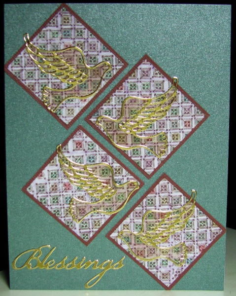
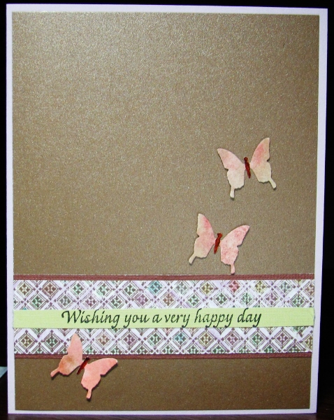
Stretch Your Stamps 2 - Day 2 - Backgrounds - Line-art (5)
Topic: Online Class
The next technique covered in class really did need a graphic line-art stamp. The closes thing I had was a very small (1 1/2 inch) grid with interlocking edges. I stamped it over and over to fill the whole cardstock using brown ink. I colored in the squares with metallic colored pencils and used a lavender one in the spaces between the blocks.
For the first card I used a square punch to make blocks which I bordered in brown. These were placed on a shimmer green background in a non-traditional arrangement. I placed a gold Dazzles dove on each block and colored them with a pastel alcohol marker. A gold Dazzles sentiment finishes it.
I used the remainder of the colored panel as a strip bordered in brown. A thin green strip of cardstock, stamped with a sentiment, fills the center of the patterned strip. This is placed on a shimmer bronze panel and three punched butterflies have brown colored bodies.
I used a lavender card base to pick up the lines in the grid strip.
Ddd
Posted by studio3d@ccgmail.net
at 12:01 AM PDT
Sunday, 14 September 2014
Stretch Your Stamps 2 - Day 2 - Backgrounds - Line-art (3/4)
Topic: Online Class
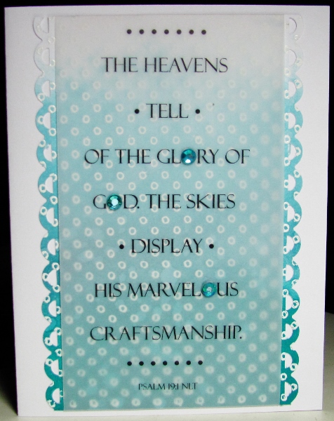
Day 2 of the class presented more ways to use background stamps. I went to my collection to find some alternatives to those already used in class. The technique was to stamp a line-art background with Versamark and emboss in white. Then three tones of a single color family were sponged on dark-to-light to create an ombre effect.
For my first sample I chose a stamp of tiny circle dots and inked in shades of teal Distress Inks. I trimmed the panel and punched the side edges with a scallop. A printed vellum strip was wrapped top to bottom. Three teal rhinestones substitute for 'O's in the text. All this was mounted on a white card base.
For the second card I used a script background stamp and tones of purple. The panel was trimmed and backed with a dark green cardstock and placed on a white card base. Then I diecut two leafy branches from a sticky-back cardstock and decorated them with five purple paper flowers.
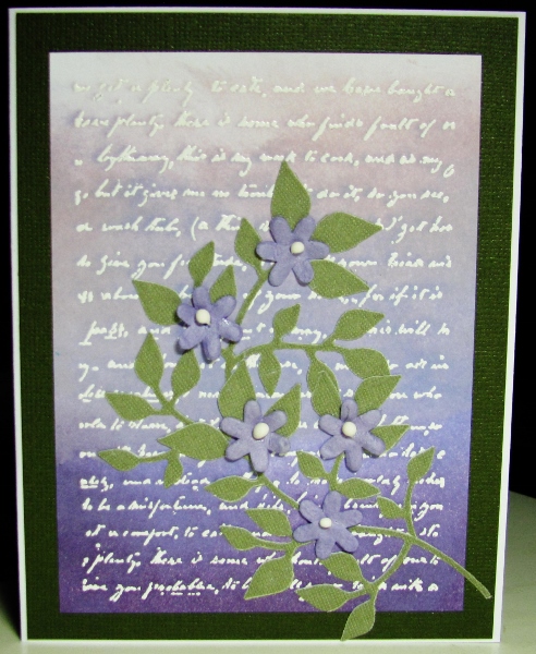
This was too busy to add a sentiment. This lends itself to any occasion.
Ddd
Posted by studio3d@ccgmail.net
at 12:01 AM PDT
Saturday, 13 September 2014
Stretch Your Stamps 2 - Day 1 - Backgrounds - Line-art (2)
Topic: Online Class
I wanted to use the same line-art background with butterflies for another technique.
This time I stamped on white cardstock with gold pigment ink and heat set it. The elements were colored with pastel alcohol inks. It is a very simple treatment that looks elegant. I cut the completed stamping into unequal panels to make two cards.
The narrower panel was adhered to a tone-on-tone brown background. I doodled a line around three sides with gold gel pen. A diecut word from gold metallic cardstock is adhered with tiny bits of foam tape.
The wider panel was placed on a tone-on-tone kraft background. The gold gel pen was used to outline the panel. I diecut words from gold metallic cardstock and again from the background. The gold words were inset.
As a final touch I added a punched butterfly and colored the body with gold gel pen.
Ddd
Posted by studio3d@ccgmail.net
at 12:01 AM PDT
Friday, 12 September 2014
Leftovers
Topic: Online Class
When I did all the backgrounds with spritzing colors on the craft sheet there was a lot of ink left over and I didn't want it to go to waste. So I swooshed watercolor paper through the ink to create random spots of color and dried it.
I used the best one of these as a backdrop to black elements - a frame, a cut and tuck diecut and a sentiment diecut.

I left a thin border of the card base showing as a frame.
Ddd
Posted by studio3d@ccgmail.net
at 12:01 AM PDT
Thursday, 11 September 2014
Stretch Your Stamps 2 - Day 1 - Backgrounds - Reverse (2)
Topic: Online Class
This card uses the same brocade stamp as those shown yesterday but with a different technique entirely.
The stamp in inked with Versamark and stamped on white cardstock. Then it is embossed in clear powder.
The page is then sprayed with glimmer sprays in a couple of colors. The ones I had that were not clogged turned out to be black and green. These are rubbed into the open areas of the card and dried.
The last step is to place the cardstock between pieces of paper towel and scratch paper and iron it until the embossing melts and absorbs into the covering papers.
I used a die to cut the sentiment out of the panel and then cut another one from white. The panel is adhered to the background and the white word inlaid into the opening.
I used shimmer papers for the bordering and backing and finished with three butterflies punched from white cardstock.
Ddd
Posted by studio3d@ccgmail.net
at 12:01 AM PDT
Wednesday, 10 September 2014
Stretch Your Stamps 2 - Day 1 - Backgrounds - Reverse
Topic: Online Class
Still Day 1 of the online class but we've switched to 'reverse' backgrounds. Well, the class did but I didn't have one so I just decided to use a 'brocade' stamp that had the same feel as theirs.
The technique used had Distress Ink pads pressed onto a craft sheet and sprayed with water. The stamp is pressed into them and moved just enough to leave no un-inked areas. Then the stamp is pressed gently onto watercolor paper and allowed to dry.
While that is drying the ink is sprayed again and stamped onto another sheet. And this is repeated for a third impression. This gives three color values.
I used the original impression (the brightest) on a black background to intensify the colors. I cut and assembled a black 'cut and tuck' diecut. This is surrounded with 5 black punched butterflies which are overlaid with colored ones.
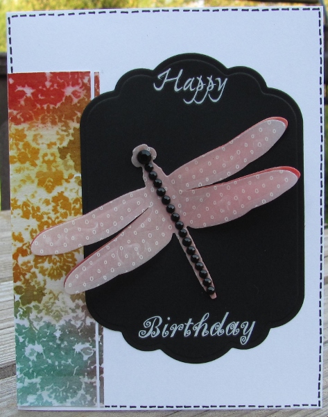
The second impression didn't have a panel of useable area so I trimmed off a wide and a very narrow strip to use on a white card base. I added a black diecut panel to back a dragonfly diecut with layers of both inked watercolor paper and vellum. The dragonfly was decorated with black rhinestones and a sentiment in white rubons was created before decorating the outer edge with black dashed lines.
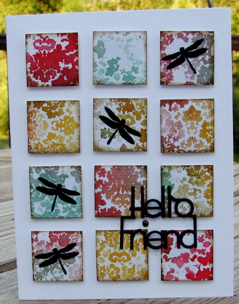
The third impression was a beautiful pastel panel. I cut it into 1" squares and inked the edges with Distress. These were adhered to a white card base with foam tape. Dragonfly silhouettes were stamped onto random blocks and a diecut black sentiment was glued to the face. The 'I' is dotted with a black rhinestone.
That made a trio of beauties!
Ddd
Posted by studio3d@ccgmail.net
at 12:01 AM PDT
Tuesday, 9 September 2014
Stretch Your Stamps 2 - Day 1 - Backgrounds - Lines
Topic: Online Class
Wow! Long title, huh?
I took an online class last month on learning more ways to use stamps I already own. The instructors selected two stamps for each category and spent two days covering techniques.
This is the first background stamp I used for the class - an overall pattern in line art. The one used in class was a graphic grid of sorts.
The technique was to stamp on watercolor paper with Versamark and emboss in white. Elements were watercolored and, before they dried, a brush with clear water was swished over them to dilute the color and spread it into the background. Then the background was dried. the original colors were again painted onto the elements and dried.
For this first card I cut the painted panel down to create a top and bottom panel and mounted them on foam tape on a white card base. The sentiment was stamped in the open space and the background was embellished with sticky back pearls and punched butterflies.
I used the left over piece of the created background as a strip across a white card base. This was combined with a black diecut sentiment and a thin black strip below the colored panel.
I used a 1/2 inch corner chomper to round the top corners.
Ddd
Posted by studio3d@ccgmail.net
at 12:01 AM PDT
Monday, 8 September 2014
Last Entry For the Fair
Topic: Beads
I entered only one thing in the Beading and Jewelry class at the County Fair.
Unfortunately, this beaded double-string necklace did not win an award of any kind.
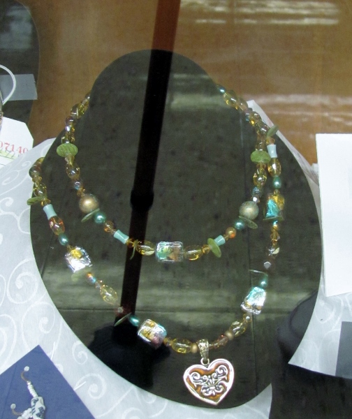
I always gets lots of compliments when the owner is wearing it and that makes me happier than an award!
Ddd
Posted by studio3d@ccgmail.net
at 12:01 AM PDT
Updated: Wednesday, 13 August 2014 8:29 PM PDT
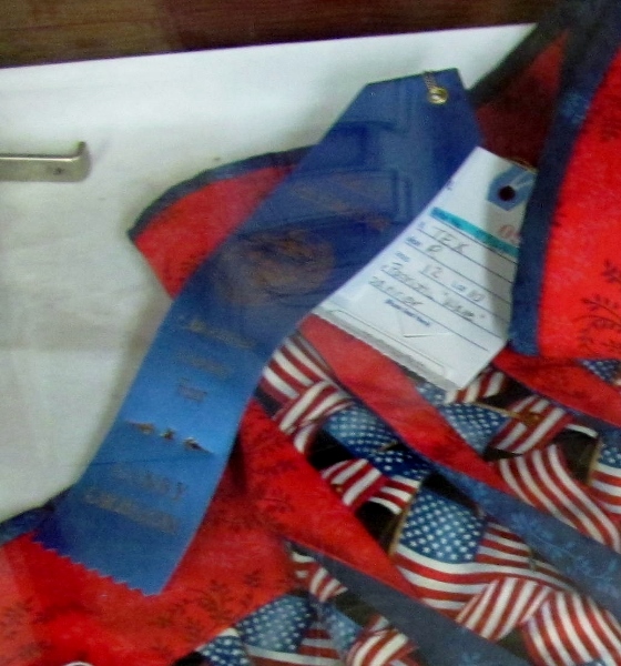
Sunday, 7 September 2014
Next Class of Fair Entries
Topic: Quilting
The next creations entered in the County Fair were quilts. I entered four of them.
First was the banner I entered in the Patriotic category:
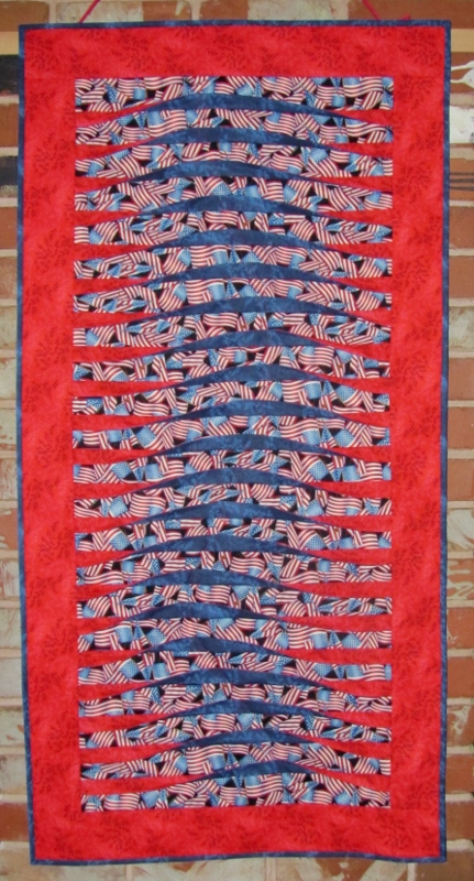
This was awarded 1st place:
In the Original Design category I entered the Birdhouse Neighborhood quilt:
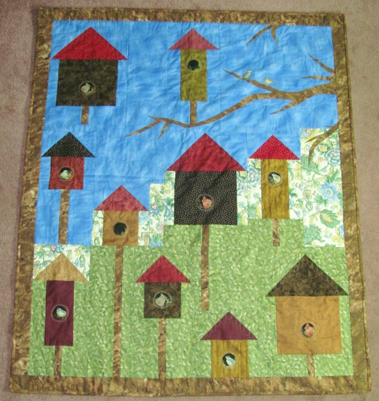
This was awarded 2nd place:
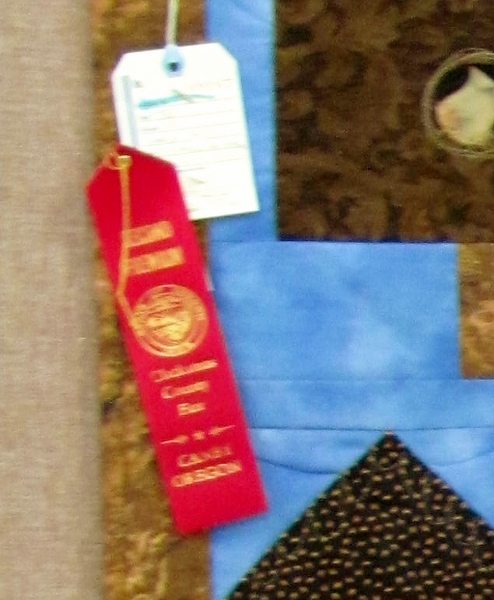
In the category of Machine Piecing with Machine Quilting I entered the Pinwheel Parade:

This was awarded a 3rd place:
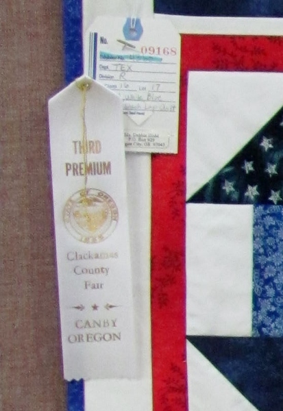
The one quilt I entered that did not get an award was Paws and Reflect that was in the category of Multiple Techniques (standard piecing, paper piecing, applique):
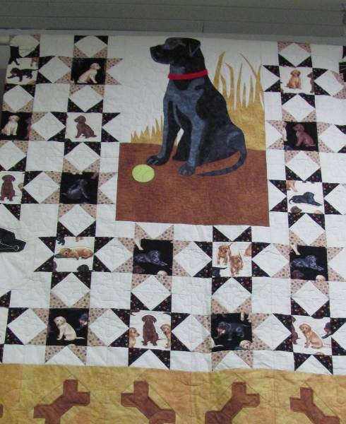
It's still the favorite quilt at OUR house!
Ddd
Posted by studio3d@ccgmail.net
at 12:01 AM PDT
Updated: Wednesday, 13 August 2014 8:23 PM PDT
Saturday, 6 September 2014
Another Category For the Fair
Topic: Stamping
My next category to participate in at the County Fair was in the area of rubber stamping and other paper crafts.
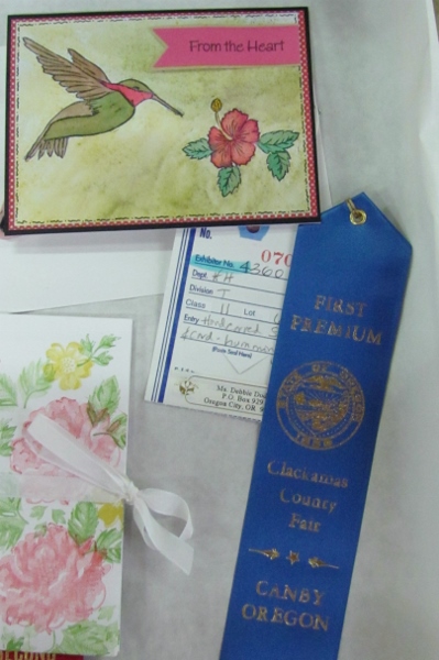
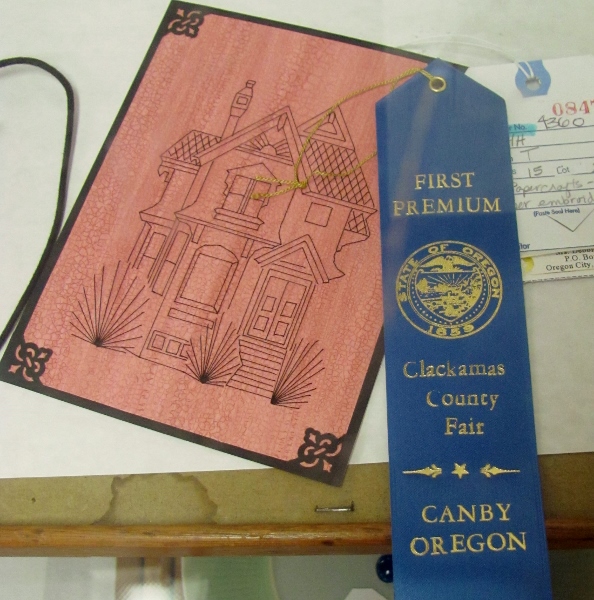
First was the entry of hand carved rubber stamps and a card made with them. I used my humbingbird and my hibiscus - awarded 1st place:
In alcohol ink coloring - awarded 1st place:
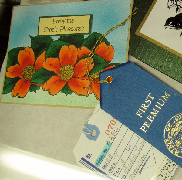
For an embellished card - awarded 1st place:
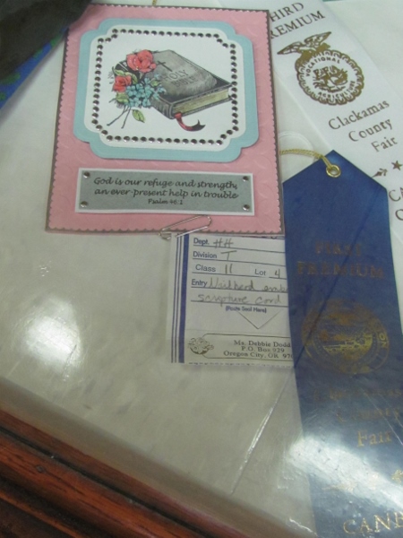
For Paper Embroidery - awarded 1st place:
For a Watercolored Card - awarded 3rd place
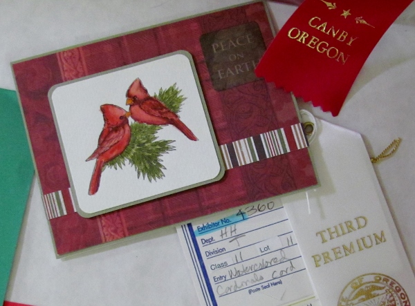
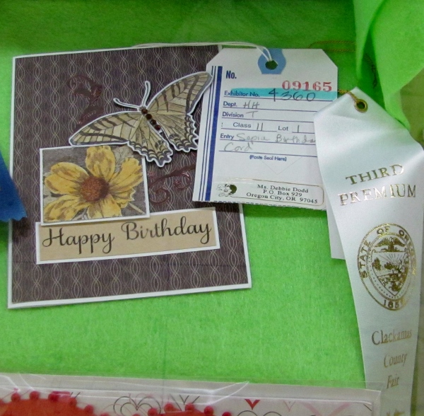
For a Birthday Card - awarded 3rd place:
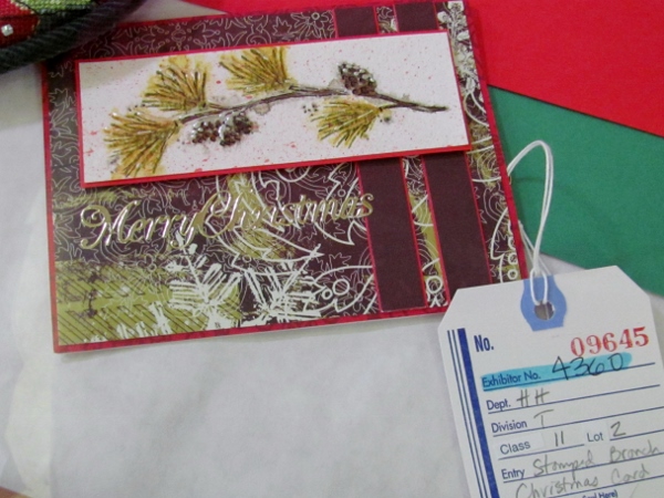
Cards entered without getting awards were a Christmas Card:
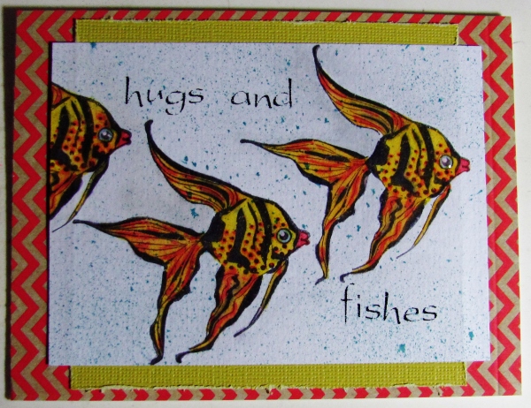
... and a Greeting Card:
Wow! Only two cards without an award of any kind.
Ddd
Posted by studio3d@ccgmail.net
at 12:01 AM PDT
Updated: Wednesday, 13 August 2014 8:09 PM PDT
Newer | Latest | Older
