« October 2014 »
S M T W T F S
1 2 3 4
5 6 7 8 9 10 11
12 13 14 15 16 17 18
19 20 21 22 23 24 25
26 27 28 29 30 31
You are not logged in. Log in
Entries by Topic
All topics  «
3D paperwork
A - Z challenge 5
A - Z challenge 7
A - Z challenge round 4
A to Z challenge round 3
A to Z round 2
A to Z round 6
A-Z round 1
Around the House
Art Challenges
Artist Trading Cards
Backgrounds
Beads
Bible Journaling
Books
Boxes
Collage
Color Challenge
Coloring
cookbook
Die Cuts
Digital Projects
Digital Stamps
Drawing
Dry Embossing
Fabric Stuff
Fantastic Folds
Field Trip
Home Decor
How Does Your Garden Grow?
Hymnal Art
In The Kitchen
In the studio
Jewelry
Lettering
Links
Multi-Technique
Music to Work By
Musings
Nail Art
New Work
Online Class
Other Hobbies
Other Projects
Painting
Paper Embroidery
Paper Piecing
Photo
Pretty Paper
Quilting
Random
reading
Scrap Recovery
scrapbooking
Sewing
Sketch Challenge
Some Backlog
Stamping
Stencils
Stickers
Supplies
Teabag Folding
Techniques
Testing
tips and tricks
Tutorial
Web resources
Welcome to my Blog
Work By My Friends
workflow
Writing
Blog Tools
Edit your Blog
Build a Blog
RSS Feed
View Profile
Group One
In & Out of Studio 3D
Monday, 27 October 2014
Stencil Tutorial - Scrolled Background
Topic: Stencils

I’m back with another stencil tutorial from the My Favorite Things order.

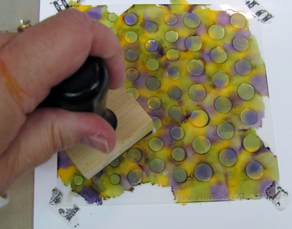
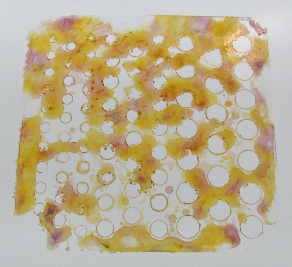
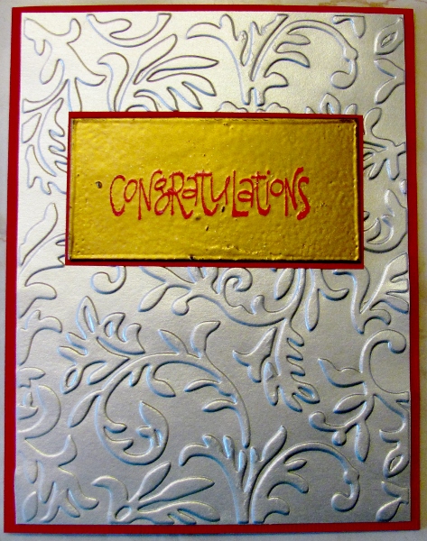
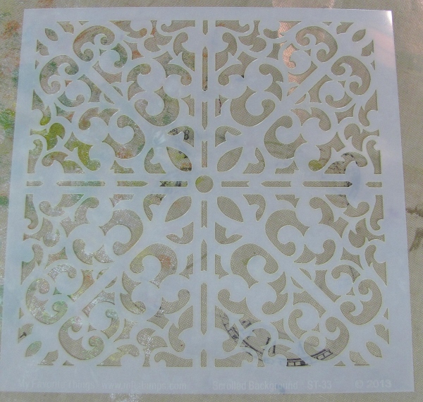
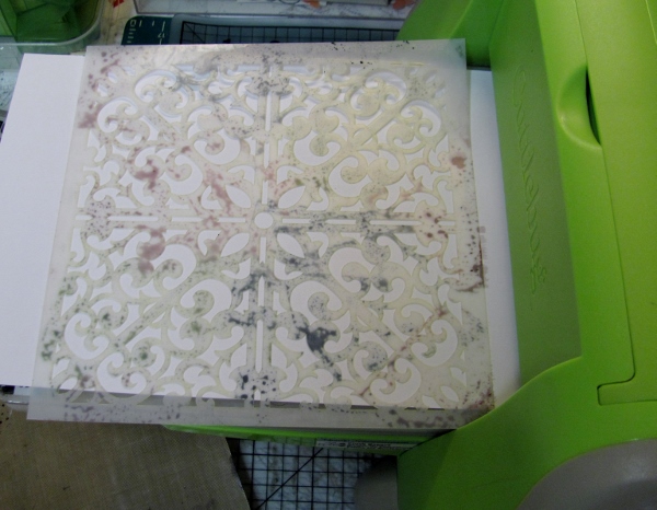
The stencil I am using today is the Scrolled Background . It really reminds me of wrought iron.

I've been able to use other stencils in the Cuttlebug to make raised impressions and I've used ink on embossing folders to make a 'letterpress' effect. I wanted to try to combine these techniques using this stencil.

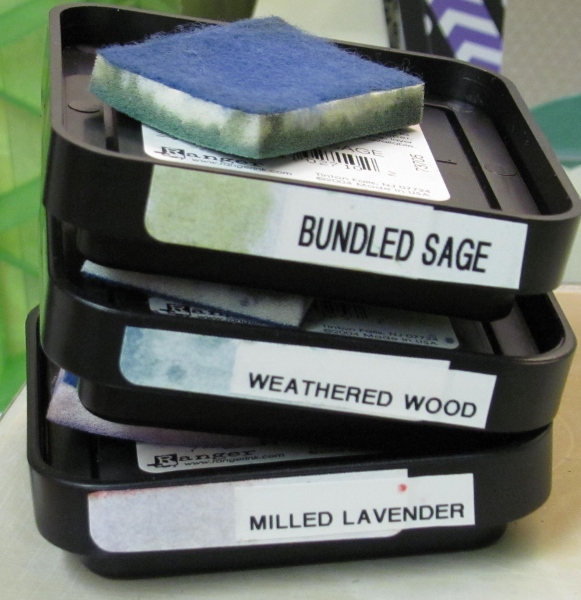
I started with three light colors of Distress Ink pads.

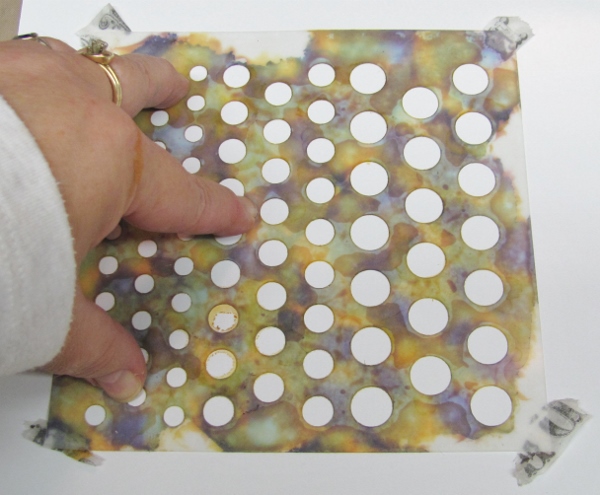
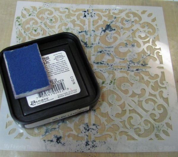
These were pressed onto the surface of the stencil, overlapping some intersections for good coverage.

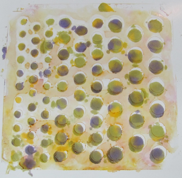
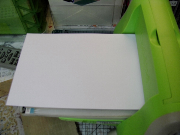
I loaded the Cuttlebug with the A plate, the B plate, a rubber mat, and the plain white paper.

Over this went the wet inked stencil, face down over the paper.


Then came the B plate along with a shim of chipboard.


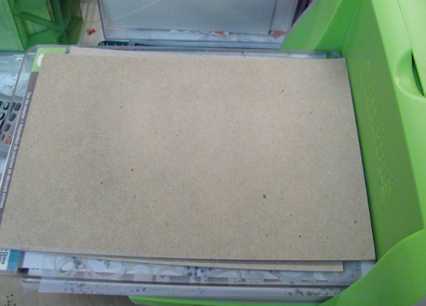
NOTE: this would be easier with a larger machine like the Big Shot as the stencil is really tight in the opening of the Cuttlebug. If I were going to do this again I might trim off 1/8 inch from the edge of the stencil.

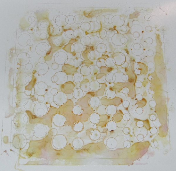
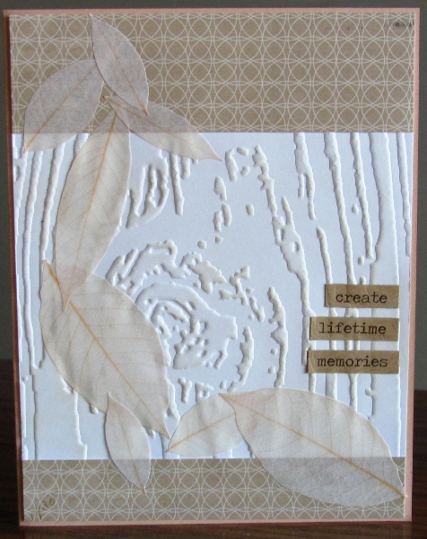
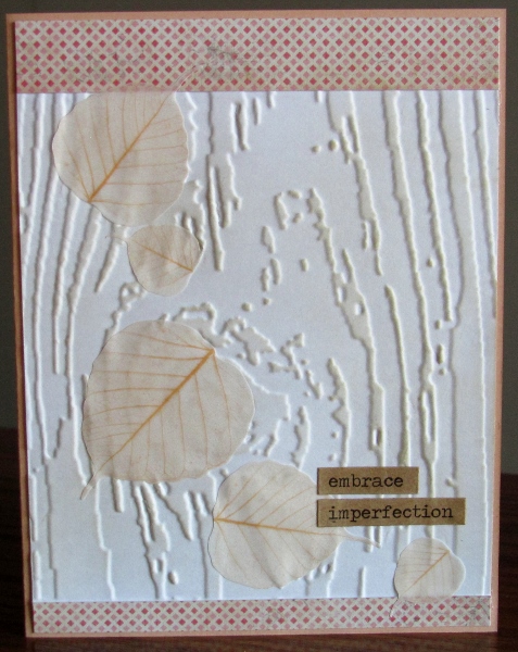
And look what you get after cranking it through!
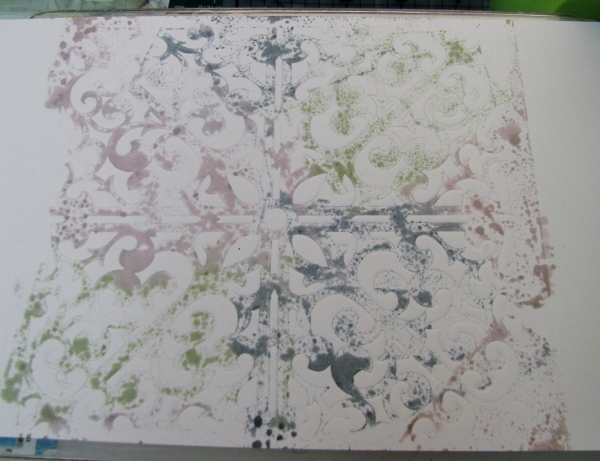
Yummy, yes?

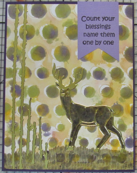
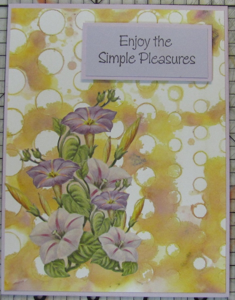
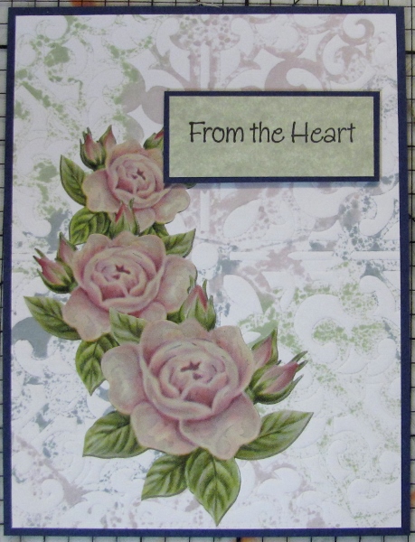
I trimmed it down and combined it with some floral stickers and a popped up stamped greeting to create this card:


Ddd

Posted by studio3d@ccgmail.net at 12:01 AM PDT
Sunday, 26 October 2014
On the Dot - a Stencil Tutorial
Topic: Stencils

I have some fabulous new stencils from My Favorite Things that I have been playing around with. So over the next several days I will show a wide variety of techniques with my five new toys!

As soon as my order was in I started brainstorming a list of techniques I wanted to try - some generic and some inspired by the stencils themselves!

Once I had the these stencils in hand I was very satisfied with my order because they are heavy enough to lay flat but still flexible so they can manouver around lumpy things on projects. They do not crease easily and there are a good variety of designs to choose from.

The stencil I'm using today is graduated dots which has three sizes of dots on one sheet.

The technique is alcohol ink print-making and the supplies I used are:

Ranger alcohol inks in three colors

and a blending tool with a felt pad.

I taped the stencil to a glossy cardstock with tissue tape.

Then I inked up the felt pad with multiple drops of each alcohol ink and pounced over the stencil.

Nice rich color fills all the holes.

Then I put some rubbing alcohol in a spray bottle:


I used this to spray the stencil which acrivates the color left on the surface. By pressing this to the cardstock I got a lighter impression to use as a fill.

Like this

I repeated this on additional clean glossy cardstock:

Love the way the edges of the holes made nice clean lines.

I was able to get three prints, spraying alcohol between each impression.

From the initial print (directly tapping the ink through the stencil) I made this card:

From the spritzed stencil prints I made these two cards:


The trims were stickers, stamped sentiments and rhinestones from my stash of supplies and colored card bases for bordering.

Ddd


Posted by studio3d@ccgmail.net at 11:11 PM PDT
Saturday, 25 October 2014
The Woods In Fall
Topic: Dry Embossing

More scraps left by the granddaughters were some woodgrain embossed on white cardstock. They were squareish so I added some scraps to top and bottom to get them up to A2 card size.

I used some Distress Ink to make the woodgrain more defined and then found some vellum leaves in the sticker drawer.

I added words from the Tim Holtz book of word stickers, using those printed on Kraft.


I had two styles of leaf in different sizes so I made sure the leaves on each card were consistent.

These are both built on kraft card bases.

Ddd


Posted by studio3d@ccgmail.net at 12:01 AM PDT
Friday, 24 October 2014
Country Fall
Topic: Dry Embossing

I picked up a new embossing folder a while back and hadn't used it yet. Then, after the granddaughters left, I found a scrap left behind from one of their projects... a blue cardstock with the chicken wire embossed on it.

Some of the white core showed through so I used my sanding block to expose even more and love the result.

I made a card base by combining this scrap with some linen-look paper and then went to the sticker box to see what I could find that would suit these papers.

I came up with a fall scene using stickers from three sets. The cats and pumpkins are one set, the scarecrow is another set and the stars are yet another.


I used a blue marker to draw in some ground for everything to rest upon.

Ddd


Posted by studio3d@ccgmail.net at 12:01 AM PDT
Thursday, 23 October 2014
Glitz and Glimmer
Topic: Teabag Folding

I decided to go all flashy with this teabag folding and paper embroidery card.

I started with a medallion made of wrapping paper - cream, printed with gold and black. It also has more of a fancy fold, adding to the glamour.

I chose a shiny gold metallic cardstock to stitch on and worked the design in black and brown threads. A metallic brad holds the medallion in place and I added sticky back rhinestones to every other scallop.

So hard to photograph shiny metallics!

I used a cream base card to match the medallion and added a gold Dazzles sentiment sticker to the bottom.

Ddd


Posted by studio3d@ccgmail.net at 12:01 AM PDT
Wednesday, 22 October 2014
Almost Quilted
Topic: Teabag Folding

I think this teabag folding card with paper embroidery looks almost quilted. It must be the way the stitching looks like a Texas Star quilt block.

I didn't have a cream colored thread to match the medallion so chose to use something that would echo some background lines in the paper. This border is a little small for the medallion but the way I arranged them in layering makes it look planned.

I used some sticky backed tinted teardrops around the border to pull in more blue and they show up better than I expected on the dark blue background.

I went with a cream card base to feature the medallion more and mounted it with a single brad.


I cut apart a Dazzles gold sentiment and mounted half at the top and half at the bottom.

Ddd


Posted by studio3d@ccgmail.net at 12:01 AM PDT
Tuesday, 21 October 2014
Tippy Teabag
Topic: Teabag Folding

Here is another of the four cards I made combining teabag folding and paper embroidery.

This one is my least favorite for several reasons:

-- the frame is just a smidge too small for the medallion, making it look crowded

-- the yellows are a poor match

-- there was no way to align the points with the beads without covering the beads, making the whole thing off kilter

-- I was disappointed after I rounded the top corners

-- not enough space to add sentiment or decor but looks unfinished without it


I guess that means "If I had it all to do over again, I wouldn't"!

Ddd


Posted by studio3d@ccgmail.net at 12:01 AM PDT
Monday, 20 October 2014
Tea On the Square
Topic: Teabag Folding

I haven't done teabag folding for oh so long! But I joined in a swap for cards that combined teabag folding and paper embroidery and needed to fulfill that challenge.

I couldn't decide between four different units so I went through my patterns and chose different borders for each of them, matched up papers and threads and jumped right in.

I used to do most of my stitching on the road (hubby driving) but we haven't been driving as much. This cut into my stitching time! Fortunately we had a road trip scheduled so I packed up my kit and soon had all 4 borders stitched.

This first one is what I finally selected to send for the swap - it's headed off to The Netherlands.

The medallion was tri-colored and I wanted to use all of those colors in the embroidery. I think this pattern is marked Linzoos but I have no idea where I got it, other than it was free online.

I chose a paper that looks like gauze and stitched up all the embroidery. The pattern calls for rice beads but I don't have any so I used bugle beads instead. I added matching seed beads and sticky back rhinestones.

The teabag fold is held in place with ATG tape as well as a single brad.

Ddd 


Posted by studio3d@ccgmail.net at 12:01 AM PDT
Sunday, 19 October 2014
Three Watercolored Flowers
Topic: Stamping

OK, I am officially addicted to this technique. Once I showed it to the granddaughters they were addicted and now I am, too.

I amde this card larger than the usual ones I make so it will not go off to Operation Write Home. I might finally have some cards on hand to send to friends and relatives!

I used a different watercolor paper that I found when we ran out of the little pad I had been using. This was a bunch of loose sheets I had cut out of a letter-sized pad and of a higher quality. Not only were the pages thicker but there was less tooth and the surface could be manipulated when wet without pilling.

I worked on a half sheet filling the whole area. The top background was inked with tumbled glass and the bottom with sage green. Then I did the spot coloring with a green, pink and yellow. When this was dry I over-stamped with the flowers and the script.

I tore the top and bottom edges and placed on wide black borders. I trimmed the whole block and mounted it on a pink background that matches the flowers.

I added a sentiment block, bordered in the same pink and popped up on foam tape.

At the last minute I decided to use little dots of yellow pearl pen on the flower centers.

Ddd


Posted by studio3d@ccgmail.net at 12:01 AM PDT
Saturday, 18 October 2014
Two Toile
Topic: Coloring

Some time ago I was given a packet of black and white papers to use in crafting. About half of them were actually 'cream' instead of white which I liked better. One pattern (4 or 5 sheets) is a toile print that looks like antique fabric or wallpaper. There are only two sections of it that are whole scenes.

I cut out these two areas and colored them with the lightest colors in the Distress Markers set. When I was done they were still a bit bright and looked pretty fresh instead of looking antique like I wanted.

Then it occured to me that a whitewash might knock back the color and decided to use the Picket Fence "Distress Stain". This was perfect for muting the colors.

For the cards I layered them on two papers, did a little pen work with a fine black marker and added some tissue tape with script.


They were both finished with a blue-grey stamped sentiment popped up on foam tape.

Ddd


Posted by studio3d@ccgmail.net at 12:01 AM PDT
Friday, 17 October 2014
Bottles And Blooms
Topic: Stamping

I liked that watercolor background card I made the first day so much that I decided to do it again - note to self: buy more watercolor paper.

This time I selected the stamp with the bottles with flowers standing in them. What a great technique this was to use with this stamp. I decided to start with a two-toned purple background. To this I added the blue and green for the bottles and an orange and red for the flowers.

After the last dry I used an unreadable text stamp to add some background in espresso ink and then stamped the image with black.

I mounted it on a purple card base with a very fine black border and hand drawn pen doodles around the stamped panel.


I attached a stamped sentiment block at the upper left.

Ddd


Posted by studio3d@ccgmail.net at 12:01 AM PDT
Thursday, 16 October 2014
Butterflies Rising
Topic: Stamping

I had three granddaughters here a while back and, as with all my grandkids, we needed to have some crafty time. Having just finished up the stretching stamps class I wanted to show one of them a technique I had learned.

I chose to demonstrate the spot watercoloring that we learned on the bonus day.

In this you tape watercolor paper to the table, apply Distress Ink to a large acrylic block, spritz it with water and press it to the paper, hold for a bit for the color to soak in the paper some, and lift it off. Then you use a heat gun to day it. It is swiped with water on a brush and you hold an image stamped on acrylic over it and drop ink onto the damp paper underneath. You then let the color bleed out into the background some.

It is dried once again and then you stamp over it with black ink and make it into a card.

I chose to border the panel with gold paint pen, added some of this gold to the image and gave it a border of patterned paper. Then I added a sentiment strip cut as a banner, popped up on foam tape.

The granddaughter made hers with a purple background and an over-all butterfly background stamp enhanced with peacock blue.

Some fun!

Ddd


Posted by studio3d@ccgmail.net at 12:01 AM PDT
Wednesday, 15 October 2014
Stretch Your Stamps 2 - Day 11 - Play Day - f
Topic: Online Class

For my last card for this class I used a version of the stencils and Copics technique.

On white cardstock I used a birch tree stencil and a foam dauber to ink in the trunks. I used a W3 Copic marker to shade the left side of the trees. Then I cut out trunks to use later.

I stamped a house on white cardstock and colored with Copic markers and shading. 

I created a mask of the house and covered it while I used blue and green Copic markers in an airbrush system to make sky and ground.

I glued the trees in front of the house and added some partial trunks against the roofline. I used a fine marker to add a little fence and a few sprouts of grass.

The panel was trimmed to size and bordered with patterned red cardstock.


I stamped a sentiment block and mounted it with foam tape. At the end I used Liquid Pearls to fill in the heart in the sentiment.

---------------------------------------

So, have you been keeping track of how many cards I made for class? A total of SIXTY THREE! Tomorrow will definitely be something different.

Ddd


Posted by studio3d@ccgmail.net at 12:01 AM PDT
Tuesday, 14 October 2014
Stretch Your Stamps 2 - Day 11 - Play Day - e
Topic: Online Class

The technique used for this card was a focus on stencils and Copic Markers. 

On white cardstock I used a tree stencil and a foam dauber to ink in branches. I slightly offset the stencil and inked with another brown to create some depth. Then I used a fine line marker to sketch in the tree trunks and branches. I used a W3 Copic marker to shade the left and bottom of the branches.

I used blue and green Copic markers in the airbrush system to make the sky and ground then used a dauber with yellow ink to make the sun. I used a black marker to border the panel.

I stamped a house on white cardstock and colored with Copic markers. This was cut out and glued to the stenciled background. I bordered it with patterned dark orange.

I stamped a sentiment strip, inked its edges in yellow and mounted it with foam tape.

Ddd


Posted by studio3d@ccgmail.net at 12:01 AM PDT
Monday, 13 October 2014
Stretch Your Stamps 2 - Day 11 - Play Day - a/b/c
Topic: Online Class

The first technique shared on day 11 of class was called Layered Heat Embossing. I made 4 cards with this technique.

First I cut piece of tagboard and inked the edges with Versamark and dipped them in silver embossing powder. I melted this with a heat gun. Then I covered the face of the chipboard with Versamark. I covered this with and silver embossing powder and heated it. This was repeated to get even coverage.

I used the anti-static bag on the piece. Then I stamped the flag with Versamark and sprinkled on cherry red embossing powder. this was heated carefully to melt only the red.

I bordered with red cardstock and layered it on white cardstock which was dry embossed with a star folder.


I used the same process to creare a gold and red block and layered it on silver cardstock bordered in red.

The next panel was embossed with silver and gold which was layered on a gold cardstock embossed with a frame folder.

Oh, my. The white embossing powder used on the next block stayed slightly sticky so some of the powder stuck to the background. I embossed the stamping in silver first and it wasn't enough contrast to I stamped over that with gold.

I chose an irridescent cardstock to emboss with a dandelion folder for the background.

I can't see using this technique again. Well... maybe.

Ddd


Posted by studio3d@ccgmail.net at 12:01 AM PDT
Sunday, 12 October 2014
Stretch Your Stamps 2 - Day 10 - Silhouette Flowers - c/d
Topic: Online Class

The next technique I tried from the day 10 class was Light Embossing on Dark Cardstock.

This first card was the 'test piece' for the technique. I selected navy cardstock and stamped flowers in white pigment ink and embossed with cherry red. I stamped leaves with white pigment ink and embossed with Christmas green. I stamped berries with white pigment ink and embossed with white.

The colors were not very vivid so I went over them with Copic markers, changing the white berries to yellow. I trimmed the panel and mounted it to pink bordering card and a blue printed layer. I added this to some pink chevron cardstock over a card base.

I was not liking this too much so I used a gold gel marker to add some sketch lines on the navy background. Still not impressed with the look of it so I found a vellum pre-printed quote and trimmed it to the exact size of the flower layer. I ran this through the Xyron machine to coat the back with adhesive. The vellum was adhered to the panel and burnished to allow the flowers to show through.

Salvaged!


OK, back to following the instructions! For the next card I did the stamping in Versamark! Stamped flowers and embossed with cherry red. Stamped leaves and embossed with Christmas green. Stamped the berries and embossed with white. Stamped the flower centers and embossed with gold. MUCH better result.

I trimmed the panel and used a gold Krylon paint pen to band all four edges. I mounted this to a white card base.

I stamped a sentiment block on white and trimmed it. I used a gold gel marker to fill in the dots and lines then mounted it on the card front with foam tape.

Ddd 


Posted by studio3d@ccgmail.net at 12:01 AM PDT
Saturday, 11 October 2014
Stretch Your Stamps 2 - Day 10 - Silhouette Florals - a/b
Topic: Online Class

Day 10 of class started out by using the floral silhouettes as... underwater plants and corals. One of the secrets to success is in the choice of color palette.

I traced a circle on white cardstock then used 2 dye inks and 2 chalk inks to stamp 4 silhouette floral 'sprigs' leaving white space at the top.

I diecut a circle in another white cardstock and a larger circle in green shimmer cardstock.

I embossed a sentiment in gold on white cardstock, trimmed and mounted it as a band on the green layer. 

The diecut layers are glued together and mounted with foam tape over the stamped layer.

Three clown fish from a sticker sheet were placed in the undersea scene.


The second card is similar but has a few changes to note. I used a darker green cardstock, added a gold edging to the sentiment strip using Krylon paint pen, and used holographic fish stickers.

You can see that the colors I chose have a bluish cast and are lighter in the background and gradually get greener and darker as the foliage comes forward.

Ddd


Posted by studio3d@ccgmail.net at 12:01 AM PDT
Friday, 10 October 2014
Stretch Your Stamps 2 - Day 9 - Silhouette Florals - e/f/g
Topic: Online Class

The third technique from day 9 was an experiment fail for me. It needed 'coated' cardstock and a wet dye ink neither of which I had. It also used florals and foliage that actually went together which I also did not have.

The technique was to ink the stamp, press to the coated cardstock and twist it slightly to create a painterly look. My stamps/inks would stick to the paper and not allow me to twist them so the images were clear and not in the least painted looking.

I stamped three daisy style flowers each in different ink. Then I stamped two leaf types.

we were then to use a fine black marker to sketch in some lines to lend a more hand designed look to the stamping - not so regimented. I stamped all three with different sentiments in black.

On the first two I drew a black border on the panel and mounted them to green cardstock.

I like this sentiment style better as it seems to suit the art better:


The third one got a solid sentiment block and a black background.


The black border negated the need for a drawn border on this one.

Ddd


Posted by studio3d@ccgmail.net at 12:01 AM PDT
Thursday, 9 October 2014
Stretch Your Stamps 2 - Day 9 - Silhouette Flowers - b/c/d
Topic: Online Class

For the second technique on day 9 we used a lot of masking. I selected sprigs and grasses (most look like weeds to me) and stamped them on sticky notes. These were cut out and used in series to create bouquets in the lower left and upper right corners. Each stamp was stamped using a different color.

I stamped a large sentiment on the card and mounted to black cardstock for a border. Each card got three colors of Liquid Pearls decorating the flowers.

On the first card I boo-booed on one of the stems so I covered it by tying black twine over it.


Each of the three cards was made with a slightly different shade of Kraft cardstock.


This background actually has a bit of a parchment look to it.


These masks were very fiddly to cut and the result was not so awesome that I'd use them again. I decided to use them up by making all three cards at once and just be done with it.

Ddd


Posted by studio3d@ccgmail.net at 12:01 AM PDT

Newer | Latest | Older