More Graduated Dots - a Stencil Tutorial
Topic: Stencils
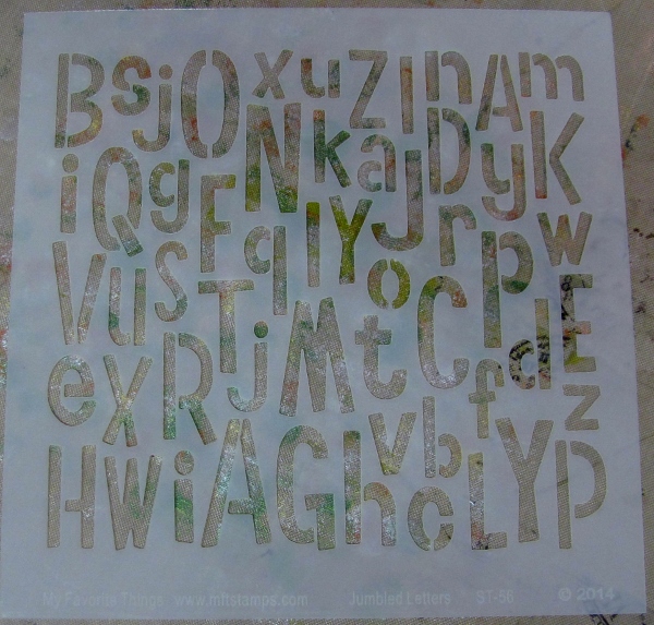
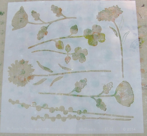
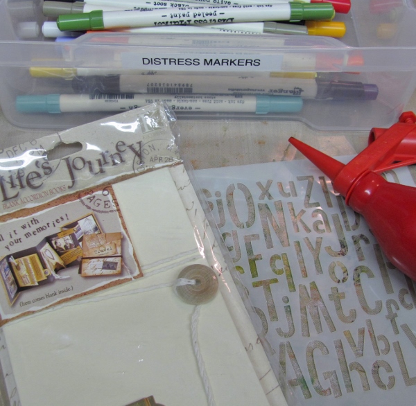
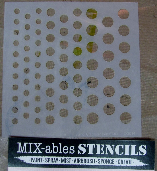
I have another technique to show you today using the Graduated Dots stencil. This is from my recent order from My Favorite Things.
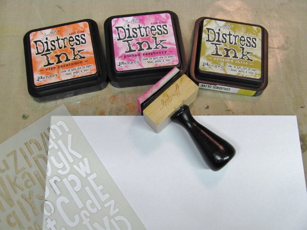
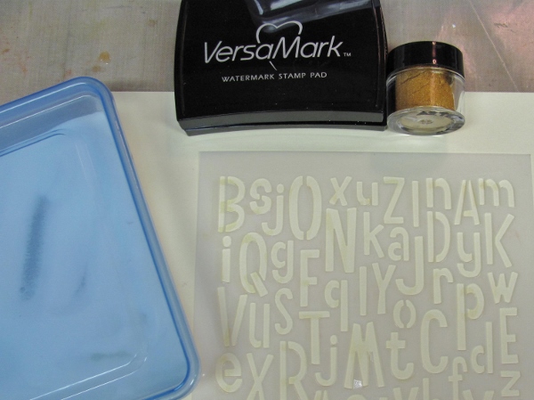
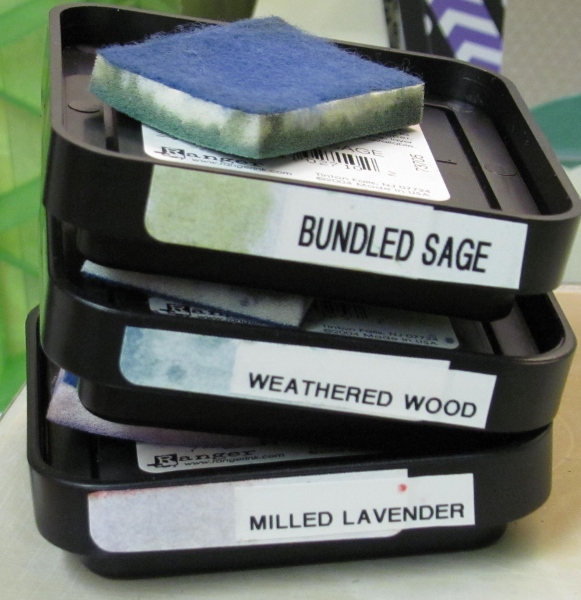
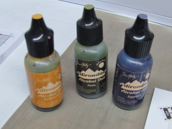
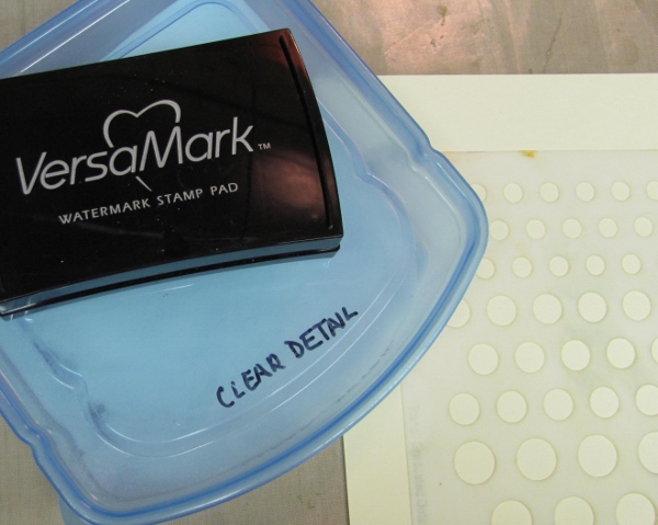
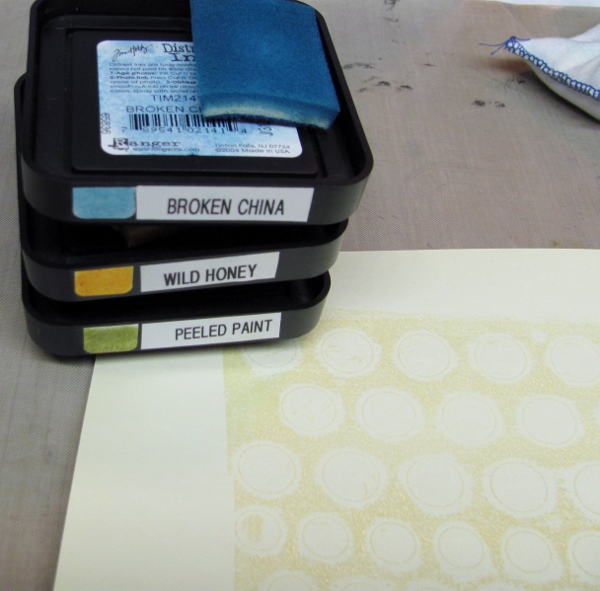
This technique uses Versamark, clear embossing powder, Distress Inks and StaZon Ink.
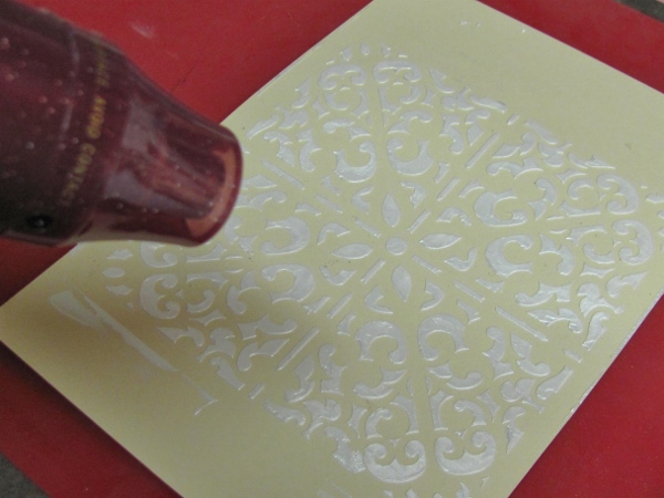
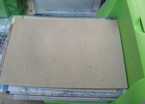
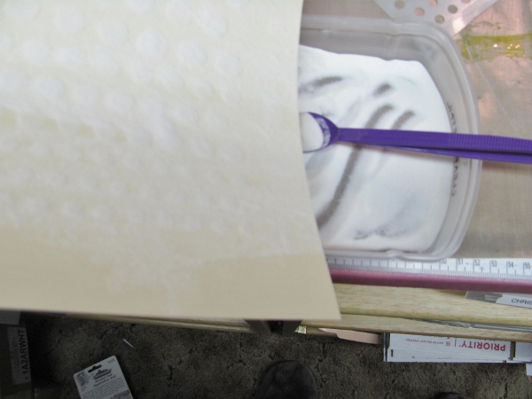
I am using cream cardstock as I wanted a light neutral but not too white. First, run an anti-static bag over the whole paper.

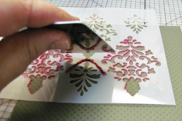
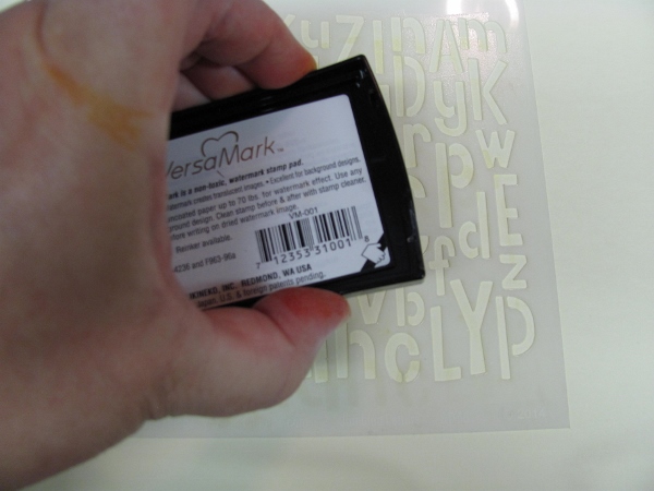
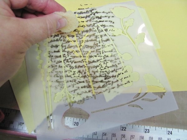
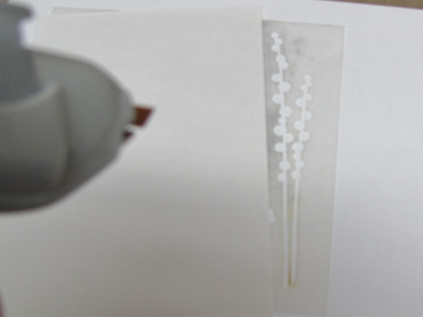
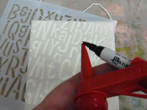
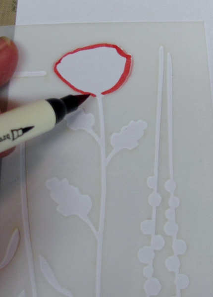
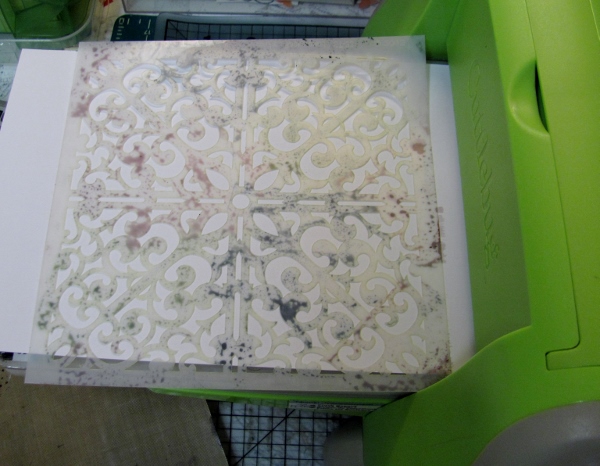
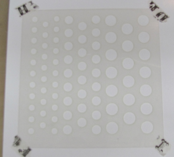
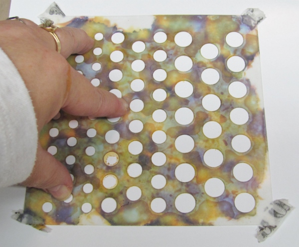
Tape the stencil in place with some low-tack tape or a post-it. This will hold it in place while you mush the Versamark pad down over the stencil. You want to make sure your holes are all filled.
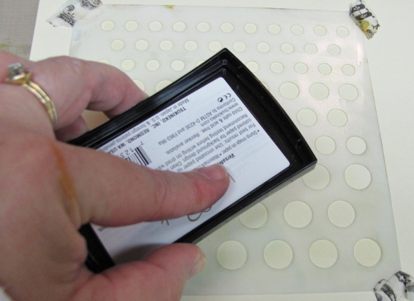
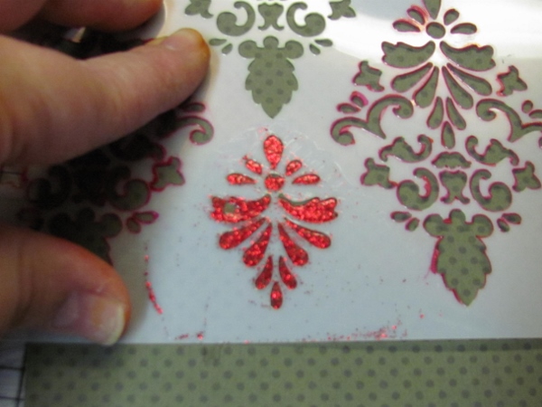
Then carefully lift the stencil off, turn it over and apply to a second sheet of cardstock. Rub thoroughly over the stencil to transfer the Versamark that was left on the surface.

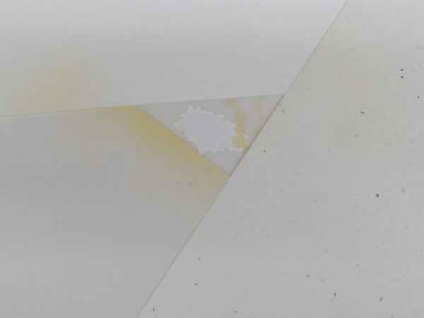
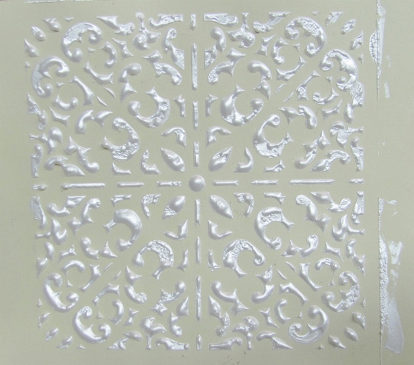
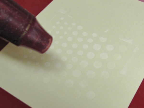
Cover first one sheet, then the other, with clear embossing powder.
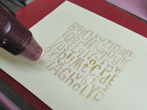
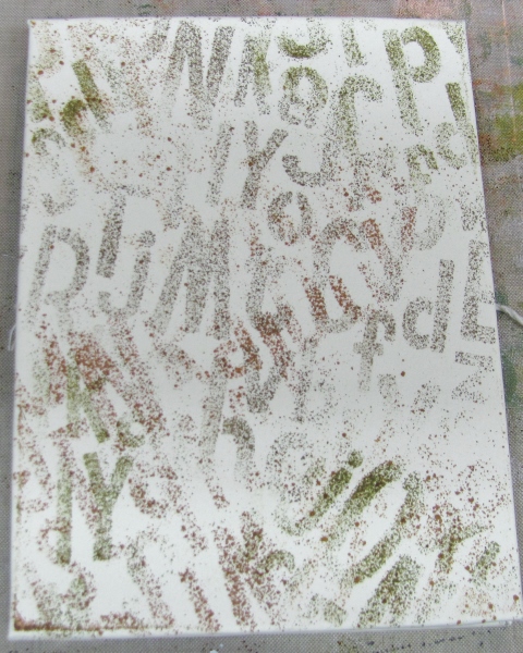
Heat set the embossing powder
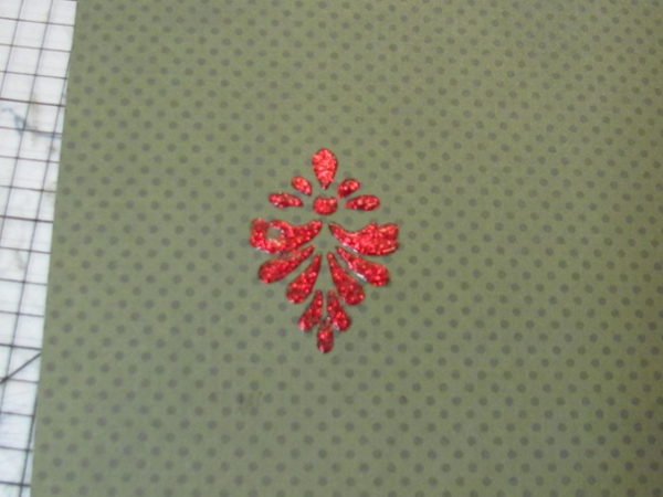
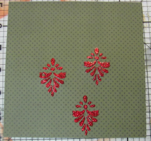
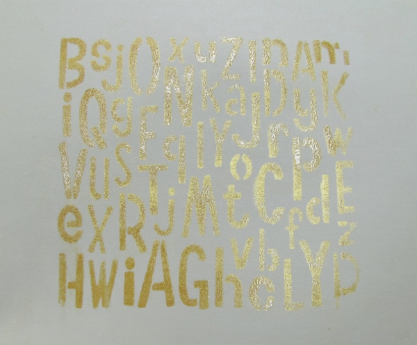
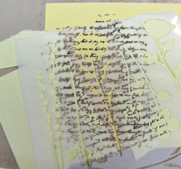
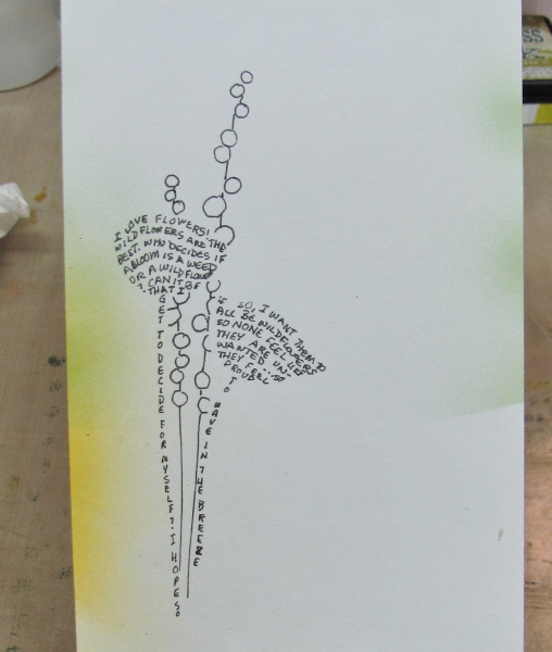
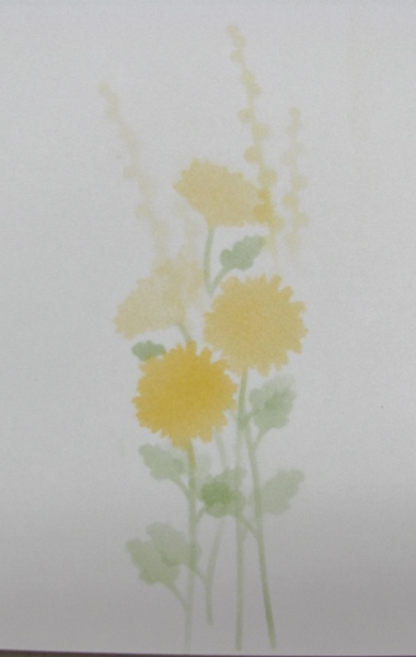
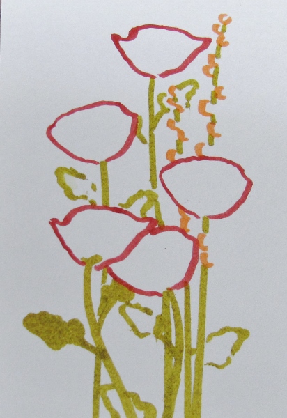
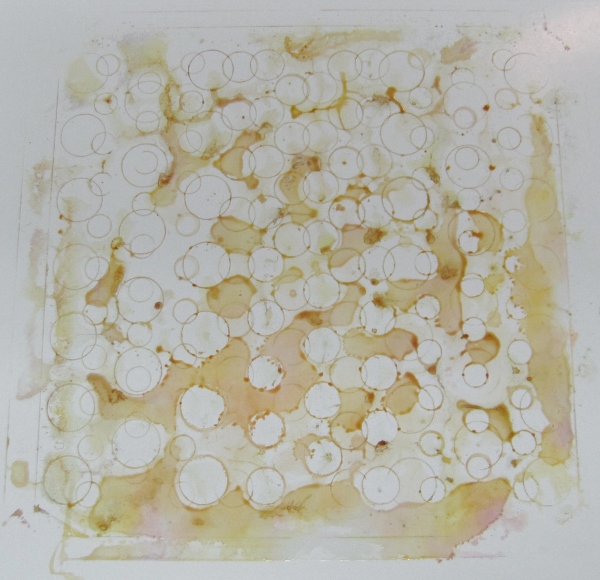
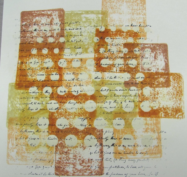
Now you have a positive and a negative of the design with an embossed resist.
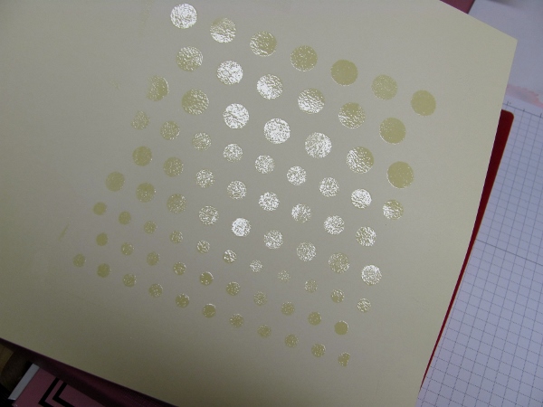
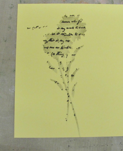
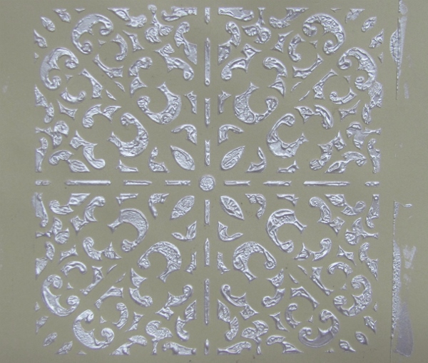
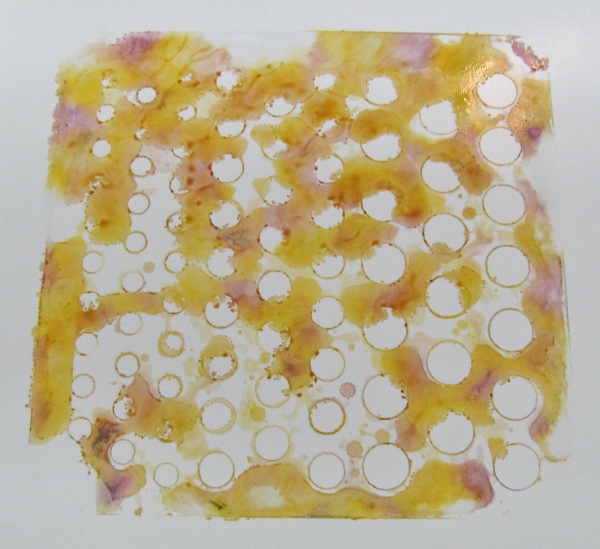
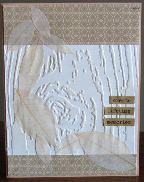
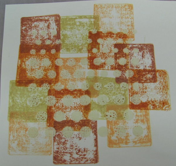
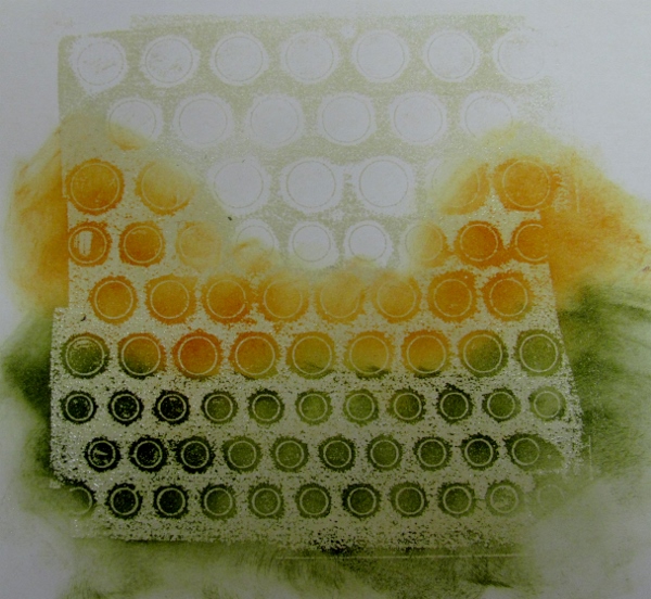
I used the positive design first.
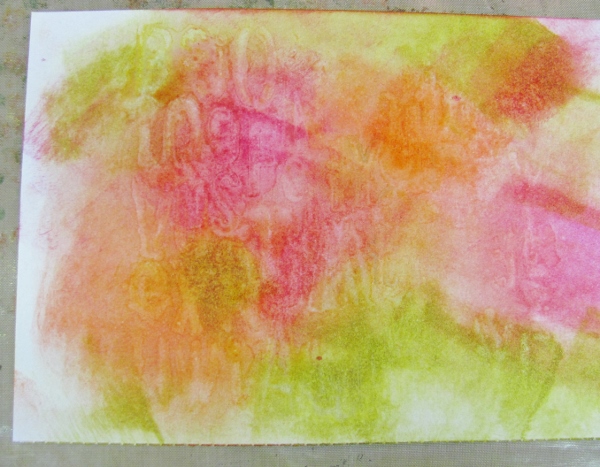
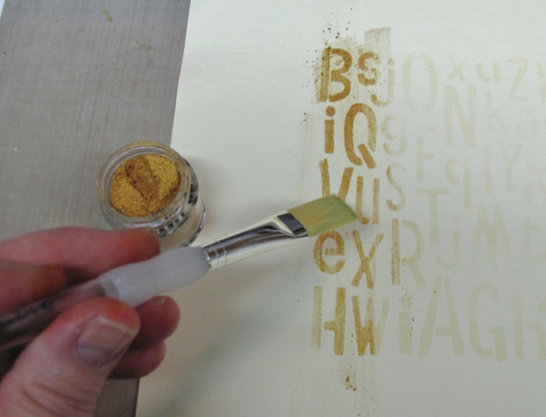
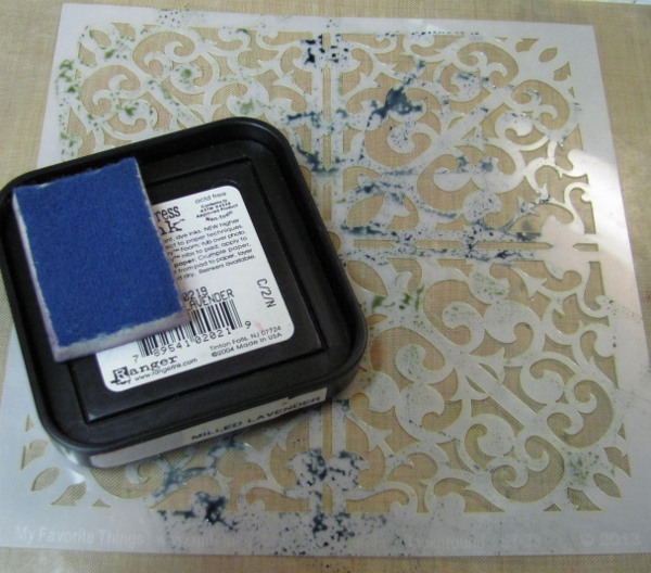
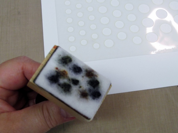
I selected four Distress Ink pads in earth tones
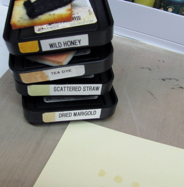
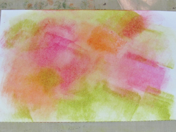
These were pressed direct to paper over the surface.
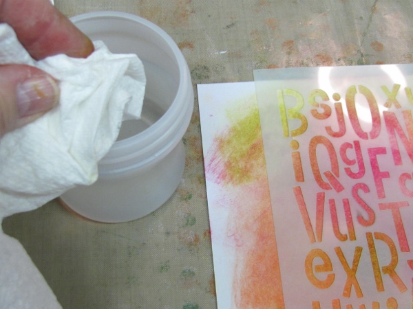
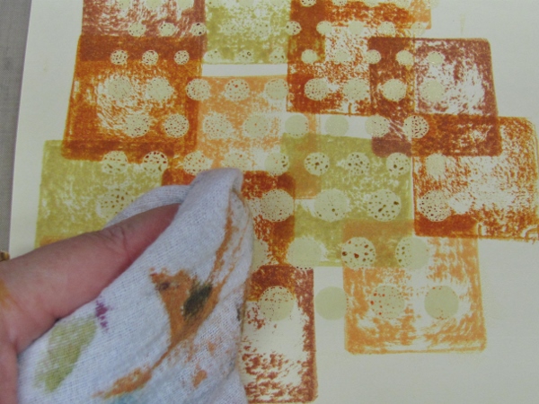
I used a cloth to buff the color off of the embossing
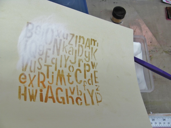
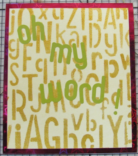
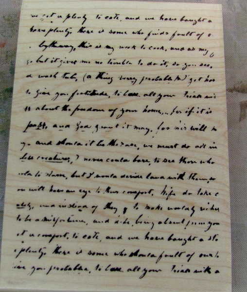
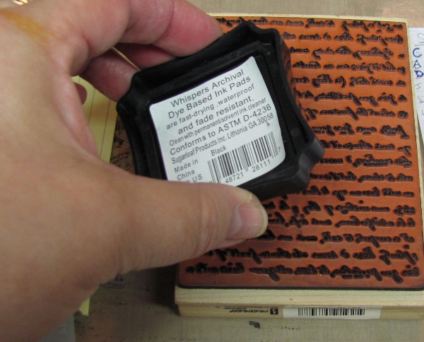
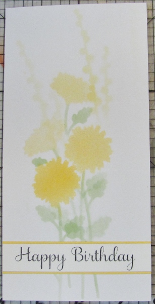
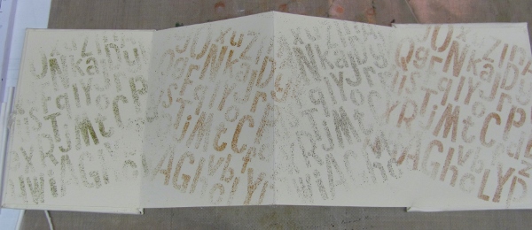
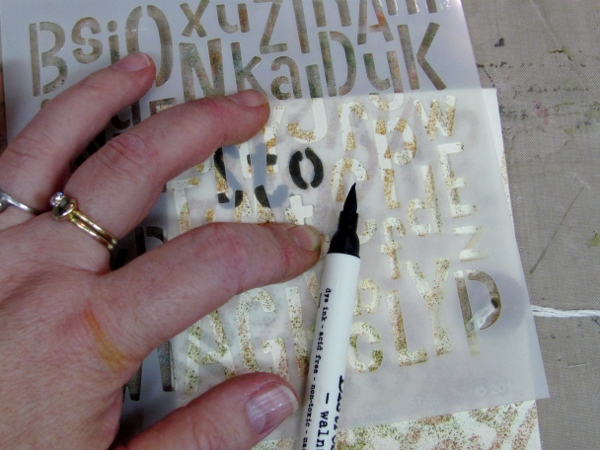
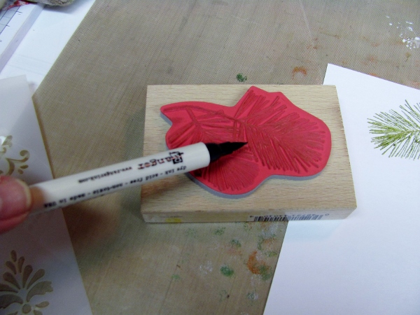
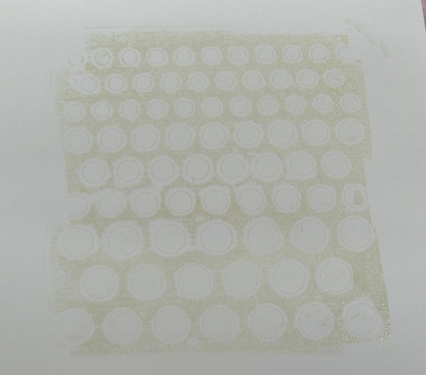
I selected a stamp of 'unreadable text' and black StaZon ink.
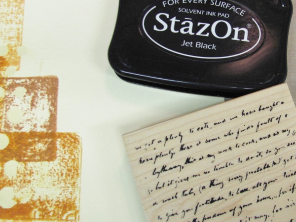
The text was stamped randomly and unevenly over the surface. The StaZon allows the ink to adhere to the embossing, making it permanent.
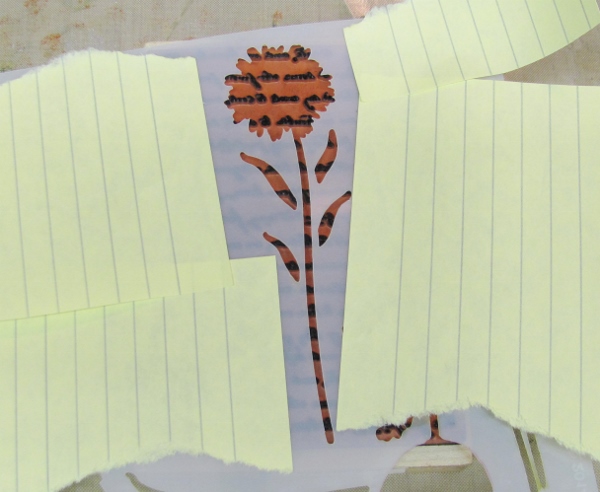
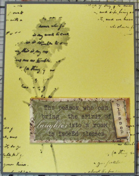
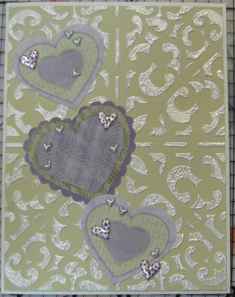
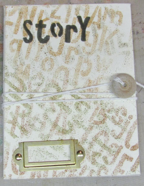
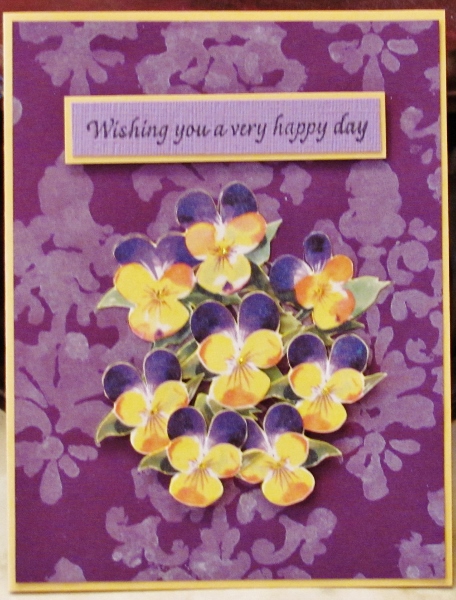
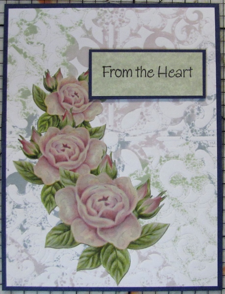
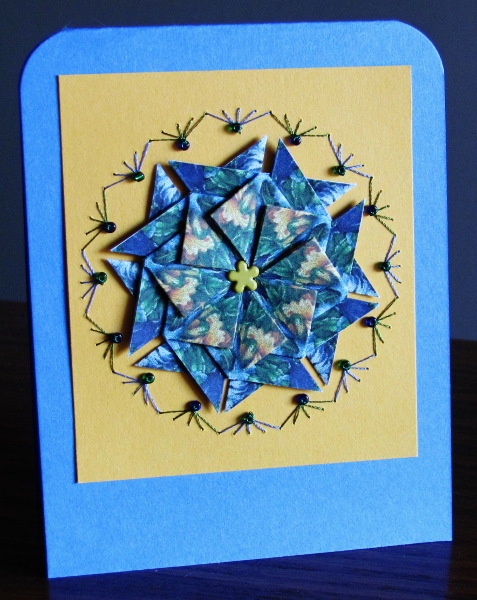
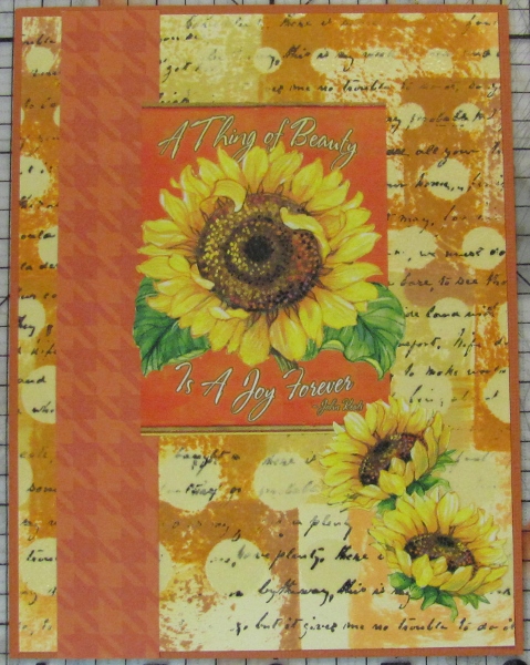
The card I made with this features a strip of houndstooth scrapbook paper and some floral stickers from my stash.
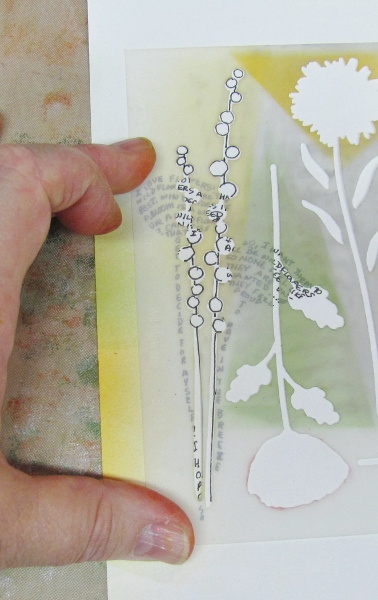
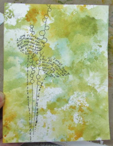
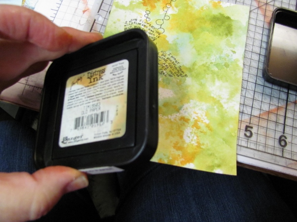
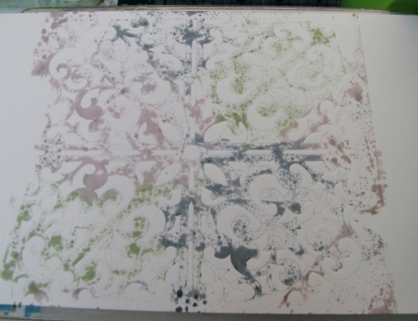
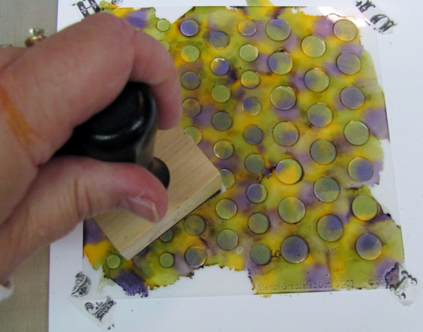
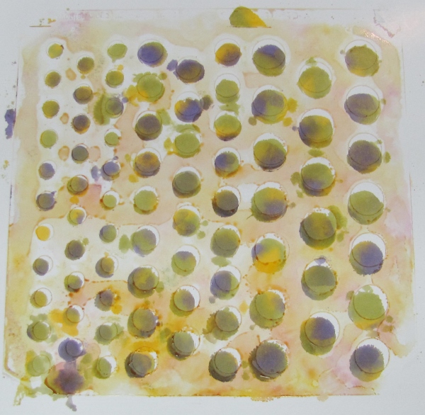
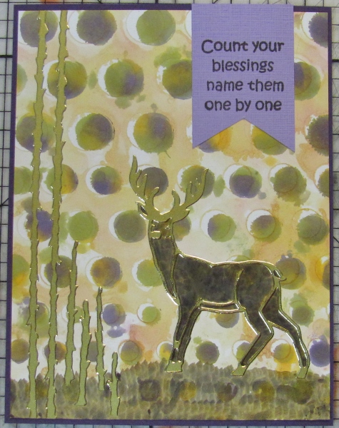
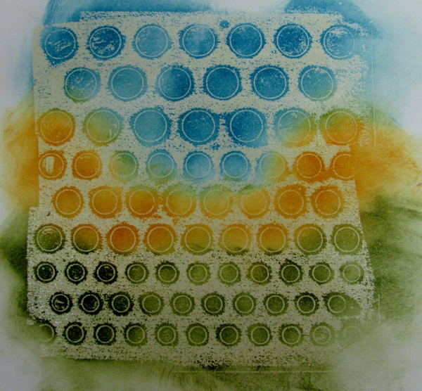
For the negative version of the embossed resist I used a green, an orange, and a blue Distress Ink so I could create a scene.
With the smaller dots at the bottom, I used a sponge tool to make a green 'ground' area.
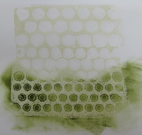
I then sponged on the orange to create a 'tree' area.
And, finally, the blue was sponged on for the sky
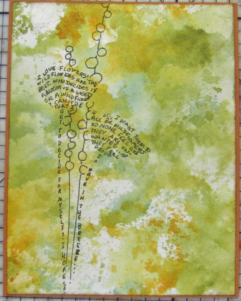
I used black StaZon to stamp trees, tall ones on the outside edges and low ones in the middle.
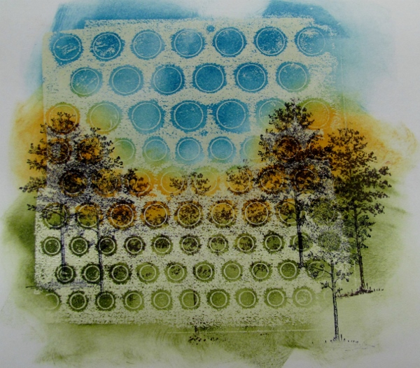
I also added some grasses to the foreground

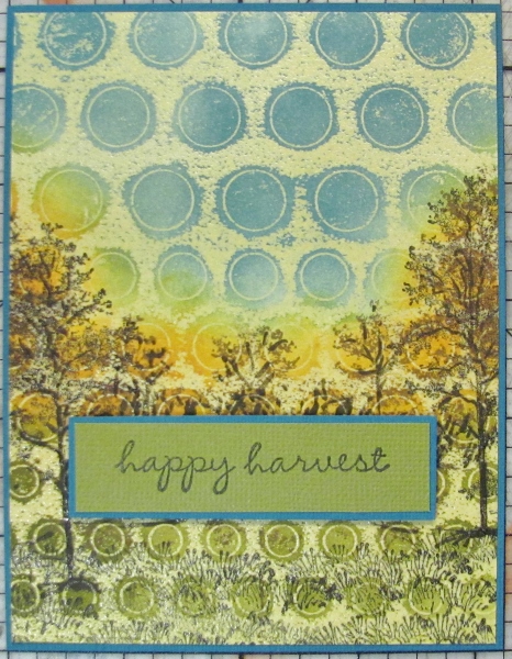
The card made from this is banded in teal to bring out the color in the sky. A stamped greeting is banded and popped up on foam tape.
TWO IMPORTANT NOTES about this technique: 1) be prepared with TWO sheets of cardstock so you get your positive and negative. 2) when you do you initial mushing of the Versamark, be generous so your reverse imprint will have plenty of ink to transfer.
Ddd
Posted by studio3d@ccgmail.net
at 12:01 AM PDT