« January 2015 »
S M T W T F S
1 2 3
4 5 6 7 8 9 10
11 12 13 14 15 16 17
18 19 20 21 22 23 24
25 26 27 28 29 30 31
You are not logged in. Log in
Entries by Topic
All topics  «
3D paperwork
A - Z challenge 5
A - Z challenge 7
A - Z challenge round 4
A to Z challenge round 3
A to Z round 2
A to Z round 6
A-Z round 1
Around the House
Art Challenges
Artist Trading Cards
Backgrounds
Beads
Bible Journaling
Books
Boxes
Collage
Color Challenge
Coloring
cookbook
Die Cuts
Digital Projects
Digital Stamps
Drawing
Dry Embossing
Fabric Stuff
Fantastic Folds
Field Trip
Home Decor
How Does Your Garden Grow?
Hymnal Art
In The Kitchen
In the studio
Jewelry
Lettering
Links
Multi-Technique
Music to Work By
Musings
Nail Art
New Work
Online Class
Other Hobbies
Other Projects
Painting
Paper Embroidery
Paper Piecing
Photo
Pretty Paper
Quilting
Random
reading
Scrap Recovery
scrapbooking
Sewing
Sketch Challenge
Some Backlog
Stamping
Stencils
Stickers
Supplies
Teabag Folding
Techniques
Testing
tips and tricks
Tutorial
Web resources
Welcome to my Blog
Work By My Friends
workflow
Writing
Blog Tools
Edit your Blog
Build a Blog
RSS Feed
View Profile
Group One
In & Out of Studio 3D
Wednesday, 7 January 2015
Operation Write Home - sketch 162
Topic: Sketch Challenge

On to OWH sketch 162

A strip of table scrap with awesome colors, a pre-stamped sentiment on a coordinating bright, a table scrap of diagonal plaid and a soft plain block to tone it all down.

I used green for the bordering to pull that out of the initial colored strip.

Three butterflies punched out of an irridescent paper brings some movement to the very static sketch.

The butterflies have loose wings so they can be raised.

Ddd


Posted by studio3d@ccgmail.net at 12:01 AM PST
Tuesday, 6 January 2015
Operation Write Home - sketch 161
Topic: Sketch Challenge

It's a good thing sketches are made to be 'a starting point' as it allows me to do my own thing. Here's OWH sketch 161:

I started with a table scrap strip of distressed paper and keyed other parts off those colors.

These included the teal borders for the distress strip and then found the greens and golds in a diagonal plaid.

I had the oval cut from a red paper and that led to selecting the flowal diecut - which is the 'over the top' I was talking about earlier.


Too much yellow in the photo makes this look orange rather than red. :(

I added oval rhinestones in the upper right to bring that teal back into the design.

Ddd


Posted by studio3d@ccgmail.net at 12:01 AM PST
Monday, 5 January 2015
Operation Write Home - sketch 160
Topic: Sketch Challenge

An over-the-top sketch is presented in OWH 160


This was a great way to use up some table scraps, though. Then the pre-stamped sentiment I chose was not large enough for the sketch so I had to add a layer, adding even more complication to the design.

I had a lot of dotted papers in the scraps and decided on black for the bordering and backing.

Because the large block was a stamped sentiment I had to do something else with that small strip on the lower right. I used a border punch and then added washi tape on the top half.


The strip was not the same size as the sketch strip but I think it works.

Ddd


Posted by studio3d@ccgmail.net at 12:01 AM PST
Sunday, 4 January 2015
Operation Write Home - sketch 159
Topic: Sketch Challenge

Moving right along to OWH sketch 159:


I deviated from the sketch a bit for this one, dropping one layer of background and turning the circle element into double hearts.

I've had the background hanging around since the 'stretch your stamps 2' onine class, waiting for just the right project. The hearts were punched out from some 'craft flop' paper from the glue pad experiments.

I mounted them on black cardstock and trimmed with a thin border. The back one is glued to the background and the front one is popped up on foam tape. 

The stamped sentiment was trimmed and backed in black with a thin border as well. The left is up on foam tape while the right rests directly on the heart.


The red twine tied around the background is a much closer representation of the color in this than the 'orangish' hearts. They are all actually a bright red.

Ddd


Posted by studio3d@ccgmail.net at 12:01 AM PST
Saturday, 3 January 2015
Operation Write Home - Sketch 158
Topic: Sketch Challenge

Almost a month since I did any OWH sketches for my self-challenge. In case you're new to this, at the first of 2014 I challenged myself to use every one of the Operation Write Home sketches - in order. I has uses a few here and there and I have allowed myself to re-post those cards without making a new one for those sketches. And in 12 months, I am now up to sketch 158.

Here's the sketch


For this card I pulled out some table scraps from the desktop and a pre-stamped sentiment.

I trimmed scraps of the recent craft flop of acrylic sprays and found a stamped greeting on a coordinating color. I used a picket fence Distress Marker over the lettering to make it more readable. I added these to a tone-on-tone dot background over a white card base.


A couple of punched butterflies from table scrap papers are the finishing touch.

Ddd 


Posted by studio3d@ccgmail.net at 12:01 AM PST
Friday, 2 January 2015
On The Edge
Topic: Scrap Recovery

While I was looking for a background to use with yesterday's semi-disaster I ran across this scrap trimmed from one of my stenciled cards. The same bin of scraps had these two strips of dotted green cardstock and, together, they exactly filled a card front! 

I just added some black peel off stickers - leaves, stripe and greeting - and the look was complete.

Must have been meant to be.

Ddd


Posted by studio3d@ccgmail.net at 12:01 AM PST
Thursday, 1 January 2015
When In Doubt, Cut It Out
Topic: Stencils

Still in the 'follow the wandering brain' mode I set out to try another odd idea. I had gotten some new spray colors in a product sampler pack and wanted to test them out through a stencil.

So I got out the So I got out the Wildflowers stencil from My Favorite Things to try it out. to try it out.

CRAFT FLOP (not all the way to a fail, but definitely not great). The problem was with the sprays themselves. I had turquoise and black. Did they mist, spritz or spray? No, they snorked, blobbed and blooped. I tried spraying farther away, but that was no help. Turns out the paints were more like an acrylic than a watercolor in viscosity and transparency.

Also, I was using glossy cardstock and they were designed for 'porous' surfaces so they sat on top and did not dry well. I finally had to hit them with the heat gun to dry.

I heard in my head the well-known quilter, Bonnie Hunter, who says (regarding fabric), "If it's still ugly, you just didn't cut it small enough!" Well, the spritzed cardstock I had in hand was obviously not cut small enough because it was hideous.

So I cut out two areas that were passable and bordered them with teal. I decided to use them both on the same card and found a scrap of 'wrinkle-free distress background' left over from a precious project. Well, look at that, it has teal in it. I can work with that!

I bordered it with teal as well and popped one of the flowers up on foam tape.


I added the birthday greeting in black to go with the black in the splattered flowers. Ddd

Posted by studio3d@ccgmail.net at 12:01 AM PST
Updated: Friday, 28 November 2014 9:32 PM PST
Wednesday, 31 December 2014
The 2014 Year In Review

Here we find ourselves at the end of another year in Studio 3D.

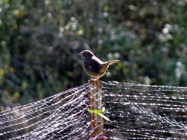
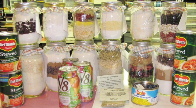
I thought I'd do a quick 'by the numbers' calculation on what's been included in 2014, so here we go: 11 pieces of doll clothes, 7 flashy nail finishes, 1 home decor sewing, 21 quilts, 9 pieces of jewelry, 6 wildlife photos, 8 gardening products, 4 cooking posts, 1 handbag, 1 field trip, 1 stamp carving, 28 paper embroidery cards, 195 cards for157 OWH sketches, 64 cards for online class homework, 22 projects for product tutorials, 9 contract kits with 72 cards, and 71 miscellaneous other cards.

From these I have selected 13 items as my favorite creations over the last 12 months.


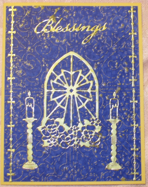
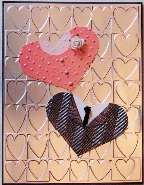
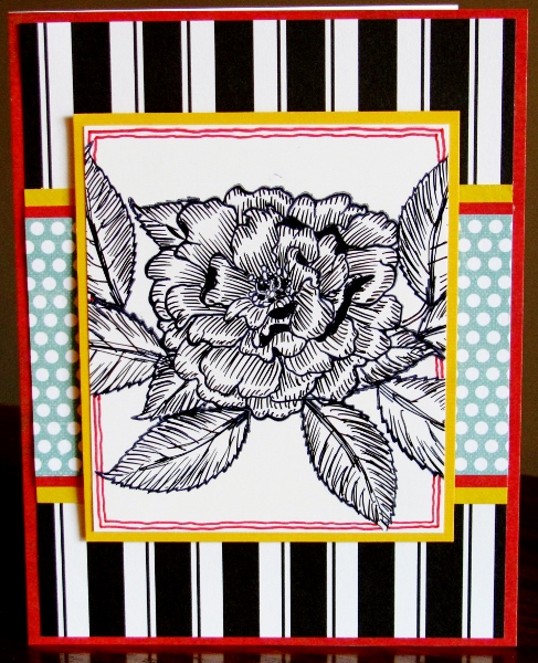
1) This card is an over-the-top use of dry embossing and diecutting. What an elegant result:


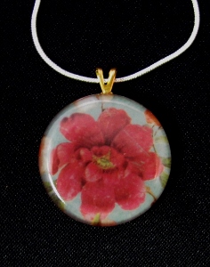
2) Resin jewelry is awfully fun to do:


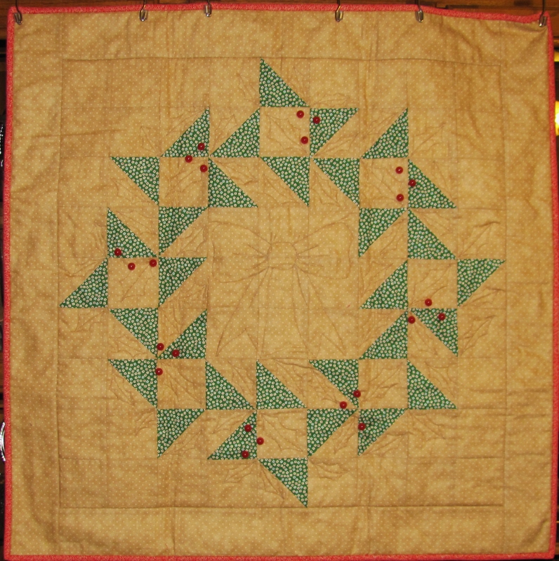
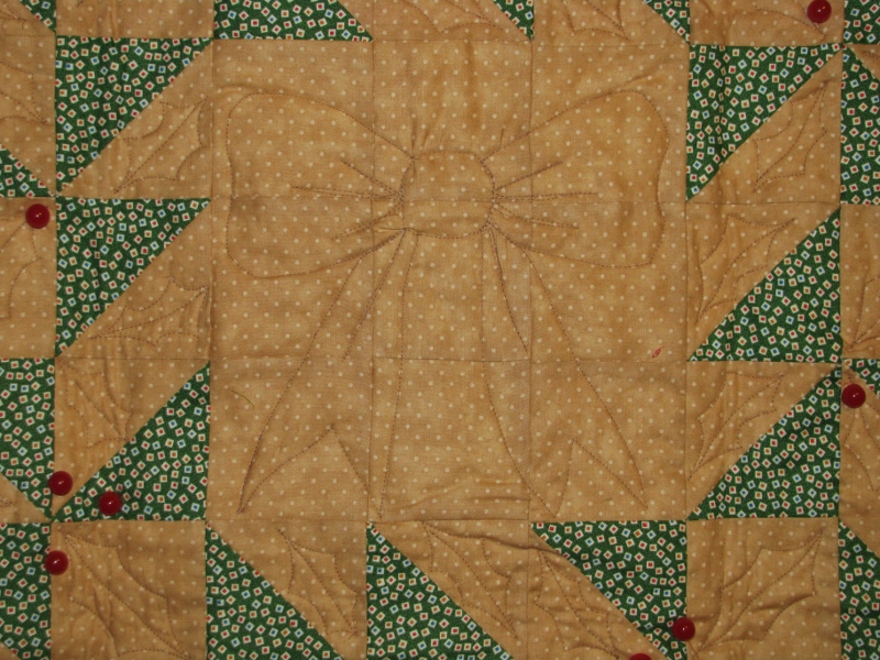
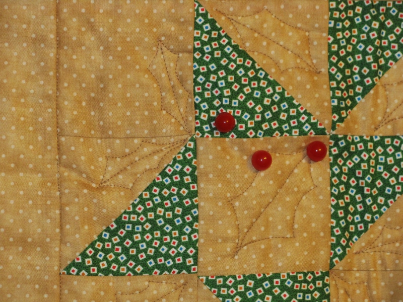
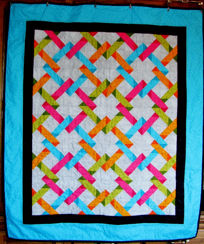
3) An original quilt designed from scratch. This was the featured quilt for a time on the Electric Quilt 7 gallery (EQ7 isa design software program)


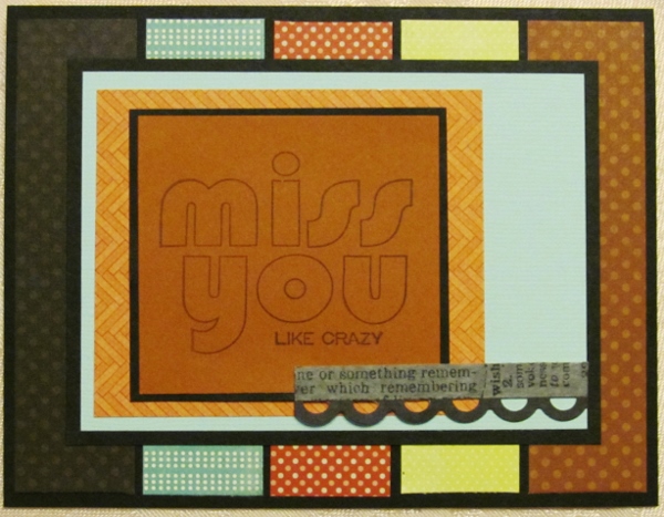
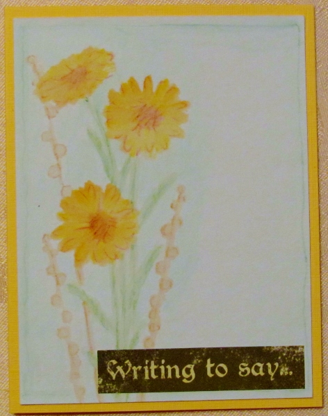
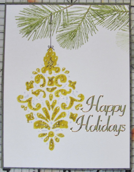
4) This was a new technique, stamping onto wet watercolor paper


5) From a technique taught in an online class I took part in


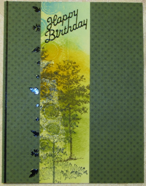
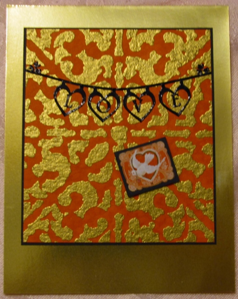
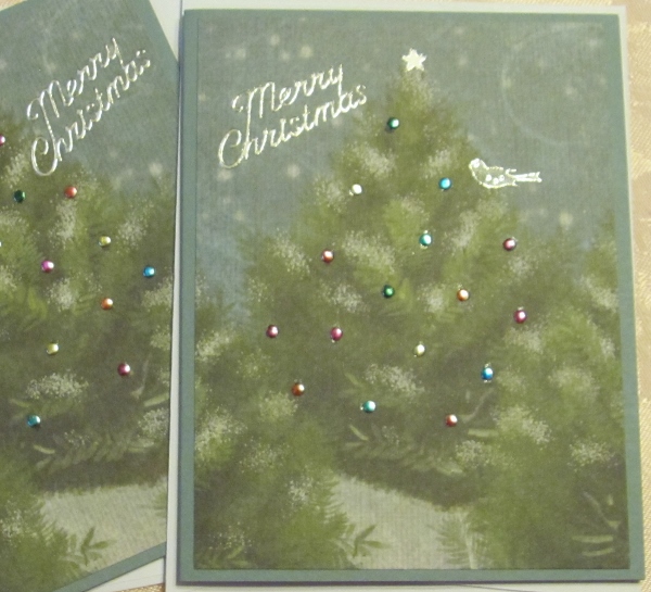
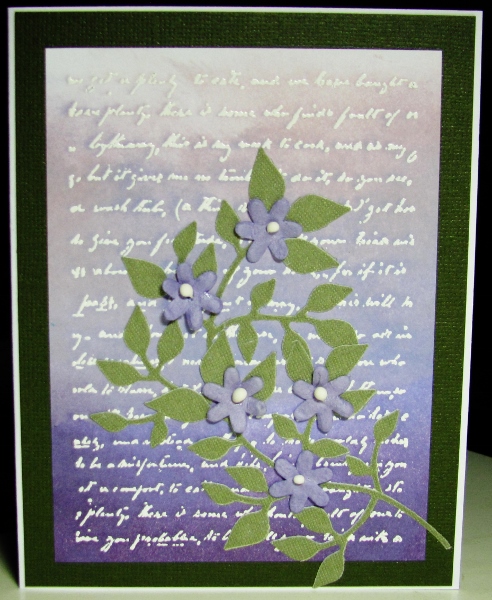
6) Love the ombre effect over the white embossed text


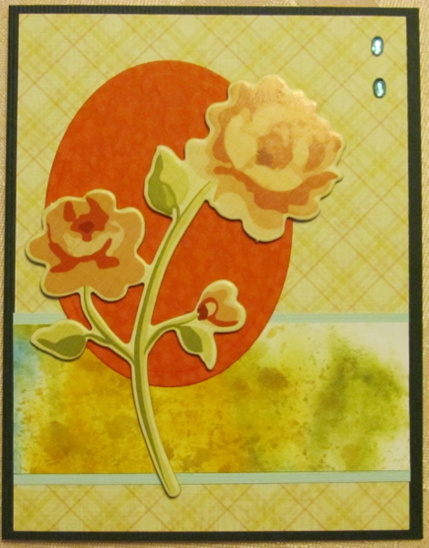
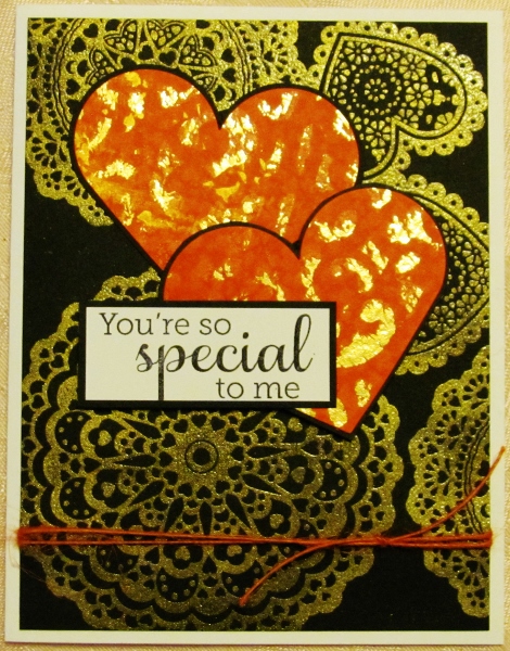
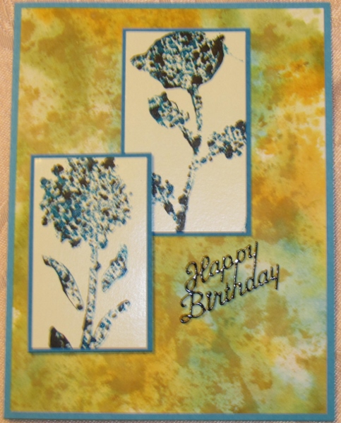
7) I really like the realistic color effect on this one


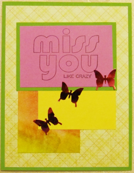
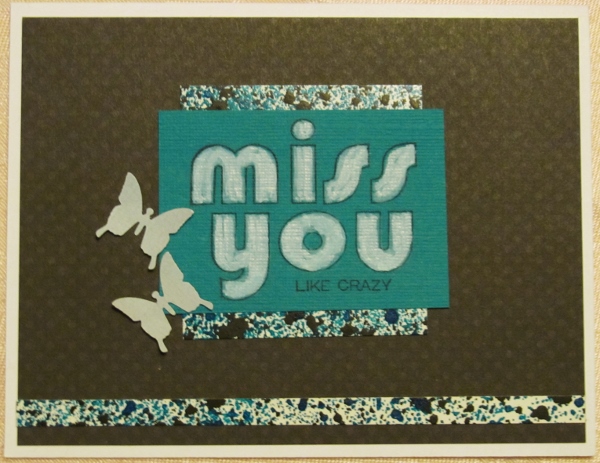
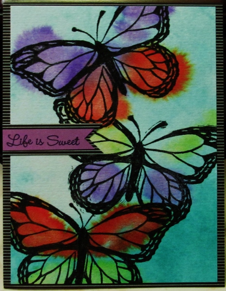
8) You can't go wrong with butterflies in my opinion


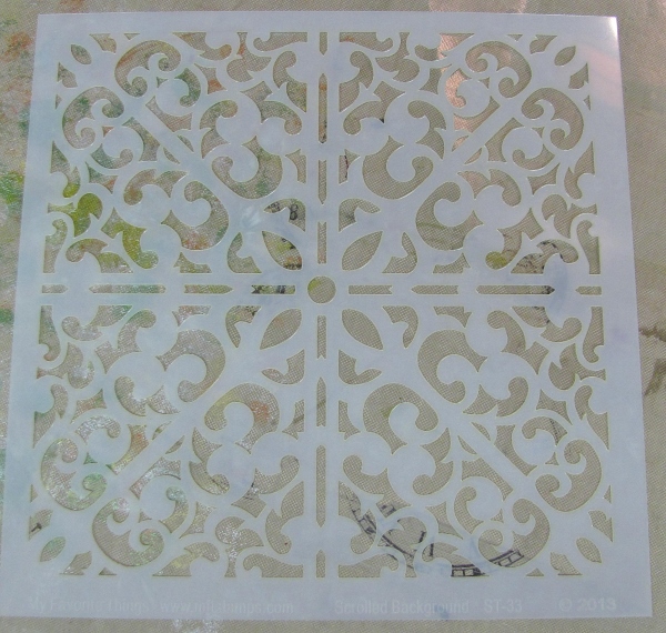
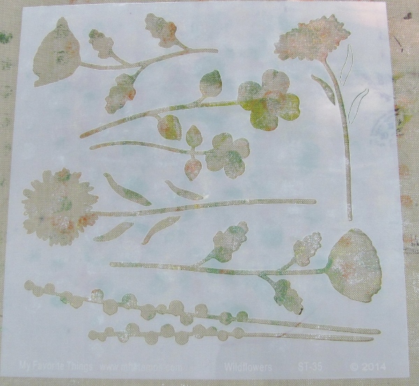
9) Some great use of stencils I was sent to work with


10) A technique demonstrated on Splitcoast was the inspiration for this


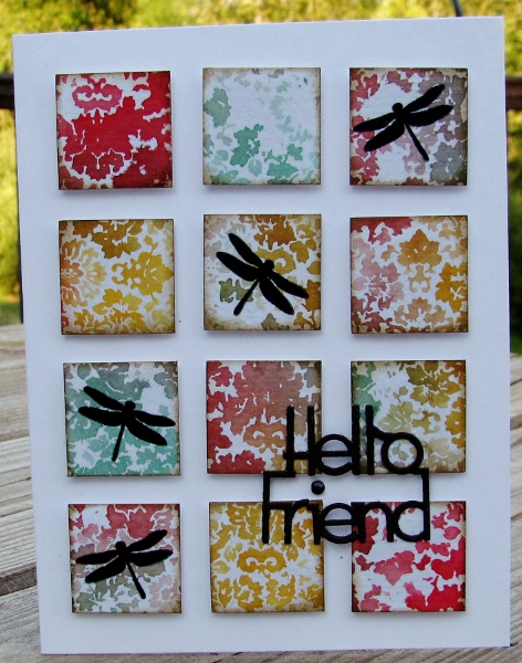
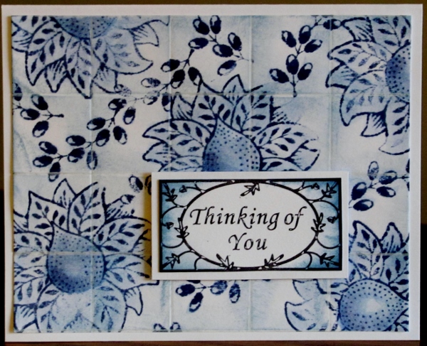
11) A delft tile treatment of rubber stamping


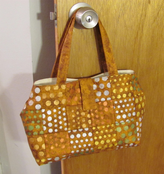
12) A great little purse with stenciled fabric and designed on-the-fly


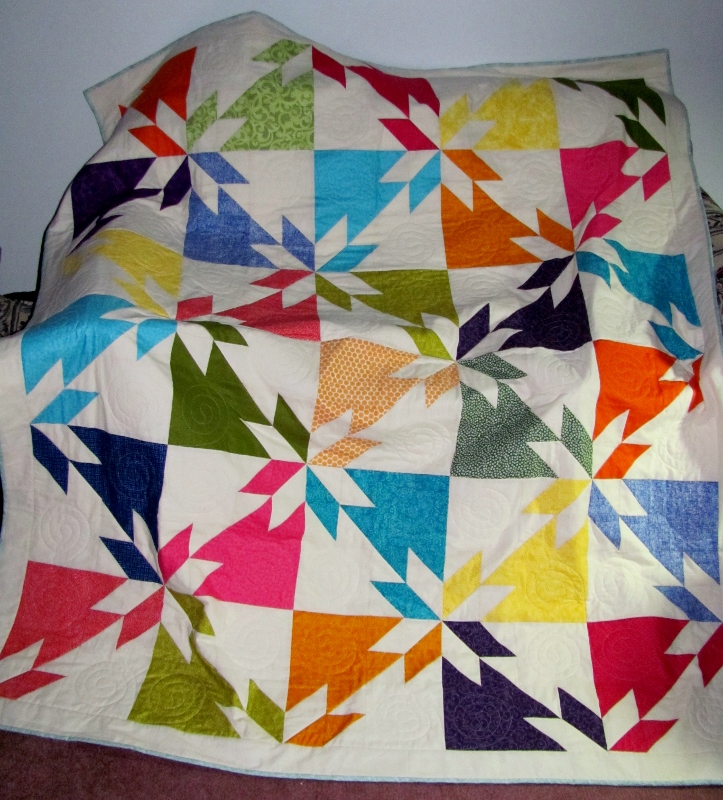
13) A stunning 66 x 78 Hunter's Star quilt


So those are my favorites. What are yours? Ddd


Posted by studio3d@ccgmail.net at 12:01 AM PST
Tuesday, 30 December 2014
Blue and Gold Rescue
Topic: Stencils

While making the card that finally worked (posted yesterday) I wanted to try to 'rescue' the gold pigment ink left on the Scrolled Background stencil from My Favorite Things .

So, while it was still wet I flipped it over onto blue cardstock, covered it with scratch paper and burnished it with my hands. Surprisingly, it did not give full coverage as I expected, but left behind all the lines that trace the cutouts. Very delicate look.

I decided to heat emboss this with clear detail powder and the result was stunning. So much that I trimmed only enough to make it fit on the card front.

It reminded me of stained glass so I pulled out some gold peel off stickers of religious emblems and built a scene with them. This included a greeting at the top.


I used a dark yellow base card which works well with the gold stickers and embossing.

Ddd


Posted by studio3d@ccgmail.net at 12:01 AM PST
Monday, 29 December 2014
Golden Grid
Topic: Stencils

Oh, sometimes my brain just wanders off on its own and starts dreaming up all kinds of projects. Then it's up to me to go try them out and see if they work as imagined. Sometimes they do and sometimes not so much.

I had this idea to use a glue pad (like a stamp pad but it has glue in it) pressed through a stencil onto cardstock and then stick gold leafing on with it. CRAFT FAIL! The leafing did not stick well to the glue and this left spots of glue uncovered on the piece. Of course, the glue collected everything else and then it looked grungy. Tossed it out!

Nest idea was to apply the same glue in the same way and use it to adhere foiling. CRAFT FAIL! Unfortunately, the foil I had was designed to stick to laser printer toner when heated. I tried heating with the heat gun to release it and it worked to some extent but a lot of the glue was left uncovered as before. Tossed it out!

Is the third time the charm?  YES! But not exactly like I had planned it.

The plan was to press a gold pigment ink pad through the stencil and heat emboss with clear powder. The gold ink, though, had too dull a look for me. I wanted SHINY, so I used gold detail powder. Yes, it totally covered up the gold pigment ink, which was then redundant. 

In any case, there was success when I used this process on red cardstock with the Scrolled Background stencil from My Favorite Things.


I cut down the resulting panel and bordered it in black. Nothing I tried for the card base really worked until I hit on this shiny bright gold cardstock. It was perfect.

I found some black peel off stickers arranged them to create a text banner. A little 'valentine' sticker bordered in black finishes it off.


The small sticker is popped up on foam tape.

Ddd


Posted by studio3d@ccgmail.net at 12:01 AM PST
Sunday, 28 December 2014
Pencil Stencil
Topic: Stencils

I ran across a stencil technique on someone’s blog that I had not used before. So I got out the Wildflowers stencil from My Favorite Things to try it out.

This is the stencil I used - selecting just the two daisy shapes and the tall weeds.


I don't have a photo tutorial to go with this technique - just a verbal description.

I laid the stencil on watercolor paper and used watercolor pencils to scribble color into the blooms, leaves and stems where I wanted them to appear. I moved the stencil around to add more flowers. 

Then I used an aquabrush to blend out the colors and then added more pencil where I wanted additional color, Including a light blue 'sky' behind the flowers. This was also blended with water.

I trimmed the panel to size and then used a pencil to sketch a border and blended this into the background.


I mounted this onto a base card to match the flowers and added a text sticker.

This technique actually makes it look like the illustration is hand-drawn. Very cool!

Ddd


Posted by studio3d@ccgmail.net at 12:01 AM PST
Saturday, 27 December 2014
Winter Bird
Topic: Photo

We live in an area where the birds don't migrate away for the winter so we see a wide variety year-round. In fact, last year, during the ice storms and freezing temperatures of January and February we had hummingbirds trying to peck through the ice on frozen feeders. We started bringing the feeders in at night to thaw, warming the nectar in the microwave in the morning and putting it back in the feeder for the day.

In any case, this little bird was hanging out on the garden fence just after the rain the other afternoon. I love how the light is caught by the netting and spills across his back.

What a sweet little visitor.

Ddd


Posted by studio3d@ccgmail.net at 12:01 AM PST
Friday, 26 December 2014
Pamtry Pack
Topic: In The Kitchen

For two people on my Christmas list I wanted to do some 'Gifts in a Jar' and set my goal at making a dozen for each of them. I sent not only the jars but the canned goods that they would need to make the recipes. The only things not included are fresh items (eggs, butter, milk, meat) and liquid ingredients (vanilla, oil).

I made half of them quart jars and half of them pint jars, depending on the recipe. I used a round of fabric over the cap before screwing on the jar ring. A fold-over tag, tied with baker's twine, identifies the dish on the outside and, on the inside lists the contents, what will need to be added, and the preparation instructions.


I added a couple of packets of home-made dip mix from the farmer's market. I also printed out a 'menu' of dishes that can be used as an inventory of what is available.

GIFTS IN A JAR PANTRY PACK

APPETIZERS

Heavenly Herb & Vegetable Dip

Southern Country Fair Dip

SOUPS

Beefy Chili Soup

Hearty Vegetable Beef Soup

Multi-Bean Soup

Potato Soup

Barley Rice Stew

BREADS

Ginger Spice Muffins

Dried Cranberry Muffins

Golden Cornbread

DESSERTS

Scottish Shortbread

Carrot Cake

Chocolate Chip Bars

Double Fudge Brownies


Yummo! Can I come for dinner?

Ddd


Posted by studio3d@ccgmail.net at 12:01 AM PST
Thursday, 25 December 2014
Outdoor Lights
Topic: Pretty Paper

I needed a couple more Christmas cards so I went looking through the trims from 12x12 papers I had already used. The leftover scrap from the Santa and Rudolph cards had a lovely stand of outdoor trees.

I trimmed these down to the required size and 'decorated' the trees with silver 'nail head' stickers. I then used alcohol markers to color these 'lights' and added a bird sticker to the tree tops.

Those silver peel-off sticker sentiments fit in perfectly.

Two papers = two cards, again.

Total made from the 12x12 card-making session 27. And it all started with 16 sheets and only 7 paper designs.

A perfect marathon session saw them all come together in just a couple of hours.

Ddd


Posted by studio3d@ccgmail.net at 12:01 AM PST
Wednesday, 24 December 2014
Wreathed in Christmas Wishes
Topic: Quilting

I made this wreath quilt over a month ago but saved it to show until after the recipient would have opened it. I quavered to make a quilt for this person as she, herself, has been quilting as long as I can remember. I figured that, by making something for the holiday season, she would only have it out for a short time every year. Therefore, not so much time to compare my efforts to her own!

This is actually a wall hanging and smaller than my usual projects, at only 33 inches square. It is made up entirely of half-square triangles and matching squares.


I quilted a bow in the center of the wreath with thread matching the background.


Then I quilted holly leaves in all the spaces and edges of the wreath, thereby rounding its shape.


You can also see that I added 24 round red buttons to serve as holly berries. The red binding ties in with the color of the berries, too.

Ddd 


Posted by studio3d@ccgmail.net at 12:01 AM PST
Tuesday, 23 December 2014
Snow Bird
Topic: Pretty Paper

I know - doves are not really snow birds - but these cards have birds and they have snowflakes, so there you go.

After trimming the illustration down to fit on the card front with a little border I mounted it on a blue card base.

I used the paper design as a guide to add 6 silver peel-off sticker snowflakes as well as a tiny silver eye.

I had some silver peel-off sentiments on hand which made the perfect finishing touch.

Two papers = two cards

Ddd


Posted by studio3d@ccgmail.net at 12:01 AM PST
Monday, 22 December 2014
Up On the Rooftop
Topic: Pretty Paper

The 12x12 paper I used for today's cards is a brown line-art illustration on taupe cardstock. Not a lot of interest or contrast.

This was a large corner illustration that I cropped WAY down to just the essentials for a 4 x 5.5 panel.

I used colored pencils to lightly color in the picture. the beard, fur trim and snow were colored with Picket Fence Distress Marker as a whitener.


Vinyl sentiment stickers finish these off. Two papers = two cards.

Ddd


Posted by studio3d@ccgmail.net at 12:01 AM PST
Sunday, 21 December 2014
Leaping Rudolph
Topic: Pretty Paper

Most of the 12x12 papers I've been working with were from a pad that all had a vintage feel to them. This is the case with the paper used for today's cards.

The leaping deer is a very subtle tone-on-tone silhouette on a swirl background. Not much was needed to elevate this to an attractive card front.

I simply added a red rhinestone nose - because that's what I do - and used a vinyl sentiment sticker.


Three papers, three cards.

Ddd


Posted by studio3d@ccgmail.net at 12:01 AM PST
Saturday, 20 December 2014
The Christmas Flower
Topic: Pretty Paper

Well, this was even more simple than the last few examples.

1) crop corner illustration

2) glue to card base

3) add glitter dots to the flower center

4) put on a vinyl sticker


And, just like that, I have three more Christmas cards done.

Ddd


Posted by studio3d@ccgmail.net at 12:01 AM PST
Friday, 19 December 2014
The Big Guy
Topic: Pretty Paper

The next 12x12 paper I selected had one large corner illustration. I actually had to crop down to the bare essentials to fit it on a card front but I think it looks good this way.

The illustration started out as a generic reindeer but I turned it into Rudolph with the addition of a red rhinestone on his nose.

The colors were very muted in this and the snow and fur areas looked awfully yellow to me. So I used some Picket Fence Distress Marker over top to whiten them. This marker is a lot like a whitewash effect that allows you to still see the original artwork underneath - just whiter.


A clear acrylic sticker was used on the lower right.

I had two of these papers so only two cards came from this pattern.

Ddd


Posted by studio3d@ccgmail.net at 12:01 AM PST

Newer | Latest | Older