« January 2015 »
S M T W T F S
1 2 3
4 5 6 7 8 9 10
11 12 13 14 15 16 17
18 19 20 21 22 23 24
25 26 27 28 29 30 31
You are not logged in. Log in
Entries by Topic
All topics  «
3D paperwork
A - Z challenge 5
A - Z challenge 7
A - Z challenge round 4
A to Z challenge round 3
A to Z round 2
A to Z round 6
A-Z round 1
Around the House
Art Challenges
Artist Trading Cards
Backgrounds
Beads
Bible Journaling
Books
Boxes
Collage
Color Challenge
Coloring
cookbook
Die Cuts
Digital Projects
Digital Stamps
Drawing
Dry Embossing
Fabric Stuff
Fantastic Folds
Field Trip
Home Decor
How Does Your Garden Grow?
Hymnal Art
In The Kitchen
In the studio
Jewelry
Lettering
Links
Multi-Technique
Music to Work By
Musings
Nail Art
New Work
Online Class
Other Hobbies
Other Projects
Painting
Paper Embroidery
Paper Piecing
Photo
Pretty Paper
Quilting
Random
reading
Scrap Recovery
scrapbooking
Sewing
Sketch Challenge
Some Backlog
Stamping
Stencils
Stickers
Supplies
Teabag Folding
Techniques
Testing
tips and tricks
Tutorial
Web resources
Welcome to my Blog
Work By My Friends
workflow
Writing
Blog Tools
Edit your Blog
Build a Blog
RSS Feed
View Profile
Group One
In & Out of Studio 3D
Tuesday, 20 January 2015
Predictions, Wishes or Plans?
Topic: Techniques

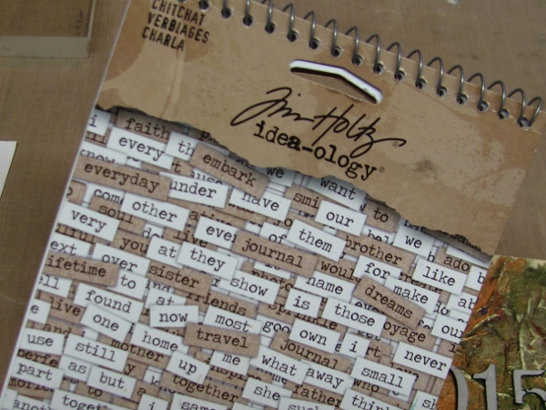
For several years I have been following Tim Holtz’s posts and collecting his ideas for decorated tags. At first he did the ’12 tags of Christmas’ with step-by-step directions for each one. Then, last year, he switched to one tag per month – still doing 12 tags, but spreading them out over a year.

Amazingly, I have never played along, making a tag with the steps he has outlined. So this year I decided to challenge myself to recreate each of the 12 tags using the products I have on hand, even if they are not the same as what Tim uses.

The first of Tim’s 12 tags of 2015 is outlined here. In case yo want to follow along with HIS products and steps to see where I got my inspiration and where I made changes.

He put together a word collage for 2015 so I did the same. Also, he uses tags for his art but I really had no need of a tag so I did mine on a larger size to create a display piece.

So here we go...

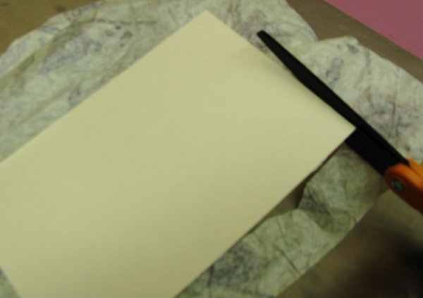
I cut a piece to work on from a manila file folder. I ran this through my Xyron to apply adhesive to one side of it.

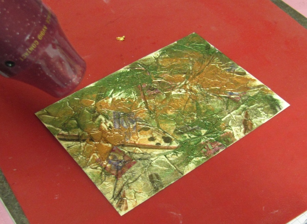
I scrunched up some printed tissue paper and applied it to the card with just a few wrinkles.

I trimmed the tissue even with the edges of the card.

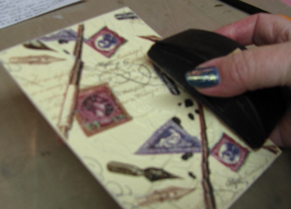
I used a sanding block to scuff the edges of the card

I used my fingers to apply various acrylic paints in a random manner:

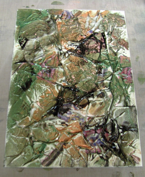
While the paint was still wet, I misted it with water to make them blend.

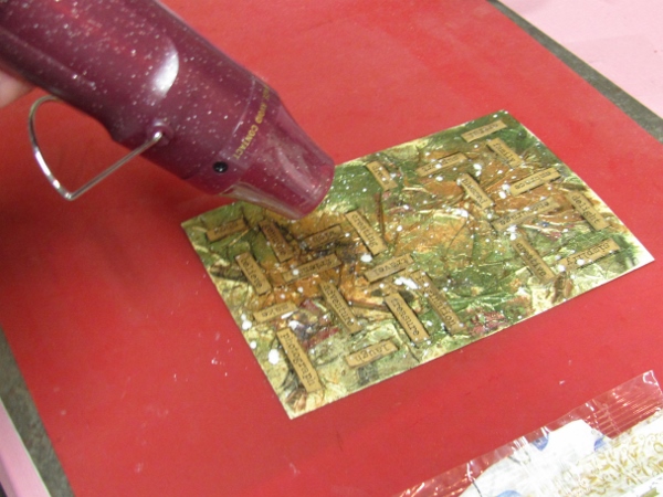
I blotted some of the paint away and then dried it partially with the heat gun.

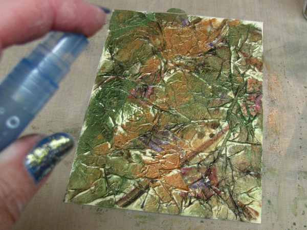
I pressed a Walnut Distress Ink pad to an acrylic block.

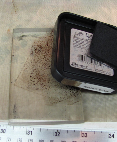
This was misted with water.

Then I used a paint brush to flick the ink over the edge of the block onto the card.

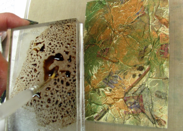
This imparted a spattered effect as shown here:

This was turned this way and that to get it to run into the creases on the surface. Then I dried it with the heat gun.


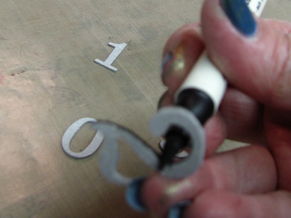
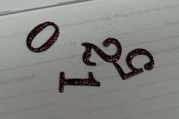
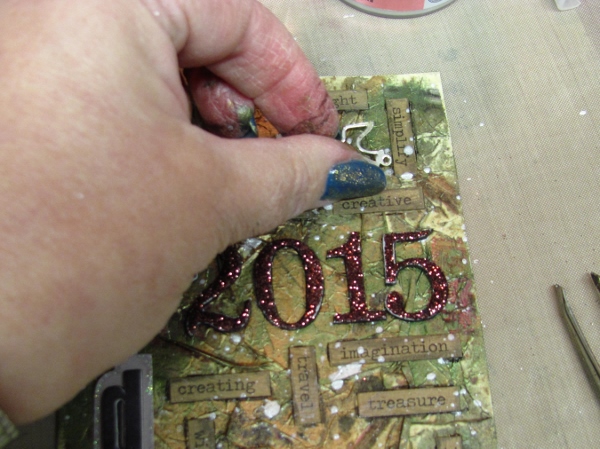
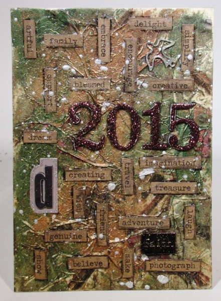
The card was set aside for a bit while I prepped some other pieces. I selected a sheet of 'grungeboard' numbers and cut out 2015.

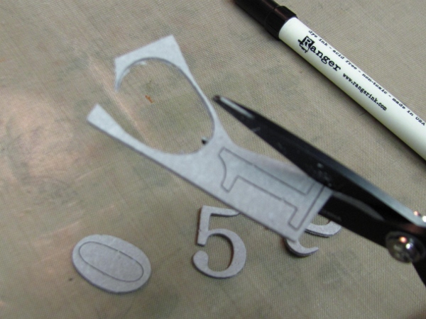
I used a black soot Distress Marker to color the edges of the numbers.

These numbers as well as a letter sticker were laid out temporarily on the card where they would eventually be adhered.

WOW! The next product was exactly the same used by Tim (unlike most of the other ones I used).


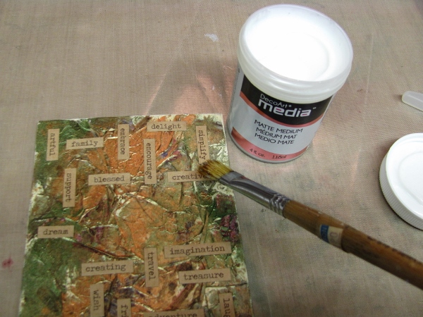
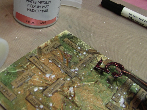
I chose, from the kraft pages, word stickers that described the things I plan and wish for myself for the year 2015. These were arranged around the numbers but not stuck down.

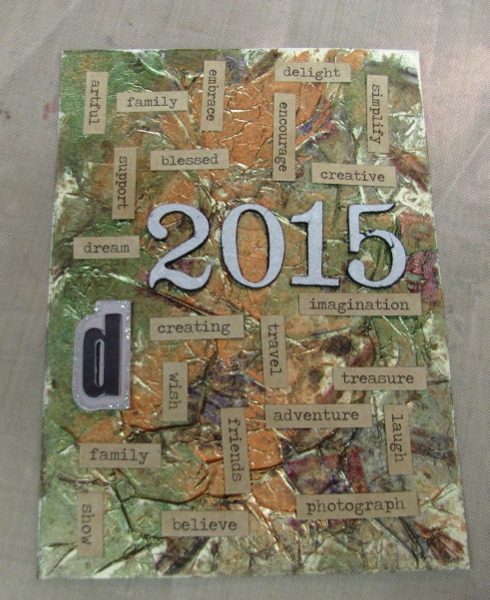
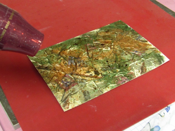
One by one the words were adhered with Glossy Accents.

The numbers were moved over to scratch paper and covered with glossy accents.

The numbers were then sprinkled with glitter and set aside to dry.

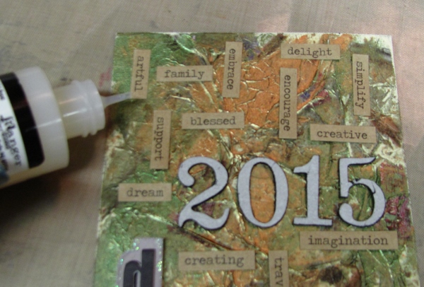
While these were drying, I brushed the main piece with a clear matte medium.

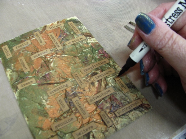
When this was dry, I used a black soot Distress Marker to trace around the word stickers and smeared the ink with my fingers.

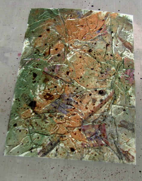
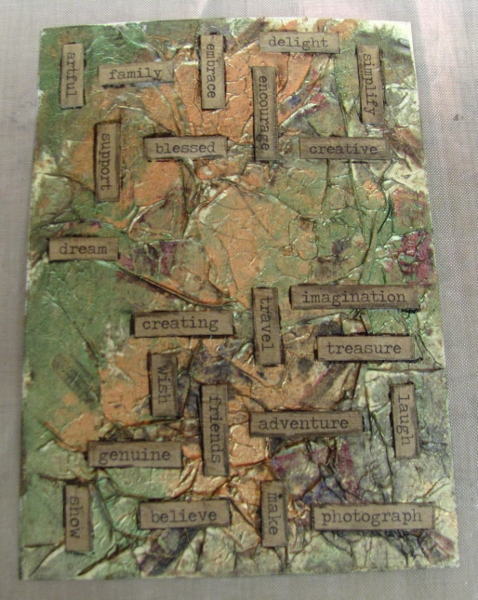
So what do we have so far?

I put some white pearl acrylic paint on an acrylic block, thinned it with water and used a brush to flick it onto the card, rubbing it away where it obscured words.

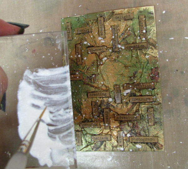
This was dried with the heat gun.

By now the glitter on the numbers was dry. I used glossy accents to glue them onto the card where they had initially been laid out in the arrangement.

I used Glossy Accents to adhere a dove charm in an open area.

A metal word tag was adhered in the same way.

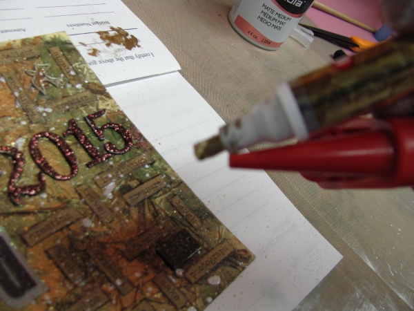
I used a bulb sprayer to make spatter from a Krylon gold metallic marker.

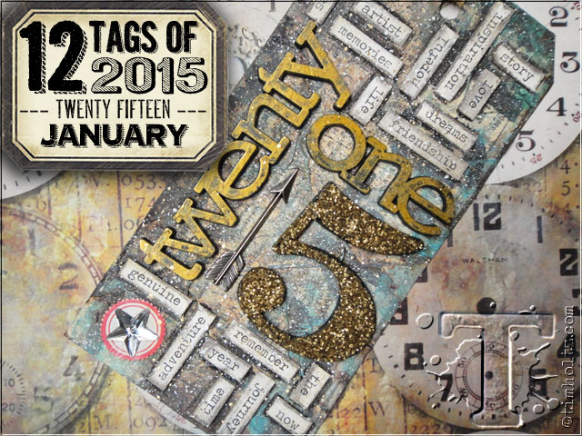
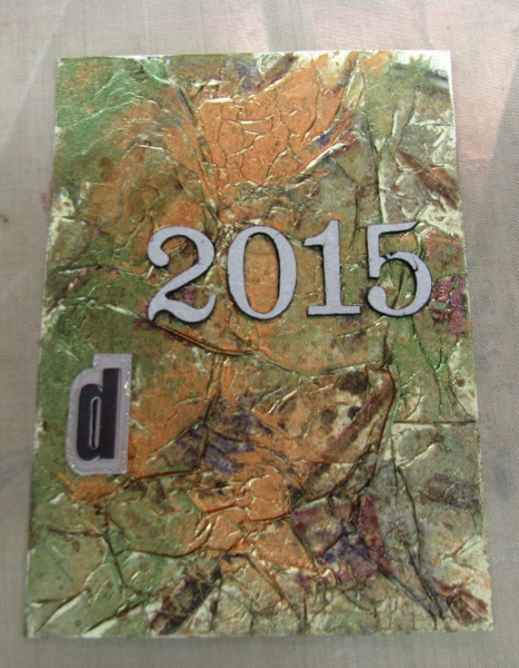
Here is my resulting art piece inspired by the first of Tim Holtz's 12 Tags of 2015.


Only 111 more to go!

Ddd


Posted by studio3d@ccgmail.net at 12:01 AM PST
Monday, 19 January 2015
Rose Border
Topic: Scrap Recovery

When I needed a green for paper piecing the leaves on yesterday's card I got it from a piece that had a border print along the other edge. So it was no longer big enough for a full card face to use today.

I grabbed from the scrap bin a larger piece that had some overspray on it grom airbrushing. This I cut down to 4 x 5.25 and added a purple graphic border on the left. 

The border print was trimmed out along the major shapes and layered onto the right side border. Nice!


I used a pre-stamped sentiment and bordered it with a dard red to match the roses. This is popped up on foam tape.

I added some rhinestones and some 'dew drops' onto the florals and placed the whole piece on a white base card.

Ddd


Posted by studio3d@ccgmail.net at 12:01 AM PST
Sunday, 18 January 2015
Paper Pieced Magnolia
Topic: Scrap Recovery

In the scrap bin I found two strips with rhe remnants of a watercolored magnolia stamp and a text stamped background. The two halves did not match up so I separated them with a tone-on-tone golden dot paper.

I had a round pre-cut in the scrap bin, too, and decided to paper piece the same floral stamp on top of it. First I stamped the flower on the round, then stamped on a green pattern, a pink pattern and a yellow pattern. the colored portions were all cut out and layered over the round. I used old paper distress ink to tone the edges of the round.

The round and a pre-stamped sentiment with the edges toned are mounted on foam tape. Then the whole piece is mounted on a distressed pink background for framing.

Ddd


Posted by studio3d@ccgmail.net at 12:01 AM PST
Saturday, 17 January 2015
Layered Flowers
Topic: Scrap Recovery

While looking for something completely different I found a scrap in the 'backgrounds' drawer in the studio. I did not make this background and I've had it forever. Whoever made it used glossy cardstock and stamped it with layers and layers of flowers in lots of colors - purple, yellow, red, green. Then they used a teal metallic to spatter across the front.

I grabbed a chartruse dotted strip and two purple graphic strips and arranged them on a base card along with the background piece.

I used a lavender pre-stamped sentiment and cut a banner end on it. This was mounted with the straight end flat to the background and the cut end raised on foam tape.

I added a strip of lavender rhinestones down the left end of the sentiment.

Ddd


Posted by studio3d@ccgmail.net at 12:01 AM PST
Friday, 16 January 2015
Dot to Dot to Dot
Topic: Scrap Recovery

This may be the most scraps I have used together on a card, ever!

I went through all the table scraps and pulled out every one that was composed of dots. I actually set aside a couple of them because the dots were too big.

So with all these dotted blocks I arranged them how I liked them and then took a photo with my phone so I could recreate the layout as I glued down the pieces on a background paper with some over-spray on it.

This was layered onto a two-toned yellow dot paper.

I had one round sentiment which fit well in a void on the design. To this I added a couple of cardstock text stickers to create a whole phrase.

Ddd


Posted by studio3d@ccgmail.net at 12:01 AM PST
Thursday, 15 January 2015
Pansy Spray
Topic: Scrap Recovery

I dug into the table scraps again for the card today. I started out with a block of silver and one of teal dots. I put them together to create a vertical card and then, when I dug out some embellishments and found that the layout was going to look better if turned horizontally.

I first found that some of the vellum pansy stickers had a touch of teal in them and arranged these in a spray over the stripes.

Then, one of those 3D printed stickers with teal and purple in it looked like it suited well.


This card has a very formal look, to me.

Ddd


Posted by studio3d@ccgmail.net at 12:01 AM PST
Wednesday, 14 January 2015
Patriotic Heart
Topic: Scrap Recovery

All of those stencil tutorial I did left me with a lot of really neat table scraps.

I started this one with the blue and puffy strips and then ran across the red from the glue pad fail experiment. I used a large heart punch on it.

Some soft dotted paper for the center made a great background for the heart which is popped up on foam tape.


I used a scallop punch on the pre-stamped sentiment.

What's with the colors lately? If you take out most of the yellow you get a better representation - true red white and blue with just a touch of cream.

Ddd


Posted by studio3d@ccgmail.net at 12:01 AM PST
Tuesday, 13 January 2015
My Inspiration
Topic: Scrap Recovery

Back to the table scraps. I started with a scrap of text and dot paper and kept pulling bits that coordinated with it - some of the diagonal plaid, some dark tone-on-tone dots, some green dots.

These were shuffled and pushed around till I found an arrangement I liked and then glued to a white card base.

I found a thick acrylic text sticker that looked wonderful over the double strips.


I pulled cardstock text stickers to turn the first sticker into a whole phrase.

The addition of a butterfly punched from the green dot paper was my finish.

Ddd


Posted by studio3d@ccgmail.net at 12:01 AM PST
Monday, 12 January 2015
Hearts On The Side
Topic: Pretty Paper

I'd been enjoying using those 'love' papers from the 6x6 pad so I pulled out more for this card.

I love that diagonal plaid - both the colors and the design of it. I added a strip of the hearts and still had a gap, so I cut a strip of the XOXOXO paper for the side.

I tied red twine around the heart panel before sticking it down and then added a thick acrylic heart sticker.


I had some silver puffy hearts stickers so added three of them over hearts in the paper pattern.

Ddd


Posted by studio3d@ccgmail.net at 12:01 AM PST
Sunday, 11 January 2015
Scrappy Valentine
Topic: Scrap Recovery

I dug into some old scraps to make a scrappy valentine. Four patterned papers cut into strips were layered over a diagonal plaid and I added a patterned tag as well.

Once I had punched out the heart and bordered it with black I needed more of that so cut a black scallop with a punch and used it to back one of the strips. 

I also used black as a border for the whole card.


I popped the heart up on foam tape and added a thick acrylic heart sticker to the green heart.

Ddd


Posted by studio3d@ccgmail.net at 12:01 AM PST
Saturday, 10 January 2015
Running Red
Topic: Scrap Recovery

Back to the table scraps to make some cards.

I used the red with some of the glue pad experiment on it and diecut an oval in it. The addition of a dotted scrap on the right makes it large enough for the card front.

I backed the oval with pink and then added three gold peel-off butterfly stickers.

I realized as I was placing them that some of the openings in the wings were heart shaped. I used those negative stickers around the sides of the butterflies and then colored in the spaces over the pink with red marker.


I used a fine line red marker to add XOXOXOX around the inner edge of the oval.

 Ddd


Posted by studio3d@ccgmail.net at 12:01 AM PST
Friday, 9 January 2015
Operation Write Home - sketch 164
Topic: Sketch Challenge

Sometimes a sketch is not very inspiring. What would YOU do with OWH sketch 164?


I left the table scraps behind and went to a 6x6 pad of 'love' papers for a heart background. I added a couple of red blocks and then pulled out the geometric purple panel.

Even with all this pattern it was less than inspiring so I dug our some heart brads in the same colors. These I arranged in a serpentine line for some movement.


With a little open space left in the center I added a pre-stamped sentiment.

Ddd


Posted by studio3d@ccgmail.net at 12:01 AM PST
Thursday, 8 January 2015
Operation Write Home - sketch 163
Topic: Sketch Challenge

 Ooooh, this is a sketch I like a LOT! OWH 163:

And look at me using the sketch exactly as it is designed!

I started with the idea to use the vellum pansy stickers. I mounted them on cream cardstock and cut to the specified size. This gave me the color pallete for the rest of the card - purple and yellow.

I pulled together a bright yellow, a dark purple and a geometric purple in a lighter tone.

I used a dotted grosgrain ribbon for which I used my 'Bow-Easy' in tying. I used small brads on the inside of the loops for stablizing it on the card.


I didn't use a sentiment so this can be sent for any occasion.

Ddd


Posted by studio3d@ccgmail.net at 12:01 AM PST
Wednesday, 7 January 2015
Operation Write Home - sketch 162
Topic: Sketch Challenge

On to OWH sketch 162

A strip of table scrap with awesome colors, a pre-stamped sentiment on a coordinating bright, a table scrap of diagonal plaid and a soft plain block to tone it all down.

I used green for the bordering to pull that out of the initial colored strip.

Three butterflies punched out of an irridescent paper brings some movement to the very static sketch.

The butterflies have loose wings so they can be raised.

Ddd


Posted by studio3d@ccgmail.net at 12:01 AM PST
Tuesday, 6 January 2015
Operation Write Home - sketch 161
Topic: Sketch Challenge

It's a good thing sketches are made to be 'a starting point' as it allows me to do my own thing. Here's OWH sketch 161:

I started with a table scrap strip of distressed paper and keyed other parts off those colors.

These included the teal borders for the distress strip and then found the greens and golds in a diagonal plaid.

I had the oval cut from a red paper and that led to selecting the flowal diecut - which is the 'over the top' I was talking about earlier.


Too much yellow in the photo makes this look orange rather than red. :(

I added oval rhinestones in the upper right to bring that teal back into the design.

Ddd


Posted by studio3d@ccgmail.net at 12:01 AM PST
Monday, 5 January 2015
Operation Write Home - sketch 160
Topic: Sketch Challenge

An over-the-top sketch is presented in OWH 160


This was a great way to use up some table scraps, though. Then the pre-stamped sentiment I chose was not large enough for the sketch so I had to add a layer, adding even more complication to the design.

I had a lot of dotted papers in the scraps and decided on black for the bordering and backing.

Because the large block was a stamped sentiment I had to do something else with that small strip on the lower right. I used a border punch and then added washi tape on the top half.


The strip was not the same size as the sketch strip but I think it works.

Ddd


Posted by studio3d@ccgmail.net at 12:01 AM PST
Sunday, 4 January 2015
Operation Write Home - sketch 159
Topic: Sketch Challenge

Moving right along to OWH sketch 159:


I deviated from the sketch a bit for this one, dropping one layer of background and turning the circle element into double hearts.

I've had the background hanging around since the 'stretch your stamps 2' onine class, waiting for just the right project. The hearts were punched out from some 'craft flop' paper from the glue pad experiments.

I mounted them on black cardstock and trimmed with a thin border. The back one is glued to the background and the front one is popped up on foam tape. 

The stamped sentiment was trimmed and backed in black with a thin border as well. The left is up on foam tape while the right rests directly on the heart.


The red twine tied around the background is a much closer representation of the color in this than the 'orangish' hearts. They are all actually a bright red.

Ddd


Posted by studio3d@ccgmail.net at 12:01 AM PST
Saturday, 3 January 2015
Operation Write Home - Sketch 158
Topic: Sketch Challenge

Almost a month since I did any OWH sketches for my self-challenge. In case you're new to this, at the first of 2014 I challenged myself to use every one of the Operation Write Home sketches - in order. I has uses a few here and there and I have allowed myself to re-post those cards without making a new one for those sketches. And in 12 months, I am now up to sketch 158.

Here's the sketch


For this card I pulled out some table scraps from the desktop and a pre-stamped sentiment.

I trimmed scraps of the recent craft flop of acrylic sprays and found a stamped greeting on a coordinating color. I used a picket fence Distress Marker over the lettering to make it more readable. I added these to a tone-on-tone dot background over a white card base.


A couple of punched butterflies from table scrap papers are the finishing touch.

Ddd 


Posted by studio3d@ccgmail.net at 12:01 AM PST
Friday, 2 January 2015
On The Edge
Topic: Scrap Recovery

While I was looking for a background to use with yesterday's semi-disaster I ran across this scrap trimmed from one of my stenciled cards. The same bin of scraps had these two strips of dotted green cardstock and, together, they exactly filled a card front! 

I just added some black peel off stickers - leaves, stripe and greeting - and the look was complete.

Must have been meant to be.

Ddd


Posted by studio3d@ccgmail.net at 12:01 AM PST
Thursday, 1 January 2015
When In Doubt, Cut It Out
Topic: Stencils

Still in the 'follow the wandering brain' mode I set out to try another odd idea. I had gotten some new spray colors in a product sampler pack and wanted to test them out through a stencil.

So I got out the So I got out the Wildflowers stencil from My Favorite Things to try it out. to try it out.

CRAFT FLOP (not all the way to a fail, but definitely not great). The problem was with the sprays themselves. I had turquoise and black. Did they mist, spritz or spray? No, they snorked, blobbed and blooped. I tried spraying farther away, but that was no help. Turns out the paints were more like an acrylic than a watercolor in viscosity and transparency.

Also, I was using glossy cardstock and they were designed for 'porous' surfaces so they sat on top and did not dry well. I finally had to hit them with the heat gun to dry.

I heard in my head the well-known quilter, Bonnie Hunter, who says (regarding fabric), "If it's still ugly, you just didn't cut it small enough!" Well, the spritzed cardstock I had in hand was obviously not cut small enough because it was hideous.

So I cut out two areas that were passable and bordered them with teal. I decided to use them both on the same card and found a scrap of 'wrinkle-free distress background' left over from a precious project. Well, look at that, it has teal in it. I can work with that!

I bordered it with teal as well and popped one of the flowers up on foam tape.


I added the birthday greeting in black to go with the black in the splattered flowers. Ddd

Posted by studio3d@ccgmail.net at 12:01 AM PST
Updated: Friday, 28 November 2014 9:32 PM PST

Newer | Latest | Older