« March 2015 »
S M T W T F S
1 2 3 4 5 6 7
8 9 10 11 12 13 14
15 16 17 18 19 20 21
22 23 24 25 26 27 28
29 30 31
You are not logged in. Log in
Entries by Topic
All topics  «
3D paperwork
A - Z challenge 5
A - Z challenge 7
A - Z challenge round 4
A to Z challenge round 3
A to Z round 2
A to Z round 6
A-Z round 1
Around the House
Art Challenges
Artist Trading Cards
Backgrounds
Beads
Bible Journaling
Books
Boxes
Collage
Color Challenge
Coloring
cookbook
Die Cuts
Digital Projects
Digital Stamps
Drawing
Dry Embossing
Fabric Stuff
Fantastic Folds
Field Trip
Home Decor
How Does Your Garden Grow?
Hymnal Art
In The Kitchen
In the studio
Jewelry
Lettering
Links
Multi-Technique
Music to Work By
Musings
Nail Art
New Work
Online Class
Other Hobbies
Other Projects
Painting
Paper Embroidery
Paper Piecing
Photo
Pretty Paper
Quilting
Random
reading
Scrap Recovery
scrapbooking
Sewing
Sketch Challenge
Some Backlog
Stamping
Stencils
Stickers
Supplies
Teabag Folding
Techniques
Testing
tips and tricks
Tutorial
Web resources
Welcome to my Blog
Work By My Friends
workflow
Writing
Blog Tools
Edit your Blog
Build a Blog
RSS Feed
View Profile
Group One
In & Out of Studio 3D
Monday, 9 March 2015
Operation Write Home - sketch 183
Topic: Sketch Challenge

As I was making this batch of sketch cards I had this metal heart that I kept wanting to use but it never fit in. Then I picked up OWH sketch 183 and knew it had found a home.


I also had another of those fancy diecuts and knew that would make a perfect frame for the heart. The heart was plain and flat so I ran it through the Cuttlebug in an embossing folder to add texture. Oh, yes!

Since I had a heart I selected paper for the background with 'love' text all over it. I layered this with a coordinating color in a simple print and a band of light green print.

That crosswise stripe was way too plain so I cut down and mounted a pre-stamped sentiment over it.


Every time I tested something for the dots on the right top it took away attention from the heart and sentiment, so I decided to leave them off entirely.

Ddd


Posted by studio3d@ccgmail.net at 12:01 AM PST
Sunday, 8 March 2015
Operation Write Home - sketch 182
Topic: Sketch Challenge

The sketch for OWH 182 has the potential to produce a very busy card.


But by selecting papers with low contrast it actually came off as very low key.

The scribbly background has a cream tone rather than white. I selected the book text because it has the same cream and black.

The ogee in peach was pulled into the text element by coloring with alcohol markers.


This really turned out nicely.

Ddd


Posted by studio3d@ccgmail.net at 12:01 AM PST
Saturday, 7 March 2015
Operation Write Home - sketch 181
Topic: Sketch Challenge

Here's a card that is rather wrong-side-out in construction. It is OWH 181:


The bordering is all a part of the background sheet. The individual panels are cut out and arranged on top of it.

I had two stamped stars already colored so I trimmed them to size. the other pink blocks were chosen to match the colors in the stars. The backing (borders) are in blue for the same reason.

The text is all actually one stamp. I placed tape over the parts I didn't want to print and then inked the stamp. The tape was peeled and I stamped in the first section. This was repeated for the other two parts of the stamp to complete the card.

Ddd


Posted by studio3d@ccgmail.net at 12:01 AM PST
Friday, 6 March 2015
Operation Write Home - sketch 180
Topic: Sketch Challenge

OWH sketch 180 is actually very plain:


I ran across the topiary sticker in my stash and decided to mount it on a black strip as that would match the bordering on the other elements.

I already had a sentiment stamped on a plain color block so chose to add another plain block behind it.

I selected a 'fretwork' paper as the backing paper.


I really like this one, much to my surprise when I first saw the sketch!

Ddd


Posted by studio3d@ccgmail.net at 12:01 AM PST
Thursday, 5 March 2015
Operation Write Home - sketch 179
Topic: Sketch Challenge

Hmmm, I found the measurements on this sketch to be a little confusing. I'm not at all sure what that extra piece is on the right side and if the top right panel is cut as indicated over half of it is hidden. Take a look at OWH 179


Oh, well. I'll just pick out the parts I like!

I started with the floral and the striped paper background. Then I pulled coordinating papers and banded them with two tones of dark gray.

How lucky I was to have on hand a sticker sentiment that exactly matched the colors.

Ddd


Posted by studio3d@ccgmail.net at 12:01 AM PST
Wednesday, 4 March 2015
Operation Write Home - sketch 178
Topic: Sketch Challenge

When I saw the sketch for OWH 178 I knew I already had the feature element colored up


That is a LOT of bordering! But it does lend a rather formal feel to the sketch. I chose papers that I thought looked class, in keeping with the colored flower. 

Putting the square brads on diagonal really elevates them.


I popped up the center panel on foam tape.

Ddd


Posted by studio3d@ccgmail.net at 12:01 AM PST
Tuesday, 3 March 2015
Operation Write Home - sketch 177
Topic: Sketch Challenge

I think this sketch (OWH 177) is rather clunky


I tried to salvage it by using a lighter element in place of the feature panel and used florals to further soften the look. These are vellum stickers.

I pulled colors from the florals for the blocks of backing and used black bordering for the contrast.


I used black rhinestones as shown but dropped them lower for balance.

Ddd


Posted by studio3d@ccgmail.net at 12:01 AM PST
Monday, 2 March 2015
Operation Write Home - sketch 176
Topic: Sketch Challenge

With all the wide open spaces on OWH sketch 176 I knew it was going to be 'all about the papers'.


I actually worked from the bottom up since the first paper I selected was the XOXOXs. I next pulled the two grays and then the red dot. This arrangement allows them to alternate so they stand out better.

I went back to the bin of fancy diecut labels and decided to use a red insert stamped with a sentiment.


Where the sketch uses three dots along the bottom edge I pulled in three red heart brads.

Ddd


Posted by studio3d@ccgmail.net at 12:01 AM PST
Sunday, 1 March 2015
Operation Write Home - sketch 175
Topic: Sketch Challenge

As soon as I saw this sketch I knew exactly what element I wanted to use for it. Here is OWH sketch 175


That block of squares was perfect for a leftover teabag fold of a 'quilt' that I had in a bin waiting to be used. While I was there I ran across the onesie stamped on plaid and trimmed out.

This was shaping up into a very nice baby card! So I selected soft colors for the backgrounds and stamped a scripture to add on.

I brought the purple back in by using three 'button' brads where indicated on the sketch.


As a last element I stitched around all four edges before mounting on the base card.

Ddd


Posted by studio3d@ccgmail.net at 12:01 AM PST
Saturday, 28 February 2015
Operation Write Home - sketch 174
Topic: Sketch Challenge

The catalog of the OWH sketches that I have printed out has 4 to a page. So I work on all four, one after the other. This is why I still had the fancy diecut labels out on the desktop when I started to work on OWH sketch 174

I also had a regular round element out and decided they looked good when layered together. So the scrollwork would stand out I decided to use solids for the blocks. And to maintain a fresh look, I made all the borders in white.

This also coordinates the borders with the base paper of chevrons.


I decided to use some gold peel-off stickers for a little extra zing.

Ddd


Posted by studio3d@ccgmail.net at 12:01 AM PST
Friday, 27 February 2015
Operation Write Home - sketch 173
Topic: Sketch Challenge

It certainly is easier to get started making a card when you have a sketch to work from - as long as the sketch is inspiring to you!

I was inspired by OWH sketch 173


I had a label diecut that was near to the right size and with a backing cut to the size of that in the sketch is exactly right. Now, what to do with it? Use a rubon!

I chose colors from the rubon for the base card and the two panels as well as the feature border. The rubon sheet had the bow used above the basket and the floral corner elements.


What with the corner elements I decided to leave the big dot off of the sketch.

I raised the feature up on foam tape.

Ddd


Posted by studio3d@ccgmail.net at 12:01 AM PST
Thursday, 26 February 2015
Read To Me
Topic: Quilting

I've wanted to make a bookcase quilt for quite a while. Every so often I would search for patterns but never really found anything that was just what I envisioned.

Then I decided to just design my own in EQ7. 

I decided to do paper piecing as it seemed like the easiest way to get it precise. The hardest part was getting the grain lined up which was necessary since I had selected a wood grain for the background.

I selected scraps that I thought might have been used on hardback book covers. After they were all sewn together I used a range of warm grey alcohol markers to shade the edges of the spines to create the illusion of them being curved. It worked very well.


I quilted by stitching in the ditch around each panel and then around each book.


I love the casual 'arts and crafts' look that I achieved on this. I created more dimensionality by using two tones of the wood print -dark behind the books and light for the shelves and bookcase frame.

This one will be for me to keep and hang on the end of the fireplace.

Ddd 


Posted by studio3d@ccgmail.net at 12:01 AM PST
Wednesday, 25 February 2015
Room Re-Do
Topic: In the studio

Due to the need to have a lower surface for sewing I gave in and rearranged my quilt studio.

Several goals - move as little furniture as possible, overhead batting must remain accessible, all machines must be near the (scarce) outlets, need to close up the work triangle, don't lose access to the bookcases.

I measured and made a scale drawing of the room on graph paper. Then I did the same with all the pieces of furniture. I colored the furniture with highlighter and then cut them all out. I arranged the paper furniture in the paper room and took a photo with my phone. I repeated this about a dozen times and then I could scroll through them until I settled on one.


The plan I decided to use allowed me to leave the large cutting table with its support bookcases in place. YAY! But, alas, I wanted more seating room after I had done it this way and ended up moving the whole thing 8 inches.

Here is the view from the door as you enter:

Once inside the room, along the left wall is a desk that houses an embroidery machine and my old Janome. If I want to use one of these it can be moved over to the work table. Next is my loom that I've had for over 40 years. It has not been used for about 30 years though.

Back in the corner is a set of end tables with a lamp that illuminates the ironing board. Continuing around the corner to the right is the ironing board. You can just see the bottom edge of the batting roll mounted up next to the ceiling.

Continuing on to the right - in the other corner - is the new sewing station. It is a standard height table.

To the right of this is the cutting table. For this photo I moved back to the other side of it, which is the side I used to cut from. Now I cut from the same side as the sewing station which makes my work triangle (cut, sew, press) all together.

This table is essentially a 3/4 inch plywood sheet cut down to 4 x 7 feet and covered with a flannel-backed vinyl. It is supported by 4 bookcases which raises it to a comfortable height for cutting. I use them for supplies and actually cleaned them all out and organized them as part of the room renovation.


Under the table, in an open area, I store large plastic bins of odd (non-quilting) fabrics and random bits of batting.

That clear plastic case you see on top of the bins is where I keep kits. When I have selected a pattern and all the fabrics for a quilt, I cut and label all the pieces and put it in a gallon ziplock bag. When I want to sew I can just grab a bag and get right to it. Here are the 7 kits I currently have prepped.

When standing at the table, if you turn around you will be facing a closet. In these top two drawers are scraps sorted by color and the bottom two have yardage I haven't decided what to do with.

I actually took every bit of the scraps out, sorted each bin so matching fabrics were together, pressed every piece and put them back neatly, Gained me a lot of breathing room in the folders.

On the bottom of the closet I have some bins with stash of fabrics that are 1 yard and over and have been used for a project already.

And that's the big room finish! I was hankering to get back to the machine so I did some paper piecing, assembled some blocks, bordered a project and then used the table to sandwich and pin-baste the two projects that I have been working on (no sneak peeks as one of them is a gift that is not ready to reveal)

Ddd


Posted by studio3d@ccgmail.net at 12:01 AM PST
Tuesday, 24 February 2015
Take Flight
Topic: Pretty Paper

While I was scouting for backing papers for the last few day's projects I ran across a piece of ColorMe paper that I had spritzed with Glimmer Mist - a couple of YEARS ago!

Time to use that!

I pulled some plaid paper with the same blue and then added purple elements to pick up on the other major tome in the plaid.

I had a sentiment already stamped on a coordinating lavender cardstock so I banded that with the blue of the other border.

The camera really did not like all the pastel so the photo did not come out well.  Here is another angle that looks a little better.

You can see that the sentiment is popped up on foam tape.

Ddd


Posted by studio3d@ccgmail.net at 12:01 AM PST
Monday, 23 February 2015
Reversing the Reverse
Topic: Stencils

This could easily becoming a never-ending process! By sponging the Distress Ink through the stencil yesterday it left ink on the stencil surface. So I grabbed another piece of watercolor paper, misted the stencil and laid it down (wet side down) and held it in place for about 30 seconds.

I dried this with a heat gun.

Then the background was too pale for me so I sponged Tea Dye Distress Ink directly onto the paper.

I also spritzed with Shabby Shutters and Mustard Seed Distress Markers using a bulb sprayer.


This was decorated with table scraps and a stamped sentiment.

Ddd


Posted by studio3d@ccgmail.net at 12:01 AM PST
Sunday, 22 February 2015
Using the Smoosh
Topic: Stencils

When I made the background for yesterday's card, lifting away the stencil pulls the color with it. Can't let that go to waste so I flipped it over and pressed it onto another piece of watercolor paper. I held it in place for about 30 seconds to let the color soak in.

I liked it 'some' but it was pretty light. I dried the stencil and laid it back in place. Then I used a foam applicator and colored the open areas of the stencil.

I used a bulb sprayer to spritz over the surface with Shabby Shutters and Mustard Seed Distress Markers.


I mounted on a dotted card base and added table scraps and a stamped sentiment. Two bronze peel-off sticker leaves finish this one.

Ddd


Posted by studio3d@ccgmail.net at 12:01 AM PST
Saturday, 21 February 2015
Ghost Leaves
Topic: Stencils

While I liked the concept showed yesterday I wanted to try to get better contrast. I started with Distress Inks in Wild Honey, Rusty Hinge and Gathered Twigs applied to watercolor paper with a foam applicator.

I chose a large metal stencil of leaves and misted it with water. This was placed water side down onto the colored paper and held in place for about 30 seconds. Then it was lifted and blotted with a paper towel.

After dries with a heat gun I used a bulb sprayer to spritz with Shabby Shutters and Mustard Seed Distress Markers.

This was a MUCH better result than yesterday's card. I had enough of this to make two card fronts.

The first I placed on a goldenrod base and decorated with table scraps. I added some nail head stickers and gold peel-off stickers.

The other half of the paper was placed on a burnt sienna base and decorated with table scraps and a stamped sentiment.

YES! Much better result!

Ddd


Posted by studio3d@ccgmail.net at 12:01 AM PST
Friday, 20 February 2015
Washout
Topic: Stencils

I was reading the Hero Arts blog the other day and came across this technique for using a stencil. It was what I had been aiming for when I did one of my stencil tutorials that kinda failed.

I had inked up my watercolor paper with Distress Inks using foam applicators then laid the stencil on top and spritzed with water to remove some of the color. What happened was that the water went under the stencil and I did not get clean outlines.

Well, in the above link and also this one and this one a different approach is used.

So I had to give it a go with these new instructions and got a better result.

I started by using Distress Inks in Iced Spruce and Weathered Wood. These were blended onto the watercolor paper using a foam applicator. Then I used a mister to spritz a stencil of birch trees and flipped it over (water side down) and placed it on the paper. I held it in place for about 30 seconds then carefully lifted it up. 

I used a paper towel to blot away some of the water and then dried it with the heat gun.

The result was very low contrast so I laid the dried stencil back in place and drew around the shaped with a Distress Marker in Bundled Sage.

I trimmed down to the best part and mounted this on doordinating green papers.

All of the trim work and sentiment are silver peel-off stickers.

Ddd


Posted by studio3d@ccgmail.net at 12:01 AM PST
Thursday, 19 February 2015
Red Rose in Scrollwork
Topic: Paper Embroidery

One list mom issued a pattern challenge. I actually took the time to go print off the pattern for use and I'm glad I did.

I found some illustrations I wanted to use and actually pricked out the pattern onto three printed papers to use with them. The two others will show up here later but I wanted to post the one I got stitched out.

I used threads to go with the illustration and then used a craft knife to trim out inside the circle with a bit of a margin.

I mounted the stitched paper over the illustration with foam tape and onto a base card in a coordinating color.

I added a strip of gold peel-off sticker trim at the top and bottom.

Ddd


Posted by studio3d@ccgmail.net at 12:01 AM PST
Wednesday, 18 February 2015
This I Love
Topic: Techniques

I set out to use the techniques presented by Tim Holtz in his February posting for the 12 Tags of 2015.

This is the project he made:

The idea was to create a collage tag with the theme presenting things you love.

Here are the steps used to create my piece:

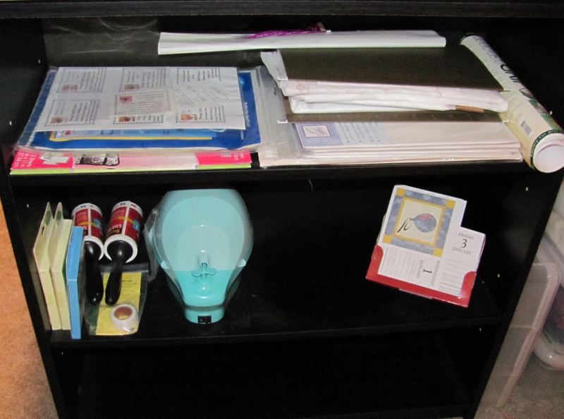
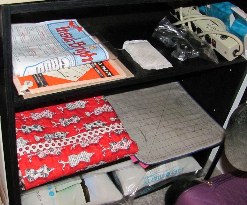
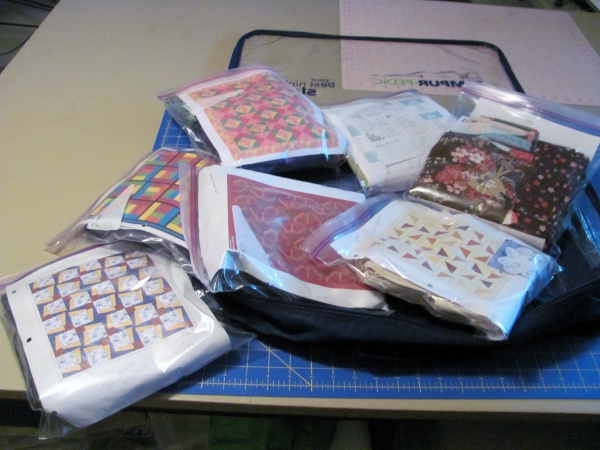
--Gather stickers, scrapbook paper, printed tissue, tissue tape, etc. with the theme (in my case this was all related to sewing and cooking)

--Run a base piece through the Xyron to cover with adhesive (in my case the base was tagboard and I used a piece 5.75 x 4.5 instead of a tag)

--Adhere the printed tissue as a base layer (I used sewing pattern)

--Adhere other selected items in collage arrangement (I used two handwritten recipe stickers, cardstock with dress forms, a strip of graph paper, cardstock with fabric print, sticker of a quilt and button stickers)

--Trimmed all the overhanging elements to the edges of the base piece.

--Added tissue tape in two styles with measurements and numbers (to represent measuring tapes)

--Lightly sanded the edges of the piece then used the sanding block to scuff the surfaces of the elements to distress them.

--Sealed the whole surface with clear matte medium. Dried it.

--Applied 'Picket Fence' Distress Stain over the whole surface. Dried it.

--Sealed with clear matte medium again. Dried it.

--Outlined the elements with Distress Marker in Walnut Stain and smeared with a fingertip to create shading.

--Applied a gold sticker frame, gold sticker corner and gold sticker lace trim.

--Smudged shading around all of these elements with same Distress Marker.

--Selected a copper heart element with engraved text.

--Sanded surface and applied Picket Fence Distress Stain to it. Dried. Glued to surface with Glossy Accents.

--Used black Sharpie to reinforce the engraved text.

--Cut out tiny letters and glued in place with Glossy Accents.

--Darkened the letters with the Walnut Stain Distress Marker and smudged with my finger.

--Used a bulb sprayer and a Black Soot Distress Marker to spatter the whole surface of the piece. Dried it.

--Punched 1/8" holes in the button stickers.

--Tied coordinating twine through the button holes with the knots in the back.

--Used same twine to tie a real button in place inside the frame with the knot on the front.

--Used foam tape to mount the piece to a fabric-covered mat board backing.

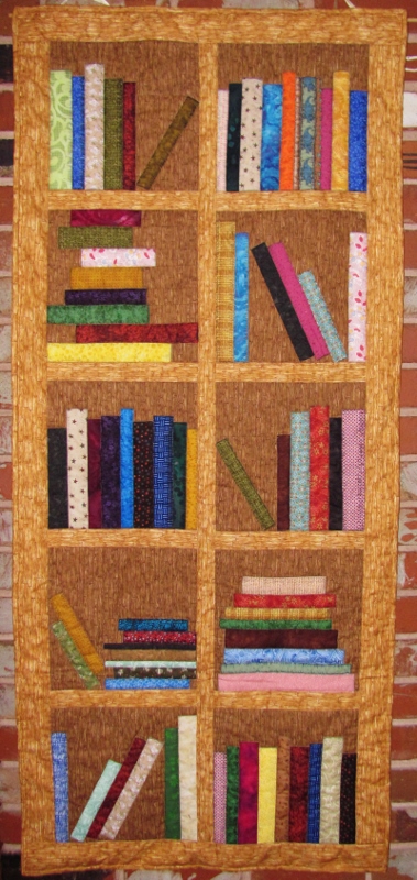
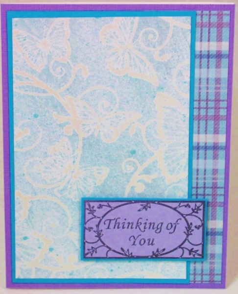
Here is the finished piece:


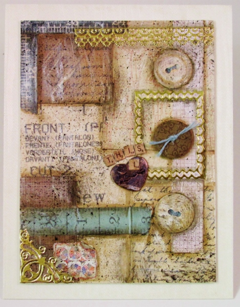
This will be a display piece on the door of my quilting/sewing studio.

Ddd


Posted by studio3d@ccgmail.net at 12:01 AM PST

Newer | Latest | Older