« March 2015 »
S M T W T F S
1 2 3 4 5 6 7
8 9 10 11 12 13 14
15 16 17 18 19 20 21
22 23 24 25 26 27 28
29 30 31
You are not logged in. Log in
Entries by Topic
All topics  «
3D paperwork
A - Z challenge 5
A - Z challenge 7
A - Z challenge round 4
A to Z challenge round 3
A to Z round 2
A to Z round 6
A-Z round 1
Around the House
Art Challenges
Artist Trading Cards
Backgrounds
Beads
Bible Journaling
Books
Boxes
Collage
Color Challenge
Coloring
cookbook
Die Cuts
Digital Projects
Digital Stamps
Drawing
Dry Embossing
Fabric Stuff
Fantastic Folds
Field Trip
Home Decor
How Does Your Garden Grow?
Hymnal Art
In The Kitchen
In the studio
Jewelry
Lettering
Links
Multi-Technique
Music to Work By
Musings
Nail Art
New Work
Online Class
Other Hobbies
Other Projects
Painting
Paper Embroidery
Paper Piecing
Photo
Pretty Paper
Quilting
Random
reading
Scrap Recovery
scrapbooking
Sewing
Sketch Challenge
Some Backlog
Stamping
Stencils
Stickers
Supplies
Teabag Folding
Techniques
Testing
tips and tricks
Tutorial
Web resources
Welcome to my Blog
Work By My Friends
workflow
Writing
Blog Tools
Edit your Blog
Build a Blog
RSS Feed
View Profile
Group One
In & Out of Studio 3D
Tuesday, 31 March 2015
Operation Write Home - sketch 196
Topic: Sketch Challenge

OWH sketch 196 is a little strange. I wasn't quite sure why the inner border does not full enclose any element. Not only that but that bordering piece and the one on top of it show the same vertical dimension in which case there would actually be no border along the top.

I decided to go with the visual rather than the written and proceeded.

I had a thick acrylic sticker picture that was a good size for this layout. So I keyed all my paper choices off of it - color and theme both.

The boat in the picture led to the map paper and the color from that led to the background. More colors from the picture led to the borders and the dotted strip. All the elements have a vintage look to them.


That nostolgic look took me to stamping the yearning sentiment in the center of the map.

Ddd


Posted by studio3d@ccgmail.net at 12:01 AM PDT
Monday, 30 March 2015
Operation Write Home - sketch 195
Topic: Sketch Challenge

What shall I ever do when I've used up all the OWH sketches and have to come up with my own ideas? Fortunately, I still have many to go. Here is OWH sketch 195:


I found a clear sticker that has been in my stash for years and placed it on a textured panel that I have probably had just as long. LOVE this little hedgehog! I decided to use multiple peel-off text stickers to reinforce the blowing of dandelion fluff to make a wish.

Papers in cream and black patterns frame out the piece although that righthand strip is supposed to be pulled away from the card edge to meet the sketch design.


I used a couple of tiny gold dragonfly stickers in place of the large round embellishment.

Ddd


Posted by studio3d@ccgmail.net at 12:01 AM PDT
Sunday, 29 March 2015
Operation Write Home - sketch 194
Topic: Sketch Challenge

Stickers are a great way to fill the design elements of a sketch. Watch for one in OWH sketch 194:


This sketch had too many layers to suit me so I left off one in each area. This simplified the sketch but not to the point of boredom.

I started with the sticker which started out as a three level topiary. I 'pruned' it down to one level to suit the dimensions and mounted it on one layer. This was placed on purple mulberry paper and bordered with dark green.

The purple element on the left picks up color from the blooms in the bush and it is also bordered with dark green.

The loose stripe in the background has just enough purple to go with the other elements. It is bordered with the same dark green.

I used a purple fine line pen to doodle around the illustration panel and an alcohol marker to add a shadow under the pot.

Ddd


Posted by studio3d@ccgmail.net at 12:01 AM PDT
Saturday, 28 March 2015
Operation Write Home - sketch 193
Topic: Sketch Challenge

Another marathon sketch card session will take us through the next 12 days. Here is OWH sketch 193:


Now that's some wide open space! Fortunately I had a fun 3D acrylic sticker that would fill it up nicely.

I cut layers of coordinating papers and applied the composite sticker on top. The bow was already in the right place to fill the sketch design!


Three large sticky back rhinestones match some of the stripes in the background and the stars on the top balloon.

Ddd


Posted by studio3d@ccgmail.net at 12:01 AM PDT
Friday, 27 March 2015
New Garden Plan
Topic: How Does Your Garden Grow?

I have FINALLY admitted the fact that I cannot grow certain produce. One is radishes - undeveloped roots, woody, dry and hot. No change of soil, seed variety, weather, planting date... has had any effect in the 10 years I have been growing. I faithfully plant every year, trying some tweak or another... failure every time. So I decided to BUY my radishes and use the pot to grow something else this year.

I have likewise dropped turnips from the plan for the same reason. 

Then, due to some restrictions of diet, I am eliminating spinach and lettuce from my garden which left me with several barrels extra. I decided to double up on the things we really like that do grow well - beets, cucumbers, green onions - and split the two varieties of peppers into their own barrels.

Out in the big bed we have eliminated potatoes and are expanding the squash. Last year we had only acorn, delicata and yellow crookneck. This year we are trading the acorn for butternut and adding zucchini and patty pan (scallop). I hope to process and freeze a lot of the patty pan like we did the fried green tomatoes last year.

The bed for the corn remains the same.

Here is the plan for the 2015 garden:

I'm hoping for a good yield and plan to preserve (freeze) a lot like I did last year.

It's fun to have a gardening 'buddy' (Mom) - and one who helps eat up the produce.

Ddd


Posted by studio3d@ccgmail.net at 12:01 AM PDT
Thursday, 26 March 2015
Bed Of Roses
Topic: Quilting

I thought I was getting a great deal when I stipped at the Mill End Store and found a roll-up of 2 1/2 inch fabric strips at only $13. SCORE! I loved the pink roses I could see around the outside and the colors of chocolate and various pinks. There was just a hint of blue and white on the folded edges of other fabrics peeking out.

The big awakening was when I got it home and unrolled it to discover there were only 4, yes - FOUR, fabrics in the roll. Lots of each one but only FOUR fabrics. Sadder than that was that one of them was a hideous stripe, one was a weird paisley, and only TWO of them were fabrics I liked - the pink and chocolate roses I had seen on the outside of the roll and a smaller print with blue squares make of tiny blue flowers and scattered with small roses.

Well, you can't make a quilt with only two strips (you could but you would be bored to tears). So I went digging in my stash for some go-alongs. I came up with some squares harvested from a wide stripe (from which I had previously used the narrow strips), some two-toned bricht pink with just the right amount of watermelon in it, and a chocolate brown with asian flowers and 'strands' of undulating dashed lines.

The stripe was fussy-cut into 5 1/2 inch blocks. Then I used the courthouse steps pattern to surround it with the pink, then the blue diamond, then the roses, and finished with the asian print.

Here is the basic block:


The two with roses are the only ones from the fabric roll.

I set these together in alternating directions in a 4 x 5 layout to finish up with this quilt:


I could not imagine what I would ever use the ugly striped strips for so I decided to try them out as binding. I rolled mostly to the back to leave as little showing as possible on the front. Turns out to be about 3/8 inch.

That 2 1/2 inch strip (folded in half of course) left a LOT of wrap for the back binding. But against the relatively sedate backing the stripe is not so bad.


I used up the paisley from this roll on the denim quilt recently so I have exausted the supply of this strange fabric collection.

(In my mind, I wonder if this fabric was all cut into strips - poorly cut, I might add - because they knew it would NEVER sell as yardage.)

This quilt ended up larger than my normal lap quilts at 52 x 65.

Ddd


Posted by studio3d@ccgmail.net at 12:01 AM PDT
Updated: Thursday, 26 March 2015 8:28 AM PDT
Wednesday, 25 March 2015
Operation Write Home - sketch 192
Topic: Sketch Challenge

It all started so innocently...


I had an uncolored image on watercolor paper. I trimmed it to the inner edges of the design and colored it with bright Distress Markers.

It was too stark so I misted it with water. This not only caused the colors to blend but made a couple of splotches on the background. Dried it with a heat gun... darkened the background with Distress Ink... used black ink to spatter... then I used a fine line marker to redraw the entire image. FINALLY, I like it.

I chose papers that echo the lines and angles of the image. I distress them with sponged ink and assembled the card.

The image was originally a 'postage stamp' so I redrew that motif around it and colored it with W7 Copic Marker.


I found in my sticker file a sheet of faux stamps that came as a 'fund raiser' junk mail enclosure. They made a suitable item for embellishment.

Ddd


Posted by studio3d@ccgmail.net at 12:01 AM PDT
Tuesday, 24 March 2015
Operation Write Home - sketch 191
Topic: Sketch Challenge

Yay! Another sketch for the challenge! Here is OWH 191:


I had another of the stamped cottages like I used yesterday. This time I still used Distress Markers but I colored on an acrylic block and used the ink with an aquabrush to do a watercolor style.This gave it a softer look than the direct use of the markers yesterday.

I selected papers based on the colors of the image. After cutting them I inked the edges of all of them with Distress Ink to make the layers stand out from one another.


The sentiment was stamped as the finishing touch.

Ddd 


Posted by studio3d@ccgmail.net at 12:01 AM PDT
Monday, 23 March 2015
Operation Write Home - sketch 190
Topic: Sketch Challenge

I am absolutely loving the personal challenge of working on all of the Operation Write Home sketches in order. It really makes me think creatively to meet the constraints of the designs and still make them my own.

Here is OWH sketch 190:


I had an uncolored stamped image on watercolor paper and decided to use Distress Markers on it.

The colors in the image set the stage for selecting papers. I really just needed three - one for the frame, one for the background and one for the offset bands.

I wanted the background to be fairly open to not be too busy since the focal image is so detailed. The sky color was carried over to the offset strips.


The sketch called for a couple of embellishments in the upper left so I added some brown peel-off leaves.

Ddd


Posted by studio3d@ccgmail.net at 12:01 AM PDT
Sunday, 22 March 2015
Cats In the Window
Topic: Quilting

I finished this quilt over a month ago but couldn't show it until now since it was a gift that was not going to be opened until now.

I wanted to do something with cats because of their love of them. I found many quilts with pieced cats and chose two basic models - face on and side view. I went into EQ7 and drew cats in blocks that looked like I wanted without measuring or noting the measurements in the quilt pictures that were my inspiration.Then I drew one laying down cat that was straight from the brain.

I selected the fabrics - some new and some from the stash - and shuffled them around until I liked the arrangement. The background fabric was selected to represent wallpaper.

I used an 'attic windows' plan to create areas for the cats to appear. This uses a side panel of light fabric and a bottom panel of dark fabric (wood tone in this case). These are mitered at the corner where they meet. Then the blocks are assembled with sashing (a light wood tone on this quilt). The outer border (also of light wood tone) becomes the window frame.

I quilted every one of the cats in a different way and then, just for fun, I named each of the cats based on either their fabric or their quilting.

This is Posey (quilted with flowers)


This is Checkers (both fabric and stitching are in squares)


Here are Flora and Fluffy (floral fabric and poofy stitching)


Next are Pickles and Fern (the traditional quilters' name for paisley is Persian Pickles and the fabric in the brown cat is printed with ferns)


Here we have Flash (because of the stitching)


And this is Squiggy (just because)


I call this one Tracer (because I traced the elements on the batik fabric)


This is Daisy (for obvious reasons)


And then we have Andes and Pebbles (the first has stitching like lots of mountains and the second has the traditional pebbles quilting stitching)


Now we've got Lupe and Furby (loopy stitching anda fabric that looks like fur)


I call this one Leif (because of the leaves in the print)


And finally we have Tubby (because he needs a diet)


I quilted the wallpaper with vertical curvy lines.

I like this quilt!

Ddd


Posted by studio3d@ccgmail.net at 12:01 AM PDT
Saturday, 21 March 2015
Operation Write Home - sketch 189
Topic: Sketch Challenge

I'll bet when you look at this OWH sketch 189 you won't even imagine how my card ends up.


I started with a softly polka dotted block for the centerpiece and placed it over a tone on tone white background. Then I pulled out a clear sticker of an envelope to place over it.

Now, what to use for those two angled banners? From the same sheet of stickers I chose an ink bottle and a fountain pen. A silver peel off sticker was then placed 'just so' with the nib of the pen completing a stroke.

The left border strip was replaced with a border sticker of lavender ribbon.

I love the simple, roamantic look of this card.

Ddd


Posted by studio3d@ccgmail.net at 12:01 AM PDT
Friday, 20 March 2015
Operation Write Home - sketch 188
Topic: Sketch Challenge

OWH sketch 188 looks like a party!

I had some 3D acrylic stickers that look like balloon animals. What fun!

I decided to use bricht papers with chevrons and dots in some of the same colors as the stickers and followed the sketch measurements. Then I arranged the stickers. Aren't they adorable!


That chevron is actually red and gold instead of white and pink! This allows the white rubon text to show up well.

Ddd 


Posted by studio3d@ccgmail.net at 12:01 AM PDT
Thursday, 19 March 2015
Operation Write Home - sketch 187
Topic: Sketch Challenge

I decided to have another go at a masculine card for OWH sketch 187


The first thing that has to go for a masculine card is that bow! I just left it off entirely.

I had a some stickers in my stash with a sports theme. The largest fit the lower block in the sketch with the exception of the trimmed corners.

I keyed the colors in the remaining blocks off of that tag shape - browns for the balls and blue of the background.

I used a couple of other stickers from the sheet in the banner shape at upper left as they repeated the colors and the theme.


I don't know what occasion this would be sent for but I do like the look of it!

Ddd


Posted by studio3d@ccgmail.net at 12:01 AM PDT
Wednesday, 18 March 2015
Operation Write Home - sketch 186
Topic: Sketch Challenge

This next sketch for the challenge was a good one to turn into a masculine card. Here's OWH sketch 186:


I already had a dragonfly stamp colored up with warm neutrals. I cut it to size and used Distress Ink to tone the edges. I selected background papers of a ledger, text in columns and a crosshatch.

Everything was cut and assembled according to the sketch and only added a gold peel off greeting.


As a finish I toned all the edges with more of the Distress Ink.

Ddd


Posted by studio3d@ccgmail.net at 12:01 AM PDT
Tuesday, 17 March 2015
Operation Write Home - sketch 185
Topic: Sketch Challenge

Time to get back to the sketches if I want to catch up by the end of the year! Sketch 185 was so plain it almost made me yawn.


I had in mind to use a particular sticker for the square element but it was not large enough. I decided to border it to bring it up to size.

I had some solids in the scrap bin and three tones of green worked really well together. Not only that but they were already almost the size needed. Cool.

So I glued the greens down and realized that the little square looked like it was falling off the bottom. So I popped it up on foam tape and moved it up closer to the crossbar. Good, but not quite there.

I added some rhinestones to the crossbar to add to the center of interest.  Better, still needs something.

I finished up with bordering lines in purple to match the rhinestones and flower.

Best.

Ddd


Posted by studio3d@ccgmail.net at 12:01 AM PDT
Monday, 16 March 2015
Country Girl
Topic: Quilting

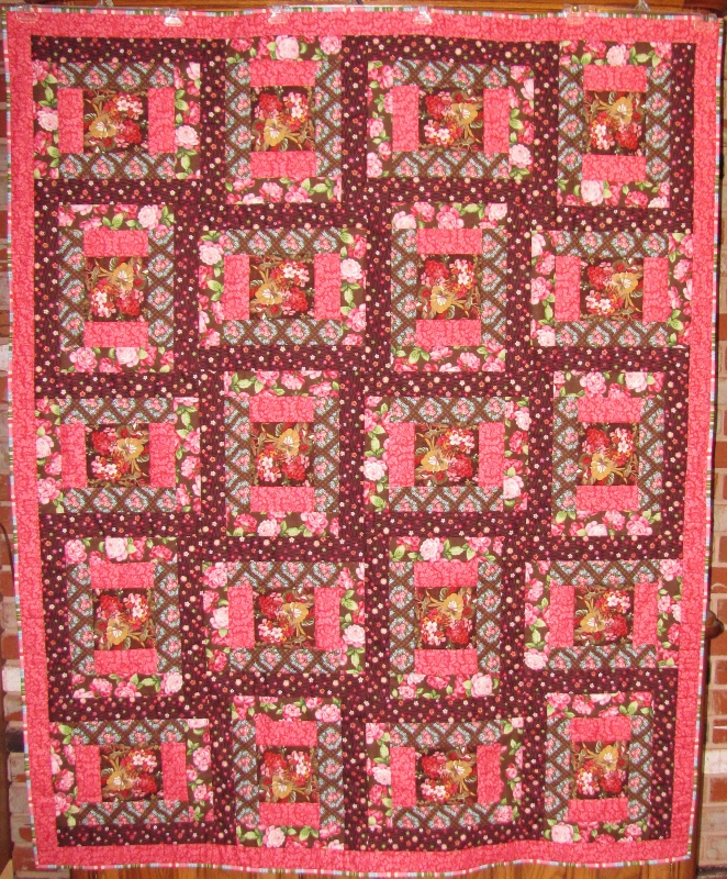
This quilt that I just finished has some history! Many years ago my mom thought she'd like to make a quilt out of old jeans. She chose a log cabin as her pattern and laboriously drew around templates and cut the pieces out with scissors. As soon as she started with the actual sewing, she realized that she had no patience for the process and put all the pieces away.

Eventually, those pieces of denim were gifted to my sister who used up a lot of them in her quilt-making - with much more success! Then she put away the leftovers.

Well, a couple of years ago my birthday gift box came with a stack of these leftover denim scraps. I kept only the ones that were 7 1/2 x 2 1/2 and they have been sitting in my 'I don't know what to do with these' bin since then.

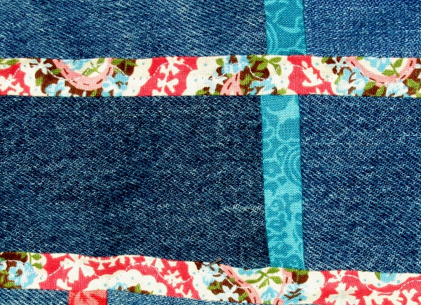
A few weeks ago, I ran across an idea on Pinterest on how to use denim in quilts without sewing through two layers of heavy fabric. You just splice the pieces together by sewing in a 1" wide strip of designer fabric. The seam allowances of 1/4 inch on each side allow the denim to butt up against the next piece with no overlapping. Genius!

Since I had long, skinny blocks I used this splicing on all the pieces end to end, creating one long strip. Then I put a 1" strip on one whole edge, cut the long strip in half and sewed these two together. I continued in this manner (like making a jelly-roll race quilt) until I had a quilt top!

One additional strip on the unfinished side and matching ones on the ends made a skinny border.

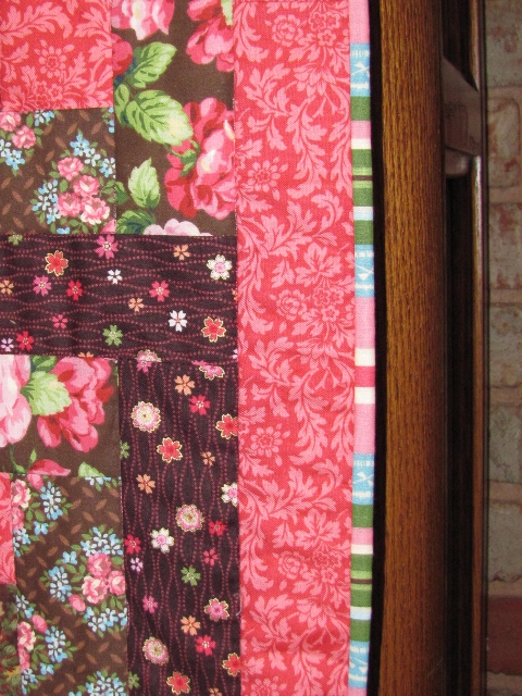
I didn't want to create another border or binding and the finish on the existing border would be 1/2 inch. So I decided to make it a turned quilt. To do this, I laid down the batting, then the backing (face up) then the quilt top (face down). I pinned it all and stitched 1/4 inch all around - leaving an opening for turning.

I pressed the seam allowances in the opening then un-pinned it all and turned right side out.

The border was pinned and stitched in the ditch all around. Then I pinned the top while smoothing it into place. The quilting is a serpentine stitch up the middle of the long strips.


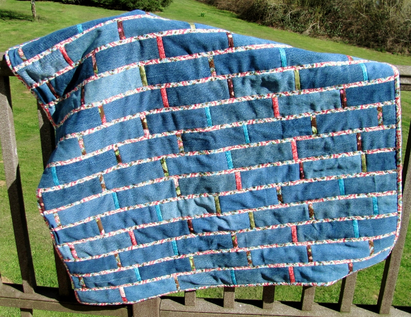
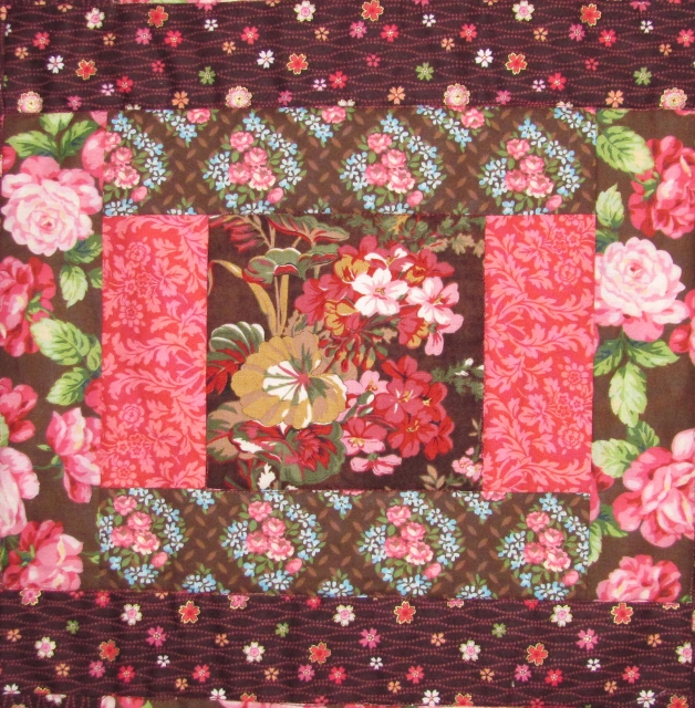
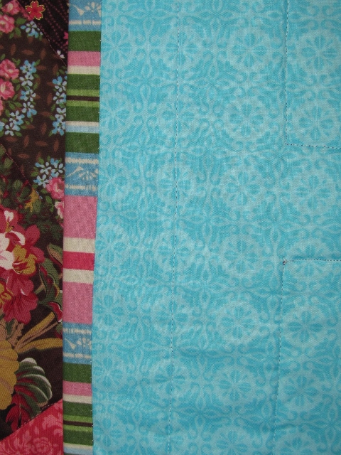
The prints are all scraps from a recent quilt top that I've yet to put the backing on. They were pink/teal/white/brown and featured paislies/tiny flowers/roses.


I added in some tone on tone fabric in pink and teal and some green scraps with a bit of the pink in them.


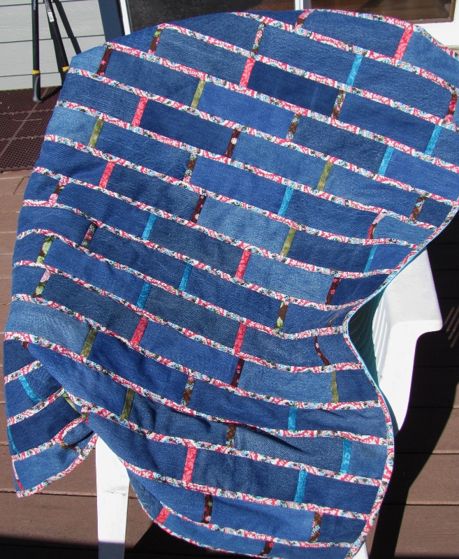
This finishes up at roughly 43 inches on the short side. It is not square but I don't know what the longer measure is. I made sure to offset the 'bricks' as I knew they would never line up just right. With this arrangement it really doesn't matter.


Here's a peek at the quilting.


This fun teal polka dot is the backing. You can see the quilting on the back is very attractive, too.

Final count: leftover denim scraps=0

This decades long family project is officially done!

Ddd 


Posted by studio3d@ccgmail.net at 12:01 AM PDT
Sunday, 15 March 2015
J Is For Job
Topic: Paper Embroidery

The paper embroidery group finished up with the original alphabet swap and were already up to J on this second round. For the first round we got to make whatever we wanted that matched the letter. This time, the host is assigning the word we use for our theme.

Our assignment was J is for Job. Since I am retired, I decided to allude to my career of 30 years as a public library manager. So I went with the theme of 'reading'.


Now that I'm retired I do have more time to read!

You may recognize this as my bookmark pattern. I just moved the text to the right to balance it out for use on a card format.

Ddd


Posted by studio3d@ccgmail.net at 12:01 AM PDT
Saturday, 14 March 2015
Fabulous Shoes
Topic: Paper Embroidery

For a challenge, I made a paper embroidery card with the theme of 'shoes'. I know there are some out there that are gaga over shoes, but I am a tennies girl and wear them daily. I do have a few dress shoes but they are all flats.

At my age, I can't afford to fall off my shoes!

I was surprised and pleased to discover I had some peel-off stickers of shoes and I chose a stitched frame to show them off.


I did the stiching on a print with dress forms to stay with the fashion theme. The panel is mounted on shiny gold to go with the shoe stickers.

The text sticker is  from the same sheet as the shoes.

Ddd


Posted by studio3d@ccgmail.net at 12:01 AM PDT
Friday, 13 March 2015
Time To Put Up the Tree
Topic: Paper Embroidery

I've gotten a bit behind on doing 2 Christmas cards a month for the paper embroidery group. These are not swapped, just put into our stash for our own use when the season arrives.

I did get one done this month, though.

I stitched on a paper that is printed with a fair isle knit pattern. The threads (all metallic) did not show up well on it so I used a light alcohol marker to create shadow areas and now it looks better.


Not ready for Christmas yet, but it's a start.

Ddd


Posted by studio3d@ccgmail.net at 12:01 AM PDT
Thursday, 12 March 2015
Let's Grow Some Spring Flowers
Topic: Paper Embroidery

I don't know what kind of flowers these are but I stitched them in the spring so I am calling them spring flowers. This was the theme of a challenge on one of my groups.

I stitched with bright yellow, lime green and true orange and then backed it with an orange cardstock to match the flower centers.

The cardstock sticker matched the colors perfectly and is a sweet sentiment!

Ddd


Posted by studio3d@ccgmail.net at 12:01 AM PDT

Newer | Latest | Older