« September 2015 »
S M T W T F S
1 2 3 4 5
6 7 8 9 10 11 12
13 14 15 16 17 18 19
20 21 22 23 24 25 26
27 28 29 30
You are not logged in. Log in
Entries by Topic
All topics  «
3D paperwork
A - Z challenge 5
A - Z challenge 7
A - Z challenge round 4
A to Z challenge round 3
A to Z round 2
A to Z round 6
A-Z round 1
Around the House
Art Challenges
Artist Trading Cards
Backgrounds
Beads
Bible Journaling
Books
Boxes
Collage
Color Challenge
Coloring
cookbook
Die Cuts
Digital Projects
Digital Stamps
Drawing
Dry Embossing
Fabric Stuff
Fantastic Folds
Field Trip
Home Decor
How Does Your Garden Grow?
Hymnal Art
In The Kitchen
In the studio
Jewelry
Lettering
Links
Multi-Technique
Music to Work By
Musings
Nail Art
New Work
Online Class
Other Hobbies
Other Projects
Painting
Paper Embroidery
Paper Piecing
Photo
Pretty Paper
Quilting
Random
reading
Scrap Recovery
scrapbooking
Sewing
Sketch Challenge
Some Backlog
Stamping
Stencils
Stickers
Supplies
Teabag Folding
Techniques
Testing
tips and tricks
Tutorial
Web resources
Welcome to my Blog
Work By My Friends
workflow
Writing
Blog Tools
Edit your Blog
Build a Blog
RSS Feed
View Profile
Group One
In & Out of Studio 3D
Sunday, 13 September 2015
Letterpress With Hummingbird
Topic: Dry Embossing

More letterpress with the Cuttlebug. This is the fourth of seven I made in this project series.

For this card I used the leafy branch folder. I smeared the bundled sage Distress ink pad over the surface of the folder and misted it with water. I also misted a piece of white cardstock and inserted it in the folder. After running through the Cuttlebug I hit it with the heat gun to dry it.

I used the bundled sage Distress marker to create drop shadows under the leaves. Then I attached a pre-stamped sentiment to it.

The hummingbird is printed on vellum. I ran the whole piece through the Xyron to apply adhesive to the whole back of it. Then it was placed on the leafy panel and both together were trimmed to size.


I hand drew in the eye on the bird and mounted the background to a sage green card base.

Ddd


Posted by studio3d@ccgmail.net at 12:01 AM PDT
Saturday, 12 September 2015
Letterpress Porcelain
Topic: Dry Embossing

Creating more cards using the Spellbinders demonstrated technique using embossing folders and inkpads to make letterpress backgrounds.

This is the third of seven different embossing folders I played with.

For this I used a larger folder with a stylized vine border on one side. I smeared the scattered straw Distress ink pad over the surface of the folder and misted it with water. I also misted a piece of white cardstock and inserted it in the folder. It was run through the Cuttlebug and then I hit it with the heat gun to dry it.

On this one I grabbed the scattered straw Distress marker and sketched in drop shadows under all the white elements. Itrimmed this panel into a tallformat and attached it to a dark yellow card base.

A pre-stamped sentiment on white was bordered with more of the dark yellow and popped it up on foam tape.


Hard to see in the photo bur the upper edges of all the white elements have a little Stickles sparkle.

Ddd


Posted by studio3d@ccgmail.net at 12:01 AM PDT
Friday, 11 September 2015
Letterpress Hearts
Topic: Dry Embossing

After watching an episode of "Scrapbook Soup" on public television on  using embossing folders and inkpads to make letterpress backgrounds I decided to try a variety of enhancements to make cards.

This is the second of seven different embossing folders I played with.

For this one I used was the hearts folder. I smeared the barn door Distress ink pad over the surface of the folder and misted it with water. I also misted a piece of white cardstock and inserted it in the folder. Once through the Cuttlebug and I hit it with the heat gun to dry it.

I scallop punched the top edge, stamped some unreadable script over the surface with aged mahogony Distress ink and applied Stickles to random hearts.

I stamped the same script onto some red paper to match the card base.  Then I punched a heart from it and applied it on the surface of the card. A prestamped sentiment was trimmed and then I smudged ink on the edges before attaching it.


As a finishing touch I placed a single red rhinestone in the center of the 'o' on the sentiment.

Ddd


Posted by studio3d@ccgmail.net at 12:01 AM PDT
Thursday, 10 September 2015
Letterpress In My Cuttlebug
Topic: Dry Embossing

I was watching an episode of "Scrapbook Soup" on public television and the guest from Spellbinders demonstrated using embossing folders and inkpads to make letterpress backgrounds. I have done this before but decided to do more and try a variety of enhancements to turn them into cards.

I chose seven different embossing folders to play with.

The first one I used was the herringbone folder. I smeared the concord grape Distress ink pad over the surface of the folder and misted it with water. I also misted a piece of white cardstock and inserted it in the folder. Once through the Cuttlebug and I hit it with the heat gun to dry it.

I didn't do anything more to the background. I trimmed it and attached it to a blue base card. I had a collection of vellum elements and one that looked like stained glass was a perfect blend of the purple and blue.


I added a stamped sentiment to the bottom of the illustration and popped the vellum piece up on foam tape.

Ddd


Posted by studio3d@ccgmail.net at 12:01 AM PDT
Wednesday, 9 September 2015
Pink and Turquoise
Topic: Paper Embroidery

I HAD this post ready, typed, posted to go live today, and POOF I have no idea where it went. It may pop up later at some random time but I wanted you to have it NOW, when it is scheduled!

--------------------------------------------------------------------

The assignment: Make a paper embroidery card with pink and turquoise.

That combination made me immediately think of those 1960s Christmas trees made of silber tinsel with the rotating color wheel light. HA! So I deided to recreate the 'magic' in thread.

I selected a bright turquoise and stitched with bright pink thread. I added pink rhinestones where the pattern showd beads because I wanted them to appear more like baubles.


Bordering is bright pink to match the thread.

I used alcohol markers to color a silver peel-off sticker and cut it apart to mount it top and bottom.

Ddd


Posted by studio3d@ccgmail.net at 12:01 AM PDT
Tuesday, 8 September 2015
Singing the Summer Blues
Topic: Paper Embroidery

Assignmment: make a paper embroidery card with the theme 'summer'.

To me summer is all about flowers and butterflies. I love them both. I am always fascinated by the variety and the profusion of both.

I had this great 3D image of blue flowers and chose a 'vine' border to stitch for a framing element. Blue cardstock was the base and I used dark green thread to go with the leaves.

A dark green layer is off centered for a little interest and I added a butterfly mounted 3D.

You can see I added just a touch of stickles glitter to the centers of the flowers.


It's now off to its new home in the UK.

Ddd


Posted by studio3d@ccgmail.net at 12:01 AM PDT
Monday, 7 September 2015
Fairy Ring
Topic: Paper Embroidery

Swap assignment for one of the paper embroidery groups was 'fairy/fairies'. I don't have any fairy patterns but I did have some fairy stickers whose wings can be bent up for a 3D effect.

I selected a yellow patterned paper and chose a ring of butterflies for the stitching pattern.

I first stitched with a bright blue shimmer thread using every other hole then went back and did the other holes with a light blue shimmer.


The fairy sticker rests in the center of the ring and the card is finished with a dark redborder and a shimmery dark blue folded card base.


I chose to not include a sentiment on this one.

Ddd


Posted by studio3d@ccgmail.net at 12:01 AM PDT
Updated: Wednesday, 5 August 2015 2:17 PM PDT
Sunday, 6 September 2015
Stitch and Swap
Topic: Paper Embroidery

It's been a while since I did any paper embroidery as I have been concentrating on those OWH sketches. But I signed up for a swap so really needed to get cracking on a card.

The assignment was to combine paper embroidery with 'decoupage'. Now in the US we usually call these 3D papers and the term decoupage is used to refer to a collage method where the layers are sealed under varnish. But in the UK (and probably the rest of the world) our 3D papers are called decoupage. Good to know I won't have to seal my card in varnish!

I've used the stitched round frame before - and with decoupage - and it turned out great so I decided to use that again. I selected a dark and a light rose and a dark green to go with the coloring of the picture I was going to use.

After stitching, I used a craft knife to carefully cut away the inside of the circle. Then I placed the rose picture behind with places that I knew would be layered extending behind.

This made it so that those layers would overlap the edges of the circle providing more dimensionality.


I colored a silver peel-off greeting sticker with alcohol marker and applied to the upper edge and then used a trio of bright pink rhinestones at the bottom.

The distressed borders at the top and bottom are part of the original paper I selected for the stitching. I finished off by trimming so that a border of the burgundy base card shows around all four edges.

Ddd


Posted by studio3d@ccgmail.net at 12:01 AM PDT
Updated: Tuesday, 4 August 2015 11:25 AM PDT
Saturday, 5 September 2015
Big Blue Beads
Topic: Beads

Some months back I was given a little jar and little package of bright blue beads - imagine the giver's surprise when she gets them back as a birthday gift!

My first step was to arrange the large beads in a balanced layout on my bead board. Then I had to decide how best to string them because some were large hole (like Pandora) and some small hole (standard beads). In looking through my own bead stash I found a bag of small faceted beads in the same blue and they fit through the holes of the large beads perfectly!

So I used beading wire to string a leader and ender of the small beads and then alternated the large hole beads with the small hole ones using the small faceted beads for the large hole beads to ''ride over". Depending on the size of the bead it might take from one to three beads to fill the center.


You can see the beads have silver hardware on them and the large faceted beads have a aurora finish.


I used a screw-type closure at the back.

Ddd


Posted by studio3d@ccgmail.net at 12:01 AM PDT
Friday, 4 September 2015
Operation Write Home - sketch 259
Topic: Sketch Challenge

GRAND FINALE!

The last sketch (forever) from Operation Write Home was published back in July. Even though I did not make a card from it to sent to them (it came out after my last box was mailed in) I did commit to completing my self-challenge of using every single one of the sketches so I did nake a card to keep in my own stash to be used when an occasion arises.

Here is the sketch for OWH 259:


Pretty plain, which always means there is lots of opportunity for interpretation.

I remembered having some fancy-edged diecut rectangles and squares so went searching for one that was close to the specified size. This one had to have one edge cut to get it down to the right shape even though the scalloped edgeextends it beyond the measurements given.

I masked the scallops and stamped my hand-carved butterfly onto the white background.

I chose a neutral backing paper with some subtle text on it. One edge (from a 6x6 sheet) had a scrollwork pattern so I trimmed it away to use as the band across the bottom.

I had the text printed on a vellum strip and secured it to the scrollwork. The skewing off to the right needed a bit of balance which called for the rhinestones on the left end.

I used alcohol markers to color the butterfly to match the background.


I trommed down the entire piece to leave a white border showing from the card base.


So, now that that challenge is fulfilled, what shall be the next?

Ddd


Posted by studio3d@ccgmail.net at 12:01 AM PDT
Thursday, 3 September 2015
Bringing Home the Tree
Topic: Stamping

Time to make art for the County Fair!

We'll start with the assignment for a Christmas card with rubber stamping.

I began the process by inking a pine tree stamp with Distress Markers and stamping it on white cardstock. I masked the tree and inked an old-fashioned car with black Distress Marker and stamped that. I added brown Distress marker to color the car.

I masked the car and tore some post-it paper. This was used to mask a line below the car and blue Distress ink was brushed upward to create a snow bank. The torn paper was moved higher and blue inked again. Then a layer of brown was inked under the car followed by two higher snow banks.

At last, I moved the mask higher and stamped bare trees.

I removed all the masks and then used foam with Blue Distress ink to color the sky. I used a Distress Marker to sketch in a shadow underneath the car to ground it.

I stamped the greeting in the lower corner with black archival ink.

Stickles glitter was used sparingly across the tops of the snow banks and then dotted in the bare trees.


I used a brown bordering paper and then mounted it all on a green card base.

Ddd


Posted by studio3d@ccgmail.net at 12:01 AM PDT
Wednesday, 2 September 2015
Blue Lightning
Topic: Nail Art

When you paint long nails it gives a very large canvas for nail art. It also makes wild and crazy artwork look not so 'out there'.

This time around I wanted a look that spoke of summer storms so chose a sky blue and added silver lightning. The lightning is stylized to be two zigzag lines plus the tips.


The glitter makes the camera freak out and not completely focus.


It won't last ALL summer but we'll see what comes next when the time comes.

Ddd


Posted by studio3d@ccgmail.net at 12:01 AM PDT
Tuesday, 1 September 2015
Red Sails
Topic: Paper Embroidery

The assignment was to make a paper embroidery card inspired by a song title. I chose the song "Red Sails In the Sunset".

I'm not entirely sure if I've ever heard this song but it came immediately to mind when I was sorting through my collection of patterns and came across this sail boat.

It was originally a string art pattern but I reduced it to card size and stitched it according to the instructions for doing it in string art.

I selected a teal paper with a faint script pattern and stitched the sails in red thread, the boat in brown and the water in dark blue.

Then I laid a circle aperture over the sails and used Distress Ink on a foam pad to create the sun behind the sails. I added a few streaks of that same color in the rest of the sky for the sunset.

I used brown and blue inks to color in the boat and the water.


I used layers of red and dark yellow for bordering.

Ddd


Posted by studio3d@ccgmail.net at 12:01 AM PDT
Monday, 31 August 2015
N is for Nature
Topic: Paper Embroidery

Nothing like signing up for swaps to force yourself to get cracking on some new creations! I hadn't joined any paper embroidery swaps for quite a while but then found myself putting my name in for three all at once.

Yesterday's card was the first and this card is the second.

The assignment came from the paper embroidery group that is working through the alphabet with themes chosen by the group leader. We are nup to the letter N and she chose 'nature' for the inspiration word.

I had set aside this stitching pattern and 3D image some time ago but for the theme 'garden'. Then I never got around to making it and missed signing up for that swap. It still worked out perfectly for this theme.

I used a plain white card to stitch on knowing that I could miss a few bits of white background in my trimming of the image and it would not show up.

From the image I borrowed the purple from the round blooms for my thread color. The five layer 3D image was carefully cut using a new blade in the craft knife and assembled using thin foam tape.

Using the image as a reference, I chose yellow for the card base.


This is larger than my standard cards at 5.5 x 6 inches to accomodate the image and stitching.

Ddd


Posted by studio3d@ccgmail.net at 12:01 AM PDT
Sunday, 30 August 2015
12 Tags of 2015 - August
Topic: Multi-Technique

I'm back with my creation based on Tim Holtz's 12 Tags of 2015 - August edition. Here is the original:


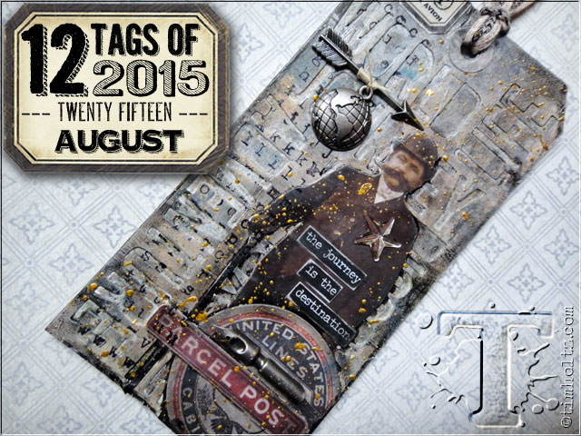
Once again, I created a display piece rather than a tag. I don't have much of an affinity for tags so creating something I can display is more to my liking.

You'll soon discover that my piece looks very little like the inspiration piece. I am pleased with this as I like mine better!

Since I did not follow the directions closely here are the steps that I used.

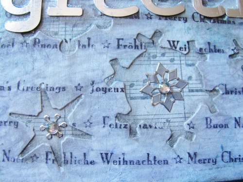
- Cut two pieces of heavy cardstock the same size (mine were 5.5 inches square)

- Use dies to cut shapes all over one of the pieces (I used 4 snowflake dies)

- On the second piece, use matte medium to adhere sheet music.

- Use matte medium to adhere the diecut piece over the music piece making sure all corners and edges are secure

- Seal the surface of the music with matte medium and dry with heat tool

- Paint white gesso over entire surface then wipe away excess gesso to allow music to show through. Dry.

- Smush three Distress ink pads onto surface (I used broken china, evergreen mough and shaded lilac)

- Immediately use thin layer of matte medium to blend the colors. While still wet, use paper towel to dab away excess ink. Dry.

- Stamp words on surface using Archival jet black.

- Use blending fluid to smudge and smear words on surface.

- Use black soot distress marker to draw inside snowflakes. Wipe away to create dimension.


- Adhere metal letters using matte medium. Dry.

- Use soot black distress marker to draw drop shadow around letters. Wipe away to create dimension

- Apply rubon words inside one snowflake


- Attach silver snowflake dazzles inside snowflakes

- Place rhinestones inside dazzles and to the dots on the 'i's

- Use stickles to add a snowcap to tops of letters

- Use black permanent marker to add a string to hold the dangling letter.


Here's the final product:


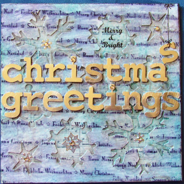
And there you have proof again that I cannot follow directions!

Ddd


Posted by studio3d@ccgmail.net at 12:01 AM PDT
Saturday, 29 August 2015
Bunny Mom
Topic: Around the House

We've always had lots of bunnies living on our property and are always excited when we see a new behavior. It helps us understand them a bit more. We're also impressed at their camoflage and understanding of what they need to do to survive.

Look closely at this scene:


What do you see? This was just a day after hubby finished painting the trim on the new shed shown in the upper right. We noticed a bunny hopping straight to the corner of the building, turn around facing out, and scrunching down to make herself blend in. The next day she was still there but, when the sun shone on the front of the shed she moved to the gravel path between the two sheds and faced front again, from the shade.

Later in the day two big crows landed on the lawn and strolled over to the tall grass around the small twig tree (lower left of photo). When either of them came within 10-12 feet of it that bunny came flying out of her corner and went on the attack.. She was taking on two birds that were bigger than she was and they were sneaky, too. They split up and came from different directions but, I'll tell you, that bunny has some MOVES! The birds wised up and moved on.

When we thought bunny was missing we got out the binoculars and saw her laying in the tall grassy area with her belly to the middle. YES, she's got a nest of babies in there and she only goes close to nurse them Otherwise she keeps her post in camoflage.

We also noticed when two other bunnies came up to the general area and casually started grazing. At this point mama bunny left the babysitters in charge and went off to the creek area. She was only gone about a half hour and when she took up her post the babysitters went back up the road.

Fascinating!

So, let's take a closer look at the photo... Zoom in on the corner of the building and you can see mama:


Zoom in on the grass clump and you can see the pile of babies:


Oh, how I want to go get a closeup look at them. But she would just move them somewhere else. I'll be patient and wait for them to get pig enough to hop around their little home.

In the meantime, we keep a BB gun at the ready to discourage any of the big birds that hang around.

Ddd


Posted by studio3d@ccgmail.net at 12:01 AM PDT
Friday, 28 August 2015
Operation Write Home - sketch 258 #20
Topic: Sketch Challenge

Done in three... two.. one...

Yes, this is the last card made with OWH sketch 258:

Again, I used a sentiment stamped on white leaving all the options for other elements open. I started with brown flags and then found this great 'label' paper in the 'vintage' divider of my papers. I thought that looked kind of homey.

I noted a greenish tinge in the background so I selected some light sage for the bordering elements. However, I used brown for the drawn border around the sentiment panel.


I reinforced the green with the use of a chipboard teacup element.

Now that this project is all done, what's on tap for tomorrow?

Ddd


Posted by studio3d@ccgmail.net at 12:01 AM PDT
Thursday, 27 August 2015
Operation Write Home - sketch 258 #19
Topic: Sketch Challenge

Keeping it at home... another OWH sketch 258 creation:


A panel of botanicals and some neutral flag prints lend a restful feeling to this card. The feel of those botanicals are echoed in the florals embelled in the text font.

Buttery yellow bordering is low-contrast for the elements so the sentiment needed that bordering line drawn in.


The lattice-look flag makes a good foil for the two chipboard rosebud elements.

Ddd


Posted by studio3d@ccgmail.net at 12:01 AM PDT
Wednesday, 26 August 2015
Operation Write Home - sketch 258 #18
Topic: Sketch Challenge

Another change in sentiments kicks off this last run of cards using OWH sketch 258:


I used what is probably my favorite color combination ever - light blue and chocolate brown. Did you know that these are actually complementary colors because borwn is really dark orange? But in these values you do not get the stark contrast that you do on the color wheel with true blue and true orange.

As justification for my color palette I give you the printed background. I added flags in the dark brown and bordering in the pale blue.

Then I selected two blue teacups to go with the 'homey' sentiment.


The brown drawn border on the sentiment ties it back to the background.

Ddd


Posted by studio3d@ccgmail.net at 12:01 AM PDT
Tuesday, 25 August 2015
Operation Write Home - sketch 258 #17
Topic: Sketch Challenge

Today's card looks like a little celebration! Here's that view of OWH sketch 258 (in case you could ever forget it!)


White panel sentiment means a wide open door. I first chose pink flags and then found the gradated background with pink and yellow. That set me on the path to selecting yellow for the bordering and also dictaated which end was 'up' on the background so the elements would have the best contrast.

I drew in that border with a marker again, using Distress marker.


The chipboard embellishment actually IS a little 'treat' as it is a dish of ice cream sundae.

Ddd


Posted by studio3d@ccgmail.net at 12:01 AM PDT

Newer | Latest | Older