« October 2015 »
S M T W T F S
1 2 3
4 5 6 7 8 9 10
11 12 13 14 15 16 17
18 19 20 21 22 23 24
25 26 27 28 29 30 31
You are not logged in. Log in
Entries by Topic
All topics  «
3D paperwork
A - Z challenge 5
A - Z challenge 7
A - Z challenge round 4
A to Z challenge round 3
A to Z round 2
A to Z round 6
A-Z round 1
Around the House
Art Challenges
Artist Trading Cards
Backgrounds
Beads
Bible Journaling
Books
Boxes
Collage
Color Challenge
Coloring
cookbook
Die Cuts
Digital Projects
Digital Stamps
Drawing
Dry Embossing
Fabric Stuff
Fantastic Folds
Field Trip
Home Decor
How Does Your Garden Grow?
Hymnal Art
In The Kitchen
In the studio
Jewelry
Lettering
Links
Multi-Technique
Music to Work By
Musings
Nail Art
New Work
Online Class
Other Hobbies
Other Projects
Painting
Paper Embroidery
Paper Piecing
Photo
Pretty Paper
Quilting
Random
reading
Scrap Recovery
scrapbooking
Sewing
Sketch Challenge
Some Backlog
Stamping
Stencils
Stickers
Supplies
Teabag Folding
Techniques
Testing
tips and tricks
Tutorial
Web resources
Welcome to my Blog
Work By My Friends
workflow
Writing
Blog Tools
Edit your Blog
Build a Blog
RSS Feed
View Profile
Group One
In & Out of Studio 3D
Saturday, 17 October 2015
Tiny Bubbles
Topic: Quilting

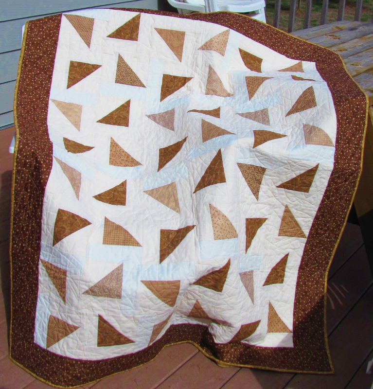
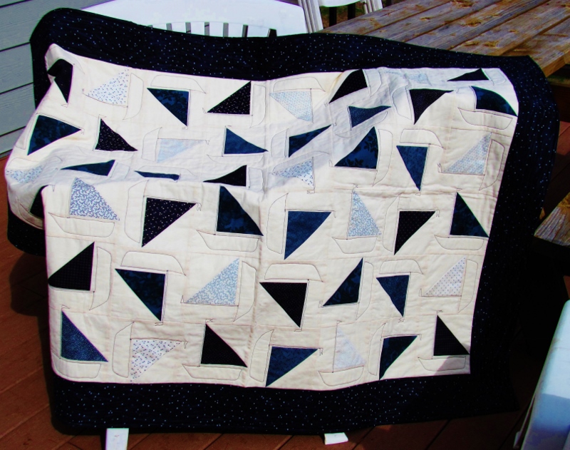
When I fould a 'manager's special' at 40% off at the fabric store I had to buy some yardage in every color it was available. This bubble fabric came in tan, brown, red and teal.

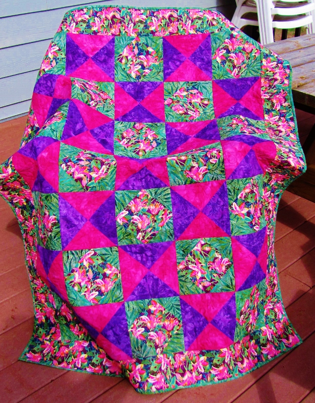
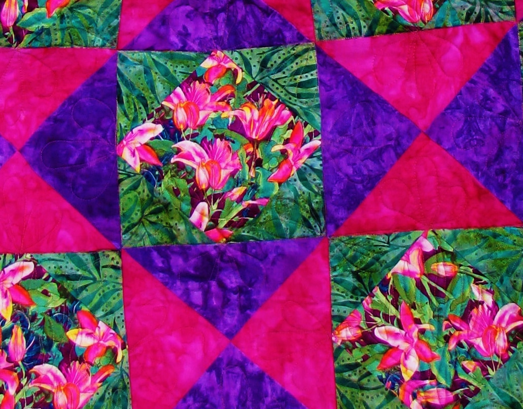
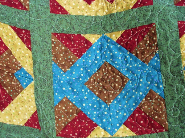
I used a tutorial from the Missouri Star Quilt Company called the Amazing Jelly Roll from 3 Dudes Quilting. It essentially has you sew four strips together side-by-side, measure the total width, and cut lengths to match so you end up with squares. These are laid, right sides together so the strips go horizontal on one and vertical on the other. You stitch 1/4 inch all around the outside and then cut on both diagonals. You end up with four squares with a mix of vertical and horizontal stripes. So Cool!

I arranged the resulting blocks into two types of blocks and assemgled the quilt with sashing. My quilt was MUCH longer than wide so I gathered all the left overs from the strip cutting and made side borders for the quilt, followed by another green border.


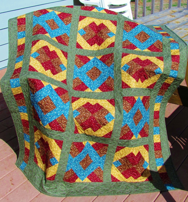
I quilted with a light cream thread in loop-the-loops.


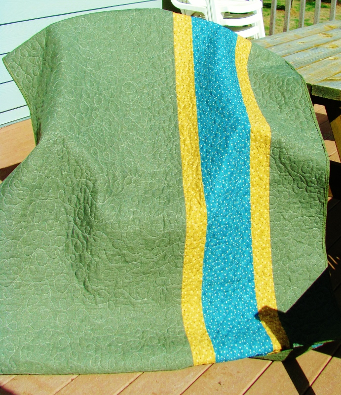
The quilt ended up larger than anticipated do the backing I had chosen was notbig enough. I took some of the scraps from the bubble fabrics and pieced a giant stripe for the back, off-centered for impact.

I obviously used cream thread in the bobbin as well, so you get a good view of the quilting here, too.

Ddd


Posted by studio3d@ccgmail.net at 12:01 AM PDT
Friday, 16 October 2015
Pickalily
Topic: Quilting

This quilt was totally inspired by the lily fabric I found in the red tag bin at the local fabric store.

I surrounded the feature squares with green batik and then used the bright pink and purple to build hourglass blocks of the same size.

It is a very simple layout that really calls attention to the lilies.


The quilting is grasses in all of the lily fabric and triple teardrops in all of the triangles.


This is also a Passages quilt for the hospital.

Ddd


Posted by studio3d@ccgmail.net at 12:01 AM PDT
Thursday, 15 October 2015
Tipsy Triangles
Topic: Quilting

From my quilting mini-marathon, today we are looking at 'Tipsy Triangles'. This is the other half of the charm pack that was given to me. It was a mix of blues and browns. I had already used the blues for the quilt shown yesterday so I added enough browns from my stash to make enough for this quilt. The background is all muslin from my stash, but from different sourdes so some have more color than others.

The pattern is a tutorial called 'Falling Triangles' from the Missouri Star Quilt Company.


I quilted this all over with interlocking triangles of various shapes and sizes.


This will go to the hospital for the Passages program - number 37!

Ddd


Posted by studio3d@ccgmail.net at 12:01 AM PDT
Wednesday, 14 October 2015
Drunken Sailor
Topic: Quilting

Once the quilt group stopped meeting for the summer (from mid-June) I had no place large enough to make quilt tops into 'sandwiches' ready to do the quilting. So I made myself a lot of kits, pre-cutting the fabrics and putting them into gallon zip-lock bags along with the pattern. Then I would pull out a kit, make it into a quilt top and set it aside with the backing fabric and the batting all cut.

Once we started meeting again in September, I had nine quilt tops ready to assemble into finished quilts. I spent one whole Saturday basting tops (hooray for spray basting) and then during the week I started quilting and binding them.

So, there will come up many quilts in a short time span - in the order they were finished.

Today we are looking at 'Drunken Sailors'. This started out with a charm pack that was given to me. It was a mix of blues and browns but I separated out just the blues and added some from my stash to make enough for this quilt. The background is all muslin from my stash.

The pattern is a tutorial called 'Falling Triangles' from the Missouri Star Quilt Company.


As soon as I got this top done the blue triangles made me think of sails. So I used a dark blue thread to do thread-sketching of hulls and masts (with little flags on them) to turn each one into a little sailboat.


The fact that the boats face every which way led to the quilt title.

Ddd


Posted by studio3d@ccgmail.net at 12:01 AM PDT
Tuesday, 13 October 2015
Blessed Are the Piecemakers
Topic: Other Projects

For my birthday I was given a frame, some buttons, and directions for the idea of making a sign for my quilt studio. We brainstormed for a good phrase to use and I set to work.

I had some flocked paper in rolls and selected a burgundy for my background. I found the easiets way to mark the lettering after I had printed it out in the size I wanted was to lay it over the flocked paper and pierce the outline of the letters. When the pattern was removed I had dotted lines to guide me.

I chose to use "Crafter's Pick : the Ultimate" glue as I knew it would adhere to both the buttons and the flocking. I drew of line of glue with a toothpick over the dotted line of a letter and then placed the buttons in random colors. 


You can see that I did not try to line up the holes in the buttons, but allowed those to be random as well.


The words 'are' and 'the' are made up of some quilt-theme stickers that I already had on hand.


That's a further reinforcement of the theme of the sign.

This is going to look GREAT in my quilt studio!

Ddd


Posted by studio3d@ccgmail.net at 12:01 AM PDT
Monday, 12 October 2015
Elegant Elements
Topic: Supplies

The final card for the recipe challenge - 3D, metal, lace - is here today.

I chose a 3D with a bit of lace built in, with a doily in it. This first layer was applied to the card base with a background paper. Then I attached the strip of lace down through the 3D and constructed the rest of the image on top of the lace.

I found a couple of gold corner elements in my 'metal embellishments' bin and tucked them into the 3D. The 3D sheet came with an extra butterfly (gotta love that) so I used it with the wings raised.


I applied a gold peeloff sentiment with bits overlapping the lace and the background.

Ddd


Posted by studio3d@ccgmail.net at 12:01 AM PDT
Sunday, 11 October 2015
House of Hope
Topic: Supplies

Back with another card from the supplies recipe challenge - 3D, metal and lace.

I chose a foil 3D element for this one. Colors from the feature appear again in the background paper. I used a strip of flat lace and wrapped it over the background piece. 

A base card in shimmery green echoes the leaves on the foil.

I used a coper metallic text piece.

All the reflection in the foil piece make it difficult to get a good photo.

Ddd


Posted by studio3d@ccgmail.net at 12:01 AM PDT
Saturday, 10 October 2015
On the Clock
Topic: Supplies

Challenge: Make a card using a 3D image, lace and a metal element. The card was supposed to be circular, too, but I totally missed that in the 'recipe'. I pulled out three 3D images that I thought would benefit from the addition of lace.

First, I had a sheet with two clock elements - a border and a feature. I constructed both of them and substituted real gears for some of the smaller printed gears that were included.

I placed a strip of lace at the lower border of the card and used the border 3D over top of it.

Then I attached the main element to the left of the background area.

I did not have any sentiments in the appropriate color so I used an alcohol marker on a silver peel-off sticker and placed that in the open area.

Ddd


Posted by studio3d@ccgmail.net at 12:01 AM PDT
Friday, 9 October 2015
It's In the Bag
Topic: Sewing

Back in March I was in Puyallup Washington for the Sewing and Stitchery Expo. I bought a pattern and special batting for making a duffel bag.

Six months later, I finally decided what fabric I wanted to use (from my stash) and bought the D-rings, sliders and swivel clips as well as two zippers. And I was ready to go.

First off you have to take your lining fabric and your main fabric, sandwich the batting between them, and quilt top to bottom at 3/4-inch intervals across the entire width. The construction pieces are then cut from this quilted 'fabric'.

For my main fabric I chose a black background with pink and teal flowers. For the trim I chose a two-tone pink. And for the lining I chose a teal with white polka-dots.

Here is a view of the overall bag:

The exterior features a slip-on pocket on each side and each end. There is also a zippered pocket on the front. Teal zippers were a lot of fun.

The back:


On the ends you can see where the padded, adjustable shoulder strap clips on:

Here's a look at the adorable polka-dot interior and the three-section pocket:


The instructions even include little zipper pulls in the trim fabric:


This a generous size and turned out SO CUTE!

It was a two-day project for me, including time to tear out a few times when I didn't catch on to the directions the first time around.

Ddd


Posted by studio3d@ccgmail.net at 12:01 AM PDT
Thursday, 8 October 2015
On the Beach Block
Topic: Quilting

In preparation for a quilting cruise I am taking in November I needed to make a block for a challenge.

Each participant was sent a piece of required fabric along with instructions to keep the finished block at 9.5 inches and use the theme "Life's a Beach". We could use any technique we wanted.

At the first look at the blue and yellow batic fabric I knew I wanted to represent a sunset on the ocean. It took me several weeks to finalize a design and settle on 'applique' as my technique.

I sketched out the components on Steam-a-Seam2 and tacked these to yellow, brown, green and cream fabrics. Then I cut out the elements, peeled the backing and arranged them on the backing fabric. These were pressed in place for a permanent bond.

I laid the piece on some tear-away stabilizer and loaded the sewing machine with invisible thread.

I stitched all the elements down on the edges as well as adding details with free-motion sewing. Then I continued on to adding artistic details to the background with stitching.

The final step was to add some shading to the water, sand and tree trunks with alcohol markers.


When we get to the cruise all the blocks that have been created will be judged by the instructors, other students and any passengers on the ship that want to vote. Winners will receive a share of all the blocks to use in creating their own quilt. Since everyone will be using the assigned fabric in some way, all of the blocks will coordinate.

Ddd


Posted by studio3d@ccgmail.net at 12:01 AM PDT
Wednesday, 7 October 2015
Apple Of My Eye
Topic: Paper Embroidery

A swap back in September called for a paper embroidery card with a 'harvest' theme.

I had a large square sticker with a branch and apples that I wanted to use. I chose a diagonal plaid cardstock and a pattern of a border cross stitch.

I stitched up the pattern with green and dark yellow threads that go with both the background and the illustration colors.

When it was time to use the illustration in the center I decided it would look better to trim away the border and background from the sticker and just use the apples, flowers and leaves.


I added a thin bordering red and mounted it all on a cream colored base card.

Ddd


Posted by studio3d@ccgmail.net at 12:01 AM PDT
Tuesday, 6 October 2015
I Think Of Pink
Topic: Paper Embroidery

I decided to combine two challenges into one card. First was a Paper Embroidery pattern challenge. The pattern is from Ann's Paper Art.

There was a 'pink' challenge on a paper crafting list so I decided to use pink printed cardstock and stitch the pattern with pink thread to meet that challenge.

I mounted it on a folded pink card base and then decided it was too plain. So I selected a pink floral 3D image to mount on top.

I guess, with the inclusion of the green of the leaves, it no longer meets the exact criteria for an 'all pink' card but I'm just that kind of a rule-breaker.

Ddd


Posted by studio3d@ccgmail.net at 12:01 AM PDT
Monday, 5 October 2015
O Is For Oriental
Topic: Paper Embroidery

It was time to move on to the next letter in the alphabet swap on the paper embroidery list. We were assigned O=oriental for this round.

I wanted to use some of the alcohol ink paper that I had left and chose two patterns to combine for this card. 

The Kanji letters on the left side say 'good luck'. This is a pattern that I designed and I added a couple of pagodas on the right side. These were from a book.

I stitched with a burgundy thread and mounted the pieces side by side on a burgundy paper.


The base card is playing havoc with the camera as it is a shimmer cardstock.

Ddd


Posted by studio3d@ccgmail.net at 12:01 AM PDT
Sunday, 4 October 2015
Falling For Fall
Topic: Backgrounds

Not done with the alcohol background yet. I had two pieces that were very close in appearance with great fall coloring and silver mixatives on the surface. Each of them was just large enough to stamp one of the large leaf images.

I used Archival black to stamp the images and dried with a heat gun. I used small scissors and trimmed right up against the images.

Now my idea was to run these cut leaves through the Xyron machine to apply a layer of adhesive and stick them onto a burgundy background. Unfortunately, I put them in the Xyron upside down and now I had adhesive ON THE FRONT! Aaaaaaak!

In an effort to salvage them, I placed them on a sheet of transparency, applied adhesive to the back of the leaves and placed this over the piece of burgundy. To keep the edges down and not have adhesive showing, I scored the transparency at the edges of the burgundy and turned it to the back. This got stuck down with a line of adhesive and 'hooray' the leaves were saved!


I finished this off by mounting it with foam tape over a sage green card base and adding silver peel-off word stickers for a sentiment.

Gotta be flexible.

Ddd


Posted by studio3d@ccgmail.net at 12:01 AM PDT
Saturday, 3 October 2015
Cornucopia of Gold
Topic: Backgrounds

 I wanted to keep going with the alcohol backgrounds and liked how that stained glass stamp was working. I have others of those types of stamps so I selected a background with a lot of gold mixative on it and a harvest stamp with a cornucopia.

There wasn't a whole lot of color in the image so I chose a fall leaf printed paper and selected a bordering color from that. I also gave the image a wide black border for impact.


This stamp runs landscape format unlike those for the last couple of days.

Ddd


Posted by studio3d@ccgmail.net at 12:01 AM PDT
Friday, 2 October 2015
Partridge Apparently
Topic: Backgrounds

The card today is SO much like yesterday's that it hardly needs all the descriptives and step-by-steps.

I actually used the other half of the same alcohol background paper from yesterday. Some of the background had a 'good' section and other 'not so good' sections. But this one was all good, allowing me to use both halves since the stamp was not too large.

This background was a little darker so I chose a purple from the image colors for bordering. I repeated the black border as on yesterday's card and found a golden pring to layer behind it.

This image has more metallic mixative on the surface which causes a glare with the camera. The image is NOT poorly stamped as the photo appears, that's just the camera.

Ddd


Posted by studio3d@ccgmail.net at 12:01 AM PDT
Thursday, 1 October 2015
Pear Wine
Topic: Backgrounds

When I made the latest Tim Tag, I 'used up' the extra alcohol inks, mixatives and blender solution on the non-stick craft sheet by swiping through them with other pieces of glossy cardstock and set them aside for later use.

Today is 'later'.

I took a piece with multiple colors and stamped it with a 'stained glass' stamp using Archival ink in black. I love how this really has the look of colored glass.

I chose one of the colors in the background and backed the trimed out stamp with this red-violet. A black border on this really gives the stamped image impact.

I chose another color from the image and found it in a printed snowflake paper.


Placing this on a black base card while leaving a border showing makes for a Christmas card that will go out without a greeting.

Ddd


Posted by studio3d@ccgmail.net at 12:01 AM PDT
Wednesday, 30 September 2015
All Buttoned Up
Topic: Paper Embroidery

Another swap assignment from a Paper Embroidery group - the theme is 'buttons'.

I really thought about doing something with a telephone, calculator, ATM, or something else with buttons but decided to play it straight.

I chose copper metallic cardstock and pierced a border off center. This was stitched with dark orange and yellow threads.

I had two sheets of stickers with buttons. They were the perfect color for this project. The smaller buttons were acrylic domes but the larger three were flat cardstock stickers. I covered these with Glossy Accents so they were shiny  like the others.


I used a yellow base card and added gold text sticker for the sentiment.

Ddd


Posted by studio3d@ccgmail.net at 12:01 AM PDT
Tuesday, 29 September 2015
12 Tags of 2015 - September
Topic: Multi-Technique

It's time again for an art pieceinspired by Tim Holtz's 12 Tags of 2015. We're up to September now:


Here are the steps I used to create this

- on non-stick craft sheet scribble metallic mixatives from the alcohol ink line

- shake and scribble several colors of alcohol ink directly over mixative

- shake blending solution over top

- swipe glossy cardstock through inks

- set aside to dry

- on heavy cardstock use foam tool and distress inks to blend color to complement alcohol inked piece.

- mist with water and dry with heat tool

- trim alcohol piece to desired size

- select stamps for feature

- ink with Archivel black ink and stamp on alcohol piece. dry with heat tool

- place stencil over top

- use plastic card to squeege  clear mmatte medium through the stencil

- carefully remove stencil (wash it immediately)

- allow piece to dry naturally

- stamp the same stamps on heavy vellum using Archival black ink

- heat dry and cut out

- shape if desired

- over dried matte medium very lightly sponge with Archival black ink to show the texture

- use sponge to ink edges of piece with Archival black ink

- use sponge to also ink edges of the heavy cardstock piece with Archival black ink

- tear a piece of black cardstock the same width as alcohol piece

- pierce four corners

- cut label shape from metallic cardstock and add metallic text sticker

- string thin wire through ends of label

- place metallic brads into pierced holds

- wind wire ends around brads

- assemble piece: alcohol piece to heavy cardstock piece, black strip to bottom, stamped vellum over stamped alcohol piece

- spritz surface of piece with spritzer and Distress marker in black

Yes, I made another display piece instead of a tag like Tim does.

Ddd


Posted by studio3d@ccgmail.net at 12:01 AM PDT
Monday, 28 September 2015
Lavender, Violet, Purple, Plum and Eggplant
Topic: Color Challenge

Have you ever tried to make a card using ONLY purple? That was the challenge I answered.

I first selected a checked background paper and stamped leaves and stem with a Milled Lavender Distress. I used Seedless Preserves Distress marker to sketch in some leaf details.

With this background prepped, I punched a zillion tiny flowers out of five shades of purple. I then used a ball tool to shape them over a foam pad. 

Starting with the darkest flowers I attached a layer using Glossy Accents as adhesive. This was followed with a layer of the next darkest, not going all the way to the edges of the darkest. Continuing in this manner I used all the tiny flowers and finished with a dot of Stickles in the center of each. I also outlined the leaves and stem with Stickles.

I used Seedless Preserves Distress marker and a spritzer to spray the whole surface. 


Here's a look at the many layers of flowers that make up this bloom.


I finished with a stamped sentiment bordered with a dark purple the same as the border on the whole card.

Ddd


Posted by studio3d@ccgmail.net at 12:01 AM PDT

Newer | Latest | Older