« June 2016 »
S M T W T F S
1 2 3 4
5 6 7 8 9 10 11
12 13 14 15 16 17 18
19 20 21 22 23 24 25
26 27 28 29 30
You are not logged in. Log in
Entries by Topic
All topics  «
3D paperwork
A - Z challenge 5
A - Z challenge 7
A - Z challenge round 4
A to Z challenge round 3
A to Z round 2
A to Z round 6
A-Z round 1
Around the House
Art Challenges
Artist Trading Cards
Backgrounds
Beads
Bible Journaling
Books
Boxes
Collage
Color Challenge
Coloring
cookbook
Die Cuts
Digital Projects
Digital Stamps
Drawing
Dry Embossing
Fabric Stuff
Fantastic Folds
Field Trip
Home Decor
How Does Your Garden Grow?
Hymnal Art
In The Kitchen
In the studio
Jewelry
Lettering
Links
Multi-Technique
Music to Work By
Musings
Nail Art
New Work
Online Class
Other Hobbies
Other Projects
Painting
Paper Embroidery
Paper Piecing
Photo
Pretty Paper
Quilting
Random
reading
Scrap Recovery
scrapbooking
Sewing
Sketch Challenge
Some Backlog
Stamping
Stencils
Stickers
Supplies
Teabag Folding
Techniques
Testing
tips and tricks
Tutorial
Web resources
Welcome to my Blog
Work By My Friends
workflow
Writing
Blog Tools
Edit your Blog
Build a Blog
RSS Feed
View Profile
Group One
In & Out of Studio 3D
Saturday, 4 June 2016
Mini-Distress Redux
Topic: Supplies

Not so long ago I shaared some cards I made with the experimentations using the mini-distress ink pads I had bought. The pads came in sets of four and I used four of them on those experiments without regard to which set the pads originated from.

So I had four new pads left and wanted to do some different experiments. I had a brown, turquoise, purple and dark yellow.

I pulled out a sheet of watercolor paper from a pad and took each of the colors in turn and made a direct-to-paper swipe top to bottom. Then I turned the paper and made stripes with each in turn until I ended up with a plaid.

When the sheet was completely dry (I helped it along with the heat gun), I used a paper cutter to chop the whole page into one-inch squares.

I sorted the squares by their dominant and accent colors as set up for the next steps.

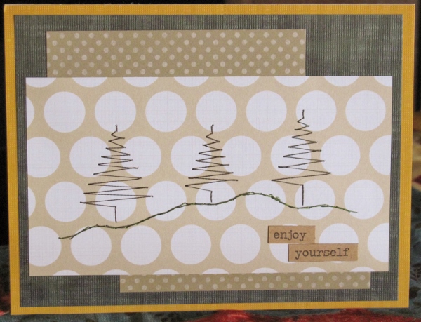
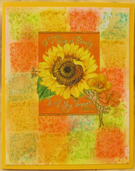
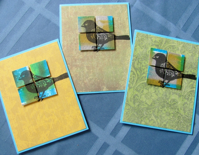
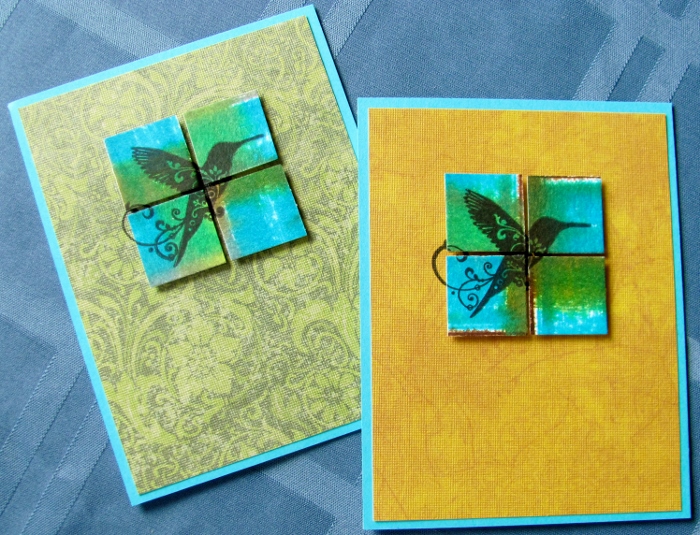
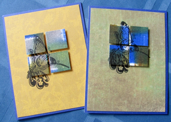
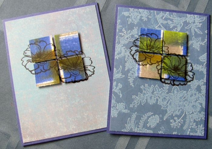
I chose four squares with similar coloring and arranged them on scrap paper in a grid with a small space separating them. Then I used black ink to stamp an image, letting the stamp hang off as needed.

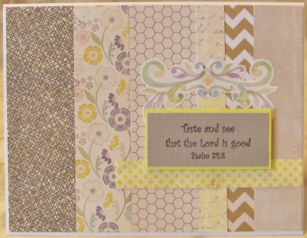
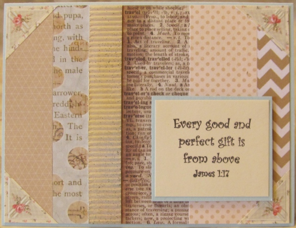
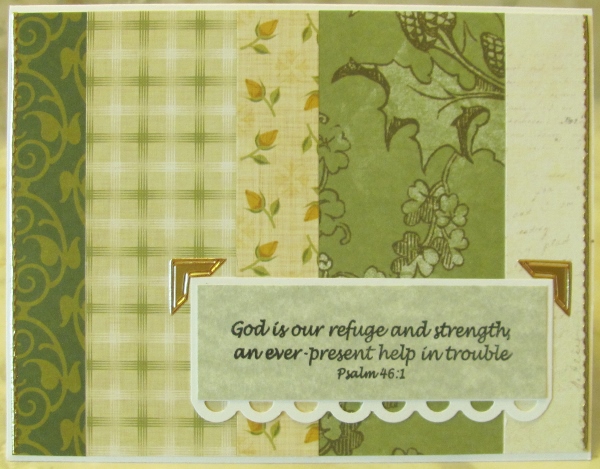
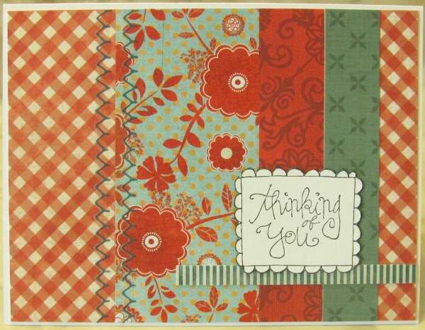
I selected a background (cut to 4 x 5.25) that went with the colors in the square. These papers were new to my stash as I just picked them up in a 12x12 pad at Tuesday Morning. I had cut each of the pages to 6x6 for ease in working with them.

First, I stamped the image onto a stamp positioner. Then I laid the squares on the background where they would be mounted. I placed the stamp positioner with the image lined up on the squares, set the 'L' in place, removed the stamped plate, removed the squares and then stamped the image on the background. PERFECT!

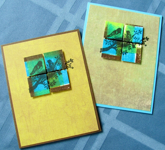
I used foam tape to mount the squares over the stamped background where their perfect alignment allows the image to show in the spaces between and aound the edges.

Each card got a bordering piece to enhance the image and became the front on a white card base.

I made 15 cards using 6 stamped images.

2 cards were made with nesting birds:


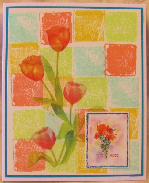
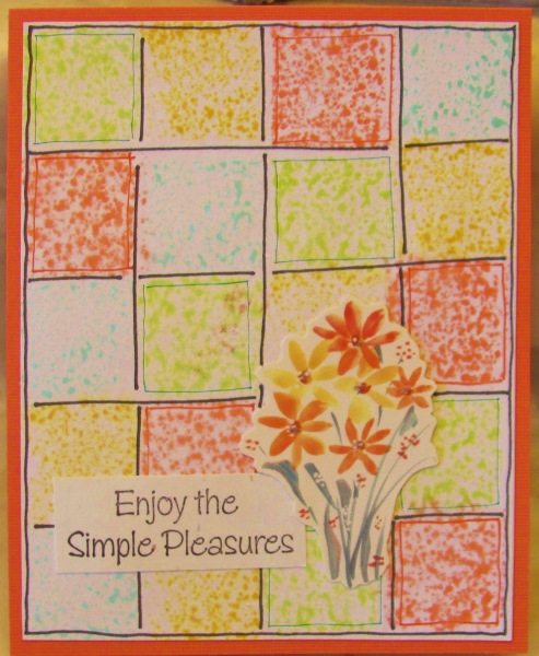
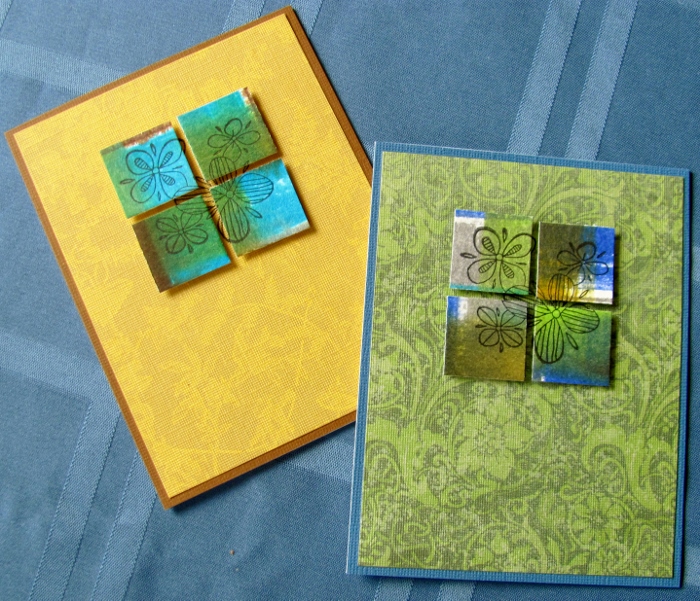
2 cards were made with a floral grouping. The image fit all inside the squares so y9ou only see the stamped portion of the background in the spaces:


3 cards were made using the large bird image:


2 cards use this small hummingbird stamp:


2 cards use a larger hummingbird:


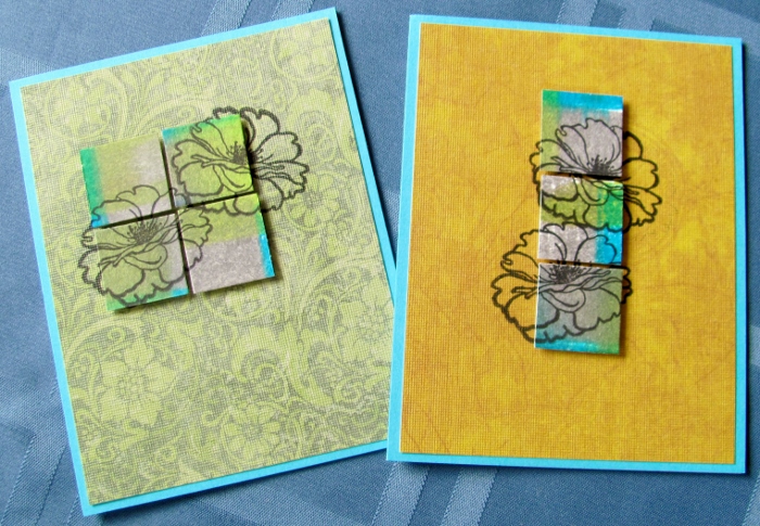
For these cards with two floral blossoms I had to use the stamp positioner two times to align the images separately. 2 cards are arranged like those shown previously:


I wanted to do something a little different so I arranged the squares to be off center on one card and I used only 3 squares on another:


I'm going to match these with envelopes and give them as a gift set of notecards.

Ddd


Posted by studio3d@ccgmail.net at 12:01 AM PDT
Friday, 3 June 2016
Gilded Marble
Topic: Nail Art

I know it hasn't been that long since I posted nail art but, I was looking at my nails and the longest one looked like it had a crack from the tip to the finger. DRAT!

It was only after I took the manicure off that I discovered it had been the polish that was cracked and not the nail.

So I just got busy repainting them.

I started this manicure by painting liquid latex around the nail on the skin and cuticles. After it was dry I did the manicure and then peeled off the latex. This allows you to get right up to the edge of the nail and do easy cleanup.

After a coat of clear base I put on a layer of white. Then, working nail by nail I applied a second coat of white, dropped on red and purple and swirled them together with an orange stick.

They all got a coat of gold fine glitter followed by clear top coat.

Not much of the white shows, just enough to create the marbled effect.


Here is the best view of the gold layer:


Can you believe how long these nails have survived?

Ddd


Posted by studio3d@ccgmail.net at 12:10 AM PDT
Thursday, 2 June 2016
T Is For Trees
Topic: Paper Embroidery

When the challenge came up to make a papeer embroidery card with 'trees' I was finding most of my patterns were for Christmas trees. It seemed a bit too early to go down that route.

I did have this pattern that I have stitched up for Christmas before but changed it up by using different papers and threads.

I went with forest green threas for the trees and grass green for the ground, stitching onto a big dot paper and backing that with small dots.

A dark green paper serves as a background over a golden base card.


I used a couple of word stickers that match the card colors.

Ddd


Posted by studio3d@ccgmail.net at 12:01 AM PDT
Wednesday, 1 June 2016
Sleep On It
Topic: Sewing

I obviously didn't stay idle too long as, the day after my BIG ANNOUNCEMENT, I'm back with a completed project.

Mom needed a set of pillowcases that were larger than standard.

We had seen them while shopping but they are ridiculously spendy.

While at the store it suddenly occured to me, "I have three sewing machines. I can MAKE pillowcases."

We walked right over to the fabric store next door and bought fabric!


The cuff on these is actually pure white but, you know my issues with the color rendition on my camera.


Doesn't that look comfy?

Ddd


Posted by studio3d@ccgmail.net at 12:01 AM PDT
Tuesday, 31 May 2016
End Of An Era
Topic: In the studio

I'm making this font larger because this is BIG NEWS!

As of today, I have been posting on this blog for 9 full years - with posts every single day. 

I have reached a point now where I feel like I am creating art just to 'feed the blog' and therefore making projects that I am not really passionate about just to have something to post.

I'm not sure how many people even read the blog as nobody ever comments on the postings. Maybe I'm just posting for myself at this point.

Since I have reached this milestone, I've decided that now is a good time to make some changes.

Henceforth, I will create art as I am inspired to and post whenever I have something to show. That might be weekly, monthly or even daily on occasion.

This will allow me time to work on long-term projects like updating my website, learning how to use video on the blog, training myself on my electronic die-cutting machine, learning how to use my embroidery machine, and investigating new materials and techniques without the goal of producing a finished piece.

I'd like to also investigate publishing some of my original designs.

So, I'll see you when I see you. Rest assured, I will be creating something, somewhere, and when that 'something' is done you'll see it here.

As you hear on Sewing With Nancy, "Bye for now!"

Ddd


Posted by studio3d@ccgmail.net at 12:01 AM PDT
Monday, 30 May 2016
I Am a Fan Of This
Topic: Pretty Paper

The challenge for week 3 of this month on the papercrafting list was 'oriental'.

I actually have a drawer in the studio where I keep all supplies with an Asian theme. From that drawer, I pulled a dyed geometric paper with a little bit of glitz, a picture of an oriental landscape painting, a black and white drawing of a lady and a cocktail umbrella.

I colored the lady with Distress markers in colors that would coordinate with the umbrella and the backgrounds. Then I used a craft knife to trim her away from the background.

I layered both backgrounds and the lady. Then I trimmed the cocktail umbrella to create a fan and mounted that with a nailhead sticker at the base.

I used an Asian stamp on the geometric paper.


A red folded base card serves as a border for the illustrations.

Ddd


Posted by studio3d@ccgmail.net at 12:01 AM PDT
Sunday, 29 May 2016
Girl's Best Friend
Topic: Fantastic Folds

I joined in a challenge on one of my groups to use a daimond shape on a card.

I pulled two designer cardstocks that were printed with diamonds and was glad to note that they were the same angles. I cut the grey one to create an aperture and aligned the lattice piece underneath before trimming both to the same size.

Then I scored and folded a long piece of cardstock into three sections - two at 4.25" and one at 1". With the 1" on the left I closed the right panel and added the lattice piece over it. Then I closed the 1" strip and mounted the grey piece, making sure to line it up with the edges of the lattice.

I found a piece of printed vellum and mounted it to the inside of the grey panel. This also got a scroll-y silver peel-off border.

When you view through the vellum you can see the two rose stickers that are placed on the lattice. That layer also got silver peel-off corners.

When the lattice layer is opened it reveals a silver peel-off greeting and more rose stickers.

This is the front view:


This is the lattice layer:

And the inner layer:


This is getting saved for a wedding card which I will need in a few months.

Ddd


Posted by studio3d@ccgmail.net at 12:01 AM PDT
Saturday, 28 May 2016
Distress Mini Tryouts
Topic: Supplies

Throughout 2015 Ranger Industries released a new color of Distress ink every month. Tim Holtz introduced them and showed comparisons with similar color families alteady in the Distress line.

I did not pick up any of these 12 new colors until this month, when I found 8 of them in the mini-sized ink pads (they come with 4 colors in a pack).

I decided to do some playing with four of the pads and here is what I did.

First, I chose Cracked Pistachio, Twisted Citron, Abandoned Coral and Fossilized Amber. I started with a coated paper and pressed the inkpads directly on it in a grid.

These blocks of color stayed very wet so I decided to blot off some of the color using a piece of watercolor paper. I just pressed it straight down onto the color and held it there for a while so the color could soak into the watercolor paper.

This picked up a lot of color and I wanted to blend it a bit so I misted it with water and let the colors bleed. To move the color even more, I pressed the piece onto a non-stick craft sheet. Then I dried it with a heat tool.

There were a lot of colored droplets on the craft sheet so I pressed the dried sheet back into it several times and dried it again.

The color on the original piece was still wet so I pressed a piece of regular white cardstock onto it, picking up more of the ink. I misted the new piece with water to activate the ink and dried it with a heat tool.

The original piece was still a little damp so I just hit it with the heat tool.

With all these pieces I used them as backgrounds for card fronts.

This is the original piece - pressed direct-to-paper on coated paper. 

I added some vellum stickers of tulips and a cardstock sticker of another floral which had a teal border. I copied that border as a layer under the block piece and mounted the whole thing on a white base card.

This is the piece contact-transfered to watercolor paper:

I added a large vinyl sticker to the center and a second sticker off to the side. I used a bright yellow base card to go with the central flower.

This last pressing onto standard white cardstock did not pick up much color:

I reinforced the grid by using a heavy black marker. Then I chose a red and a green fine line marker to add inner borders to those colors. I added a cardstock floral sticker and a pre-stamped sentiment. A coral base card picks up the color of the floral and one of the inks.

I still have 4 new colors to play with but probably won't repeat this method of experiment with them.

Ddd


Posted by studio3d@ccgmail.net at 12:01 AM PDT
Friday, 27 May 2016
Close To the Breaking Point
Topic: Nail Art

On average, a manicure lasts me about 2 weeks. By that time the base of the nail is growing out and leaving a gap. Then, too, some little chips may be appearing along the edges of the tips.

Lately, every time I do my manicure I expect it to only be a few days until a nail breaks. When one goes, I cannot leave them alone and have to clip them all back to the same as the shortest one.

Well, they survived another two week span so I did a new manicure to see how long it will hold out.

I used a base coat, two coats of copper, one of sheer gold glitter, silver glitter dots, and a topcoat.


Glitter is hard to capture in a still photo so I took pictures in sunlight and in shade to see if one was better than the other.

Not better, just different.

Ddd


Posted by studio3d@ccgmail.net at 12:01 AM PDT
Thursday, 26 May 2016
It's About Time For This
Topic: Dry Embossing

I dug back into the papers my friend sent in a dry embossing swap and caame up with a great image of watches on yellow cardstock.

I sponged on Distress Ink to the raised surfaces, with more concentrated color in the lower right and fading up to the upper left.

Three of the clock elements got gears attached using tiny brads.

I selected a brown card base and then needed some contrasting element. I came up with the black and white striped paper and mounted it to the card base with mitered corners. I think it gives sort of a steampunk vibe without being overt about it.


A pre-stamped sentiment was bordered with black showing fine white lines and this was popped up on foam tape.

Ddd


Posted by studio3d@ccgmail.net at 12:01 AM PDT
Wednesday, 25 May 2016
You Gotta Feel It
Topic: Dry Embossing

I did not do ANY dry embossing on this card! Really! All of the embossing was done by a friend and sent to me in a swap.

I chose different textures she embossed on the same color of yellow cardstock along with one strip of red. By lining them all up on a card base I got a very tactile background.

I trimmed down a framing element also on the yellow and backed it with a piece of the same red. A cat sticker takes center stage in to red circle.

By chance, I had a sentiment pre-stamped on a similar yellow and I bordered it with more of the red before mounting it on foam tape.


I used some fine line red marker to outline the big areas of yellow to give them some separation.

I still like the concept even though the reality is not as neat as I had hoped.

Ddd


Posted by studio3d@ccgmail.net at 12:01 AM PDT
Tuesday, 24 May 2016
Diecut Scrap
Topic: Die Cuts

That nativity card I made almost two weeks ago used a diecut from corrugated cardstock. I kept the cutout piece of the barn for later use and, guess what, its later!

I also had some red checked paper which just screamed 'country' to me so that had to be included.

I backed the barn with some woodgrain and cut the base for dimensionality. Then I drew in some lines to represent the back wall.

I used some Distress Ink (sponged) on the surface of the barn piece and then glued the whole thing onto the red paper.

I added a couple of animal stickers from my stash to 'make sense' of the barn.

A pre-stamped sentiment was cut into separate words to adhere on the card.


OK - it's not high class or fancy but it will make a suitable card for a young child someday.

Ddd


Posted by studio3d@ccgmail.net at 12:01 AM PDT
Monday, 23 May 2016
Scrappy Strips - Brown
Topic: Scrap Recovery

Here we are at the end of the card fronts made from my scrap bin full of strips of design papers.

Seven cards have passed by the screen and we have only the brown one left.

This time there were fewer strips in the color range and they were a lot longer. This allowed me to use a vertical format for the card.

By chance, a scripture printed on vellum fit perfectly as an overlay to the lace paper. I ran it through the Xyron for a full coverage of adhesive, which does not show through the vellum.


I had some very fine silver corner stickers which I used sparingly - just on the left side.

Ddd


Posted by studio3d@ccgmail.net at 12:01 AM PDT
Sunday, 22 May 2016
Scrappy Strips - Teal
Topic: Scrap Recovery

On the downhill stretch with my little scrap bin full of strips of design papers. I did a little sorting and combining to make card fronts from them.

Having seen the pink, orange, red + teal, green, tan + blue, and yellow + gray, we've just got a teal one and a brown one to go.

Today we'll look at the teal card.

I actually started with a square doily print on tan. I built out from this with two strips of teal on each the left and the right. Then I split a couple of long strip lengthwise and stacked them at the top and bottom.

This left one shorter strip which I cut in half to make some crossbars upper left and lower right.

I had some colored peel-off border stickers that made a nice framing element on the top and bottom.

A pre-stamped sentiment on teal green suited perfectly.

Ddd


Posted by studio3d@ccgmail.net at 12:01 AM PDT
Saturday, 21 May 2016
Scrappy Strips - Yellow With Grey
Topic: Scrap Recovery

Very close to done with the card fronts made with my little scrap bin full of strips of design papers.

This blog has displayed ones in pink, orange, red + teal, green, and tan + blue. Just the yellow + gray, teal, and browns are left.

The sliced and arranged strips were glued down on card fronts and decorated with text blocks, stickers and rubons.

Today we'll look at the yellow and grey card.

There isn't a lot of yellow in the mix on this card but I did get some from the floral piece. I added a short strip of yellow crosswise at the botto and bordered a stamped scripture in yellow before popping it up on foam tape.


A rummage in the sticker bin revealed the scrolls in colors found in the floral paper.

Awesome!

Ddd


Posted by studio3d@ccgmail.net at 12:01 AM PDT
Friday, 20 May 2016
Scrappy Strips - Tan With Blue
Topic: Scrap Recovery

Yay - more card fronts from the scrap bin of strips.

We've viewed those in pink, orange, red + teal, and green. There's just the tan + blue, yellow + gray, teal, and browns left.

Strips were sorted and glued down on the card fronts and decorated with text blocks, stickers and rubons.

Today we'll look at the tan and blue card.

I had several tan strips (including one of corrugated card) but only one with some blue in it. I wanted to use it and needed to find ways to bring that blue into the rest of the card.

I decided to use a blue card base as a starting point. Then I added that same border color to the stamped scripture block which was popped up on foam tape.


In my sticker file I found these sweet floral corners - a perfect finish.

Ddd


Posted by studio3d@ccgmail.net at 12:01 AM PDT
Thursday, 19 May 2016
Scrappy Strips - Green
Topic: Scrap Recovery

Still churning out card fronts from my scrap bin.

I've already shown those made in pink, orange, and red + teal.

Today's green will be followed up with tan + blue, yellow + gray, teal, and browns.

Strips arranged in an attractive fashion were glued down on the card fronts and decorated with text blocks, stickers and rubons.

Today we'll look at the green card.

This was pretty straightforward to the point of looking very boring. So I added a scalloped border to the bottom of the stamped text block.


I selected gold peel-off stickers for corners around the text block and borders up the left and right edges.

Ddd


Posted by studio3d@ccgmail.net at 12:01 AM PDT
Wednesday, 18 May 2016
Scrappy Strips - Red and Teal
Topic: Scrap Recovery

More sorting and combining to make card fronts with my little scrap bin full of strips of design papers.

I ended up making ones in pink, orange (both already shown), red + teal, green, tan + blue, yellow + gray, teal, and browns.

The card fronts with the sliced and arranged strips glued down were  decorated with text blocks, stickers and rubons.

Today we'll look at the red and teal card.

The strip that combines both colors was the starting place for the selection of other papers. I had that one tiny strip that wasn't long enough to fit on the card vertically so I swung it around to the bottom right.

This made a great place for a prestamped sentiment, in white to match the base card.


Yep, I had even more of the 'stitching' rubons to use.

Ddd


Posted by studio3d@ccgmail.net at 12:01 AM PDT
Tuesday, 17 May 2016
Scrappy Stripes - Orange
Topic: Scrap Recovery

With my little scrap bin full of strips of design papers I did a little sorting and combining to make card fronts.

I ended up making ones in pink (shown yesterday), orange, red + teal, green, tan + blue, yellow + gray, teal, and browns.

I sliced and arranged the strips in an attractive fashion and them glued down on the card fronts and decorated them with text blocks, stickers and rubons.

Today we'll look at the orange card.

Two of the papers had leaves printed on them and I kept them together on the arrangement. 

Then I had one paper that was a rectangle instead of a strip so that made a perfect place to drop a pre-stamped - a perfect choice.


More of those 'stitching' rubons in the 'perfect colors' make their appearance here.

Ddd


Posted by studio3d@ccgmail.net at 12:01 AM PDT
Monday, 16 May 2016
Scrappy Stripes - Pink
Topic: Scrap Recovery

My little scrap bin was full of strips of design papers after recent projects so I decided to do a little sorting and combining to make card fronts.

I ended up making ones in pink, orange, red + teal, green, tan + blue, yellow + gray, teal, and browns.

After slicing and arranging the strips in an attractive fashion they were glued down on the card front and decorated with text blocks, stickers and rubons.

Today we'll look at the pink card.

I started arranging the strips vertically to create a horizontal card and then saw that one of them had text running lengthwise so I placed it at the top.

I bordered a pre-stamped scripture with some raspberry cardstock to go with the sketchy ferns in the largest paper.


When I went looking for border stickers I came across some forgotten 'stitching' rubons. These flower sprigs were the perfect color and came out looking great.

Ddd


Posted by studio3d@ccgmail.net at 12:01 AM PDT

Newer | Latest | Older