« July 2016 »
S M T W T F S
1 2
3 4 5 6 7 8 9
10 11 12 13 14 15 16
17 18 19 20 21 22 23
24 25 26 27 28 29 30
31
You are not logged in. Log in
Entries by Topic
All topics  «
3D paperwork
A - Z challenge 5
A - Z challenge 7
A - Z challenge round 4
A to Z challenge round 3
A to Z round 2
A to Z round 6
A-Z round 1
Around the House
Art Challenges
Artist Trading Cards
Backgrounds
Beads
Bible Journaling
Books
Boxes
Collage
Color Challenge
Coloring
cookbook
Die Cuts
Digital Projects
Digital Stamps
Drawing
Dry Embossing
Fabric Stuff
Fantastic Folds
Field Trip
Home Decor
How Does Your Garden Grow?
Hymnal Art
In The Kitchen
In the studio
Jewelry
Lettering
Links
Multi-Technique
Music to Work By
Musings
Nail Art
New Work
Online Class
Other Hobbies
Other Projects
Painting
Paper Embroidery
Paper Piecing
Photo
Pretty Paper
Quilting
Random
reading
Scrap Recovery
scrapbooking
Sewing
Sketch Challenge
Some Backlog
Stamping
Stencils
Stickers
Supplies
Teabag Folding
Techniques
Testing
tips and tricks
Tutorial
Web resources
Welcome to my Blog
Work By My Friends
workflow
Writing
Blog Tools
Edit your Blog
Build a Blog
RSS Feed
View Profile
Group One
In & Out of Studio 3D
Friday, 29 July 2016
I Can Do Without That
Topic: Musings

I'm sure everybody has them... things that every one else thinks are so trendy and you can't stand them.

I run into this a lot in quilting and sewing. Here is a partial list of things I can do without:

HEXIGONS - Affectionately refered to as 'hexies'. These just do not appeal to me at all.

YO-YOs - Grandma used to make these and decorate liberally with them. YUK!

POM-POMs - Doesn't matter what you put them on, they look tacky.

RICK-RACK - Comes in giant, regular and itty-bitty. Same as Pom-Poms... tacky.

HOUNDSTOOTH -  As a subtle, tone-on-tone for a wool skirt it might be nice. But much of it is just too much.

PAISLEY - Subtle, mixed with other motifs, in very small doses. THAT I can live with. Sort of.

And when you get out of the sewing world, there are some other irritants...

'POP' OF COLOR or MAKES IT 'POP' - I am SO over hearing these phrases. Especially on decorating shows.

HOT MESS - I don't know who came up with this phrase, but it wasn't then, nor is it now, cute.

AMAZING - If everyone who uses this is truly that amazed, they need to get out more. Let's save it for things that we truly are genuinely amazed by.

AWESOME - Same as 'amazing'

There are probably many more, and I undoubtedly use many myself that others would put on their list, but for now, that is all I will burden you with.

Ddd


Posted by studio3d@ccgmail.net at 9:25 AM PDT
Wednesday, 13 July 2016
U is for United States
Topic: Paper Embroidery

It's been a while since I did a paper embroidery project - in fact, the last one was for this same alphabet challenge! It won't be long until the alphabet will be used up and I don't know what the host has in mind to do after that happens.

In the meantime, today we are up to 'U' and the theme 'United States'.

Since I was choosing my pattern at about the same time as Independence Day the natural tendency was to lean toward using a flag, fireworks or some other 'holiday' imagery.

But I got over that thought as soon as I ran across my pattern of the flying bald eagle with its patriotic banner.

I pricked it out on a flecked white cardstock and stitched with realistic coloring.

Other than trimming, I did not do anything else (stamping etc) that might compete with the image.

I did mount it on the card with a red border which gives it a more patriotic punch with the red, white and blue combination.


You can see in the photo that I decorated the envelope, too. Those dots and dashes continue all around the face of it. A simplified flag was drawn on the flap (one blue star and four red stripes). I hand wrote "God Bless America" in the white spaces between the red stripes.

Ddd


Posted by studio3d@ccgmail.net at 9:48 AM PDT
Thursday, 7 July 2016
Angels' Song
Topic: Quilting

When at the BIG fabric store I fell in love with a particular print and actually bought it in three colors. Then I selected some other prints that echoed the colors that they had in common. It wash't until I got them home that I realized that the script printed in the background was scripture! Cool.

I wanted the butterfly fabric to be a true feature on a quilt and knew I had the right pattern when the Missouri Star Quilt Company tutorial for the Friendship Star Sashing came out. It was perfect - using huge blocks with all of the design work taking place in the sashing.

I arranged the blocks to create an off-center concentric diamond shape and used a medium blue for the stars and a dull red for the outer border.


Here you can see how the snowballed ends of the sashing combine with a matching cornerstone block to create the friendship stars.


The scriptures (Revelation 4: 8, 11, 5:13) are repeated over and over in different colors and sizes across the fabric.


Here you can see a little bit of the quilting. I quilted the scriptures in script across the surface. "Holy, holy, holy is the Lord God Almighty, who was, and is, and is to come. You are worthy, our Lord and God, to receive glory and honor and power, for you created all things, and by your will they were created and have their being. To him who sits on the throne and to the Lamb be praise and honor and glory and power, for ever and ever."


This will go as a gift for a departing pastor from our church staff.

Ddd


Posted by studio3d@ccgmail.net at 5:14 PM PDT
Monday, 4 July 2016
3rd Quarter Bingo Challenge
Topic: 3D paperwork

It being the beginning of the 3rd quarter of the year, the papercrafts group was issued a new challenge with a tic-tac-toe board. We were to make a card using the three items from any single line in any direction.

This is the board:

Wood       Punch      3D

Dots        Autumn     Cork

Sequins    Animal      Brown


I chose the top row: Wood, Punch, 3D and set to work.

For the wood I used a cardstock printed with boards. I used corner punches and a foil finish 3D image of a door knocker.

I mounted the door knocker on the wood printed piece and bordered this in brown. In the background (with subtle dots) I used individual letter dies to spell out 'new home' which I backed with more brown which also borders the entire piece.

I used corner punches all around and topped them with silver peel-off corner stickers that I had tinted with alcohol markers.

I used a double layer of peel-off text sticker in the space between the diecut words. This word was also tinted with alcohol markers.


Perfect timing for sending to someone whose new home purchase closes this week.

Ddd


Posted by studio3d@ccgmail.net at 5:31 PM PDT
Sunday, 3 July 2016
Speedy Delivery
Topic: Books

Whoosh! Shutterfly is fast on delivery of the books I have designed. I ordered this one late on June 29 and received it in the mail on July 2.

The subject I chose for my book this time was the use of my hand-carved stamps. I have been carving for years - sometimes with a craft knife and sometimes with Speedball carving tools, sometimes using erasers (both pink and white) and sometimes using pink or white carving medium. Personally my preference is for the carving tools on pink carving medium. I think it yields a much better result.

In any case, I have quite a collection of hand-carved stamps and use them a fair bit. Some are more popular than others: Hummingbird, Roses and Butterfly.

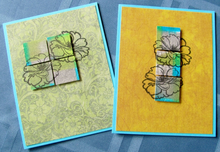
For the book, I collected photos of projects and grouped them by the stamps I used along with simple labeling.

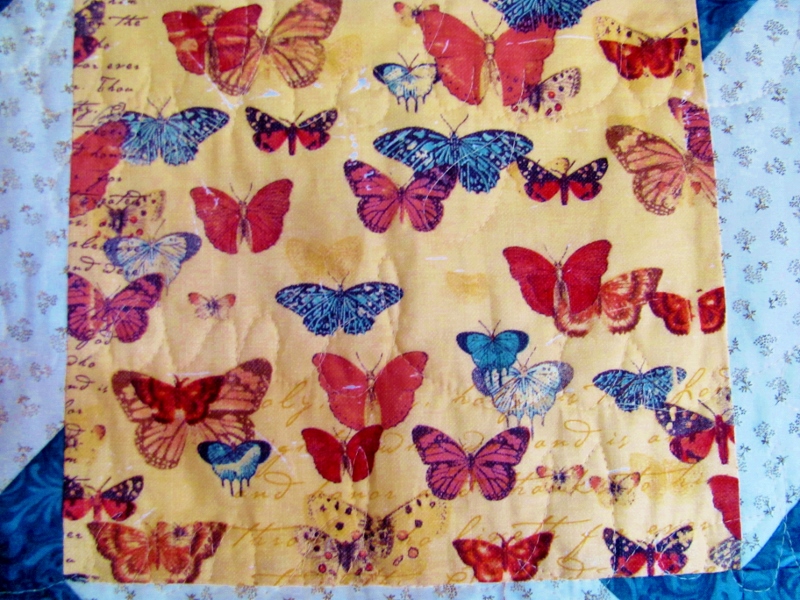
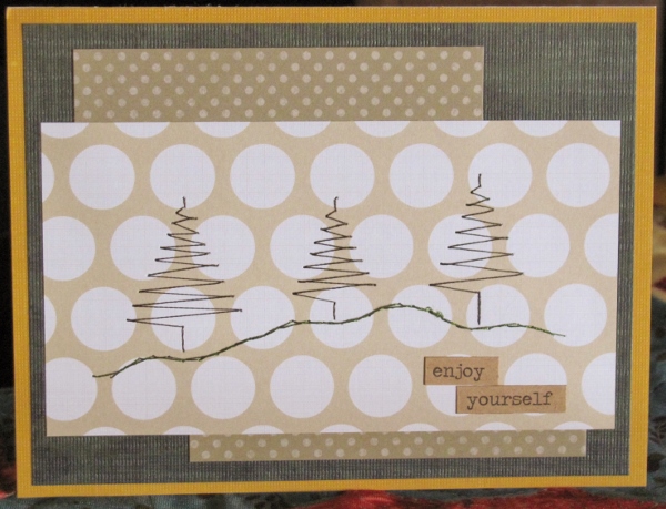
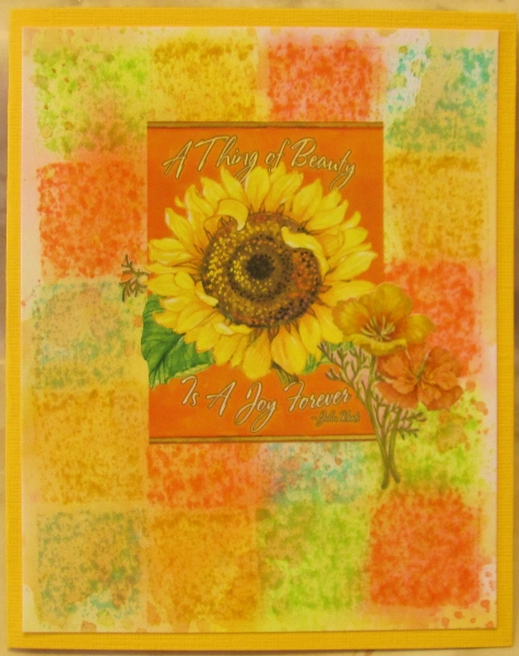
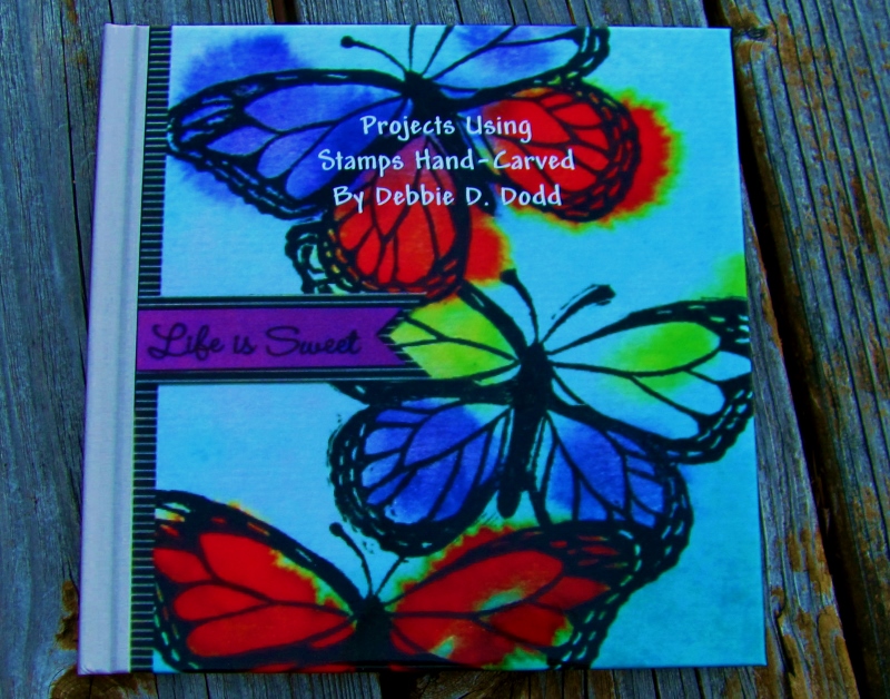
The cover piece is made with watercolors, overstamped with the butterfly:


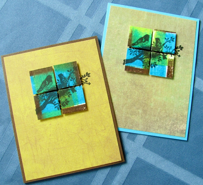
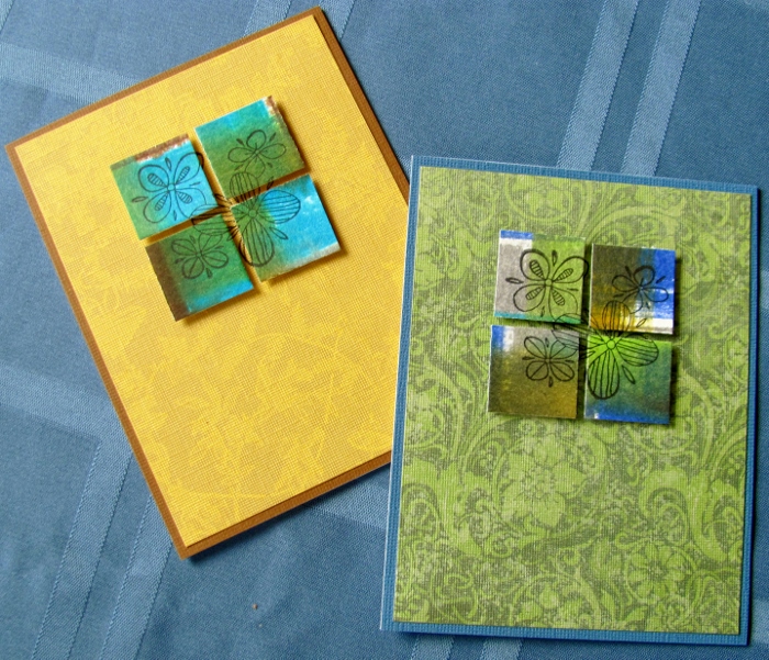
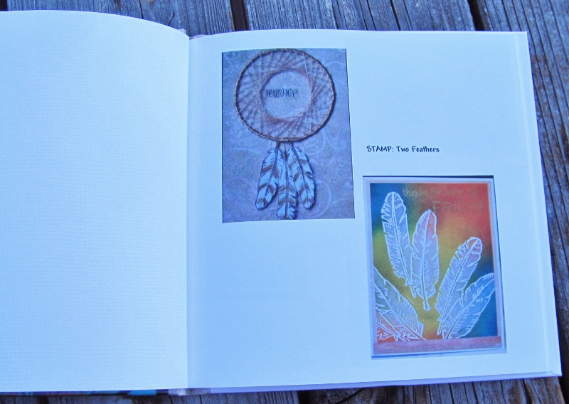
I had two photos of projects using the Two Feathers stamp:


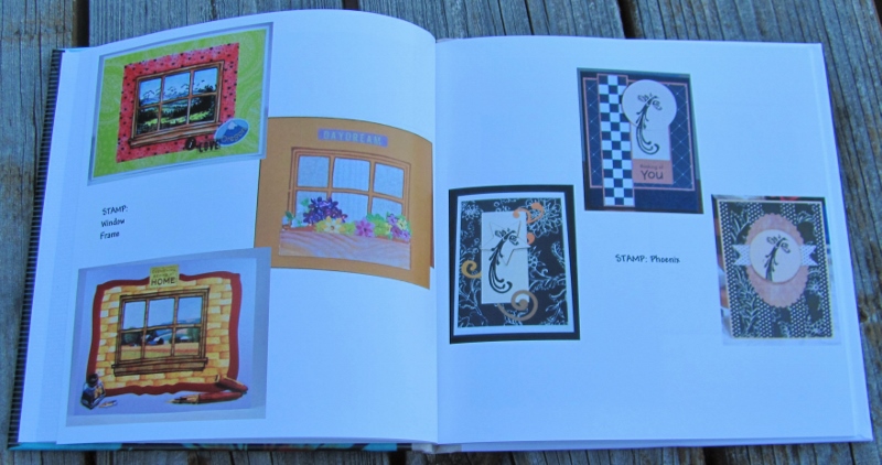
The next spread features the Window on the left page and the Phoenix on the right:


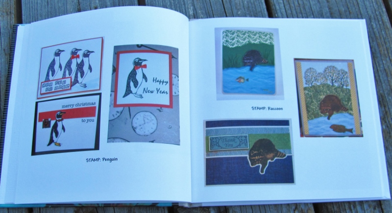
Until I gathered the photos, I didn't realize that I had put a red bow-tie on the Penguin every time I used it! On the right page the Raccoon goes fishing every time:


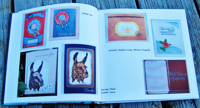
On this left page I featured the Hat and the Llama. The right page has three stamps - Aladdin's Lamp, a Hibiscus, the Dragonfly:


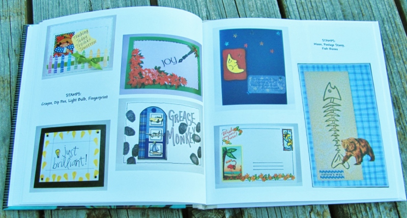
This whole spread is single uses of different stamps. On the left are Crayons, a Dip Pen, a Lightbulb and a Fingerprint. On the right page are a Moon, a Postage Stamp and Fish Skeleton:


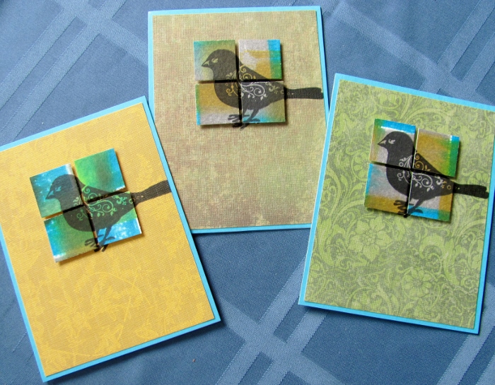
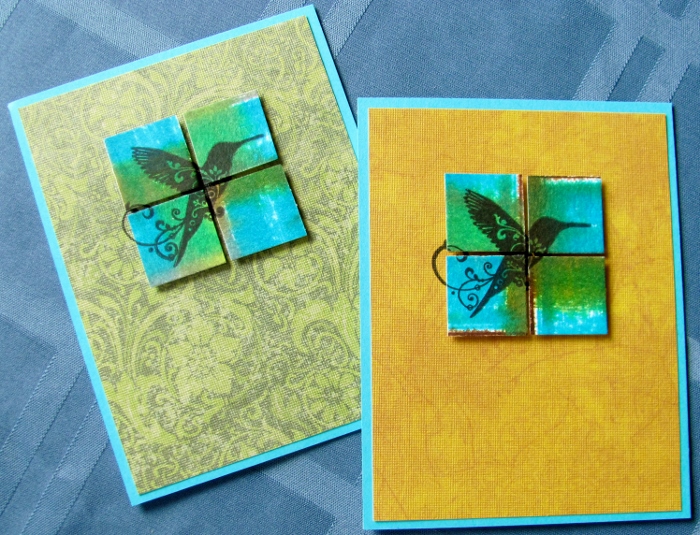
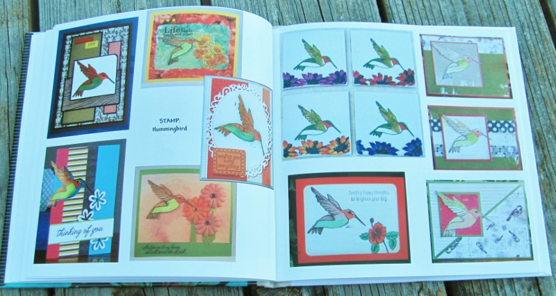
You can tell what my favorite stamps are by how many times I have used them. This whole spread is on the Hummingbird. Although mostly cards, I do have a set of coasters I made using white tiles:


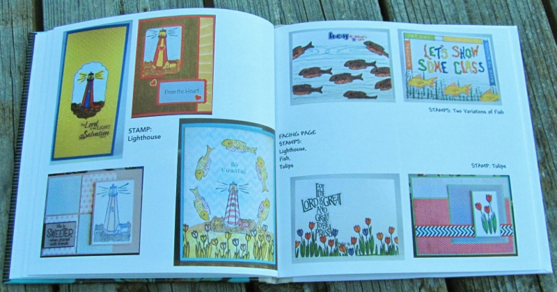
This next spread features single stamps around the edges and one card that combines them all in the center. On the left is the Lighthouse. At the top-right are two different Fish and the lower-right shows the Tulip Cluster. The center card uses all except the Tropical Fish.


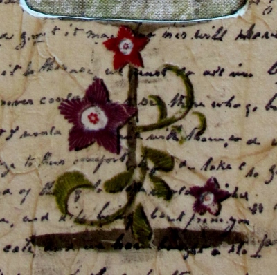
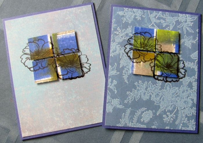
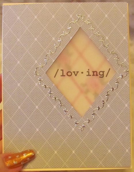
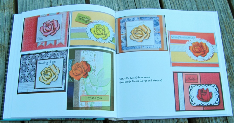
The most used stamp is a set of 3 Roses. There is a full bloom, a half bloom and a bud. This spread uses single blossoms:


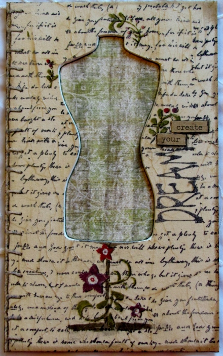
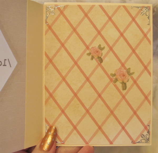
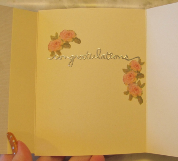
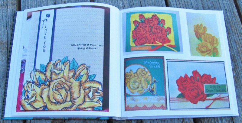
This page spread features the full set of 3 Roses. Through the use of judicious masking I am able to create small to large bouquets:


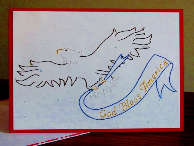
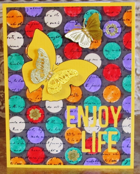
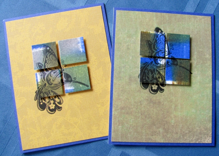
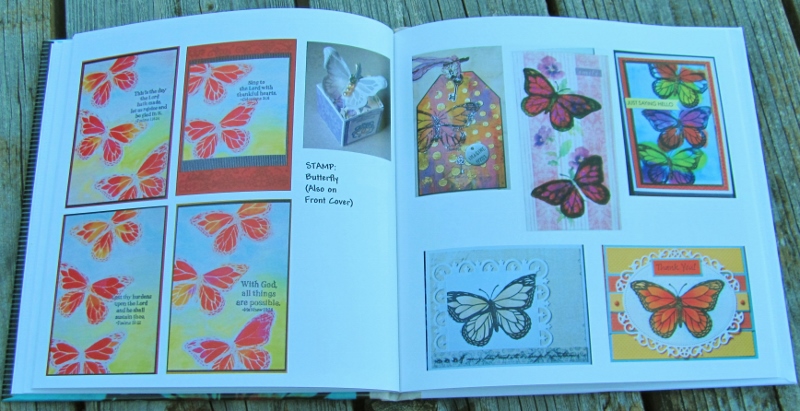
Another favorite stamp to use time and time again is the Butterfly. The parchent box with the butterfly on the lid was created by my sister-in-law for a wedding. The card on the front cover of the book is not repeated here:


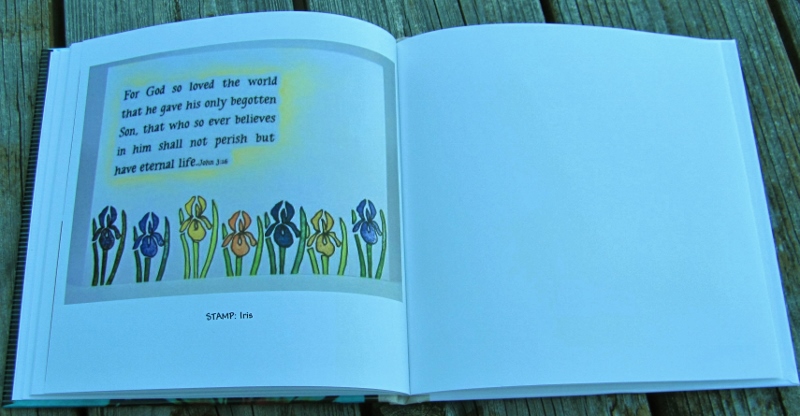
The last page features the Iris:


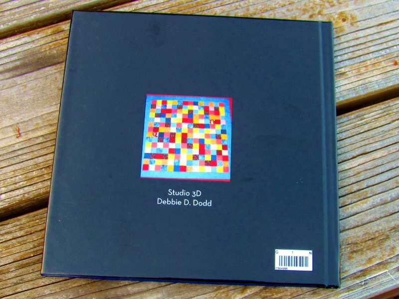
On the back cover I included the actual Panda stamp I carved for my grandson but never used on a project. My other grandson has a Train Engine I carved but never stamped.


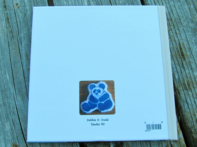
The back cover also includes Author and Studio information.

Another fun project is 'in the books'.

Ddd


Posted by studio3d@ccgmail.net at 12:20 PM PDT
Saturday, 2 July 2016
Booking It, Again
Topic: Books

Remember how I said that if I ever got a coupon to make another free book with Shutterfly I would sure do it? Well, I got one of those coupons and finally decided what to make a book about.

I chose to document the 25 baby quilts I made for a donation project at church, where our quilt group meets.

For the cover  I used an image of a quilt with an over-all random arrangement of scrappy squares. A title in white print showed up best.


This is an 8x8 hardbound book with black pages to show contrast with the colorful quilts. The first page groups together 4 strip-pieced quilts with the same scraps and layouts.


Since the book only has 20 pages and I had 25 quilts I made layouts that combined similar projects. Since I've showed these all before on multiple platforms I'll just show the layouts instead of commenting on each one.


I kept changing the layout of the pages to keep the look fresh.


I also included the quilts that are on the front and back covers so I could say more about them.


By combining like quilts throughout, I ended up with an extra page at the end. I used it to summarize the project.


The back cover has room for a small photo and text. I included the photo of the small grid quilt and added author and imprint notations.


I love that it has the barcode on the back cover though I've never scanned it to see what it links to.

I had one more coupon for a free book which I have submitted but not yet received back in the mail. Soon, I promise.

Ddd


Posted by studio3d@ccgmail.net at 9:14 AM PDT
Friday, 1 July 2016
12 Tags of 2016 - July
Topic: Multi-Technique

I set a new record (for me) in the speed with which I completed one of the tags in Tim Holtz's series. I mean, he only posted it THIS MORNING!

Here is the tag he made:

and it is based on a remix of these two tags:


Here are the steps I used to create MY project:

- Stamp image on heavy watercolor paper using black archival ink

- Watercolor the image using the ink from Distress Markers

- Dry with heat tool

- Apply Microglaze to select areas that you want to resist color

- Apply a wash of Distress Ink over the surface

- Use heat gun to dry completely. This will melt the Microglaze away

- Spritz image with walnut ink

- Trim to size

- Use walnut Distress to ink the edges

- Cut a mounting piece at lease 1/4 inch larger all around

- Mark and cut a top and bottom slit for the stamped piece to slide behind.

- Ink edges of background piece with walnut Distress

- Ink edges of the sliced area with walnut Distress

- Place word die on the sliced area

- Cut word from background

- Cut a script word from dark cardstock

- Slide stamped piece into place behind cut strip of background

- Adhere stamped piece and background together securely

- Glue script word in place

- Prick holes for 5 brads across bottom. Install brads

- Add stickers to decorate (chit chat words, arrow, passport, photos)

- Adhere to front cover of a handmade book

Here is my finished piece:


Here's to finishing more projects in record time!

Ddd


Posted by studio3d@ccgmail.net at 8:10 PM PDT
Wednesday, 29 June 2016
Mini-Distress Inks - Take 3
Topic: Supplies

It has been a LONG break here on the blog - something that takes getting used to. From posting daily for 9 years to taking an 18 day break between posts...

I was able to use a gift card I'd had for 4 1/2 years (!) at a craft store yesterday and was delighted to find they had the last set of mini-distress pads in stock. I picked those up, along with a large set of Prismacolor colored pencils, a bit of fabric and some other random bits of fun supplies.

Today, I set out to use the Distress inks. I started with a cardstock with big white dots on black background. I used Q-tips to apply the four colors in the set randomly on the dots. The colors are Lucky Clover (teal green), Wilted Violet, Candied Apple and Carved Pumpkin.

There were a few dots left so I filled those with a Distress Marker in Old Paper.

I used black ink to stamp unreadable script over the whole surface and diecut text and a butterfly from the background. I trimmed the piece down to size and backed it with a bright yellow cardstock then traced around the butterfly cutout with black pen.

I used two gold butterfly stickers to decorate the front and added three sizes of pearl to the bodies of the butterflies.


The same sheet as the butterflies had some round flowers so I used three of those for continuity.

Ddd


Posted by studio3d@ccgmail.net at 4:44 PM PDT
Saturday, 11 June 2016
Guess the Medium
Topic: Nail Art

I don't know if this is a new idea for you but it sure was for me. 

I had a wild thought the other day when contemplating what to put on my nails next. I wanted some kind of artwork look and decided to see if I had any tissue paper in the studio that had small motifs on it.

Sure enough I found this piece:


I had the idea to try a tissue wrap on my nails much like the ones I used recently on the Tim-tags.

So, I started out by cutting out small purple flowers and then I cut slits into the paper all around right up to the flowers (this was so the tissue would mold to the shape of the nail.


I used clear base coat and two coats of white polish on each nail. When they were completely dry I worked one-by-one. I applied a coat of clear topcoat, placed and burnished a tissue and trimmed around all the edges and tip wiith small scissors.

Then I put a small dot of gold glitter on the yellow flower centers.

After all was dry I filed the edged smooth and then used two coats of topcoat to seal them.

They ended up looking like painted porcelain and I love them.


I have no idea how long something like this will last. It's all an experiment at this point.

Also, this was a LOT of work, so I probably won't do it again.

Ddd


Posted by studio3d@ccgmail.net at 7:31 AM PDT
Sunday, 5 June 2016
12 Tags of 2016 - June
Topic: Multi-Technique

Look how early in the month I am getting the June tag done!

As you recall, Tim Holtz creates a tag every month for inspiration using his products. Throughout 2016 he is combining two old tutorials to be his own inspiration.

This month he combined these two tags:


And this is the tag he created:


Of course, I never have the same supplies to work with (well, a few here and there) so I just wing it with similar things from my studio.

Here are the steps I used to create my piece:

- Stamp white tissue paper with black archival ink in overall background print (used second-generation stamping to lighten it)

- Crinkle and smooth tissue paper

- Cut piece of white mat board

- Tint matte medium with vintage photo Distress Stain

- Use matte medium to adhere tissue to mat board

- Dry with heat gun

- Wipe over surface with anti-static bag to reduce tackiness

- Cut shape into covered board using a craft knife

- On white fabric use mini-Distress ink pads to create a subtle plaid (I used hickory smoke and ground espresso in one direction and fossilized amber and cracked pistashio in the other)


- Mist very lightly and dry with heat tool

- Use Xyron to adhere fabric to white cardstock

- Use Xyron to adhere this base to back of the cut-out piece

- Outline inside of cut-out with black Distress marker

- Decorate front surface with rub-ons that look like stitching


- Use black Distress marker to draw drop-shadows under rub-ons

- Smudge with fingertip

- Ink edges of piece with walnut Distress ink

- Adhere a couple of 'chit chat' words

- Use black Distress marker to draw around the words

- Smudge with fingertip


- Use Black Distress marker to draw in a 'stand' for the cutout


And here is my finished piece:


This piece is about 4 1/2 x 8 (I say this from guestimates NOT measuring).

Ddd


Posted by studio3d@ccgmail.net at 8:37 PM PDT
Saturday, 4 June 2016
Mini-Distress Redux
Topic: Supplies

Not so long ago I shaared some cards I made with the experimentations using the mini-distress ink pads I had bought. The pads came in sets of four and I used four of them on those experiments without regard to which set the pads originated from.

So I had four new pads left and wanted to do some different experiments. I had a brown, turquoise, purple and dark yellow.

I pulled out a sheet of watercolor paper from a pad and took each of the colors in turn and made a direct-to-paper swipe top to bottom. Then I turned the paper and made stripes with each in turn until I ended up with a plaid.

When the sheet was completely dry (I helped it along with the heat gun), I used a paper cutter to chop the whole page into one-inch squares.

I sorted the squares by their dominant and accent colors as set up for the next steps.

I chose four squares with similar coloring and arranged them on scrap paper in a grid with a small space separating them. Then I used black ink to stamp an image, letting the stamp hang off as needed.

I selected a background (cut to 4 x 5.25) that went with the colors in the square. These papers were new to my stash as I just picked them up in a 12x12 pad at Tuesday Morning. I had cut each of the pages to 6x6 for ease in working with them.

First, I stamped the image onto a stamp positioner. Then I laid the squares on the background where they would be mounted. I placed the stamp positioner with the image lined up on the squares, set the 'L' in place, removed the stamped plate, removed the squares and then stamped the image on the background. PERFECT!

I used foam tape to mount the squares over the stamped background where their perfect alignment allows the image to show in the spaces between and aound the edges.

Each card got a bordering piece to enhance the image and became the front on a white card base.

I made 15 cards using 6 stamped images.

2 cards were made with nesting birds:


2 cards were made with a floral grouping. The image fit all inside the squares so y9ou only see the stamped portion of the background in the spaces:


3 cards were made using the large bird image:


2 cards use this small hummingbird stamp:


2 cards use a larger hummingbird:


For these cards with two floral blossoms I had to use the stamp positioner two times to align the images separately. 2 cards are arranged like those shown previously:


I wanted to do something a little different so I arranged the squares to be off center on one card and I used only 3 squares on another:


I'm going to match these with envelopes and give them as a gift set of notecards.

Ddd


Posted by studio3d@ccgmail.net at 12:01 AM PDT
Friday, 3 June 2016
Gilded Marble
Topic: Nail Art

I know it hasn't been that long since I posted nail art but, I was looking at my nails and the longest one looked like it had a crack from the tip to the finger. DRAT!

It was only after I took the manicure off that I discovered it had been the polish that was cracked and not the nail.

So I just got busy repainting them.

I started this manicure by painting liquid latex around the nail on the skin and cuticles. After it was dry I did the manicure and then peeled off the latex. This allows you to get right up to the edge of the nail and do easy cleanup.

After a coat of clear base I put on a layer of white. Then, working nail by nail I applied a second coat of white, dropped on red and purple and swirled them together with an orange stick.

They all got a coat of gold fine glitter followed by clear top coat.

Not much of the white shows, just enough to create the marbled effect.


Here is the best view of the gold layer:


Can you believe how long these nails have survived?

Ddd


Posted by studio3d@ccgmail.net at 12:10 AM PDT
Thursday, 2 June 2016
T Is For Trees
Topic: Paper Embroidery

When the challenge came up to make a papeer embroidery card with 'trees' I was finding most of my patterns were for Christmas trees. It seemed a bit too early to go down that route.

I did have this pattern that I have stitched up for Christmas before but changed it up by using different papers and threads.

I went with forest green threas for the trees and grass green for the ground, stitching onto a big dot paper and backing that with small dots.

A dark green paper serves as a background over a golden base card.


I used a couple of word stickers that match the card colors.

Ddd


Posted by studio3d@ccgmail.net at 12:01 AM PDT
Wednesday, 1 June 2016
Sleep On It
Topic: Sewing

I obviously didn't stay idle too long as, the day after my BIG ANNOUNCEMENT, I'm back with a completed project.

Mom needed a set of pillowcases that were larger than standard.

We had seen them while shopping but they are ridiculously spendy.

While at the store it suddenly occured to me, "I have three sewing machines. I can MAKE pillowcases."

We walked right over to the fabric store next door and bought fabric!


The cuff on these is actually pure white but, you know my issues with the color rendition on my camera.


Doesn't that look comfy?

Ddd


Posted by studio3d@ccgmail.net at 12:01 AM PDT
Tuesday, 31 May 2016
End Of An Era
Topic: In the studio

I'm making this font larger because this is BIG NEWS!

As of today, I have been posting on this blog for 9 full years - with posts every single day. 

I have reached a point now where I feel like I am creating art just to 'feed the blog' and therefore making projects that I am not really passionate about just to have something to post.

I'm not sure how many people even read the blog as nobody ever comments on the postings. Maybe I'm just posting for myself at this point.

Since I have reached this milestone, I've decided that now is a good time to make some changes.

Henceforth, I will create art as I am inspired to and post whenever I have something to show. That might be weekly, monthly or even daily on occasion.

This will allow me time to work on long-term projects like updating my website, learning how to use video on the blog, training myself on my electronic die-cutting machine, learning how to use my embroidery machine, and investigating new materials and techniques without the goal of producing a finished piece.

I'd like to also investigate publishing some of my original designs.

So, I'll see you when I see you. Rest assured, I will be creating something, somewhere, and when that 'something' is done you'll see it here.

As you hear on Sewing With Nancy, "Bye for now!"

Ddd


Posted by studio3d@ccgmail.net at 12:01 AM PDT
Monday, 30 May 2016
I Am a Fan Of This
Topic: Pretty Paper

The challenge for week 3 of this month on the papercrafting list was 'oriental'.

I actually have a drawer in the studio where I keep all supplies with an Asian theme. From that drawer, I pulled a dyed geometric paper with a little bit of glitz, a picture of an oriental landscape painting, a black and white drawing of a lady and a cocktail umbrella.

I colored the lady with Distress markers in colors that would coordinate with the umbrella and the backgrounds. Then I used a craft knife to trim her away from the background.

I layered both backgrounds and the lady. Then I trimmed the cocktail umbrella to create a fan and mounted that with a nailhead sticker at the base.

I used an Asian stamp on the geometric paper.


A red folded base card serves as a border for the illustrations.

Ddd


Posted by studio3d@ccgmail.net at 12:01 AM PDT
Sunday, 29 May 2016
Girl's Best Friend
Topic: Fantastic Folds

I joined in a challenge on one of my groups to use a daimond shape on a card.

I pulled two designer cardstocks that were printed with diamonds and was glad to note that they were the same angles. I cut the grey one to create an aperture and aligned the lattice piece underneath before trimming both to the same size.

Then I scored and folded a long piece of cardstock into three sections - two at 4.25" and one at 1". With the 1" on the left I closed the right panel and added the lattice piece over it. Then I closed the 1" strip and mounted the grey piece, making sure to line it up with the edges of the lattice.

I found a piece of printed vellum and mounted it to the inside of the grey panel. This also got a scroll-y silver peel-off border.

When you view through the vellum you can see the two rose stickers that are placed on the lattice. That layer also got silver peel-off corners.

When the lattice layer is opened it reveals a silver peel-off greeting and more rose stickers.

This is the front view:


This is the lattice layer:

And the inner layer:


This is getting saved for a wedding card which I will need in a few months.

Ddd


Posted by studio3d@ccgmail.net at 12:01 AM PDT
Saturday, 28 May 2016
Distress Mini Tryouts
Topic: Supplies

Throughout 2015 Ranger Industries released a new color of Distress ink every month. Tim Holtz introduced them and showed comparisons with similar color families alteady in the Distress line.

I did not pick up any of these 12 new colors until this month, when I found 8 of them in the mini-sized ink pads (they come with 4 colors in a pack).

I decided to do some playing with four of the pads and here is what I did.

First, I chose Cracked Pistachio, Twisted Citron, Abandoned Coral and Fossilized Amber. I started with a coated paper and pressed the inkpads directly on it in a grid.

These blocks of color stayed very wet so I decided to blot off some of the color using a piece of watercolor paper. I just pressed it straight down onto the color and held it there for a while so the color could soak into the watercolor paper.

This picked up a lot of color and I wanted to blend it a bit so I misted it with water and let the colors bleed. To move the color even more, I pressed the piece onto a non-stick craft sheet. Then I dried it with a heat tool.

There were a lot of colored droplets on the craft sheet so I pressed the dried sheet back into it several times and dried it again.

The color on the original piece was still wet so I pressed a piece of regular white cardstock onto it, picking up more of the ink. I misted the new piece with water to activate the ink and dried it with a heat tool.

The original piece was still a little damp so I just hit it with the heat tool.

With all these pieces I used them as backgrounds for card fronts.

This is the original piece - pressed direct-to-paper on coated paper. 

I added some vellum stickers of tulips and a cardstock sticker of another floral which had a teal border. I copied that border as a layer under the block piece and mounted the whole thing on a white base card.

This is the piece contact-transfered to watercolor paper:

I added a large vinyl sticker to the center and a second sticker off to the side. I used a bright yellow base card to go with the central flower.

This last pressing onto standard white cardstock did not pick up much color:

I reinforced the grid by using a heavy black marker. Then I chose a red and a green fine line marker to add inner borders to those colors. I added a cardstock floral sticker and a pre-stamped sentiment. A coral base card picks up the color of the floral and one of the inks.

I still have 4 new colors to play with but probably won't repeat this method of experiment with them.

Ddd


Posted by studio3d@ccgmail.net at 12:01 AM PDT
Friday, 27 May 2016
Close To the Breaking Point
Topic: Nail Art

On average, a manicure lasts me about 2 weeks. By that time the base of the nail is growing out and leaving a gap. Then, too, some little chips may be appearing along the edges of the tips.

Lately, every time I do my manicure I expect it to only be a few days until a nail breaks. When one goes, I cannot leave them alone and have to clip them all back to the same as the shortest one.

Well, they survived another two week span so I did a new manicure to see how long it will hold out.

I used a base coat, two coats of copper, one of sheer gold glitter, silver glitter dots, and a topcoat.


Glitter is hard to capture in a still photo so I took pictures in sunlight and in shade to see if one was better than the other.

Not better, just different.

Ddd


Posted by studio3d@ccgmail.net at 12:01 AM PDT
Thursday, 26 May 2016
It's About Time For This
Topic: Dry Embossing

I dug back into the papers my friend sent in a dry embossing swap and caame up with a great image of watches on yellow cardstock.

I sponged on Distress Ink to the raised surfaces, with more concentrated color in the lower right and fading up to the upper left.

Three of the clock elements got gears attached using tiny brads.

I selected a brown card base and then needed some contrasting element. I came up with the black and white striped paper and mounted it to the card base with mitered corners. I think it gives sort of a steampunk vibe without being overt about it.


A pre-stamped sentiment was bordered with black showing fine white lines and this was popped up on foam tape.

Ddd


Posted by studio3d@ccgmail.net at 12:01 AM PDT

Newer | Latest | Older