« July 2017 »
S M T W T F S
1
2 3 4 5 6 7 8
9 10 11 12 13 14 15
16 17 18 19 20 21 22
23 24 25 26 27 28 29
30 31
You are not logged in. Log in
Entries by Topic
All topics  «
3D paperwork
A - Z challenge 5
A - Z challenge 7
A - Z challenge round 4
A to Z challenge round 3
A to Z round 2
A to Z round 6
A-Z round 1
Around the House
Art Challenges
Artist Trading Cards
Backgrounds
Beads
Bible Journaling
Books
Boxes
Collage
Color Challenge
Coloring
cookbook
Die Cuts
Digital Projects
Digital Stamps
Drawing
Dry Embossing
Fabric Stuff
Fantastic Folds
Field Trip
Home Decor
How Does Your Garden Grow?
Hymnal Art
In The Kitchen
In the studio
Jewelry
Lettering
Links
Multi-Technique
Music to Work By
Musings
Nail Art
New Work
Online Class
Other Hobbies
Other Projects
Painting
Paper Embroidery
Paper Piecing
Photo
Pretty Paper
Quilting
Random
reading
Scrap Recovery
scrapbooking
Sewing
Sketch Challenge
Some Backlog
Stamping
Stencils
Stickers
Supplies
Teabag Folding
Techniques
Testing
tips and tricks
Tutorial
Web resources
Welcome to my Blog
Work By My Friends
workflow
Writing
Blog Tools
Edit your Blog
Build a Blog
RSS Feed
View Profile
Group One
In & Out of Studio 3D
Friday, 28 July 2017
Bible Journaling - Isaiah 55:12
Topic: Bible Journaling

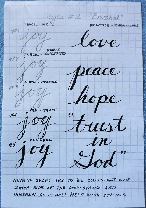
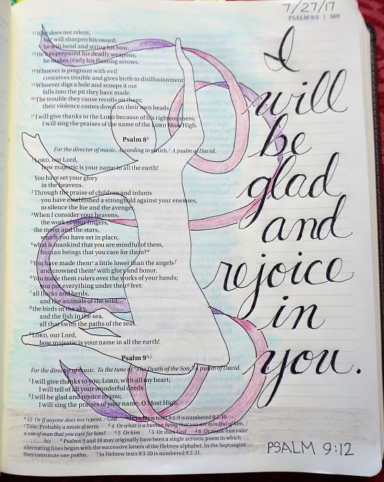
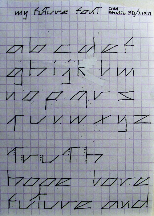
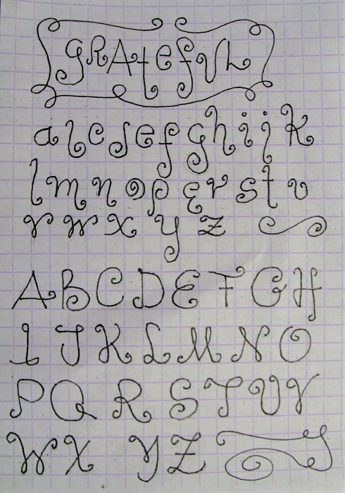
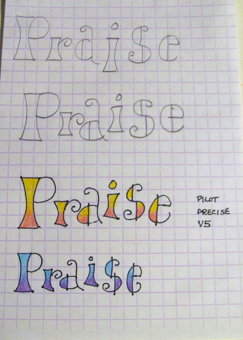
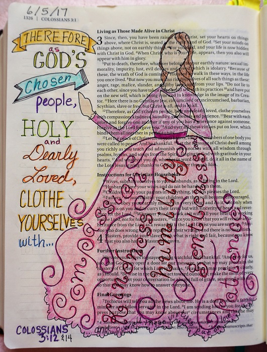
As promised, here is the assignment for day #5 in the Lettering Lodge, using the 'joy' font and 'twisty ribbon'.

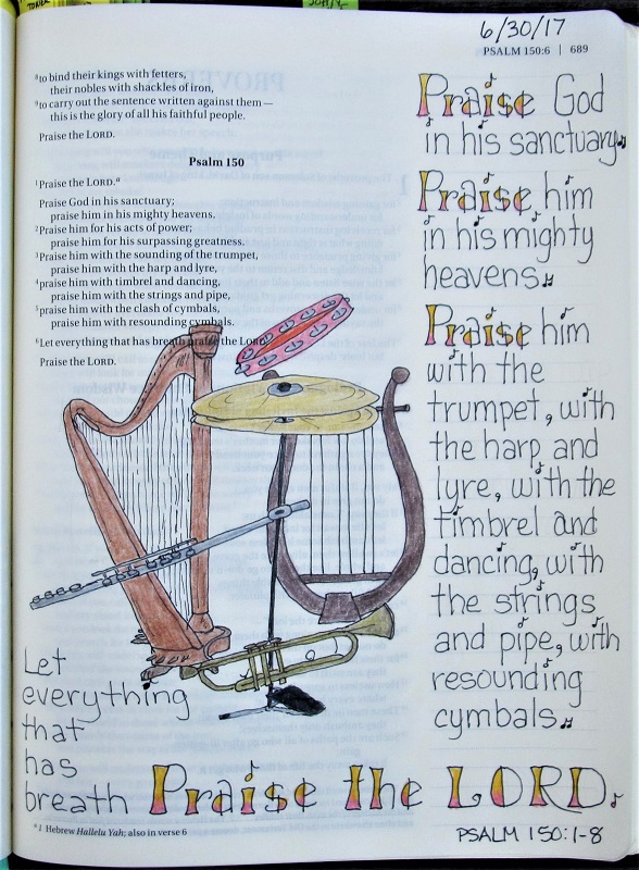
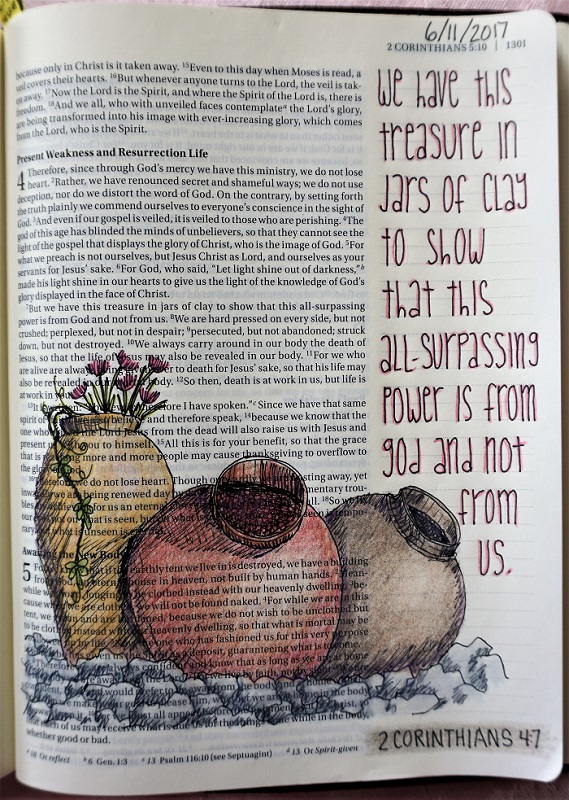
I worked in imagery for all the parts of the verse and even turned the twisty ribbon into a musical staff.

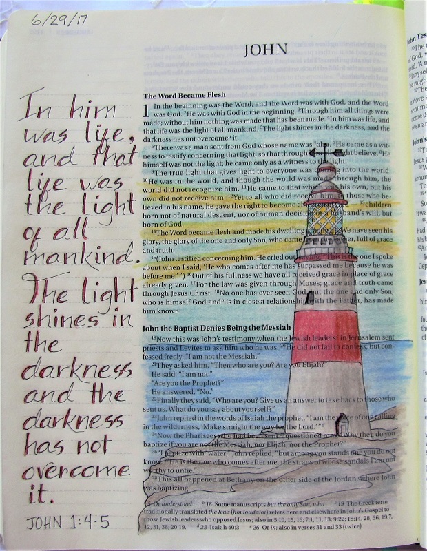
I had fun dreaming up this layout and researching on Pinterest to find photos of the elements I wanted to use in order to get the perspective right. This was especially important for the wrought iron gates.


I drew double lines on most of this as I had done so on the gates and then needed to do the same on the background as it was fading away with only a single thin line.

I found myself singing the song while I was doing the lettering - and still catch myself humming it today!

Ddd


Posted by studio3d@ccgmail.net at 10:37 AM PDT
Thursday, 27 July 2017
Bible Journaling - Psalm
Topic: Bible Journaling

We're back in the Lettering Lodge doing homework with a faux brush font nicknamed 'Joy'.

This font starts with neatly drawn cursive. Then an additional line is added to the downstrokes and the space is filled in.

The first day we practiced a few words to get the feel of the font:


The second day we wrote out the entire alphabet in upper- and lower-case:


The third day we wrote out familiar words and learned to make twisted ribbons:


Finally, on the fourth day we were given a specific scripture to write out 'on plain paper' and decorate with ribbons. I figured, if I'm going to all the trouble to write it out and decorate it, I might as well do it in the Bible and add art:


Tomorrow we will be instructed to do a full Bible journal page in our Bible using the font and a ribbon. I've already done mine but I'll restrain myself and not post it until then.

Ddd


Posted by studio3d@ccgmail.net at 8:06 PM PDT
Tuesday, 18 July 2017
Bible Journaling - 2 Corinthians 12:9
Topic: Bible Journaling

It seems when I learn a new font for the Lettering Lodge on the Bbile Journaling Facebook page I follow, I immediately want to write out the whole alphabet. Then, depending on the 'word' that is assigned to that font I start thinking about verses I can journal with that font.

The group is doing one word on Monday, the alphabet on Tuesday, a surprise assignment on Wednesday, a verse on paper on Thursday and then using the font in the Bible on Friday.

I can't work that slow. I end up doing the word AND the alphabet on Monday, looking for verses on Tuesday and journaling in the Bible by Wednesday...Thursday at the latest.

If they did it all in one day, I would be OK with that!

So, this week it was a font they called Grace. It has a bit of Native American art vibe to it.

I changed up little bits in the font to come up with this page (the uppermost word is a different font by the same artist):


As you can see, the lowercase letters re not very exciting - the rounder letters have a diamond-ish feel to them, but everything else is just basic printing.

So, when I wrote out the verse in my Bible, I used all uppercase letters. Again, I edited bits of the letters and then I did some creative coloring to give them a bit more pizazz.


For the hands, I used an illustration sheet that taught how to draw this particular pose and then traced to the back of the paper to get the reverse image. 

I took a photo of the tiny sketch with my phone, turned up the contrast and enlarged it and then used the screen under my bible like a lightbox to trace the hands.

It was a new process for me.

Ddd


Posted by studio3d@ccgmail.net at 3:43 PM PDT
Friday, 14 July 2017
Bible Journaling - Jonah 2:2 and 9
Topic: Bible Journaling

Yesterday I used the new font 'Grateful' which was shown the other day to journal in Jonah.

The lettering instructor included some inspiration on creating decorative wreaths and some traditional symbols for the word 'grateful'.

I combined all three elements for my page.


This kind of page treatment works when there is no specific 'picture' to illustrate the selected scripture.

I did include a little whale to set off the scripture reference in the upper right. :)

Ddd


Posted by studio3d@ccgmail.net at 12:01 AM PDT
Thursday, 13 July 2017
Slipcase for Colored Pencil Box
Topic: Boxes

It was hard to select a topic category for this entry because 'technically' what I made is related to bookbinding. But I'm using the end product for something else so I'm classifying it as a Box.

Remember the other day when I had an 'aha moment' on making a slipcover for my metal box of colored pencils. I wanted to do this so they would look like the other materials in the stack of Bible journaling supplies.

Reminder: this is what the box looks like:


...and how out of place it looked in the stack:


I searched on YouTube and found a great set of four videos by bookbinder Sage Reynolds that were extraordinarily detailed and perfect for my purposes. He covers every detail that leads from raw board to a beautiful and completely custom slipcase. You can watch yourself at https://www.youtube.com/watch?v=ccWnUQqFyKg&list=PLKThD7m8NDz7k4HVV0g27Sjzrd3RgkujP.

I didn't have some of the materials he used so I mounted the lining paper with spray adhesive, assembled the case with Ranger's Glossy Accents, and attached the cover papers with a foam brush and Matte Medium (generally used for collage). 

The lining paper is Tim Holtz's Idea-ology Melange Tissue Paper from a roll. The cover paper is Dollar Tree kraft gift wrap. I added a spine strip so it would liik more like the other box 'books' in the stack. This was a scrap of mulberry paper.

I was so excited to show you this project that I didn't wait for the glue to dry before taking pictures. This explains any dark areas on the papers, especially the spine.

Here is the basic look of the slipcase:

Another view:

Here you can see the lining paper better and get a look at the great way the edges are finished:

Look how neatly the pencil box fits into the slipcase:

And how well it fits all the way in the case:


It even looks good 'standing' on the shelf:


But the best thing is how nice it looks in the stack of other supplies:


Well, I must say, this turned out every bit as good as my 'vision'.

Ddd


Posted by studio3d@ccgmail.net at 12:01 AM PDT
Wednesday, 12 July 2017
The Future of Lettering
Topic: Lettering

I was noodling around the other day and wanted to design lettering with a futuristic vibe.

My practice paper was 1/4-inch grid so I started working around the grid blocks, using the verticals the horizontals and the 45-degree angle.

Here is my final design. There are no uppercase letters for this alphabet:


You can see that some of the letters are very wide. In the sample words at the bottom you'll note that I only used 1/8-inch for letter spacing and 1/4-inch for word spacing. Also, on occasion, there is an opportunity to overlap some letters for a better look.

I did a little dot embellishment on one sample word.

Feel free to use these letters in your own work but do not reproduce this alphabet for sale or distribution, either my drawn letters or the same letters you have re-drawn. Feel free to direct others back to this page for inspiration.

Ddd


Posted by studio3d@ccgmail.net at 11:01 AM PDT
Tuesday, 11 July 2017
Organizing Journaling Supplies
Topic: Bible Journaling

I reorganized my Bible journaling supplies and they can now be on display. I already had several boxes that look like books and they were all tucked away not being useful at all!

I had reference materials - books on lettering and sketching, printouts of alphabets, sketching reference material, etc (mostly 8 1/2x11) that I put in the large wooden box on the bottom of the stack.

The box with the purple binding has my Bible, a list of verses to work on, one drawing pencil, one journaling pen, a white eraser, a pencil sharpener and repositionable page flags.

On top of that is my box of colored pencils. I haven't figured out a way to repackage them so they stay in order.  Oooh-oooh-oooh, I just thought of something! I can build a slipcase that looks like a book and slide the metal bo inside. Yeah, I'll be doing that.

Topping the stack is a box of drawing paper and loose drawing pens and pencils.

Over on the left is a box containing a portable pop-up light and a box of my favorite pens.


In the next photo you can see that I put a bookmark in each one with the supplies listed so I don't have to keep opening them to find what I need.


The only thing not here is my Huion led light pad that I use for tracing my sketches into the Bible. It is too big for the display so it lives elsewhere.

This keeps everything neat and together.

Ddd


Posted by studio3d@ccgmail.net at 4:38 PM PDT
Monday, 10 July 2017
Grateful For a New Font
Topic: Lettering

Another font for creating word art was posted today on the Bible Journaling site I belong to.

Once again, I created an entire upper- and lower-case alphabet based on the single word we were taught.

Part of the assignment was to create some decorative swirls in keeping with the style.

Here is my homework page:


I'll add this to my samples to use in my journaling Bible.

Ddd


Posted by studio3d@ccgmail.net at 5:46 PM PDT
Sunday, 9 July 2017
Sunset Nails
Topic: Nail Art

 To decide on a look for a new manicure, I took to Pinterest and did a search for "Summer Nail Art". The one I was ezpecially taken with was this:

Unfortunately, those particular colors were not in my selection of polish so I selected some from the same color families but more subdued and came closer to this:


I first did a sample chart combining various purples, reds and copper. Then I overlaid these with a variety of clear polishes with glitters.


You can see the set of polishes I selected as the one that is circled on the chart.

This was the selection of polishes I used:


I started out with liquid latex surrounding the nail to keep sponged colors off my fingers. Then I gave the nails a clear base coat and a single layer of white polish. The white gives the colors life as it is brighter than the plain nail color and allows sheer sponging to show up in true color. (Think of the difference you get when using a marker on a brown paper bag as opposed to a white paper.)

For the application of color, I painted stripes of each polish, in order, onto a plastic sandwich bag.


This was picked up onto a makeup sponge by dabbing onto the bag.


The sponge was then tapped onto the nail moving to and fro to blend where the colors meet. I did two coats on each nail. After this I tapped a little more red over part of the purple for a smoother transition.

A clear coat with fine irridescent glitter was the next step, followed by clear top coat.


The latex peels off easily leaving little cleanup required.


I find that complete drying overnight will allow the little bits in the cracks of the cuticles to be removed with soap and water when scraped with the point of my nail file.

Yep, I like these just fine.

Ddd


Posted by studio3d@ccgmail.net at 12:01 AM PDT
Friday, 30 June 2017
Bible Journaling - Psalm 150:1-8
Topic: Bible Journaling

The assignment for today on the lettering part of the Bible journaling Facebook page I am following was to use that new 'Praise' font we learned to write a scripture in our Bible.

There are so many scriptures that have the word 'Praise' in them. I decided to focus on Psalm 150 where all 8 verses use it:


Praise the LORD.

Praise God in his sanctuary;

  praise him in his mighty heavens.

Praise him for his acts of power;

  praise him for his surpassing greatness.

Praise him with the sounding of the trumpet,

  praise him with the harp and lyre,

praise him with timbrel and dancing,

  praise him with the strings and pipe,

praise him with the clash of cymbals,

  praise him with resounding cymbals.

Let everything that has breath praise the LORD.

Praise the LORD.


Well, I sure didn't have room to write out all of it so I paraphrased it like this:


Praise God in his sanctuary.

  Praise him in his mighty heavens.

Praise him with the trumpet,

  with the harp and lyre,

with the timbrel and dancing,

  with the strings and pipe,

with resounding cymbals.

Let everything that has breath Praise the LORD.


For the illustration I drew a trumpet, harp, lyre, and cymbals. Then I added a flute for the pipe and a tamborine for the timbrel.


Another assignment completed.

Ddd


Posted by studio3d@ccgmail.net at 10:17 PM PDT
Thursday, 29 June 2017
Bible Journaling - John 1:4-5
Topic: Bible Journaling

The Bible Journaling Facebook page I've referenced over the past few days had an area I had not explored yet. They have a chart of scriptures to write out, one for each day of the month.

I joined in today, writing the assigned verse (plus one) in the margin area of the Bible page and illustrating it with a lighthouse from a photo I recently took on Gibraltar. It is such a pretty lighthouse with the diagonal gridwork around the light and the weathervane on top.

For the text I used a font recently taught on that same website, that the instructor named 'kindness'. However, I used a double line on the left downstroke of all the letters so I would have an area to add color. I used red to go with the lighthouse.


I realize that light would not show up like this, especially during the daytime, but it is meant to illustrate a point, not be literal.

Ddd


Posted by studio3d@ccgmail.net at 12:57 PM PDT
Wednesday, 28 June 2017
Bible Journaling - Matthew 9:12-13
Topic: Bible Journaling

The impetous to do this scripture was the new Facebook page I recently joined. One of their activities is a daily devotional.

They are working in a published devotional book that includes black and white illustrations to color as well as a decorative writing of the scripture text. A little devotional is included along with a lined area to write one's own thoughts about the lesson.

Not having the book, I decided to just illustrate that scripture in my Bible in the style I have been doing.

I went to the internet to find a picture of a stethescope and one of a male torso. I drew these out on scratch paper and then traced them onto the Bible page.


I used the new alphabet I learned yesterday for lettering the text.

All the coloring is done with Prismacolor colored pencils over the Prismacolor 0.05 fine line pen.

Ddd


Posted by studio3d@ccgmail.net at 4:22 PM PDT
Tuesday, 27 June 2017
Praise Alphabet
Topic: Lettering

I added a new category to the topics list today.

I have joined a Facebook group that (among other activities) teaches, via video, new decorative alphabets. 

They start with a single word and teach the letters necessary to write it out in the new font. Then we are to practice it.

This is my practice sheet for day one:


The next day we were given two other words to write out. 

I went ambitious at this point and decided to construct the whole alphabet in both upper- and lower-case using the clues in the letters I already knew.

Here is my worksheet:


What I didn't know was that the whole alphabet was supposed to be the homework for day three!

I actually came very close to the instructor's alphabet and decided to just use my own as the final version (for me).

The blended coloring was part of the lesson as well.

Ddd


Posted by studio3d@ccgmail.net at 4:10 PM PDT
Thursday, 22 June 2017
Bible Journaling - Hebrews 10:24-25
Topic: Bible Journaling

The illustration for this entry came entirely from my head. I had, long ago, photographed some churches on my phone to use as references but they were just too formal-looking. I wanted more of the 'church in the wildwoods' feeling to it.

My original sketch was way too small and I didn't want to do a lot of 'fill-in' of landscaping and such to expand it. The church needed to be the centerpiece. So I re-sketched it freehand into the Bible using pencil and then added a few trees and a hedge in the background.


I dropped some of the text in thse verses and combined them to create a shorter phrase. The full text says, "And let us consider how we may spur one another on toward love and good deeds,  not giving up meeting together, as some are in the habit of doing, but encouraging one another—and all the more as you see the Day approaching."

The highlighting shows the parts I used.

The lettering is based on a font I had photographed into my phone to use as a reference. I wanted something that walked the line between formal and casual.

Ddd


Posted by studio3d@ccgmail.net at 3:13 PM PDT
Bible Journaling - Hebrews 4:12
Topic: Bible Journaling

This is the second sketch I did on vacation for use in my Bible.

I used a photo that I had saved to my phone to reference the hand and sword and drew the rest from memory.

The lettering was all done without reference. I wanted some of it to look like knife blades and some to look like it was in motion.

I used the lightpad to transfer the drawing to the page in the Bible.

Ddd


Posted by studio3d@ccgmail.net at 2:57 PM PDT
Wednesday, 21 June 2017
Bible Journaling - 1 Corinthians 9:24
Topic: Bible Journaling

I did some sketching for Bible journaling while on a recent, short vacation trip. I have all my supplies in a large canvas tote while at home and this includes printouts of drawing ideas and lettering styles as well a books on both. I also have a book about Bible journaling, a collapsible light and a box with a variety of pens and pencils. My lightpad fits in there, too.

When I travel, however, I put my favorite pen, one drawing pencil, a sharpener, an eraser, my index of verses I want to work on and some sketch paper into the box that holds my journaling Bible. I wrap an elastic band around the metal box that holds my colored pencils and I have all I need to work 'on the road'. I have photographed many of the lettering and sketch ideas into my phone and I can use these for reference.

I did three sketches while on vacation and waited to transfer them to my Bible until I got home so I could use the lightpad to trace them.

This is the first of the three that I finished.


I worked from a photo on the internet to get the poses for the runners, though all the sketching was done free-hand (no tracing). After lots of re-drawing, editing and refinement I did use the lightpad to trace my own drawing into the Bible using the fine-line black marker.

I colored all the illustration with the Prismacolor colored pencils. Then I used one of the photos of lettering styles on my phone to write out the scripture and colored that as well.

All of the lettering and the runners were gone over with the lightest colored pencil I have to smooth out the coloring.

Ddd


Posted by studio3d@ccgmail.net at 2:39 PM PDT
Tuesday, 20 June 2017
Frosted Flags
Topic: Nail Art

I've welcomed summer by decorating the house with red, white and blue items as I do most every year. Soon after, my manicure began to chip so I decided to carry that theme onto the new nail enamel.

I chose a berry red, shimmery blue and silver to work with. Red was first applied in wide stripes to the the outer edges of the nails leaving a wide opening in the middle on the diagonal. I skipped the ring finger on each hand.

Those ring fingers got solid blue.

After giving all the colors a second coat and letting it set I went back to the red nails and added a wide silver stripe across the open area. Then the blue nails got tiny dots of silver.

I added a second coat of silver to the red nails and let everything set.

Finally, I gave everything a coat of clear that has a fine irridescent glitter in it (this is the 'frosting' refered to in the title). A coat of topcoat protects the finish.


These are all Dollar Tree polishes and a manicure will last about 10 to 12 days.


I'm hoping this lasts until the 4th of July and then I'll think of something else fun to do.

Ddd


Posted by studio3d@ccgmail.net at 10:01 PM PDT
Sunday, 11 June 2017
2 Corinthians 4:7
Topic: Bible Journaling

I had a spot of time while on a short vacation and worked on this page in the hotel room. I hope I didn't use too much data over the phone lines as I was having issues with the Wi-Fi there.

I chose a photo of clay jars to illustrate 2 Corinthians 4:7:


The lettering was from a photo I had taken of a form online onto my cell phone. It was easy to replicate and I really like it in this setting.

Ddd


Posted by studio3d@ccgmail.net at 5:08 PM PDT
Tuesday, 6 June 2017
Colossians 3:12, 14
Topic: Bible Journaling

Even though I did this page yesterday, it was late at night and I had already done a post for the day so I didn't mind delaying it.

The kernel of the idea for this illustration came from someone else who had used the skirt of a woman to write out character traits from the Proverbs 31 woman. When I saw it, I thought instead of this scripture and sketched out the idea on scrap paper.

I did better on this drawing than I expected to as I admit I am not great at drawing people. I think the key might be to keep it stylized and not use too much detail.


I had completed the skirt with the list of 5 virtues and then,when I kept reading, noticed that there was further instruction in verse 14. I added this along the hemline and then added the bit of lace to contain it in the fabric area.

I really like doing mixed typeography in the text section, too.

Ddd


Posted by studio3d@ccgmail.net at 12:49 PM PDT
Monday, 5 June 2017
Flash of Summer
Topic: Nail Art

After a couple of ho hum nail painting sessions I asked for ideas from my hubby. He suggested 'something with flowers'.

I started with clear base coat, as usual, followed by two coats of silver.

Then I used the brushes in the bottles of three soft colors to dot on 5-petal posies and added yellow centers to them. Lastly, I brushed on a few light green leaves.

When everything was set, I put on clear top coat.


I did three flowers on the thumbnails, two on all the middle fingers and one on the pinkies.

I think they turned out really cute!

Ddd


Posted by studio3d@ccgmail.net at 2:06 PM PDT

Newer | Latest | Older