« January 2018 »
S M T W T F S
1 2 3 4 5 6
7 8 9 10 11 12 13
14 15 16 17 18 19 20
21 22 23 24 25 26 27
28 29 30 31
You are not logged in. Log in
Entries by Topic
All topics  «
3D paperwork
A - Z challenge 5
A - Z challenge 7
A - Z challenge round 4
A to Z challenge round 3
A to Z round 2
A to Z round 6
A-Z round 1
Around the House
Art Challenges
Artist Trading Cards
Backgrounds
Beads
Bible Journaling
Books
Boxes
Collage
Color Challenge
Coloring
cookbook
Die Cuts
Digital Projects
Digital Stamps
Drawing
Dry Embossing
Fabric Stuff
Fantastic Folds
Field Trip
Home Decor
How Does Your Garden Grow?
Hymnal Art
In The Kitchen
In the studio
Jewelry
Lettering
Links
Multi-Technique
Music to Work By
Musings
Nail Art
New Work
Online Class
Other Hobbies
Other Projects
Painting
Paper Embroidery
Paper Piecing
Photo
Pretty Paper
Quilting
Random
reading
Scrap Recovery
scrapbooking
Sewing
Sketch Challenge
Some Backlog
Stamping
Stencils
Stickers
Supplies
Teabag Folding
Techniques
Testing
tips and tricks
Tutorial
Web resources
Welcome to my Blog
Work By My Friends
workflow
Writing
Blog Tools
Edit your Blog
Build a Blog
RSS Feed
View Profile
Group One
In & Out of Studio 3D
Wednesday, 3 January 2018
A Gift For Myself
Topic: Supplies

If you neglect to tell your gift buyers what you really want, sometimes you have to go buy it for yourself. Not to say that the gifts I got were in any way unwanted (because they were awesome), but I just wanted more!

So what did I want more OF? Colored pencils!

I had started out with a set of 72 Prismacolor pencils and have used them a lot. But sometimes I just wanted a slightly brighter red or a green with less yellow in it.

When I saw a link to an exceptional deal on the 132 set of pencils, it went right into my cart.


Now, I've been juggling just three flimsy plastic trays of pencils and knew that juggling 6 would be no fun. So I also ordered myself a case with 4 zippered sections and elastic that secures the individual pencils.

The pencils come in some sort of order but I have yet to determine what that is. They are not entirely in order by color groups nor are they by color number (printed on the pencils) nor color name. Best I can determine they are arranged in the order they were released as colors were added to the range.

So the first thing I did was divide them up into color groups. These were subdivided into ranges of light to dark within a specific family (denim blues vs. navy blue). I determined the order by scribbling on scratch paper.

Then, with the pencils laid out in the order I wanted, I colored a 'key' on large-square graph paper and noted the color number under each.


Neutrals are at the top, divided by warm, cool and 'french' grays.

I stored the pencils in the binder pages following the chart. An empty space in the binder corresponds to where a nre range starts on the chart.


On the left page I stored just the pure white and pure black as well as the metallic silver and gold. After this was taken I pulled out my Crayola metallic markers (a set of 8) and stored them here, too)


All of the pencils are turned with the color numbers facing up so it is easy to pull the one I want from the notation on the key chart.


I am glad I did the color key chart first asit is often difficult to recognize the true color of a pencil from the paint OR the tiny view of the lead.


Some of the aquas were moved out of their chart sequence to fit in the binder in front of the greens.

I knew that I would not be able to remember exactly what section of the binder a particular color could be found so I tied snippets of colored ribbons on the four zipper pulls representing the contents.


While I was at it, I ordered a battery operated pencil sharpener. This is a cross-cut so it is less likely to break the leads than the little hand-held, single razor blade style.

I have colored many projects already and love this new setup - not only the organization but having almost double the range of colors as before.

I retired the old set of 72 to the studio where they will be used for greeting cards and less detailed projects.

Ddd


Posted by studio3d@ccgmail.net at 3:36 PM PST
Sunday, 31 December 2017
2017 Year-End Wrapup
Topic: Multi-Technique

In reviewing my posts for 2017 for my top 12 favorites, I realized how much my focus has been narrowing in the arts.

I spend much of my time either quilting, Bible journaling or lettering. The two latter are relatively new focus areas for me and encompas the wider skills of drawing, using different supplies, and even online teaching!

In the area of quilting, this year, I completed 22 projects start-to-finish and also pieced 4 tops for baby quilts from blocks embroidered by my Mom. 15 of my quilts were for charities (11 to the hospital, 4 to a pregnancy center). 3 of the quilts were ones I kept, 2 were for family and 2 for children in crisis.

I put three of my quilt finishes in this year-end roundup. These were all my own designs:

From a panel print, I fussy-cut the bird blocks and then made paper-pieced birdhouses to alternate with them. This is a wall hanging I kept.


The second is also from a panel print which I joined with black sashing to coordinating fabrics. This lap quilt went to the hospital.


The third quilt in my hit parade is another wall hanging that I made for me. All of the blocks are paper pieced. Many of the blocks and the overall design of the quilt are my original designs. It all started as a way to use up the three snowmen blocks!

I do less and less cardmaking as I get involved with other arts and crafts, but I did take an online cardmaking class this year where the theme was 'rainbow techniques'. Of the 28 cards made for that class, this is my favorite:


I did two random crafts that I ran across and had to try. This one was in a magazine: (yes, those are snowmen made of buttons)

And this one was from Etsy: (maker was trying to sell them so I had to figure out my own directions)


The Bible journaling I started in the fall of 2016 is a way to meditate on scriptures using art and creative lettering. I completed 56 pages in my Bible this year. I work in black pen and colored pencils. 

In the course of this, my drawing skills have improved vastly! Here are three pages that are my favorites from the year, all entailing original artwork:


I joined a Facebook group on Creative Bible Journaling partway through the year and soon became involved in the Lettering Lodge there, which focuses on learning new lettering styles. In the past few months, I have become co-staff of that area and have been teaching some week-long online lettering lessons for people to use in their own Bibles.

These are some of the lettering classes I have taught:

(An entirely original font)


(adapted from a VERY old book on lettering)


(Adapted and combined two styles to mimic the illuminated manuscripts we saw at The Getty Center in L.A.)


In the process of learning new lettering styles I started branching out into other materials, as well. I have recently begun practicing with brush markers and did this piece combined with original art, also in brush marker:


So, there you have it - a baker's dozen of my favorite arts and crafts from 2017.

Since I am so immersed in all of these areas (except the button craft and wine-glass candleholders), I expect that 2018 will yield more of the same.

Ddd


Posted by studio3d@ccgmail.net at 12:02 AM PST
Tuesday, 26 December 2017
Loving Those Letters
Topic: Lettering

I saw a headline for a bullet journal on Pinterest and I got my brain gears working on a new lettering idea.

First, tape two pencils together. I used mechanical pencils and clear tape.


This will allow you to draw guidelines that are consistently and evenly spaced.

Using this new tool, draw double vertical lines to make bars.


The space between your bars should be 1/2 the width of a bar.


 Make horizontal guides at the top of the bars and the height of three bar widths.


Use pairs of bars as guide to form letters. Ends of single lines get triangle serif (base of A, curves of C, etc.)

Continue to form entire alphabet.


 Draft out a word. Use to trace onto another piece of paper in light larker, highlighter or colored pencil.

Fill in with the same medium as drawn with.


 Practice some 'stretched out' cursive to equal one cursive letter to each block letter size.


Pencil in cursive letters OCER block letters. Letters can be drawn first and then connecting lines done when inking.


 Ink cursive letters. Erase pencil (use care when erasing over colored pencil letters as you will remove color.

Use as  headline in your Bible and combine with other letter forms for a completed margin decoration.


If I was truly kind, I would redo these illustrations and that may happen at some point in the future. In the meantime, this can get you started!

Ddd


Posted by studio3d@ccgmail.net at 2:53 PM PST
Friday, 22 December 2017
Bible Journaling - Isaiah 9:6
Topic: Bible Journaling

The focus word for the Lettering Lodge in Creative Bible Journaling this week was 'son'.

On the first day, we learned another faux brush cursive font by lettering the words 'Son of God'.

I decided to try as much of the week as I could using actual brush markers as I am trying to learn that lettering style. I still followed the rules of doing it in pencil first, inking over that and then erasing the pencil.

On the second day, we learned the entire alphabet. I stayed with the brush markers, using red and green in keeping with the season.


The third lesson had us writing lyrics to a song that had the word 'son'. Again, I used the brush markers. I have a set of 8 markers from Prismacolor that I use for this.


I skipped the fourth lesson which was writing out a scripture. But, I did do the final lesson which was using the new font in our Bibles.

I didn't trust myself to do this directly in my Bible with the brush markers so I switched back to the faux brush lettering where you draw out all the letters, add a second line to the downstrokes and fill in the gap.

99% of the styling on this font is in the upper-case so it looks pretty standard when writing out mostly words in the lower-case. It does have a non-traditional r, s and i for a cursive font, though, which makes connecting the letters more challenging.

I chose Isaiah 9:6 to work on, in keeping with the Christmas season, and used an illustrative style I've been thinking about for several weeks. I originally wanted to do this on Christmas cards but don't have a creche stamp to use. I didn't want to draw it individually for cards but one drawing for the Bible was not too hard to do.


I have done this style with florals on cards before. Basically, you draw the whole illustration, mask out the center and shade in the sides. Then you take off the center mask and do the exposed illustration in full color. I went back and used a darker version of the shade color to shadow in the creche.

Ddd


Posted by studio3d@ccgmail.net at 4:38 PM PST
Thursday, 21 December 2017
Learning Lettering
Topic: Lettering

A while back, I recommended a book my Amy Latta that teaches several lettering styles and embellishments for them in a format that builds techniques one upon another.


I'm not working quickly through this book as I go off to practice things on Dawn Nicole Designs site and the Lettering Lodge at Creative Bible Journaling. I've been picking up some books from the library as inspiration, too.

But, I have gotten through lesson 12 in this book and wanted to show a few of the pages I have done.

The pages for the final practice have some decorative elements on them. I often add to those. Fankly, at this point, I would be hard pressed to tell you which are hers and which are mine!


I know I could get my lettering straighter if I worked at the table instead of wrangling this large book on my lap-board in my recliner. Yeah, ergonomics.


This is the latest one:


All of the colored elements on this one are mine. The original page had only the branches up the sides.

I do feel like I am progressing. A friend pointed out that the phrases in the book samples are all 'me, me, me' and she is going to use scriptures for her finished pages.

I think that is a grand idea and I think I'm going to do the same.

Ddd


Posted by studio3d@ccgmail.net at 5:34 PM PST
Saturday, 16 December 2017
A Little Gift Or Two For You
Topic: Dry Embossing

I realized I was still short of cards for Christmas! So, I decided to work with an idea I saw on Pinterest - with changes, of course!

I used my stamp platform for a top border and a bottom sentiment on the card fronts. 

Then I gathered some shimmery cardstock in several colors. These were run through different embossing folders using the Cuttlebug and cut into various sizes of rectangles.

I used sticky-backed satin ribbons to decorate these as packages and added bows punched out of other shimmery cardstock.

These are hard to photograph because of all the shine. Reality lies somewhere between  these two images.


Only the front package is up on foam tape for dimension. All of the bows are held on with mini glue dots.

Ddd


Posted by studio3d@ccgmail.net at 12:01 AM PST
Friday, 15 December 2017
Singing For the Season
Topic: Bible Journaling

The font for this week was named 'contemporary versals' in the book by Joanne Fink, Complete Guide to Bible Journaling. It leaves a lot of room for interpretation and decoration so that makes it 'just my style'.

The group leader had us working with the theme word 'sing'.

Monday, we practiced just that word:


On Tuesday, we got to see the whole alphabet and practiced making doodles to decorate the letters. I added a few other embellishments to my page.

I spent so much time on Wednesday's homework that it extended into Thursday, too. I liked it so much that I believe I will have it turned into Christmas cards next year.

I spent most of my time on coloring (first with colored pencils), recoloring (added brush marker to letters and stars), smothing colors (used blender pencil then blender pen), correcting colors (added Distress Marker to all but letters and stars) and detailing in color (sky was not smooth enough so I added intentional swirls).


I think this is the first lettering piece that I have had enough foresight to make a copy of before coloring. In fact, I colored the copy so I have the original for future use.

On to Friday. That is the day we use the new font in our Bibles. I worked in 1 Chronicles 15:23 and combined the versals with some faux brush lettering.


I did only the set of music notes over the scripture I was quoting for illustration. The rest is all about the decorative lettering.

Ddd


Posted by studio3d@ccgmail.net at 8:43 PM PST
Thursday, 14 December 2017
Card Mill
Topic: Stamping

I recently got the Tim Holtz Stamp Platform. It is a stamp positioner with a gridded base, and a hinged gridded clear lid. You put your cardstock on the base, arrange stamps on it, close the lid and raise it. Now you can ink the stamp, close the lid to stamp, raise it, change out cardstock and repeat.

If you don't get a good impression you can ink and stamp again and it always goes back to the same place!

The difference on this positioner is that the lid is removable so you can use one side for clear stamps and the other for the thicker red rubber stamps.

So, for this card, I had a swath of snowfalkes plus several individual ones, the sentiment and the bear. All could be stamped in one go. Then I turned the card around, removed everything but the swath and repositioned that to fill the opposite corner. 

Just like that, I had a dozen card fronts ready to color.


I used Distress Markers for all the coloring. Then I got out the bulb spritzer and used it with two colors of marker to create the mist over the surface.

I do believe I am going to like this new tool.

Ddd


Posted by studio3d@ccgmail.net at 12:01 AM PST
Friday, 8 December 2017
Lettering Lesson for Bible Journaling
Topic: Bible Journaling

This week it was my turn again to teach classes on lettering. I totally hacked a font I found online for this one.

Here is the lesson plan:

MONDAY

Monday, we start working with a new font. I hope you’ll like the one I chose this week. Not only is it freewheeling and forgiving, but you get to do all the improvising you want!

In the sample shown you’ll note that every letter has some squared-off pinwheels. I first did the word of the week where all the letters are a standard height.

Then I tried to work a little looser with a bit of variation in the letter height – not much, just a smidge.

Then I kept that looser styling but also let the letters fall a bit above or a bit below the baseline.

As you look between these three words, you’ll note that there are some variations in the actual letter forms. Remember, you get to improvise!

As always, draw your letters in pencil first, trace in pen and then erase the pencil lines.


TUESDAY

Today, we’ll draw up the alphabet, both upper and lower case, in the new font using pencil first.

Although you’ll note that every single letter has a pinwheel somewhere, remember to make these letters your own. Have fun with this. You can see where I digitally edited the C so it did not look like an O, E or G!

Trace over your alphabet with ink and then erase the pencil.


WEDNESDAY

For the Wednesday activity, use your new font to write some words relating to water. Try using both upper and lower case. Vary the slant and the baseline of the letters. This is called ‘bouncing’.

Remember to draw in pencil, trace in ink and then erase the pencil.

When you’ve written the words, use your pen to thicken the main parts of the letter forms by scribbling over them (not over the pinwheel areas). Your letters should look solid with rough edges, not smooth.


THURSDAY

When it's Thursday, we select a scripture with the focus word in it and use new font to write it out on paper. So let's go find a scripture with a 'water feature! (I do a keyword search in www.biblegateway.com to find verses. They let you choose the Bible translation you want.)

Bounce your lettering up and down from the baseline and improvise your letters a bit. You can see that some of my lowercase ‘t’s have the curl going up and some down. Scribble-thicken the main letter forms.

As always, draw in pencil, trace in ink and erase the pencil.


FRIDAY

It’s Friday and today we take the font to our Bibles.

Select a scripture to journal that has ‘water’ in it.  Letter in pencil, add ink and erase the pencil. Also, do this for any illustration you might wish to add to the page BEFORE you add color. Color can lock the pencil lead to the page so it cannot be erased and it may show in the background behind your beautiful colors.

I did my work on John 4:14. I got the idea for my illustration from a blog called Doodle 101 at https://1arthouse.blog/doodles-101/. She makes drawing SO simple!


When I was a freshman in college (1972), I was taking an art class in the Home Econ department as a pre-requisite to all the future classes that would use basic design skills (fabric design, interior design, clothing design, etc.) At one point, when we were in the midst of learning lettering styles with pen and ink, the instructor was called out of town for a week and left me in charge of the classes to teach lettering. Seems that I had a firm grasp of the knowledge and skills needed. Who knew that so many years later, I would find myself teaching lettering again?

Ddd


Posted by studio3d@ccgmail.net at 4:27 PM PST
Wednesday, 6 December 2017
Bouncy Brush Lettering
Topic: Lettering

After reviewing three videos on 'bouncy' brush lettering I decided to have a go at it. I actually used 'faux' brush lettering, where the lettering is done with a regular pen then the lines are thickened on the downstrokes.

This is my sample piece:


Then a friend asked me to design a piece for her with specific text and she wanted a graphic of praying hands.

I used actual brush lettering on this one and also used brush pens for the drawing:


Customer is satisfied.

Ddd


Posted by studio3d@ccgmail.net at 8:37 PM PST
A Lettering Lesson - Illuminated Manuscript
Topic: Lettering

Back on October 29 I posted about designing some lettering for my Bible based on some illuminated manuscripts we saw at the Getty. Since then I developed that post into a lesson plan to teach on the Bible Journaling Facebook page I belong to.

Here it is:

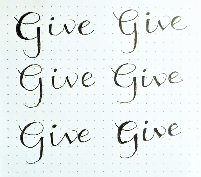
This week’s set of lessons are a real departure from our usual fonts. But there is a very good reason for this and by the end of the week it will all come together into a spectacular page for your Bible journaling.

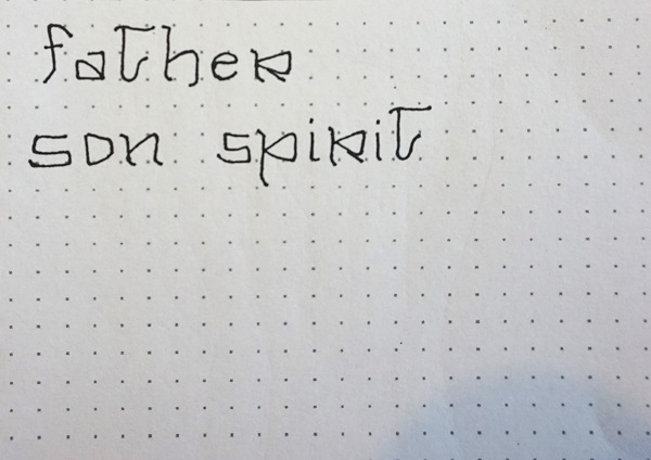
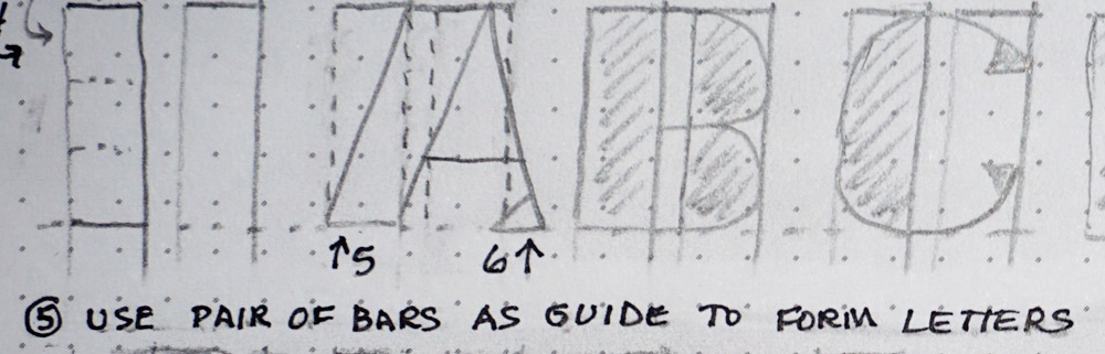
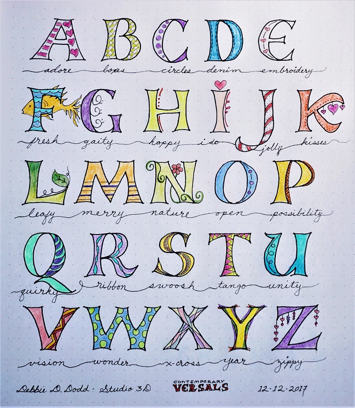
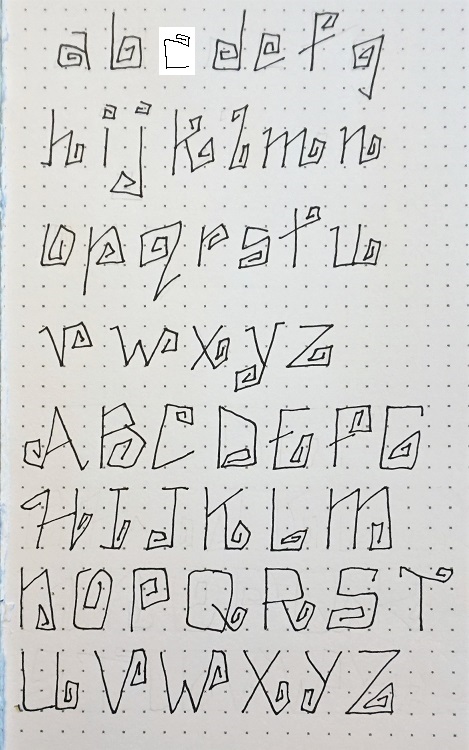
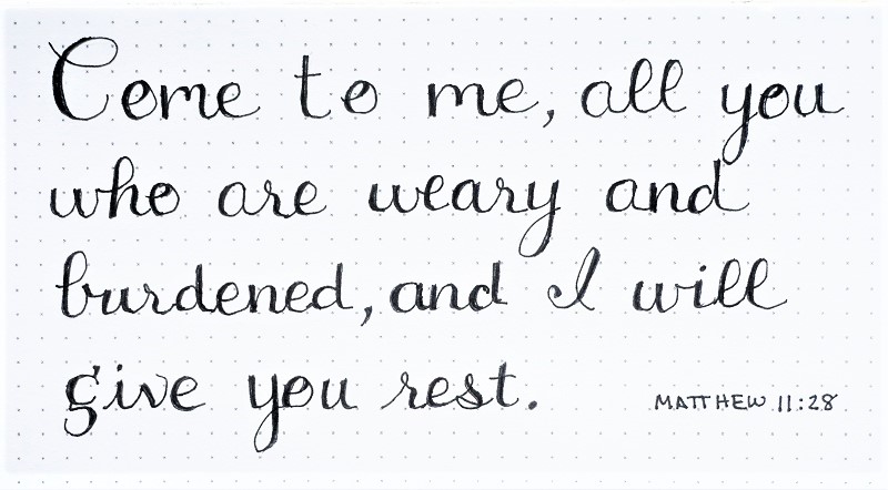
The font has some odd shapes but you’ll notice a lot of rounded triangulars and a little slanted tip on many letters.

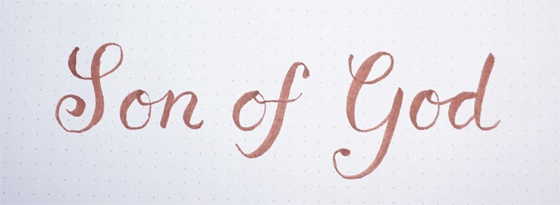
We will be focusing on God the Father, Son and Spirit this week so those are the words we’re writing today.

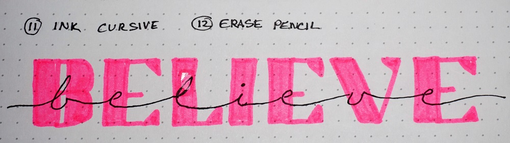
Remember to draw your letters in pencil several times to get the feel of them, trace them in ink and then go back and erase the pencil.


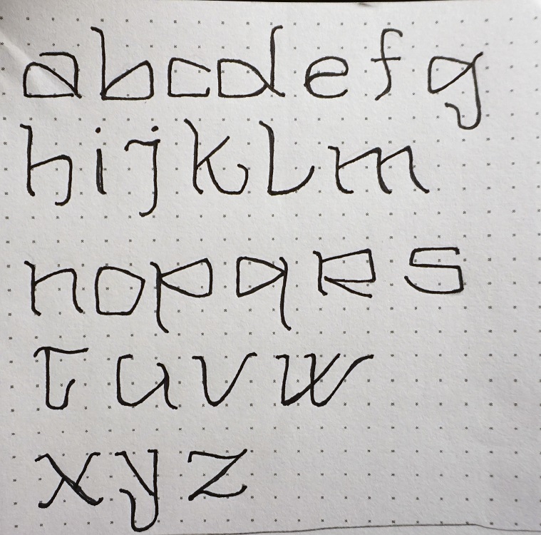
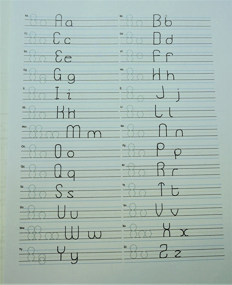
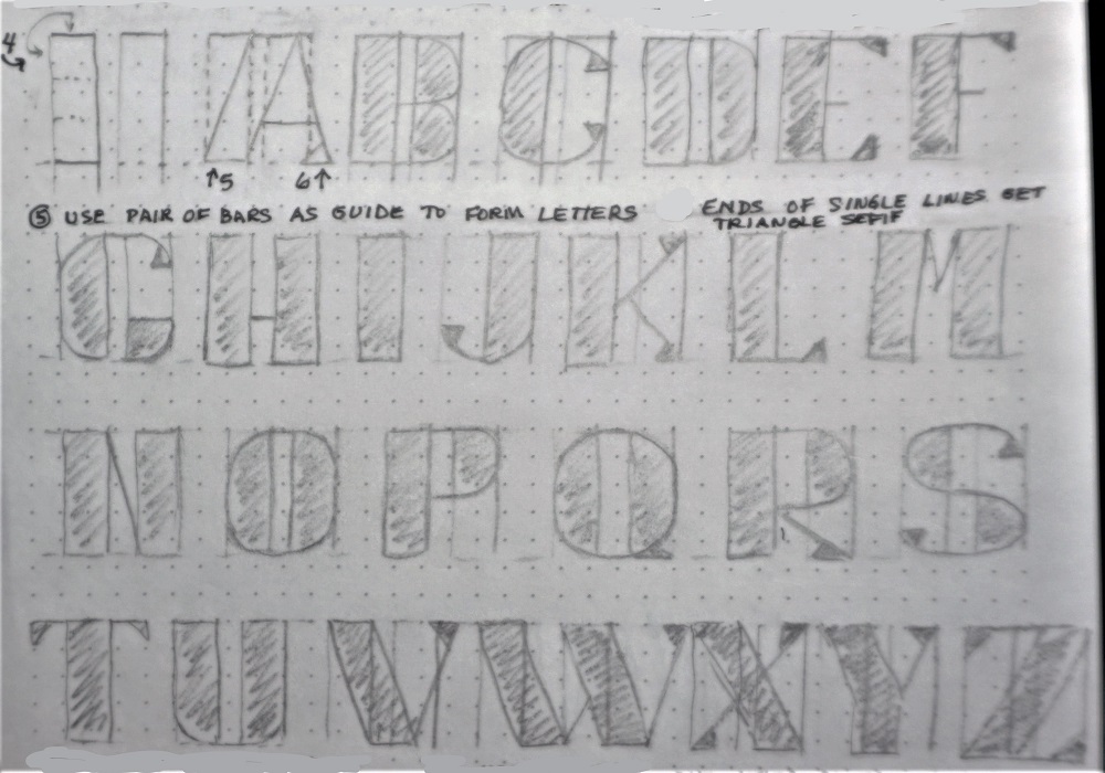
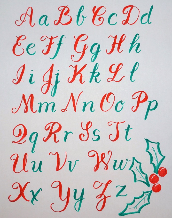
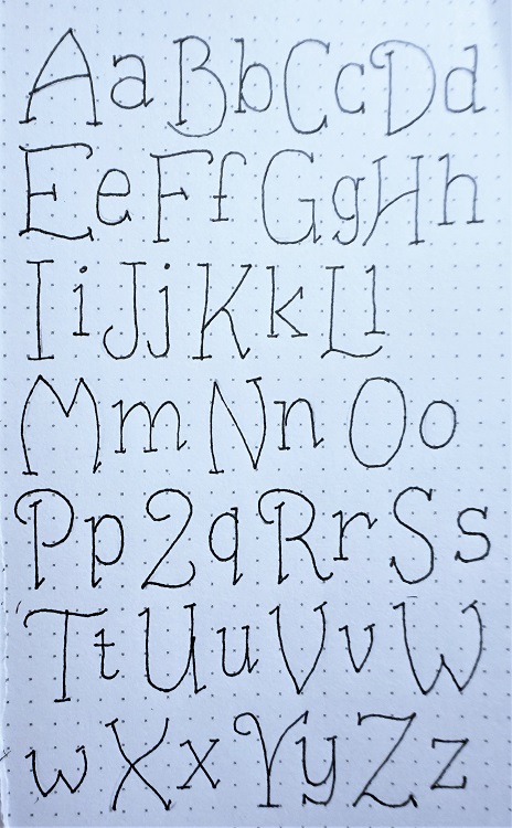
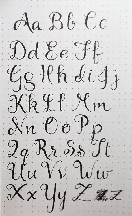
Today we’ll get a look at the full alphabet for the week’s font.

This is an old-fashioned looking font as I wanted something ‘antiquated’ for our special project this week.

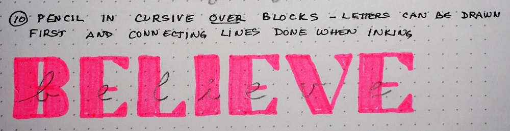
Trace the letters several times in pencil to get them into muscle memory. Then ink over them and erase the pencil.

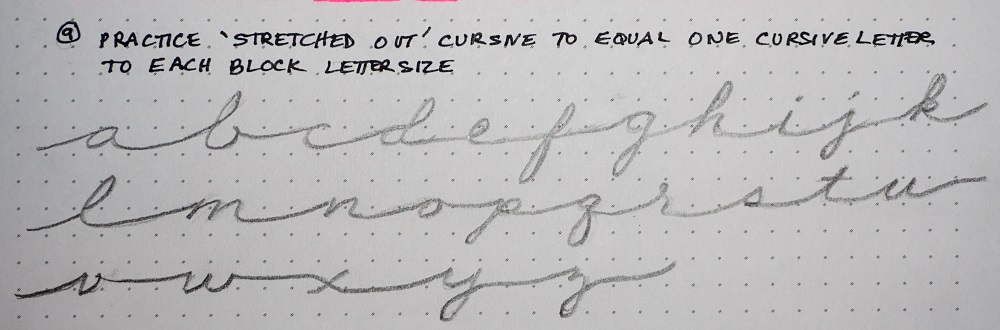
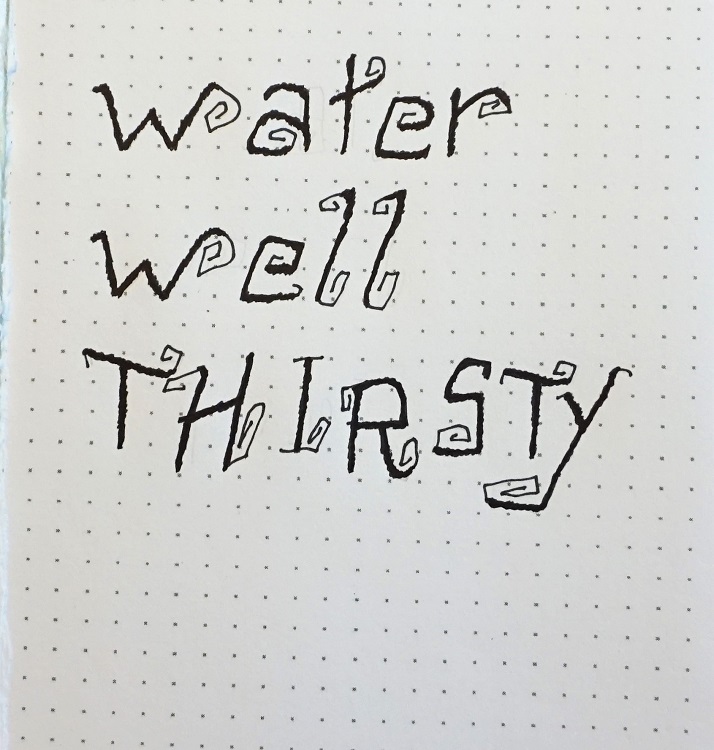
When you’ve practiced with the lines spread out like they are in the sample, try a set using slightly shortened ascenders and descenders and NO SPACE between the lines. Hmmm… curious? It’s part of the special project I’ve designed for this week.


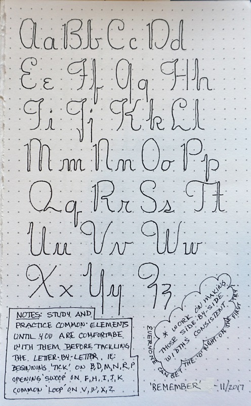
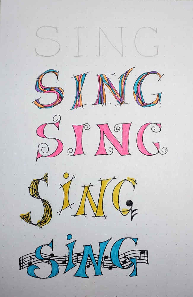
Well, today is an intensive learning day. You get to learn another alphabet!

Although you will be designing all of these capitals, you’ll be relieved to know that you will only be using one or two in your finished project and on your Bible page. But you only have to do this designing one time and then you’ll have ALL the letters for your reference on future projects!

There will follow today two additional posts since only one photo can be added to each comment and there is a step-by-step process to follow.

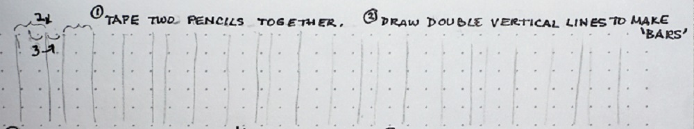
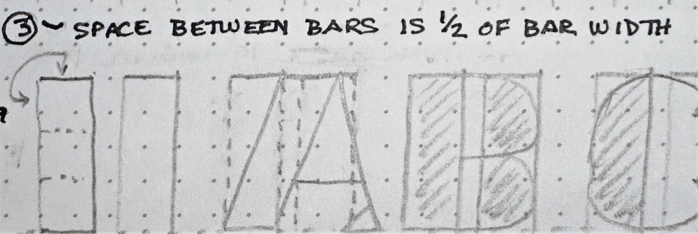
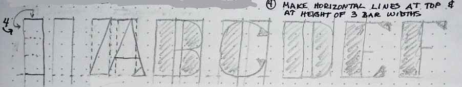
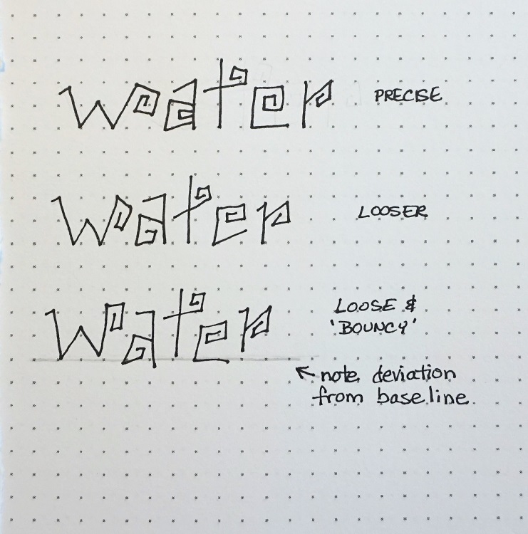
First, for each letter, draw (in pencil) a box that is 3 units wide and 4 units tall. Ink the boxes and erase the pencil. Now (in pencil) draw one letter per box with casual ‘funky’ letters that fill the boxes all the way out to the edges.


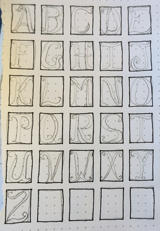
Ink the letters and then erase the pencil.


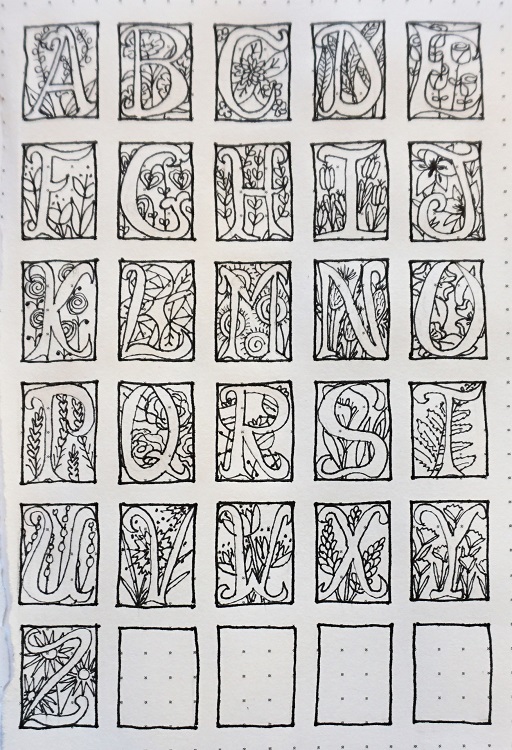
Using pencil again, fill the backgrounds of each letter with sketched flowers, lines, diamond grids, whatever you want. They don’t even have to be the same. You’ll just have lots of choices for backgrounds when you actually draw up a boxed letter for your project.

Ink the backgrounds while not crossing into the letter forms.

Now erase the pencil a final time to reveal your illuminated letters.


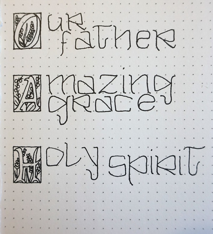
Now we are going to put the two alphabets together.

I was inspired to design this lettering series by a couple of museum visits – a trip to Dublin, Ireland where we viewed the originals of the Book of Kells and a recent trip to the Getty Museum in Los Angeles where we viewed a whole room of illuminated manuscripts and pages in prayer books and Bibles. Even though they were in foreign languages the artistry and beauty were so moving.

Anyway, back to the project. Today also has three posts to get in all the examples for the step-by-step process.

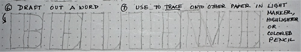
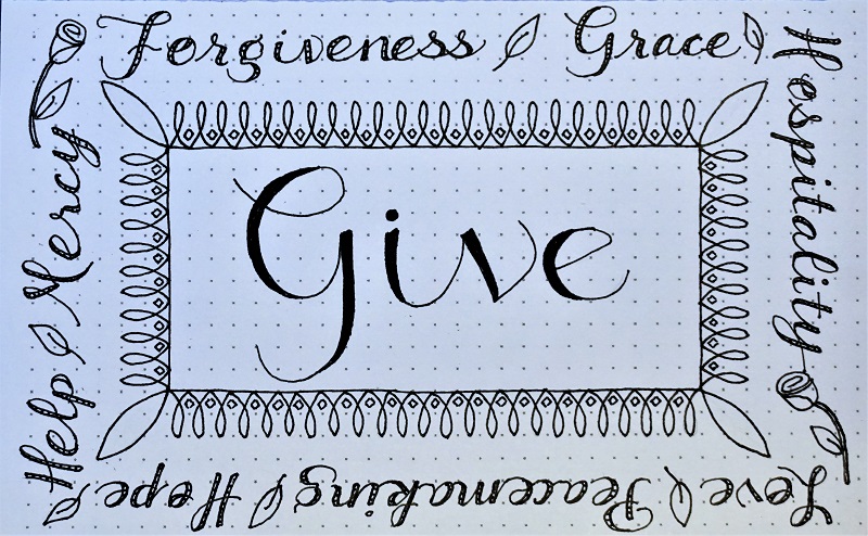
First, decide on a few two-word phrases that you’d like to work on. The first letter of the first word will be the one that uses the large block letter with whatever background you choose to use. Then in the original alphabet complete the remainder of the phrase.

These letters will be half the height of the block letter and their lines will not have a space between them. You’ll also shorten those ascenders and descenders so the letters do not actually touch one another.


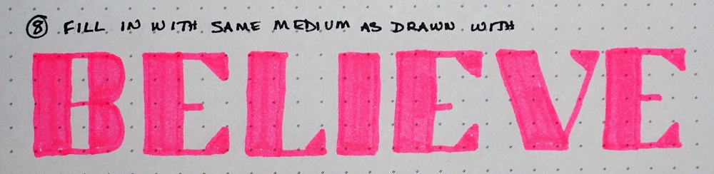
Next, use markers or colored pencils to fill the design in the background of your block letters. Use bright, vivid colors as you are mimicking the inks that were available to the scribes in the early centuries.


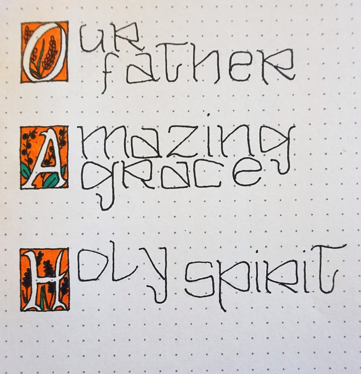
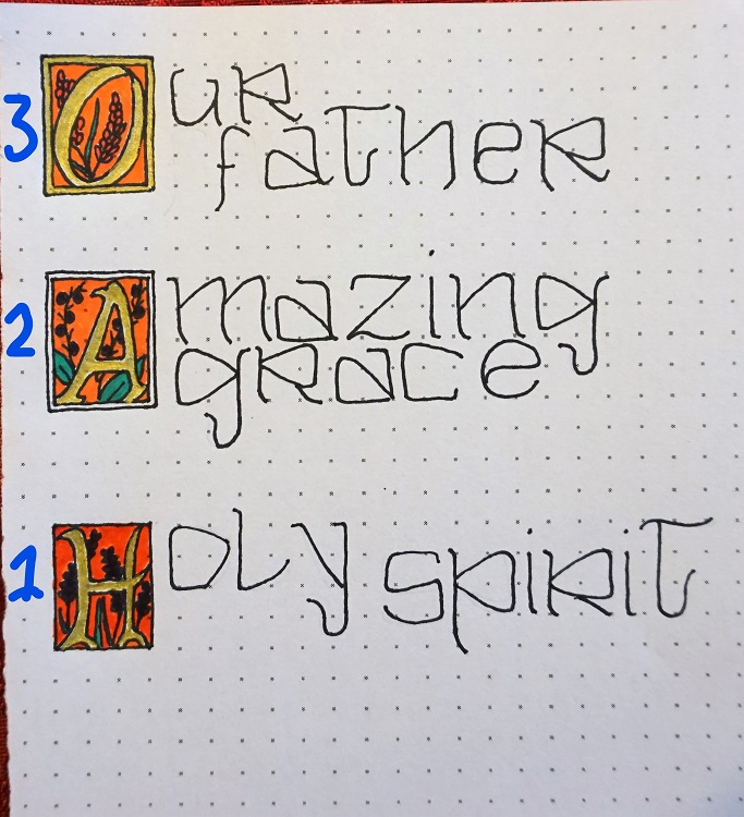
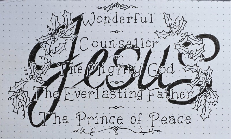
On this next illustration I showed the finishing steps in reverse (sorry about that). First, (shown at the bottom) use gold gel pen to fill only the letter inside the block.  You could also use metallic colored pencils. Second, draw a box around the block. Third, fill the new border with the gold gel pen.


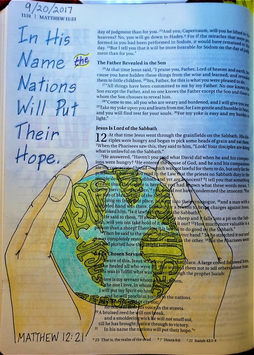
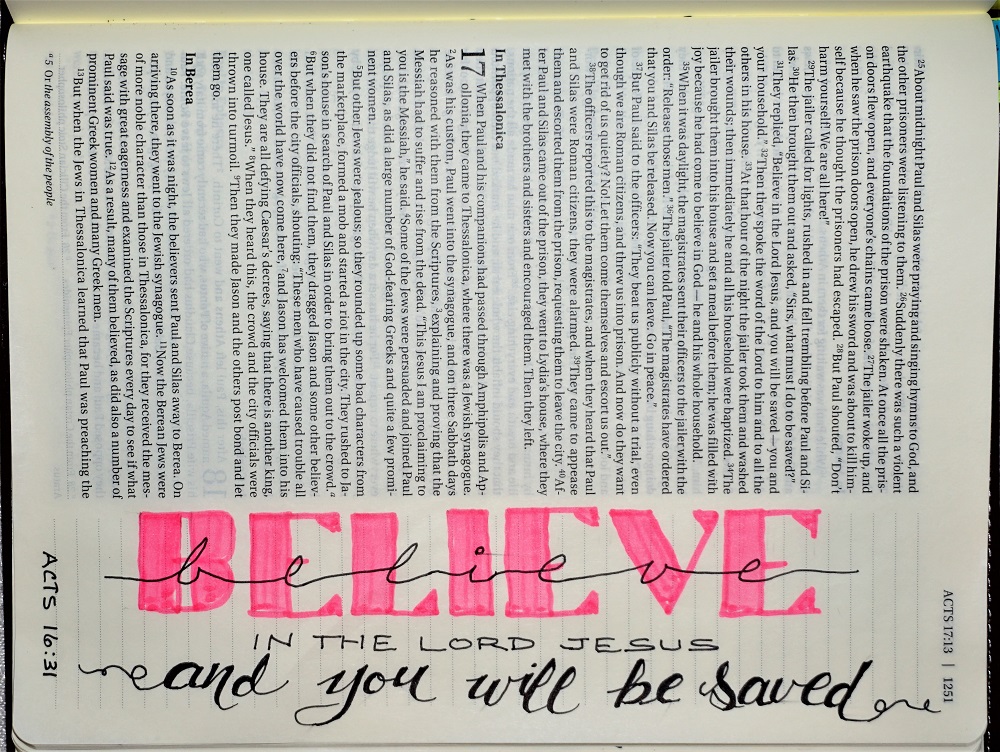
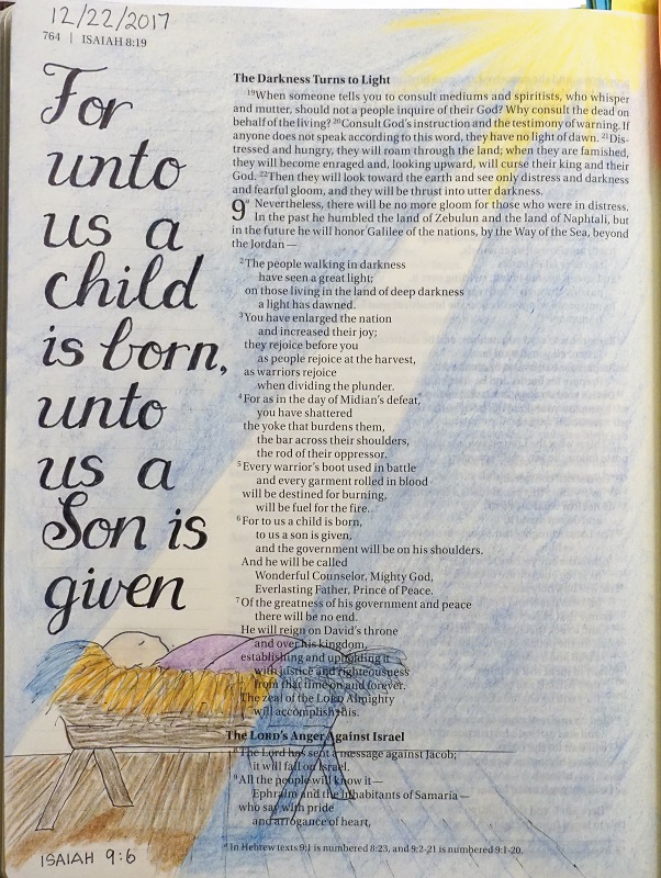
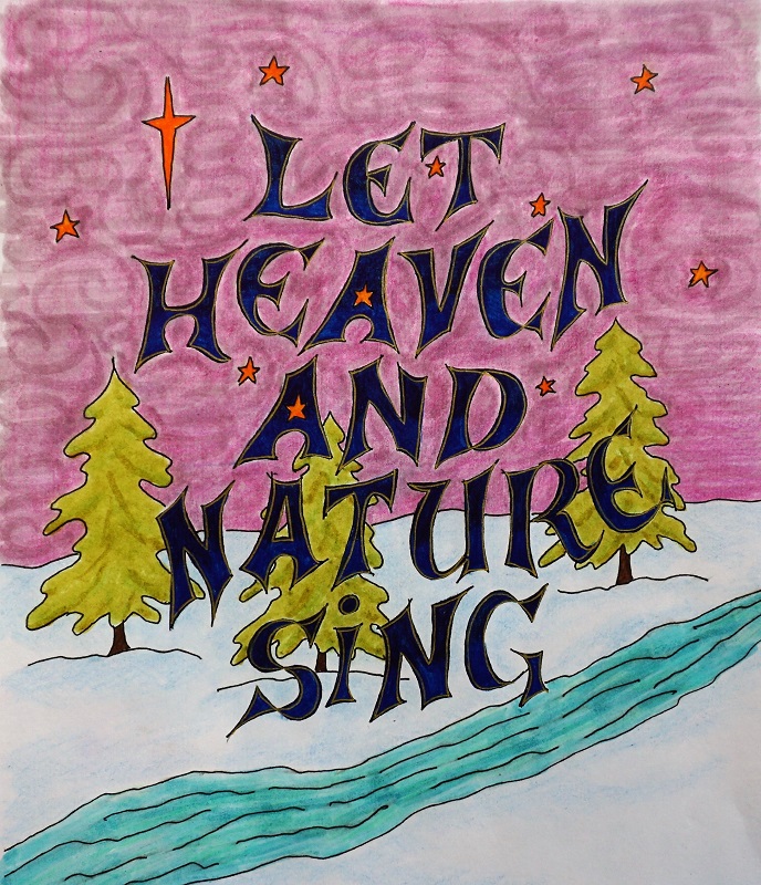
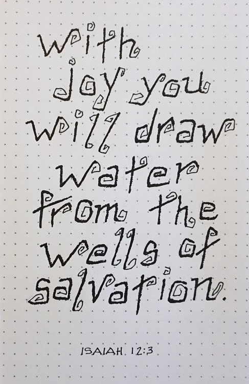
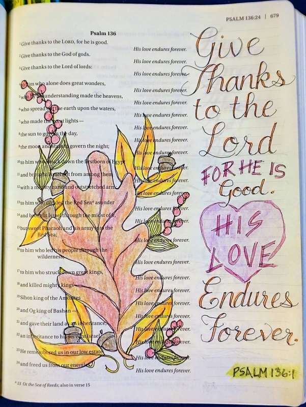
Now we’ll finally take the illuminated manuscript design to our Bible.

So, why did I choose ‘father, son and spirit’ as the words of the week? It was to be an inspiration looking at celebrating the full majesty of God. I had in mind that those words could help you choose a scripture that would embody reverence and adoration.

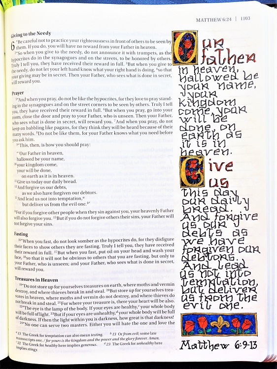
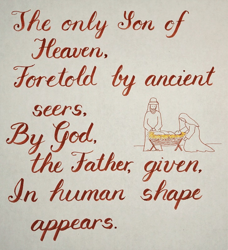
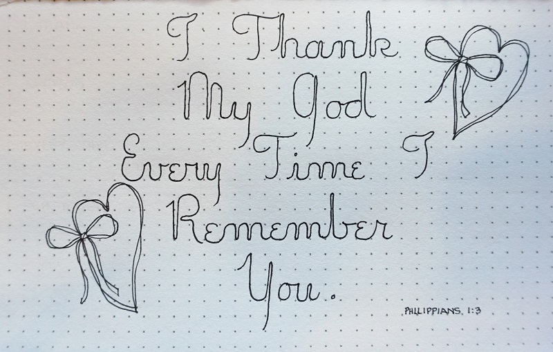
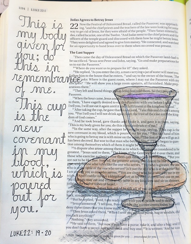
Now, YOU will select a scripture that you feel suits the character of the illuminated manuscript. I chose the Lord’s Prayer for my Bible (Matthew 6:9-13). Some other good selections might be John 1:1-3, Psalm 23, Psalm 8, Luke 1:46-55, Luke 6:20-22, Isaiah 9:6-7, Revelation 4:8b + 11, Revelation 15:3b -4, Isaiah 12:1-6. There are so many more though!

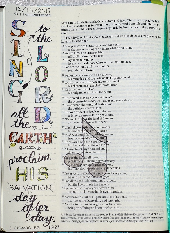
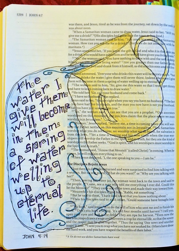
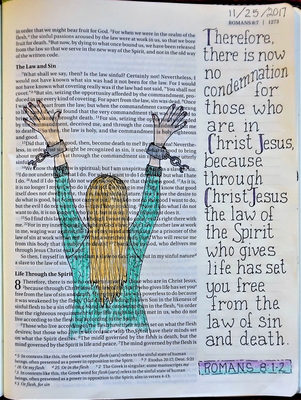
I had two sections that I wanted to use the large illuminated letters on. I penciled in the block for the first one followed by the first two words of the section in two lines like our Thursday lesson. The rest of the section was penciled in with VERY small print (one line of text in each space of the guidelines) using the original font for this week. Remember to use those condensed ascenders and descenders. Then came penciling in the next block, feature words and text.

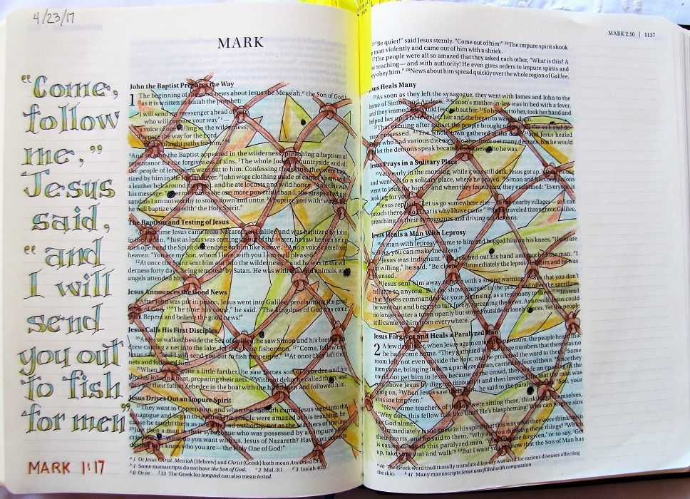
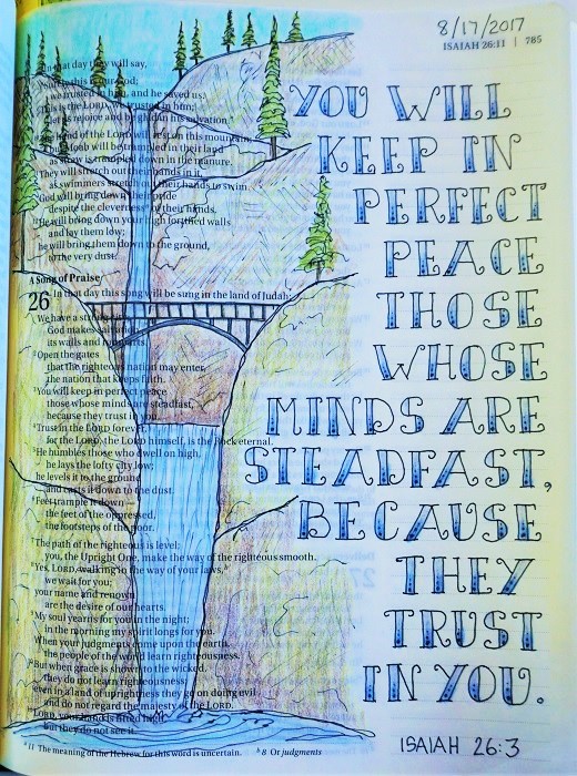
I Inked it all. In inking this piece, note that the small font looks more like the manuscripts in the museums if a heavier tip pen is used. It wants to look denser than a standard print. Don’t you love it?

I erased all the pencil at this point. Then I penciled in the letters in the illumination blocks and inked those and erased the pencil. Next, I penciled the backgrounds to the illuminated letters and inked those. I went back and penciled double lines on the feature words next to the illuminated letter and inked those. I then erased ALL the pencil marks remaining before adding color to the Illuminated letter and filled between those lines of the feature words, all with colored pen.

Finally, I added the gold gel pen to the illuminated letters. I had a space left at the bottom of the page so I filled it with a decorated block that matches the illuminated letter blocks.

***Remember to work in pencil first, then ink your work and erase the pencil before adding any coloring***


Want to see some of the ‘inspiration pieces’?


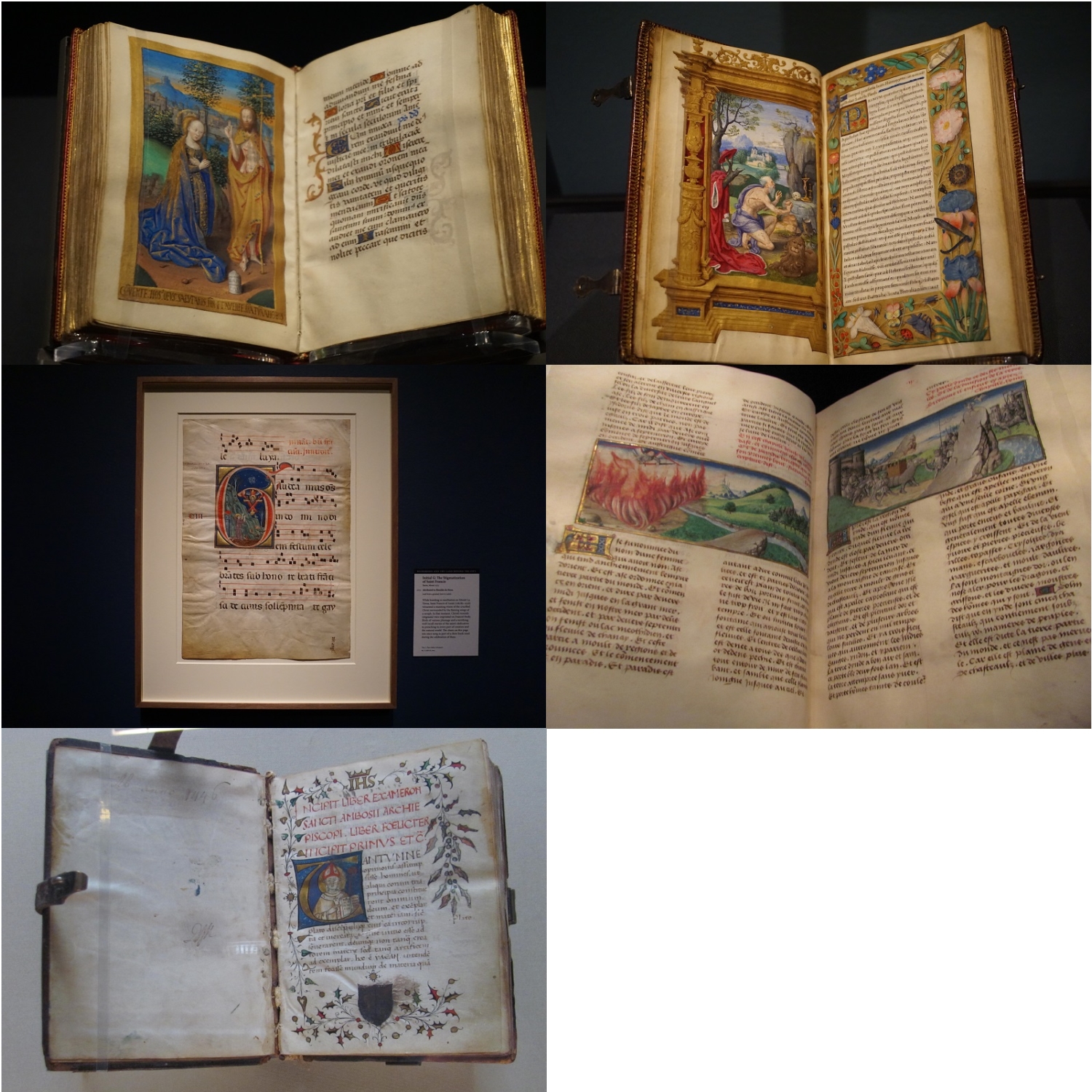
I love this style and may be doing some further work along these lines.

Ddd


Posted by studio3d@ccgmail.net at 8:20 PM PST
Saturday, 25 November 2017
Bible Journaling - Romans 8:1-2
Topic: Bible Journaling

This week I again followed along in the Letterintg Lodge on the Facebook group for Creative Bible Journaling.

The font this week was a serif print while the focus word was 'Jesus'.

Monday - assignment was to practice the new font with the focus word:


Tuesday - assignment was to learn the whole alphabet in the new font.


Wednesday - assignment was to use the font to write various names from the Bible for Jesus. I did that first. Then I decorated the edges. Then I used pencil to draw the name in large script. I traced it in pen, stopping just short of lettering and decorations and filled it in the same way.


I skipped the Thursday assignment to write out a scripture on plain paper.

Friday - assignment was to use the font in our Bibles on a scripture with the name Jesus. 

I didn't get around to doing the assignment till Saturday, though.

I selected Romans 8:1-2 for my scripture and made a drawing to illustrate it.


All work in Prismacolor Premier 005 Fine Line Marker and Prismacolor Colored Pencils.

Ddd


Posted by studio3d@ccgmail.net at 3:01 PM PST
Friday, 24 November 2017
Paper Chase
Topic: Scrap Recovery

Continuing on my Christmas card creation marathon, I next pulled out scrapbook papers with themed elements that could be used as card fronts with minimal embellishment.

Rubons and stickers were used for the sentiments.


I did four out of a single 12 x 12 page cut into sections. Love those birch trees.


So, that completes 21 cards in one afternoon. Still more to go, but that will be another day.

Ddd


Posted by studio3d@ccgmail.net at 11:37 PM PST
On Dasher, On Dancer...
Topic: Scrap Recovery

When I was done with those 'window' cards I still had many fronts of cards received in past years. I sorted through to find several that I could trim, mount, decorate and use to make creative scrap recovery cards.

In no particular order......


Many of these use rub-on sentiments, some have stickers. All have holiday cheer!

Ddd


Posted by studio3d@ccgmail.net at 11:26 PM PST
Inspired To Begin
Topic: Scrap Recovery

I suddenly got inspired to start my Christmas cards!

The first set I made started with fronts from cards received in previous years. I had seen a window effect over pictures that someone had made using a grid of quilling paper strips. 

I, on the other hand, made a grid by using a square punch on solid cardstock. These were layered over the top of the pictures.

I added stickers with Christmas sentiments and mounted the windows on base cards with backgrounds of coordinating papers.

Most of the windows got trimmed with decorative sticker 'valances' for fun.


This last one, in a vertical format, got 'snow' in the window created from Liquid Pearls.


Group one done.

Ddd


Posted by studio3d@ccgmail.net at 11:08 PM PST
Friday, 17 November 2017
Farm Country Flyover
Topic: Quilting

Another quilt today, actually finished up yesterday along with the trio already showed.

At a warehouse sale at the fabric store I picked up a bunch of matching mini-charm packs and two charm packs of cream solid. The pattern I found (a tutorial from Missouri Star Quilt Company) needed 96 units of each and I only had 84 so I had to cut a few extras from the stash.

All the blocks are constructed by sewing a half square triangle of the mini-charm onto the corner of each cream block. Then they are twisted and turned to form circles.

In the tutorial there are circles all over the quilt and no diamond shapes out in the middle.

One could also move the half circles on one side to join those on the other so there would be 6 full circles.


However, this is the arrangement I settled on:


The circles made me think of the big circles of crops that one sees when flying over the midwest. I quilted nested shapes in diagonals to represent the furrows in fields and I'm letting those diamonds out in the open spaces represent the farm houses.

I filled the wide borders with continuous triangles.

The binding matches the border.

Ddd


Posted by studio3d@ccgmail.net at 4:22 PM PST
Bible Journaling to Remember
Topic: Bible Journaling

I taught a 5-day tutorial on lettering for Bible journaling this week on a Facebook site I belong to (Creative Bbile Journaling). Here are the lessons day-by-day:

Monday

Welcome everyone! Here in the lettering Lodge we are learning new fonts, practicing lettering in them, and using them in our Bibles.

Monday’s lesson is always the introduction of a new font paired with a ‘theme word’ for the week. This week the word is ‘remember’ although you can use any form of the word (remembered, remembering, remembrance).

When we are lettering we use a few skills to help break away from our own natural handwriting. Work in pencil first, ‘drawing’ the letters instead of just writing them. Then trace your finished work in ink and erase the pencil lines.

You can work on lined notebook paper, graph paper, dot paper or blank paper on which you have penciled in some guidelines for yourself. There is also a lined practice paper available for you to use if you like at http://creative-bible-journaling.com/wp-content/uploads/lined-PAPER-pg.jpg

So, without further ado, here is the new font. Note that I added some important tips and things to watch for in notations at the bottom of the page. Basically, for this font, anywhere you would normally create a loop in the letter or retrace the path of a stroke, it becomes a side-by-side double stroke with a tight bend at the turn. See examples for the letters ‘a’ and ‘b’ in the photo.

Practice writing out this word on your selected paper and share your work back here in a ‘comment’.


Tuesday

On Tuesdays we get to see the entire alphabet in uppercase and lowercase (whenever both are available).

For this font, study and practice common elements until you are comfortable with them before tackling the letter-by-letter. For instance, the beginning ‘tick’ on the B, D, M, N, P, R – the opening ‘swoop’ on F, M, I, J, K – the common ‘loop’ on V, W, X, Z. Then note the things that make particular letters unique like the split crossbar on the ‘t’ and the direction the ‘Q’ is drawn.

Work on making those side-by-side widths consistent by practicing on a long row of up-down-up-down lines. This helps to get the width, the turn and the spacing into muscle memory.

GOOD NEWS! Everyone can draw the ‘O’ and the ‘o’ on the first try. See, you’ve already mastered one letter of this font! LOL!

Finally, working in pencil, draw out your alphabet, trace in pen and erase the pencil lines. Then share your work back here in a ‘comment’.


Wednesday

On Wednesdays the lessons vary week to week. Today we are going to practice the new font by writing words that are methods by which people remember things. Choose from current day and/or biblical times.

Part of the challenge of this assignment is figuring out the best way to connect letters in various combinations. The lead-in or lead-out on a letter may end up being different than in your written alphabet, depending on the letter that precedes or follows it.

Again, work in pencil to write your practice words, trace in ink and erase the pencil lines. Then, share your work back here in a ‘comment’.


Thursday

For the lesson on Thursdays we select a scripture with the ‘theme word’ in it (In www.biblegateway.com there are 235 verses with versions of it!) and write it out in the new font on paper.

We usually try to do this on a plain paper on which we’ve drawn guidelines for ourselves in pencil. I did mine on dot paper, just because I like the way it looks!

As we’ve been doing all week, draw the scripture in pencil, trace in pen and erase the pencil – including your guidelines.

If you wish, you can add embellishments to your page.

Share your work in the comments. We love to see your work!


Friday

Friday is the day we take the new font to our Bibles. Select a scripture that uses the theme word in any form (remember, remembered, remembers, remembrance) and journal it into your Bible.

You can leave your page with just the lettering or decorate the page as you wish. I chose to draw in non-bleeding pen and use colored pencils to complete the illustration.

Be sure you draw everything (lettering and artwork) in pencil, trace in pen and erase pencil BEFORE you do any coloring that might seal the pencil to the page and make it non-removable.


Thanks for joining me again for a lettering lesson.

Ddd


Posted by studio3d@ccgmail.net at 1:59 PM PST
Thursday, 16 November 2017
Three Big Finishes
Topic: Quilting

What do you do when you have a LOT of a specialty fabric to use up and you don't like to do the same project over and over? Well, you could make three different patterns with the fabric. But it took so long to finally find a pattern that I liked for it that I didn't really want to do that.

So I cut all the parts for three quilts from the same pattern, subbing in alternate fabrics where there wasn't enough to use the same (mostly the sashings, but also the lightest squares).

I worked through them all step-by-step all at the same time - sew fabric A to B on all the quilts, then AB to C on all the quilts, etc. This followed through all the way - borders on all, backings on all, quilting all, binding all.

The whole process took a little over two weeks from cutting to binding (not working on them every day and some days only a few hours.)

Since I don't like to do the same thing over and over I changed up the quilting on each of them. The quilting choices inform the titles for the quilts.

This first one is called 'Exit 10' and the quilting is loop-the-loops. The freeway exit we go through the most has flocks of Canada Geese hanging out in the grassy areas surrounded by the ramps. The loops in the quilting represent those freeway ramps.


The second one is called 'Gander At This'. Obviously, gander refers to the geese on the feature fabric. The quilting is overall leaves. You get the best view of this in the white areas. Both the sashings andthe fabric with the open pattern have leaves.


The third quilt is named 'To Each His Own' as each fabric type is quilted in a different manner. Geese have a wavy line side to side, dark green has loops, white tree prints have trees, leafy print has leaves, plaid has 'plaid' quilting, and sashings have leaves on vines.


So, the same.... but different.

Each has binding to match its sashing.

Ddd


Posted by studio3d@ccgmail.net at 3:50 PM PST
Friday, 10 November 2017
Bible Journaling - Psalm 139:1
Topic: Bible Journaling

The lettering word for this week was 'give' and we learned another cursive font, this time with lots of swoops on the uppercase letters.

Day 1 - Draw out the word 'give' and practice thickening the downstrokes.


Day 2 - Practice writing out the whole alphabet in uppercase and lowercase.


Then we also practiced the alphabet with thickened downstrokes.


Day 3 - practice the new font by writing out words you associate with 'give'. Use some decorative elements.


For the thickened downstrokes I only filled them with hashmarks.

Day 4 - Use the new font to write out a 'give' scripture in a notebook or journal or on paper. I used Matthew 11:28.


Day 5 - Use the new font to journal a 'give' scripture in your Bible. I went with Psalm 139:1.


I used the assigned font mixed with some others. As you can see, I gave up on the 'backwards' letter 'o' and substituted a more conventional one.

I decorated my page with fall elements (leaves, nuts and berries) based on a journaling page that came up on Pinterest when I put in the scripture reference.

Next week I will be the one teaching the lettering lesson.

Ddd


Posted by studio3d@ccgmail.net at 9:52 PM PST
Thursday, 9 November 2017
Quilt Stats
Topic: Quilting

I have had a spreadsheet detailing my quilt finishes since near the beginning. Today I made a second sheet for it that gathers statistics and sumarizes several categories (sizes, disposition and pattern source). This is the current tabulation:


Start date for first quilt 9/2010    
Total Quilts completed to date 146    
Average per month 1.6437    
DISPOSITION     PERCENTAGE
Mine 18   12%
Family 17   12%
Friends 15   10%
Charity (itemized below) 96   66%
Will. Falls Hospital   66  
Warm Springs Indian Res.   25  
Hope 360 Pregnancy Clinic   4  
Project Linus   1  
SIZES     PERCENTAGE
Wall 13   9%
Baby 29   1%
Lap 92   63%
Twin 1   1%
Full 5   3%
Queen 3   2%
King 1   1%
Other 2   14%
DESIGNS      
Missouri Star Quilt Co. 19    
Quilt in a Day 5    
Fons & Porter - TV or mag 6    
Magazine 16    
Web 20    
Original 25    
Sewing With Nancy 3    
Mystery Quilt - various sources 7    
Purchased Pattern 1    
Traditonal 29    
Can't remember 2    
Live Class 2    
Shop Hop materials 2    
Craftsy 4    
Book 5    


It's kind of fun to see them categorized these different ways.

Ddd


Posted by studio3d@ccgmail.net at 3:42 PM PST

Newer | Latest | Older