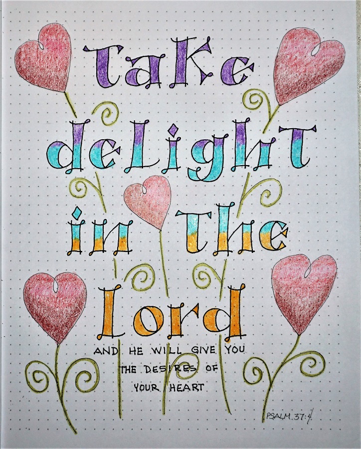
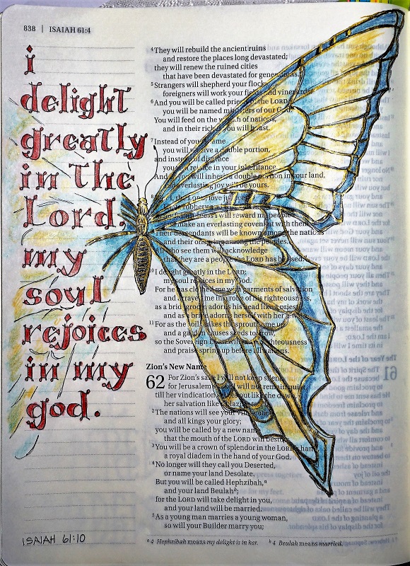
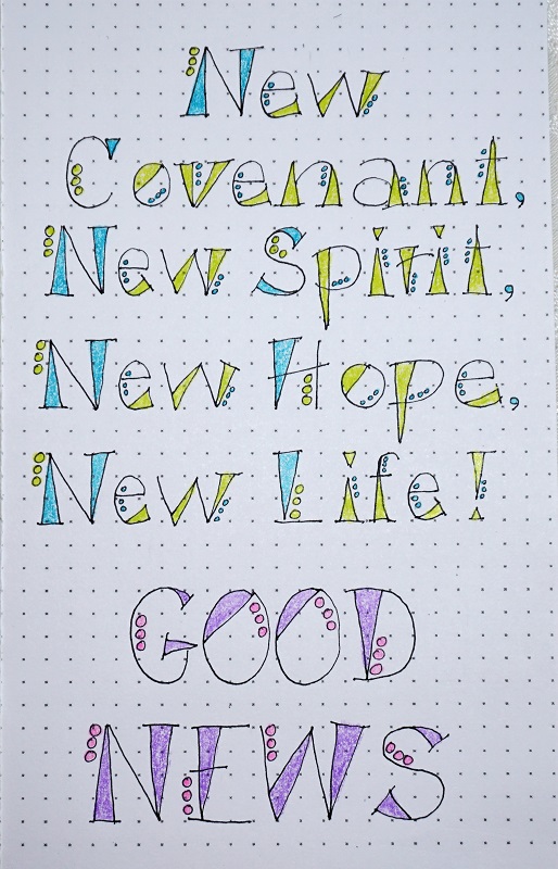
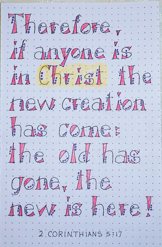
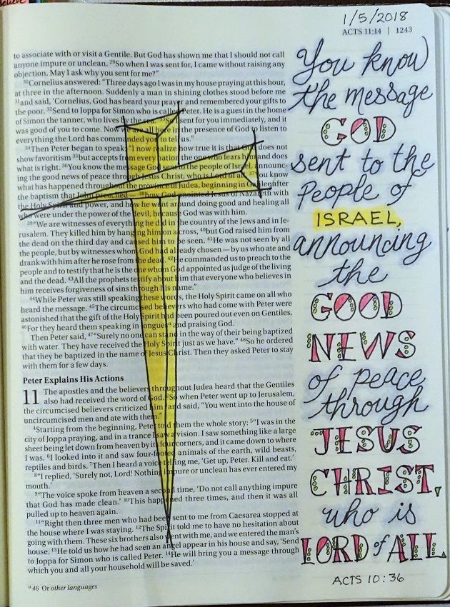
Topic: Bible Journaling
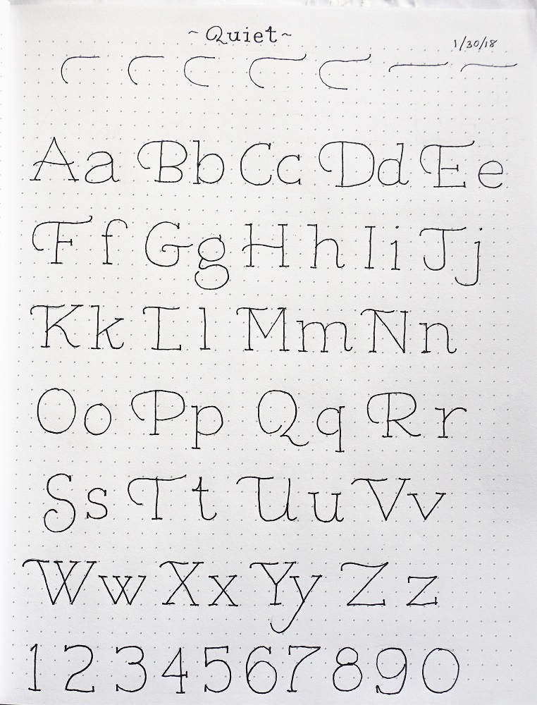
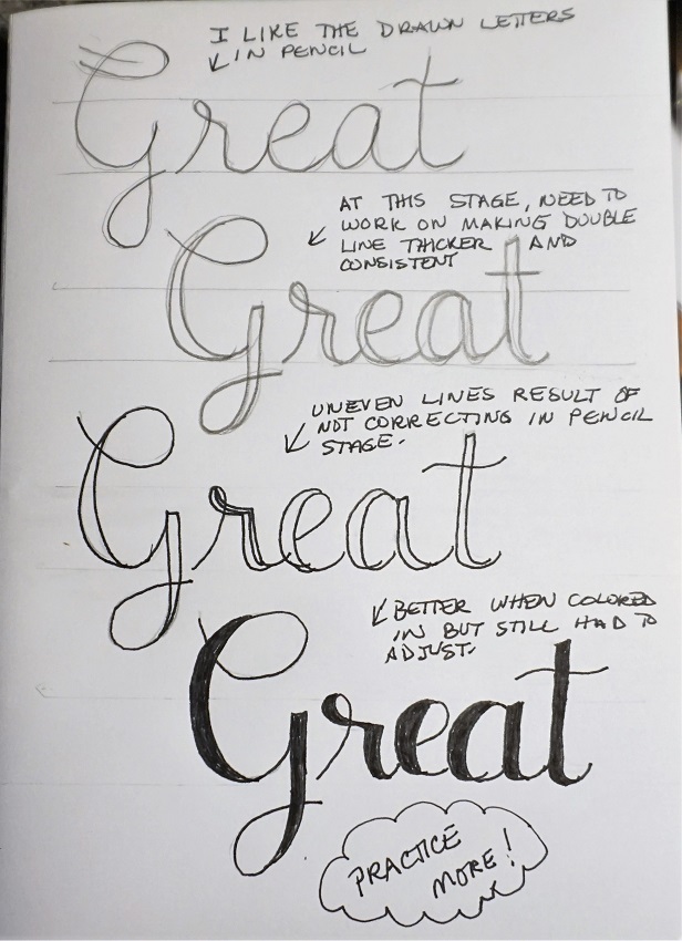
Time to wrap up another week of lettering lessons. This font is such a departure from any that have gone before.
I found the original alphabet on the web but did a lot of editing and substituting of letter forms to ones I liked better. So here's the lesson plan:
MONDAY
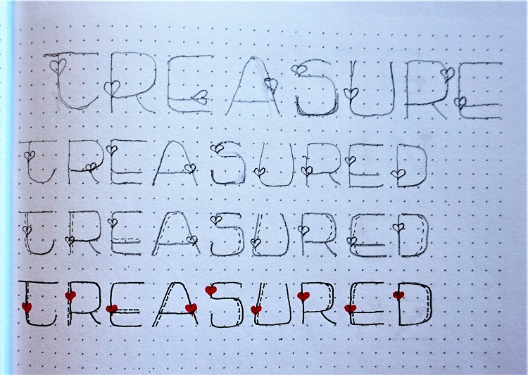
This week we’re going to learn a font that uses and mimics musical notations in place of letters. It kind of looks like a code and we are going to work with the word ‘rejoice’.
Right up front, I’ll tell you that this is NOT a precise font. Sizes of the letters vary and can be adjusted to suit yourself. Letters can move up or down from the baseline to put a little bounce in the step. If you don’t like the form given for the letter, go ahead and draw up one you like better. You get a LOT of leeway on this font.
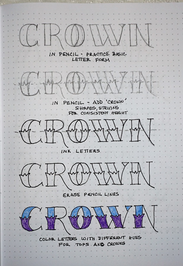
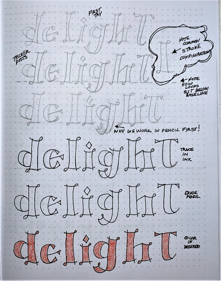
Here are the letter forms I’ve drawn up for ‘rejoice’. Sketch in pencil, refining as you go. Write several times. Select your best effort and trace over it in ink. Then erase the pencil.
Crank up the music and get writing!
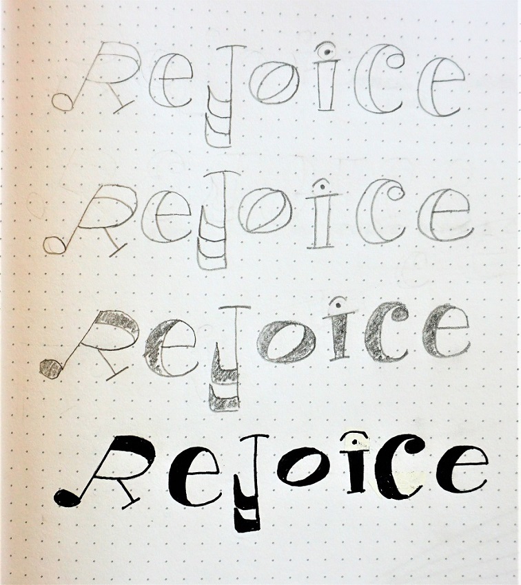
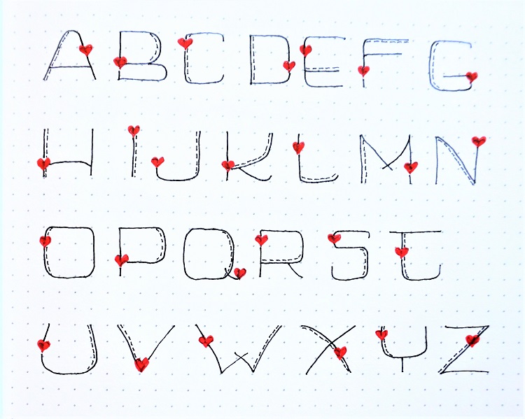
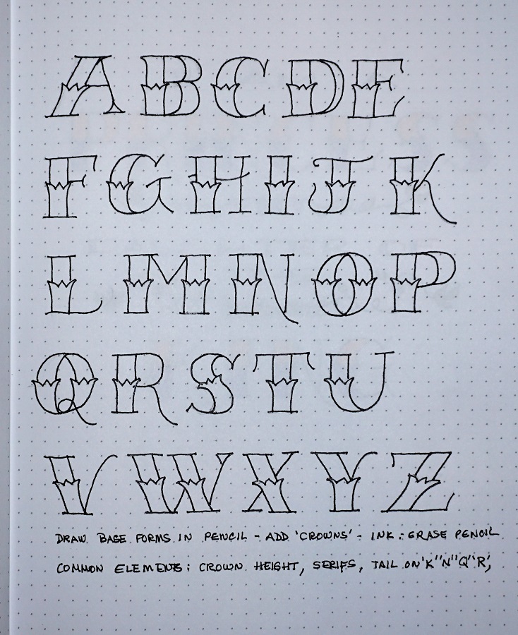
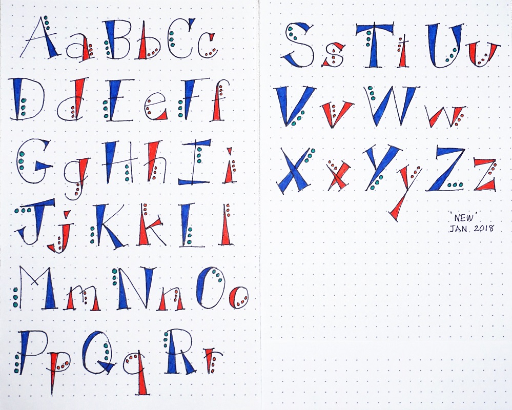
Are you ready for the whole crazy ‘rejoice’ alphabet?
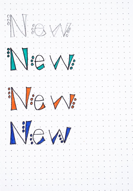
As I mentioned yesterday, this font is completely customizable. As long as your letter form has some resemblance to the real letter and some element that evokes the feeling of music, you are good to go!
I hope that’s not too much freedom for you!
Don’t forget to vary the sizes and the positions on the base line. In fact, as you begin writing words later in the week, these two elements can change from your alphabet and change within the piece you are writing.
What are you singing in you head as you are writing these letters?

Today I will show you how to change those ‘twisty ribbons’ we’ve learned into musical staffs. THERE WILL BE FOUR POSTS WITH PICTURES.
You will start by drawing a softly waving line looping around your page. Leave white space on the page as you will want it to write in.
Add a second line with space separating them. Let the lines cross over but immediately open them out to the same width apart.
Add a line down through the center. This should pass directly through the place where the lines cross.
Add another line, evenly spaced between the center and each side. You will end up with 5 lines.
Close both ends with a double line that is perpendicular to the 5 lines.
Practice till your staff flows naturally around the page. Use your very thinnest tipped pen to ink over your lines. Erase the pencil.
Set this aside – you’ll use it tomorrow.


THURSDAY
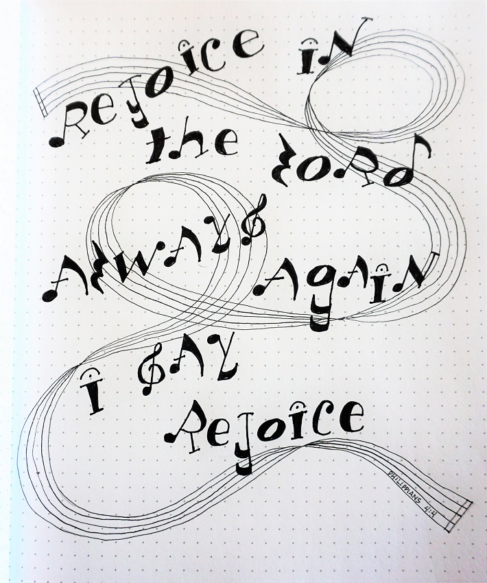
Today we’re going to use the twisty staff you made yesterday as a foundation for lettering a verse with the word ‘rejoice’.
Remember that you can still vary the size and position of your letters. Try not to go TOO sideways with them as they can quickly become unreadable.
Pencil-Ink-Erase. Add little random notes along the empty spaces on the staff.

FRIDAY
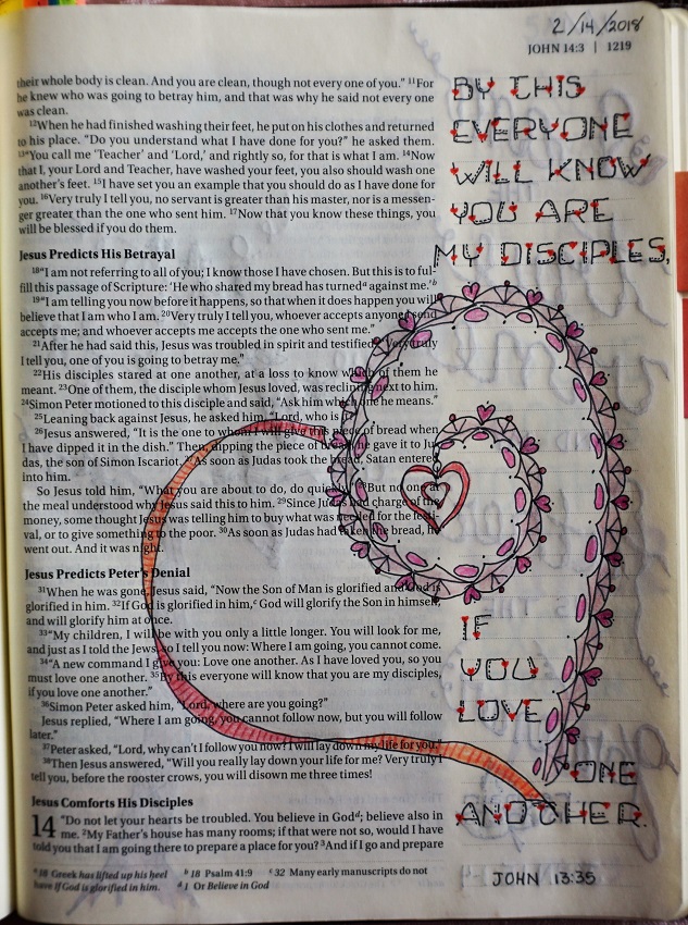
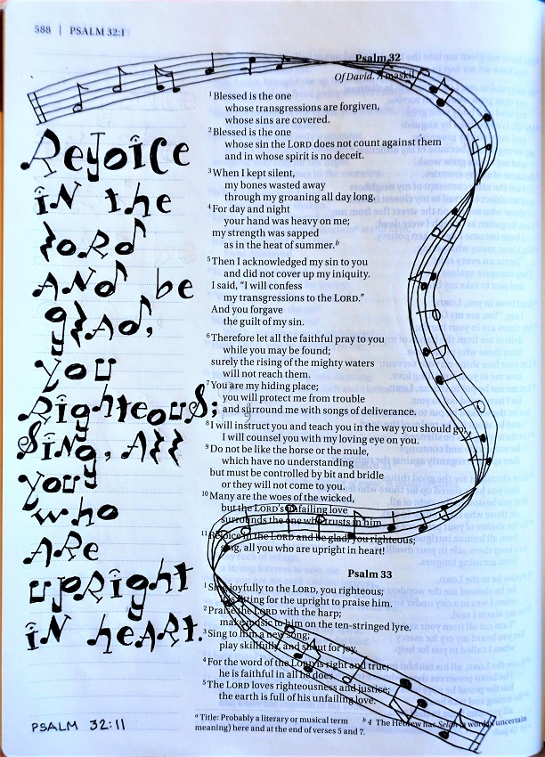
In our Bible were going to use the lettering off to the side and let the twisty ribbon staff travel over the rest of the page.
Look at the example to get the feel for some note forms you can use to randomly fill the staff. There is no need to make a real musical score out of this (unless you’re into that sort of thing) nor to mark bars, rests and all. Remember, we’re just trying to evoke a feeling or impression here.
No need for color on this page, either. Music IS black and white.
I sure hope you’ve had fun with the ‘rejoice’ font this week. I certainly have.
Ddd