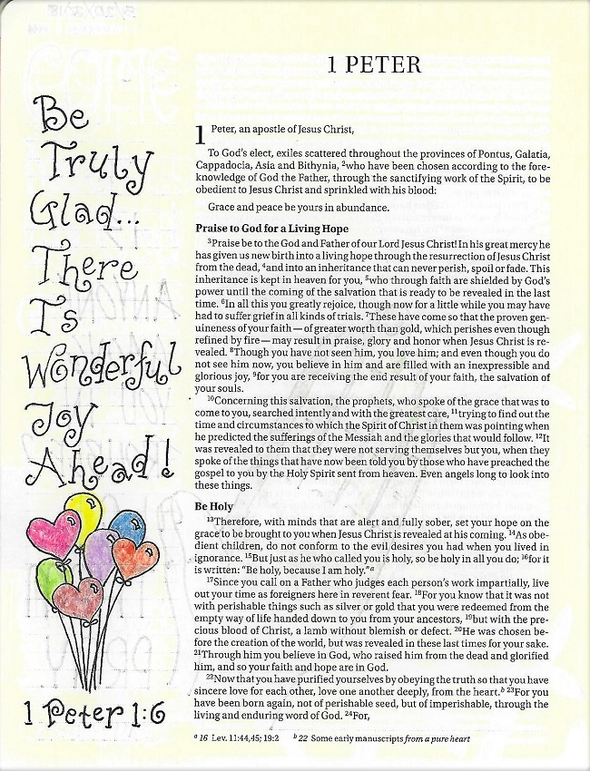
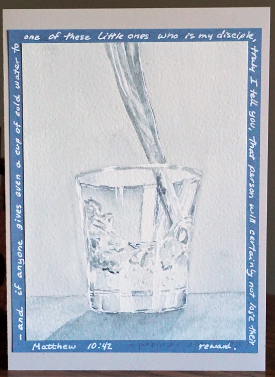
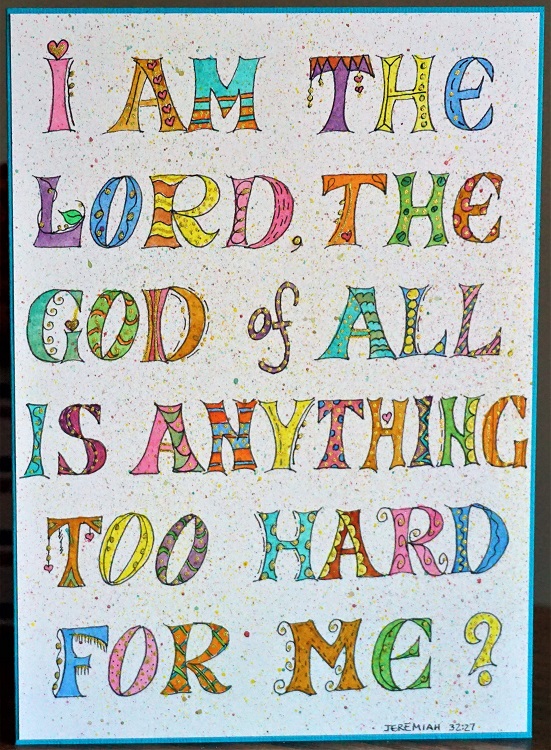
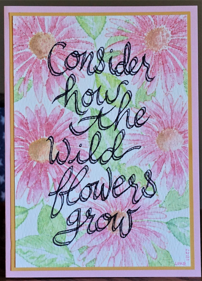
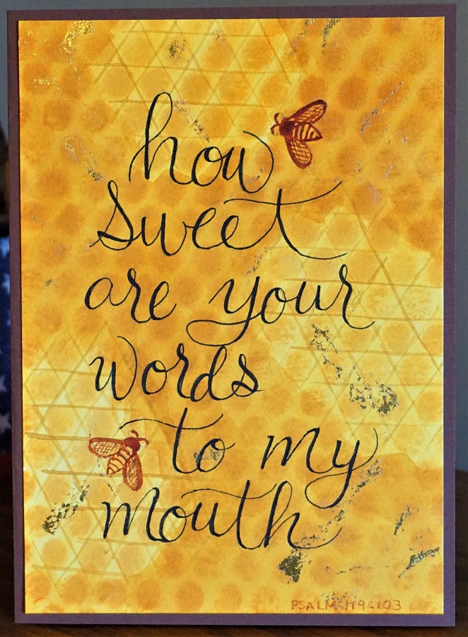
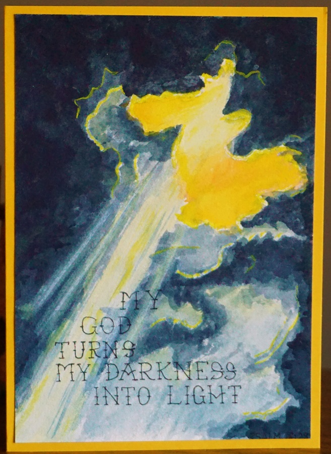
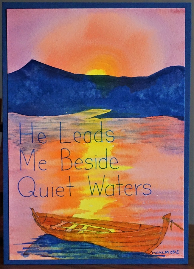
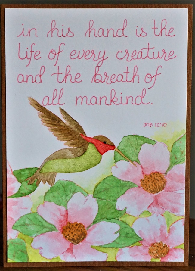
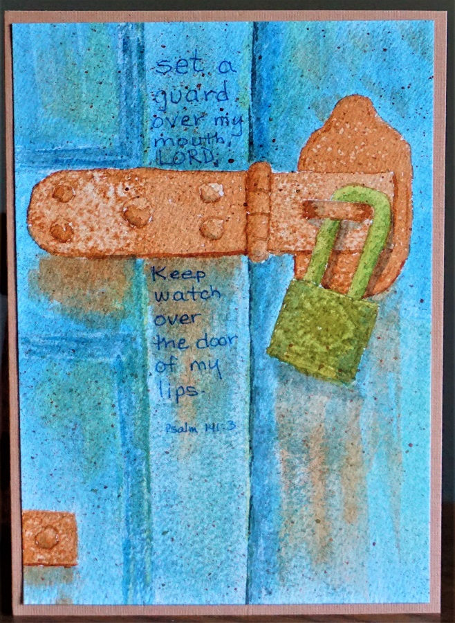
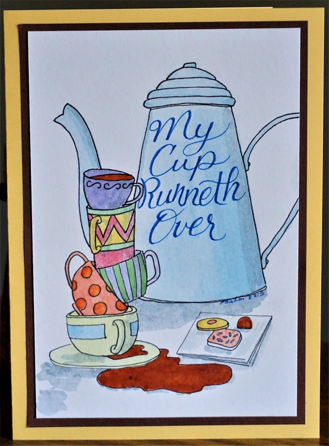
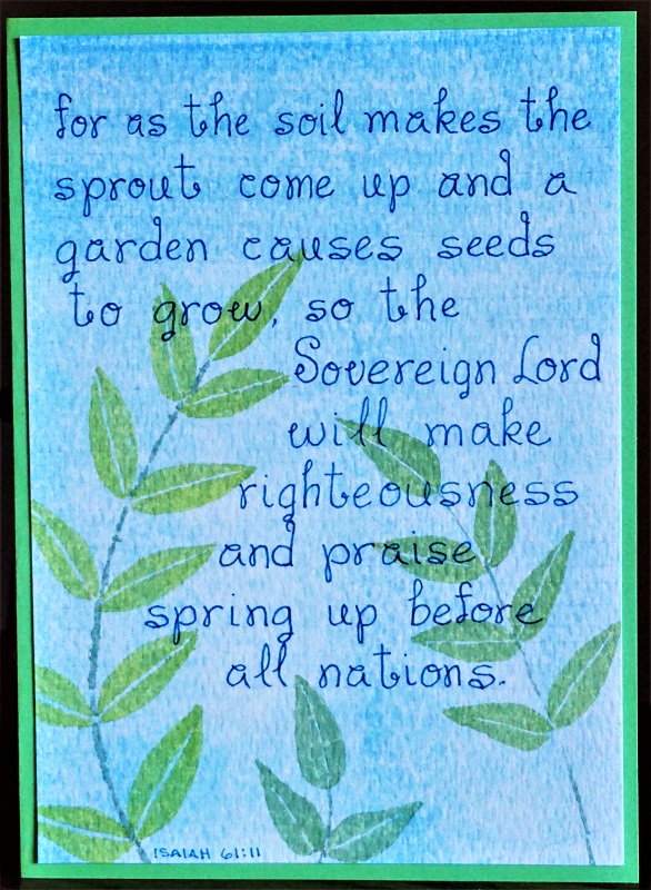
Topic: Bible Journaling
I am back-dating this post to the date the lettering class actually finished. I was away for a while and had no access to my computer or blog to do it at that time.
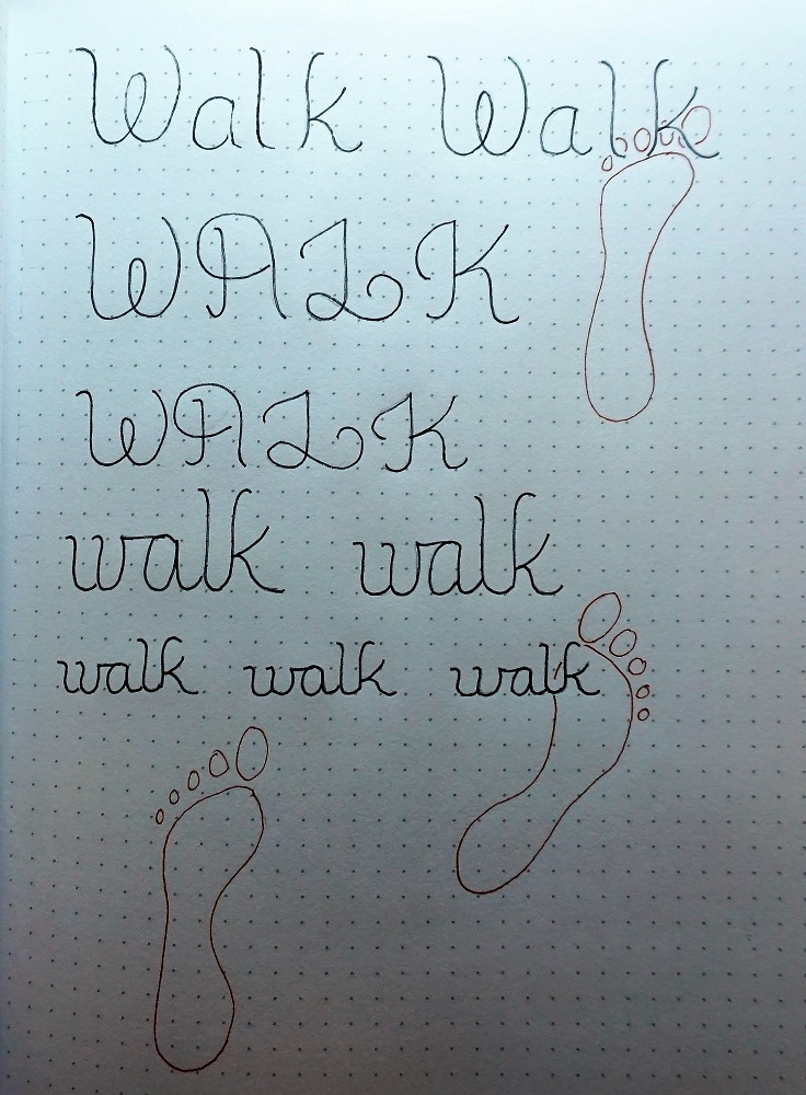
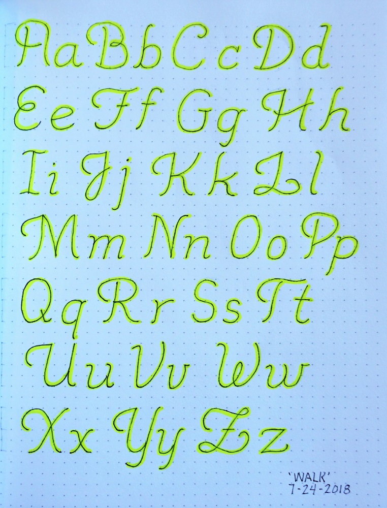
Another lettering class is in the books over on the Creative-Bible-Journaling Facebook site. This week we worked with a very novel style and the focus word 'protect'. Here are the lessons:
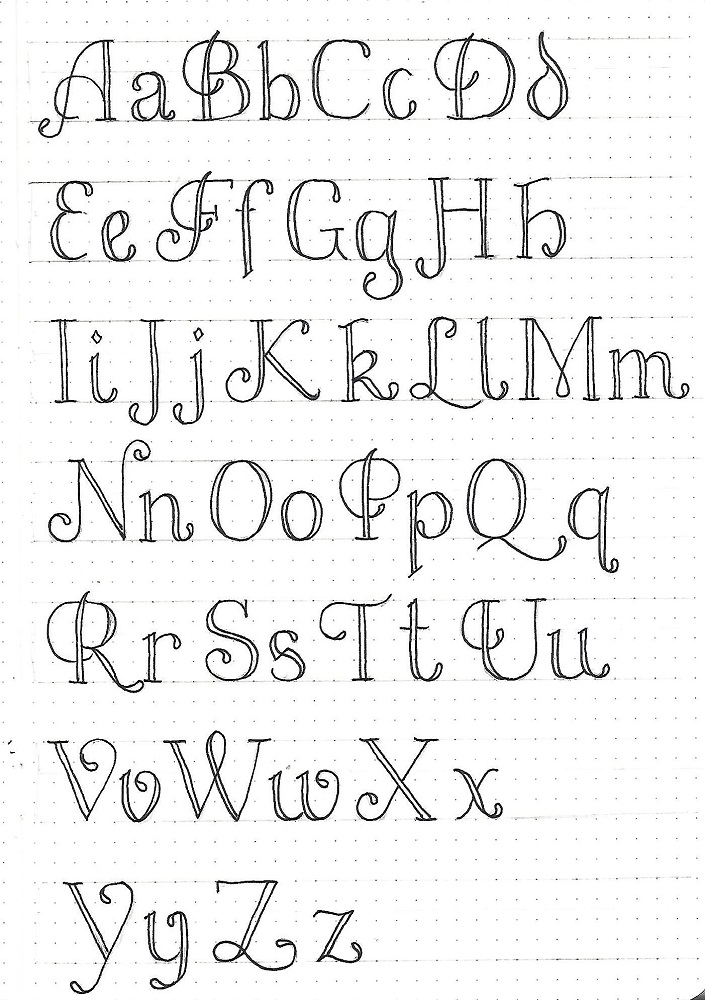
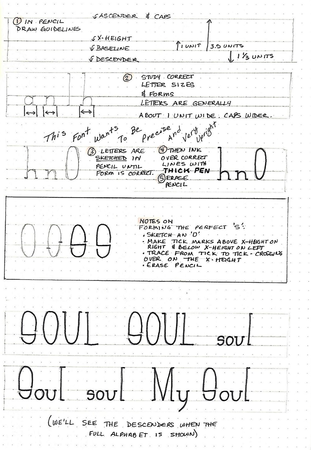
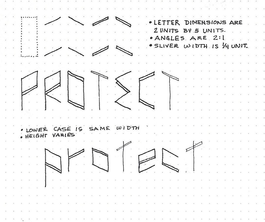
PROTECT FONT – DAY 1 – INTRODUCTION
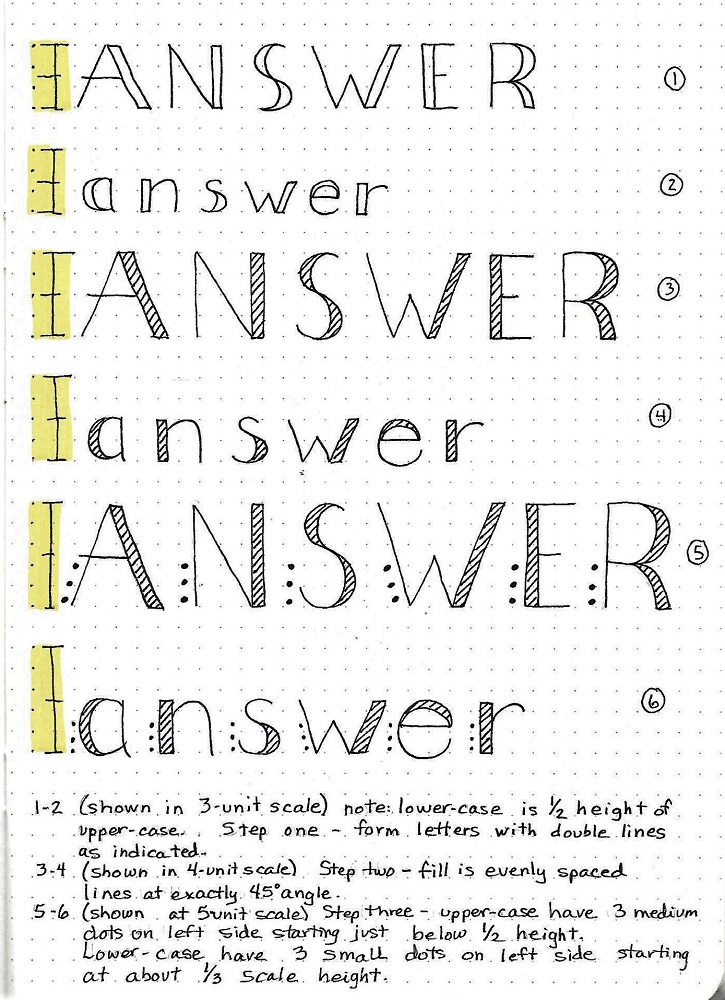
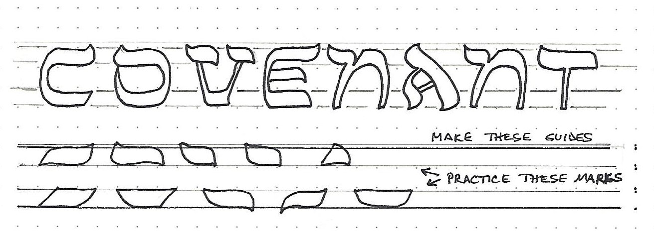
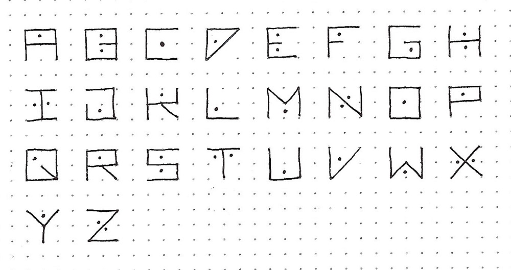
This week we are learning a novelty print with angles and double lines. There are no curved lines.
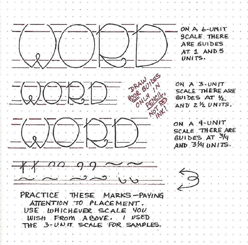
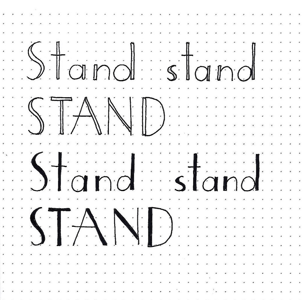
The capitals are 2 units wide and 5 units high. The lower case is the same width but the height varies.
There are no truly horizontal lines in this font. The angles on the ‘horizontal’ slanted lines are 2:1 (with an exception for the capital E).
The double line, always on a slant (never a vertical), has a width of 1/4 unit.
Practice the angled lines first, including single and double lines, on both the upward and downward slants. Then go on to construct the letters.
Remember to work in pencil first, then ink your letters and erase the pencil.
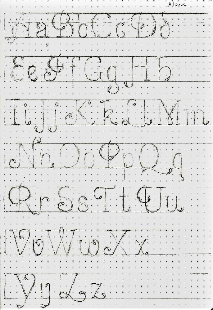
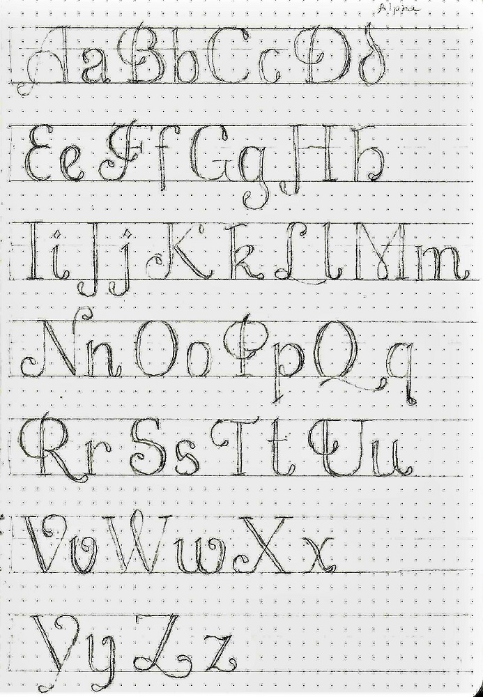
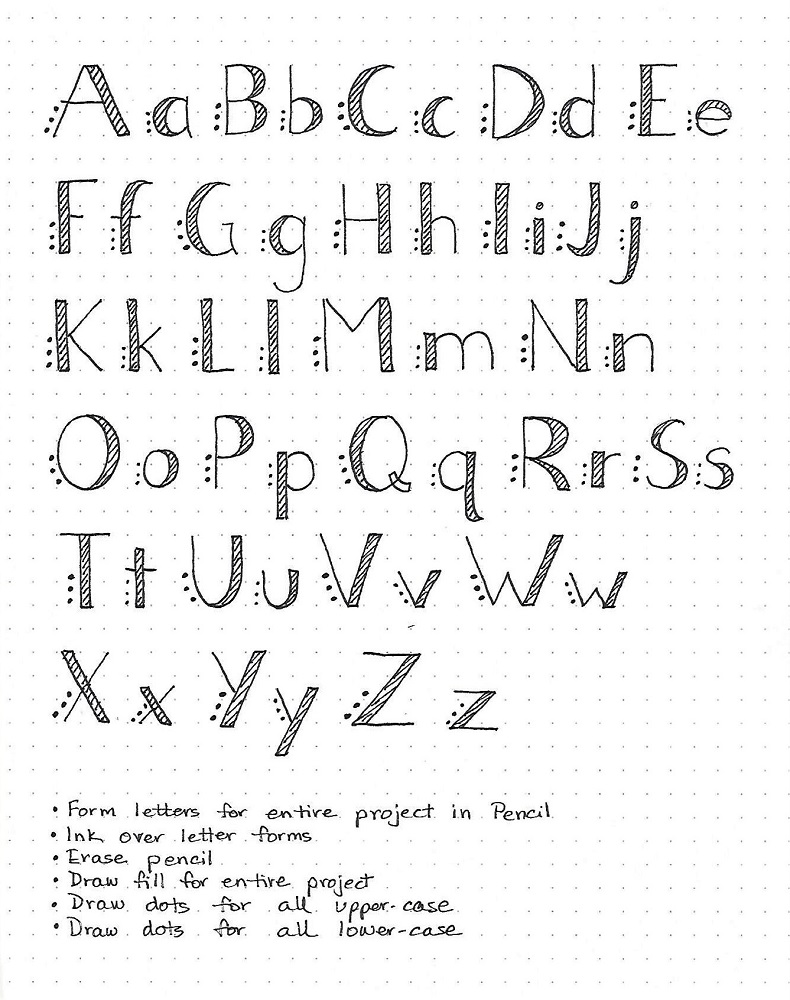
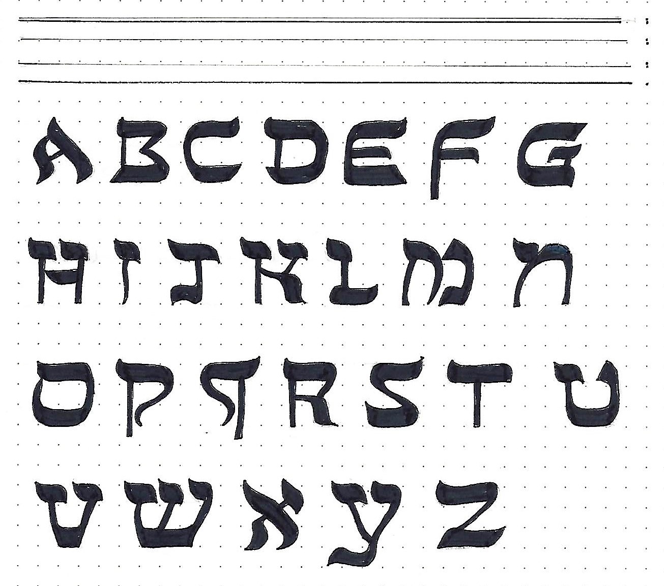
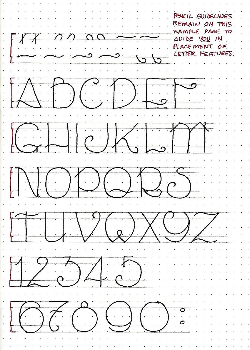
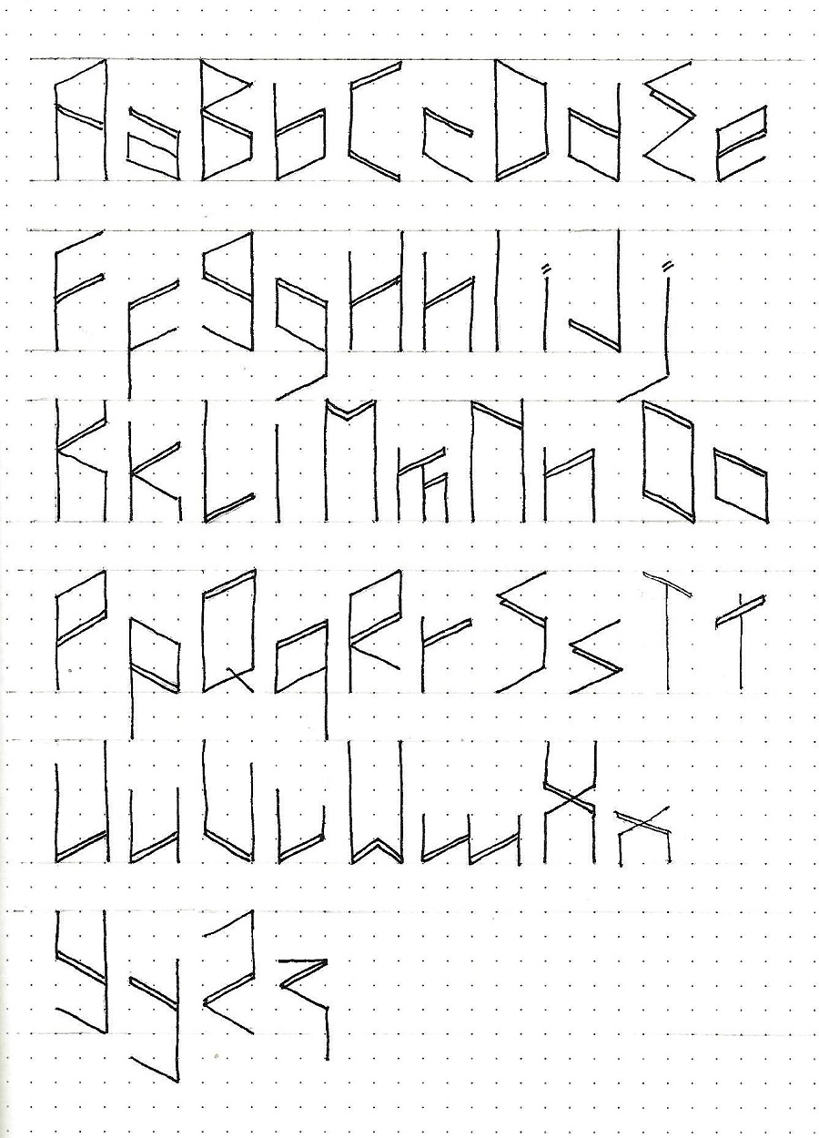
PROTECT FONT – DAY 2 - ALPHABET
Even in writing out this alphabet, you can see how context makes the letters make more sense.
All of the double lines are on angles, never on the vertical lines. You will note that the E and Q break the rules of angles slightly.
If YOU have a better idea for how to write a letter that still fits the styling of the rest of the alphabet, please share!
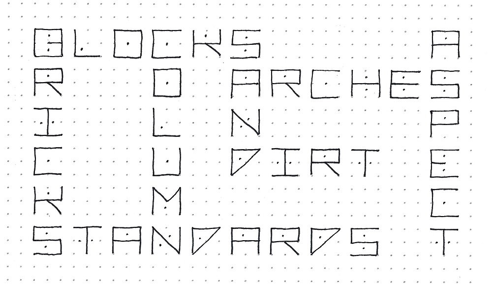
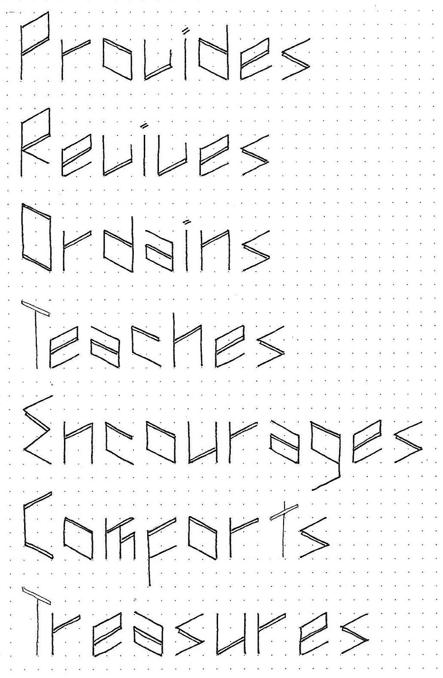
PROTECT FONT – DAY 3 – FUN DAY
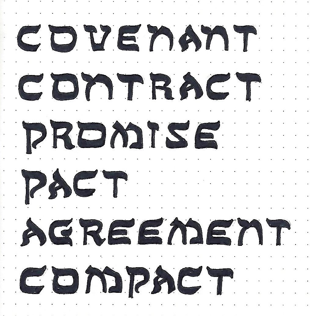
Today let’s use an anagram to list some ways that God protects us.
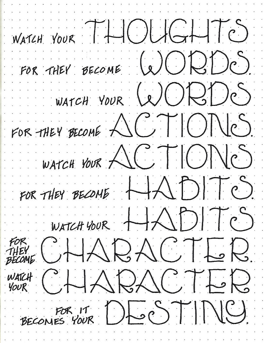
Note that the space between letters is generally 1 unit. However, when a capital is open on the side like the T in Teaches and Treasures a smaller lower-case letter can be tucked in close (in this case an ‘e’ and an ‘r’). The ‘s’ at the end of ‘comforts’ gets to snuggle in, too.
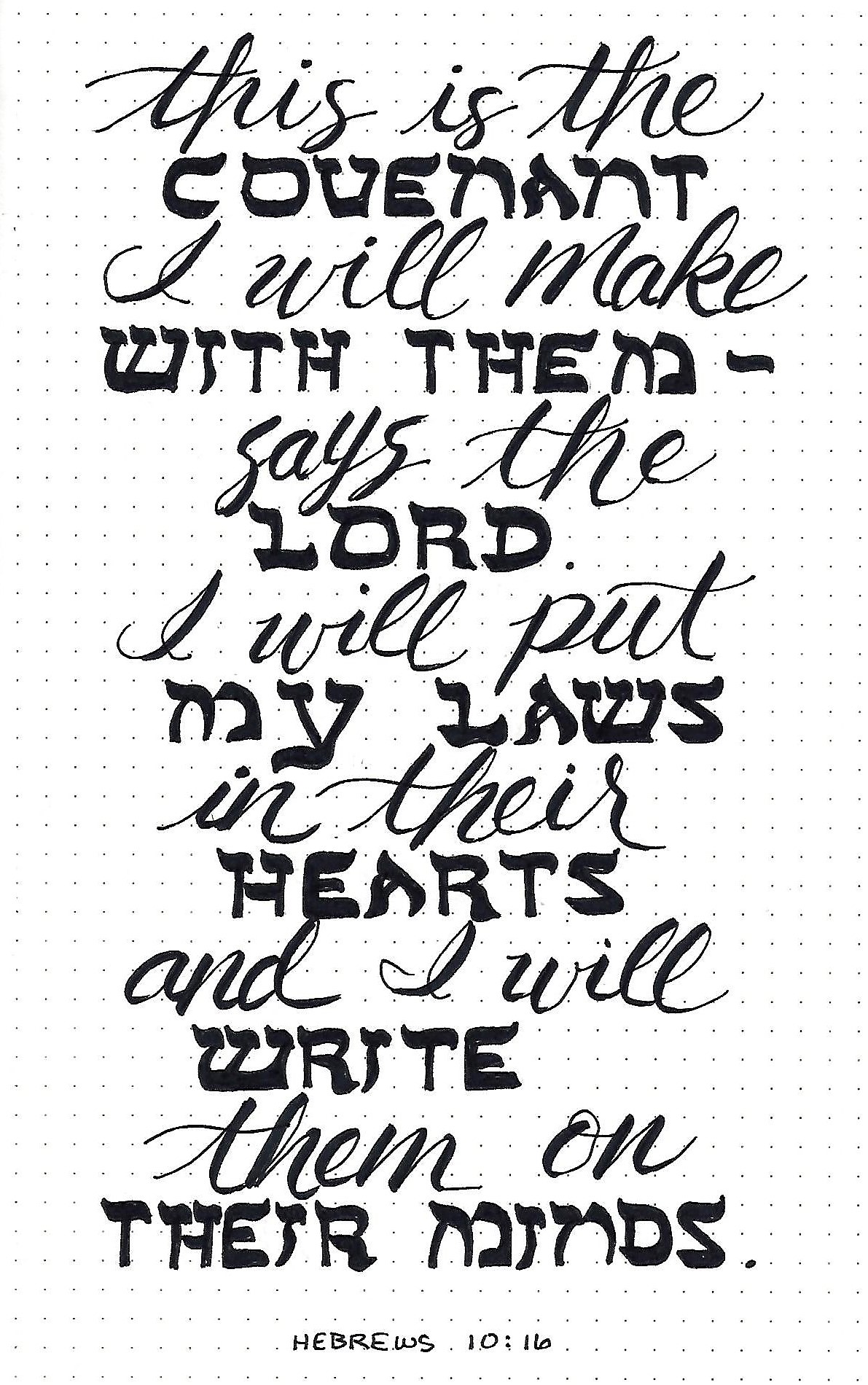
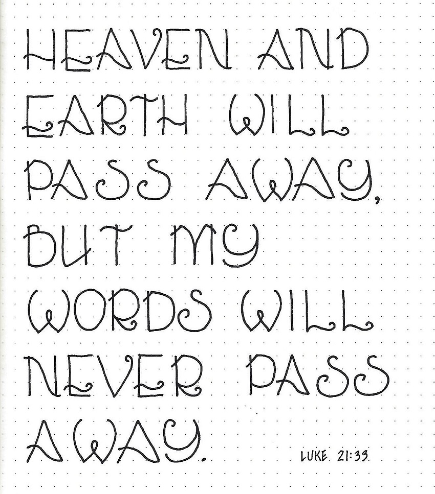
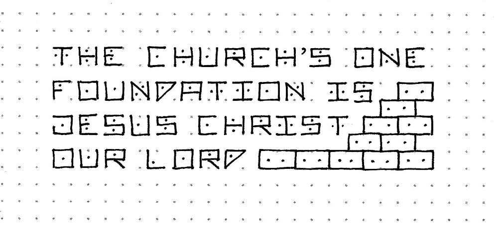
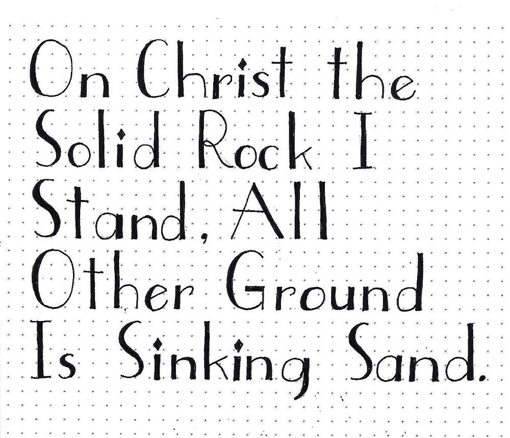
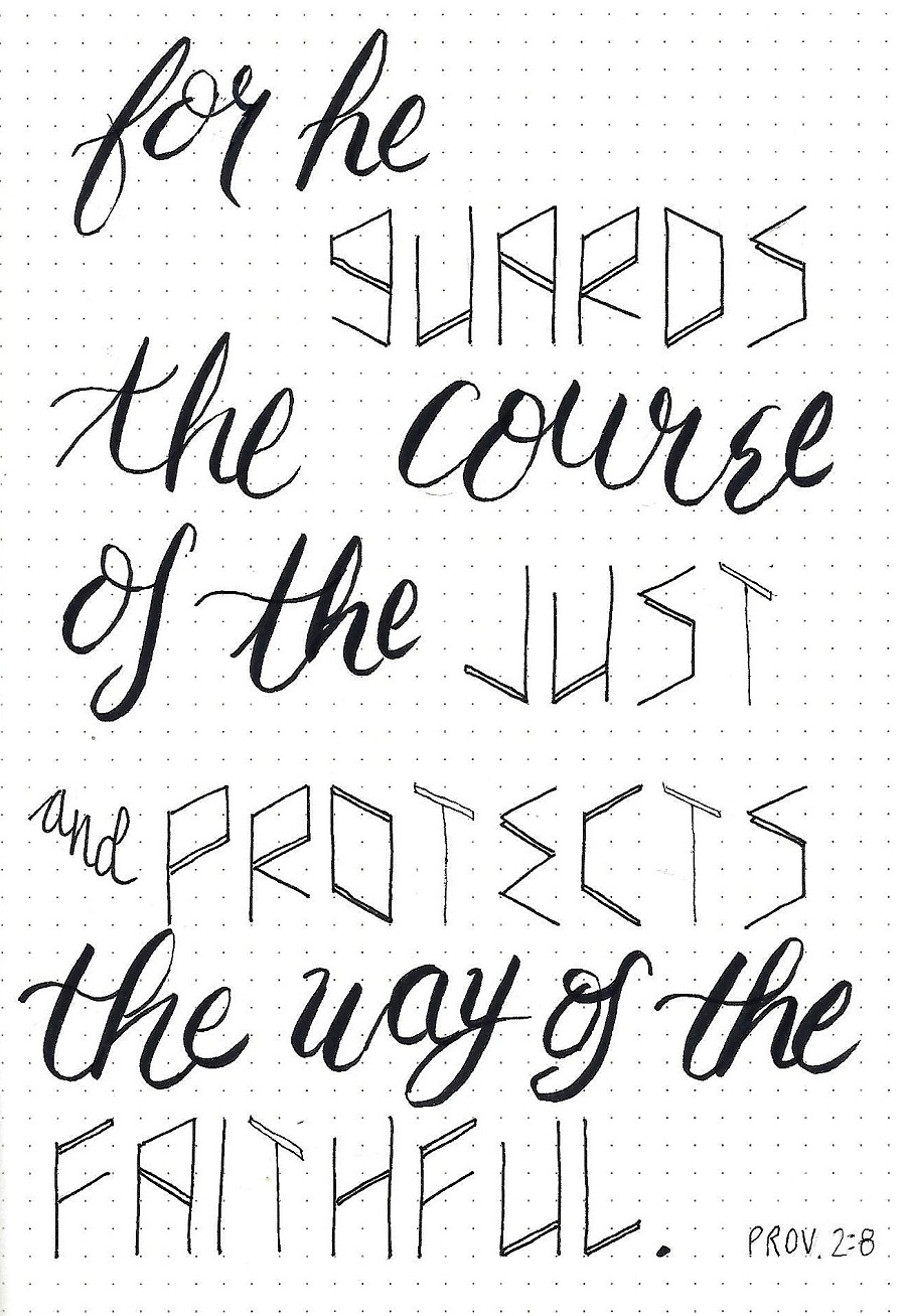
PROTECT FONT – DAY 4 – SCRIPTURE WRITING
For a longer scripture or other project, it is always perfectly permissible to join the new font with something completely different. The context of something easily recognized will assist in the ‘interpretation’ of the odd letter forms through context.
What do you think of this font? Be honest!
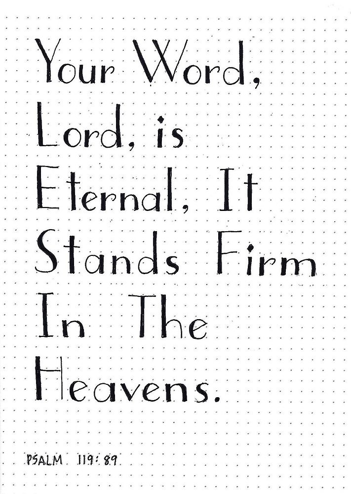
Give a try to writing scripture with the word ‘protect’.
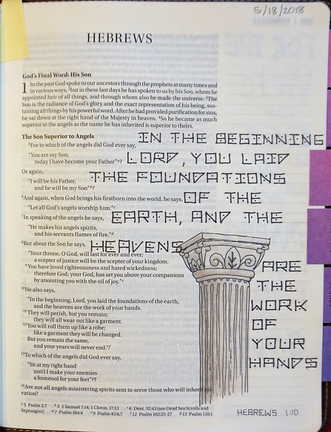
PROTECT FONT – DAY 5 – TAKE IT TO YOUR BIBLE
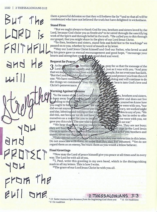
I decided to have a little fun with the focus word and imagined what you might find inhabiting a ‘hedge’ of protection! After I was done with the page, I wondered if someone might think I meant that this hedgehog was ‘the evil one’ referred to in the verse. Sigh…
Actually, there are no scriptures that actually use the term ‘hedge of protection’ in any translation. It’s more of something that has been handed down from one preacher to another. However, if you want a hedgehog of your own, visit the Drawing Room where he is featured this week. I’m kinda thinking the hedgie is the best thing about this page as, truthfully, I am really not sold on the ‘Protect’ font.
And there you have it!
Ddd