I'm Still Here
Topic: Bible Journaling
Time for another lettering lesson to use in Bible journaling. This is the series I taught last week at Creative Bible Journaling Facebook group.
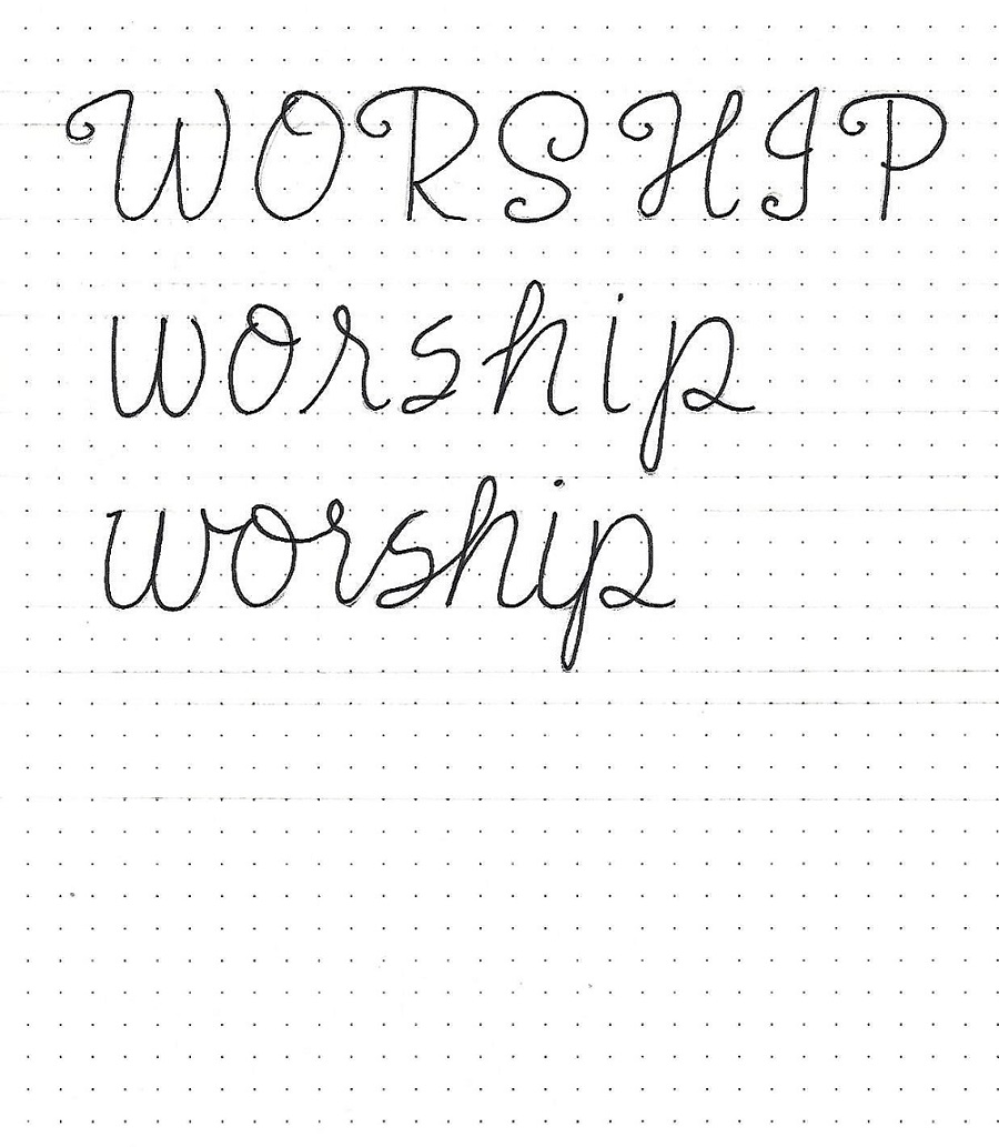
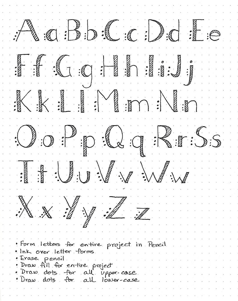
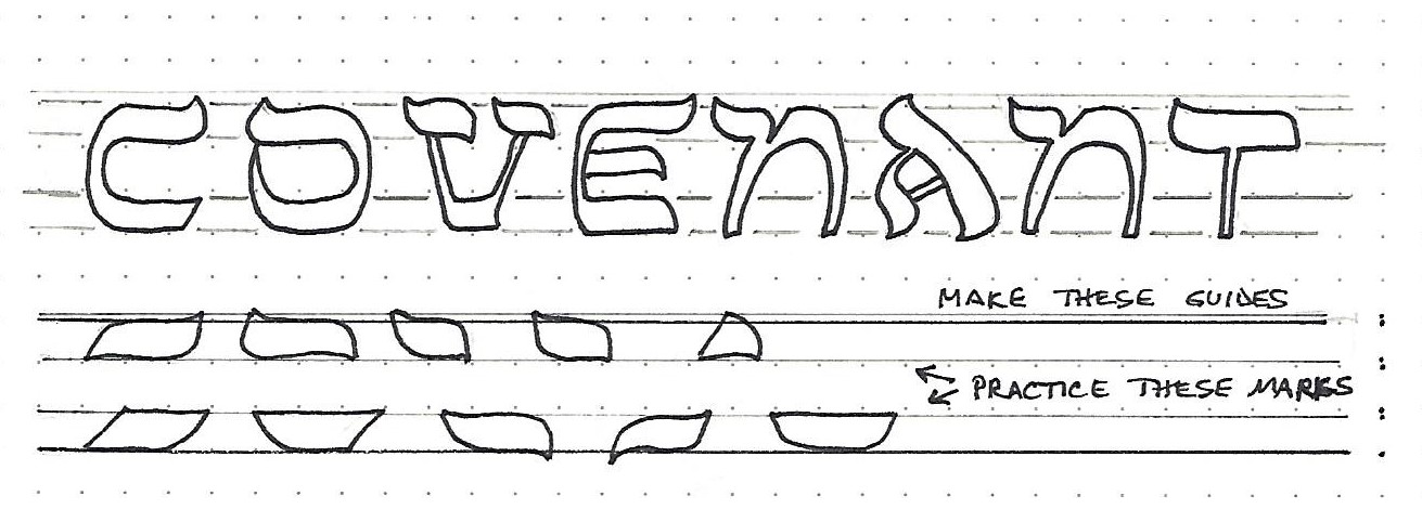
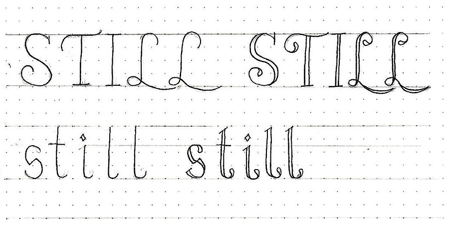
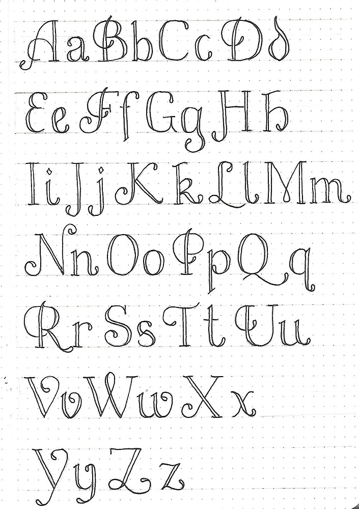
STILL FONT – DAY 1 – INTRODUCTION
Welcome to another week of Lettering Lessons. This time we will focus on the word ‘Still’ and use an upright formal print style.
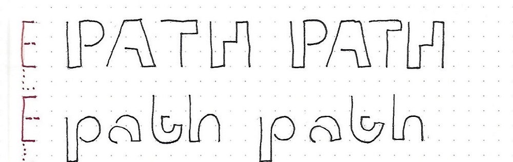
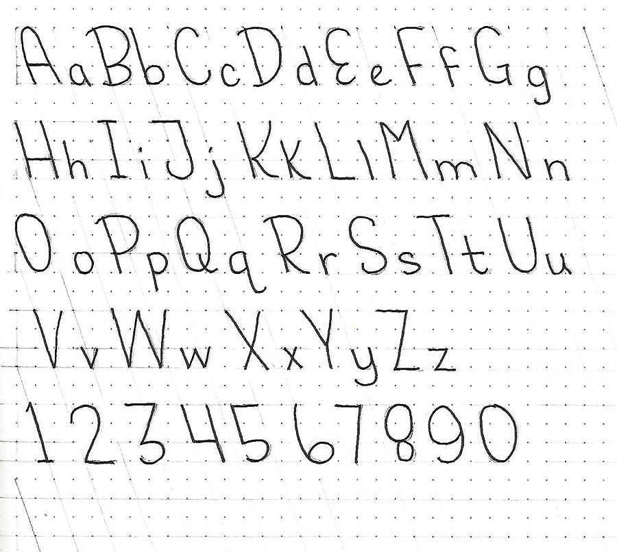
This font features double lines, teardrop ends and big sweeping curves. Watch the tops of letters that are plain as they may either have a chisel top or a serif. Some letters have bottom serifs and some end in teardrops. NOTE: If you think something is totally out of character, it is OK to change it to suit yourself.
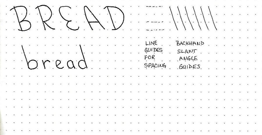
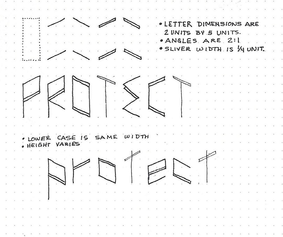
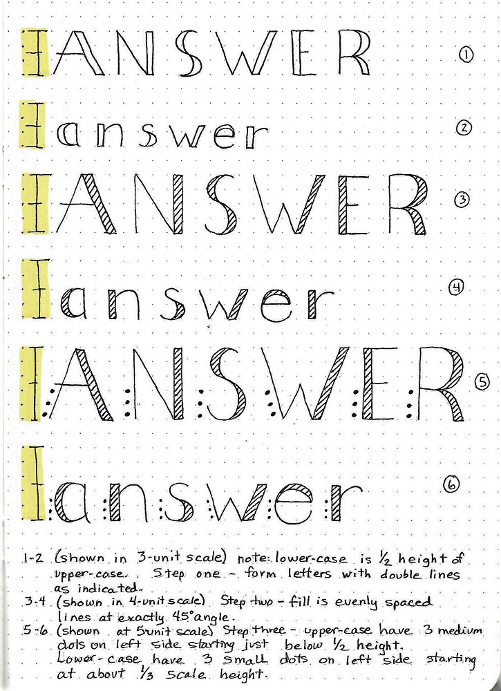
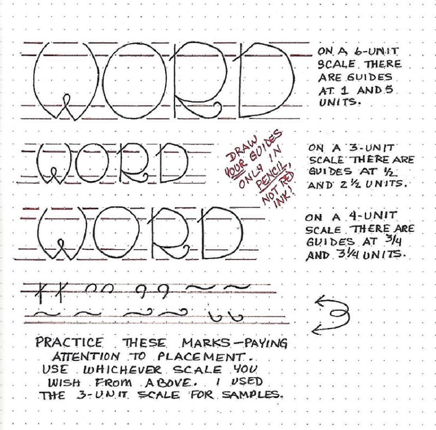
All of my samples are drawn on a 4-unit scale. The x-height for lower-case is at about the 2/3 mark.
To begin, you will pencil in your basic letters while concentrating on form and spacing (column 1 in the sample). Then, still working in pencil, refine the forms and add the second lines and teardrops (column 2). When the letters are just as you wish, ink them.
After the ink is dry, erase the pencil.
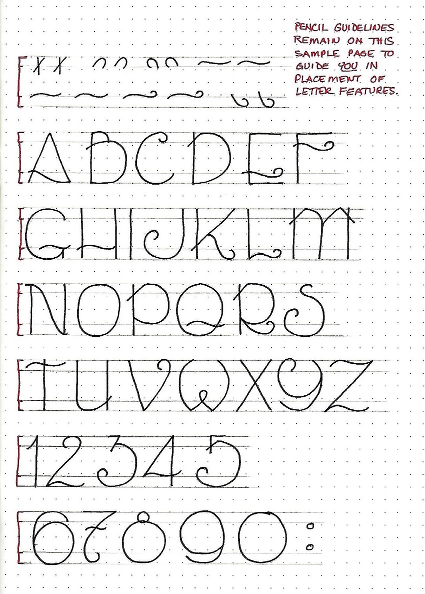
In the sample I have left the guidelines in place so you can see the relationships in letter size.
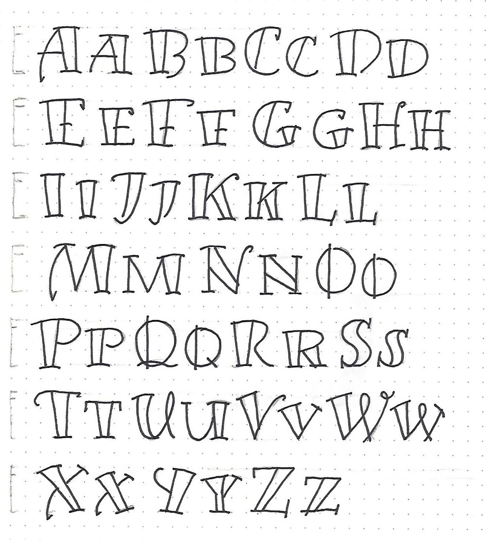
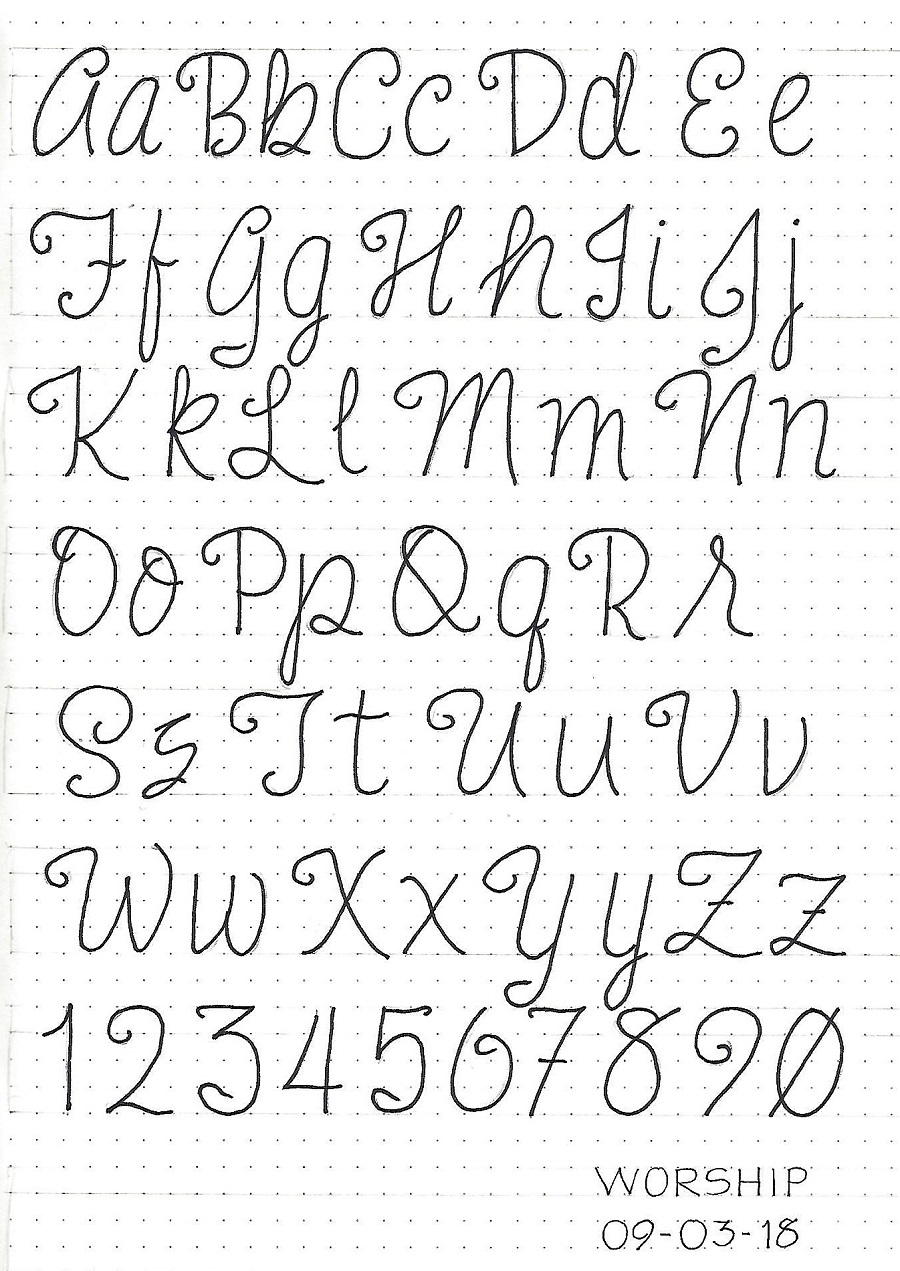
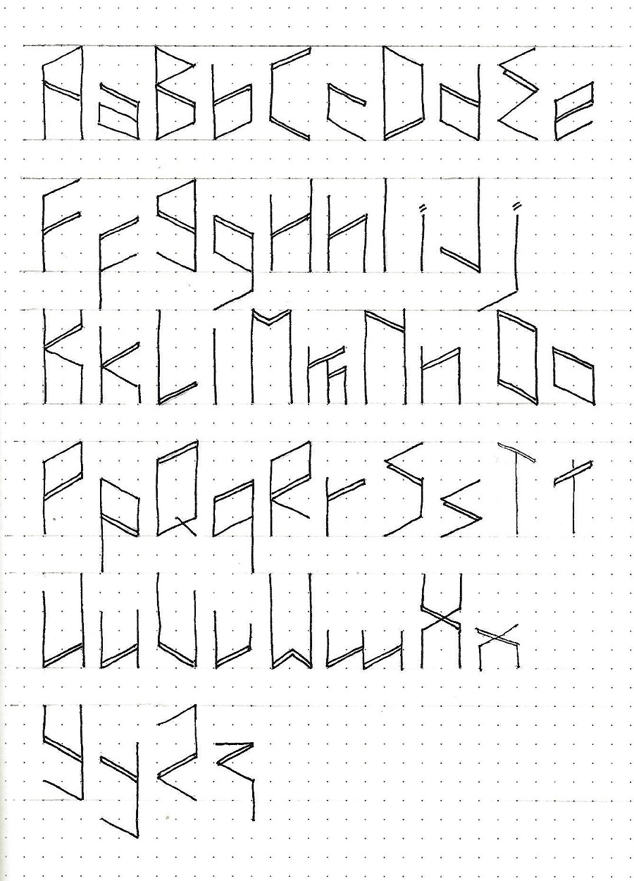
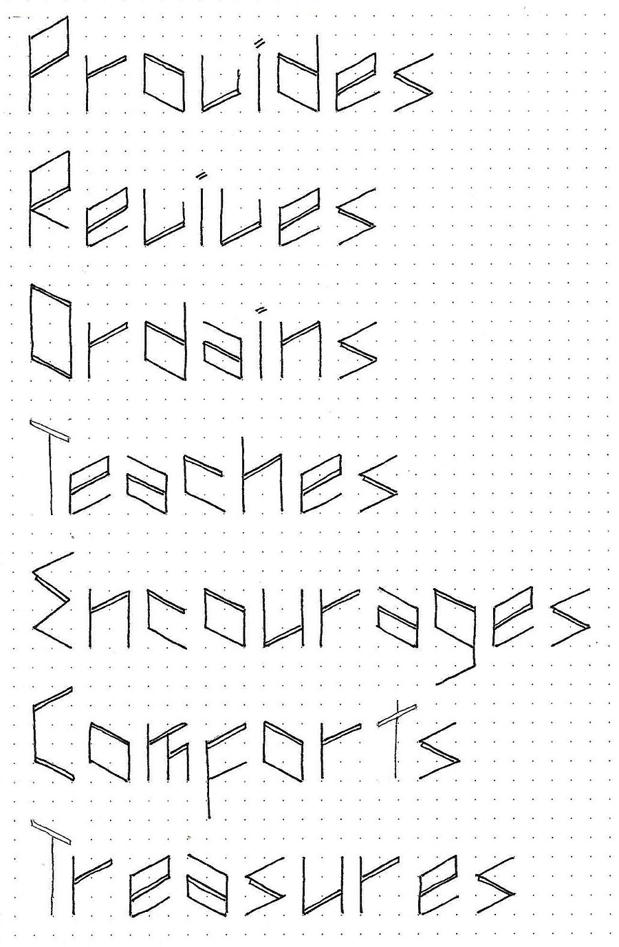
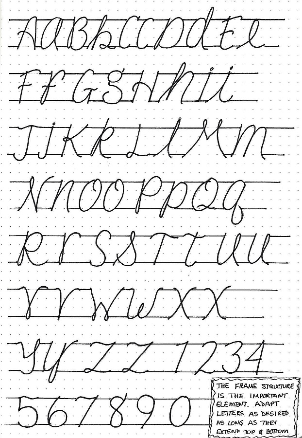
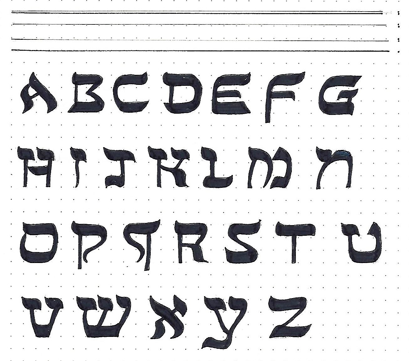
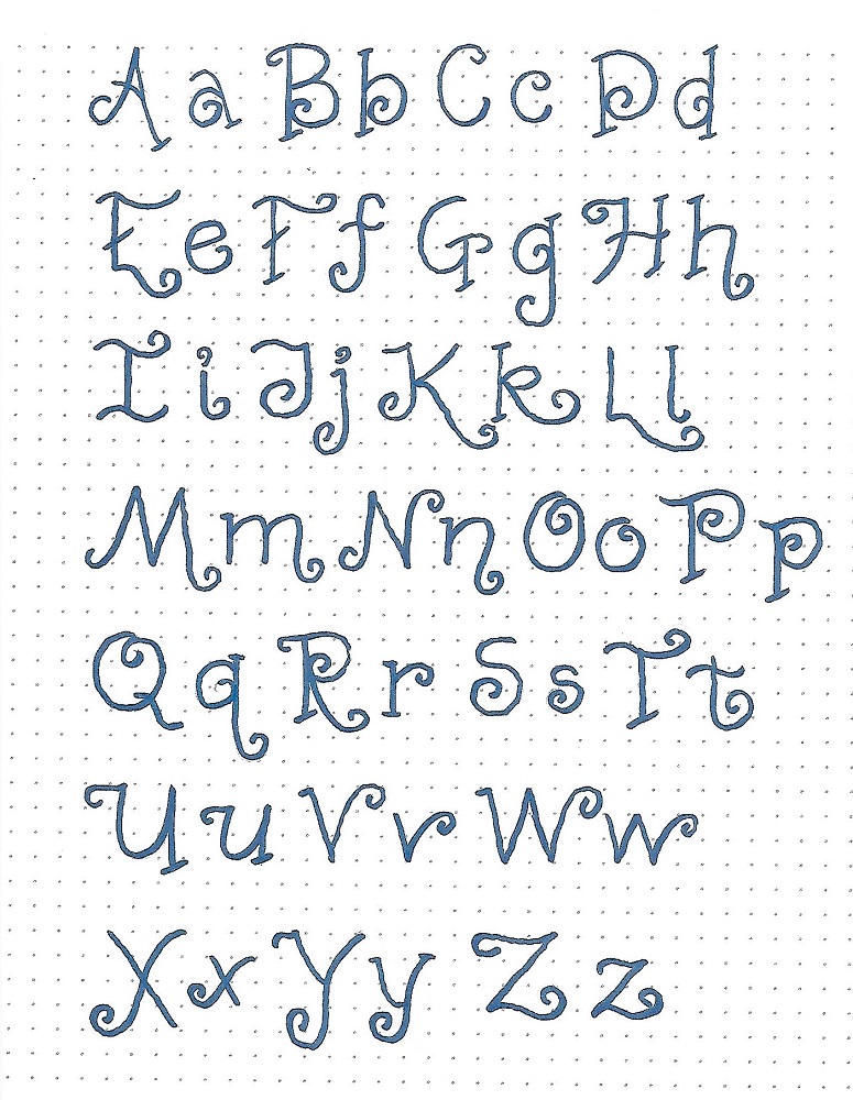
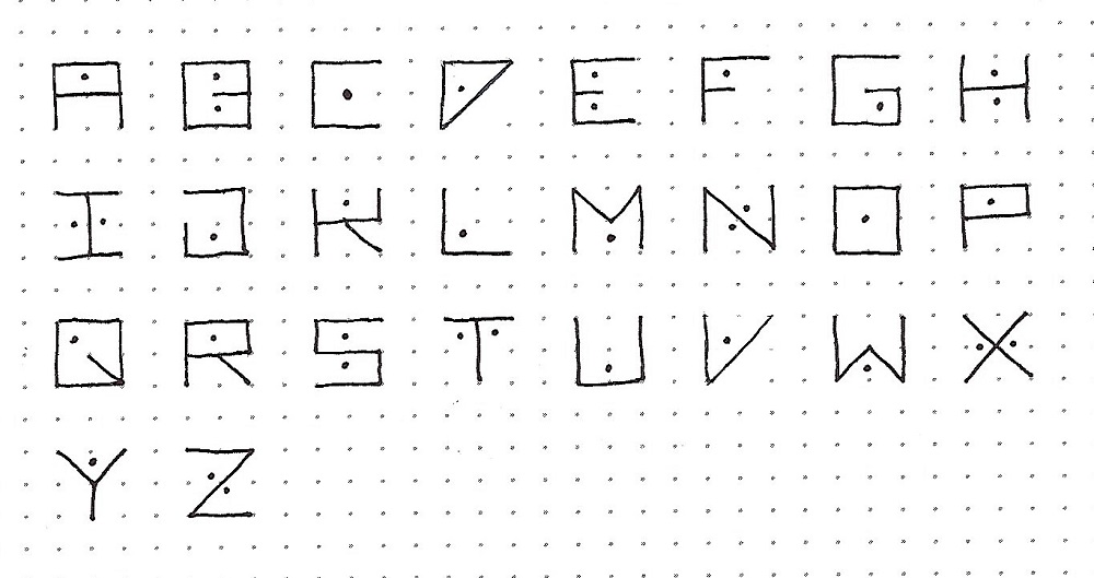
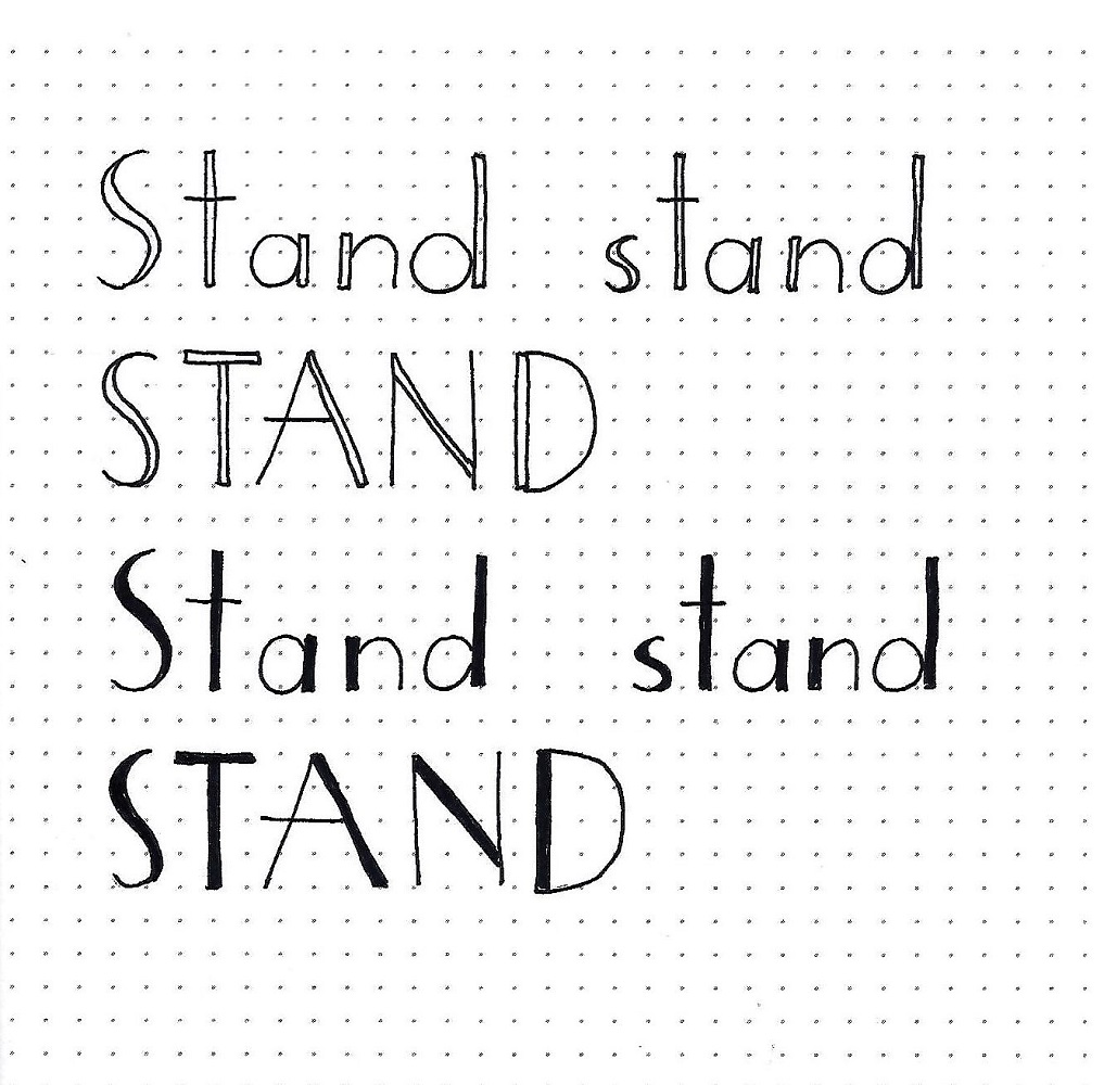
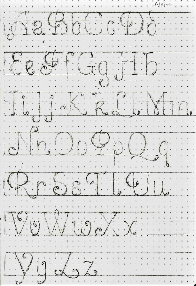
STILL FONT – DAY 2 – ALPHABET
Part 1 - Letter Formation
The lesson today is in THREE PARTS to better demonstrate the steps in recreating this letter form.
FIRST STEP: Draw guidelines. Then use pencil to sketch in your basic letter forms while focusing on form and spacing.
Now go on to step two.
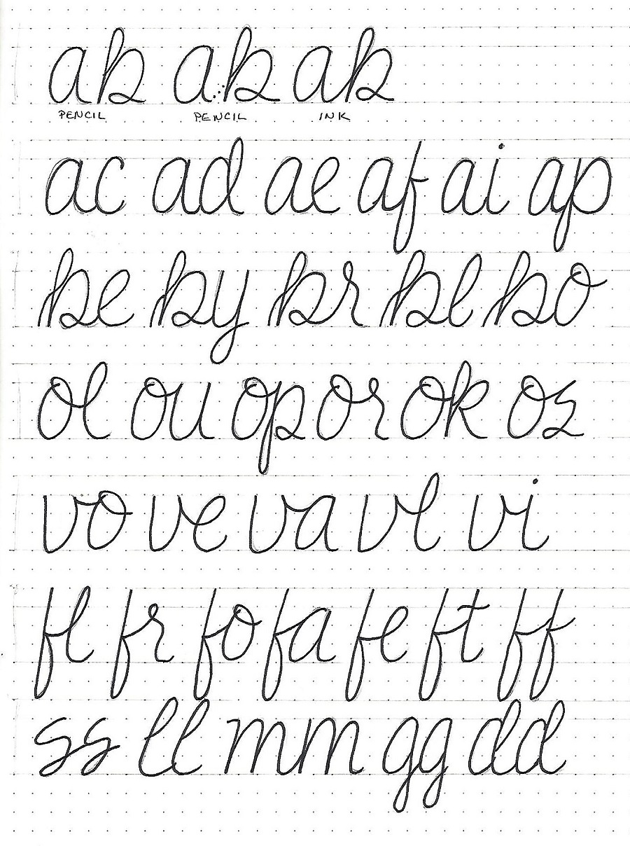
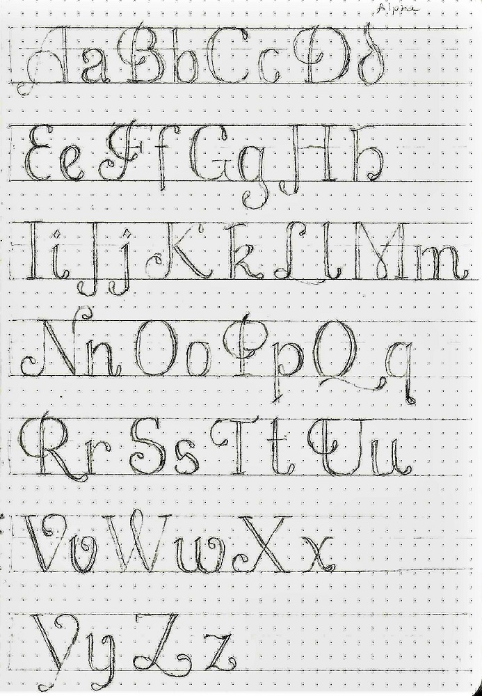
STILL FONT – DAY 2 – ALPHABET
Part 2 - Letter Definition & Details
The lesson today is in THREE PARTS to better demonstrate the steps in recreating this letter form.
SECOND STEP: On the same paper, still using pencil, refine the forms and add the second lines and teardrops.
Now go on to step three.
STILL FONT – DAY 2 – ALPHABET
Part 3 - Letter Inking Final Product
The lesson today is in THREE PARTS to better demonstrate the steps in recreating this letter form.
THIRD STEP: When the letters are just as you wish, ink them. After the ink is dry, erase the pencil. I leave the guidelines in place as it will refresh my mind when using the lettering on future projects.
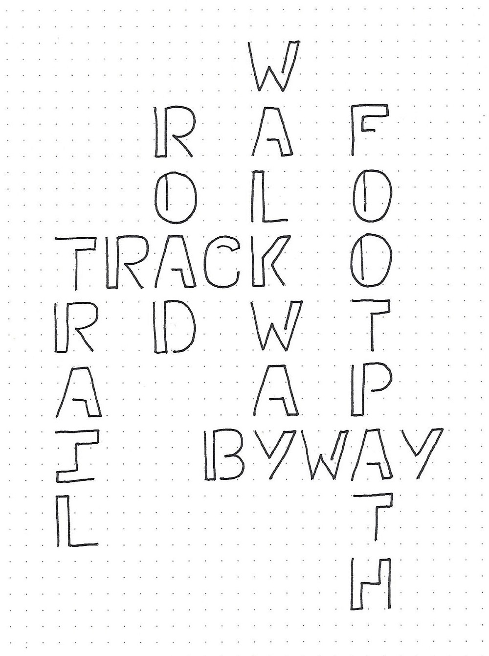
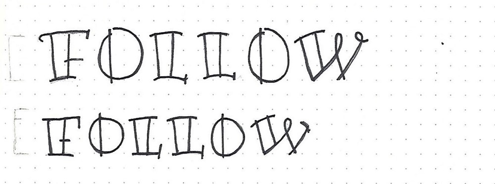
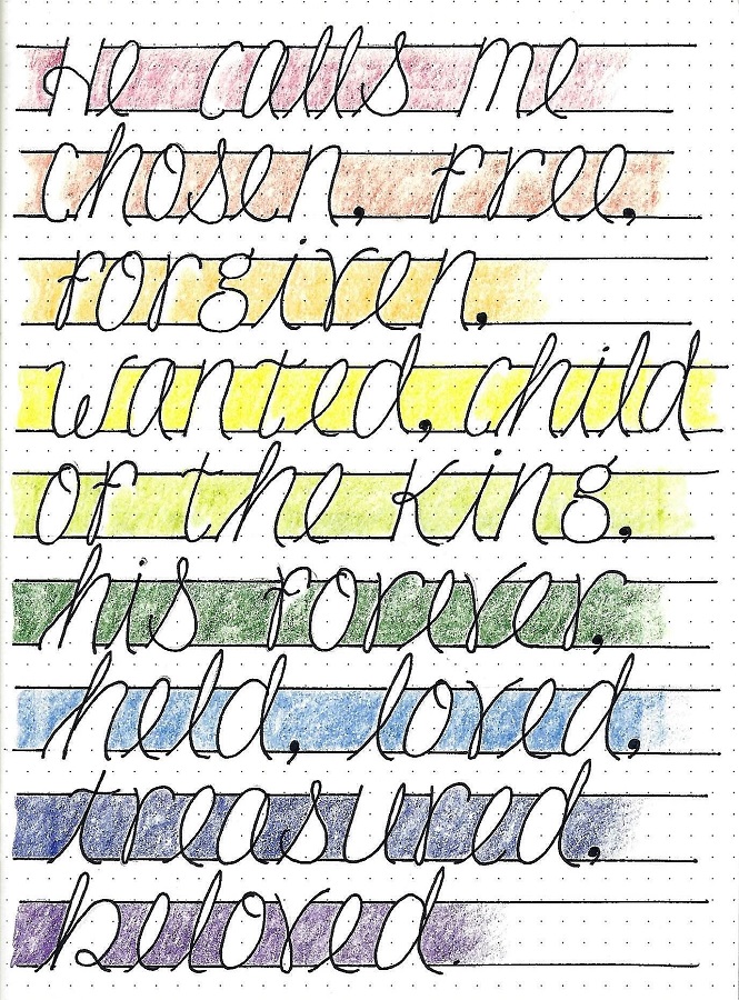
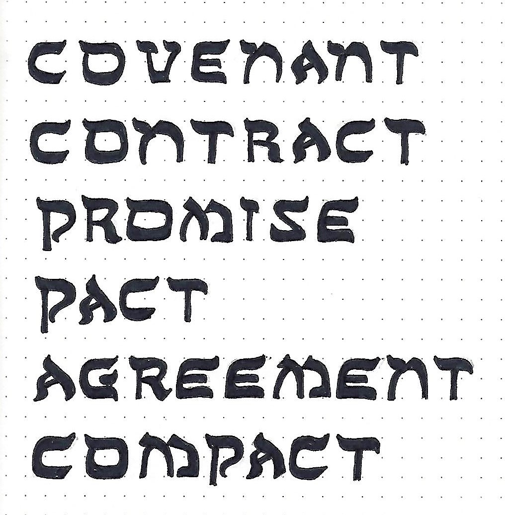
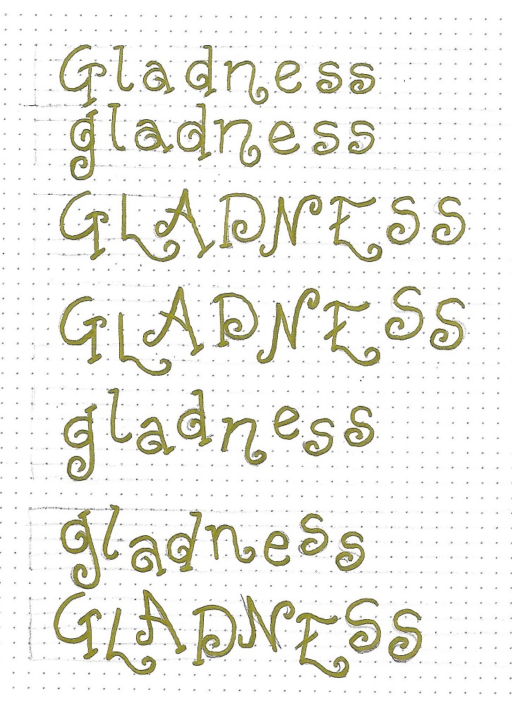
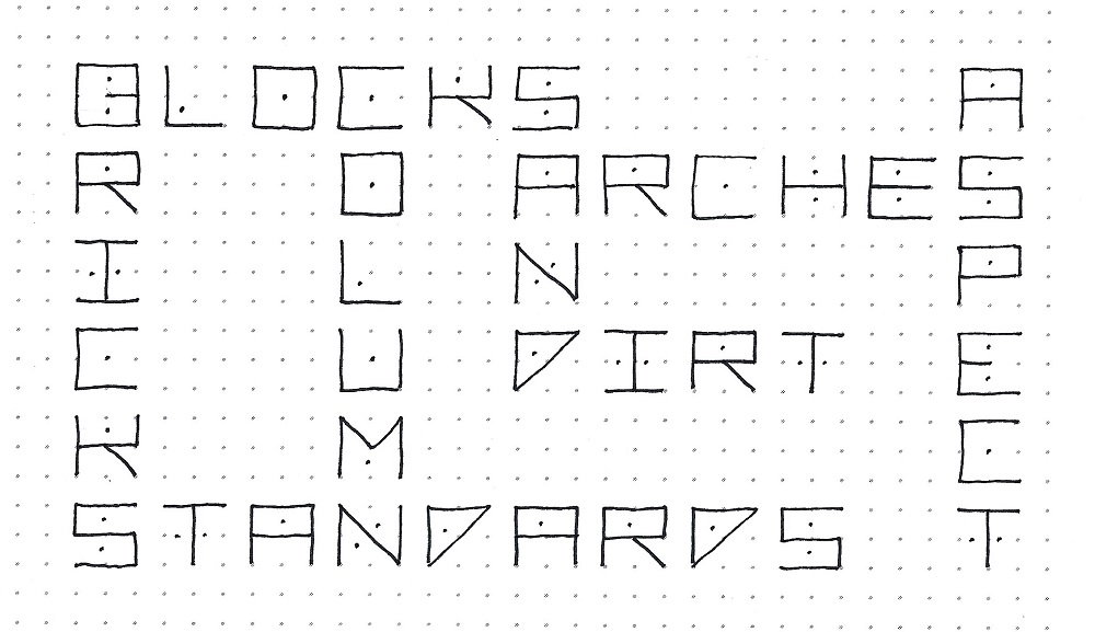
STILL FONT – DAY 3 – FUN DAY
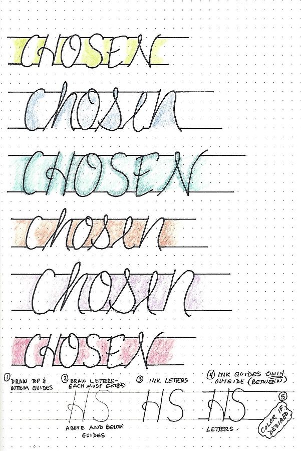
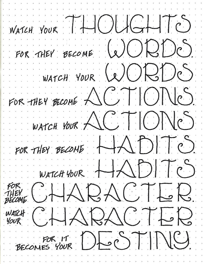
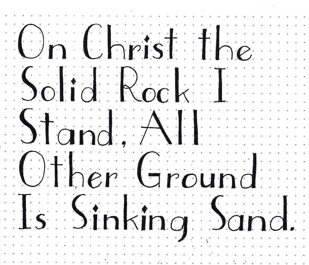
Let’s all select some song lyrics to write up using the ‘Still’ font. This way you get to practice writing the letters some more but you are also going to get to see how beautiful this font is when used on words instead of just writing out the alphabet.
You may wish to use a larger or smaller size guidelines to practice letter formation in a different scale.
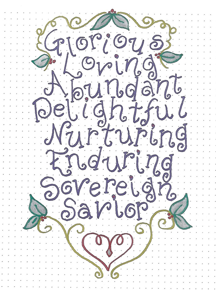
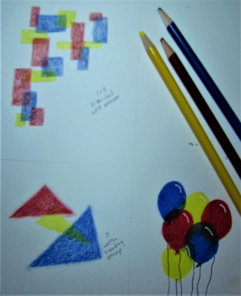
Although this font is designed to remain ‘open’ you might wish to experiment with adding color between the double lines. I wouldn’t fill in the area entirely in black, however, as you lose so much of the elegant character that way.

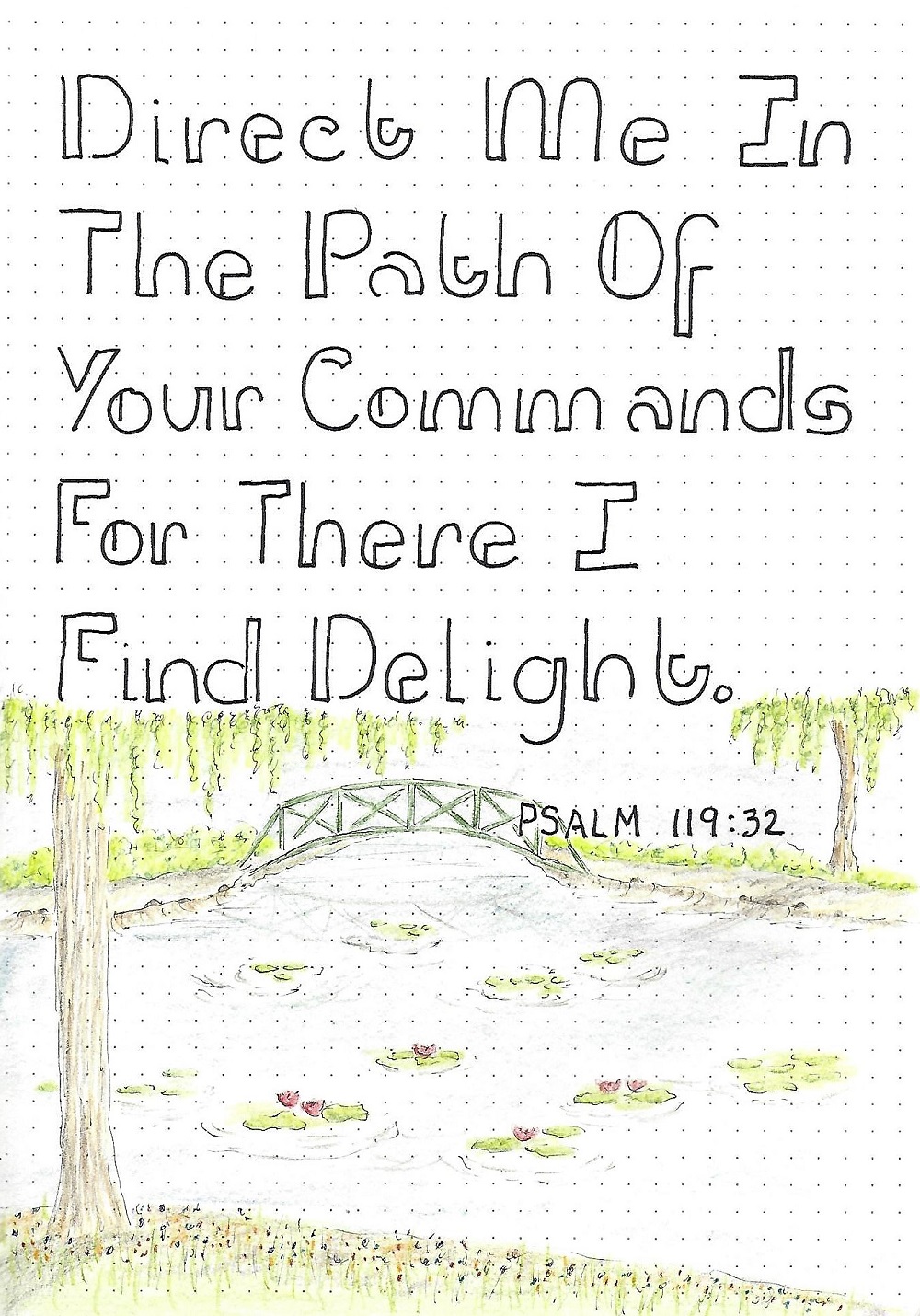
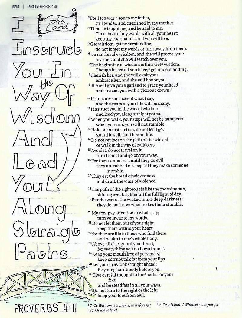
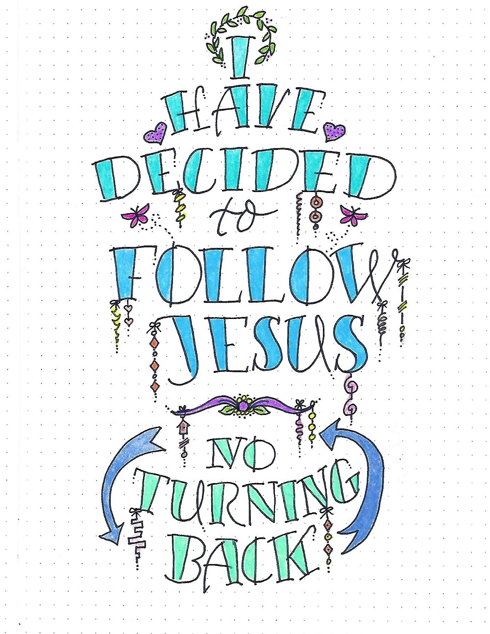
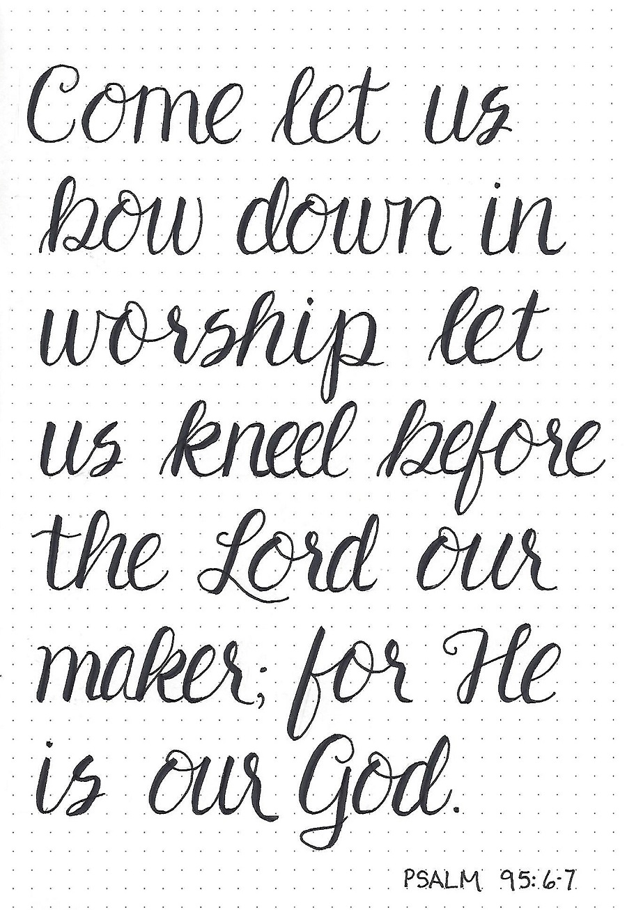
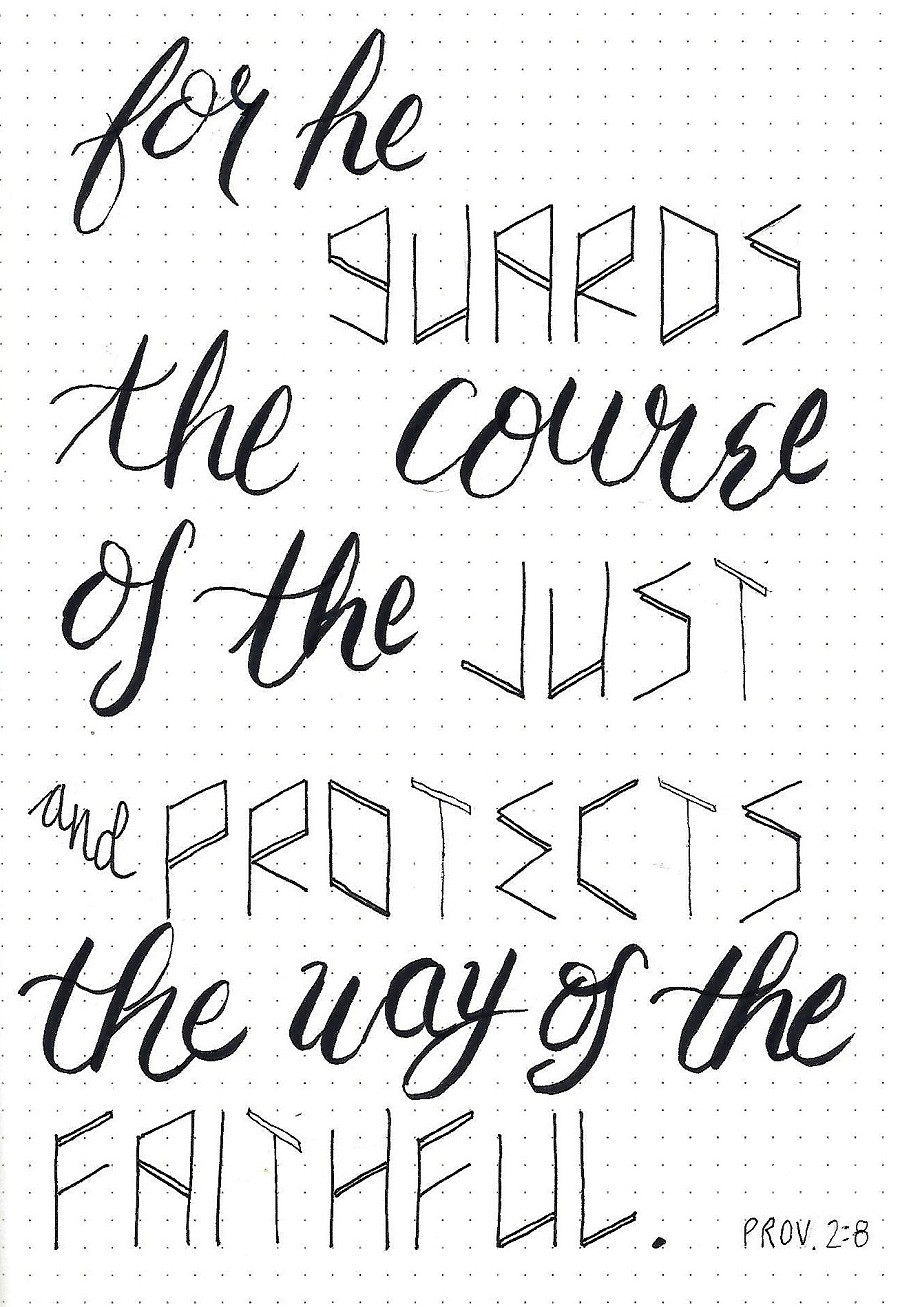
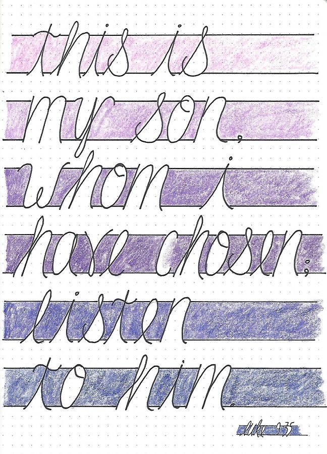
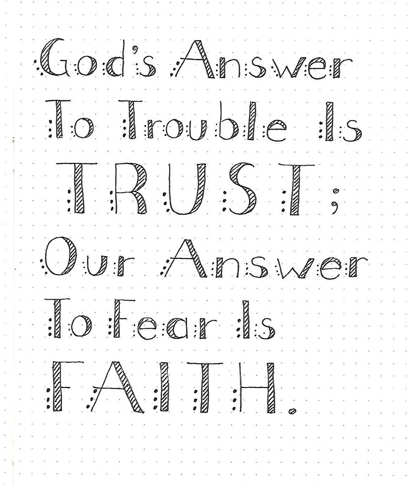
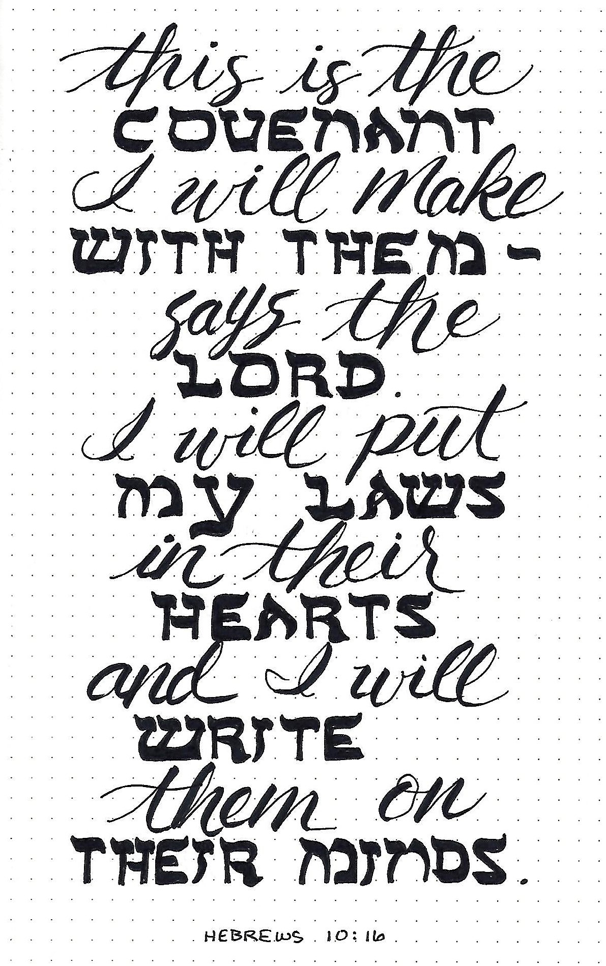
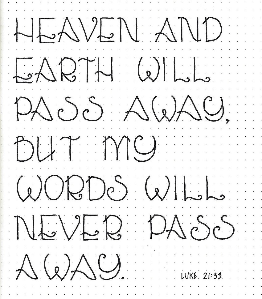
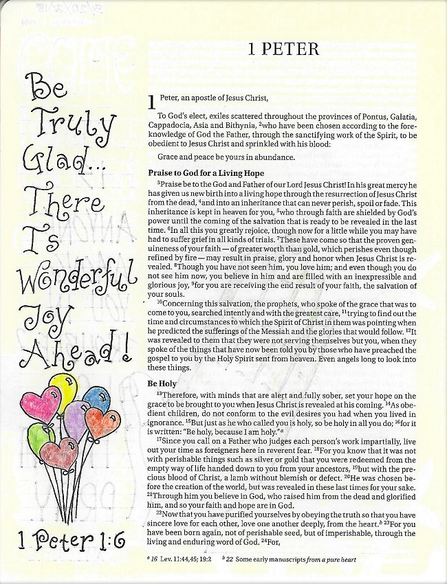
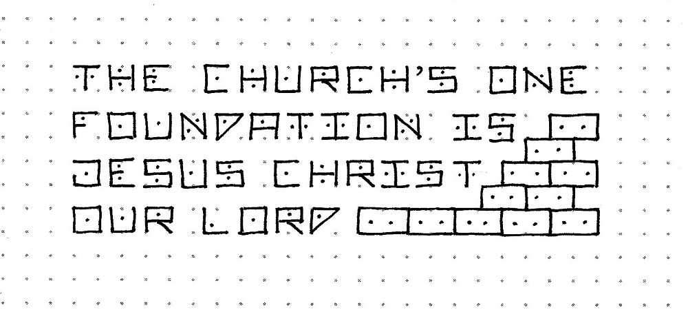
STILL FONT – DAY 4 – SCRIPTURE WRITING
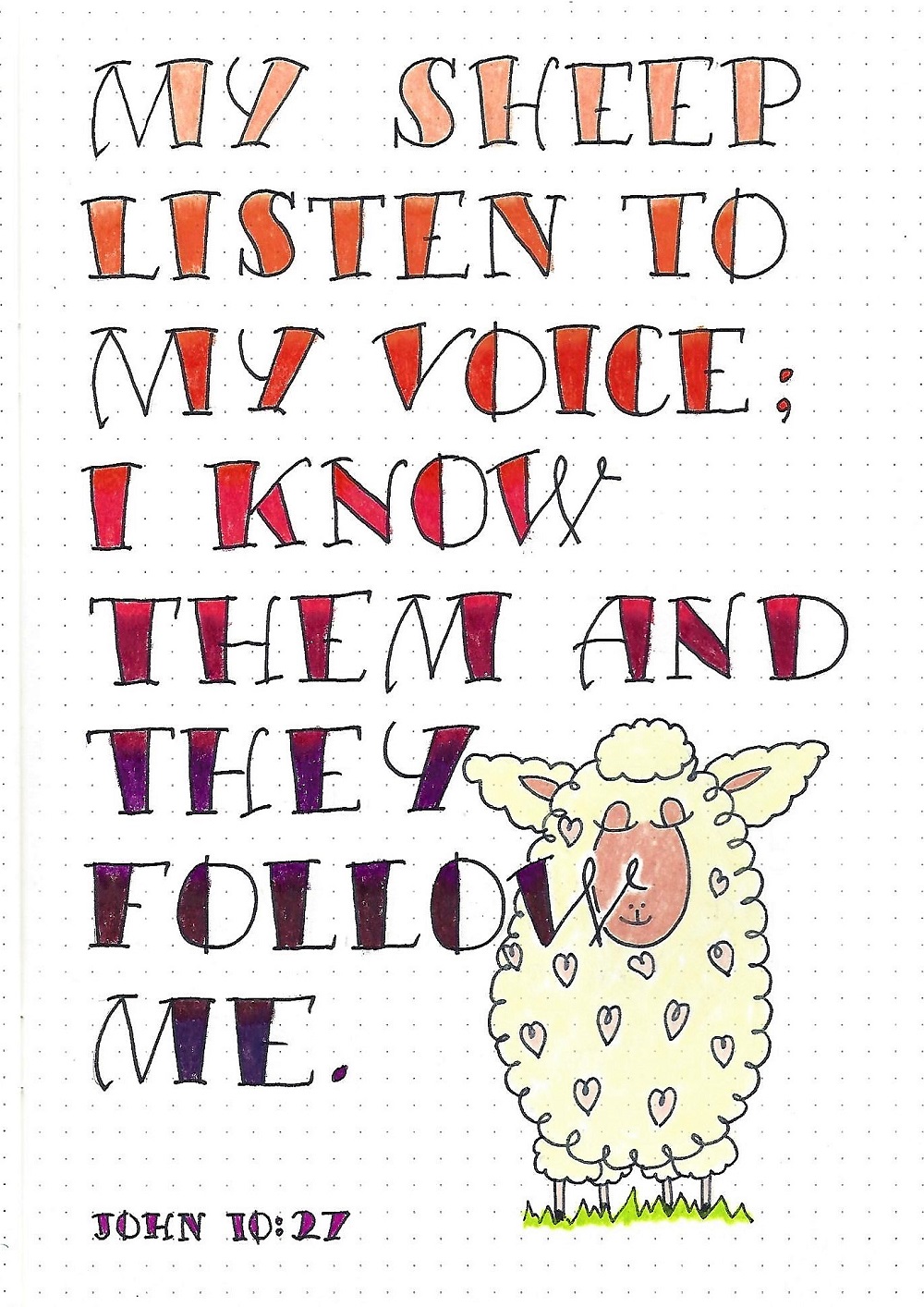
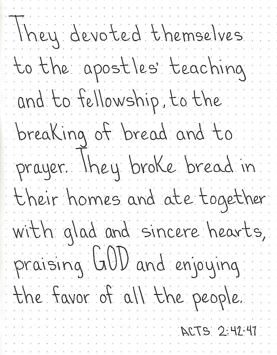
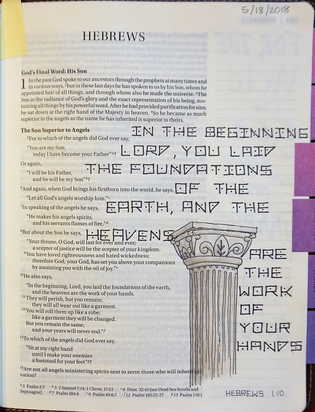
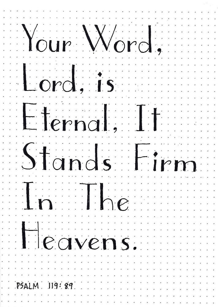
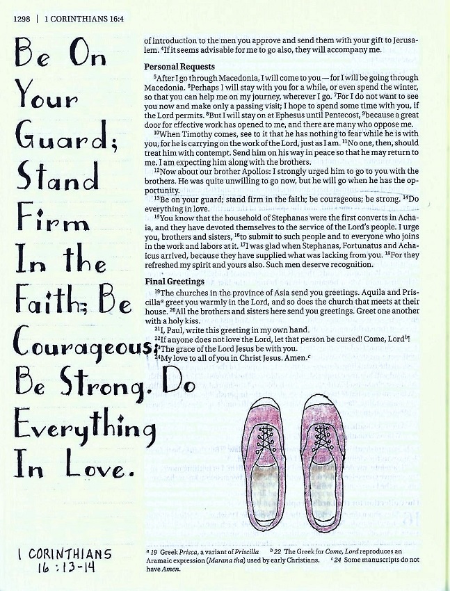
As always, on day 4 of Lettering Lodge we are going to use the new font to write a scripture with the focus word ‘still’.
As I usually do, I used upper-case for the initial letter on every word as I think it looks more like a display piece this way and I get more practice in on the beautiful capitals.

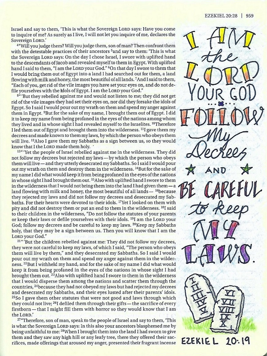
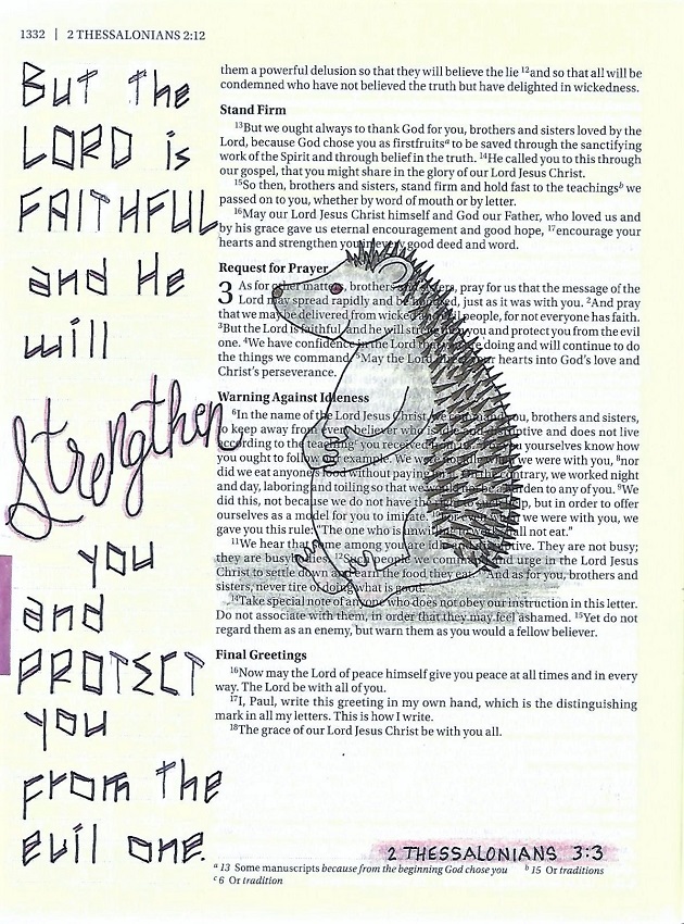
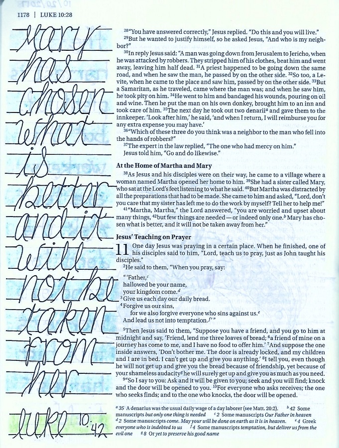
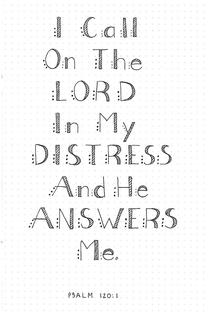
STILL FONT – DAY 5 – TAKE IT TO YOUR BIBLE
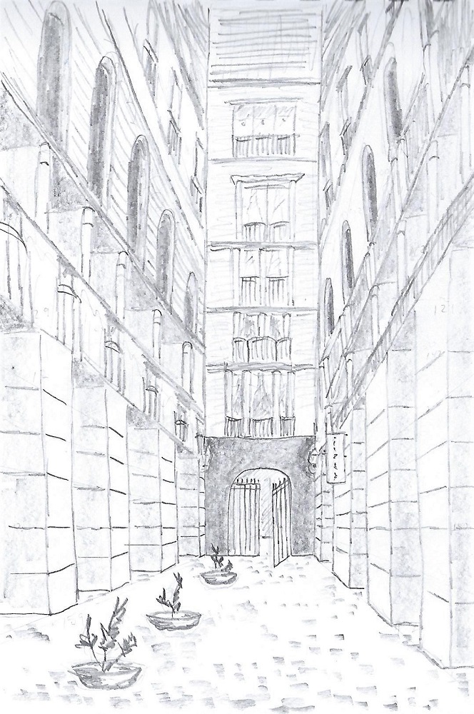
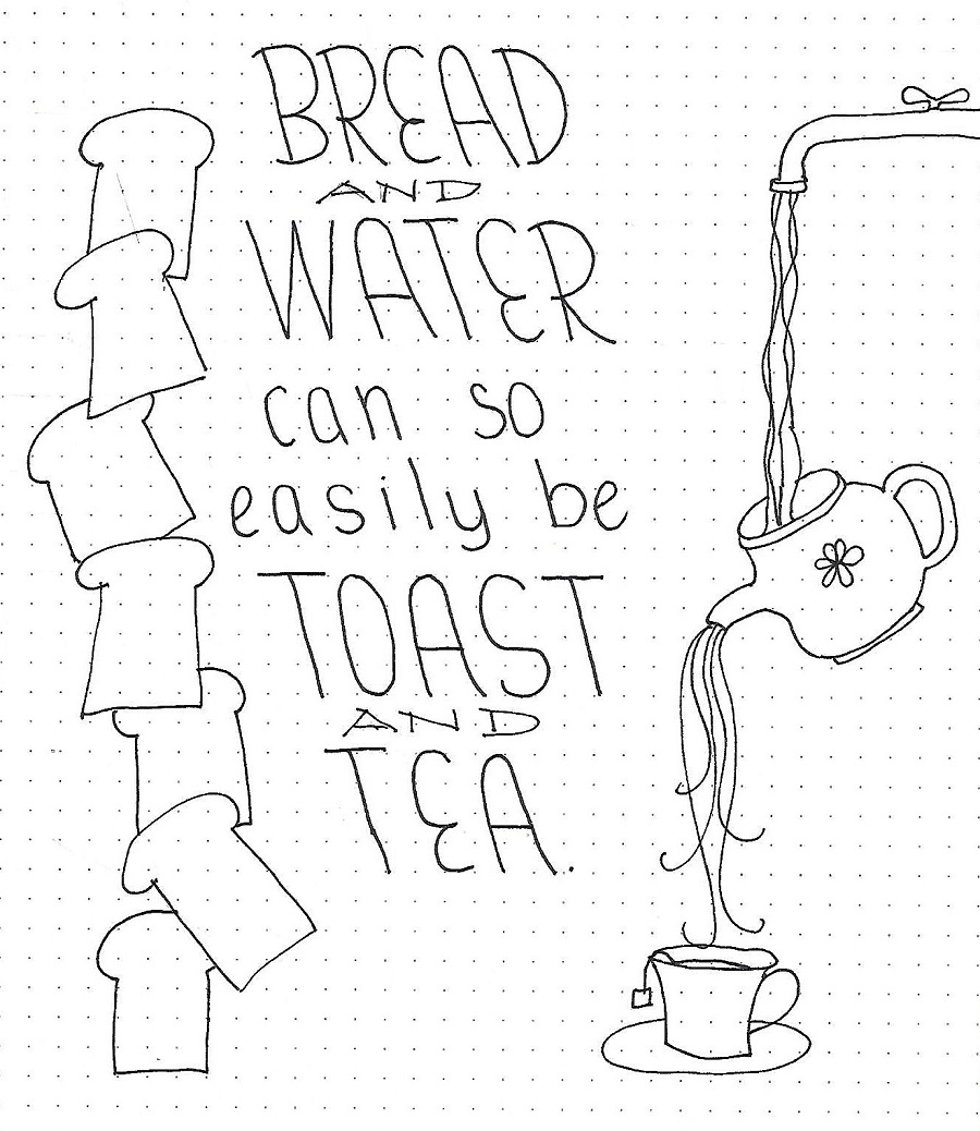
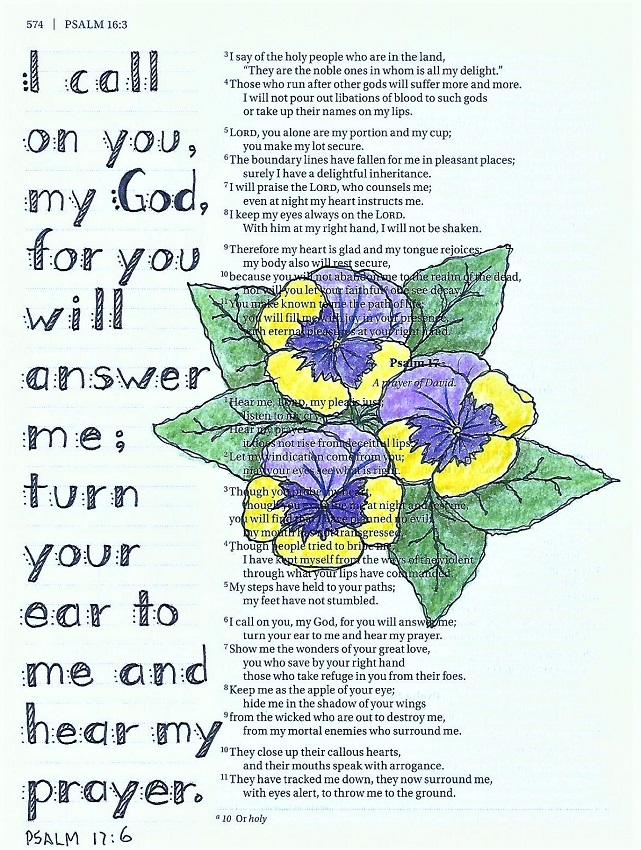
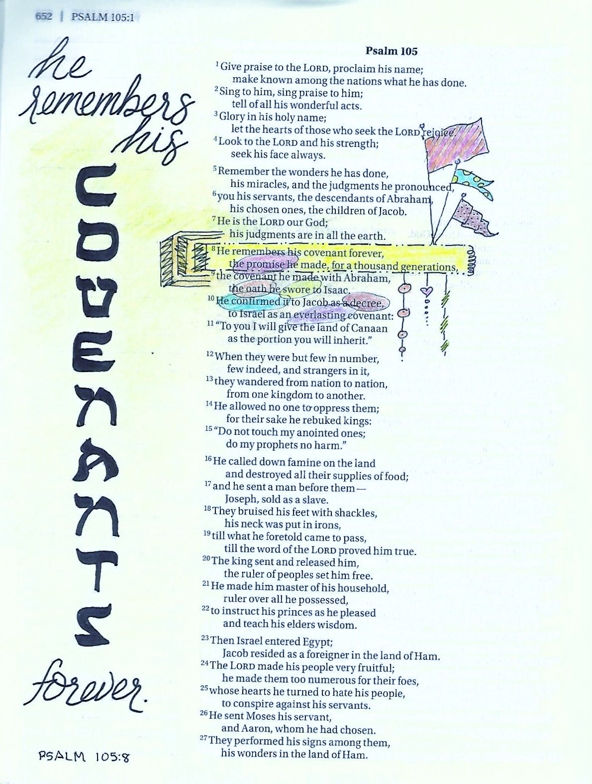
From the day I chose the word ‘still’ as my focus, I have been planning to use cattails as an illustration. Aren’t we fortunate they showed up in the Drawing Room this week? <grin>
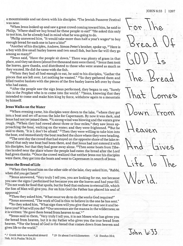
There was an obvious need to reduce the scale of the font when used in my Bible. I used just two units height and remembered to set the lower-case height at 2/3 of that space.

Since I mentioned the Drawing Room in the lesson above I'll show what I did for that lesson, too. It actually goes step by step on how to draw the cattails and how to use them as an outline (like above) or colored or in silhouette (both shown beow)
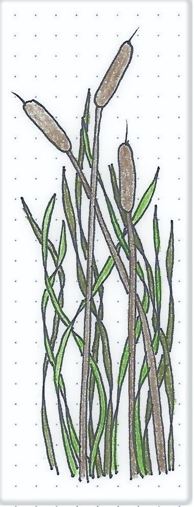
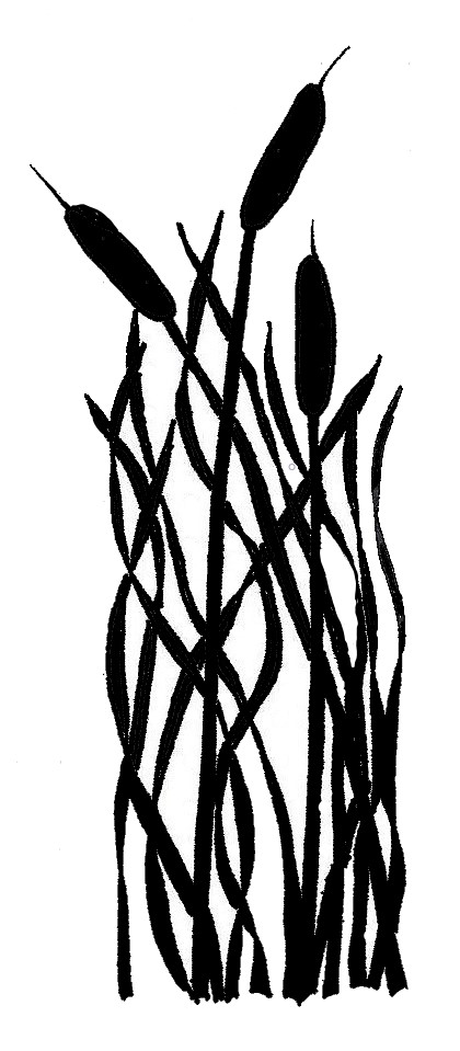
If you want to see this, or any other of my drawing tutorials, they can be downloaded (PDF) at Creative-Bible-Journaling.com
That's it for another week.
Ddd
Posted by studio3d@ccgmail.net
at 10:48 AM PDT