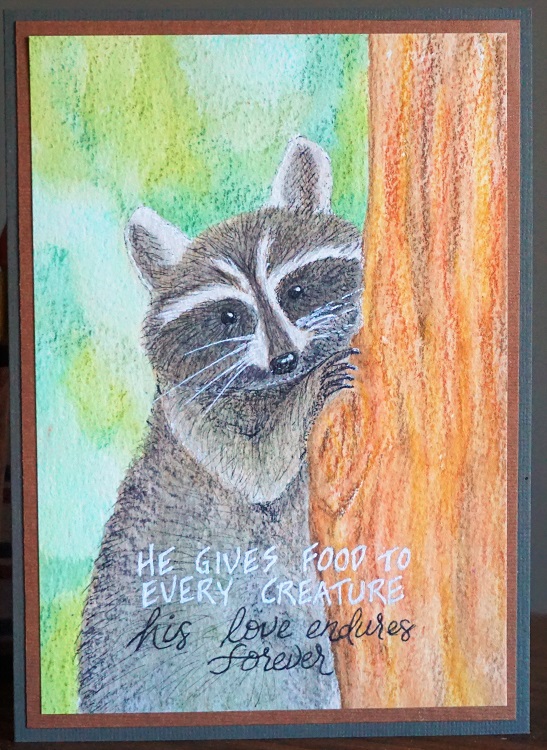
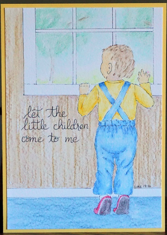
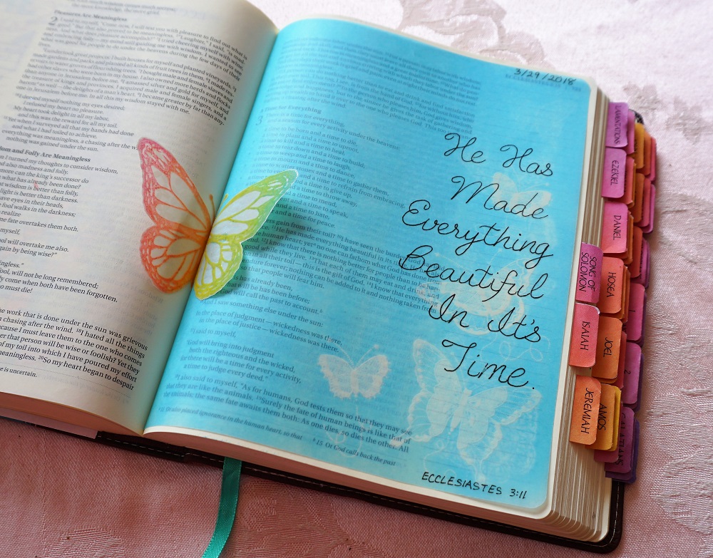
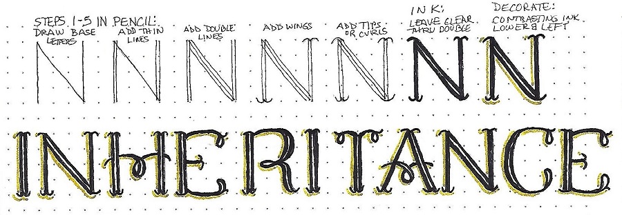
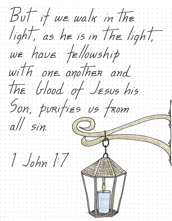
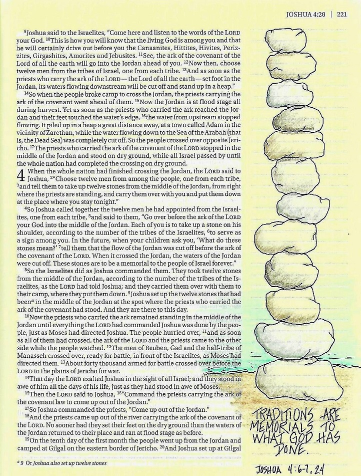
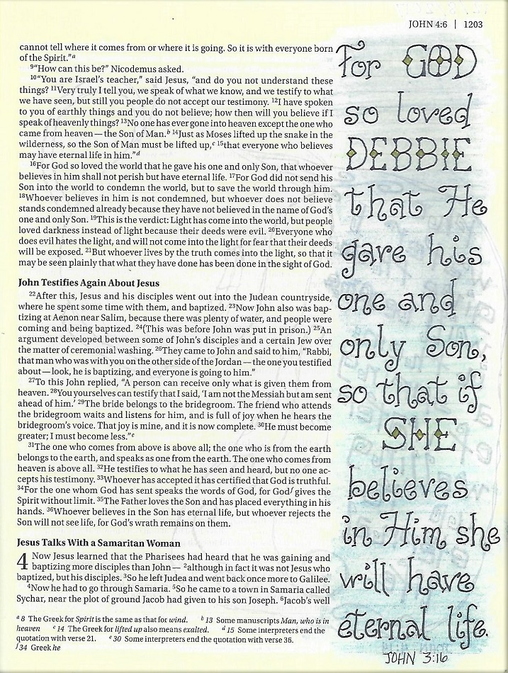
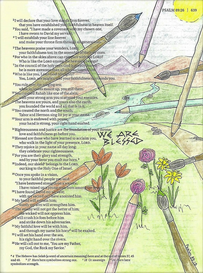
Topic: Lettering
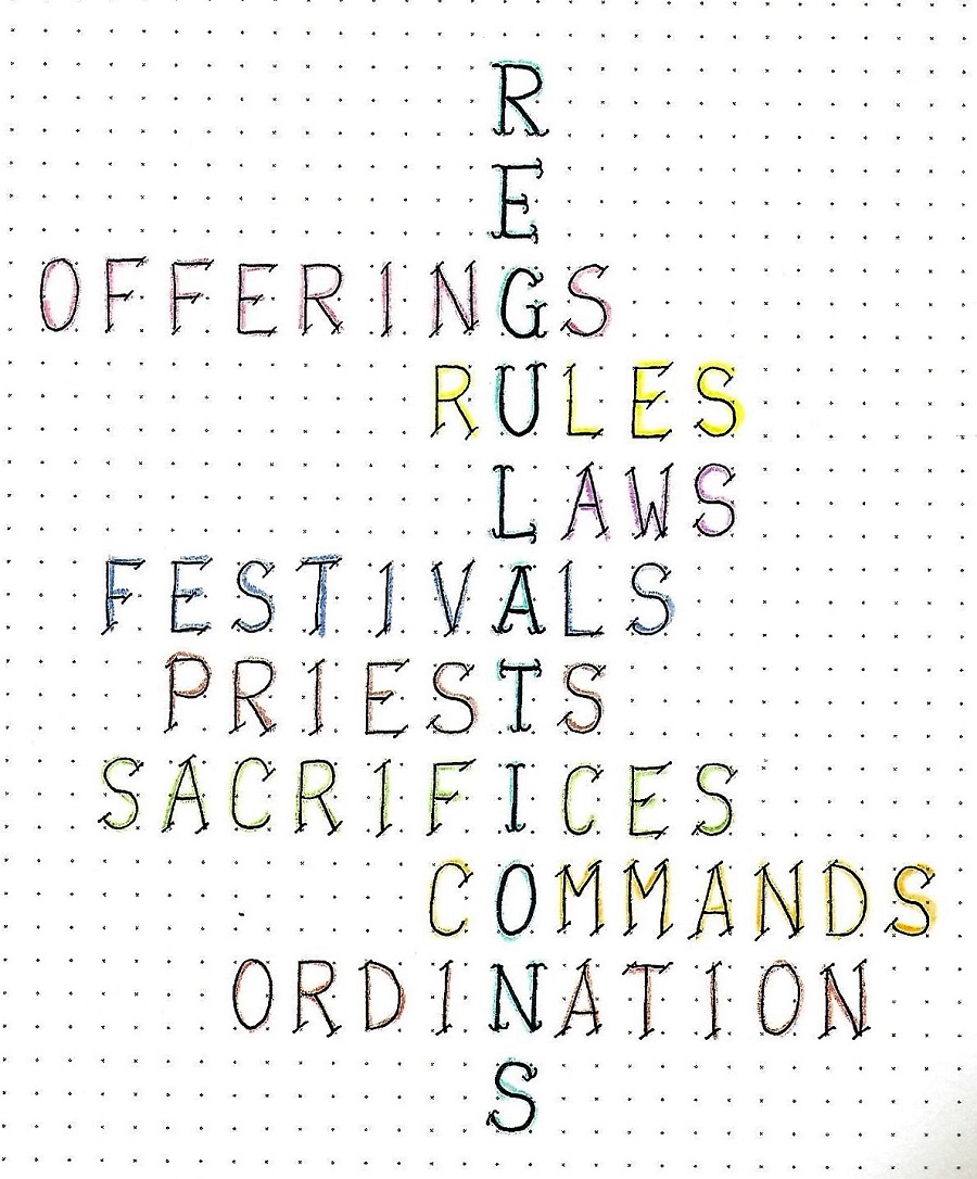
Continuing on with my series on progressive lettering development, I have a set of lessons based in the book of Numbers in the Bible.
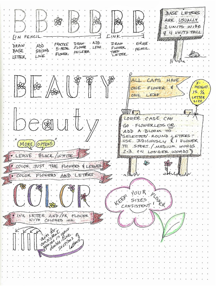
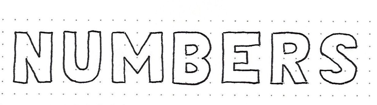
Day 1 – Block Letters – Introduction
| We are moving now into an entirely new letter form – the basic block. We will only be working with an upper-case.
Note that all of the letter parts are the same width, whether they are verticals, horizontals or angled and whether they are straight or curved. On the sample I made these elements one unit wide which works well with a letter height of four units. The letter widths will vary as you can see with the M below.
Be sure you are working in pencil throughout the design and layout stages and only ink your letters after they are exactly the way you want them.
|
Just as we did with the basic round letters, we will be exploring a variety of ways to customize this basic style over the next few weeks. So, work now to develop good form so you have a good base from which to branch out.
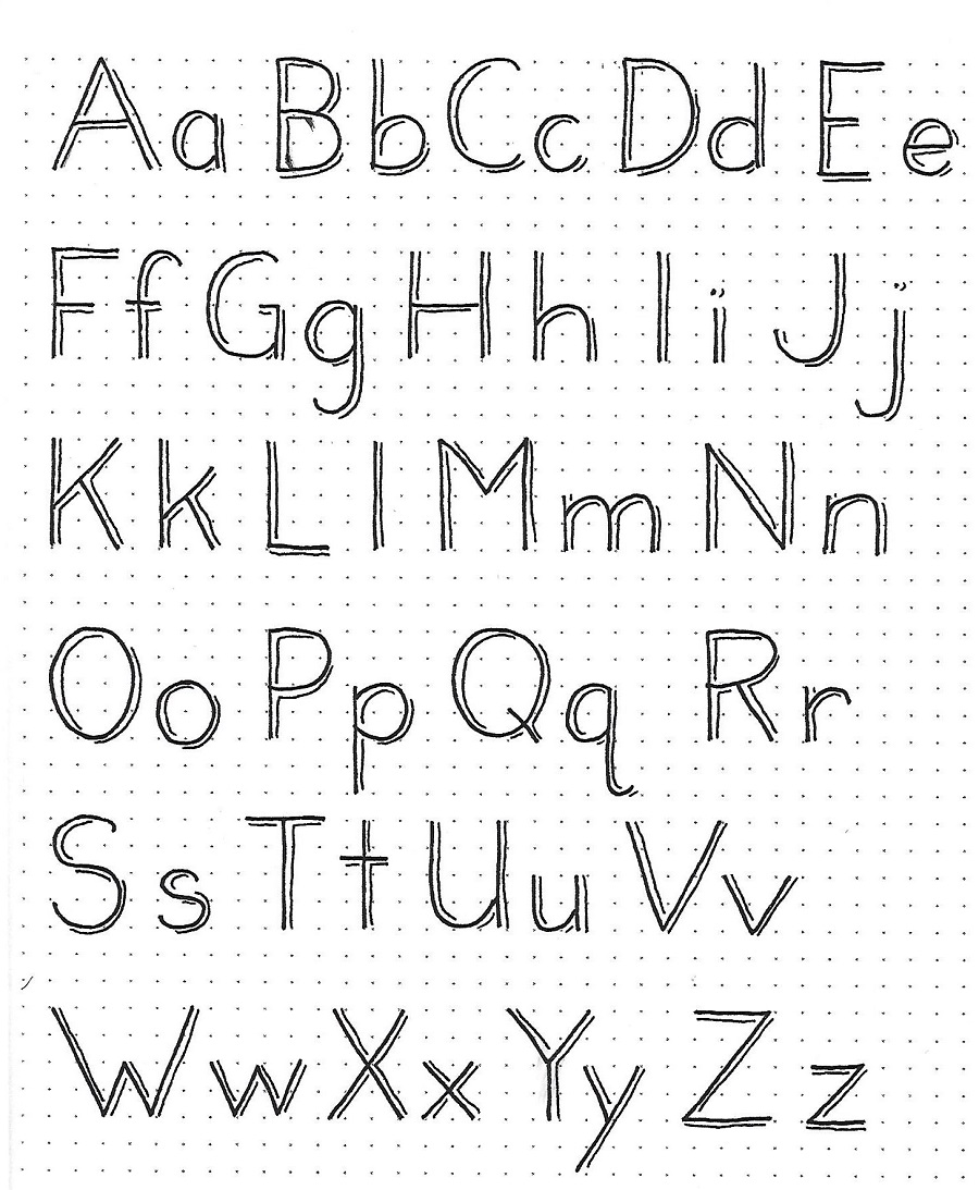
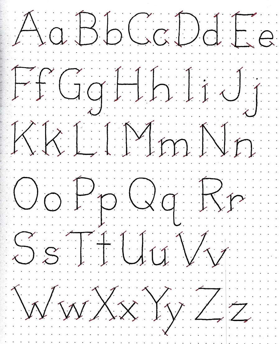
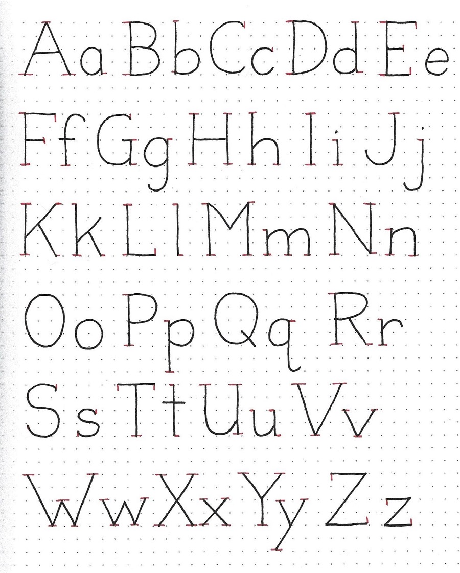
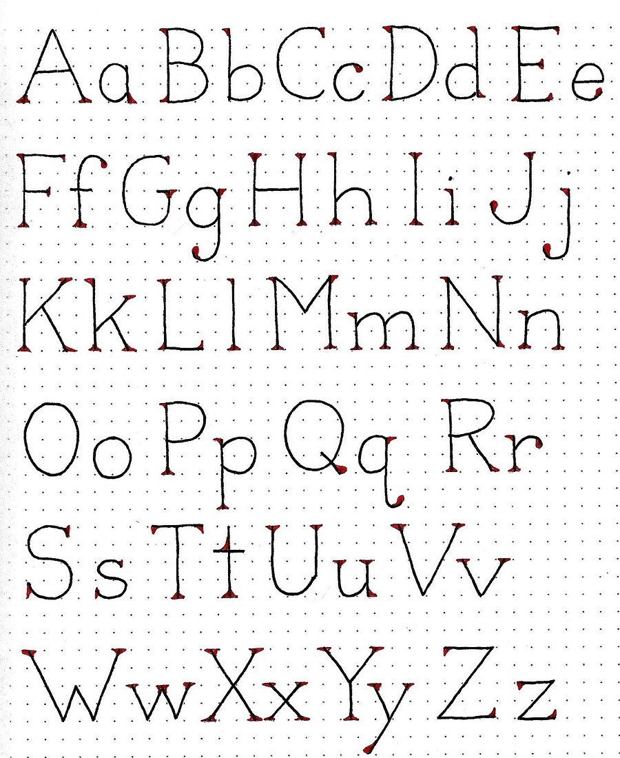
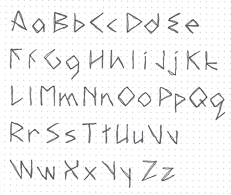
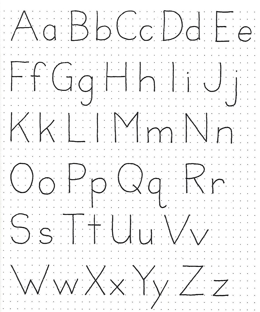
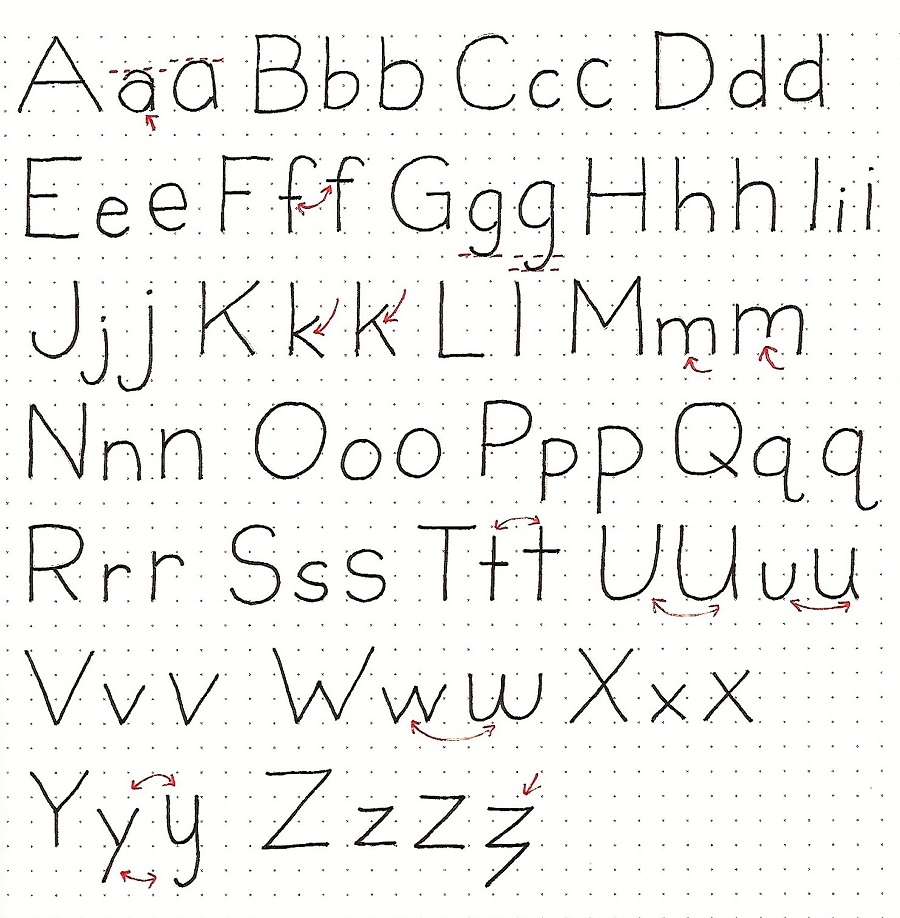
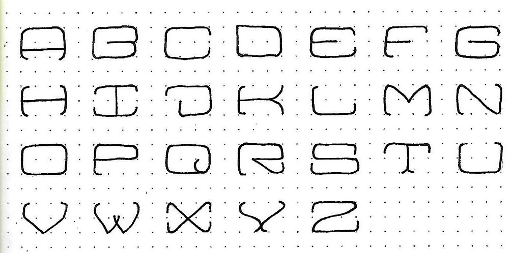
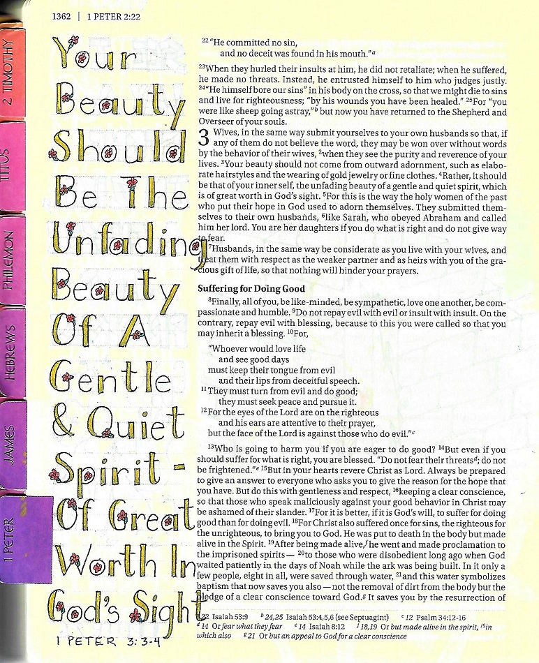
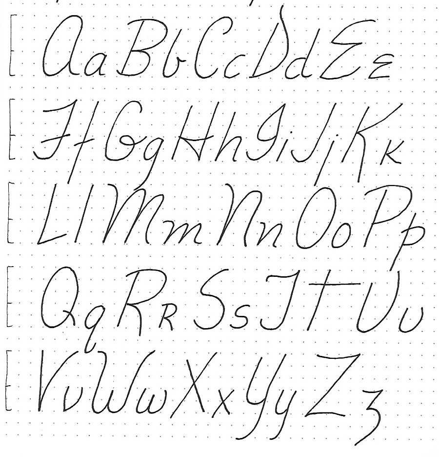
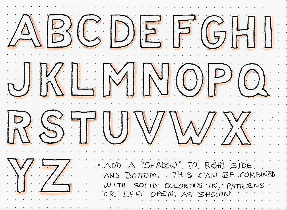
Day 2 – Block Letters – Alphabet
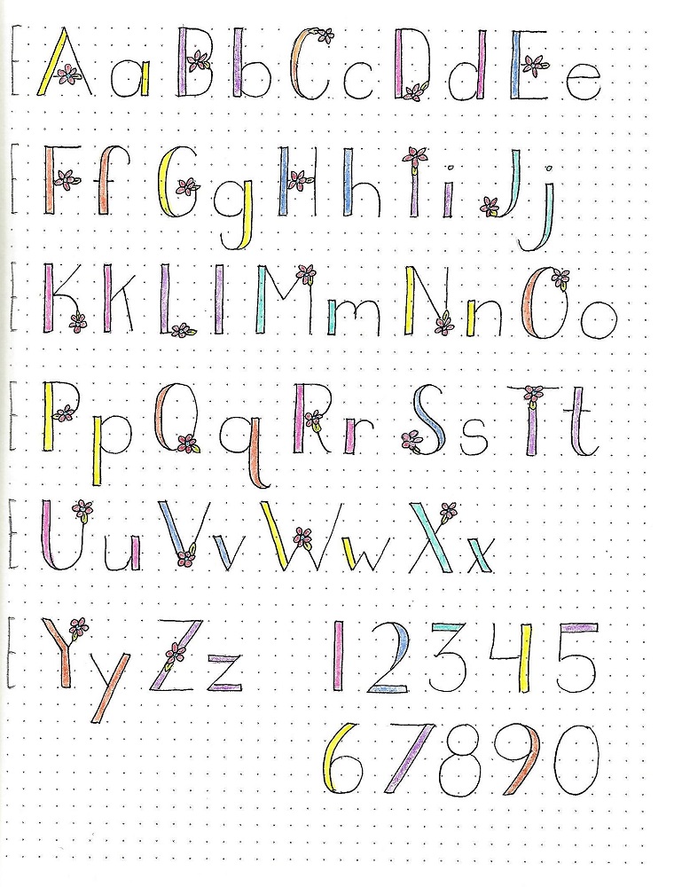
| This is the full alphabet for the basic block letters (capitals only). Just as with yesterday’s sample this is a four-unit letter height with one-unit elements.
Strive for consistency in your letter forms. The hardest letter to achieve is the S with its double curves, though that seems to be a common problem with most alphabets. This is one of the reasons it is important to start with pencil and only ink after everything looks like you want.
|
You do still have some leeway in the basic forms. I think I may have gotten the W a bit too wide and I note that the Q is the only letter that has a non-blunted end. Try correcting these in your own alphabet, or offer them as options on your page so you can choose between forms if you like when using the alphabet for a project.

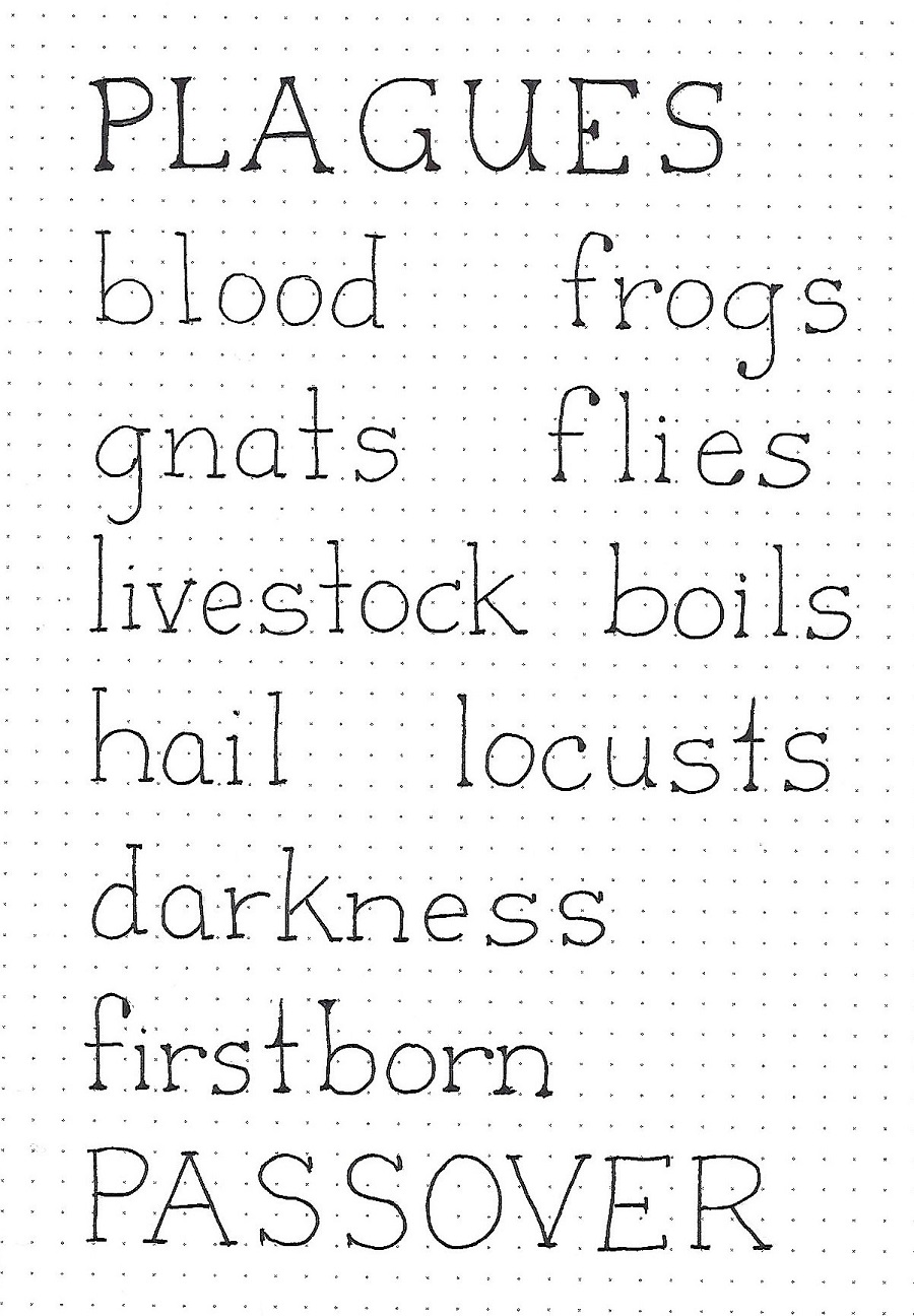
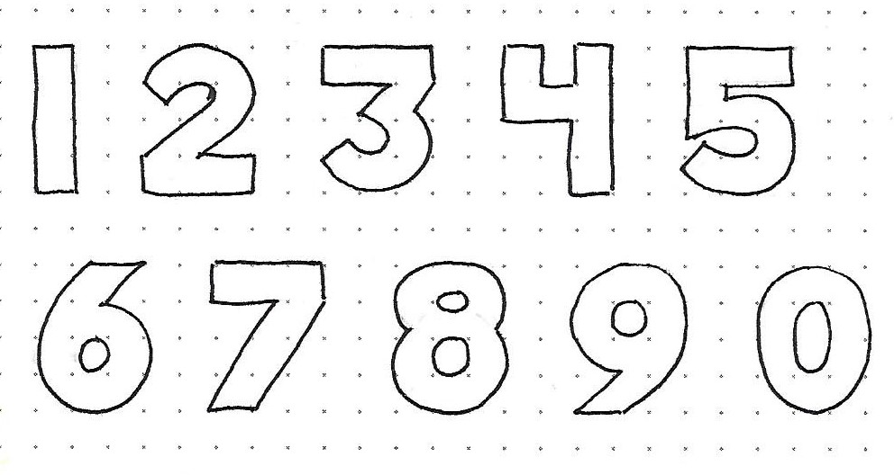
| This afternoon, we have a bonus page for you! Since you may wish to write your scripture reference in the same block lettering as the rest of your project, you’ll need to have the numbers in the block style.
I have provided 1-9 and 0 for you in the basic block. Write these up as a reference and then, as we go through the lessons on enhancements, edits and embellishments you can apply the same rules to the numbers as we do to the letters.
|
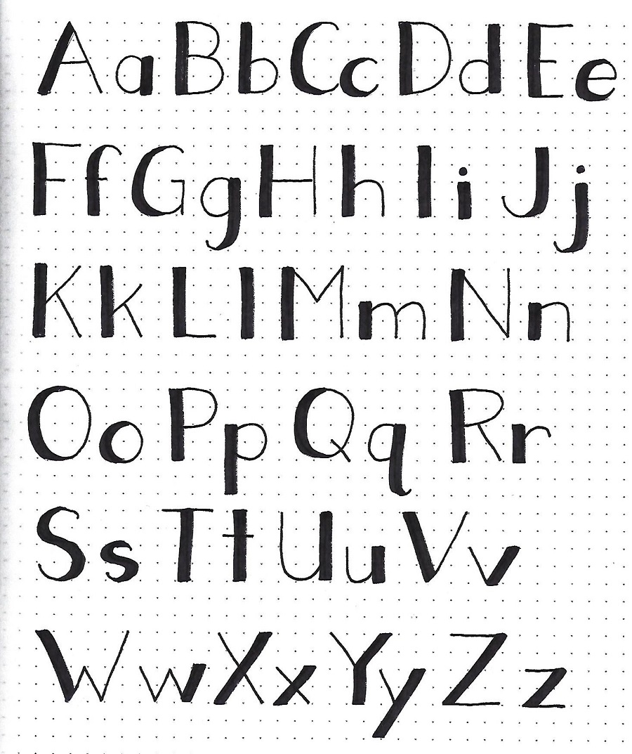
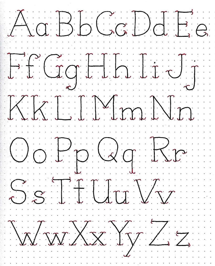
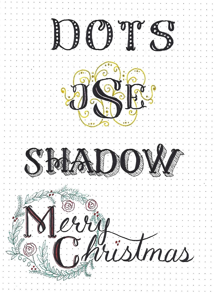
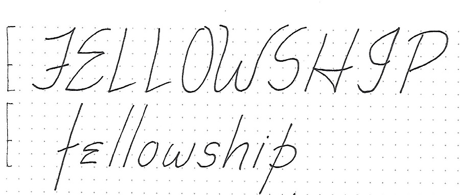
Day 3 – Shadowed Blocks – Alphabet
| Here we are with our first option. Today, write up a full set of block letters, ink them and either leave them open as this shows or fill them in solid (your choice).
Once you’ve done that, use a highlighter to make a drop-shadow on the right and bottom of all letter parts These marks should be about ½ the width of the letter elements as it will make your letters look like they are standing up off the page. If you have a hard time visualizing these shadow placements try this: take two identical copies of your alphabet and hold them layered together up to a window. Slide the top copy to the left and up (1/2 the width of the letter elements). The lower layer will show up from behind indicating where the shadow lines should be, just trace them onto the top copy!
Sorry that my scanner did not like highlighter so it washed it out a lot. In reality the shadows are day-glow orange! **************************** NOTE: before you begin, test your pens and highlighter together to make sure the inks are compatible. You don’t want to get all solid letters and then have the highlighter smear your ink. Eeeek! |
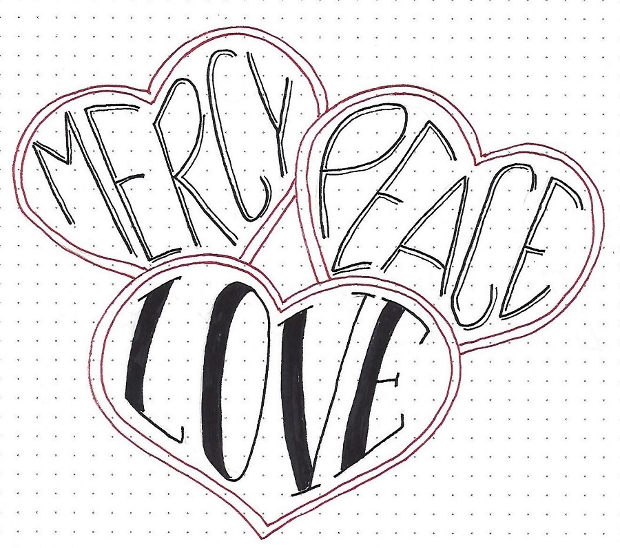
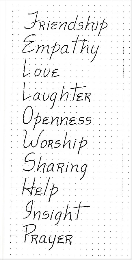
Day 4 – Shaped Block Letters – Word Art
| Today, I want you to take a short phrase and create word art with it. This is similar to what we did in week 5 with the words contained in hearts but the result will look more free-form.
Start by creating shaped boxes where the words will go. For instance, I penciled in the first wedge shaped box with a curved bottom going upward as it went to the right. I used block letters to write in the word ‘the’, letting the edges and ends of the letters follow the curve of the box.
Below that I drew a second box with an arched top and a flat bottom. The outline of the box has an offset from the previous one so the letters don’t touch. The next word was lettered inside this box. The same was done for boxes three and four, changing the curves to create interest. See how the top of the U even echoes the curve on the bottom of the S.
Where I had vacant spaces, I filled in with illustrations. Then I filled in my letters with a gradient of colored pencils.
|
I hope you will try out this technique.
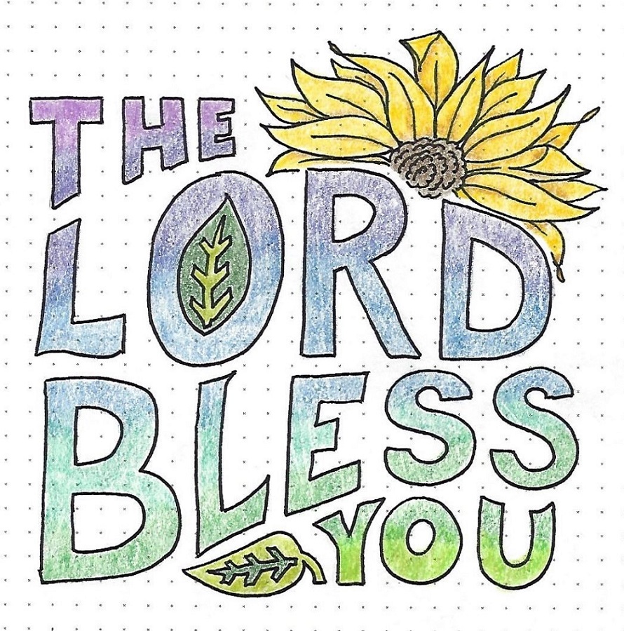
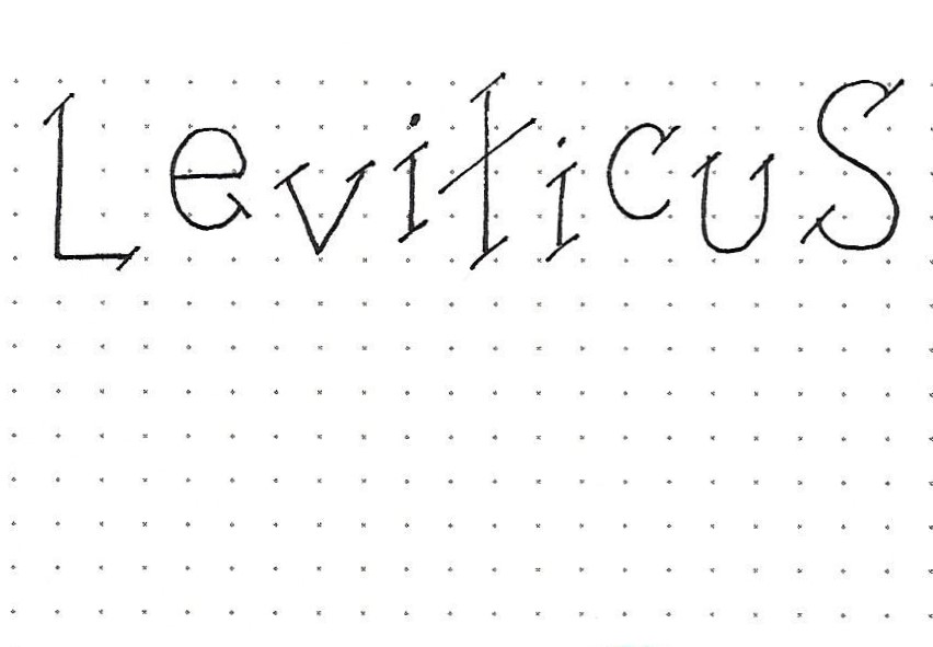
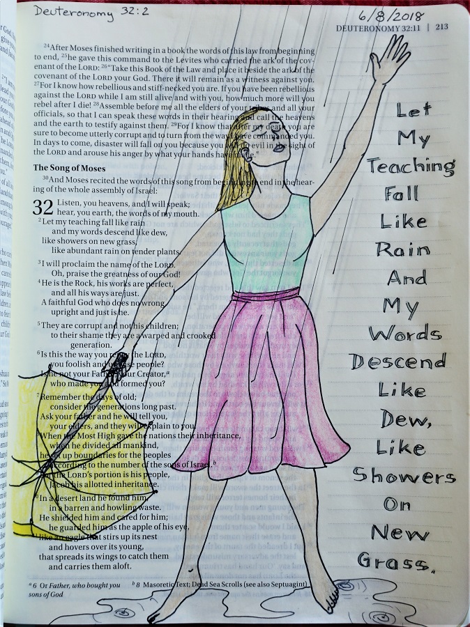
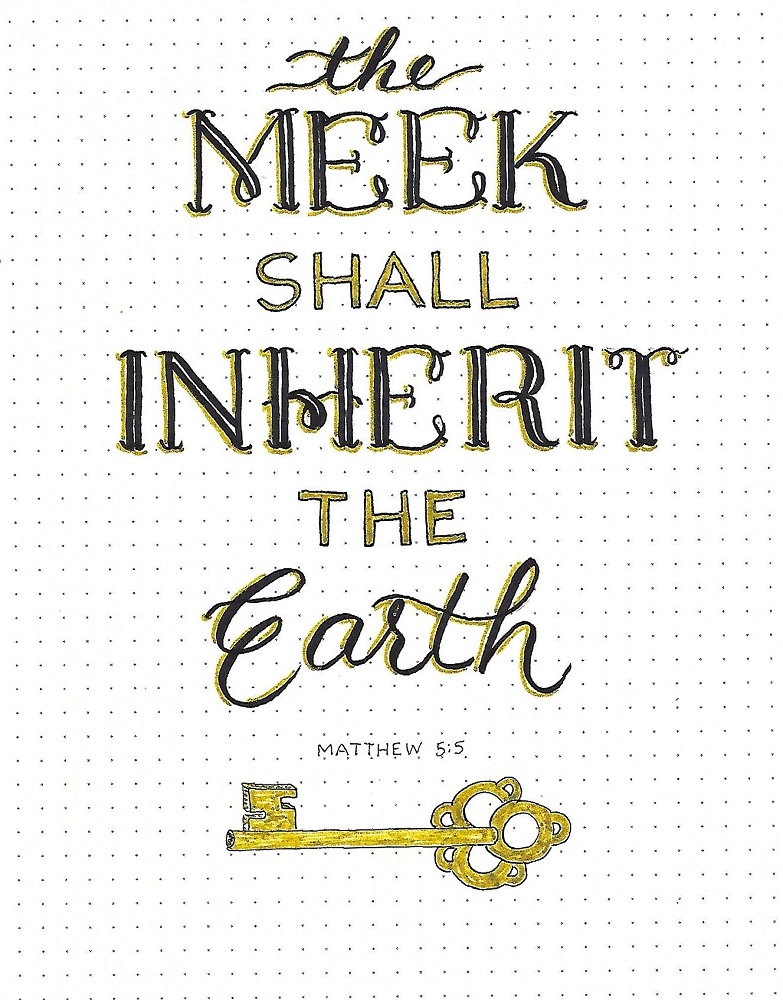
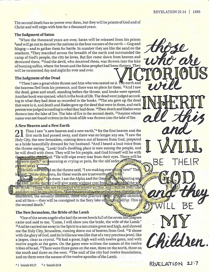
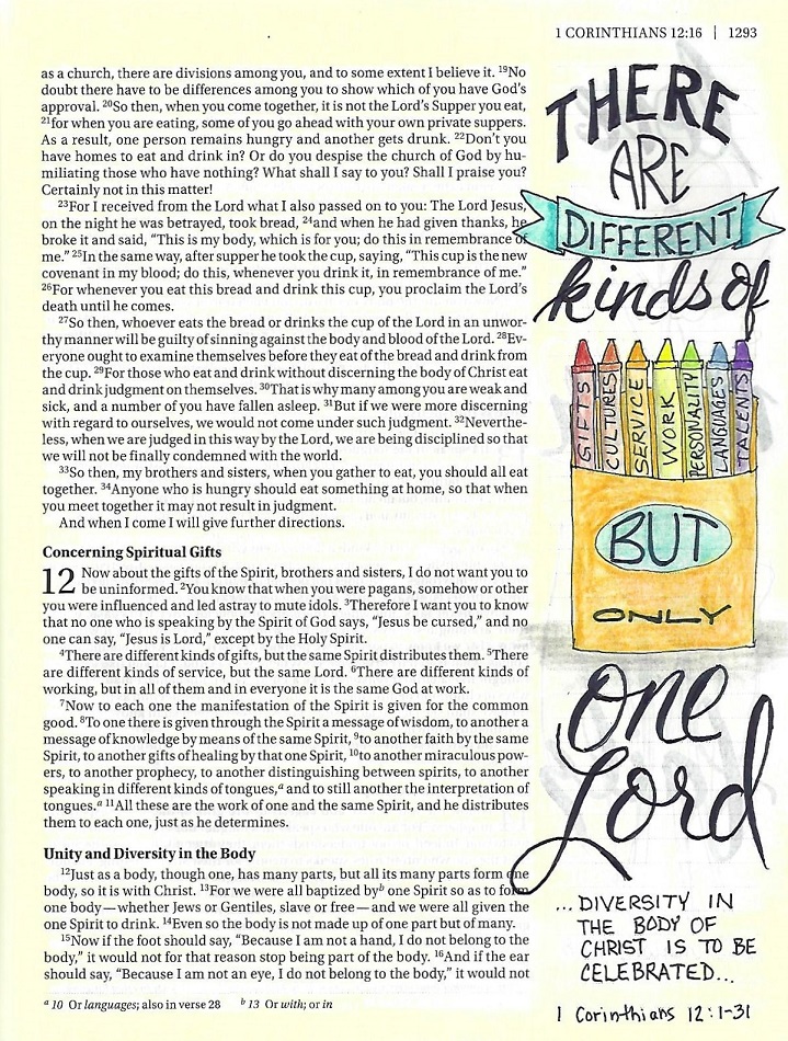
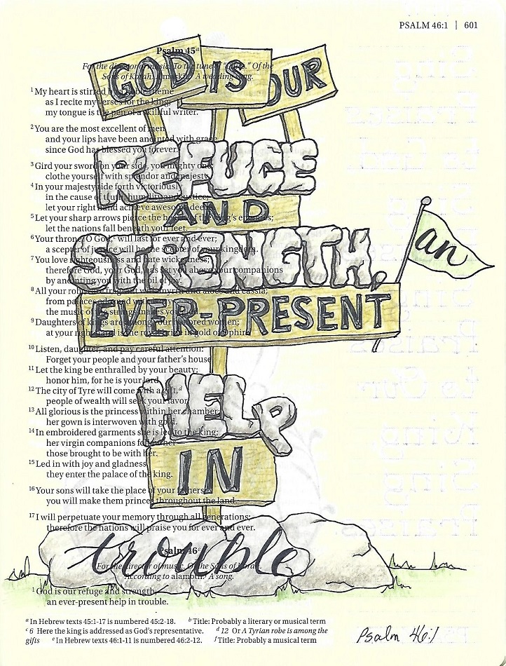
Day 5 – Shaped Blocks – In Your Bible
| Today we will use the shaped block letter technique studied yesterday and create word art in our Bibles.
I combined my block letters with some basic round letters from earlier lessons as well as some handwriting script and other styles learned over time. You can use as many or as few styles as you wish, although the block and the basic round should be among them. Note that I adapted the ‘styling’ of the basic block capitals to create some words in lower case!
Look at how much text you can include without it looking cluttered or messy. Keeping some things consistent will help in this realm: a) repeat your styles in more than one place, b) color repeated styles consistently, c) nest shapes and letters together, d) vary the size of words.
|

So in 6 weeks we have learned a total of 11 versions of lettering. SO much more to come: 1, 2 and 3 alphabets per week. Hope you are enjoying the journey.
Ddd