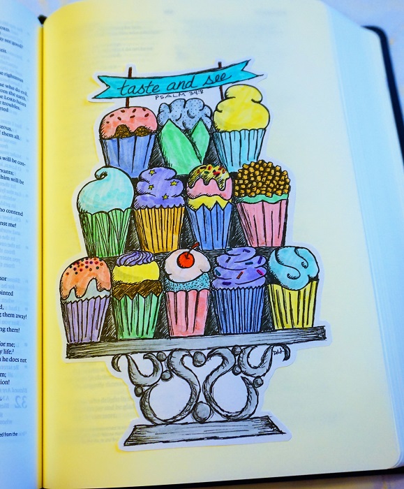
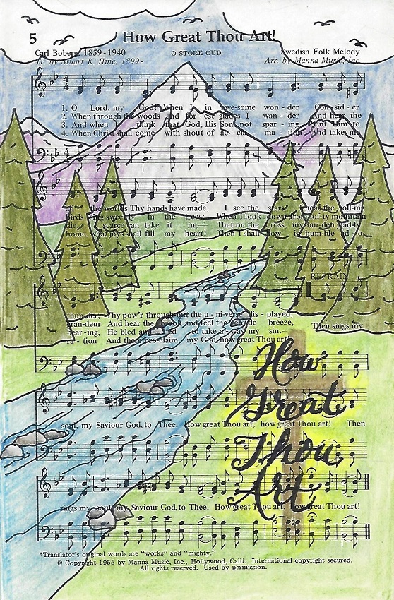
Topic: Bible Journaling
Time for the weekly post of another lettering lesson. This week we cover 1 and 2 Samuel.
Here are the weekly lessons:
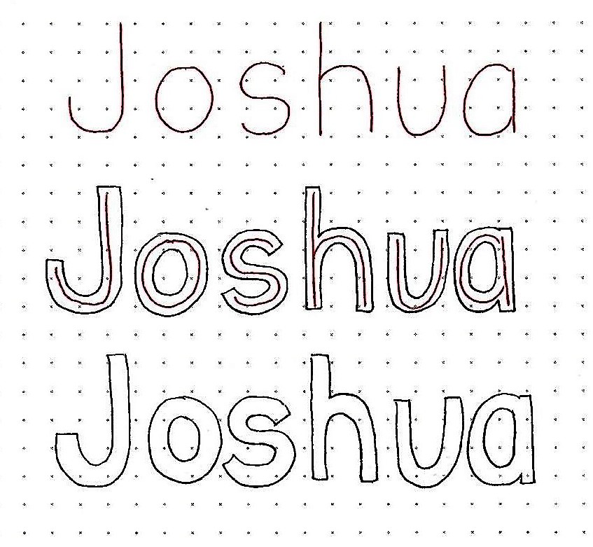
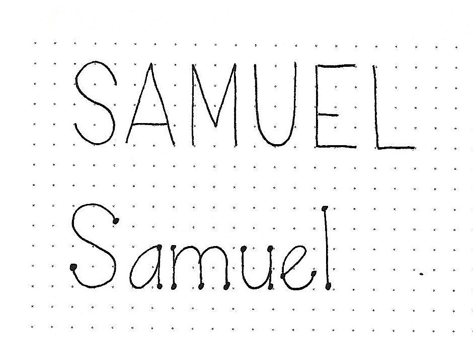
1 & 2 SAMUEL: Day #1 – Basic Oval Lettering – Intro
Having spent so much time on block letters we are now going to move on to another simple print style and then explore variations on it. The style we are starting with is called a basic oval print.
The general letter construction is very similar to the basic round but the letters are narrower and, where there are ‘bowls’ on the letters they become an oval that sits at an angle, tipped to the right.
You don’t see much evidence of this in the all caps version of the sample below but it does show up more in the lower-case ‘a’ and ‘e’ in the second line.
Practice drawing these letter forms. Remember to work first in pencil, correcting your letters as you go. Only ink when the letter is exactly how you want it, then erase the pencil.
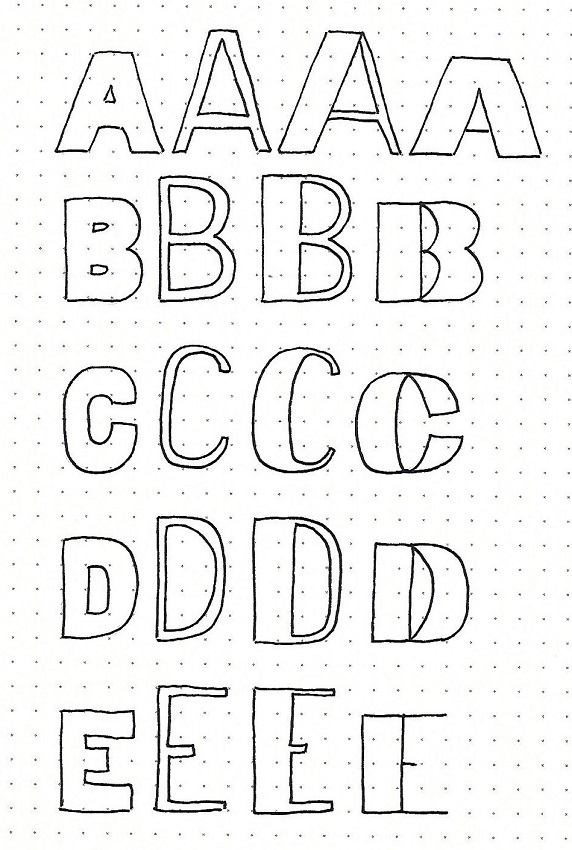
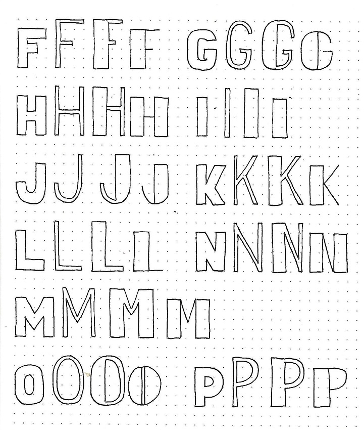
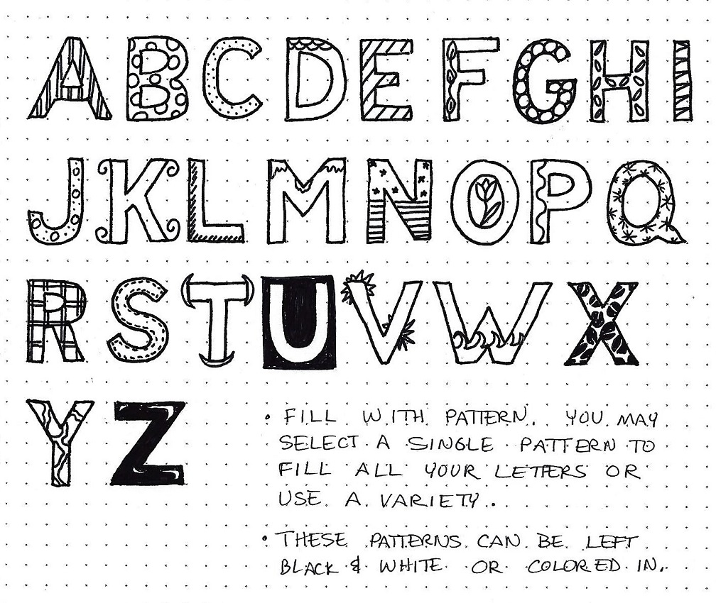
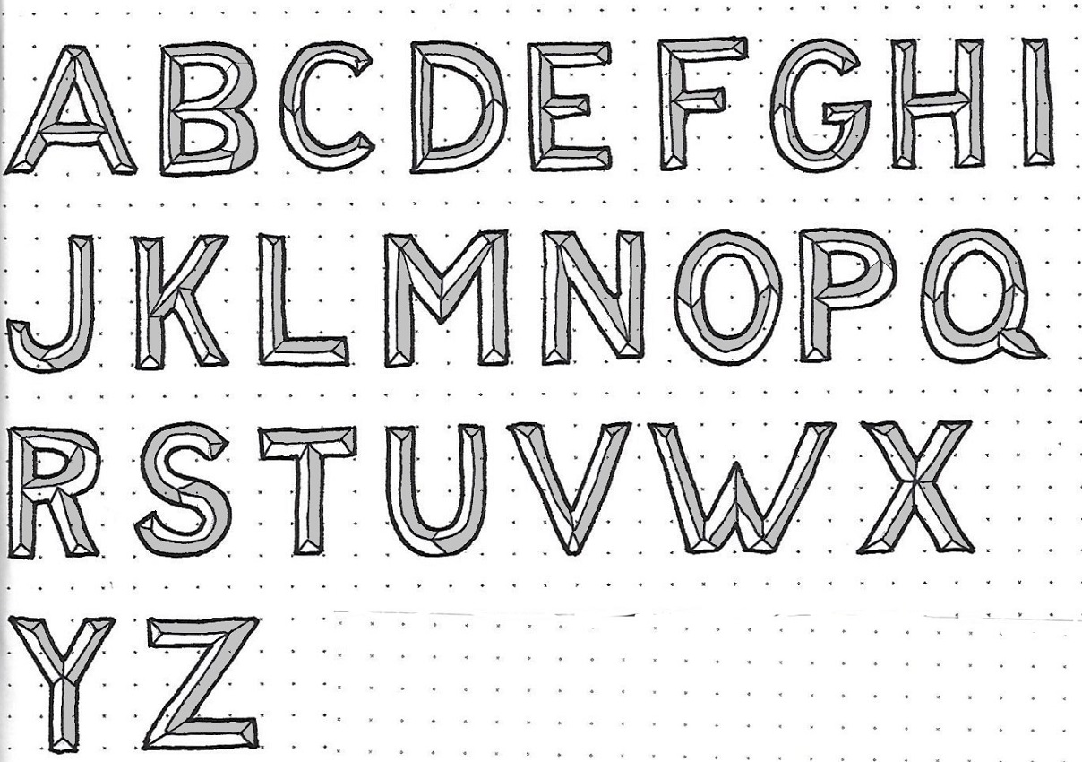
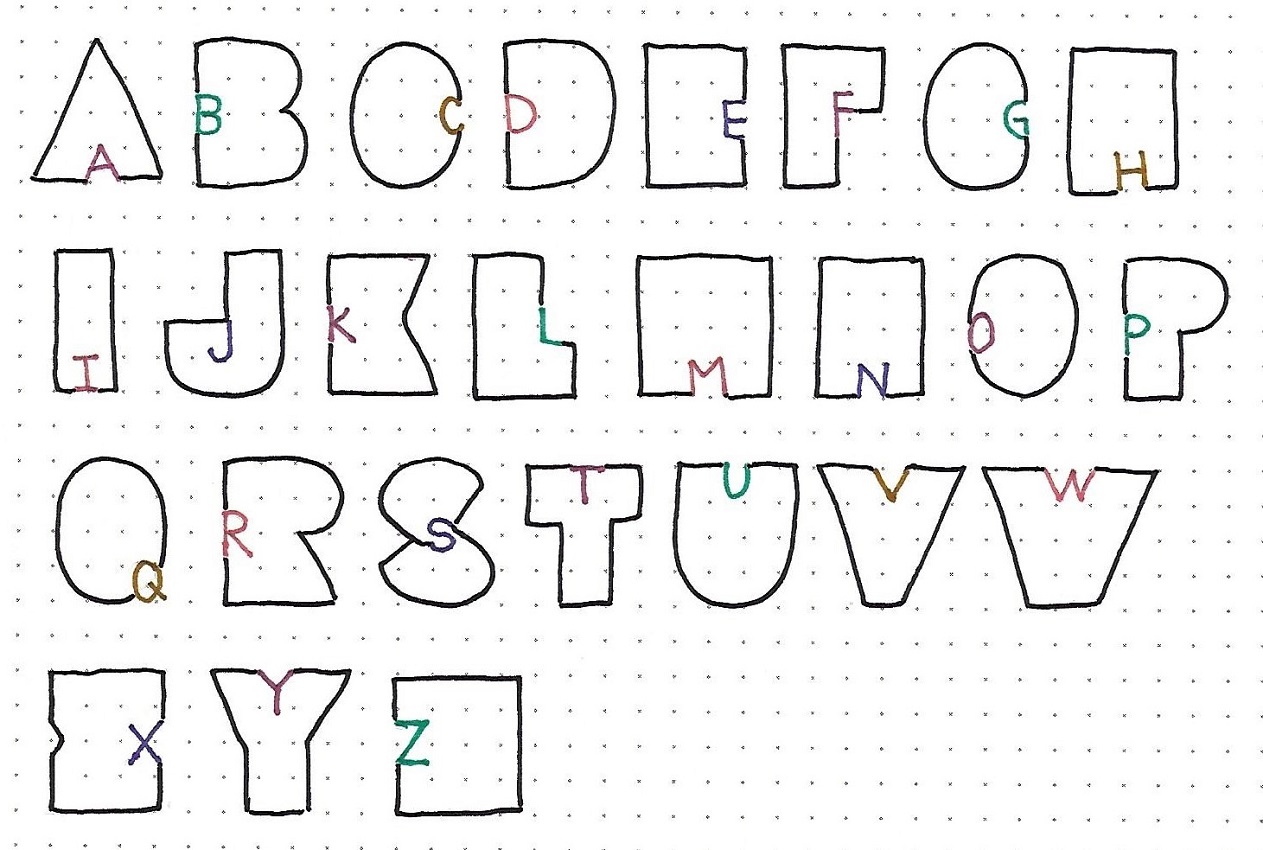
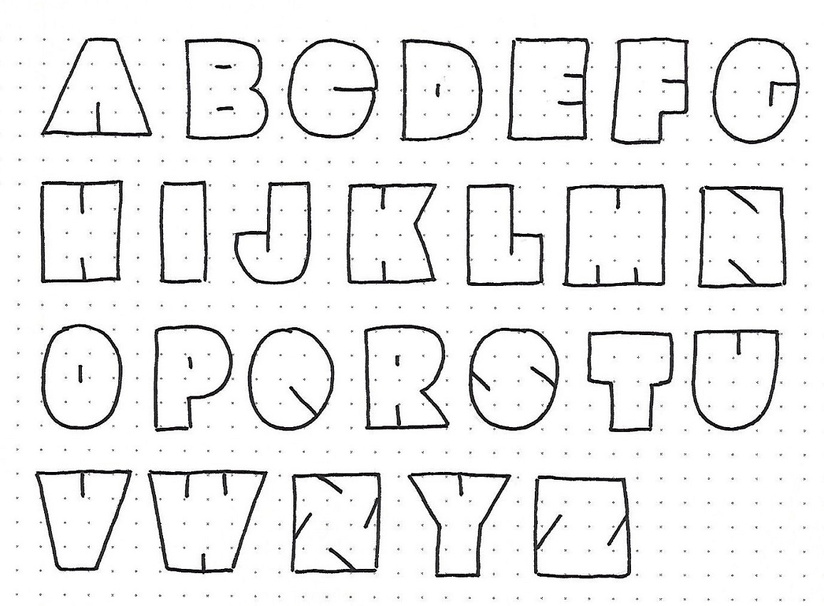
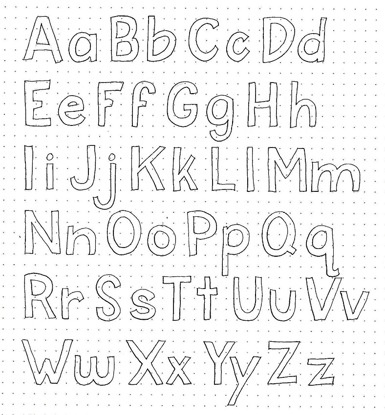
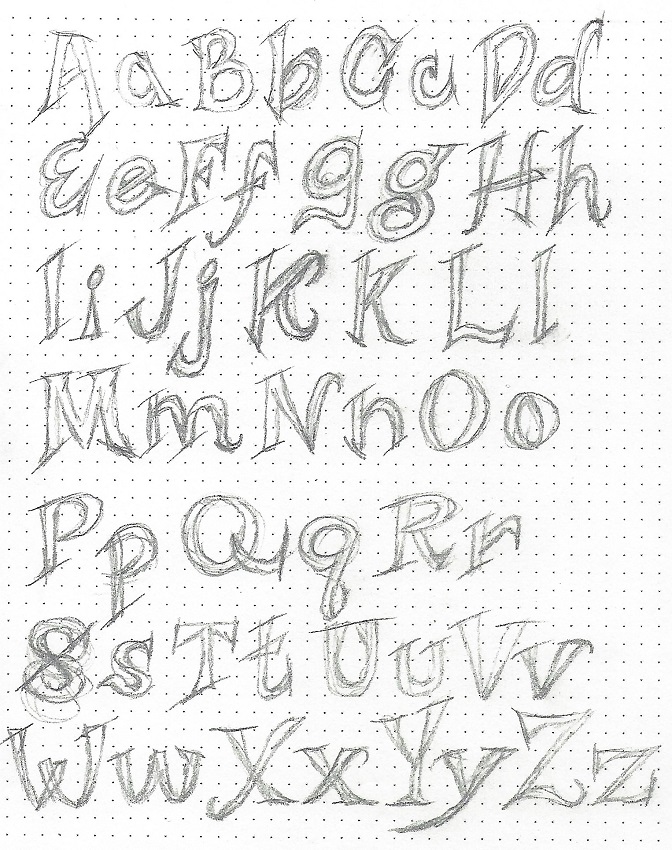
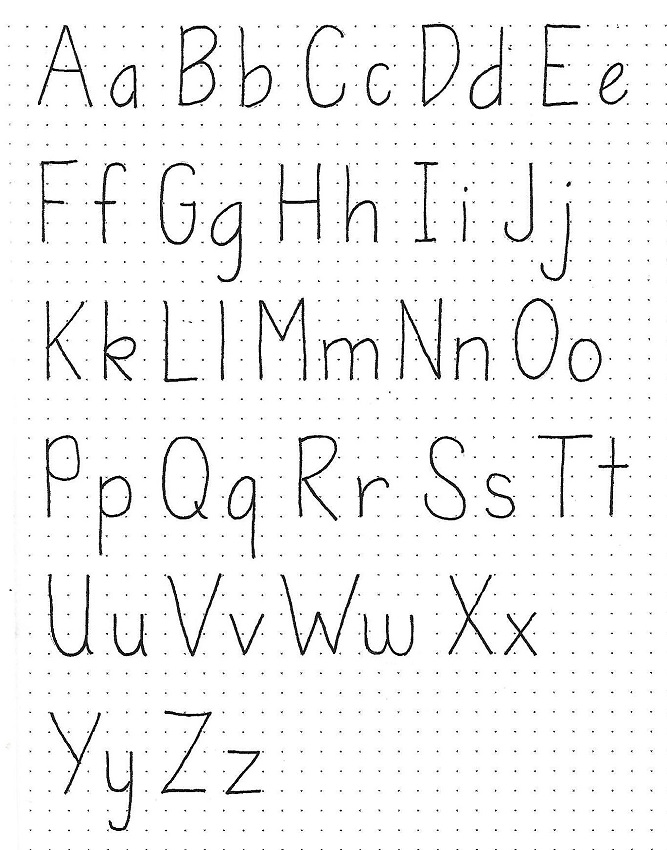
1 & 2 SAMUEL: Day #2 – Basic Oval Letters – Alphabet
This is the full alphabet for the basic oval print style. Note that the ‘bowls’ of the letters are oval in shape and have a slight lean to the right. The uprights, however do NOT lean.
The letters are narrower than the basic round print. The x-height is still ½ the full letter height.
Sketch out the letters lightly in pencil, correct until they are exactly as you want them, trace over the pencil with pen and then, when the ink is dry, erase the pencil.
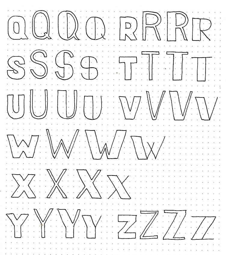
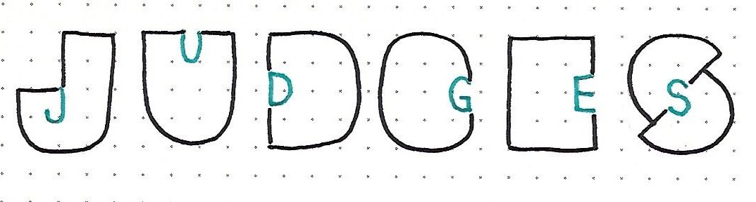
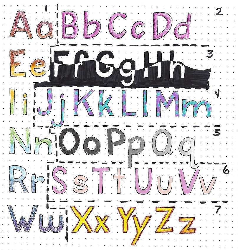
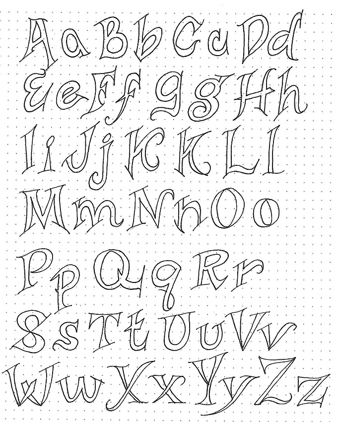
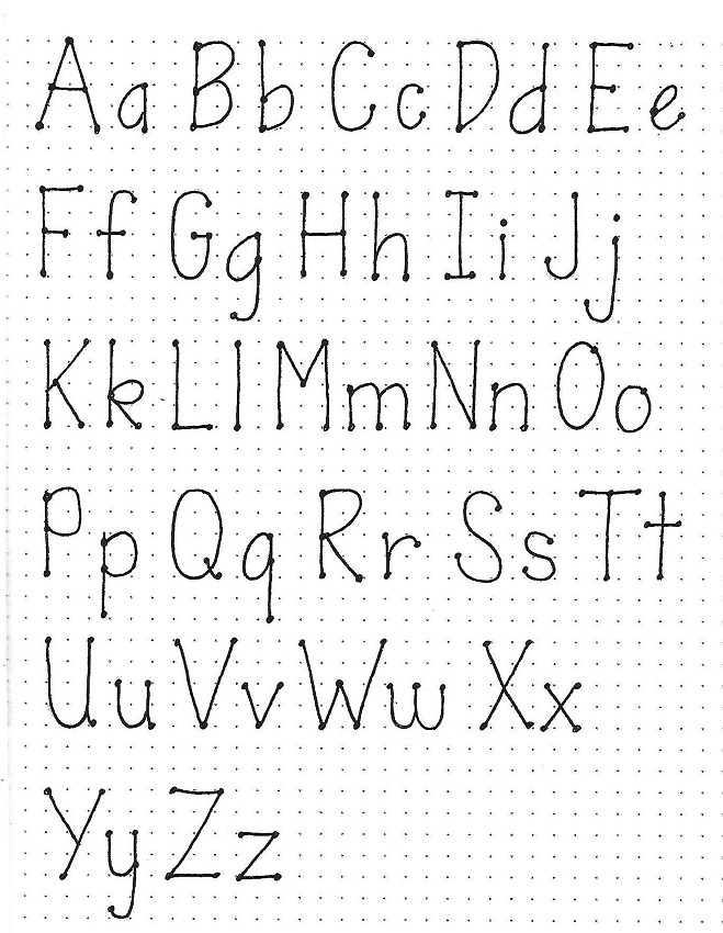
1 & 2 SAMUEL: Day #3 – Oval Style & Dot Serifs – Alpha
Creating the dot serif style is very simple. First, write out another copy of the basic oval style alphabet. Then draw a small dot on all of the line ends and intersections.
It is fun to let these letters bounce off the baseline and use a mix of colors in your text. For my sample page, though, I toe the line so I can make sure the relative sizes and shapes are correct. The play can come into use when using the alphabet on a project.
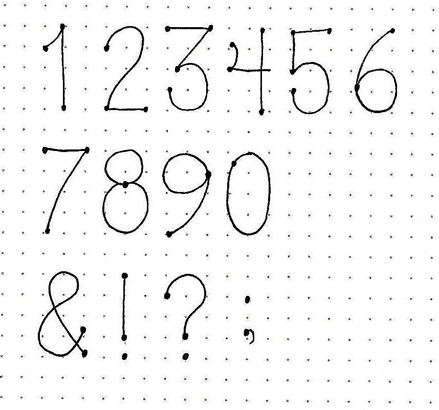
1 & 2 SAMUEL: Day #4 – Numbers w/ Dot Serifs
To make numerals that fit with the basic oval and dot serif styles you really have a lot of leeway. The keys will be: make the numbers as tall as your upper-case, keep them upright, make narrow like your letters. Other than that, you have the choice of how your digits are shaped. Do you like a 9 with a straight stem? Boom! You got it. How about a 4 with an enclosed top? Your choice.
For the dot serif numbers, just add that dot at all line ends and intersections.
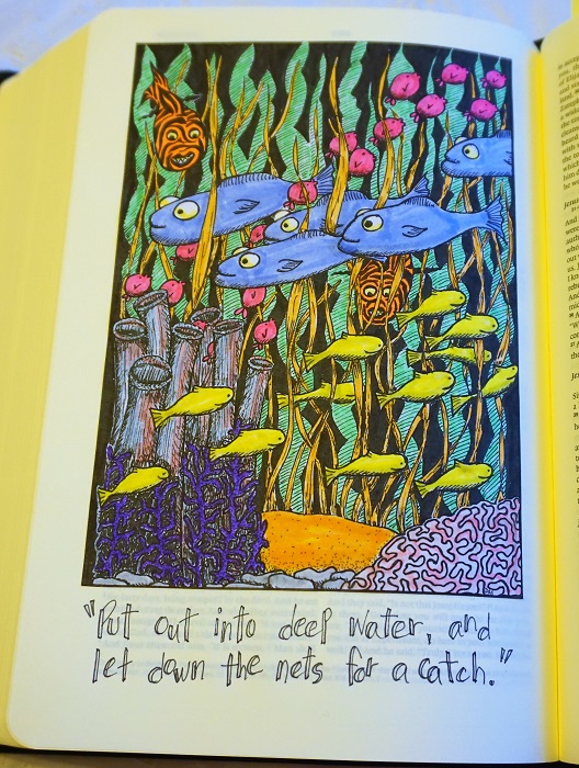
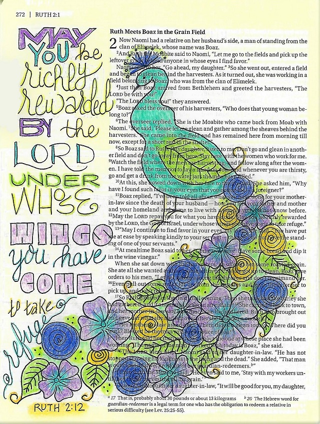
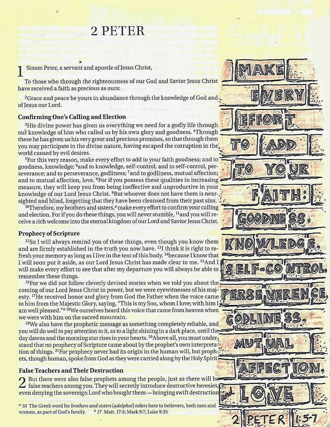
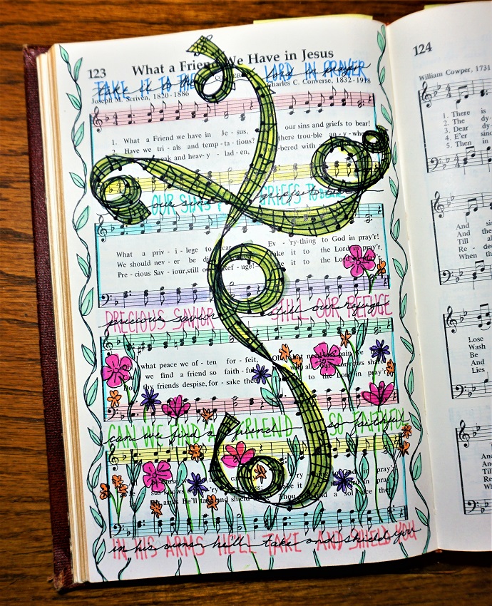
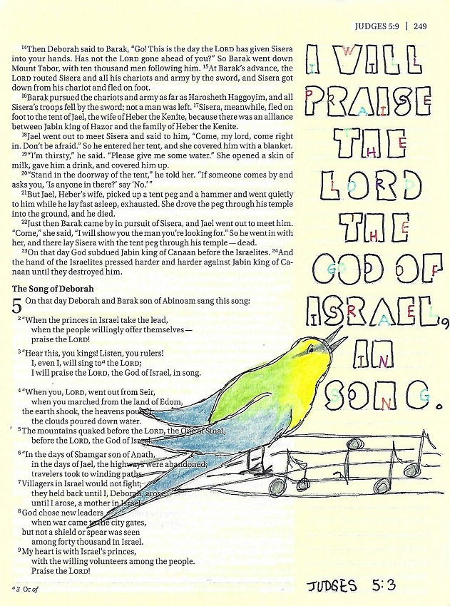
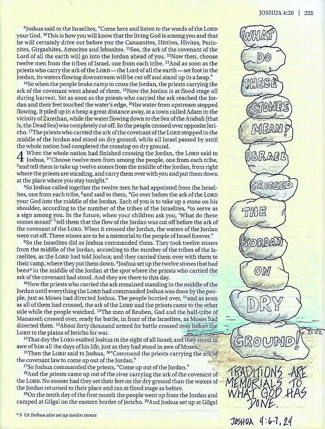
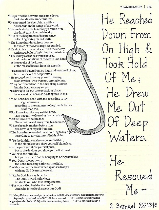
1 & 2 SAMUEL: Day #5 – Dot Serifs – Bible Page
For my Bible page in 2 Samuel, I used the dot serif style in a very straightforward manner.
This style is easy to scale up or down – see the reference at the bottom of the page – while remaining very clear and readable. Note that the smaller the lettering, the more prominent the dots become.
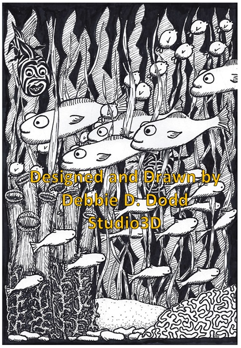
I combined my text with the simple illustration of the fish hook from the Drawing Room tutorial.
Great stuff, huh?
Ddd