« May 2019 »
S M T W T F S
1 2 3 4
5 6 7 8 9 10 11
12 13 14 15 16 17 18
19 20 21 22 23 24 25
26 27 28 29 30 31
You are not logged in. Log in
Entries by Topic
All topics  «
3D paperwork
A - Z challenge 5
A - Z challenge 7
A - Z challenge round 4
A to Z challenge round 3
A to Z round 2
A to Z round 6
A-Z round 1
Around the House
Art Challenges
Artist Trading Cards
Backgrounds
Beads
Bible Journaling
Books
Boxes
Collage
Color Challenge
Coloring
cookbook
Die Cuts
Digital Projects
Digital Stamps
Drawing
Dry Embossing
Fabric Stuff
Fantastic Folds
Field Trip
Home Decor
How Does Your Garden Grow?
Hymnal Art
In The Kitchen
In the studio
Jewelry
Lettering
Links
Multi-Technique
Music to Work By
Musings
Nail Art
New Work
Online Class
Other Hobbies
Other Projects
Painting
Paper Embroidery
Paper Piecing
Photo
Pretty Paper
Quilting
Random
reading
Scrap Recovery
scrapbooking
Sewing
Sketch Challenge
Some Backlog
Stamping
Stencils
Stickers
Supplies
Teabag Folding
Techniques
Testing
tips and tricks
Tutorial
Web resources
Welcome to my Blog
Work By My Friends
workflow
Writing
Blog Tools
Edit your Blog
Build a Blog
RSS Feed
View Profile
Group One
In & Out of Studio 3D
Tuesday, 7 May 2019
Can't Stop Singing
Topic: Hymnal Art

Amazing how many of these hymns we've been assigned that are not in the hymnal I am using. I remember singing them as a kid but, somewhere along the way, somebody decided they didn't need to be in the book any more. Harumph!

I end up finding a printable copy online and adjusting the size so it will fit into the hymnal I have. I do the art and coloring before I trim it down and glue it into the gutter.

I found a clip-art image to guide me in the features of this lady's face.


Her hair is all original! This is colored in pencils.

Ddd


Posted by studio3d@ccgmail.net at 12:24 PM PDT
Sunday, 5 May 2019
More Lettering Lessons
Topic: Bible Journaling

Ready for the next lesson in the series? Let's dive in to beginning script.

This week we will convert our semi-script into full script. It is much easier than you might expect, thanks to the way we have studied incremental changes.


Today, make some practice areas on your paper, marked with even amounts of space above and below the x-height. I have written out two slightly different versions of script that you can practice. As you go, try to identify the things that make this font different from our semi-script and what makes it different from your handwriting?


This is the full alphabet for a basic script style. Note that I said ‘A’ basic script. Because there are many alternative forms for many of the letters. We will look at a few of the more common ones tomorrow.


This alphabet uses an x-height that is one-half of the total letter height. The bowls are oval and the letters have an italic slant.


You will note that some of the letters are not what one commonly learns in cursive writing – the bowl of the ‘b’, the ‘f’ fully above the baseline, the loops of lower-case beginning at the x-height, etc. Let’s just all agree to write them this way today and break any pre-conceived notions about script lettering (which is NOT the same as cursive handwriting).


As was mentioned a few days ago, there are alternative forms to many script letters. A few have been included here to give you some choice in your personal style going forward.


When watching others do script lettering, I have been drawn to the new way of drawing the ‘b’, the ‘H’, the ‘p’, the ‘r’, and the ‘s’. As I have practiced these more and more, they are becoming part of my own style. If you were to look at script fonts online or in books, you would find other forms that you might like to incorporate.


Once you’ve practiced and selected the form you want to use for each lower-case letter you will move on to learning how to connect them to form words. Again, this is NOT the same as cursive handwriting. Unlike penmanship, hand lettering is meant to be drawn rather than written; decorative rather than utilitarian.

One of the hardest things for many is forming the habit of pausing and lifting the pen in the middle of words. This allows for connecting letters in a more artistic way than the cursive we learned in childhood.


Use this method to write out your lower-case alphabet as long words, using the letter forms you have chosen. When you get to the end of a line, move down and continue with the next letter series (beginning with the last letter used). I have marked the end-point (where I lifted the pen) with a red dot. I have marked the start points (where the letter began) with a green dot. [green=go, red=stop]


You will likely want to do different letter connections when going from a short letter into one with a loop and stem than when connecting a series of small letters. Also, you can elect to pencil the letters as stand-alones and then go back and add the connections where they seem natural to you. Do NOT leave letters unconnected within words at this point. Later, when you are confident with styling, this may be an artistic choice you make.


Letter pairs (bb, dd, ee, gg, ll, mm, nn, oo, pp, rr, ss, tt) often get a different styling than a single letter of the same. It is hard to get both letters to match, so you may intentionally change one slightly so it looks planned.


Having studied individual letter connection, you will want to practice writing words which will use different combinations of letters. Choose a scripture in our feature book (Ezra) and practice on paper until you are pleased with how all your letters are formed and connected.  Remember to work in pencil first and to s-l-o-w

d-o-w-n. You are drawing the letters, not writing them.


Transfer your best effort into your bible either by tracing or by following your original steps to recreate it.


Another one in the books!

Ddd


Posted by studio3d@ccgmail.net at 9:45 PM PDT
Wednesday, 1 May 2019
Sometimes It Just Comes Together
Topic: Hymnal Art

Mostly, when I can't think of an image that illustrated a scripture or a song, the easiest thing to do is flowers.

For this Easter hymn I decided to do lilies like the ones I taught in the Drawing Room lesson last year.

But once I got to the stage of coloring I decided to color like stargazer lilies because they have the most beautiful pink streaks and fascinating dots on the petals.

I used these on the hymn with colored pencils as the medium.


These came out exactly how I envisioned them!

Ddd


Posted by studio3d@ccgmail.net at 12:16 PM PDT
Tuesday, 30 April 2019
Here's Where It All Ends
Topic: Lettering

That title refers to the Typography for Bible Journaing class and the 30 Days Of Bible Lettering challenge that I combined for this series. Both of these end today.

These three lessons were to focus on 'impact' in the lettering.

April 28 - Romans 15:13 - May the God of hope fill you with all joy and peace as you trust in him, so that you may overflow with hope by the power of the Holy Spirit.


April 29 - Proverbs 27:17 - As iron sharpens iron, so one person sharpens another.


April 30 - Proverbs 3:5 - Trust in the Lord with all your heart and lean not on your own understanding;


I hope you've enjoyed this series with the combination of class homework and an online challenge.

Now I will have to decide which of these I want to refine and add to the margins of my journaling bible.

Ddd


Posted by studio3d@ccgmail.net at 8:55 AM PDT
Monday, 29 April 2019
Advancing In Skills At Retreat
Topic: Bible Journaling

This past weekend I went to a bible journaling retreat in southern Oregon with 13 other ladies from around the PNW and other states.

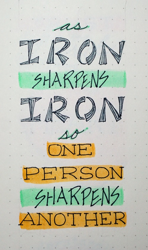
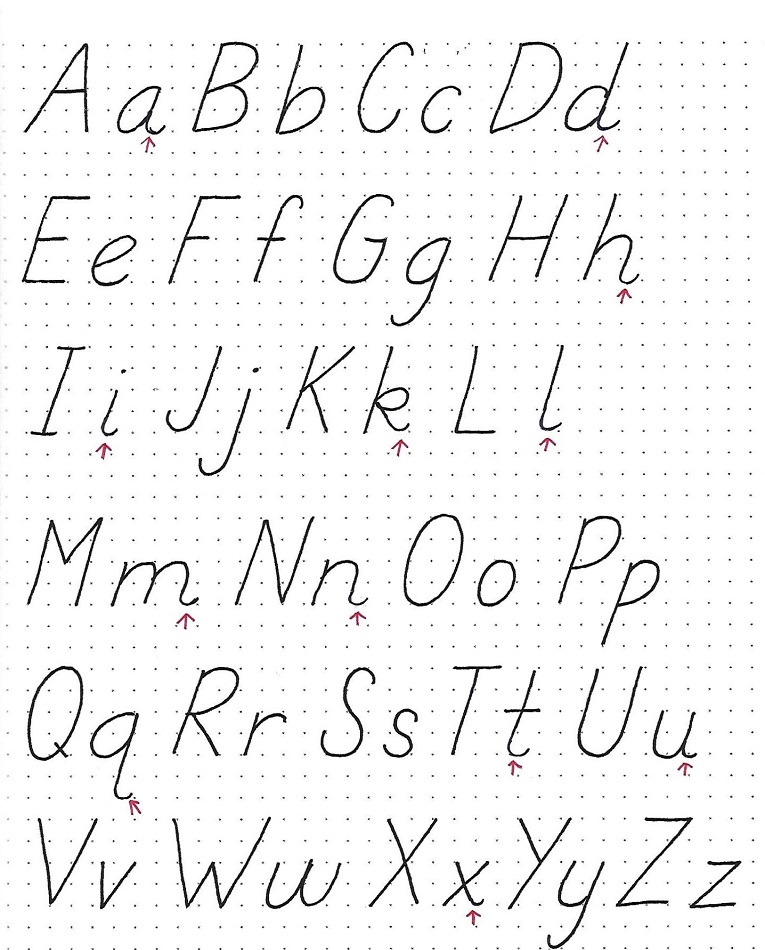
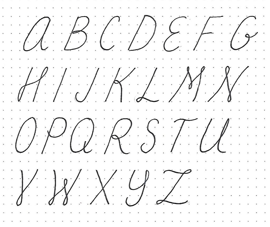
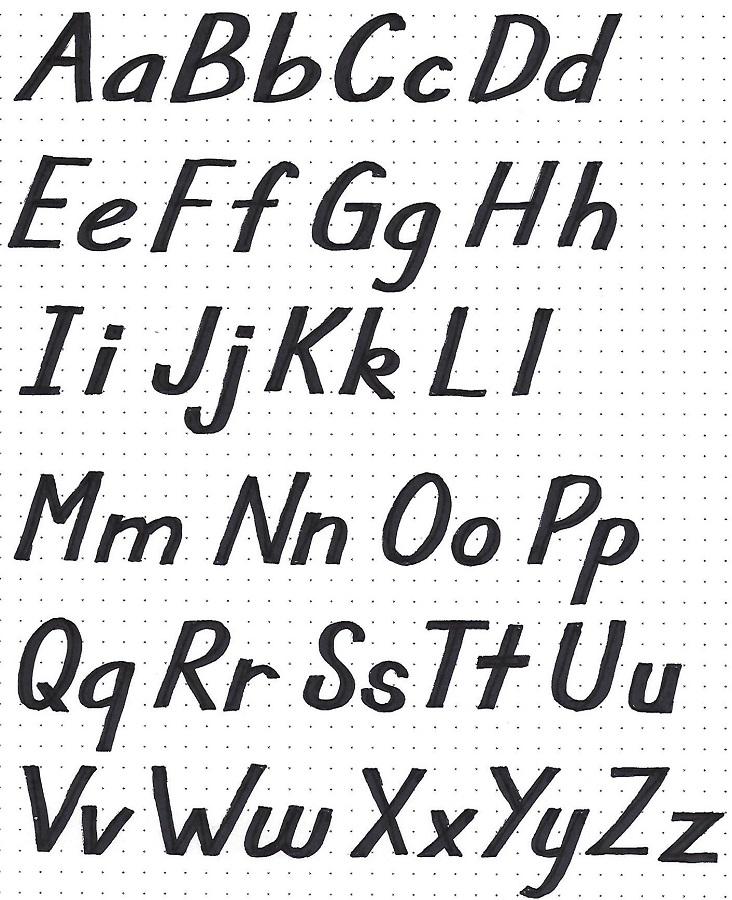
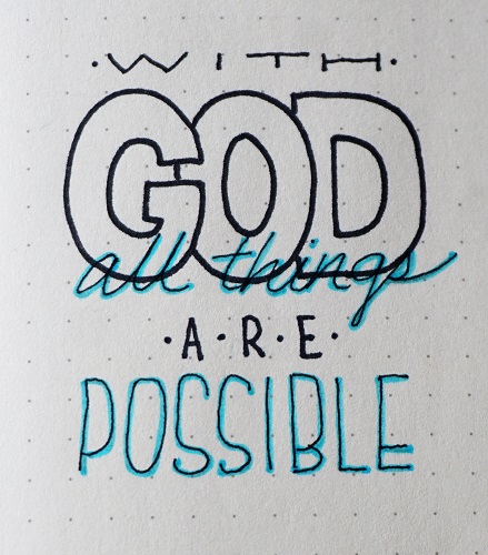
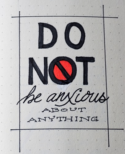
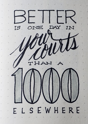
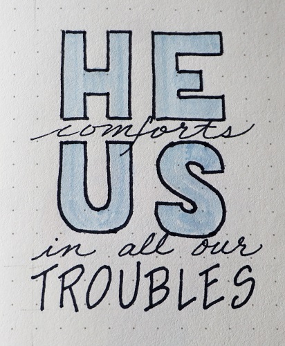
Several of us taught classes to the others - My contribution was lessons based on my Drawing Room tutorials and Lettering Lodge series. Great success!

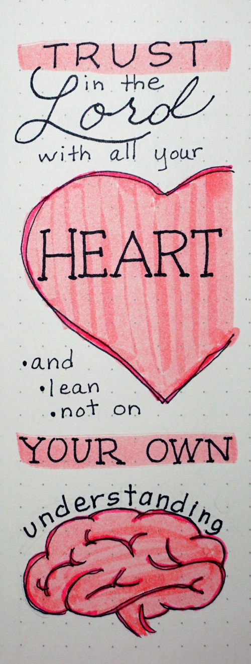
Though I don't have anything to show from that, I do have pictures of the final bible pages from the other lessons.

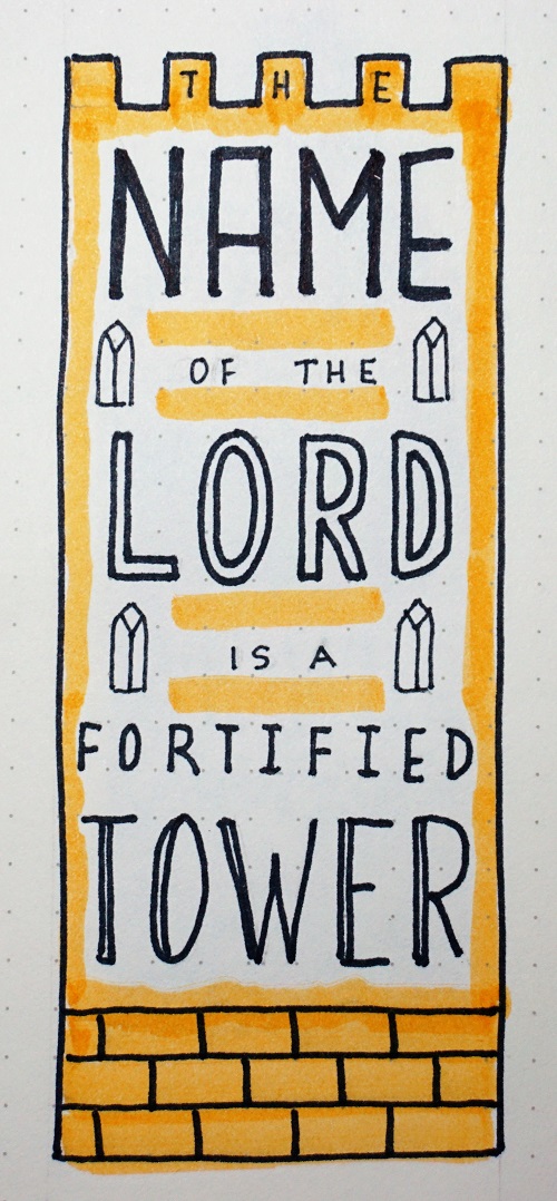
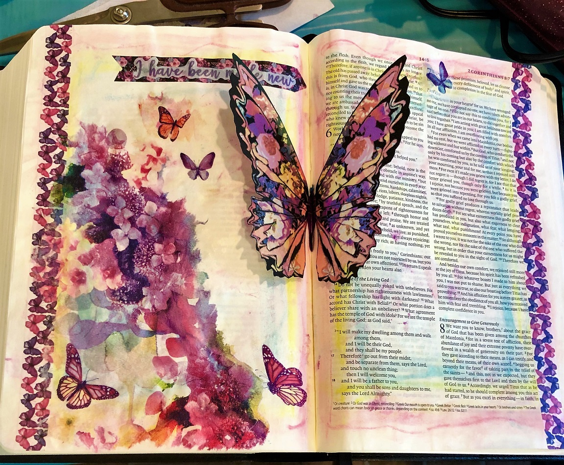
This first page is 2 Corinthians 5:12 in my interleaved bible. Products/processes: gelato background, printed vellum tipin, washi tape borders, napkin technique using Mod Podge. This combined two of our lessons.


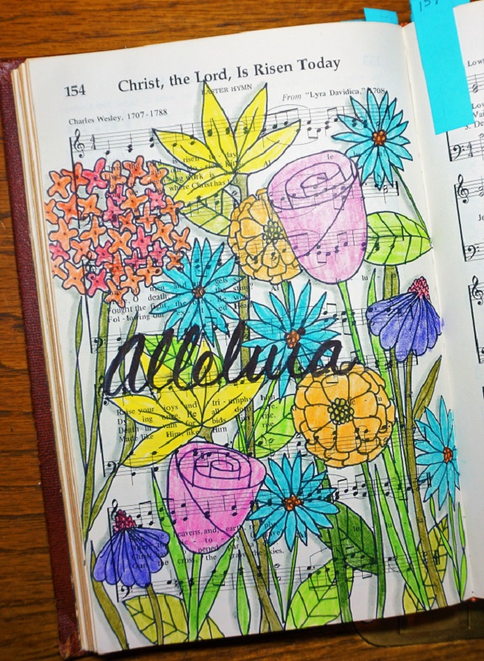
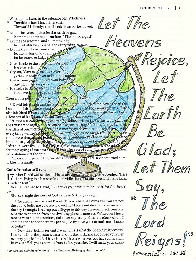
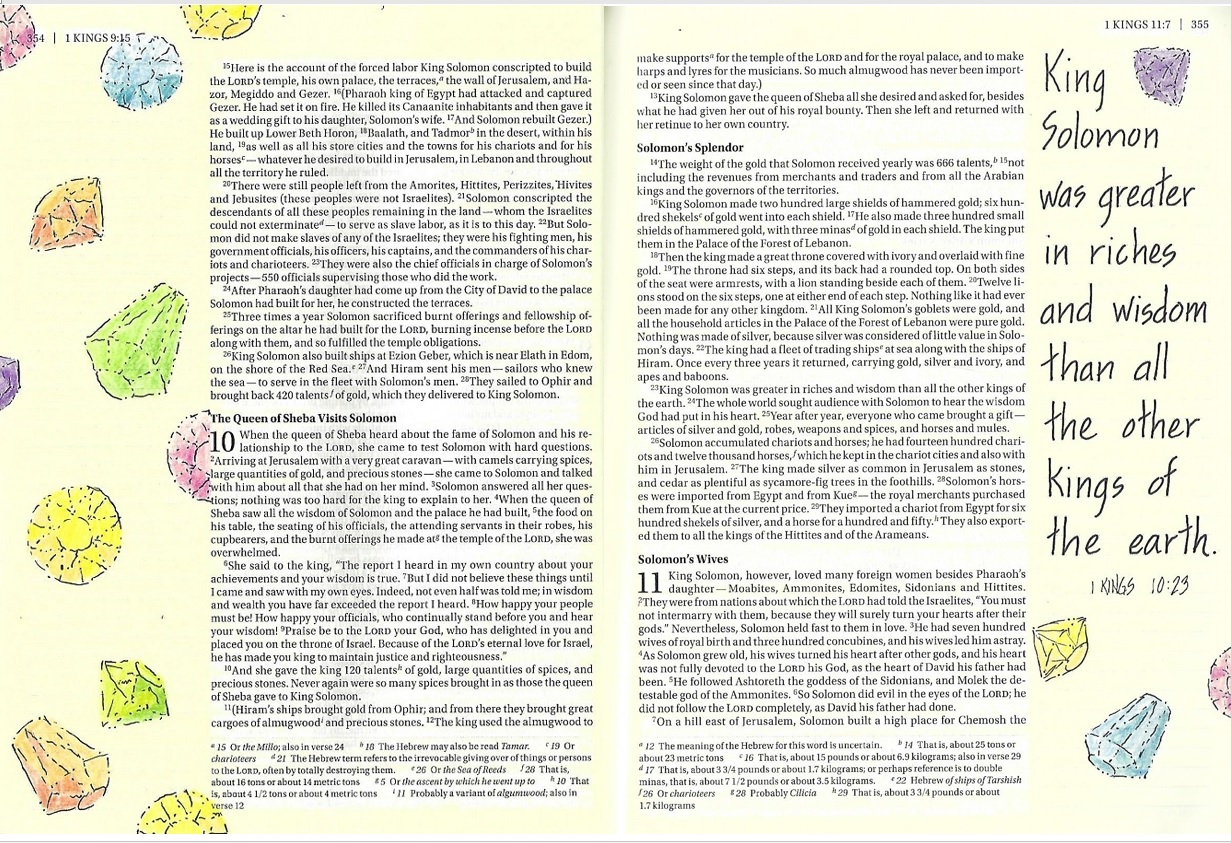
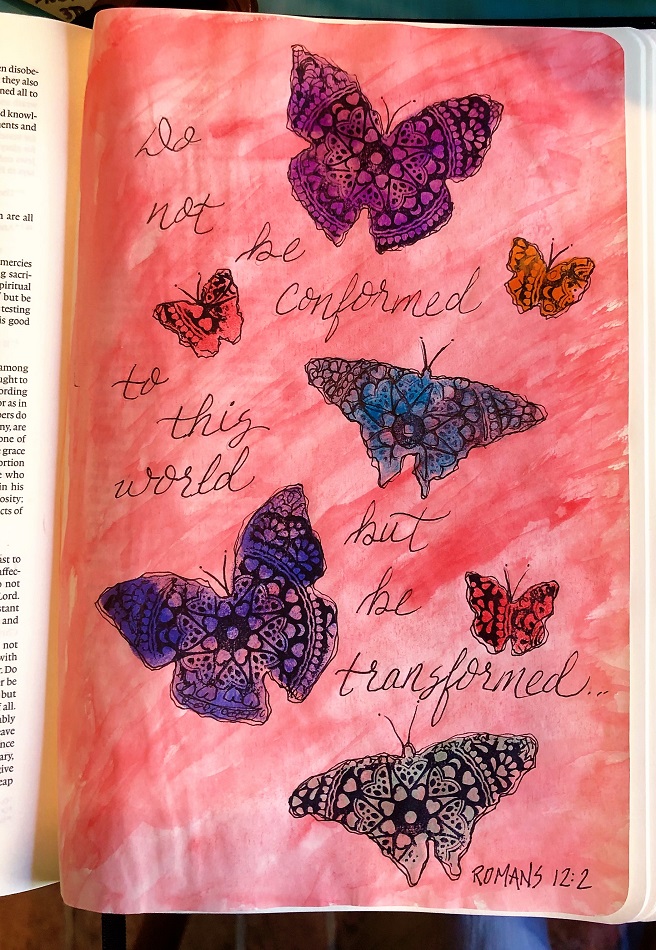
Next is also in my interleaved bible in Romans 12:2. 

It uses a watercolored background, Distress Inks through stencil, A doily stamp applied through stencil, pen outlining and lettering.


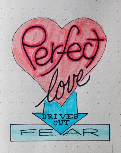
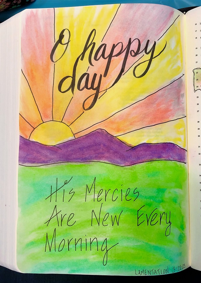
For Lamentations 3:22-23 in the interleaved bible I used gelatos and baby wipe, lettering with brush pen and pen.


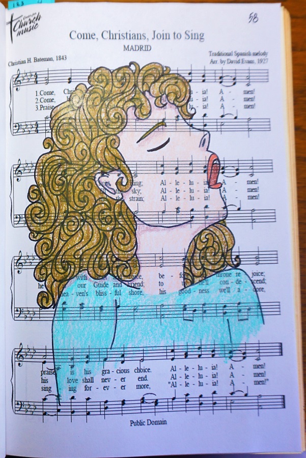
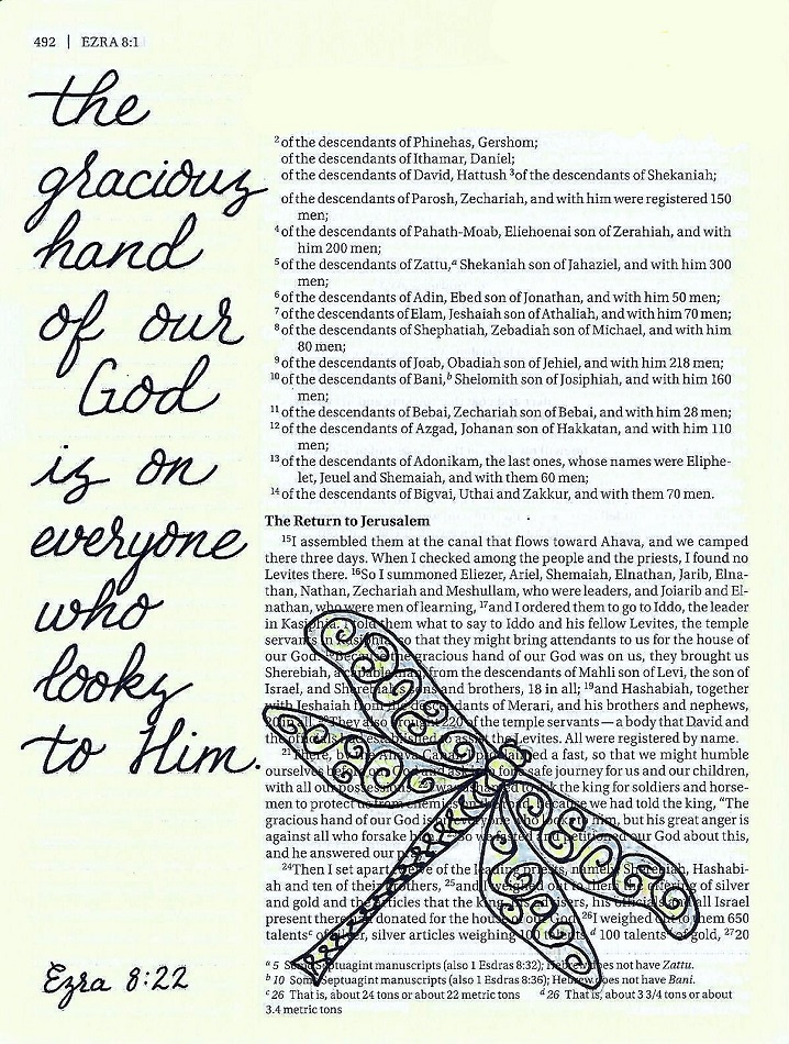
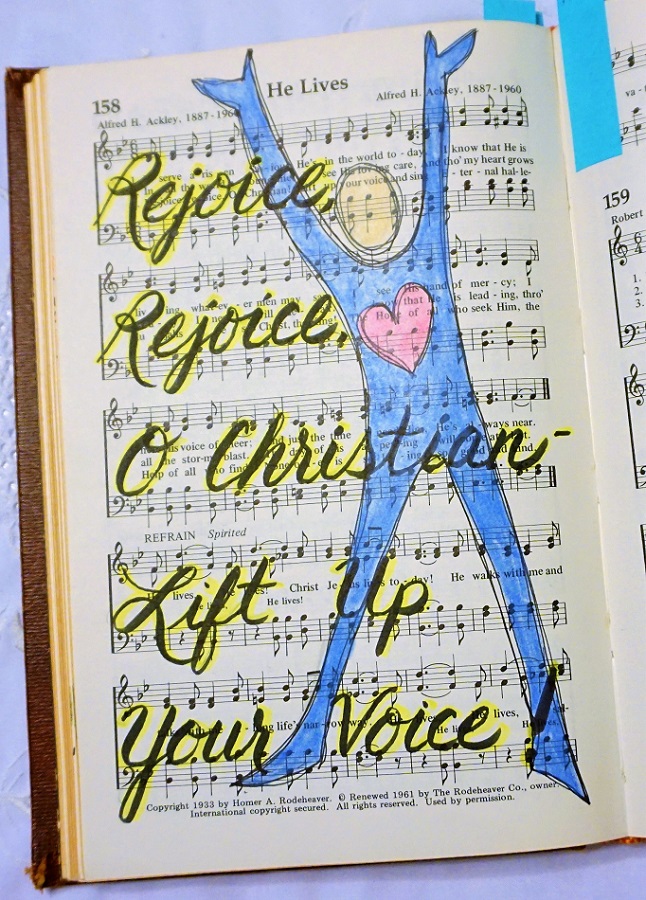
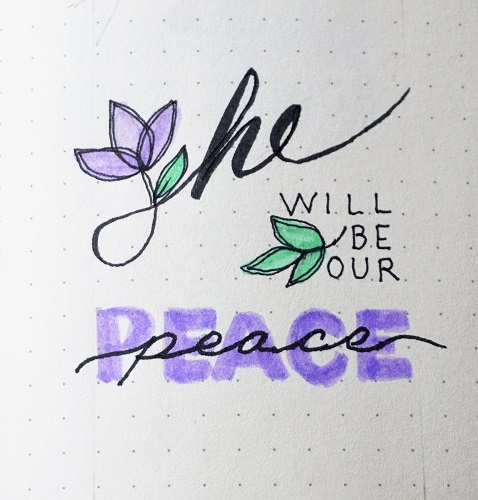
Next up was Psalm 51:10 in the interleaved bible.

First up was gelatos and bubble wrap! Then I drew in the rope with pen, made drips with watercolor and a straw, distressed the edges of the cutout shapes using Distress Ink pads, glued the music hearts and fabric heart only enough to keep them in place while allowing them to be free at the bottom. I made tiny clothespins with skinny washi tape. The bottom steip is Him Holtz tissue tape. Watercolor shading on the clouds.


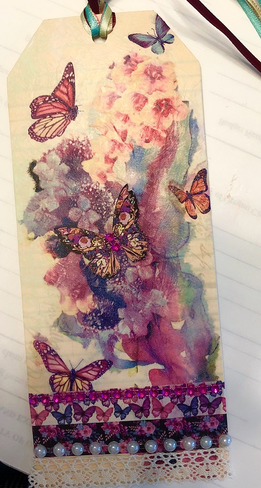
We then made a tag with a napkin technique that utilized Saran Wrap to aid in placement. Embellished with washi tape, strips of pearls and bling, lace and ribbons.

I haven't lettered on mine yet.


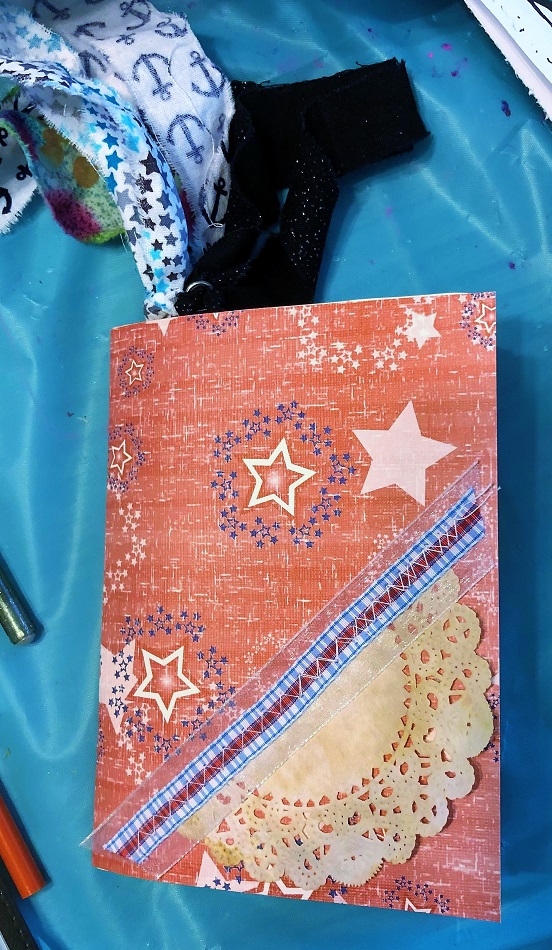
We then were given a variety of papers and pockets to fold and nest. These were then center-stapled to create a 'junk journal'. Materials included strips of torn fabric to attach to big paper clips.

I have not used any of the pages in mine yet.


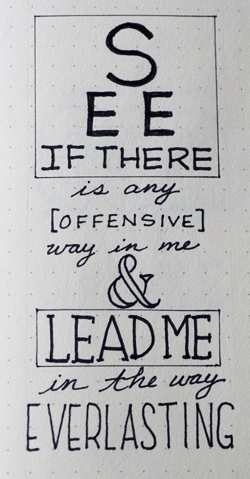
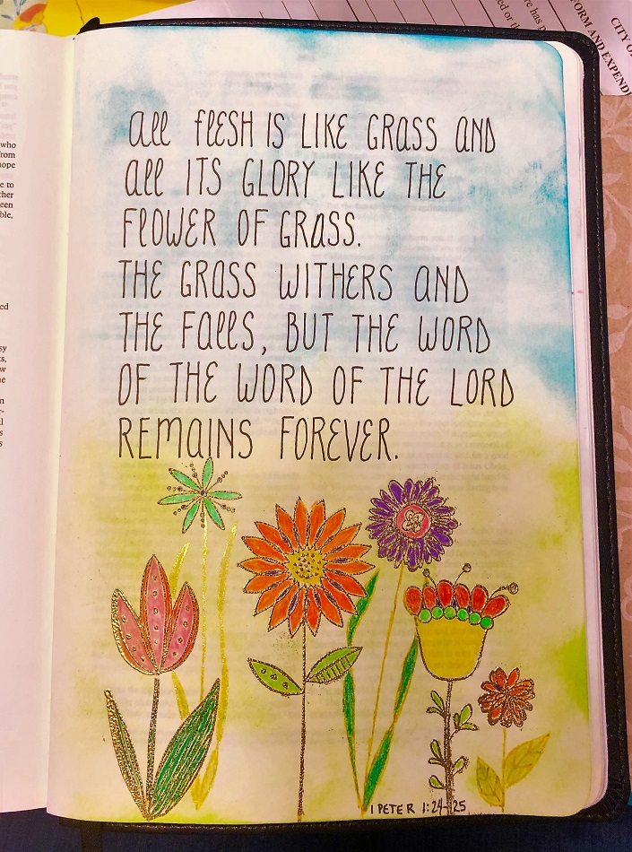
In 1 Peter 1:24-25 in the interleaved bible I made a Distress Ink background with blender tool, stamped in versamark and embossed with gold, colored with colored pencils and lettered with Micron pen.


And the last one that I did during 'free time' and not from anything we had covered in the lessons.

I did this in Song of Solomon 2:1 in my Journal the Word bible.

Method uses packing tape over a printed image with a white background. This is burnished well and then placed in a bowl of water to soak. When it is thoroughly soaked you lay it face down on a towel and use fingertips to rub away the paper. Soak and rub, soak and rub till all of the white paper is gone, leaving just the image on the tape.

You allow the tape to air dry and it is still sticky. Just place in the margin and trim the edges.


So that is it - the sessions were held over two days so we really accomplished a lot.

Ddd


Posted by studio3d@ccgmail.net at 12:01 AM PDT
Sunday, 28 April 2019
Learning Semi-Script Lettering
Topic: Bible Journaling

This series on progressive lettering styles is coming right along! This part of the series is focused on moving into semi-script.

The remarkable thing about today’s practice word is how unremarkable it is! In fact, it looks pretty much like it was written from last week’s lesson on italics.


However, note that the tail on the ‘e’ is just a little longer and the base of the ‘w’ is now round instead of coming to two points. The whole word is just a little more relaxed.


Consider it like the difference between these two typefaces:   Hebrews and Hebrews


Tomorrow we’ll see the many other changes that transform this style.


Although very similar to the italic oval print, the semi-script introduces little curled tails at the end of letters that would normally end on the baseline.


These letters do NOT connect to one another in their application which is why it is only a semi-script and not a script. But those tails actually make the letters faster to write as they help the letters to flow together and they make the text to enhance the feeling of the words being cohesive elements.


Today we are using the same upper-case as for the italics.


Today you can practice an alternative upper-case for the semi-script. These are more in keeping with the flowing style that allows you to make the letter forms more quickly.


Notice the trailing tails on the ‘A’, ‘E’, ‘L’, ‘Q’, ‘R’, ‘U’ and ‘Z’.


Let’s put it all together – The alternative upper-case, the italic slant, the trailing tails. But remember, we are NOT connecting out letters together.


Practice by writing out a block of text. I used Hebrews 4:16.


It is more difficult to write in this particular scale (3 units) as it is hard to keep the x-height consistently falling between those dotted lines. If this is an issue for you, consider penciling in a straight line using a ruler to establish your x-height.


This style of print is what my children learned in school instead of basic printing. The teachers felt it would be an easier transformation into cursive for them. In the long run, it did not make their handwriting any more readable than those children who learned standard print and then cursive! But it does make for a very nice print that reads more attractively than a rigid standard print.


Remember, we still always work in pencil first to establish our letter size and shapes as well as spacing. Then we ink over our letters, making corrections as desired. When the ink is dry, we erase the pencil.


On work such as this blank page, 1) the lettering can be written on graph or dot grid paper and traced 2) guidelines can be drawn on the page with a ruler and pencil to guide the lettering or 3) use the ghost of the printing on the following page to serve as your guidelines (this is what I did).


I love this lettering style!

Ddd


Posted by studio3d@ccgmail.net at 9:27 PM PDT
Saturday, 27 April 2019
Almost There
Topic: Lettering

This set of lessons for the Typography class focused on ‘Banners and, as always, the scriptures are part of the #30DaysofBibleLettering challenge. Banners are fun!

25 - 1 Timothy 6:12 - Fight the good fight of the faith. Take hold of the eternal life to which you were called when you made your good confession in the presence of many witnesses.


26 - Romans 12:12 - Be joyful in hope, patient in affliction, faithful in prayer.


27 - 1 John 4:19 - We love because he first loved us.


Almost there - just one more set of Typography lessons to show with the last three in the 30 day lettering challenge. We will finish on April 30.

Ddd


Posted by studio3d@ccgmail.net at 8:50 AM PDT
Wednesday, 24 April 2019
30 Day Challenge Continues
Topic: Lettering

The next set of lessons for the Typography class focused on ‘Movement’ and, as always, the scriptures are part of the #30DaysofBibleLettering challenge

April 22 - Joshua 24:15 - But if serving the Lord seems undesirable to you, then choose for yourselves this day whom you will serve, whether the gods your ancestors served beyond the Euphrates, or the gods of the Amorites, in whose land you are living. But as for me and my household, we will serve the Lord.


April 23 - Psalm 55:22 - Cast your cares on the Lord and he will sustain you; he will never let the righteous be shaken.


April 24 - Hebrews 4:12 - For the word of God is alive and active. Sharper than any double-edged sword, it penetrates even to dividing soul and spirit, joints and marrow; it judges the thoughts and attitudes of the heart.


Just 6 more days (two more lessons) in the 30 day challenge and the Typography class. So far, this has come together very nicely!

Ddd


Posted by studio3d@ccgmail.net at 8:39 AM PDT
Monday, 22 April 2019
Easter Hymn
Topic: Hymnal Art

For our hymnal art this week we were assigned Christ the Lord Is Risen Today, a celebration of Easter.

I was carried along by all of those Aleluias at the end of every phrase!

I used principles learned in the Whimsical Sketching class to combine flowers that I have taught in the Drawing Room at creative-bible-journaling.com.

Here is my Easter garden:


I used a wide gray line on the left and bottom of each element to make them raise off the page.

Ddd


Posted by studio3d@ccgmail.net at 9:02 AM PDT
Sunday, 21 April 2019
Next three Bible Lettering
Topic: Lettering

 Three more days of bible lettering for the 30-days challenge. The technique being explored in Typography For Bible Lettering is'kerning' - the process of letter spacing for readability and impact.

April 19 - 1 Chronicles 16:24 - Declare his glory among the nations, his marvelous deeds among all peoples.


April 20 - 1 Corinthians 16:14 - Do everything in love.


April 21 - Proverbs 18:10 - The name of the Lord is a fortified tower; the righteous run to it and are safe.


This has been such a fun challenge. 9 more lessons to go.

Ddd


Posted by studio3d@ccgmail.net at 5:48 PM PDT
Saturday, 20 April 2019
Lettering In My Bible
Topic: Bible Journaling

Oh, how I wish my blog editor allowed more than one Topic tag! I fear I switch back and forth between Bible Journaling and Lettering for these posts and so they will never all appear together in one search. Grrrr!

In any case, this week I taught lettering again and include the script here for you.

Day #1 – Adding Weight – Intro

This week we’re going to explore options for adding weight to our italic fonts learned last week.

For the sample word, write it in pencil using a basic oval font OR an architect font in italics.

Add a second line along the left side of the letter then ink and erase the pencil.


Day #2 – Double Line Italic – Alphabet

This entire alphabet is based on an italic of the basic oval letter. You can refer back to your own sample sheets from previous lessons to see if you had changed any letter forms into ones you would like to keep for this lesson.

Write out the whole italic alphabet in pencil. Add a second line to the left side of each letter. Ink and erase pencil.


Day #3 – Filled Line Italic – Alphabet

You can use a COPY of yesterday’s lesson for this exercise. The only difference is that we will fill in the area between the double lines. You can use either black or color for the fill.

The reason I emphasize using a COPY is that you will then retain samples from every stage of the progression which can be used to decide what lettering you want to use on a future project.


Day #4 – Wide Line Italics – Alphabet

This style adds weight by thickening ALL the lines on the letters.

Note that the verticals are slightly thicker than the horizontals and that all line ends are squared off.

We are keeping the general letter shapes of the basic oval lettering in their italic forms.


Day #5 – Weighted Italics – Bible Page

The final exercise of the week is to select one of the weighted italic forms learned this week and use it in your bible. I chose a scripture in 1 Chronicles and applied the filled double line style. I used color as my fill.

I added artwork using the Drawing Room lesson for this week ‘Globe’.


Is anyone out there USING these lettering lessons?

Ddd


Posted by studio3d@ccgmail.net at 9:28 AM PDT
Friday, 19 April 2019
Continuing a Month of Bible Lettering
Topic: Lettering

Now, for the Typography class, the projects wre to feature 'word stacking'. My prompts continue to be from the 30 Days of Bible Lettering challenge.

April 16 - 1 John 4:18 - There is no fear in love. But perfect love drives out fear, because fear has to do with punishment. The one who fears is not made perfect in love.


April 17 - Psalm 139:24 - See if there is any offensive way in me, and lead me in the way everlasting.


April 18 - Matthew 19:26 - Jesus looked at them and said, “With man this is impossible, but with God all things are possible.”


You can see from the text I have highlighted for each date, they do not sometimes match what the art says. That is because I highlighted in red the text I thought I would use foe each day. But then, as I progressed on the art, sometimes I changed my mind. I did not go back to change my original worksheet though.

More in three days!

Ddd


Posted by studio3d@ccgmail.net at 7:53 AM PDT
Monday, 15 April 2019
Three More Days of Bible Lettering
Topic: Lettering

This post is to show the next three days of the 30 Days Of Bible Lettering challenge.

In the class Typography for Bible Journaling, the lesson was on Line Weights. 

These are the samples I made:

April 13 - Philippians 4:6 - Do not be anxious about anything, but in every situation, by prayer and petition, with thanksgiving, present your requests to God.


April 14 - Psalm 84:10 - Better is one day in your courts than a thousand elsewhere; I would rather be a doorkeeper in the house of my God than dwell in the tents of the wicked.


April 15 - 2 Corinthians 1:4 - who comforts us in all our troubles, so that we can comfort those in any trouble with the comfort we ourselves receive from God.


I'll be ack in three days with more of this project.

Ddd


Posted by studio3d@ccgmail.net at 12:00 AM PDT
Sunday, 14 April 2019
He Lives - Decorated Hymnal
Topic: Hymnal Art

I am sticking with the Easter themed songs this month and it was time for another old favorite... 'He Lives'.

I gave my page a stylized figure, singing praises to accompany some handwritten lyrics.


I have a couple ore ideas on this theme to complete the month.

Ddd


Posted by studio3d@ccgmail.net at 11:36 PM PDT
Saturday, 13 April 2019
Lettering in the Books of Kings
Topic: Bible Journaling

Here we are up to week 15 in the series on lettering progression from basic to advanced. We are now starting the transformations leading from print to script - not all at once but in small, incremental steps.

Let's begin.

1 & 2 KINGS: Day #1 – Architect – Introduction

Now that we’ve mastered the basic oval print, we’re going to start morphing it into more styled letters. This page introduces a font called Architect. This is the type of print you would find on blueprints and building designs, but generally only using upper-case.

It is very readable and every letter is distinct so it cannot be mistaken for something else. The slants on the letter forms make it very natural to write quickly.

Today, just practice on these few letters introducing the books of Kings.


1 & 2 KINGS: Day #2 – Architect – Alphabet

Now we have the full alphabet in both upper- and lowercase for the architect font.

Note that the tops of letters as well as the horizontal crossbars are on an angle. The bowls of the letters are based on a slanted oval and the left and right posts of letters are staggered in height.

I think this has become my favorite lettering style to default to, especially for lettering things accompanied with a drawing.


1 & 2 KINGS: Day #3 – Italics Oval Print – Alphabet

We’re going to drop back to the basic oval print again today but turn it into an italic font. Rather than just tipping the bowls, like the architect print did, this sets all the uprights on a slant and the bowls follow them. However, the horizontal marks remain square to the baseline.


1 & 2 KINGS: Day #4 – Italic Architect – Block of Text

Let’s combine the Architect and the Italic today and use them to write up a block of text. Do this by using the letter forms for the architect style but with the uprights on a slant.

I selected a scripture from 1 Kings for my sample.


1 & 2 KINGS: Day #5 – Architect/Italic – Bible Page

Choose with the architect font or the italic oval font or a combination of architect/italic and use it to write a scripture in your bible. I chose 1 Kings for my scripture reference again.

I have added some gems from this week’s Drawing Room lesson.


Keep joining me here every week for the continuation of this series.

Ddd


Posted by studio3d@ccgmail.net at 8:23 PM PDT
Friday, 12 April 2019
Still Making Typography Scriptures
Topic: Lettering

The next 3 lessons in the Typography For Bible Journaling class were on combining fonts. I had already been doing this so basically continued with what I was doing.

April 10 -

10 - Micah 5:5 - And he will be our peace when the Assyrians invade our land and march through our fortresses. We will raise against them seven shepherds, even eight commanders


April 11 -

11 - Psalm 107:9 - for he satisfies the thirsty and fills the hungry with good things.


April 12 -

12 - 1 Thessalonians 5:11 - Therefore encourage one another and build each other up, just as in fact you are doing.


More to come!

Ddd


Posted by studio3d@ccgmail.net at 9:02 AM PDT
Tuesday, 9 April 2019
Three More Typography Scriptures
Topic: Lettering

The next set of samples in the Typography For Bible Journaling class were to practice 'casual script', using our own handwriting.  We practiced using script beforehand and explored letterforms that we might want to incorporate. 

I have already been doing this in my bible lettering and have changed, for 'art lettering' the way I make h, r, s, o and others. I have also worked on letter connecting. So this was not a problem for me.

As before, I am using the prompts for the 30 Days Of Bible Lettering challenge for my class homework. I used a combination of regular markers and brush markers in my script.


April 7 - Isaiah 40:31 - but those who hope in the Lord will renew their strength. They will soar on wings like eagles; they will run and not grow weary, they will walk and not be faint.


April 8 -1 Corinthians 13:13 - And now these three remain: faith, hope and love. But the greatest of these is love.


April 9 -John 14:1 - Do not let your hearts be troubled. You believe in God; believe also in me.


You can see, because of the dots, that I did this whole series of lettering designs in a notebook. This way I can later choose which ones I want to transfer to my journaling bible.

Ddd


Posted by studio3d@ccgmail.net at 10:22 AM PDT
Monday, 8 April 2019
We All Sing Again
Topic: Hymnal Art

This week the decorated hymn assigned was 'Because He Lives'.

First, let me say that I was stunned to find that this hymn was NOT in my book! WHAT?!?!? I had to find the sheet music online, resize it and cut it out to tip in. When I do this, I put it where the page number says it should go and then I add it to my hymnal index.

I went with a straight-up resurrection theme for my drawing and did all the coloring in markers.

I took some of what I learned in the class Typography For Bible Journaling and applied those principles for the lettering.


I did the tipin with just a fine line of glue at the inner edge and closed the book to dry.

Ddd


Posted by studio3d@ccgmail.net at 12:01 AM PDT
Saturday, 6 April 2019
30 Day ChallengeOn Bible Lettering
Topic: Lettering

The next series of lessons for Typography class were related to Serif letters. Again, I used scriptures from the 30 Days of Bible Lettering challenge for my homework.

April 4 - Psalm 103:2 - Praise the Lord, my soul, and forget not all his benefits


April 5 - Proverbs 16:24 - Gracious words are a honeycomb, sweet to the soul and healing to the bones.


April 6 - Nehemiah 8:10 - Nehemiah said, “Go and enjoy choice food and sweet drinks, and send some to those who have nothing prepared. This day is holy to our Lord. Do not grieve, for the joy of the Lord is your strength.”


Lesson 2 complete.

Ddd


Posted by studio3d@ccgmail.net at 12:00 AM PDT
Friday, 5 April 2019
Lettering James
Topic: Bible Journaling

The lettering lessons continue - this week in the book of James.

Here are the daily lessons:

JAMES: Day #1 – Bouncing Letters – Introductions

I tend to like my lettering all lined up in neat rows, showing off their symmetry and consistency. But every now and then it is good to let them loose to play a little.

We’re going to concentrate on that aspect this week while using the basic oval letters.

To begin, letter the word ‘James’ in a couple of bouncing styles. On one, twist the letters this way and that while allowing them to float at varying distances above the base line. On the next, Only allow the bounce to be vertical without any tilt to the letters.


JAMES: Day #2 – Bouncing Letters – Alphabet

I think the hardest part of bouncing letters is keeping the sizes consistent when you don’t have that baseline and other guidelines to key off of. So it is especially important to draw out the letters first in pencil and make any edits in conformity before inking.

Practice bounding your basic oval lettering on a full alphabet. Include some of your alternative letter forms as well.

While you’re at it, you might toss in a set of numbers for future reference.


JAMES: Day #3 – Bouncing With Options – Style Page

Today we will practice writing words with bounced print lettering. There are so many options (not all of them are listed) that I included the samples and pointers right in the practice piece.

I did all of my lettering in pencil and then drew them with colored markers. Try this out for fun!


JAMES: Day #4 – Bounced – Writing Text

For more practice, choose your favorite technique from yesterday’s practice and write a block of text using it. You’ll notice how much less frantic it appears when you confine yourself to only a few options.

I used vertical bouncing with slant serifs and no color.


JAMES: Day #5 – Bounced/Colored – In Your Bible

For my Bible page I used vertical bouncing with shadow lines and added a rainbow of color to the letters.

Like yesterday, I want you to choose a favorite style from Day 3 and use it in your bible in the book of James. I combined mine with the Drawing Room lesson on ‘Gears’.

More to come.

Ddd


Posted by studio3d@ccgmail.net at 1:00 AM PDT

Newer | Latest | Older