Topic: Bible Journaling
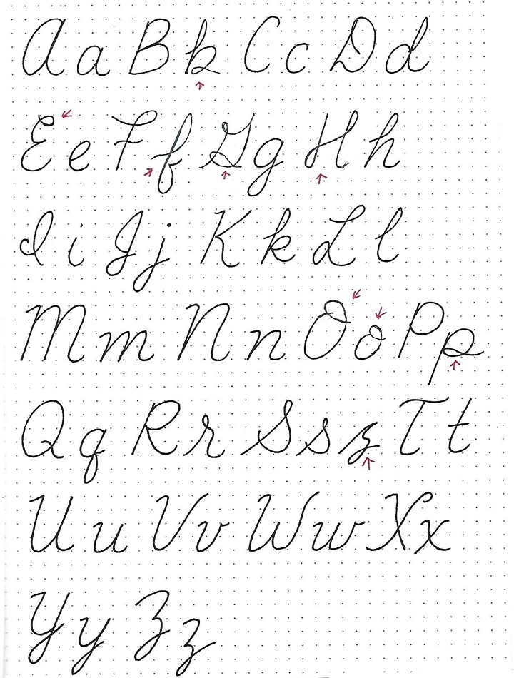
On to another lettering lesson!
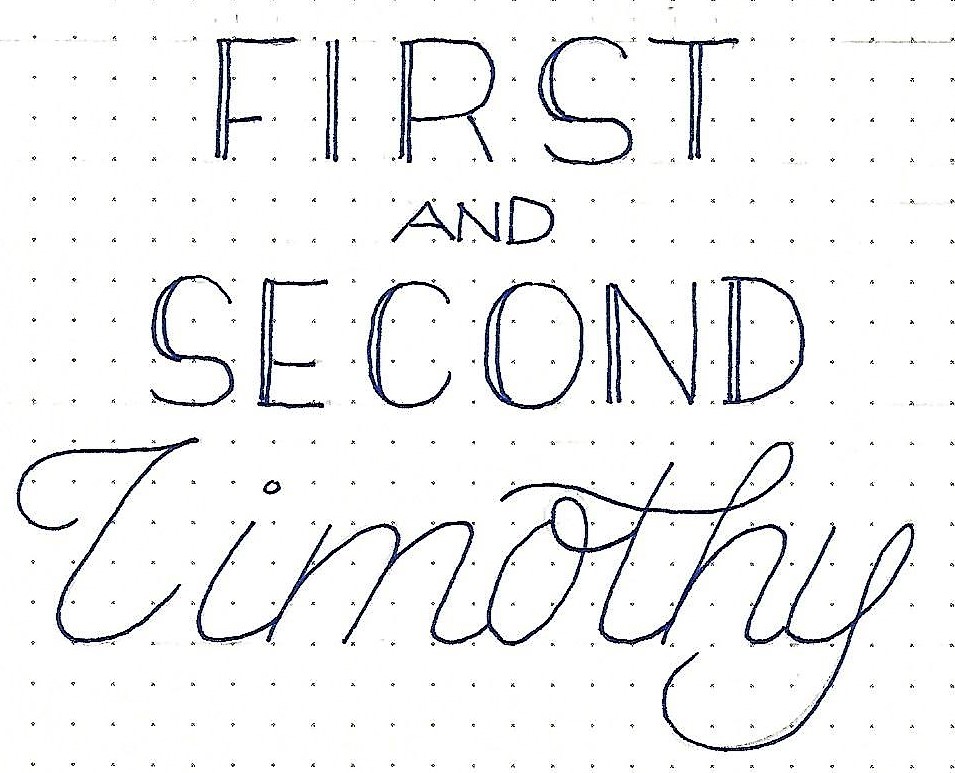
1&2 TIMOTHY: Day 1 – Font Combos – Introduction
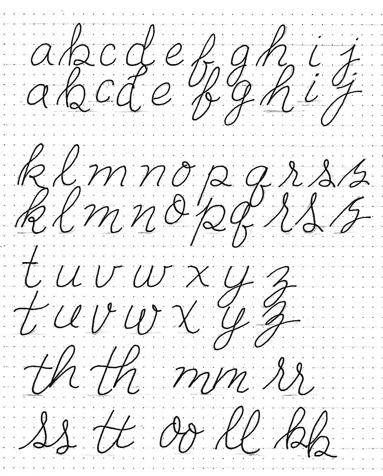
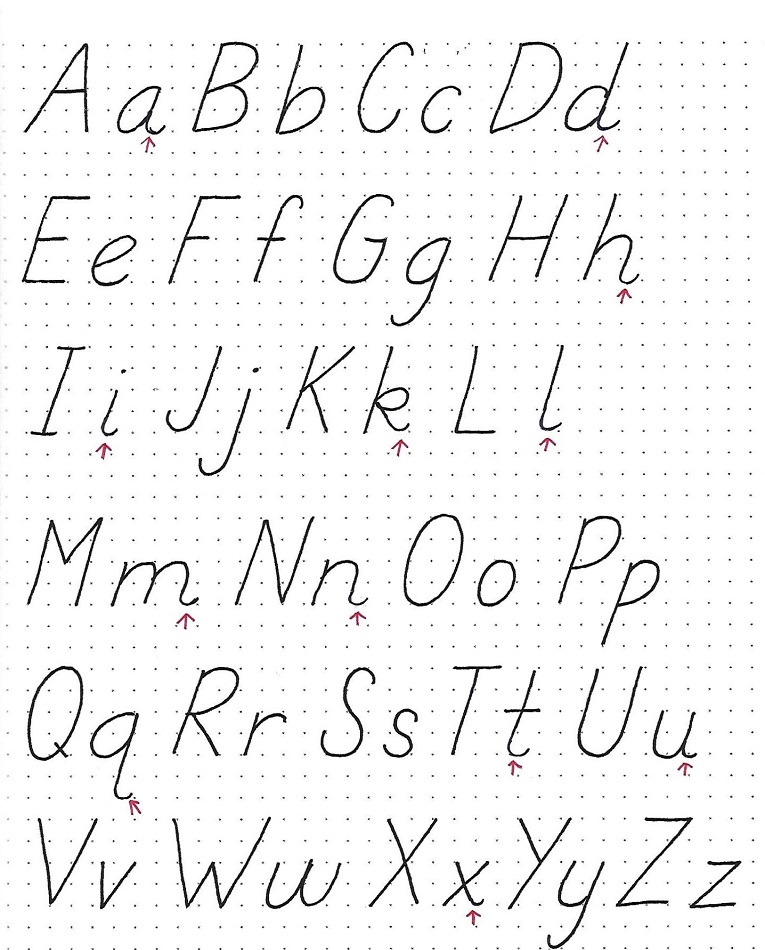
In beginning to combine fonts to make blocks of text that seem integrated, there are several options. You’ll find no hard and fast rules here – just suggestions for things you can try. These are just the basics this week. After this you can experiment and soon, you’ll be flying solo.
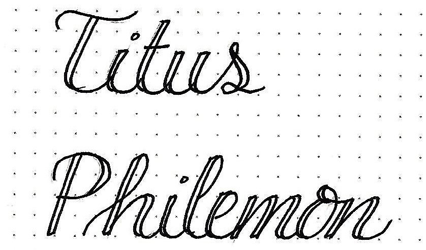
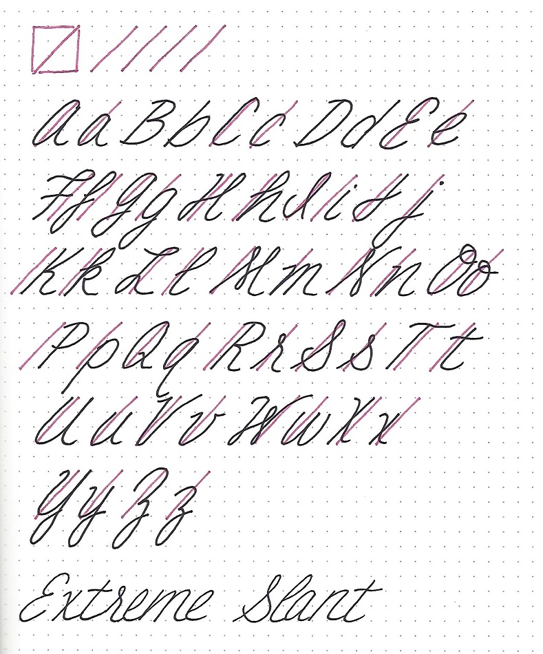
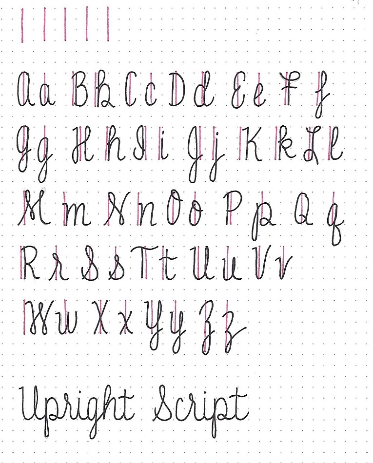
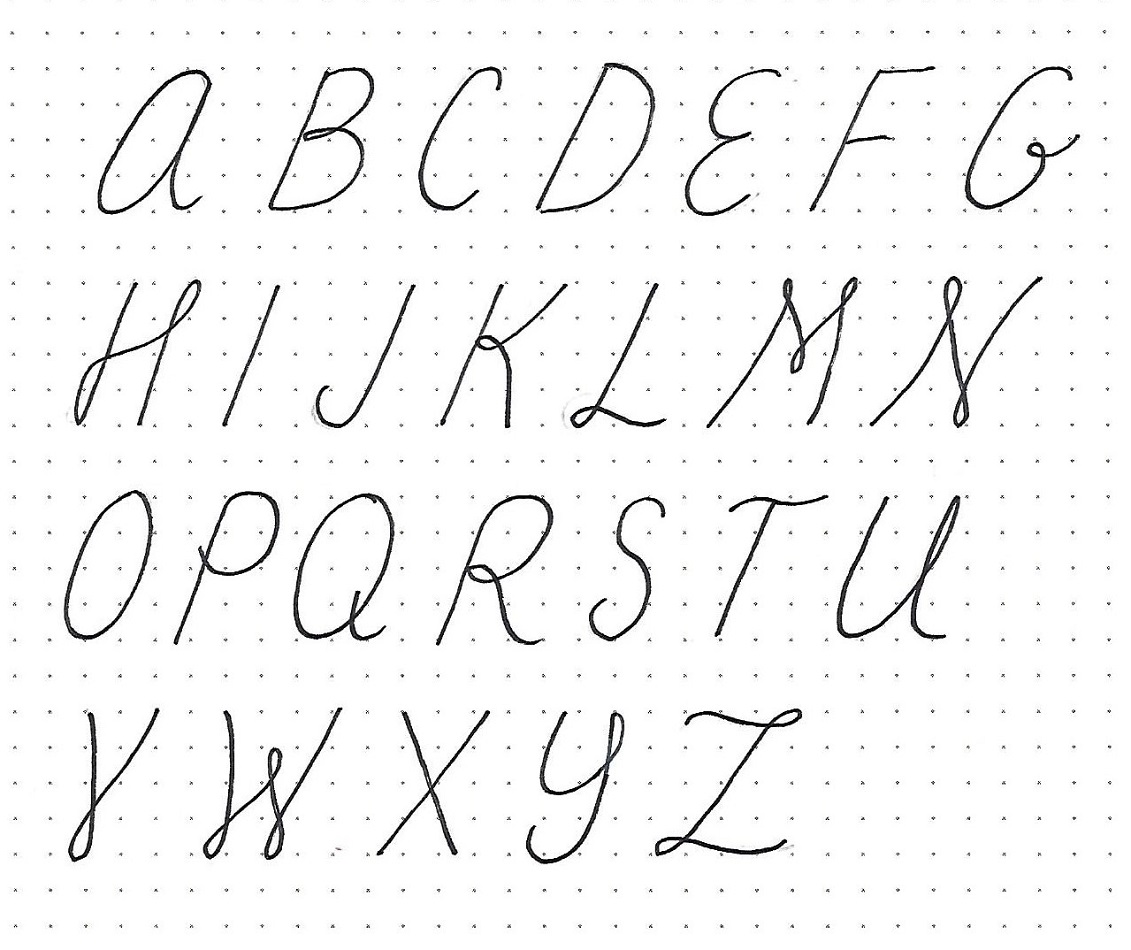
For the practice piece today, I want you to combine a basic round font with a basic script. I changed up my print to include a left-side doubled line and used all caps.
Scale is important, too. Reserve the large letters for the important words and use smaller, plainer letters for the conjunctions. Note that there are some extra flourishes on the script letters to help them hold their own against the double lines in the print.
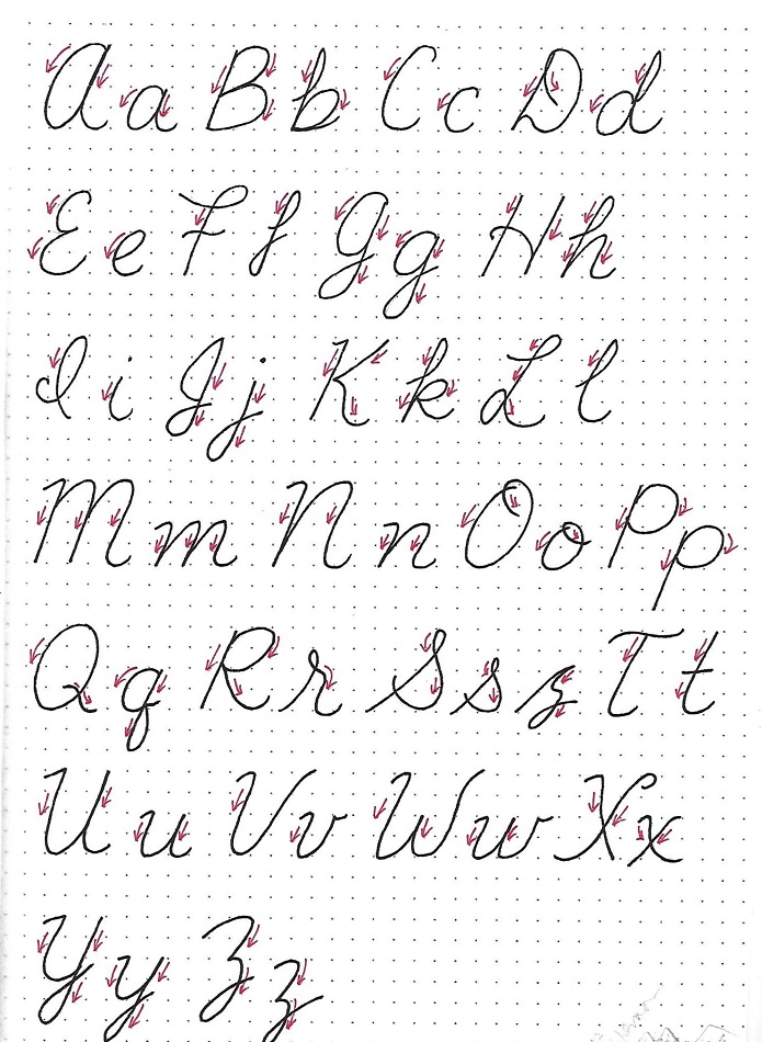
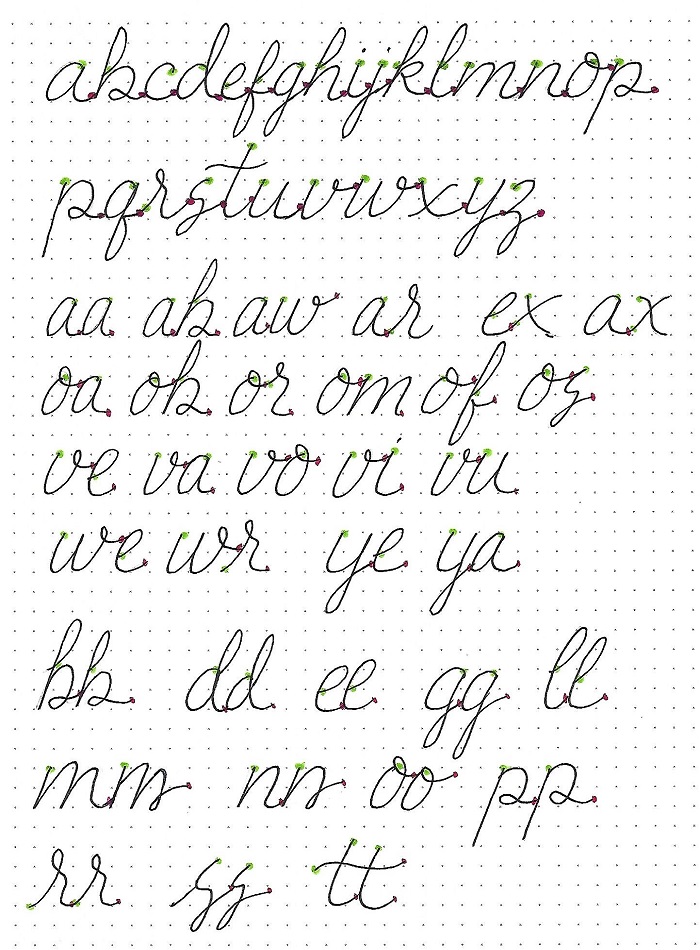
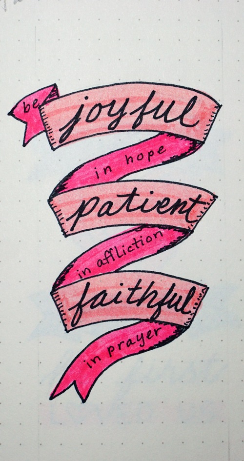
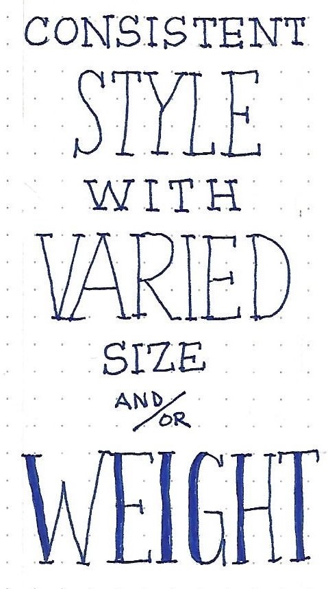
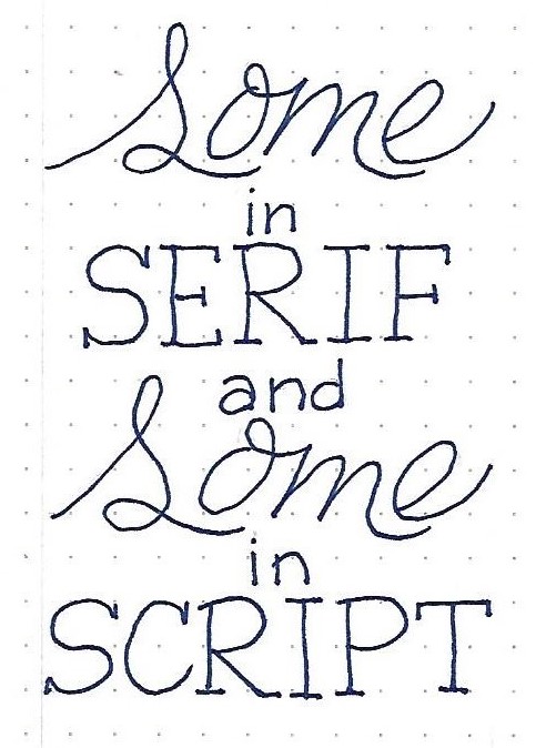
1&2 TIMOTHY: Day 2 – Font Combos – The Basics
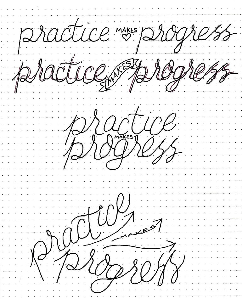
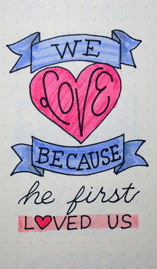
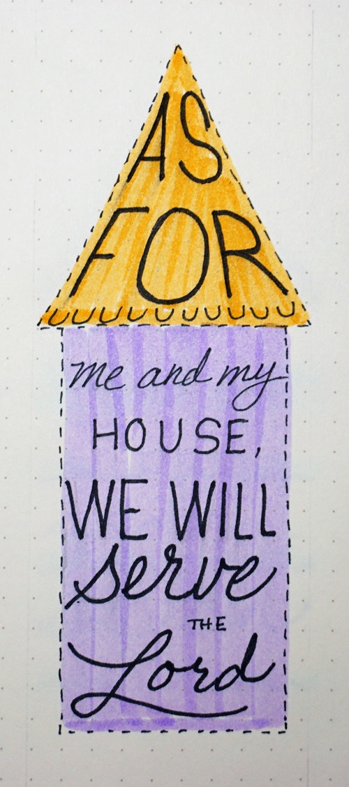
I decided to let the samples speak for themselves today. So, check out these two panels and note how the work described is being implemented. These are the two most basic formats: 1) a consistent style with various size changes and 2) mixing a basic print with a basic script.
You can write up any phrase you want for your own work, or copy the text from these.
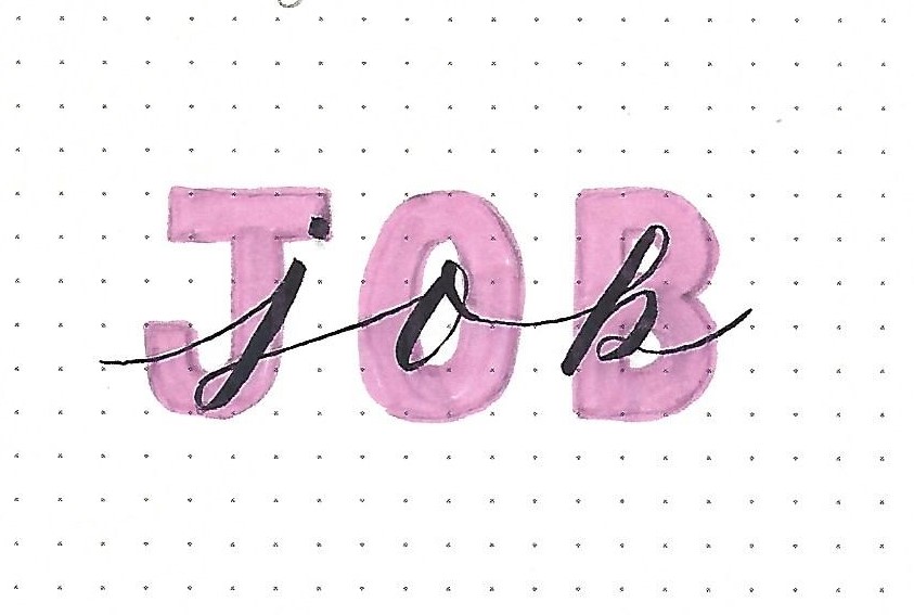
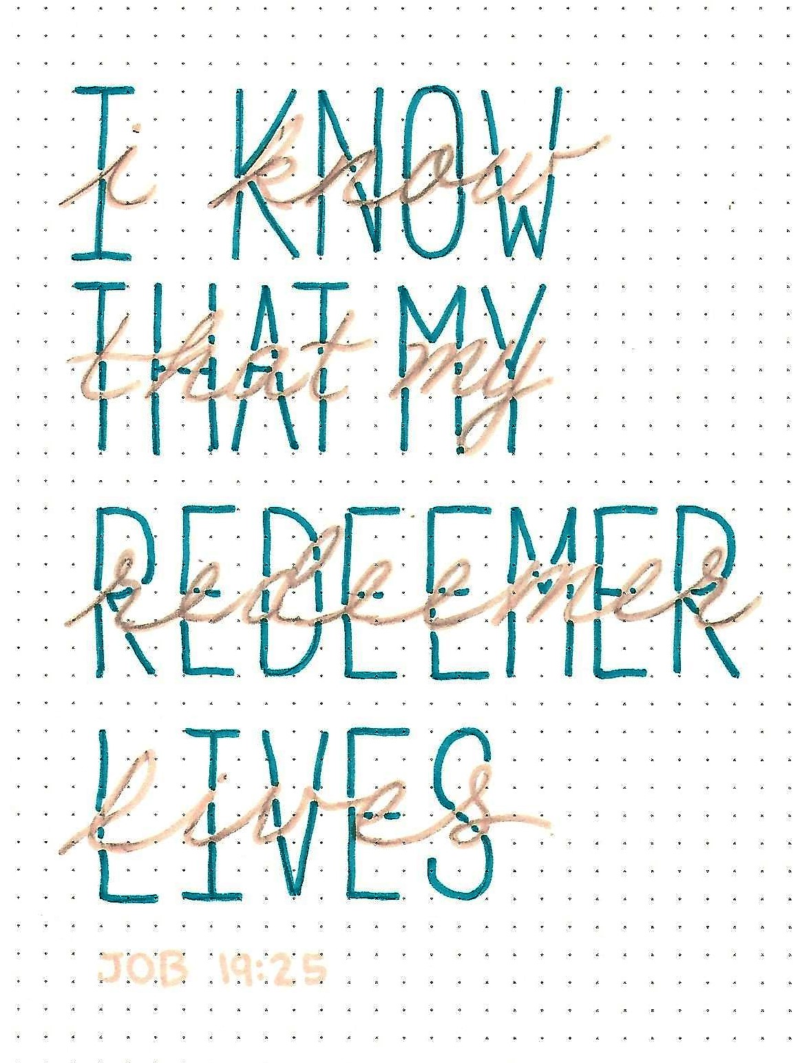
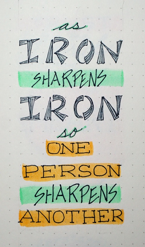
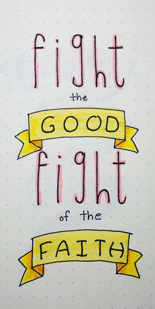
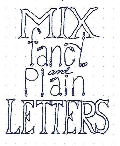
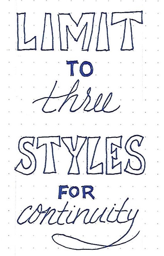
1&2 TIMOTHY: Day 3 – Font Combos – Other Options
When using something other than the basic fonts, try to keep one plainer and one fancier. They should not be similar if they are not exact. (Match closely OR vary widely).
Sample two is a reminder to stick with 2-3 fonts. More than that looks cluttered and mismatched.
Whatever your font choices, try to use each font more than once. Use fonts with flair in styling or size for important words.
Use these or other phrases to write up to demonstrate the principles.
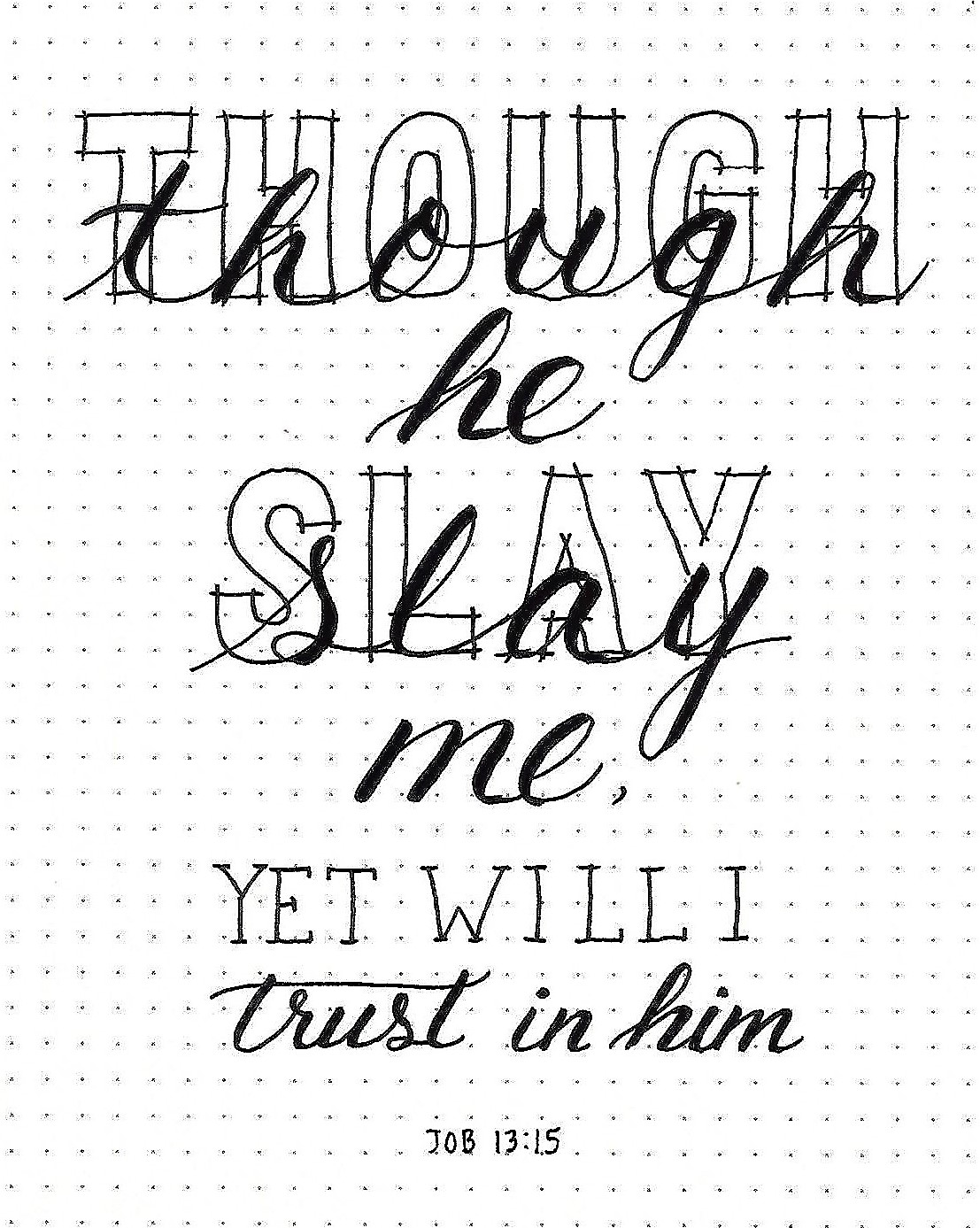
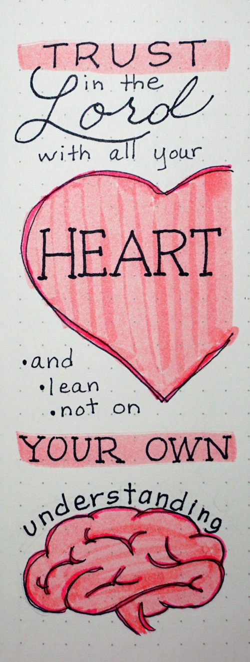
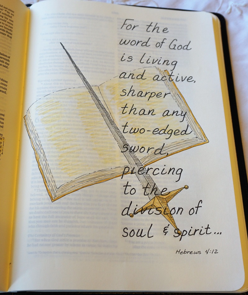
1&2 TIMOTHY: Day 4 – Font Combos – Scripture
Novelty prints are fun to include in your word art. You can bump up the interest on a word lettered in a very basic font by adding a banner to it.
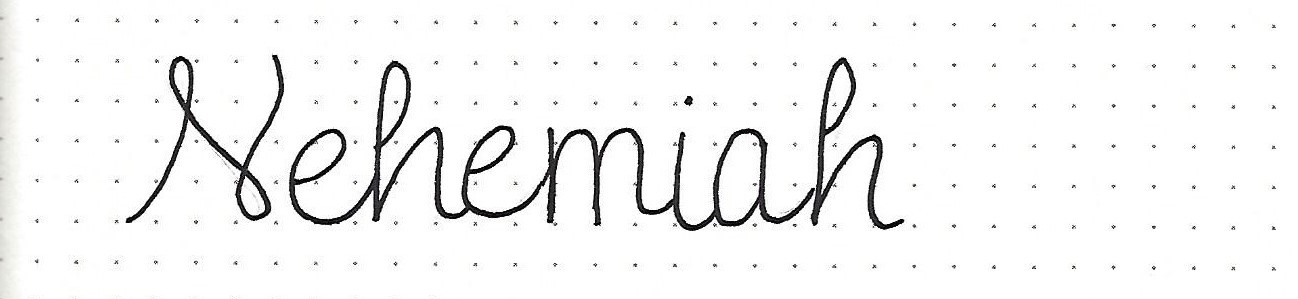
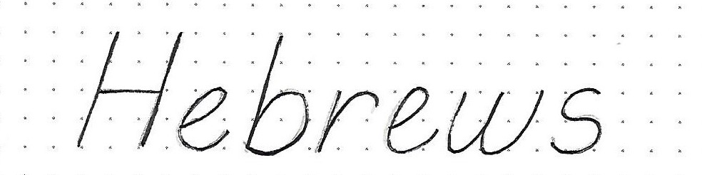
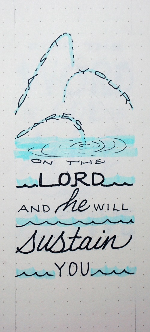
Here is a sample scripture from 1 Timothy 6:12 you can practice on.
To make banners: 1) draw the main block with a slight arc 2) add the little triangles underneath 3) connect the triangles to the main body with flagged ends that also curve downward.

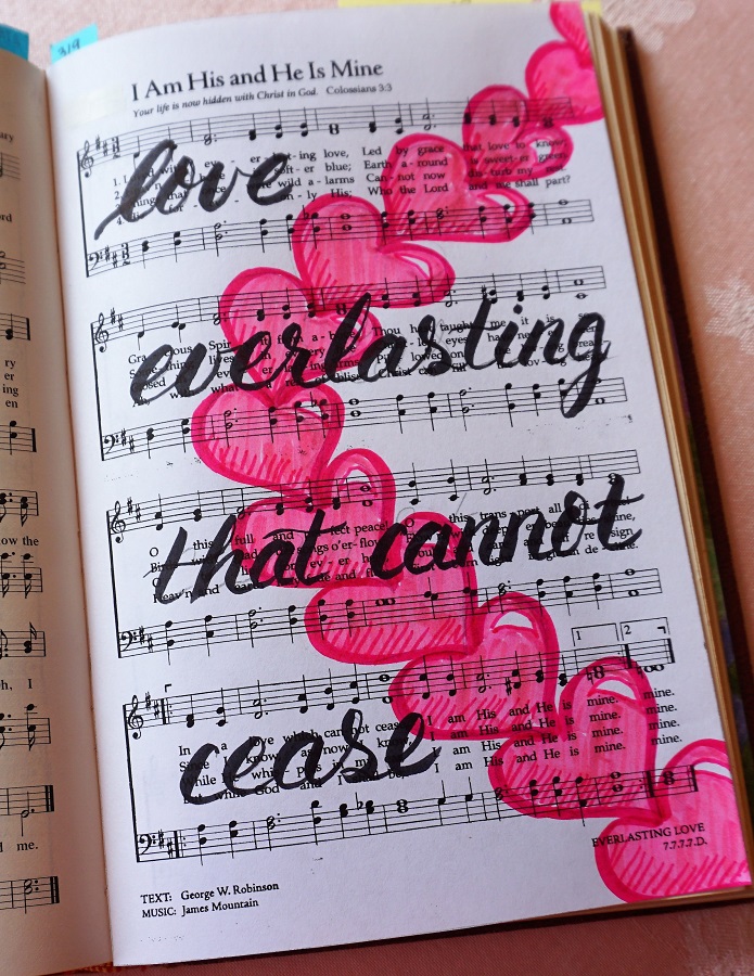
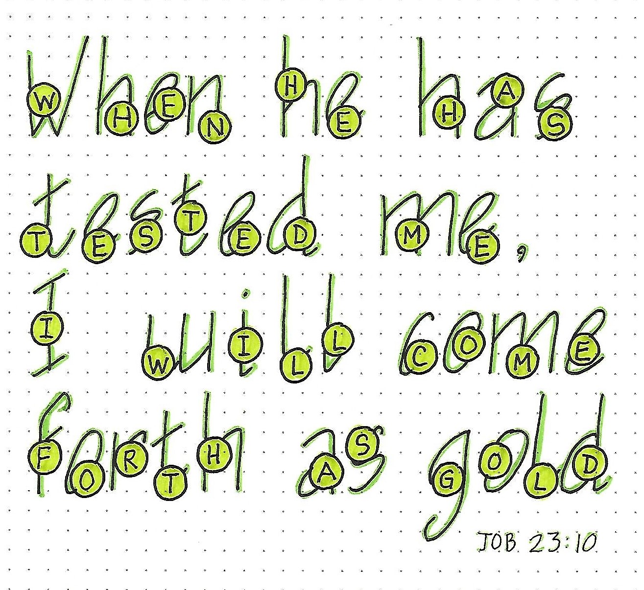
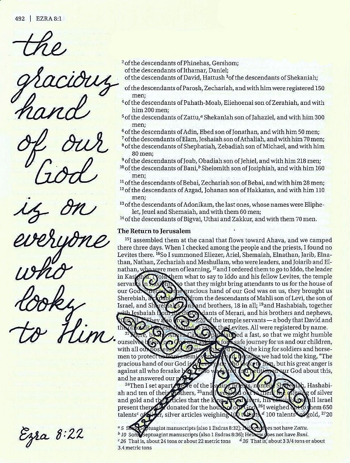
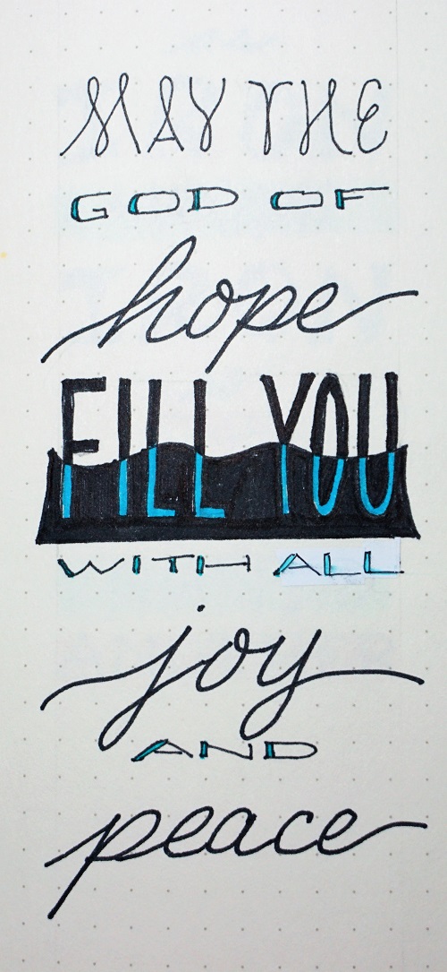
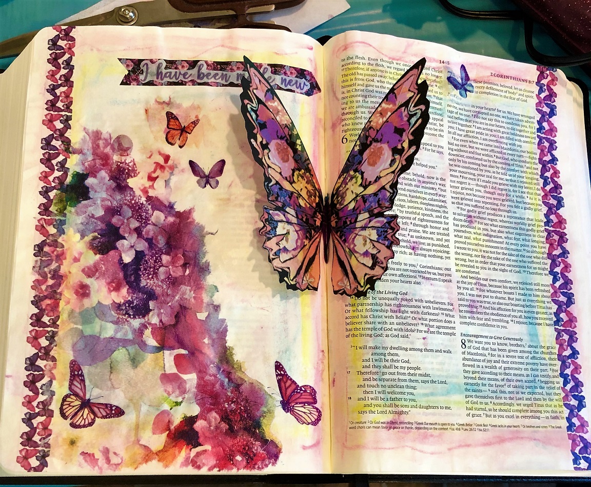
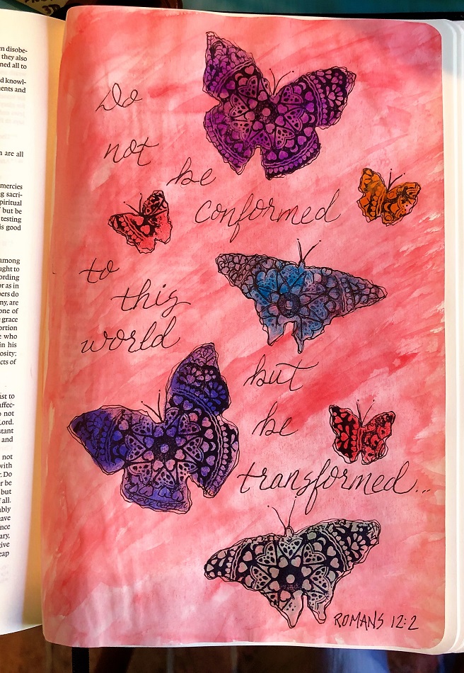
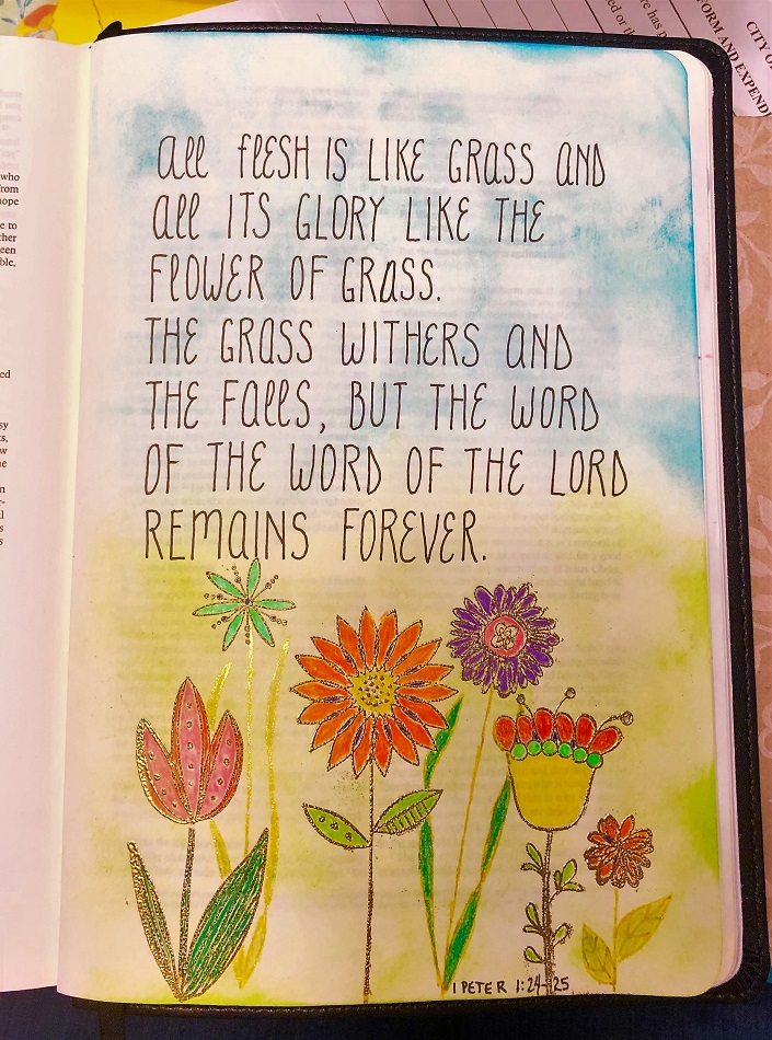
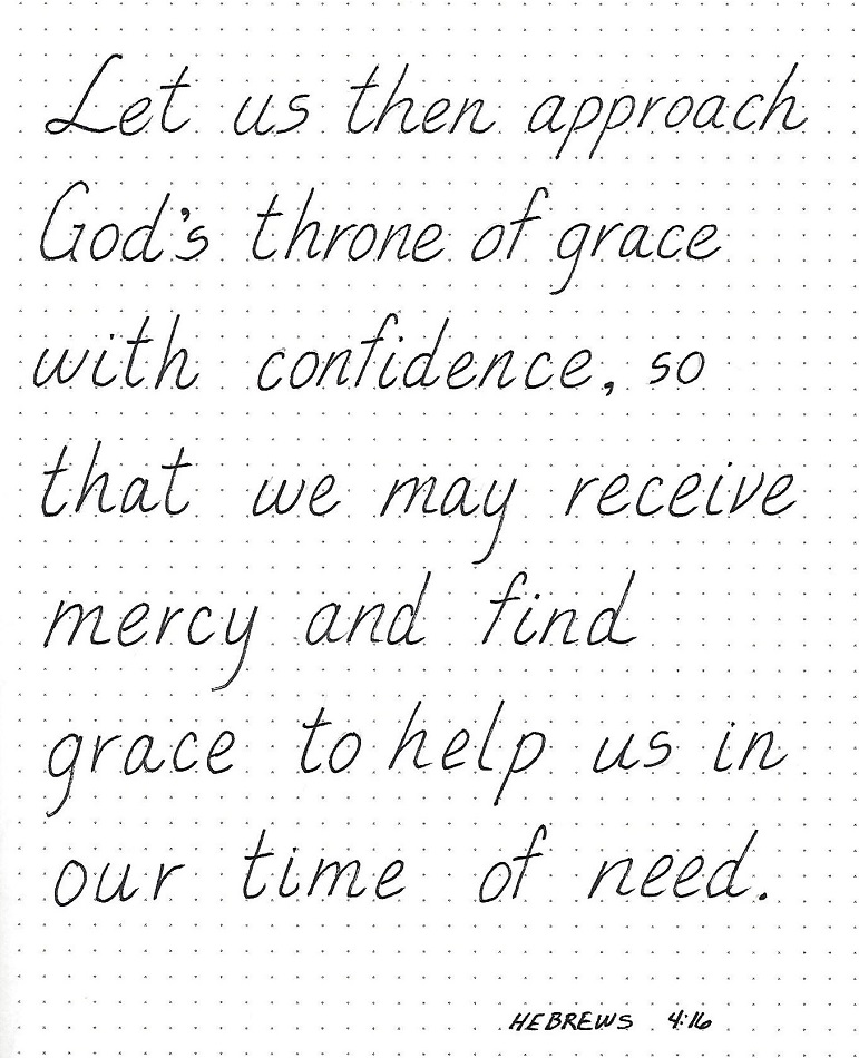
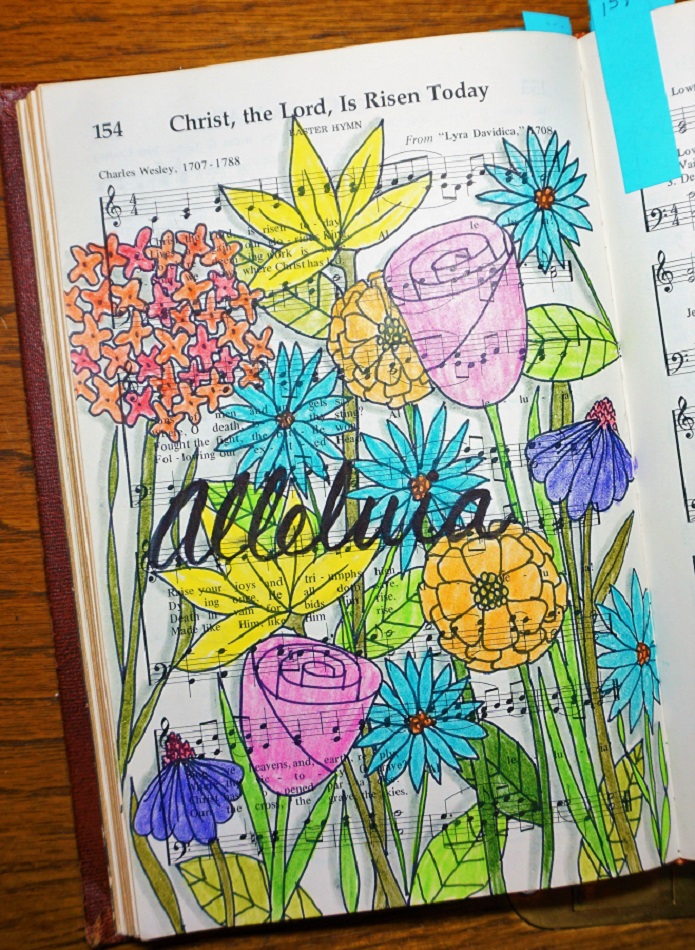
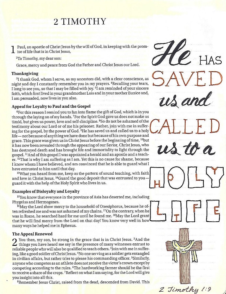
1&2 TIMOTHY: Day 5 – Font Combos – In Your Bible
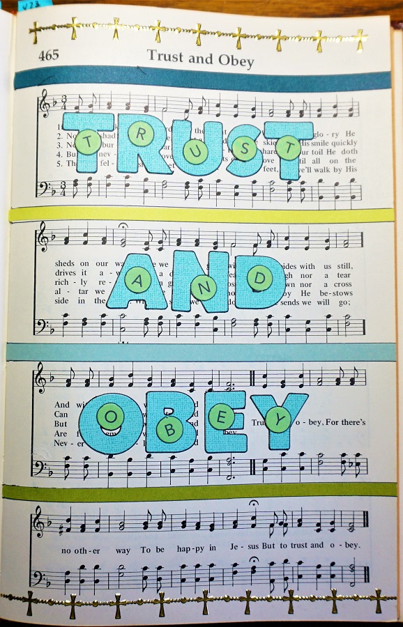
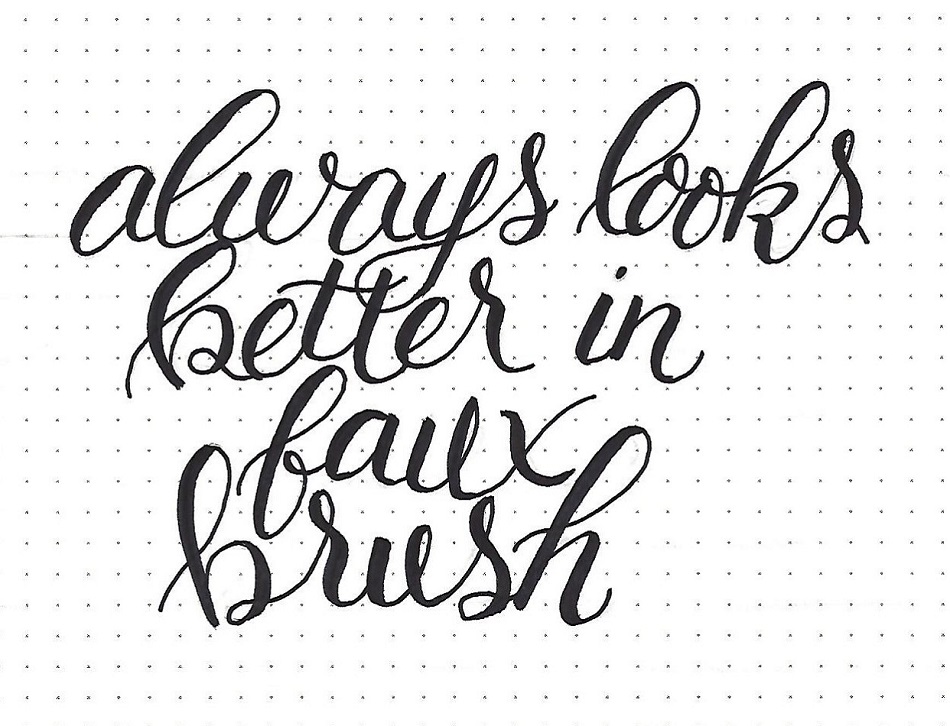
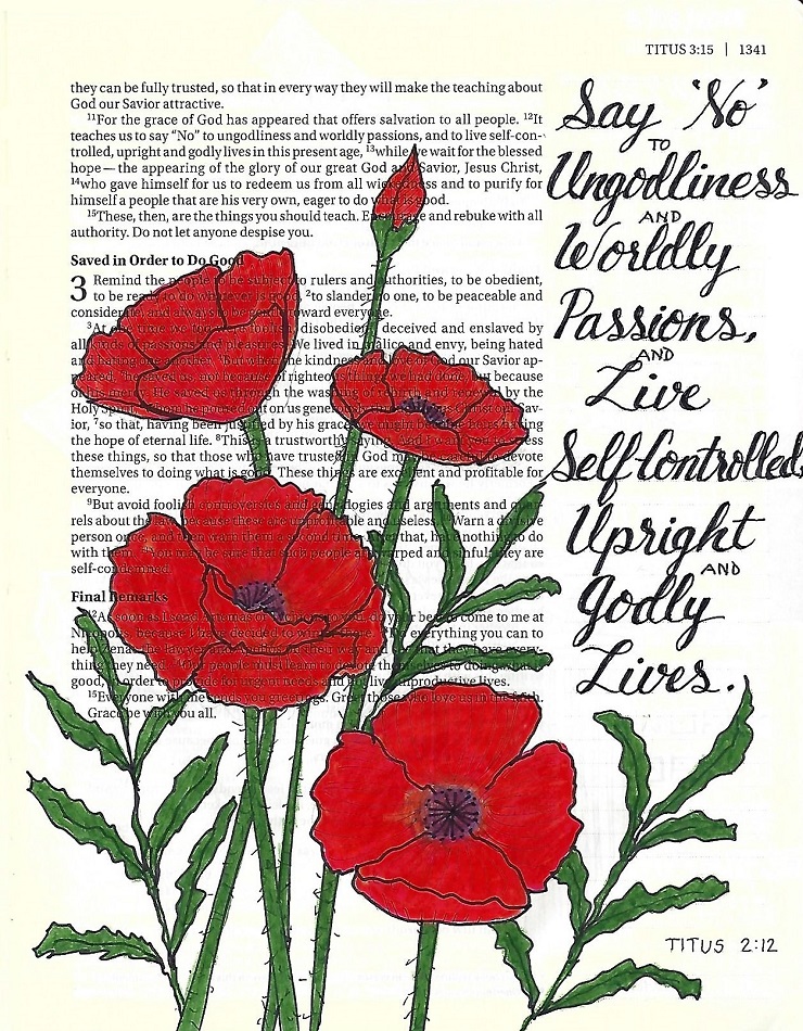
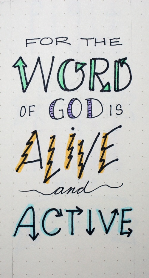
This scripture in my bible uses just three fonts but looks more complicated than that. I used Faux-brush script, basic round print in serif and a block novelty print. Because these are all from different font families, they do not compete with one another.
Varying the sizes of the matching fonts helps to make it look more complex while consistent use of color throughout also helps with continuity.
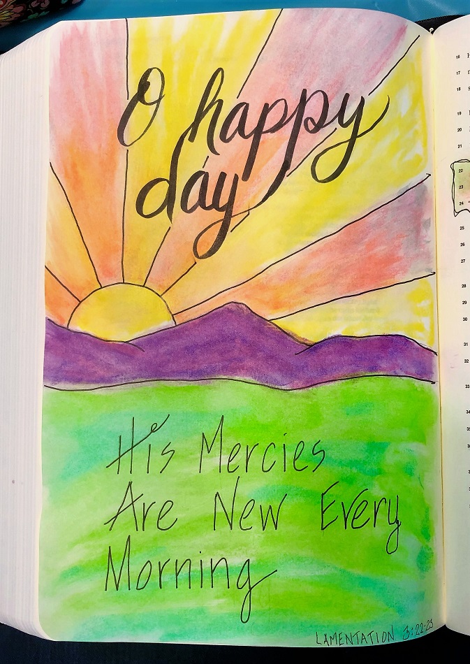
Choose a scripture from either 1 or 2 Timothy and make some word art in your bible by combining fonts.
It’s great to learn how to use all these fonts in new and creative ways.
Ddd