Topic: Bible Journaling
Next lettering lesson is due and we've worked our way to Lamentations. Here are the 5 days of lessons:
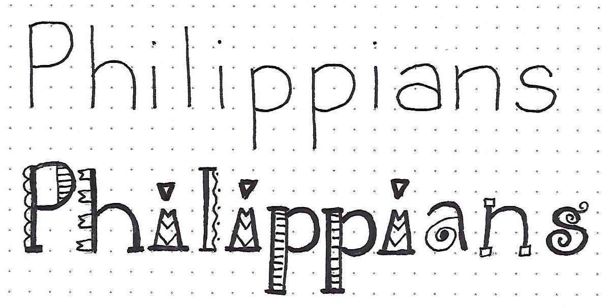
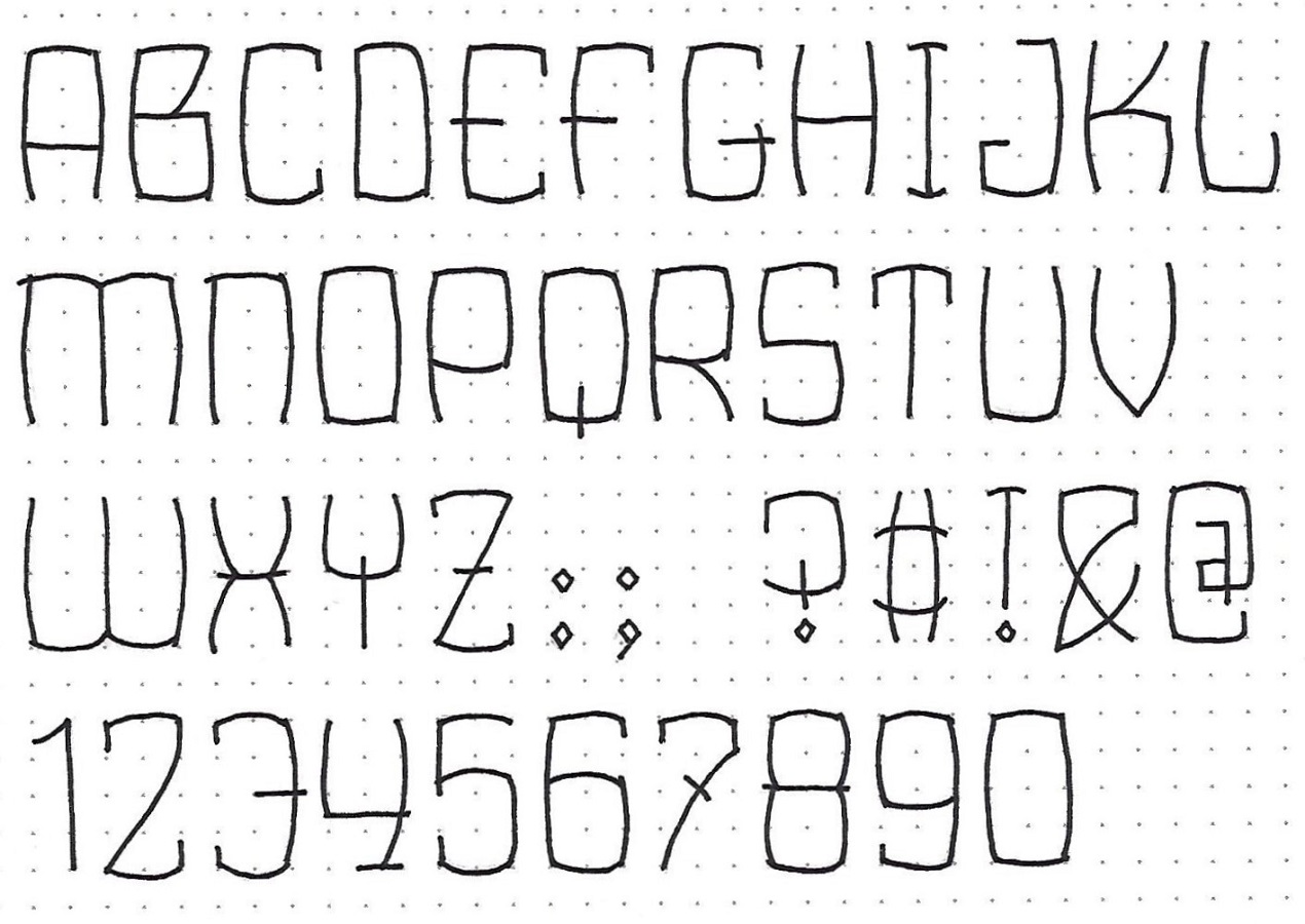
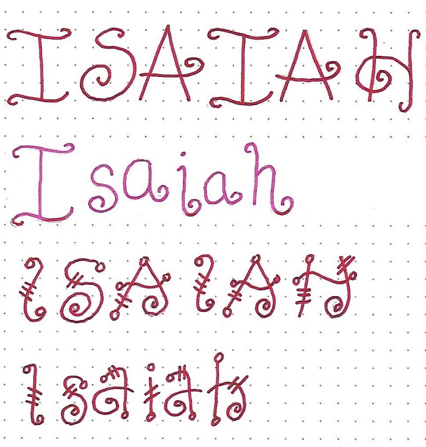
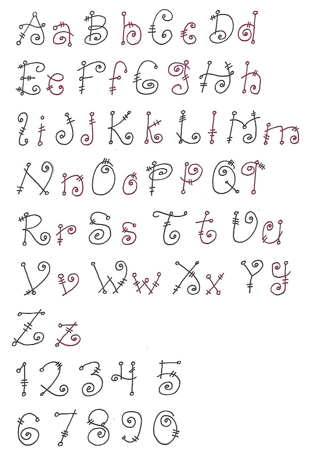
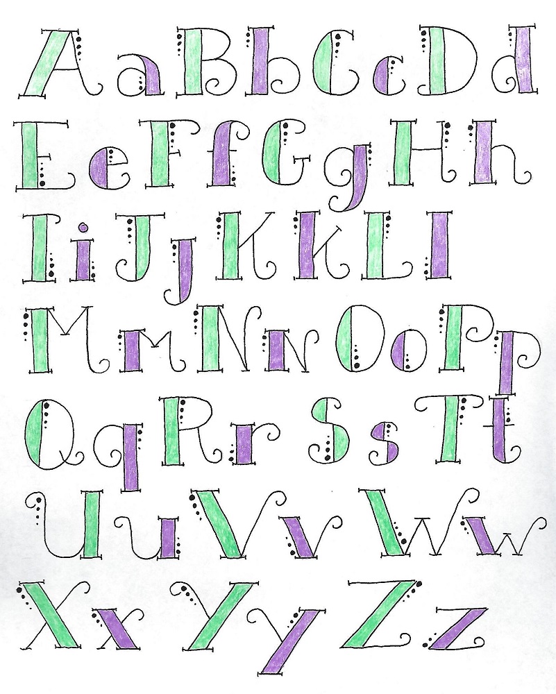
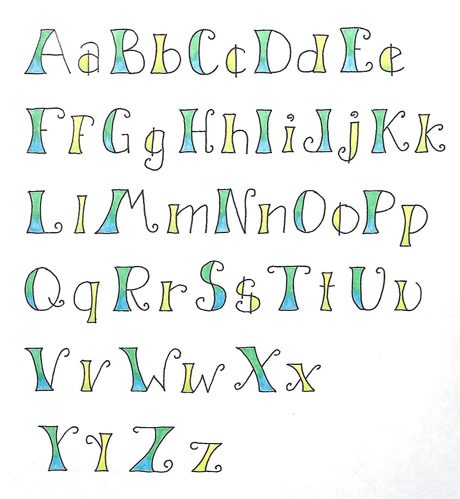
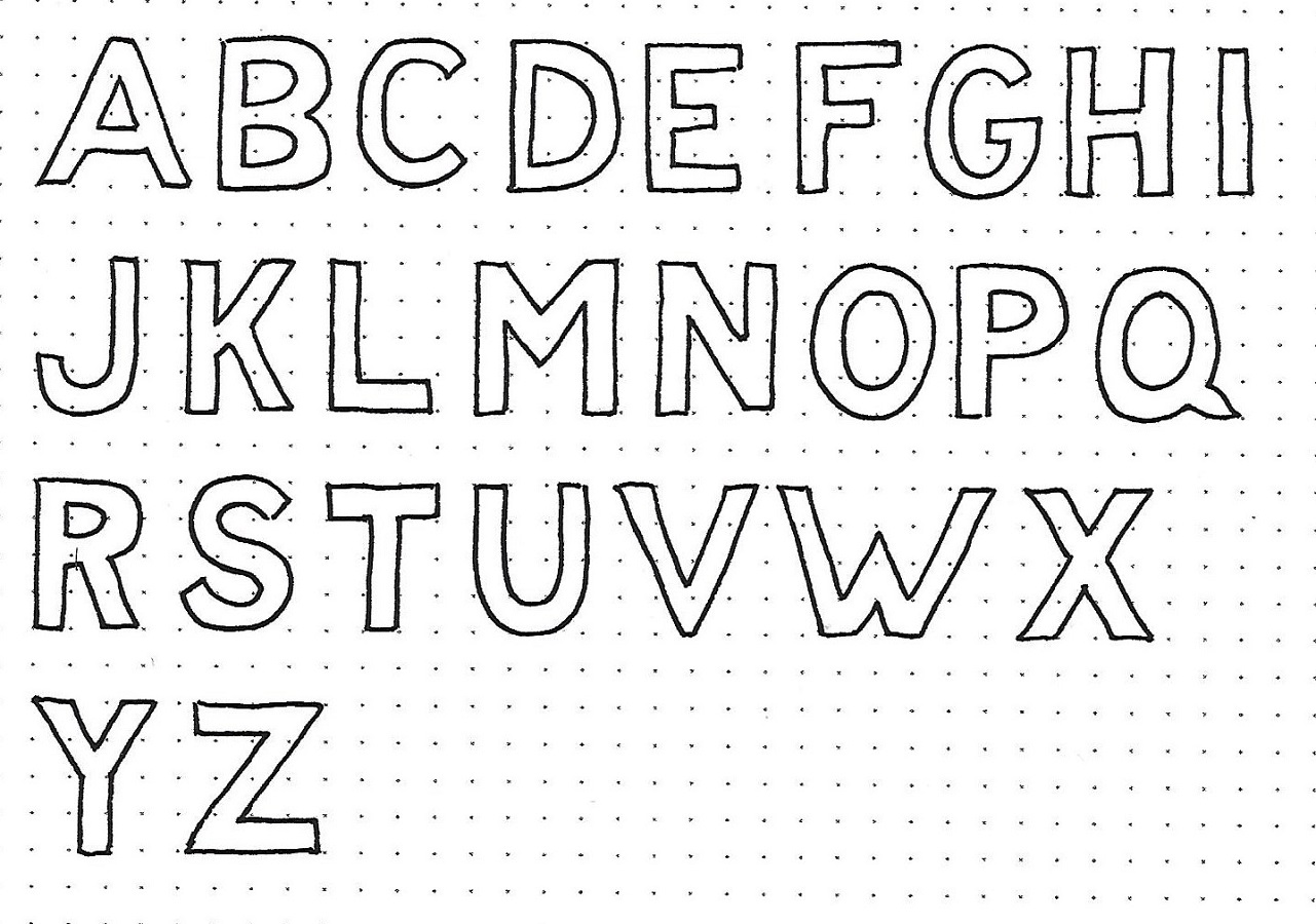
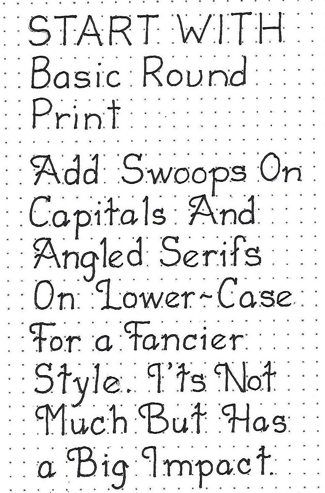
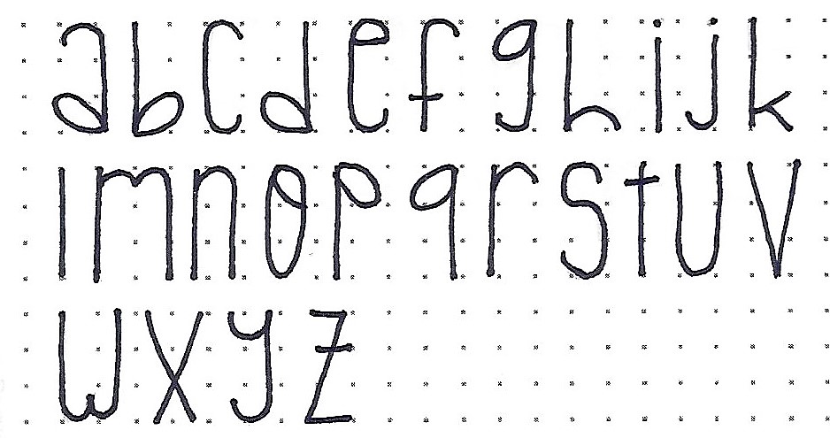
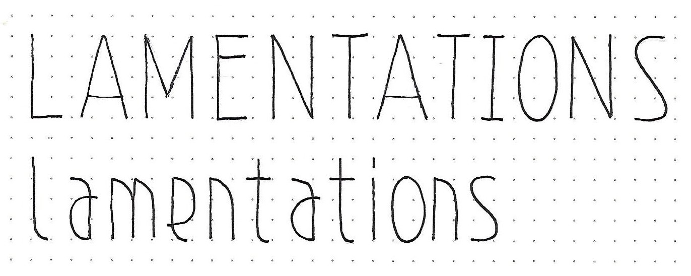
LAMENTATIONS: Day #1 – Art Deco – Intro
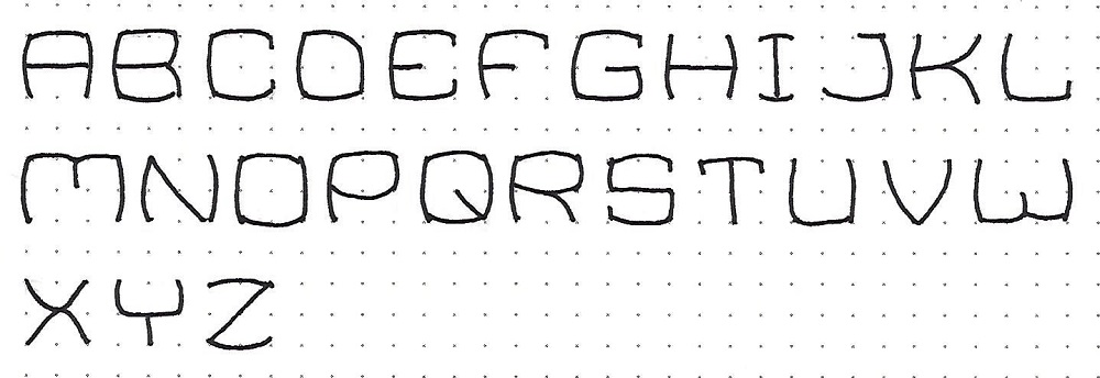
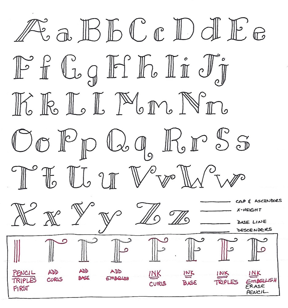
The alphabet font we will focus on this week is based on the Basic Oval Print but is really a half-oval. You do not notice the overall styling too much in the upper case (at least with the letters used today). But you can definitely see the ‘art deco’ make its self-evident when we work in the lower case.
Work with an overall letter height of four units. Crossbars fall at the ¾ mark or down at the ¼ mark. The upper-case ‘I’ gets serifs even though this is not a serif font.
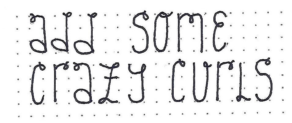
Try out these two words for a start and we’ll jump into the full alphabet tomorrow.
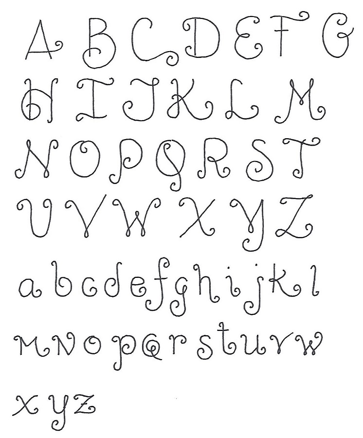
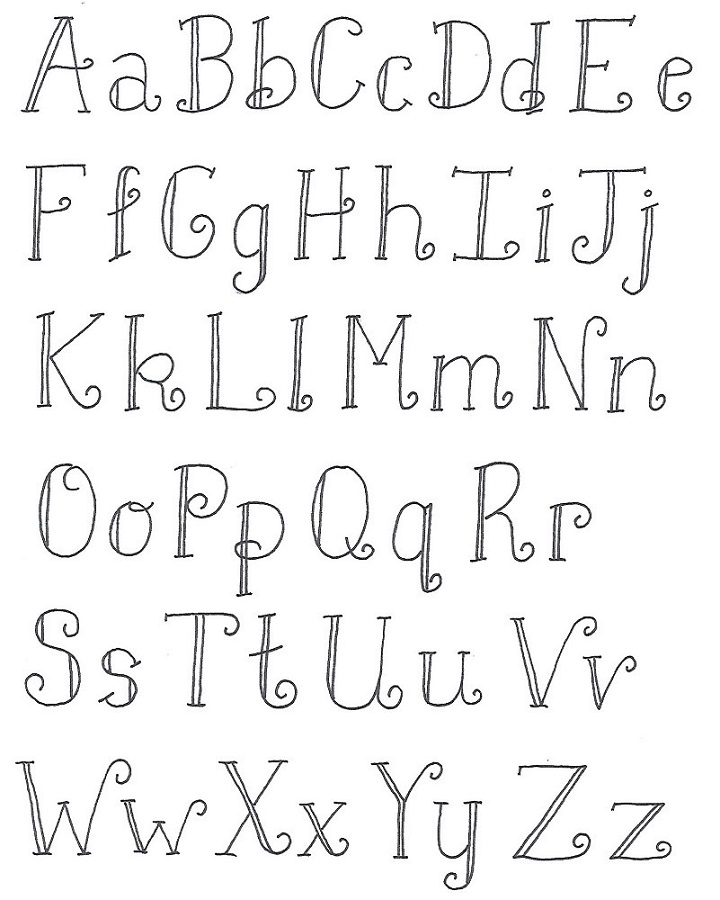
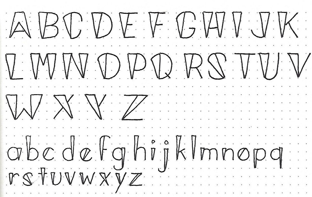
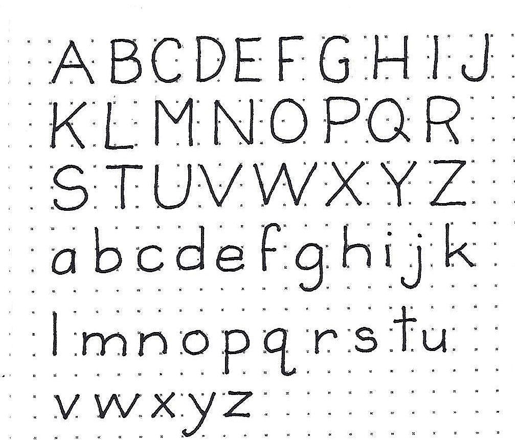
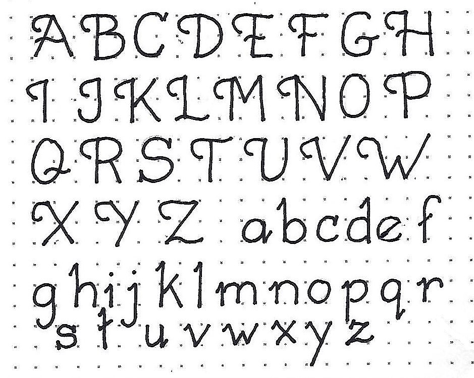
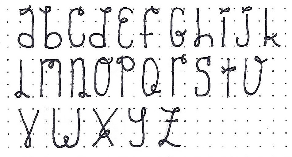
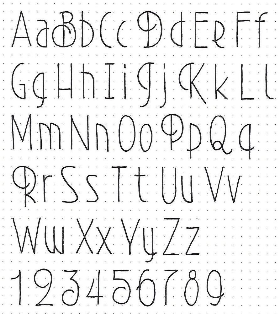
LAMENTATIONS: Day #2 – Art Deco – Alphabet
There’s that classic art deco look. Yesterday we did not see any styling evident in the upper-case letters we used, but now you’ll take note of the classic sweeping curves that open the B, D, P and R. The J and K share a different sort of opening sweep. Note the little overhangs where a half-oval crosses a straight line.
As to scale, the x-height is 3 units of the overall height of 4 units. The descender is only 1 unit.
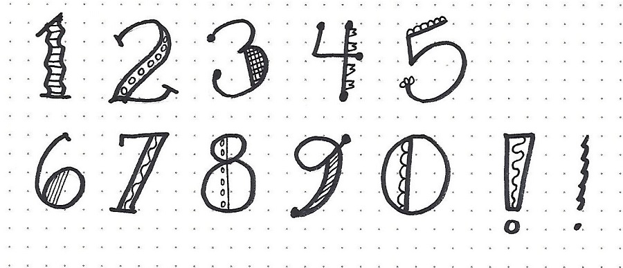
Once again, we get a full set of numbers with this font.
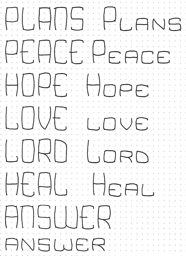
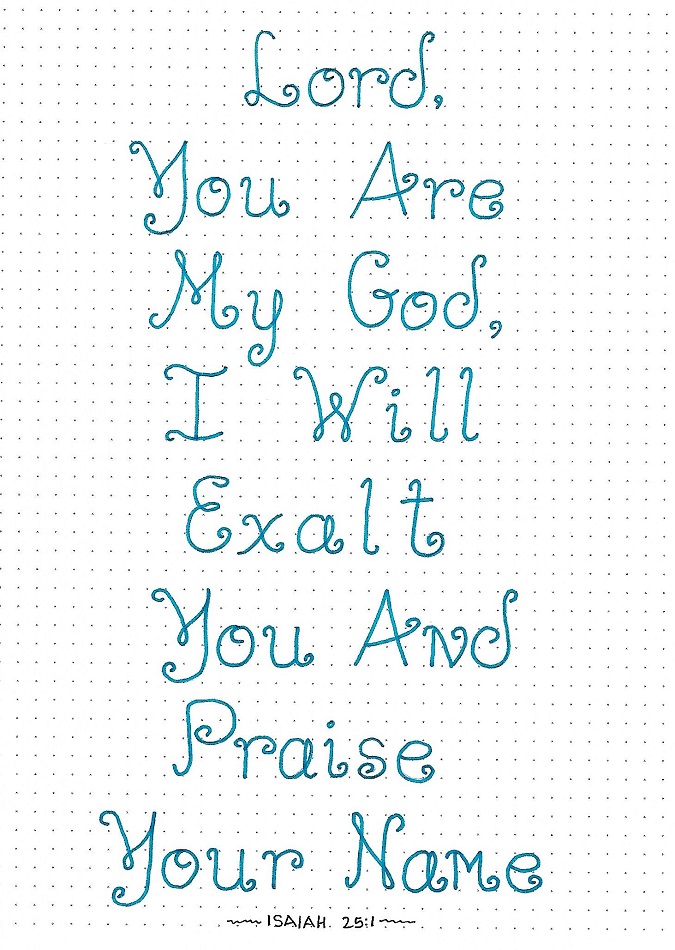
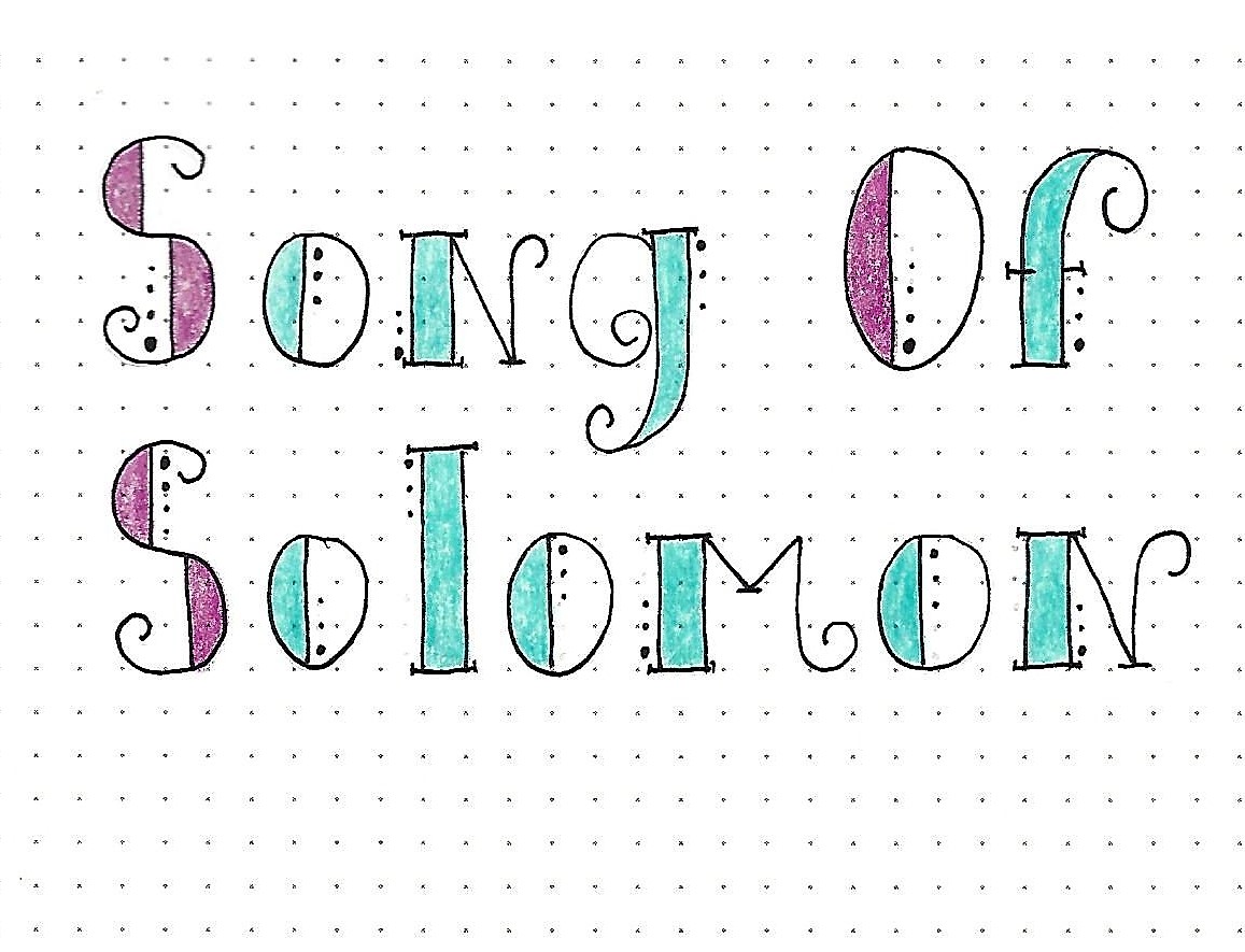
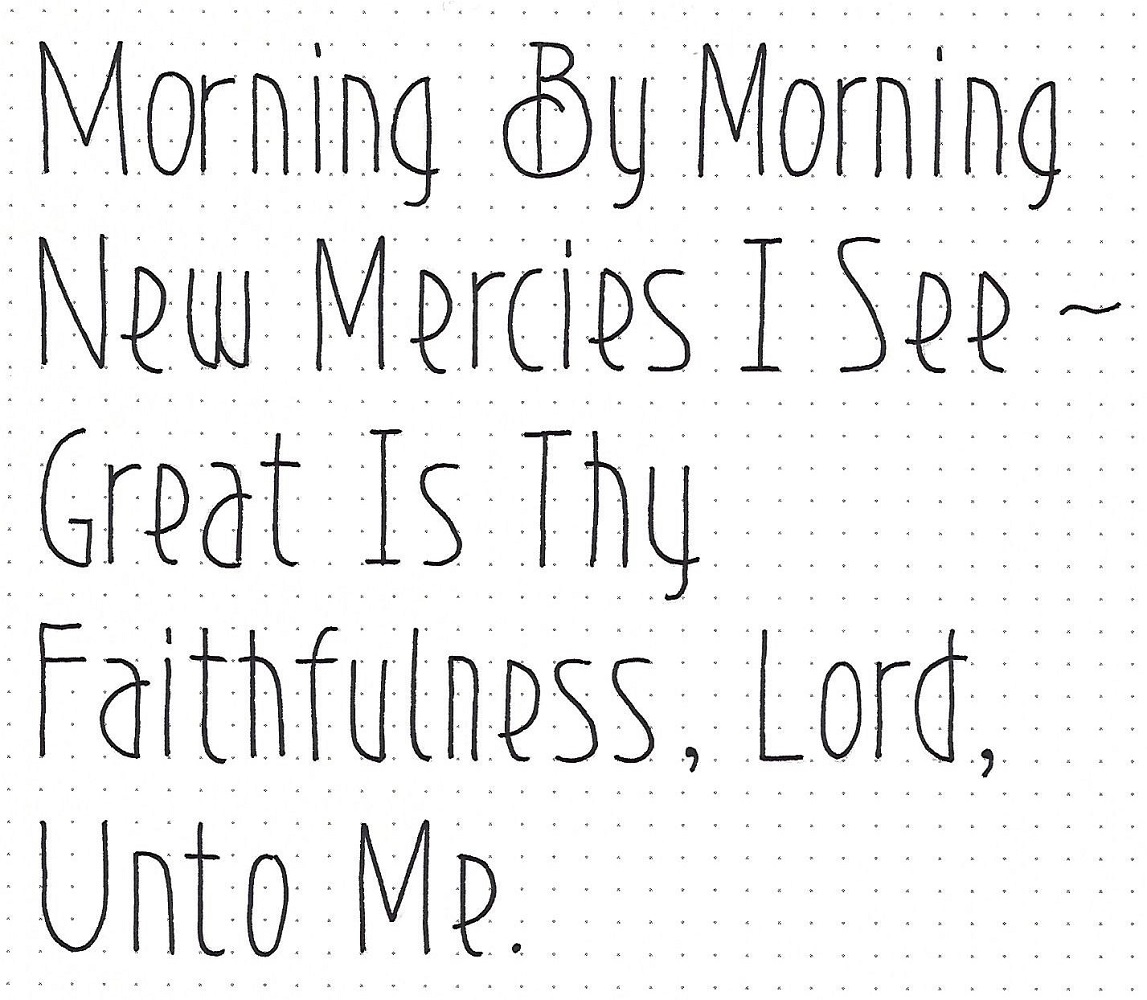
LAMENTATIONS: Day #3 – Art Deco – Hymn Lyrics
A fun way to practice getting the letter spacing and word spacing correct is to write lyrics to hymns. Did you realize that some of the lyrics to Great Is Thy Faithfulness come from Lamentations? Here it is from the King James Bible: Lamentations 3:22-23 - It is of the Lord's mercies that we are not consumed, because his compassions fail not. They are new every morning: great is thy faithfulness.
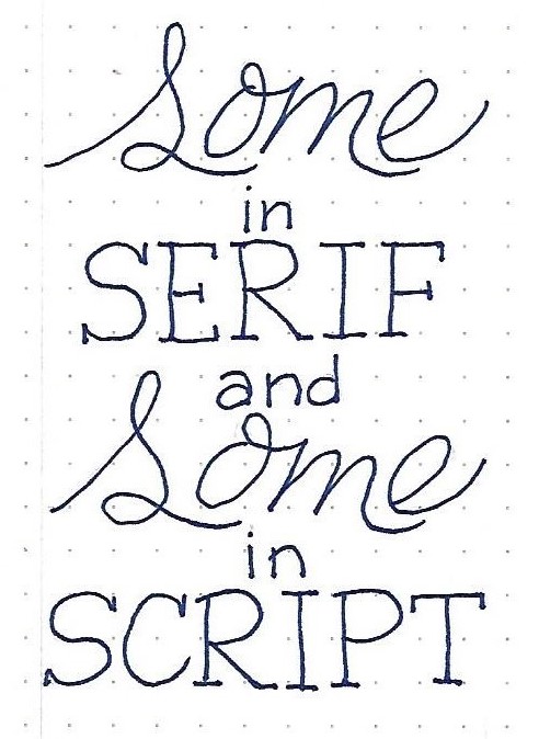
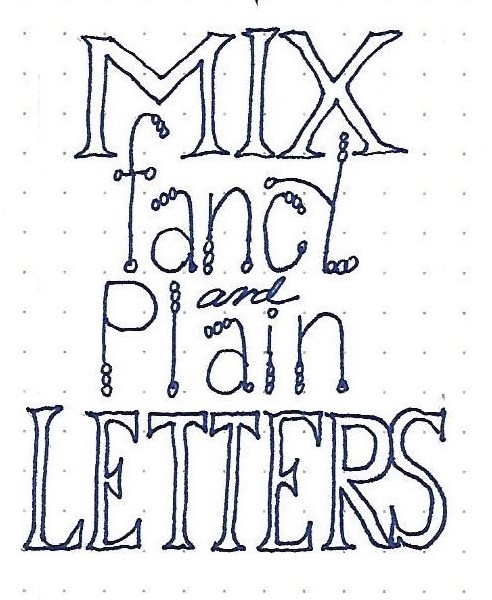
When writing blocks of text, I like to use Upper-case to begin every word.
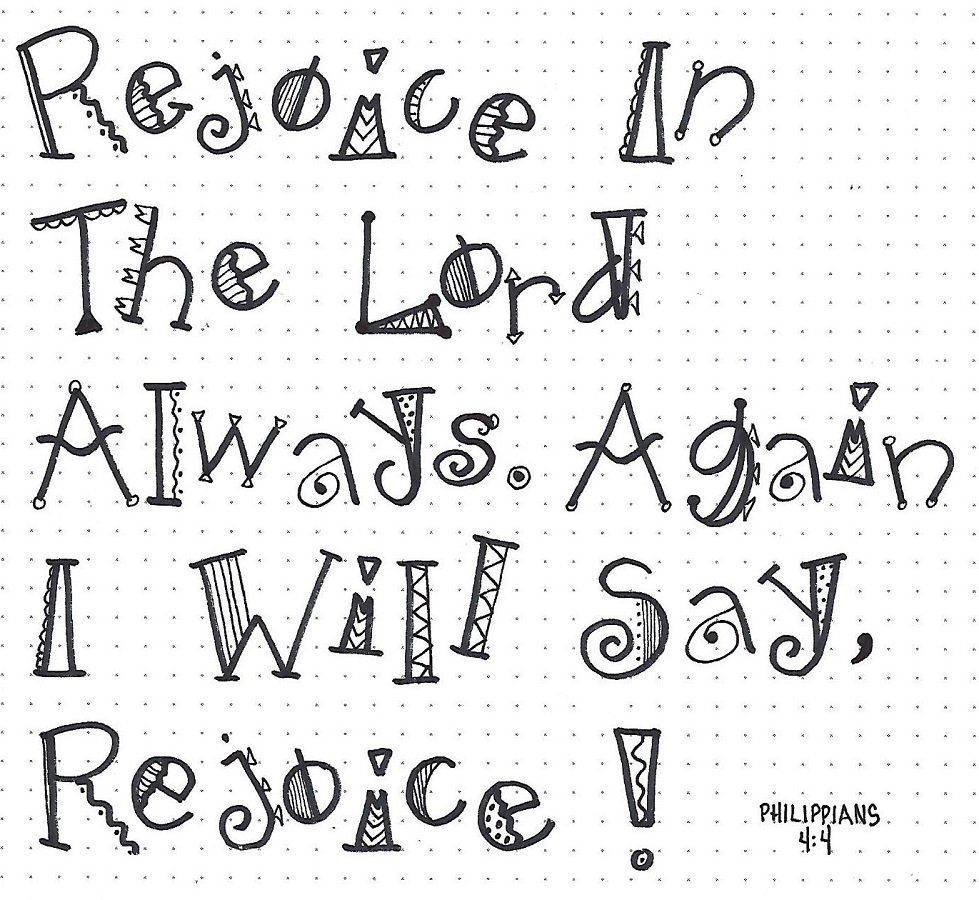
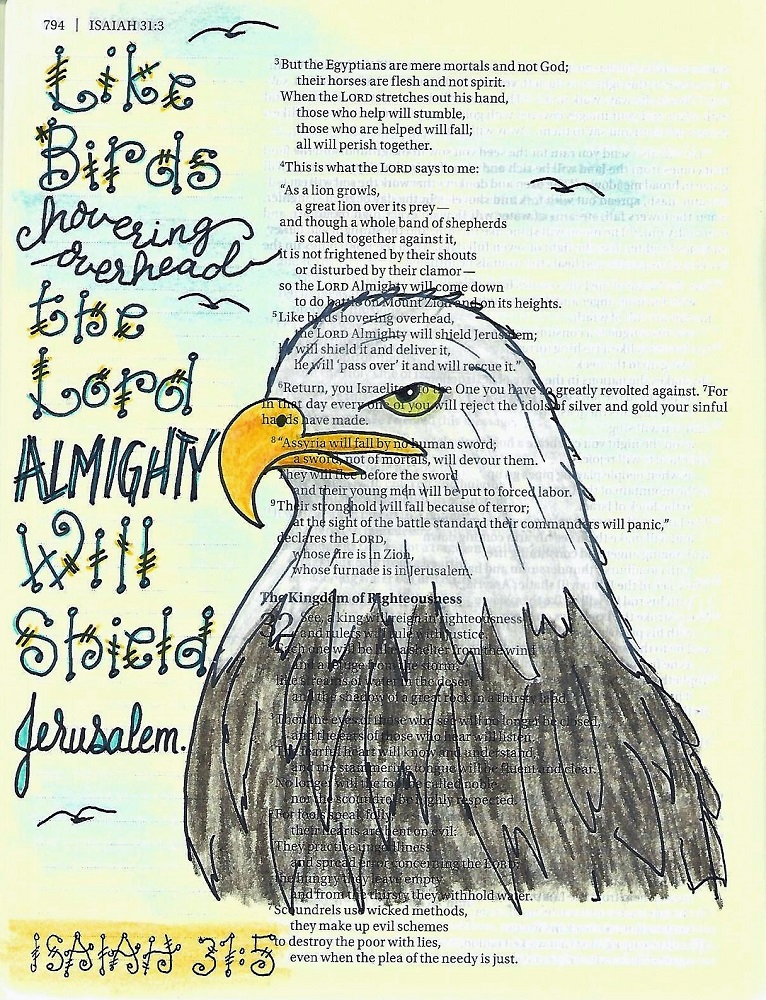
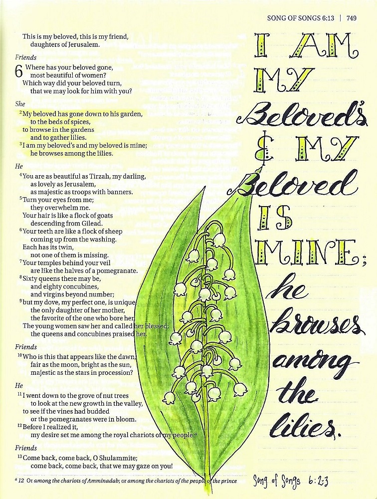
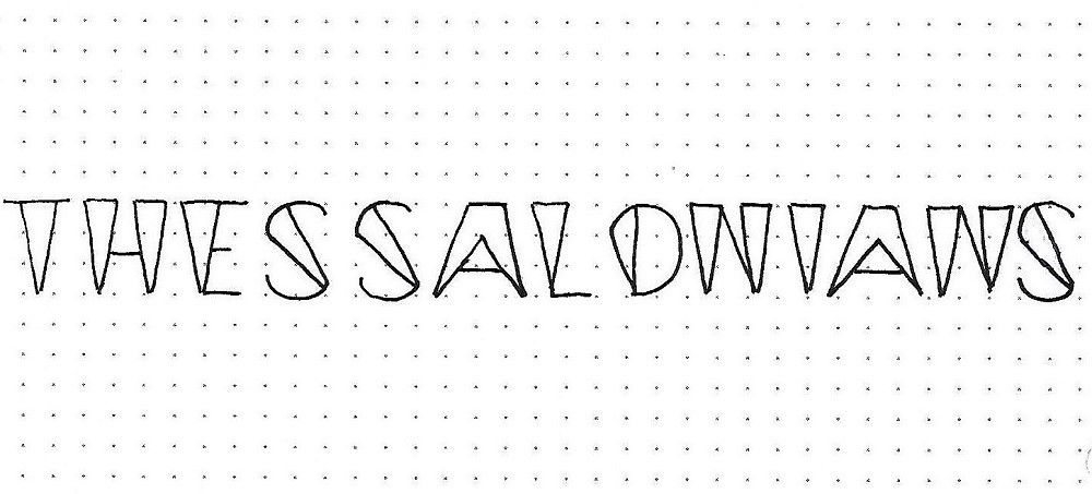
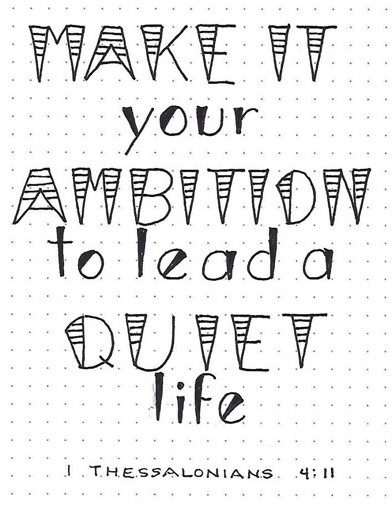
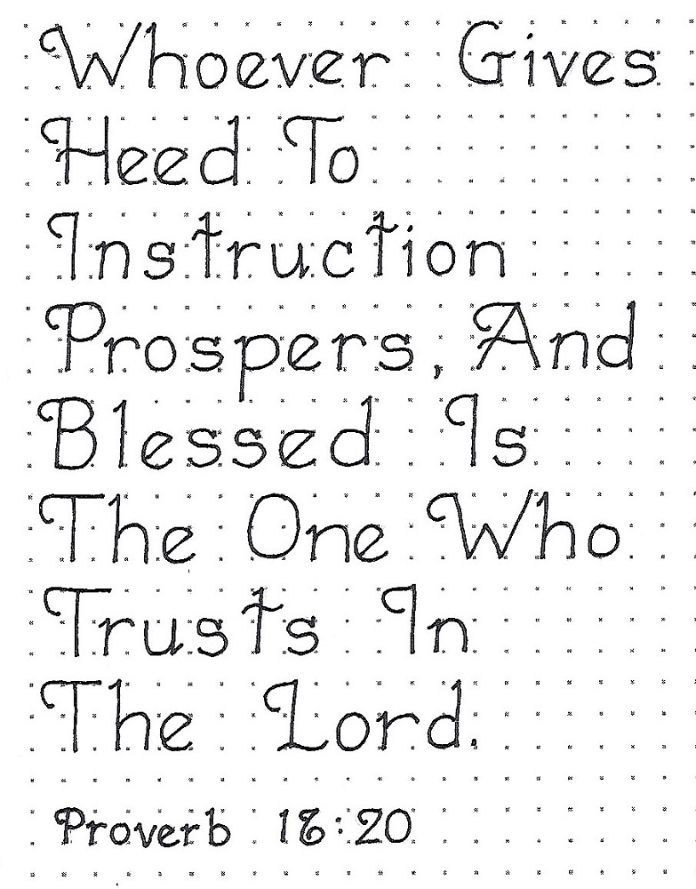
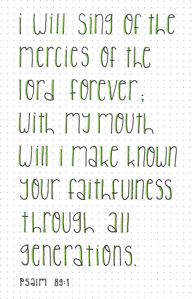
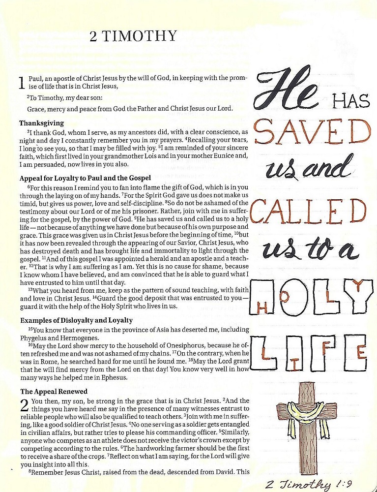
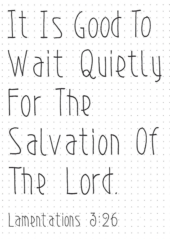
LAMENTATIONS: Day #4 – Art Deco – Scripture
Today we will write another block of text – this time a scripture from Lamentations. With the scripture reference you get to practice working on a smaller scale – 2 units high with 1 ½ units as the x-height.
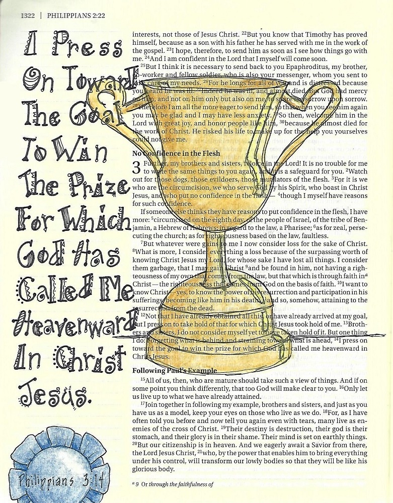
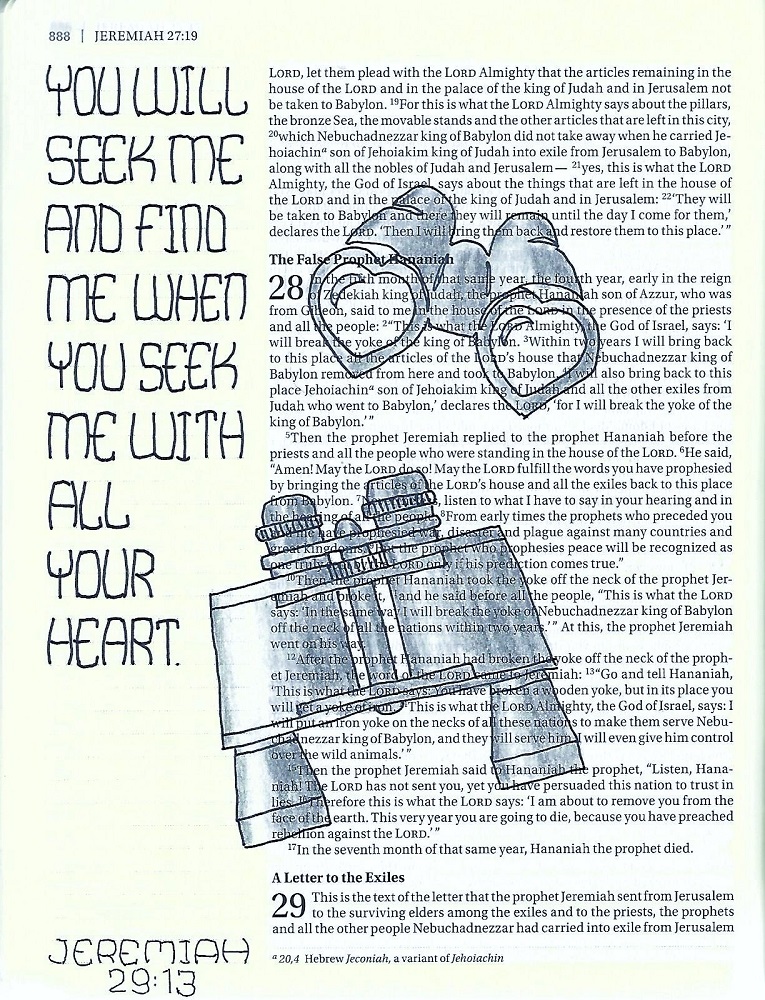
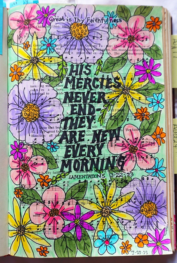
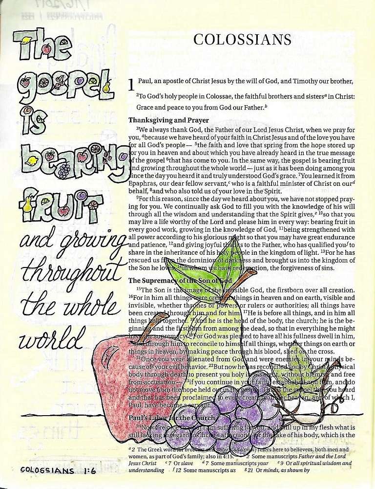
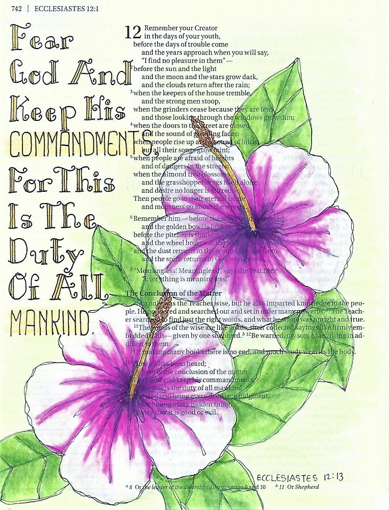
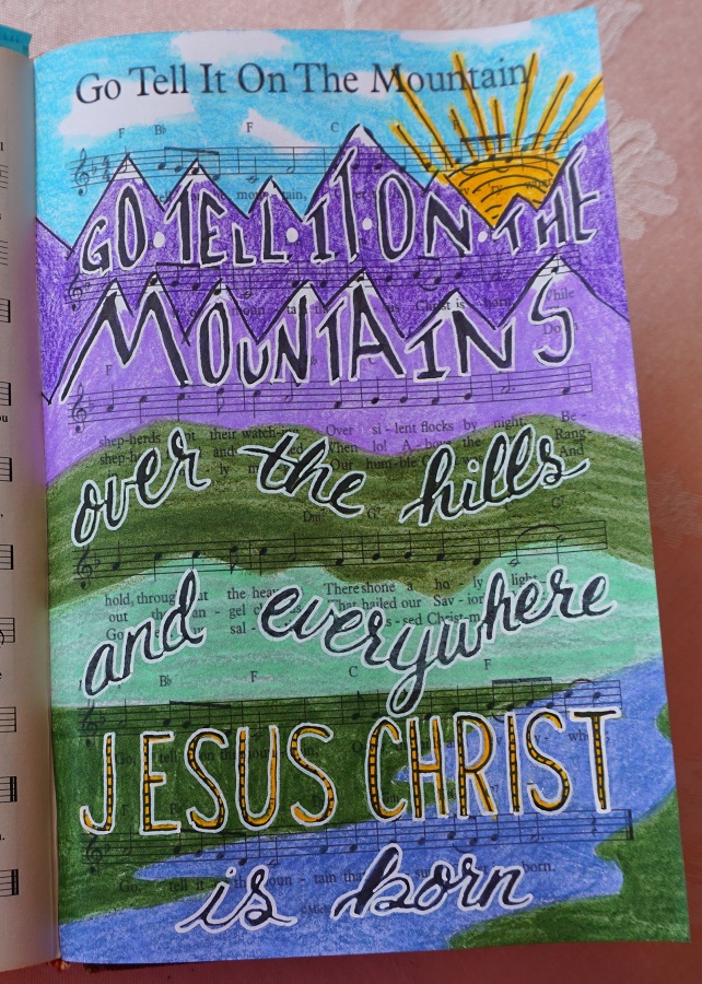
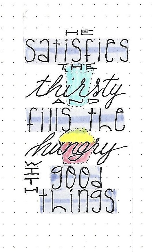
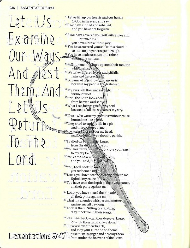
LAMENTATIONS: Day #5 – Art Deco – Bible Page
For this bible page in Lamentations I shrank my letters down to 2 units. You can actually get a lot of text in this font as it is compressed horizontally by nature.
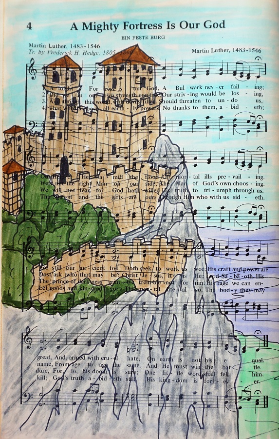
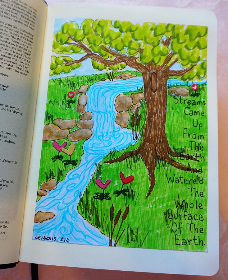
My scripture selection worked well with the magnifying glass from the weekly Drawing Room lesson.
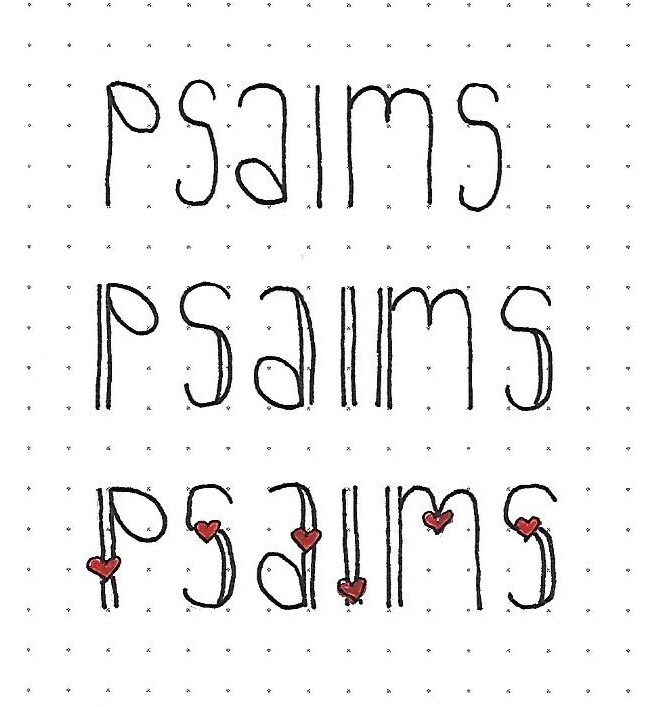
Have YOU tried any of these lettering lessons?
Ddd