« August 2019 »
S M T W T F S
1 2 3
4 5 6 7 8 9 10
11 12 13 14 15 16 17
18 19 20 21 22 23 24
25 26 27 28 29 30 31
You are not logged in. Log in
Entries by Topic
All topics  «
3D paperwork
A - Z challenge 5
A - Z challenge 7
A - Z challenge round 4
A to Z challenge round 3
A to Z round 2
A to Z round 6
A-Z round 1
Around the House
Art Challenges
Artist Trading Cards
Backgrounds
Beads
Bible Journaling
Books
Boxes
Collage
Color Challenge
Coloring
cookbook
Die Cuts
Digital Projects
Digital Stamps
Drawing
Dry Embossing
Fabric Stuff
Fantastic Folds
Field Trip
Home Decor
How Does Your Garden Grow?
Hymnal Art
In The Kitchen
In the studio
Jewelry
Lettering
Links
Multi-Technique
Music to Work By
Musings
Nail Art
New Work
Online Class
Other Hobbies
Other Projects
Painting
Paper Embroidery
Paper Piecing
Photo
Pretty Paper
Quilting
Random
reading
Scrap Recovery
scrapbooking
Sewing
Sketch Challenge
Some Backlog
Stamping
Stencils
Stickers
Supplies
Teabag Folding
Techniques
Testing
tips and tricks
Tutorial
Web resources
Welcome to my Blog
Work By My Friends
workflow
Writing
Blog Tools
Edit your Blog
Build a Blog
RSS Feed
View Profile
Group One
In & Out of Studio 3D
Friday, 23 August 2019
'Shroom
Topic: Photo

The other day my hubby called me to come look at the HUGE fungus growing off the side of some cement steps at the side of the house. Holy Smokes! This thing was at least 10 inches across.


Those perfectly round holes in it are a mystery but it kinda makes this look like a big face.


It's a little disconcerting - am I right?

Went out after a couple of days to see if it had grown bigger and it was completely shriveled up.

A true mystery.

Ddd


Posted by studio3d@ccgmail.net at 12:01 AM PDT
Thursday, 22 August 2019
Summer Flowers
Topic: Field Trip

We spent a day at a local art festival. The venue had some lovely gardens that we wandered through when we needed a break.

I only had my iPhone to use for taking pictures and did a lot of editing when I got them back on my computer. I was pleased with how well they came out.


I was pleased with the focu and rich colors I got with my phone.

Ddd


Posted by studio3d@ccgmail.net at 12:01 AM PDT
Wednesday, 21 August 2019
Jesus Loves Me This I Know
Topic: Hymnal Art

With a hymn so familiar to all I wanted an illustration that had a lot of symbolism. I went with the hands of Jesus holding the earth and then turned the earth into a heart.

I references John 3:16 to tie it all together.

I used markers for the coloring.

Ddd


Posted by studio3d@ccgmail.net at 12:01 AM PDT
Tuesday, 20 August 2019
A Sure Foundation
Topic: Hymnal Art

This is another hymn assignment that immediately brought an image to mind. I used a similar illustration in my bible quite some time ago with a scripture that refers to the cornerstone.


The original idea for the cross built into the corner was one I saw on Pinterest - I think it was for a conference advertisement but I am no longer sure about that.

This page is colored with markers.

Ddd


Posted by studio3d@ccgmail.net at 12:01 AM PDT
Monday, 19 August 2019
Everybody Sing!
Topic: Hymnal Art

I took most of July off from this activity as I did not want to do 4 weeks of patriotic hymns. One was plenty.

When I saw the name of this hymn I immediately thought of the stacked up animals in the children's book: The Bremen Town Musicians. I don't remember what the book was about so no idea how well it fits, but I just wanted that illustration.


I colored using markers.

Ddd


Posted by studio3d@ccgmail.net at 11:01 PM PDT
Sunday, 18 August 2019
No Lament - It's Lamentations
Topic: Bible Journaling

Next lettering lesson is due and we've worked our way to Lamentations. Here are the 5 days of lessons:

LAMENTATIONS: Day #1 – Art Deco – Intro

The alphabet font we will focus on this week is based on the Basic Oval Print but is really a half-oval. You do not notice the overall styling too much in the upper case (at least with the letters used today). But you can definitely see the ‘art deco’ make its self-evident when we work in the lower case.

Work with an overall letter height of four units. Crossbars fall at the ¾ mark or down at the ¼ mark. The upper-case ‘I’ gets serifs even though this is not a serif font.

Try out these two words for a start and we’ll jump into the full alphabet tomorrow.


LAMENTATIONS: Day #2 – Art Deco – Alphabet

There’s that classic art deco look. Yesterday we did not see any styling evident in the upper-case letters we used, but now you’ll take note of the classic sweeping curves that open the B, D, P and R. The J and K share a different sort of opening sweep. Note the little overhangs where a half-oval crosses a straight line.

As to scale, the x-height is 3 units of the overall height of 4 units. The descender is only 1 unit.

Once again, we get a full set of numbers with this font.


LAMENTATIONS: Day #3 – Art Deco – Hymn Lyrics

A fun way to practice getting the letter spacing and word spacing correct is to write lyrics to hymns. Did you realize that some of the lyrics to Great Is Thy Faithfulness come from Lamentations? Here it is from the King James Bible: Lamentations 3:22-23 - It is of the Lord's mercies that we are not consumed, because his compassions fail not. They are new every morning: great is thy faithfulness.

When writing blocks of text, I like to use Upper-case to begin every word.


LAMENTATIONS: Day #4 – Art Deco – Scripture

Today we will write another block of text – this time a scripture from Lamentations. With the scripture reference you get to practice working on a smaller scale – 2 units high with 1 ½ units as the x-height.


LAMENTATIONS: Day #5 – Art Deco – Bible Page

For this bible page in Lamentations I shrank my letters down to 2 units. You can actually get a lot of text in this font as it is compressed horizontally by nature.

My scripture selection worked well with the magnifying glass from the weekly Drawing Room lesson.


Have YOU tried any of these lettering lessons?

Ddd


Posted by studio3d@ccgmail.net at 10:24 PM PDT
Saturday, 17 August 2019
Milestone Moments
Topic: Quilting

Thanks to YouTube I was able to figure out on my own how to load my first quilt onto the longarm machine. Yay Me!

Then, with YouTube I was able to figure out how to set the stitch regulator as I wanted and baste the first section of the quilt sandwich. Hooray For Me!

And finally, I went to my class on Thursday and had hands-on training on the whole enchilada. We used a sample sandwich of plain fabric to practice a wide variety of free-motion fill patterns plus how to thread, change bobbins, fix problems (most user error) and maintain our machines.

So today... two days later... I approached the already loaded lap quilt, fired up the machine, gave it a new bobbin and thread cone, cleaned the rails, and adjusted the stitch regulator for 'the real deal'.

About an hour later, voila! It was fully quilted and ready to take off the machine. Another hour to trim it and bind it - label added - and DONE!


This quilt is from the book by Ricky Tims on Convergence Quilts which I had to order from a different library system. - Fascinating concept that had found me selecting about a dozen sets of fabric from my scores of fat quarters. I will be making MANY of these quilts. So easy with stunning results.


For the quilting, I did large rosettes in the four corners and then echoed ripples out about 3/4 of the way across the quilt in both directions. The ripples all cross one another and overlap at the center.


Theinner border was not quilted. The outer border got leaves and vines. I use this a lot on my domestic machine and I wanted to test with a pattern I was familiar with.


This quilt will go to the hospital's Passages program.

Ddd


Posted by studio3d@ccgmail.net at 11:11 PM PDT
Sunday, 11 August 2019
Lettering in Philippians
Topic: Bible Journaling

We’re in for a real adventure this week!

PHILIPPIANS: Day #1 – Funky Print – Introduction

The alphabet we are creating to play with this week is based on the Basic Round Print. So you can easily see that relationship, I have written out the basic followed by the Funky Print with all the bells and whistles.

You can decorate your letters as you wish but do try to make changes from one letter to another to maintain the funky feeling.


PHILIPPIANS: Day #2 – Funky Print – Alphabet

Although this entire alphabet is based on the Basic Round Print, it is only a jumping off point. Many of the letter shapes have changed to suit the slightly whacky style. For instance, the ‘g’ and ‘q’ do not descend below the baseline and have severe curves in their stems. Both of the ‘j’s have a distinct back slant and the ‘u’s are almost closed at the top.

Begin by writing the Basic Round Print in pencil. Make changes to the letter shapes as you wish, then ink the NEW basic shapes with a very heavy pen. Finally, use a very fine tip pen to make funky decorations on your letters. To create some unity, I used some elements repeatedly (stripes, dots, triangles, flags, squiggles).

If you don’t like the way I have decorated a letter, just change it to suit yourself.


PHILIPPIANS: Day #3 – Funky Print – Going Digital

A crazy alphabet deserves an equally craze set of numbers. Note that these numerals use many of the same decorative elements as the alphabet.


PHILIPPIANS: Day #4 – Funky Print – Write It Out

This is the perfect alphabet to bounce off the baseline. Because of all the wild decorations I wanted to find a way to have a little bit of control so it would not look sloppy. I found that raising every other letter one unit off the baseline worked very well.  Capitals and full-height lower-case letters are not bounced. I also added a bit of slant here and there. You could also add color for even more fun.

Your assignment today is to use your funky letters to write a scripture from Philippians for practice.


PHILIPPIANS: Day #5 – Funky Print – Bible Page

The task for today is to use your new Funky Print to journal a scripture in your bible. I used Philippians 3:14 and combined it with the trophy cup from this week’s Drawing Room tutorial.

There is much less bounce used here than on yesterday’s journal page. Instead, I used slanted letters and occasionally made a few letters smaller to accommodate the long words in the narrow margin. The good news is that, with this font, it allows a lot of leeway while still looking good.


What a ride!

Ddd


Posted by studio3d@ccgmail.net at 9:57 PM PDT
Sunday, 4 August 2019
Spying Out Letters For Jeremiah
Topic: Bible Journaling

The consistent look of this lettering is all in the details. It looks deceptively simple but it does take careful attention to get it just right:

JEREMIAH: Day #1 – Bulging Rectangles – Intro

Getting the curved sides for these letters ‘just right’, is not as hard as one might think – thankfully.

Begin by using a pencil and making a box for each letter. Most will be two units wide by four units tall. (the letter ‘I’ is one unit wide while the ‘M’ and ‘W’ are four units wide.) Then draw the letter shape by making the corner start just on the inside of the dot and bulge to the outside of the dots and back into the corner on the inside of the dot. Repeat for all lines.

Note that there are a few straight lines (crosspieces on ‘E’, ‘A’ and ‘H’) and a few overhangs (center of ‘E’ and upper left of ‘M’). Tomorrow we’ll see more of these but these will get you through this introductory word.


JEREMIAH: Day #2 – Bulging Rectangles – Alphabet 1

Review of the process of making the Bulging Rectangles Font: Begin by using a pencil and making a box for each letter. Most will be two units wide by four units tall. (the letter ‘I’ is one unit wide while the ‘M’ and ‘W’ are four units wide.) Then draw the letter shape by making the corner start just on the inside of the dot and bulge to the outside of the dots and back into the corner on the inside of the dot. Repeat for all lines.

Note that there are a few straight lines (crosspieces on ‘A’, ‘B’, ‘E’, ‘F’, ‘G’, ‘H’, ‘J’, ‘X’, and ‘Z’ plus uprights on ‘D’, ‘I’, ‘M’, ‘Q’, ‘T’ and ‘Y’) There are a few overhangs (center of ‘E’, ‘F’, ‘G’, ‘Q’, ‘X’, ‘Y’ and ‘Z’ plus the upper left of ‘M’ and ‘N’).

Because of the unique construction of this set of letters you’ll need to match them with numbers and punctuation. So those are included as well. Study those for the straight lines, and overhangs that make them fit with the alphabet.


JEREMIAH: Day #3 – Bulging Rectangles – Alphabet 2

I wanted you to have something to use as a lower-case with the main alphabet so I developed a similar bulging half-size font. After I put this together, I realized that it works very well on its own as well.

The general shaping is done the same as on the larger font but the size of the letters is 2x2. The exceptions are, again, the ‘I’ at 1x2 and the ‘M’ and ‘W’ at 3x2.


JEREMIAH: Day #5 – Bulging Rectangles – Bible Page

Use either, or both, of the alphabets to journal a scripture in Jeremiah in your Bible. I had a fairly short block of text to write so I was able to use the taller letters quite effectively.

The shape of these letters made me think of how you could hold them in two hands (especially the M and W) so that led to the pairing them with the binoculars from the Drawing Room.

I did use the smaller letter set for the scripture reference at the bottom of the page.


Wrapping up another week of lessons! Keep practicing.

Ddd


Posted by studio3d@ccgmail.net at 12:01 AM PDT
Saturday, 3 August 2019
Shades Of Blue
Topic: Color Challenge

The second challenge issued by the card group mentioned yesterday was to create a card with shades of blue.

Again, I worked mainly from what I could find in the scrap bin on the desktop except that I started with the round sticker that is the focal point. This gave me the tonal range of blue I wanted to work with.

Scraps were arranged in stripes with a further scrap being circle-punched.

I used some flowers and scrap dots from the same sheet to build some trailing plants for which I made stems with blue marker.

When I was done, the bright pink of the flower was too harsh on it's own so I added rhinestones of the same color to the centers of the silver flowers.


Challenge met!

Ddd


Posted by studio3d@ccgmail.net at 12:01 AM PDT
Friday, 2 August 2019
August Card Sketch
Topic: Sketch Challenge

It's been a long time since I created a card using a sketch. I usually just wing it!

But a group that I am a member of issued a challenge to make a card using a specific sketch.

I started with the photograph that I took many years ago while visiting out of state. Then I keyed all my colors off of that palette - digging materials out of the scrap bins on my desktop. Everything was leftovers except for 1) the light speckled background which I created a while back by using it to dab up the bits of leftover paint and ink on my worksurface while watercoloring 2) the ribbon which I opened a new roll for and 3) the word stickers.

On the original sketch, the word stickers would have been wro circle elements.

Ddd


Posted by studio3d@ccgmail.net at 12:01 AM PDT
Wednesday, 31 July 2019
Squatch Is In the House
Topic: Quilting

I have been gifted with a longarm quilting machine! We drove up to central Washington in the middle of July  to disassemble it and transport it back home. Then we had to wait until today for the service techs to do the reassembly and add a few features.

Now I have to wait for a new power cord for the computer and then for August 15 when I can take a class.

I have never laid hands on a longarm machine before and I don't want to break anything! I don't know how to load a bobbin, thread the machine, or anything.

I plan to spend a lot of time watching various YouTube videos to bring me up to speed.

I named it Sasquatch (Squatch for short) because it has a big footprint (bigfoot print)! The frame is 12 feet long and 4.5 feet deep. It has a 26" sewing head on it.


You'll no doubt be hearing a lot about this in the future - or at least seeing a lot of the resulting quilts!

Ddd


Posted by studio3d@ccgmail.net at 12:01 AM PDT
Sunday, 28 July 2019
Isaiah Lettering - Week 30 in the series
Topic: Bible Journaling

I find it hard to believe that this is week 30 of this progressive learning of lettering series. But, because many weeks (like this one) contain more than one alphabet, I have totally lost track of the total number that have been taught. Here are the daily lessons for this week:

ISAIAH: Day #1 – Quirky Prints – Intro

We are going to work with a couple of quirky print styles this week. In this introductory piece you will find the book of Isaiah written out in each using an all-caps and an upper- and lower-case.

The styles are similar with their curled ends but the letter forms often change up. The first letters are closer to standard print and the second alphabet adds open circles to the line ends and hash marks on the long lines.


ISAIAH: Day #2 – Quirky Prints – Alphabet 1

This is the full alphabet for the first of our quirky prints.  Get relaxed with those sweeping curls on this casual style.

Although the sample shows the lower-case smaller, the actual size of it is ½ of the full letter height. I made them smaller to conserve space on my paper! Also, note that the letter forms sometimes break out of the confines of their normal baseline and ascender lines. To demonstrate this, draw in a baseline and ascender on the sample.

In use on a project, this is a good alphabet to bounce off the baseline for added interest.


ISAIAH: Day #3 – Quirky Prints – Alphabet 2

The second alphabet is similar to the first but many of the letter forms are changed (see the ‘a’ in both alphabets). In addition, the curls end in little open circles as do many of the other lines. We also add two or three hashmarks on the letters for a little ‘zippiness’.

I used black and red pens to differentiate between the capitals and lower-case letters. AND you get a set of numbers to go with them.

This font also looks great when bounced off the baseline.


ISAIAH: Day #4 – Quirky Print 1 – Writing Scripture

Today we will practice using one of the new alphabets to write scripture. I used the first form introduced and kept it more formal by maintaining the baseline.

Note the change in the letter ‘Y’ where I shortened the main ‘v’ of it. Remember, you can always make an alphabet your own by editing the letter forms to suit yourself. Just remember to use them consistently throughout your piece.


ISAIAH: Day #5 – Quirky Print 2 – In Your Bible

Whichever of this week’s alphabets you did NOT use yesterday will be used today in your Bible. This alphabet 2 combines nicely with a casual script, a sketchy double-lined print and a controlled formal script.

I used different coloring on the various parts of these letters, echoing the colors in the drawing.


Quirky letters, indeed! Right?

Ddd


Posted by studio3d@ccgmail.net at 12:01 AM PDT
Saturday, 27 July 2019
Hymnal Art - Great Is Thy Faithfulness
Topic: Hymnal Art

I didn't realize how closely the lyrics of the chorus of this hymn reflect the verses in Lamentations3:22-23. 

I didn't have any inspiration for illustrating the lyrics so I filled with hand-drawn flowers which I colored with markers.

I love finding little cross-references like this!

Ddd


Posted by studio3d@ccgmail.net at 12:01 AM PDT
Sunday, 21 July 2019
Lettering in Colossians
Topic: Bible Journaling

Here is a nice departure from the standard lettering!

COLOSSIANS: Day #1 – Icon Blocks – Intro

This week we are going to have some fun experimenting with the insertion of little icons into Basic Block Letters. The block alphabet I am using is a casual mix of upper- and lower-case letters.

For this sample I have used tiny fruits to substitute for the holes in letters that usually have one and as an added layer on other letters.

I colored in the fruits as well as the base letters.


COLOSSIANS: Day #2 – Icon Blocks – Alphabet

You can see in this full alphabet how the icons fit into the design of the letters. In case you find it difficult to distinguish the fruit shapes as they are layered, I included a line of them separately.

It is often useful to have a number style included but I would not use the icons on these.

When using the letters in writing of text, keep in mind that you can use whatever fruit you want on whichever letter. No rules! Also, keep in mind that the fruit on the letter B can be colored as either a lemon or a lime. The fruit on the letter I can be a slice of lemon or an orange. The same is true of the fruit on the E. The fruit on the C can be an apricot, peach or a red or purple plum. There are many colors of apples, so pick your favorite.


COLOSSIANS: Day #3 – Icon Blocks – Other Icons

Fruit is not the only icons you can use on your block letters. Try a few words using the icons shown below. What other icons can you think of to use?


COLOSSIANS: Day #4 – Icon Blocks – Word Layouts

This lettering style is a very nice one to overlap and let them bounce around off the baseline.

In the first sample I overlapped the letters – always with the letter to the left tucked behind. I also changed the icons to buttons and then added little ‘stitches’ around the letters. This might be fun to use with Colossians 3:12 – “Therefore, as God’s chosen people, holy and dearly loved, clothe yourselves with compassion, kindness, humility, gentleness and patience.”

On the second sample I still overlapped the letters but I kept the baseline more consistent. When the second line was penciled in, I made the tops of those letters conform to the bases of the letters above. This set got the wonky stars icons.


COLOSSIANS: Day #5 – Icon Blocks – Bible Page

For my Bible page I reverted back to the original design with the fruit filling. I did overlap my letters and let them bounce off the baseline. I combined the Icon Block lettering with a plain script that would not compete for attention.

The fruit in the illustration can be found in the Drawing Room tutorial(s) for the week. There you will learn to draw the apple, the pear and the grapes!


I had a lot of fun with these Icon Block Letters. How about you?

Ddd


Posted by studio3d@ccgmail.net at 12:01 AM PDT
Sunday, 14 July 2019
Solomon or Songs?
Topic: Bible Journaling

Okay, the ongoing debate – do we call this book Song of Solomon or Song of Songs? It depends on what translation one is reading from! Both are acceptable. Now, on with the lettering:

SONG OF SONGS: Day #1 – Half Blocks – Intro

The fonts we will learn this week are what I call ‘half blocks’. They are kind of a cross between a block letter and a basic oval print with serifs. The x-height is over half the total height of the capitals.

Note that the loose ends of the ‘basic oval’ portion end in a curl (like last week’s letters) and the serifs have added little bits on them. The capital letters have four graduated dots alongside them and the lower-case have three dots. These are always along one side or the other of the block portion of the letter.

The letters can be colored in a number of ways which we will explore throughout the week.


SONG OF SONGS: Day #2 – Half Blocks – Alphabet

Here is the full alphabet for the half blocks. Note the finishing curls on the single lines, the extensions on the serifs and the dots next to the block side of the letters.

I colored these to distinguish between the upper- and lower-cases.


SONG OF SONGS: Day #3 – Half Blocks – Décor Options

There are a lot of ways to customize these letters. A few are shown below:

1)      Use two values of the same color to fill in a blend from top to bottom, with darker on the bottom.

2)      Use two colors to create a blend from top to bottom. As before, use the darker color on the bottom.

3)      Less decorating: Leave off the extensions on the serifs and don’t add the dots.

4)      Leave off the dots and the color. Fill the block portions with ‘S’ curls to look like wrought iron.

5)      Move the dots inside the block portions. A coloring option is to use two hues and alternate letters.

6)      Collapse the blocks and extend the internal lines outside the letter confines. Blend color side to side.


SONG OF SONGS: Day #4a – Half Blocks – Concave

This alphabet was introduced at the end of yesterday’s lesson. It does not have the dots or the serifs and we have collapsed the block portions into concave bars.

In the alphabet shown only a few of the lines are extended outside the confines of the letters. Note that you can play with the ending curls, too. See how you like them compared to the first alphabet.


SONG OF SONGS: Day #4b – Half Blocks – Casual

Here is a more informal version of the half block letter. Note that the bars are still collapsed but instead of the extensions outside the letter confines we get very loose with the basic oval portions. See how they cross over into the bars in a very casual manner.

When you are using this alphabet in a written piece and have two of the same letter together in a word, find a way to change the form of one of the letters so they look more spontaneous.


SONG OF SONGS: Day #5 – Half Blocks – Bible Page

For this Bible page I used the original half block alphabet all in caps and moved the dots to be internal decoration. This was combined with a faux-brush script to maintain a formal look.

The blend of yellow to green within the letters echoes the coloring of the lily of the valley from the weekly Drawing Room tutorial.


I’ve always been a little confused by this book of the bible, but there is beautiful imagery to journal.

Ddd


Posted by studio3d@ccgmail.net at 12:01 AM PDT
Sunday, 7 July 2019
A Time For Ecclesiastes
Topic: Bible Journaling

Gonna have to WORK it this week…

ECCLESIASTES: Day #1 – Related Curls – Intro

We’re going to go all out this week and learn THREE alphabets! Why? Because they are all based on the Basic Oval Print and they share many of the same decorative elements. There are enough changes to make it obvious that they are separate styles but close enough to demonstrate how little changes can have a big impact.

The nice thing in knowing all three of these alphabets is that you can see where you could borrow a letter form from one to use with the decorative elements of another. For instance, if you like the shape of the ‘a’ in the 2nd and 3rd you could borrow it to use in the 1st.

Practice with these three and we’ll visit the full alphabet for the first one tomorrow.


ECCLESIASTES: Day #2 – Related Curls – Alphabet 1

This alphabet is curlier than the other two with at least one, but sometimes two curls per letter. I usually replace the star on the ‘I’ and ‘j’ with little curled dots.

This sample shows very round bowls on the letters but we are actually going to use oval bowls so it looks more like the other two alphabets used this week. The x-height is just slightly taller than ½ of the letter height.

Note that some of the curls are a continuation of a round part of a letter so they are curved all the way around. Others are an extension off of a straight part of a letter so they start with a little corner and then dip into a curl. Note also that these are SMALL curls, not big swoops like the ‘Leading Loops’ font learned not too long ago.


ECCLESIASTES: Day #3 – Related Curls – Alphabet 2

This alphabet retains a few of the loops from yesterday’s piece but many of them have been converted to serifs. None of these letters has more than one curl.

In addition, every letter has one (and only one) vertical line doubled – always on the left side. Again, you could dot the ‘I’ and ‘j’ with curls if desired.

The x-height is exactly ½ of the letter height.


ECCLESIASTES: Day #4 – Related Curls – Alphabet 3

This alphabet retains some of the curls from the first two alphabets and adds some shaping to the oversized serifs. X-height is slightly over ½ of the letter height.

The most notable feature of this alphabet is the triple lines on the verticals. These may sometimes be on the right side of the letter (unlike yesterday’s). There are also some unique letter forms like the ‘f’ and ‘g’.

Because this is a more complicated style, there is a step-by-step guide at the bottom for drawing and inking.


ECCLESIASTES: Day #5 – Related Curls – In Your Bible

Today, use one of the three alphabets from this week’s lessons on a page in your bible. The three styles are closely enough related that they do not mix together well. If you want to combine with another font, use something very plain.

I used alphabet #3 for this page in Ecclesiastes. As an optional feature, I added color to the triple-bar section of the letters. This page was decorated with the ‘Hibiscus’ from the Drawing Room lesson of the week.


Wow! Three alphabets in one week. What a bonus.

Ddd


Posted by studio3d@ccgmail.net at 8:28 PM PDT
Sunday, 30 June 2019
Lettering in the Books of 1 and 2 Thessalonians
Topic: Bible Journaling

One alphabet for two books. In order to fit all 66 books into 52 weeks of the year, a few were combined. This is one such week.

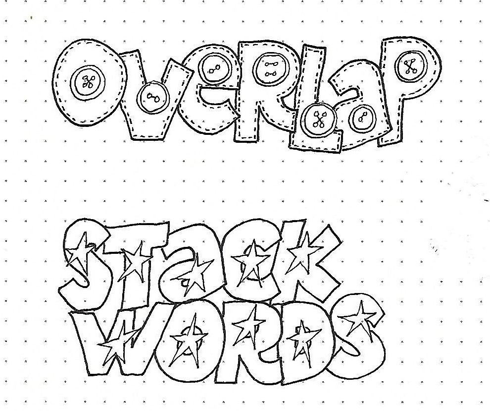
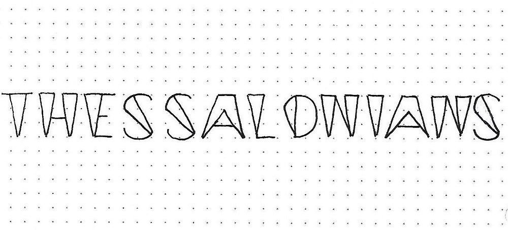
THESSALONIANS: Day #1 – Wedged – Introduction

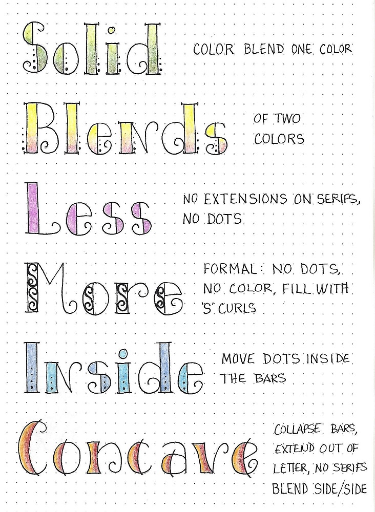
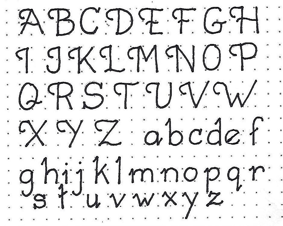
We explored a few alternatives to the Basic Block Lettering when it was first introduced early in the year. All of those were significant departures from the base form. Now, I want to show you how to make some minor changes to the font and still create a very unique alphabet.

We’re going to do this a step at a time so you can learn how design edits are initiated and become a participant in the design process.

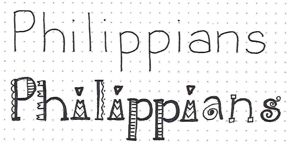
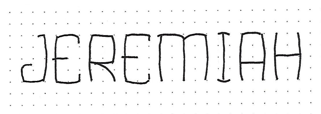
For today, practice with this introductory word to get a taste of the end goal.


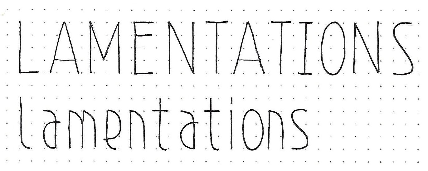
THESSALONIANS: Day #2a – Wedged – Review Blocks

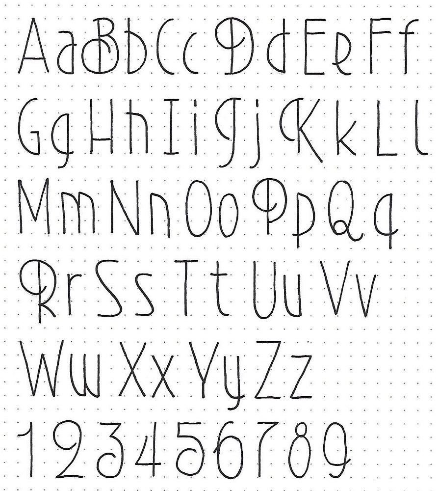
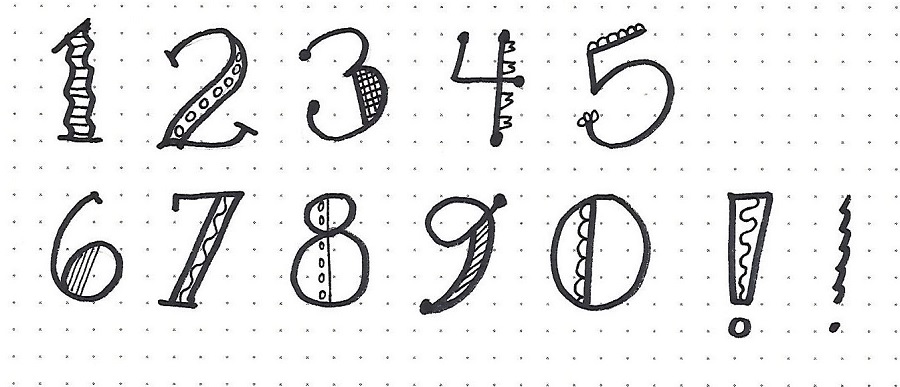
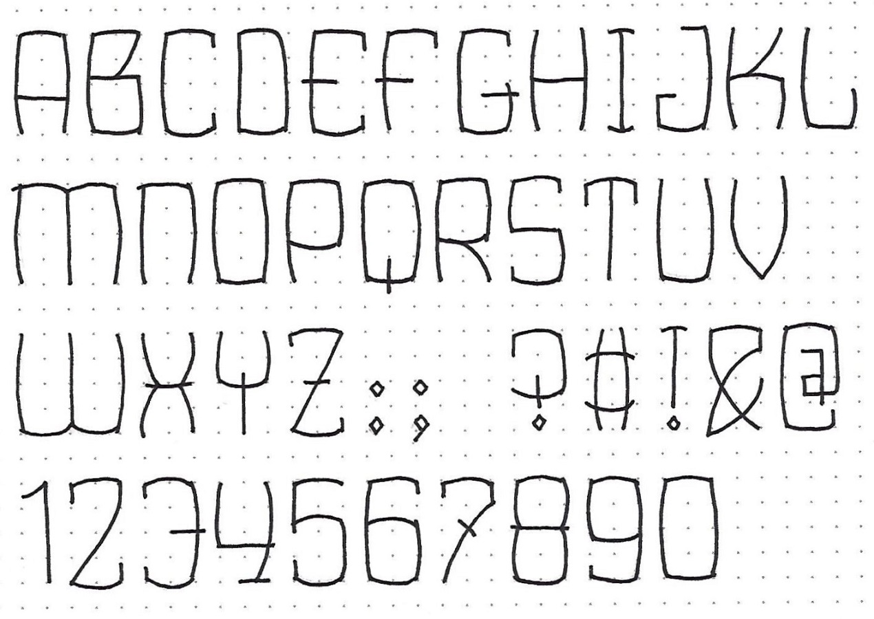
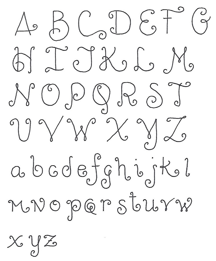
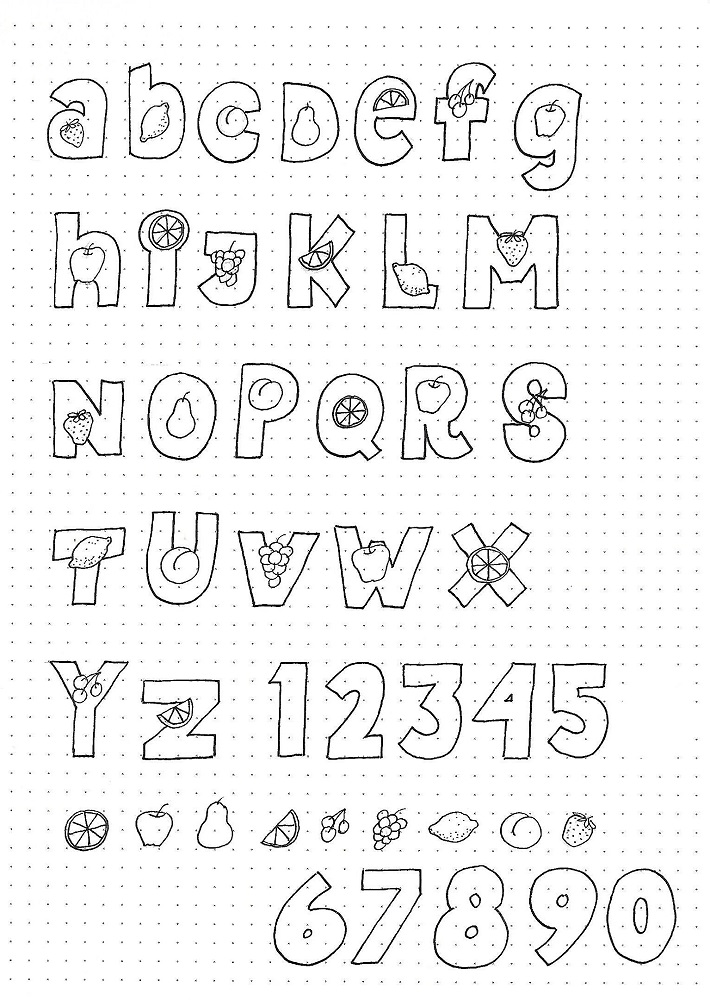
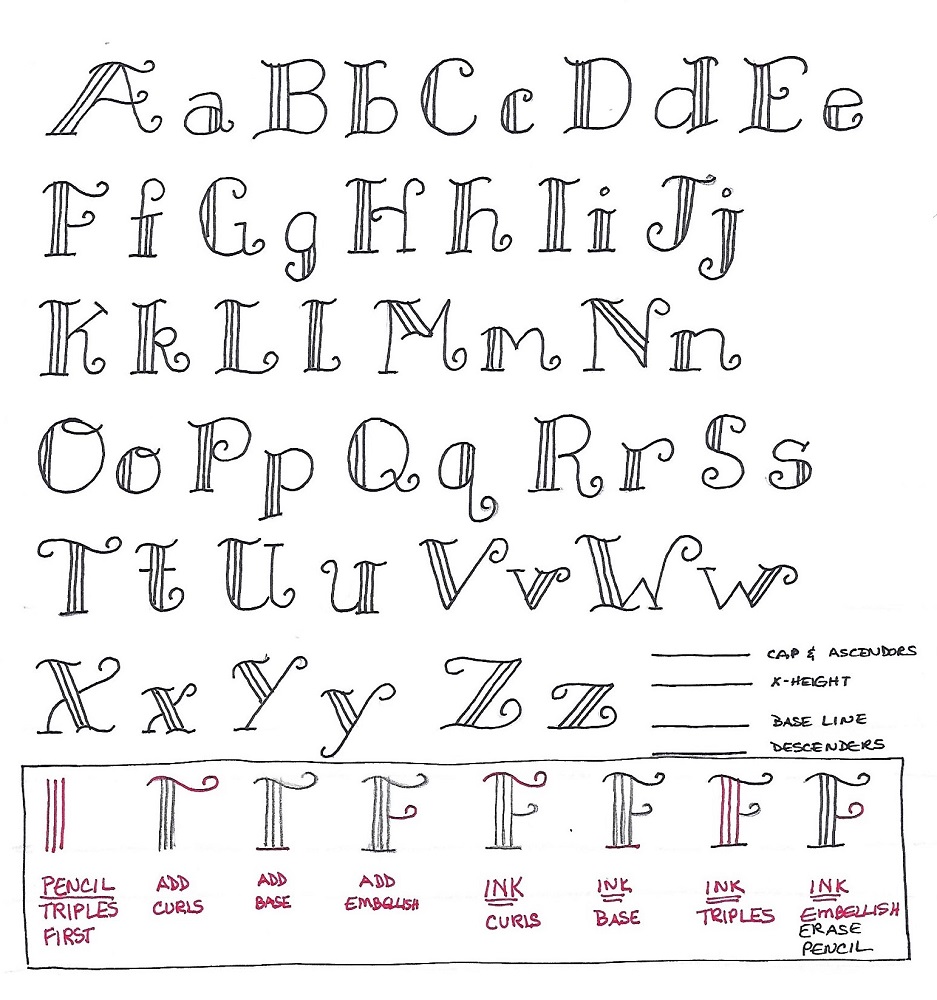
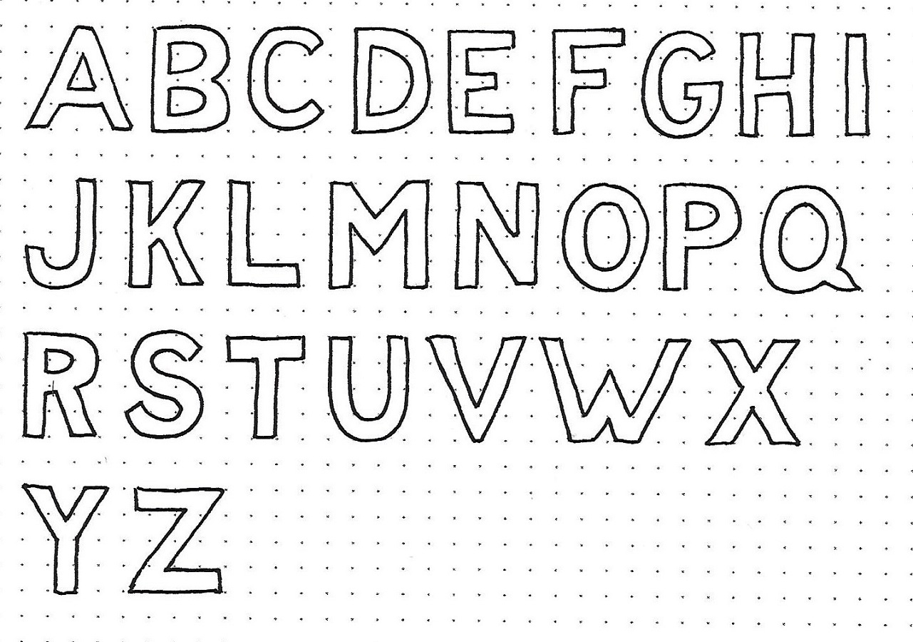
As the first step in this design overhaul, you will want to review the root form of the Basic Block Alphabet. However, our new alphabet will need an altered form to begin with. We want a letter that uses elements of 3 units high by 1 unit wide.

First, write out a new alphabet based on those dimensions. This will be your template for the redesign.

When you have that done, move on to the next graphic.


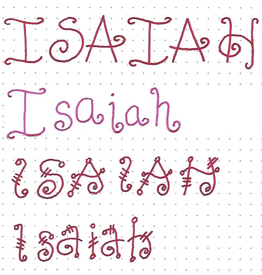
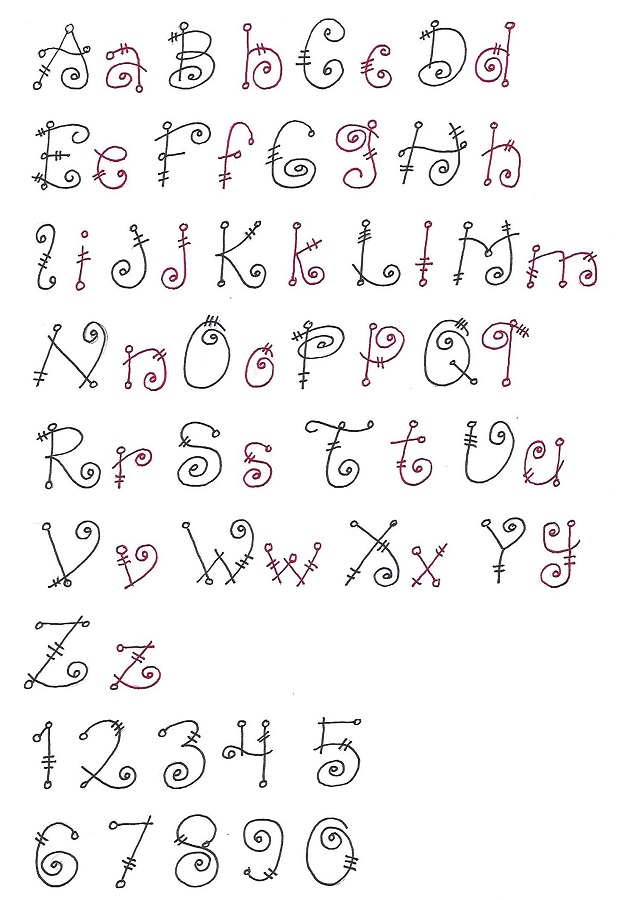
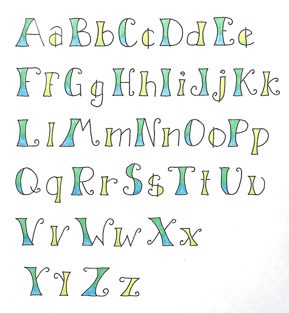
THESSALONIANS: Day #2b – Wedged – Changing Font

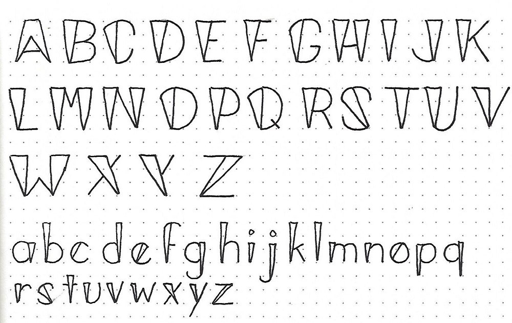
Using the ABC graphic below, note how the Basic Block is transformed. Column 1 is the base letter; column 2 substitutes the vertical for a wedge that is the 1 unit width at the top and narrows to a point that is centered on the base of the element; column 3 shows the final result. Note that, when the vertical has a curved top, like in the letter C, the wedge is vertical on the inside edge, slanted on the outside edge and follows the curve at the top.

Use your practice piece from graphic 1 to see how many of the forms you can get right.

The graphic at the right demonstrates a lower-case alphabet that uses narrow wedges (1/2 unit wide) to modify the verticals of the Basic Round Print. Try creating a full alphabet for this as well.

We’ll get to see both of these full alphabets tomorrow so you can evaluate how well you did.


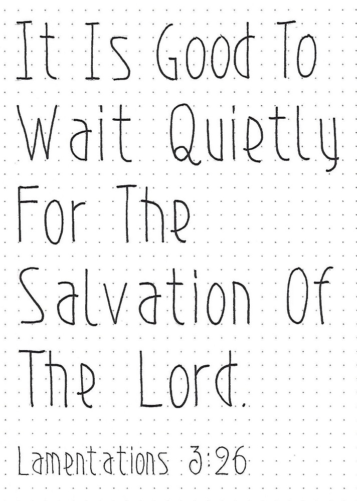
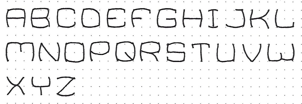
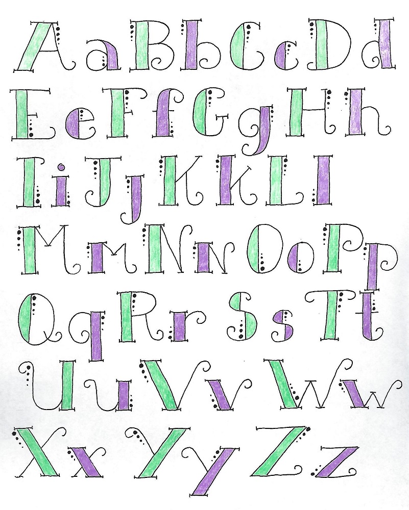
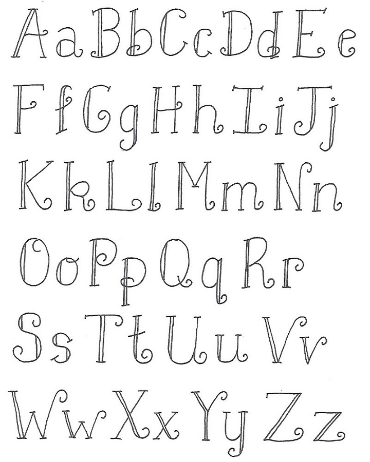
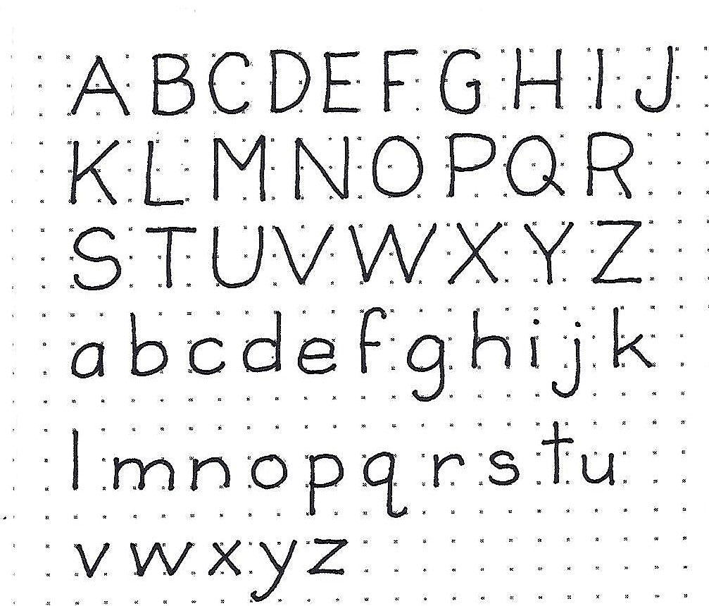
THESSALONIANS: Day #3 – Wedged – Alphabets

So, how well did you do yesterday? Check your invented alphabet against the one shown here. If there are deviations between them, which forms do you like better? If you like yours, then GO WITH IT!

If you didn’t do the exercise yesterday, you can copy out this version and adopt it for the rest of this week’s activities.


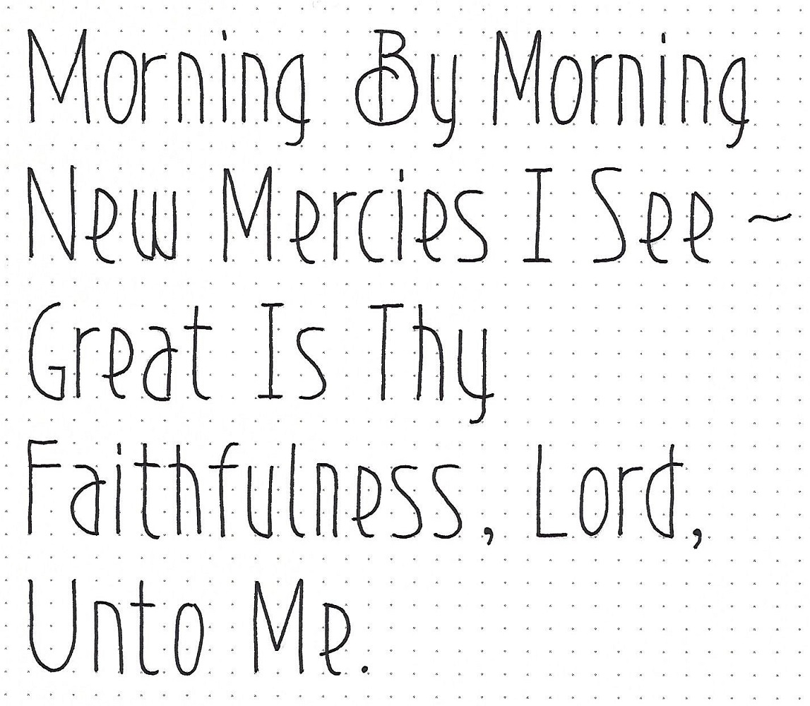
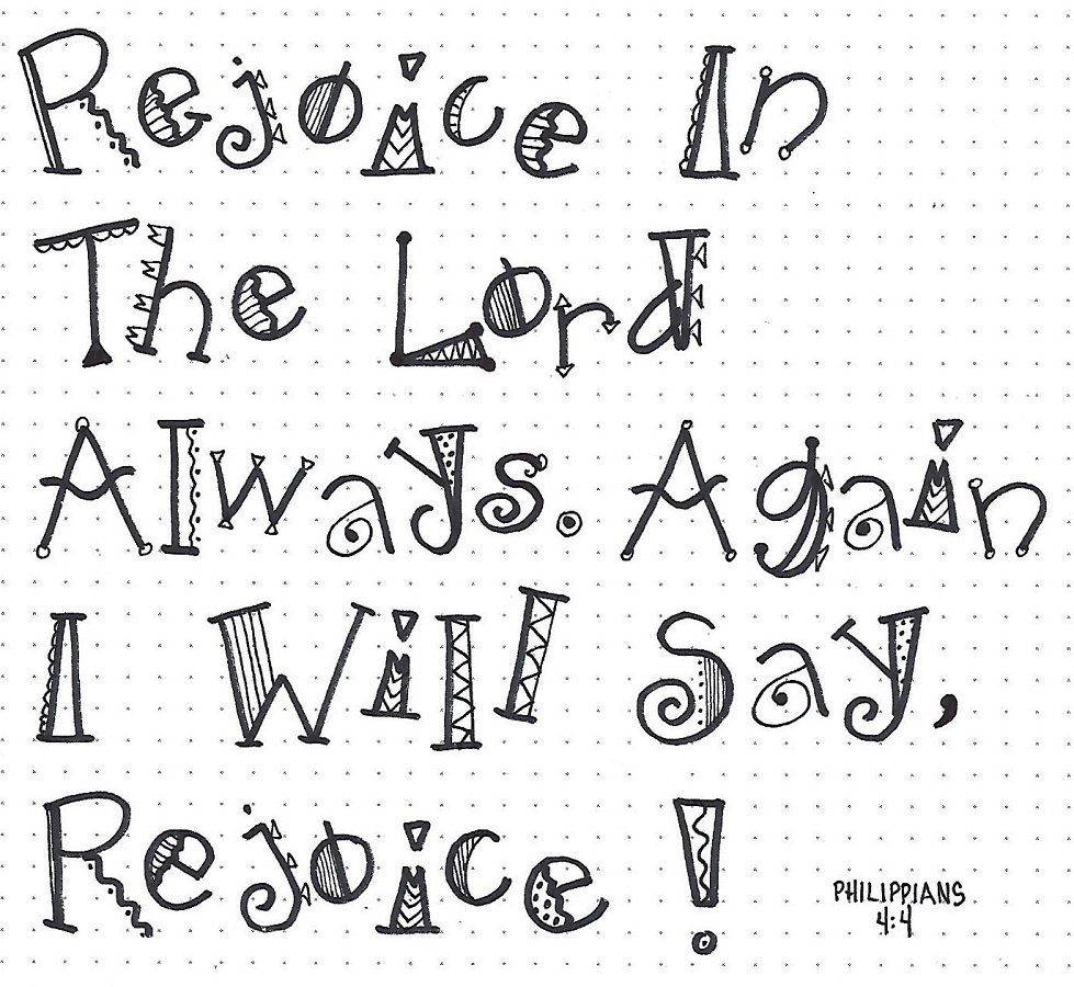
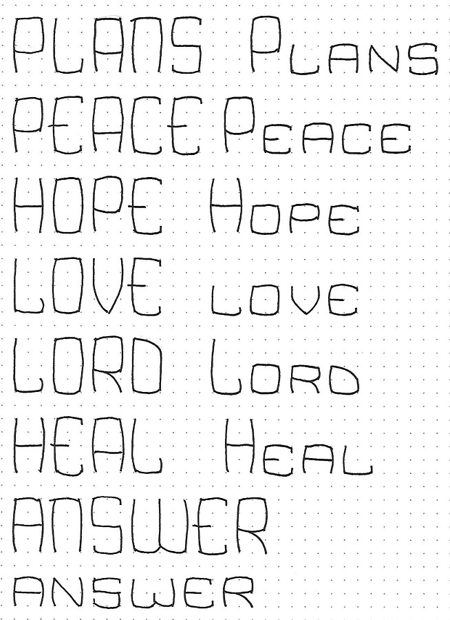
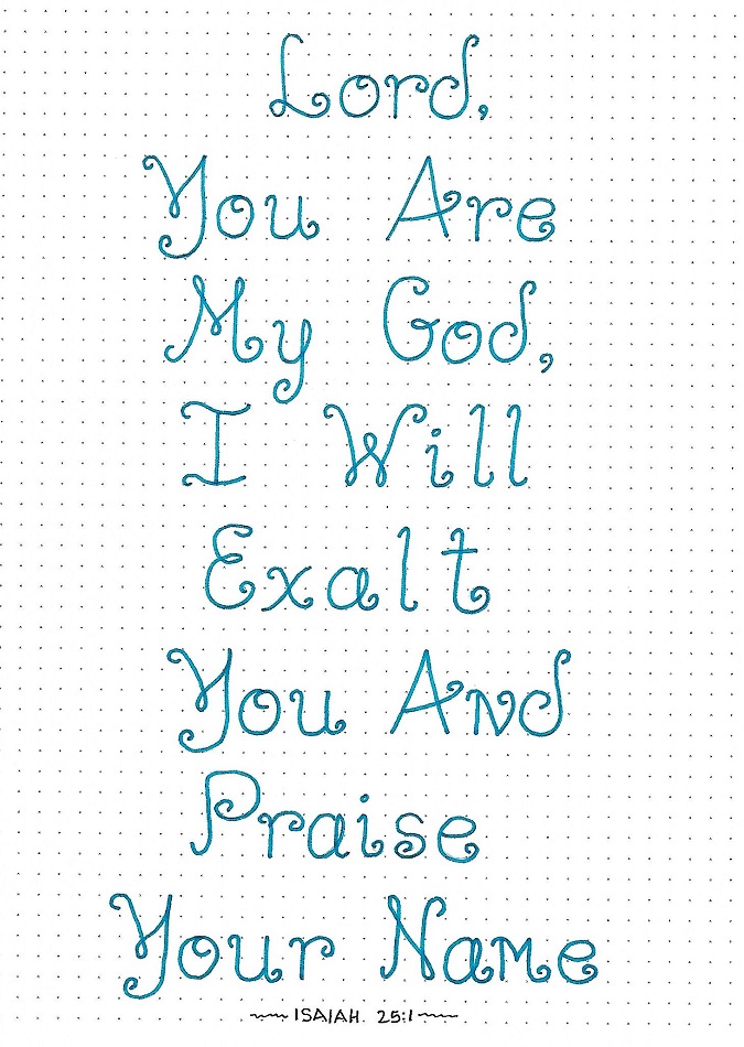
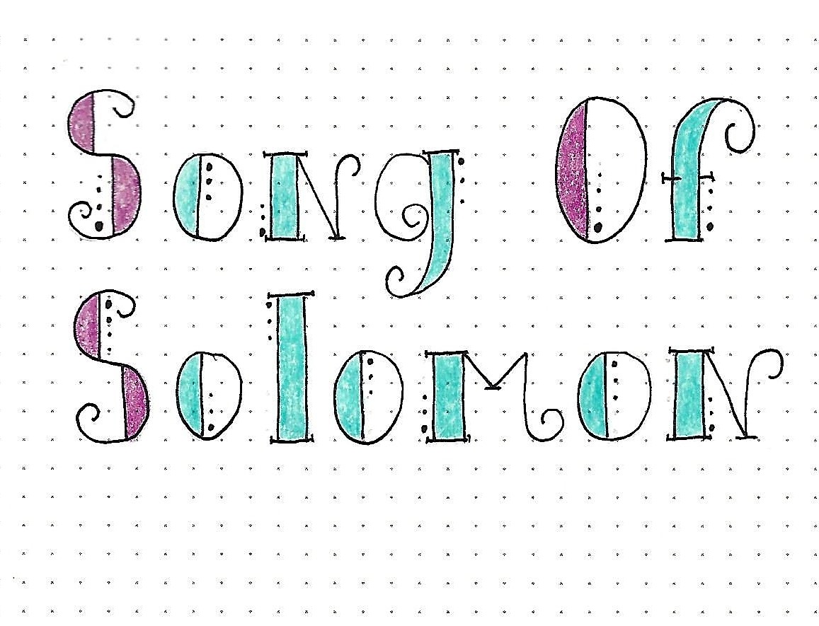
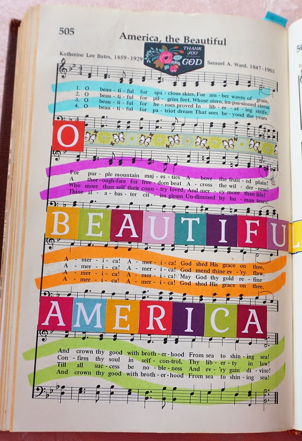
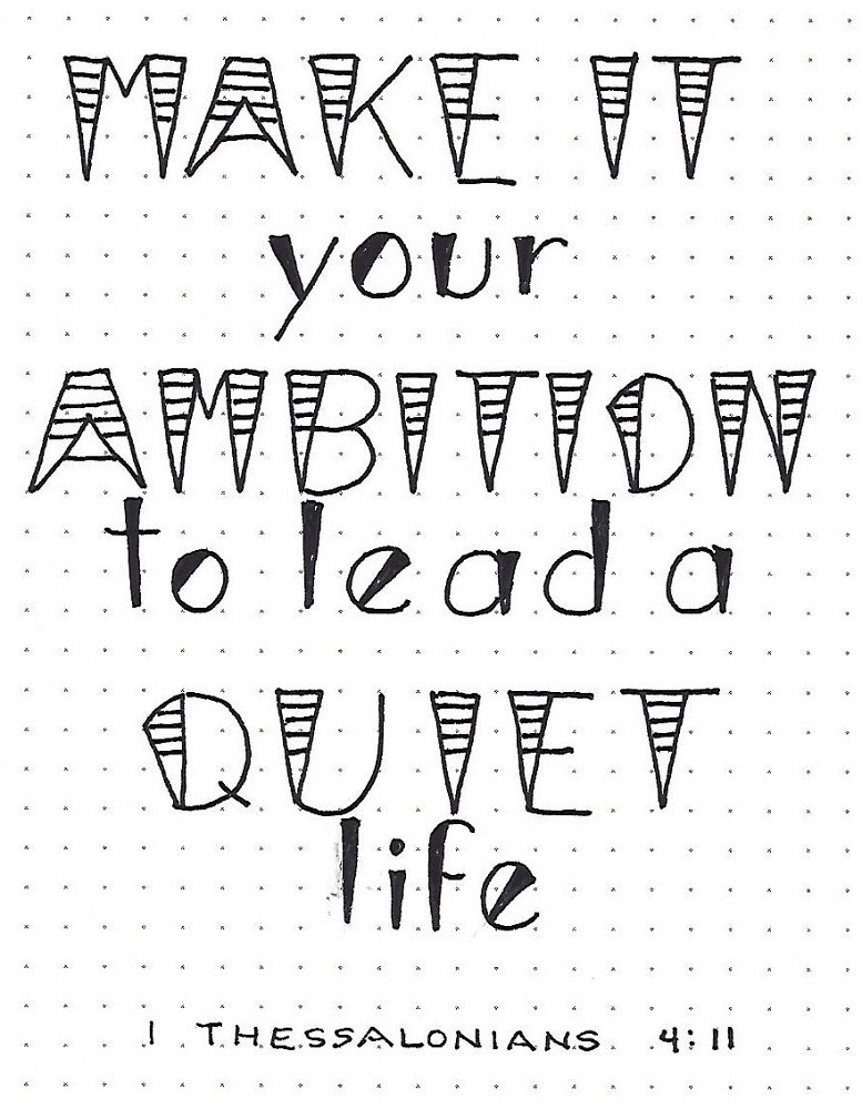
THESSALONIANS: Day #4 – Wedged – Use in a Phrase

Today, we’re going to use the new ‘wedged’ font to write a scripture on practice paper.

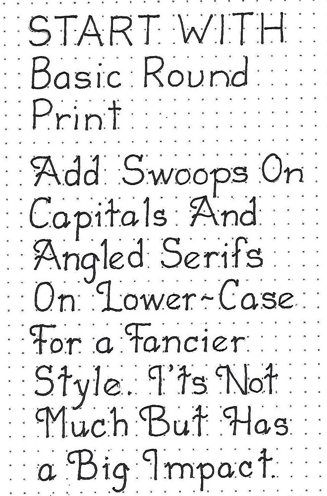
I made a couple of additional variations to my letters to add interest. On the upper-case letters I drew a horizontal line at the mid-point and divided that in half and in half again. The result, more attention-getting word art.

I simply used a filled wedge on the lower-case letters.

Imagine what this would look like if you were writing a patriotic message and colored those upper stripes in alternating red and white while coloring the bottom half and the lower-case with blue! What other fun color combinations would you like to try?


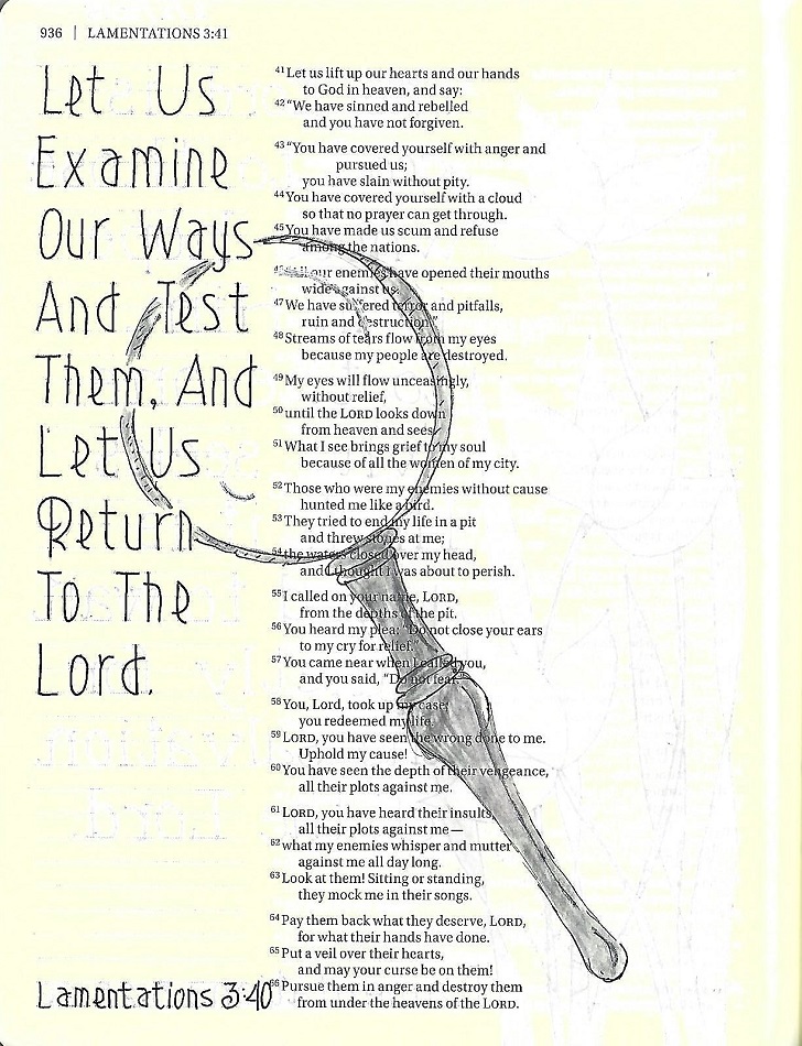
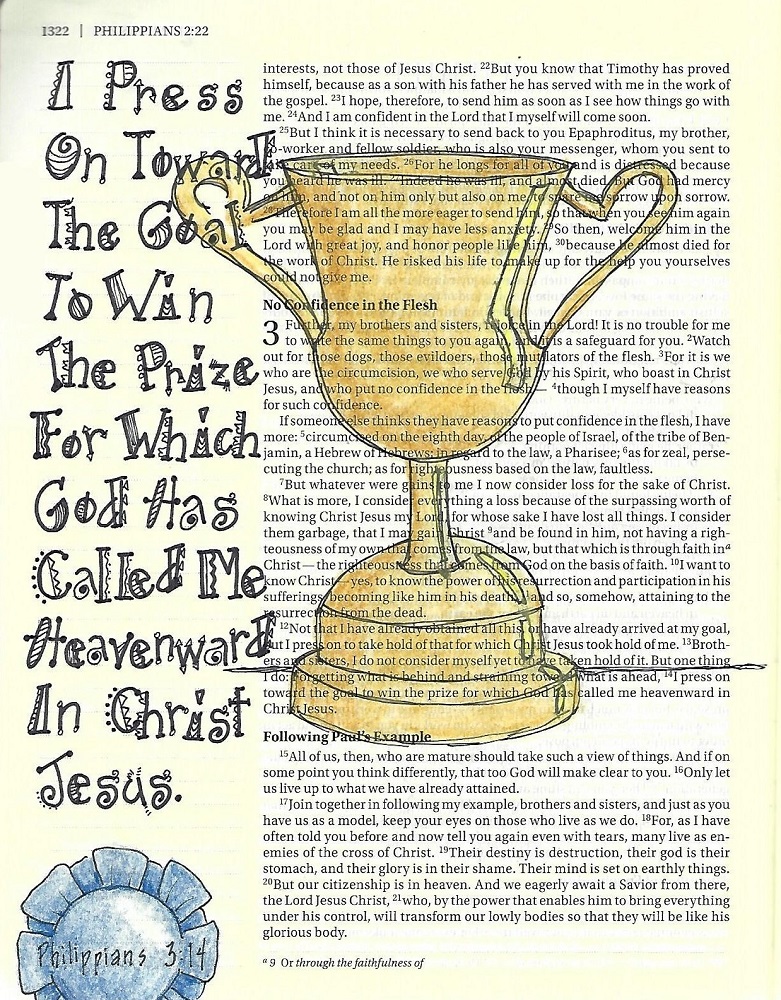
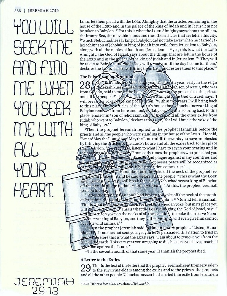
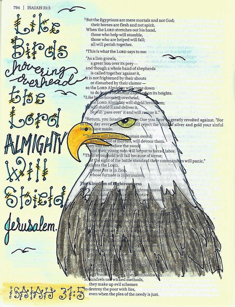
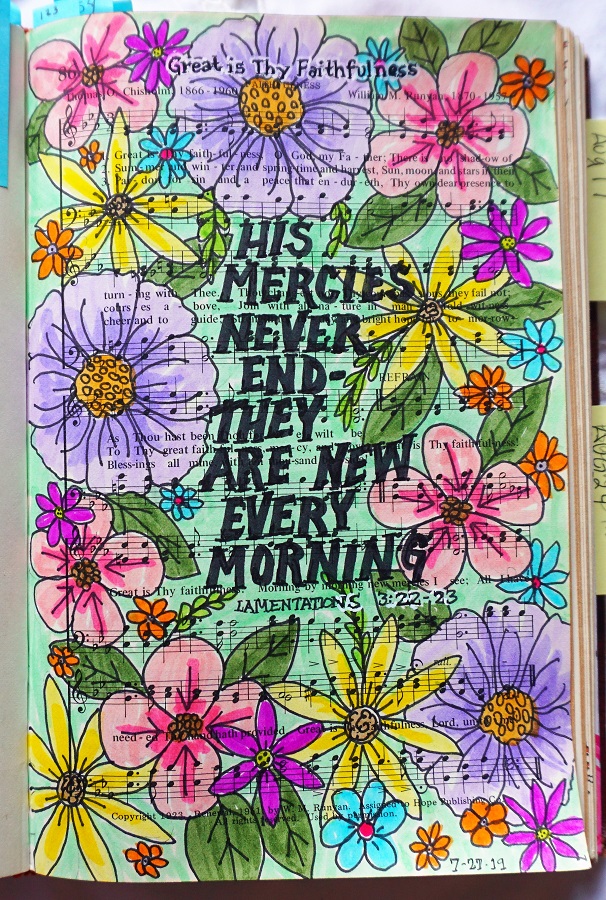
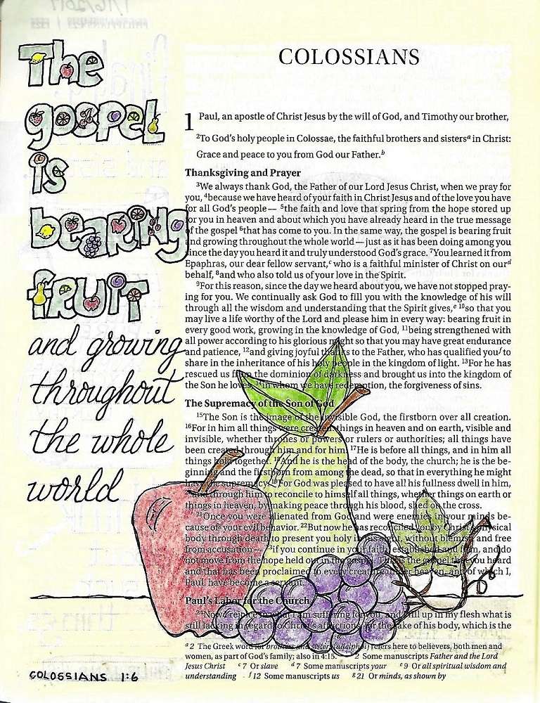
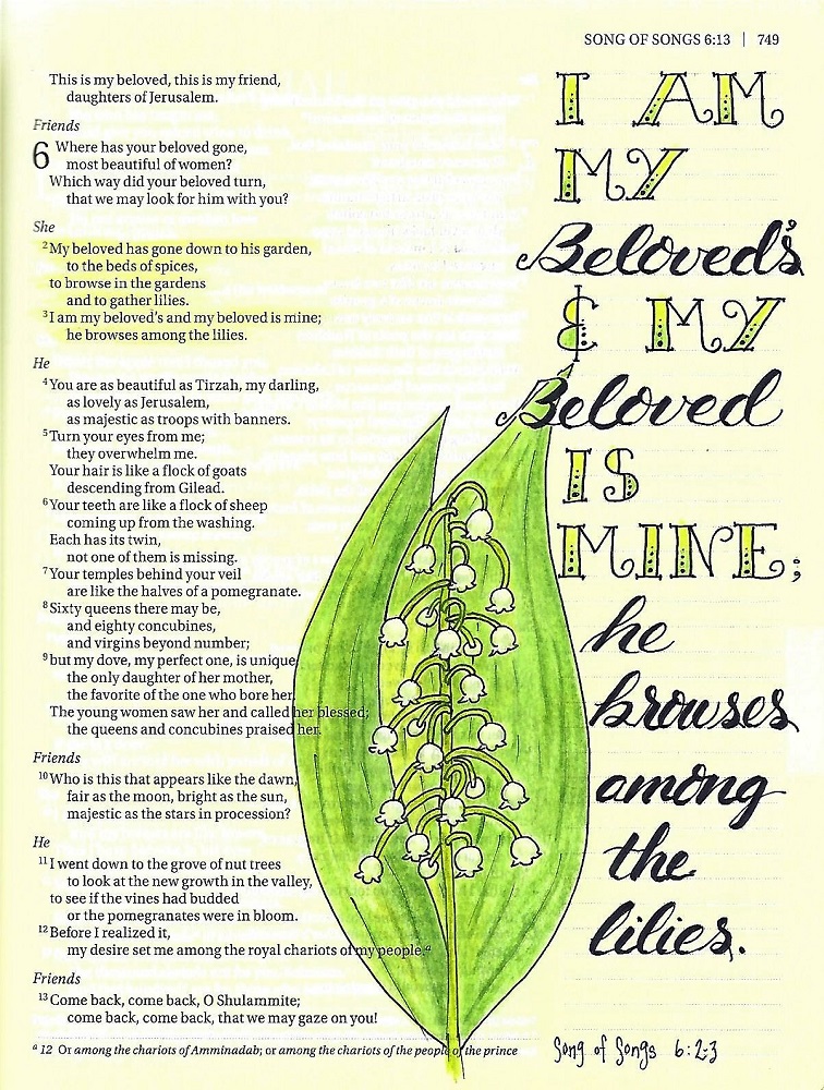
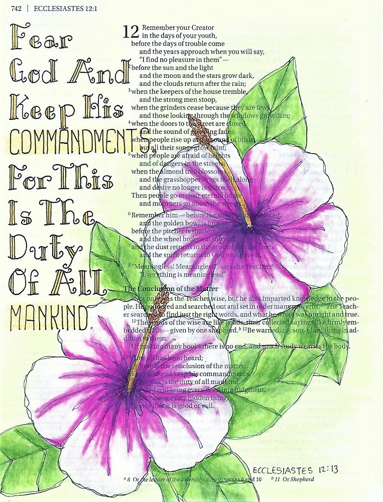
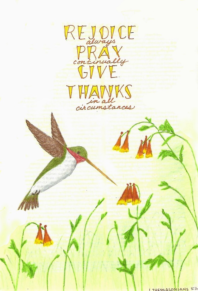
THESSALONIANS: Day #5 – Wedged – Bible Page

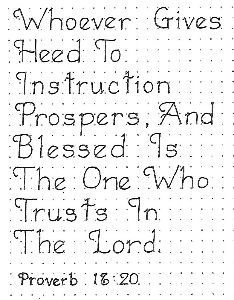
Here we are at Friday again! Today we are using the new font in our Bible to write a scripture in the books of 1st or 2nd Thessalonians. I combined the upper case with a small script. Did you notice, I also made the tops of the wedges concave? This makes it at little more casual.

I wrote my letters in colored ink and then filled with a lighter color. I did this to keep the lettering from looking too harsh against the gentle coloring of the illustration (which is the hummingbird from this week’s Drawing Room). This is in my interleaved Bible.


And so we wrap up another week of lettering lessons for our bibles.

Ddd


Posted by studio3d@ccgmail.net at 7:51 PM PDT
Friday, 28 June 2019
Hymnal Art - America the Beautiful
Topic: Hymnal Art

Our leader in the group of hymnal artists assigned a whole month of patriotic songs for this week and through the month of July. I want my hymnal to reflect worship more than nationalism so I completed just this one patriotic song.


I created the words with a sticker set. The color bands represent the lyrics (not in order) as 'spacious skies', 'purple mountains majesty', 'amber waves of grain' and ' the fruited plain'.

Ddd


Posted by studio3d@ccgmail.net at 12:01 AM PDT
Sunday, 23 June 2019
Proverbs in Lettering Lessons
Topic: Bible Journaling

Seems that many of the Proberbs are ideal for lettering decoratively. We'll take advantage of that in the lessons this week:

PROVERBS: Day #1 – Leading Loops – Introduction

This week we’re going to make enhancements to the basic round print font that will turn it into an elegant style.

For today, we’ll write the word ‘proverbs’ in upper- lower-case and in all-caps. Just work from these samples keeping in mind the very straight uprights and the very round bowls of the letters. Try to make the leading loops uniform and note that your serifs (one per letter) are only on the lower-case and are short and on an angle.


PROVERBS: Day #2a – Leading Loops – Review

There are TWO graphics today as I wanted to provide you with a quick review of the Basic Round Print. Practice writing this alphabet out to note the basic forms before you go on to the enhanced alphabet that shows the changes.


PROVERBS: Day #2b – Leading Loops – Alphabet

Compare this alphabet to the Basic Round Print just shown. Here are the elements that make up the enhancements: 1) capitals have a leading loop (make them consistent) 2) crossbars are curved 3) lower case have angled serifs (just one per letter) 4) x-height is ½ the overall letter height. Note the angle of the crossbar on the lower-case ‘f’ and ‘t’ and the angle on the lower-case ‘e’

Practice writing out this alphabet in pencil until it becomes natural to your hand. Then trace in ink and erase the pencil.


PROVERBS: Day #3 – Leading Loops – Getting There

Use the writing of these phrases to practice writing words and setting the steps to success in your mind.


PROVERBS: Day #4 – Leading Loops – Practice

Use the Leading Loops style to write out a scripture from the book of Proverbs. All this practice will prepare you for tomorrow’s activity of writing in your Bible.


PROVERBS: Day #5 – Leading Loops – Bible Page

This is a font that just seems to be made for writing scriptures. Isn’t it elegant?

With so much of the styling in the leading loops of the capitals, I think it looks best if you capitalize every word.

For my sample page, I combined the Leading Loops style with the ‘Country Church’ from the Drawing Room.


I often mention that I have combined the lettering on a bible page with art from the Drawing Room. I make a drawing tutorial every week for posting at www.Creative-Bible-Journaling.com. This is the drawing room I am referring to.

Ddd


Posted by studio3d@ccgmail.net at 12:01 AM PDT

Newer | Latest | Older