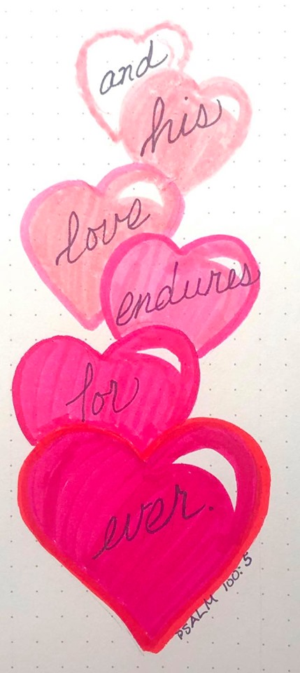
Topic: Bible Journaling
Right on time for a lettering lesson working in the book of Romans. Here are the lessons for the week:
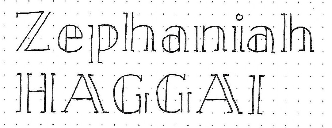
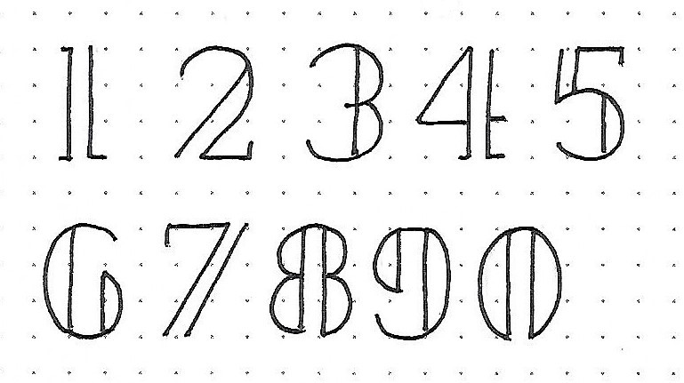
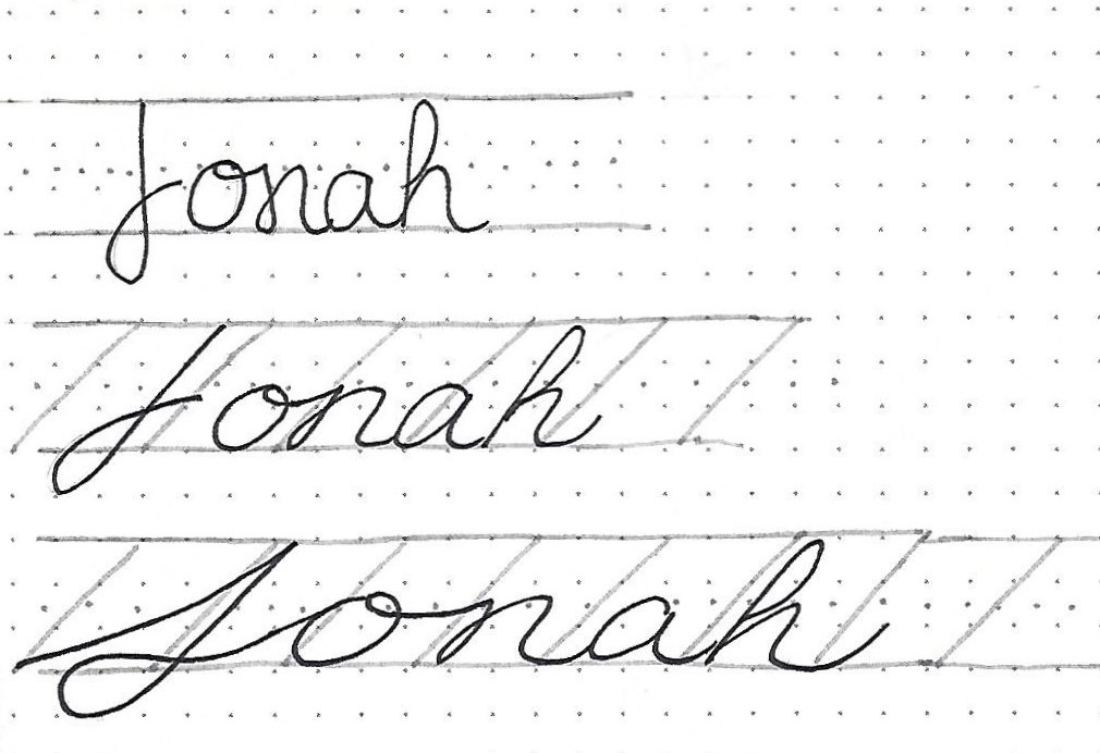
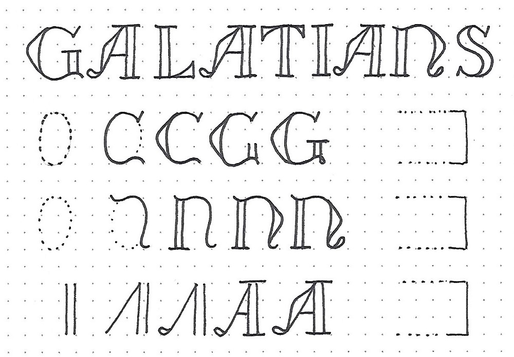
ROMANS: Day #1 – U-Turn Font – Introduction
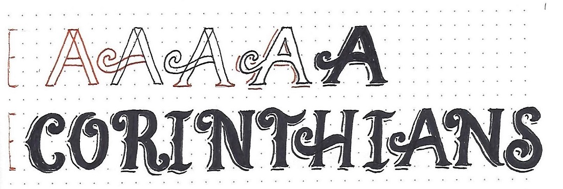
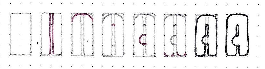
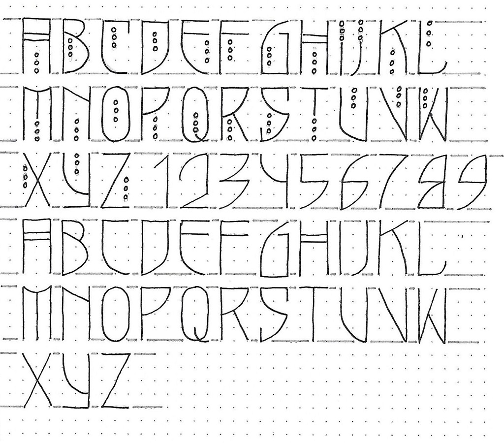
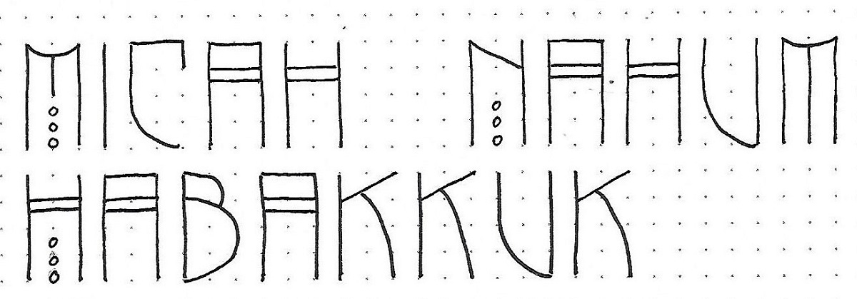
It’s been a couple of years since this font was introduced on CBJ but it is unique and I thought it was time to see it again. Today we will just write out the bible book name in upper- and in lower-case. To assist in this, there is a set of instructions at the bottom of the page that defines the ‘rule’ for drawing out this style.
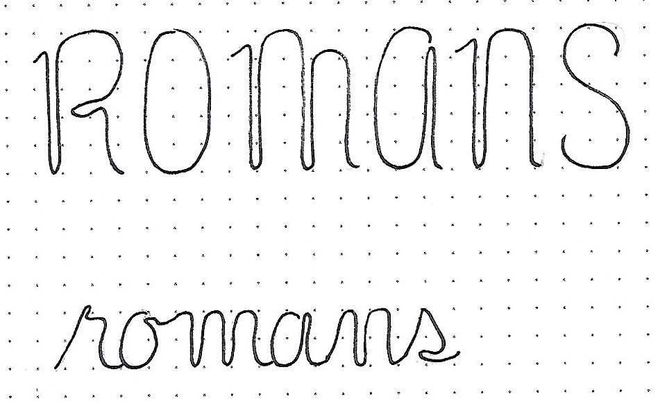
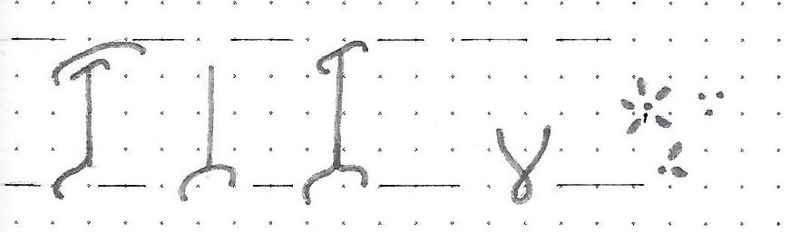
Anywhere you would normally create a loop in a letter or re-trace the path of a stroke, it becomes a side-by-side double stroke.
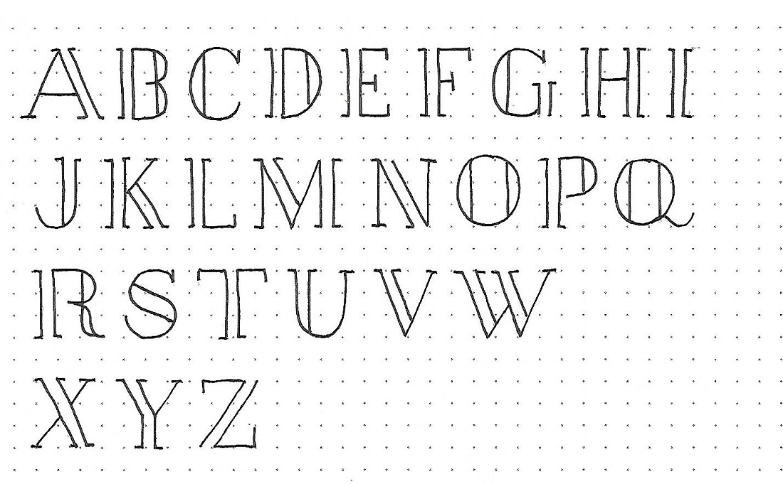
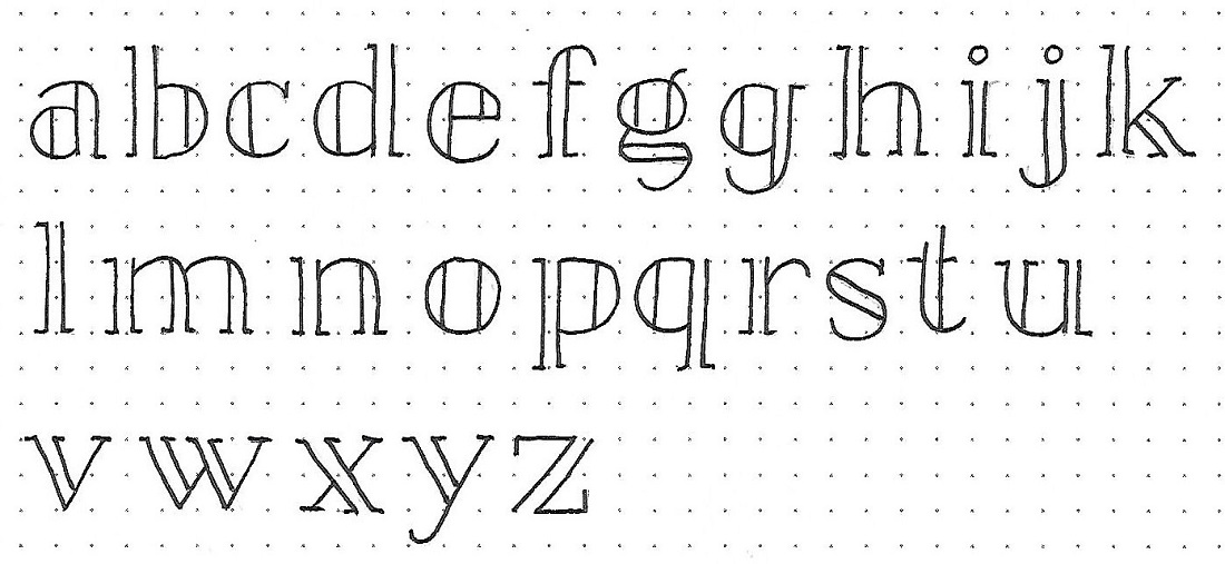
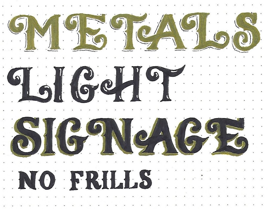
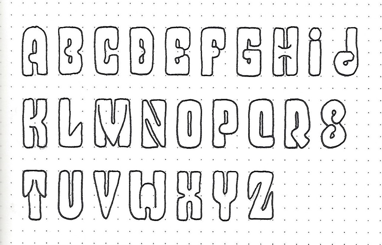
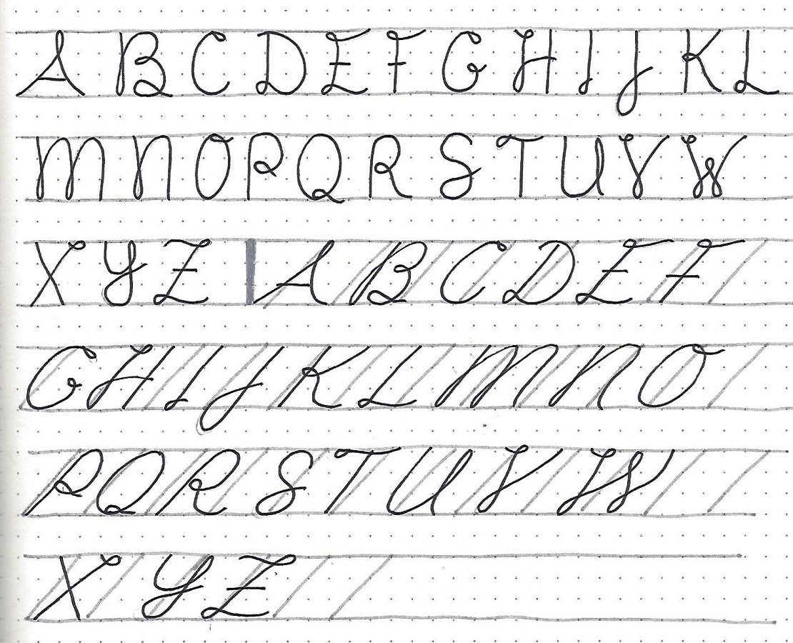
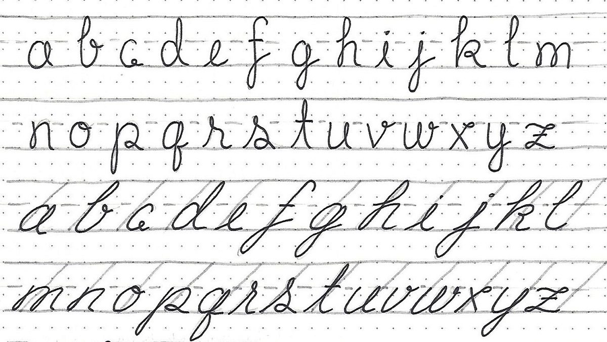
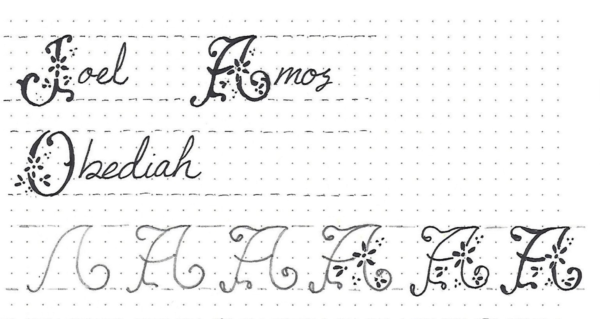
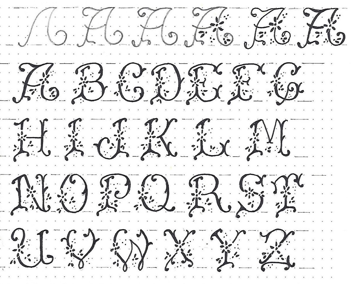
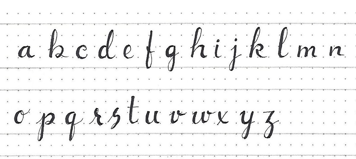
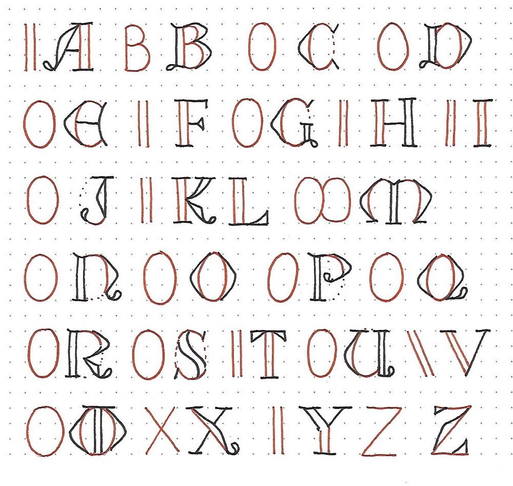
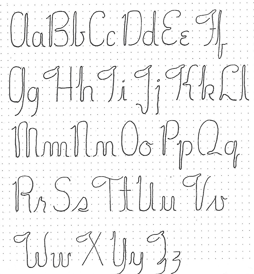
ROMANS: Day #2 – U-Turn Font – Alphabet
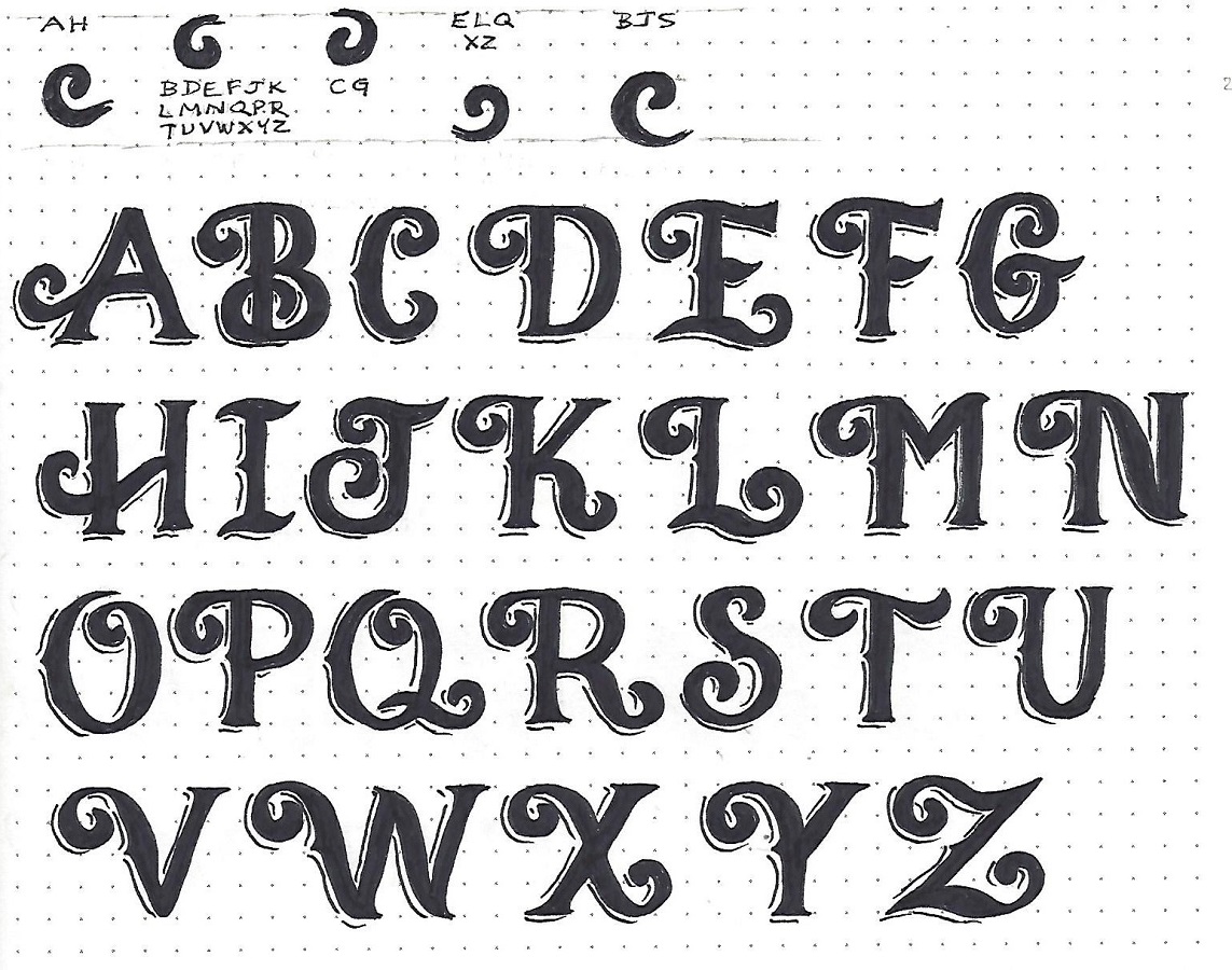
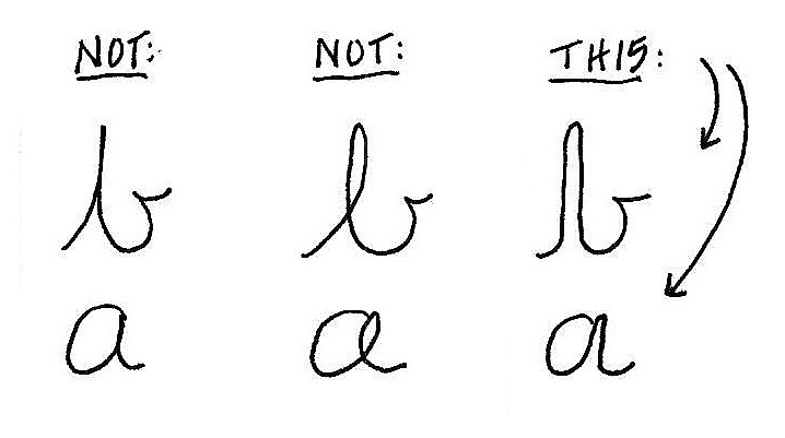
Remember the basic rule from yesterday? Anywhere you would normally create a loop in a letter or re-trace the path of a stroke, it becomes a side-by-side double stroke. Also note the shape of the leading stroke on many of the letters (F, H, I, J, K, V, W, X, Z) and practice this separately until you can reproduce it consistently. There is another less complicated beginning stroke on others (B, D, M, N, P, R) and another on U and Y.
Your overall letter height is 5 units and the x-height is at 2 units. The descender is at -2 units. It is not as important to make your letters this tall as it is to keep your x-height below the midpoint.
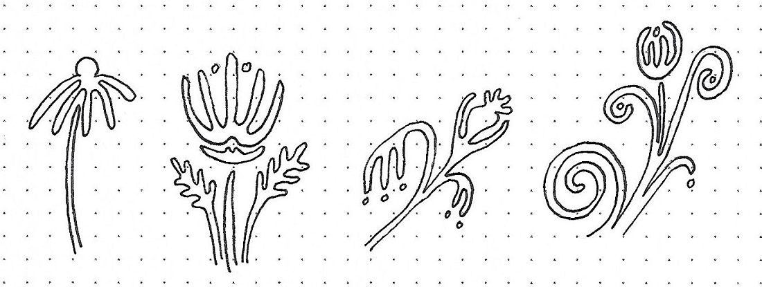
ROMANS: Day #3 – U-Turn Font – Loop Practice
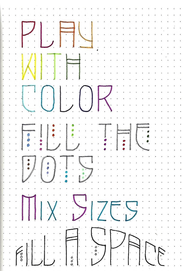
Because the consistency of the loop width is the most important feature of this font, today we’re going to work only on that. The drill will be to create flowers and leaves using consistently spaced looping lines.
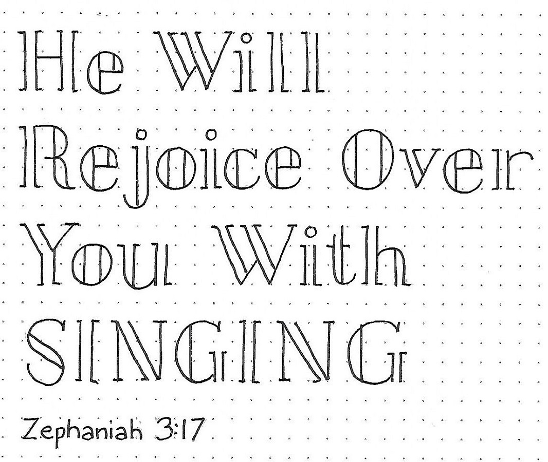
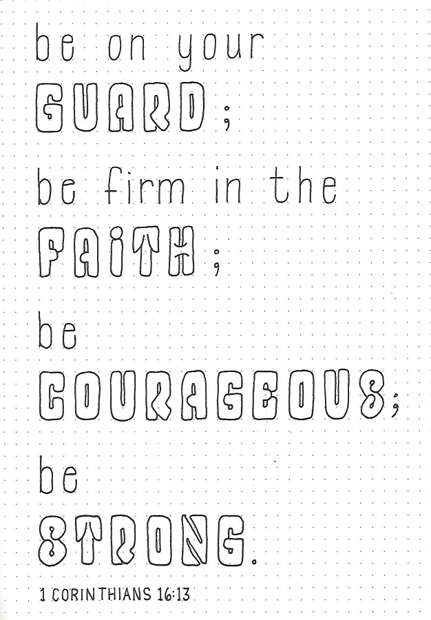
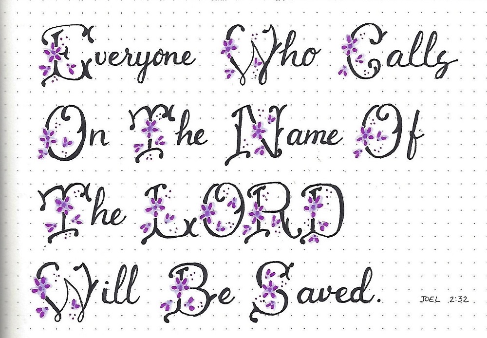
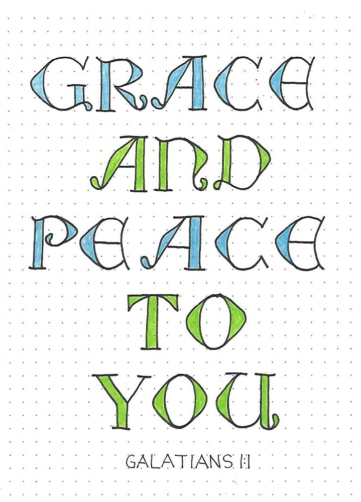
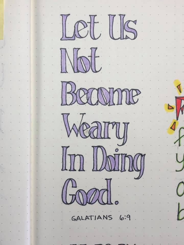
ROMANS: Day #4 – U-Turn Font – Scripture Writing
Now that we’ve got consistent looping lines and have practiced on those leading features, it’s time to put this font to work.
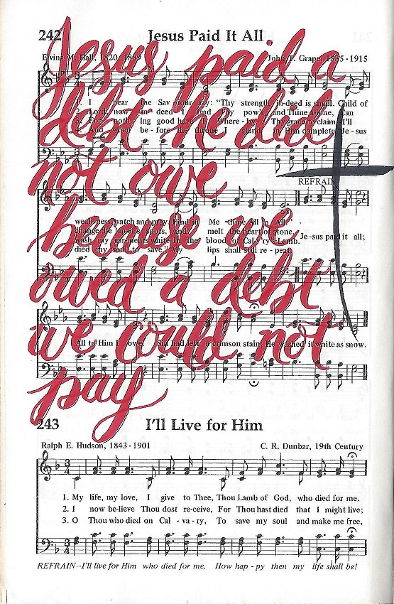
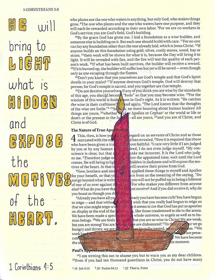
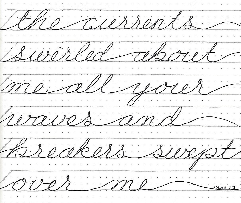
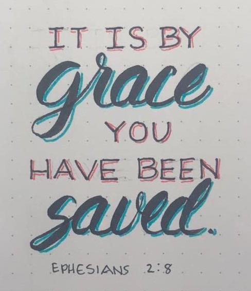
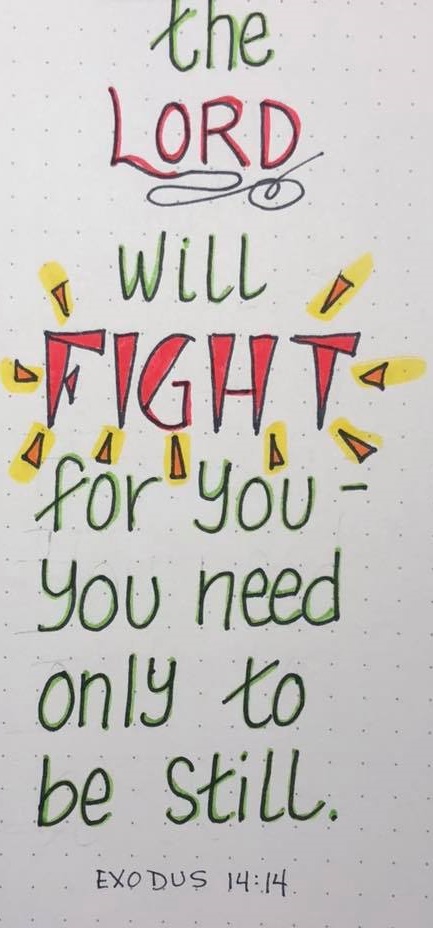
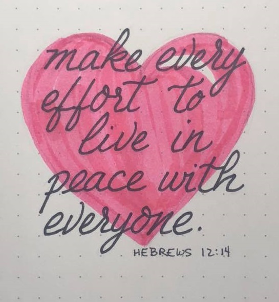
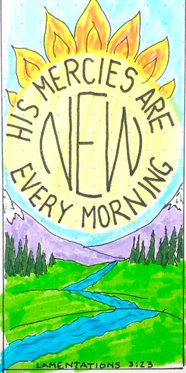
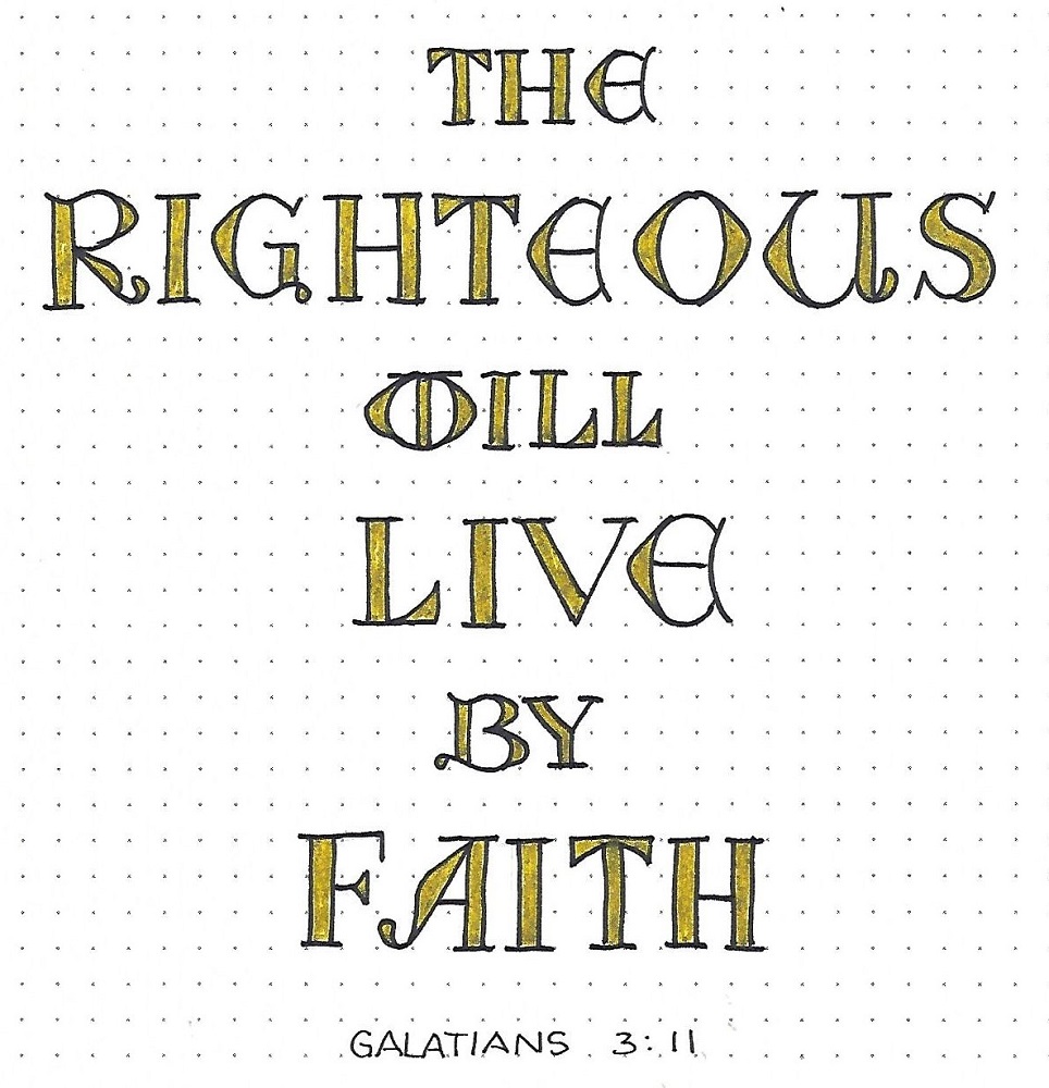
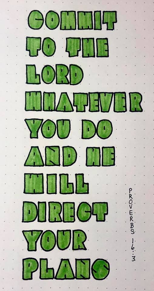
Use the U-Turn Font to write out a scripture from Romans. Mine is chapter one, verse sixteen.

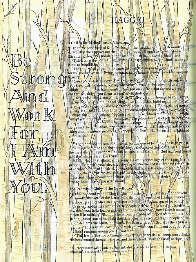
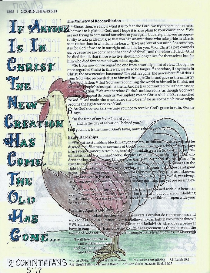
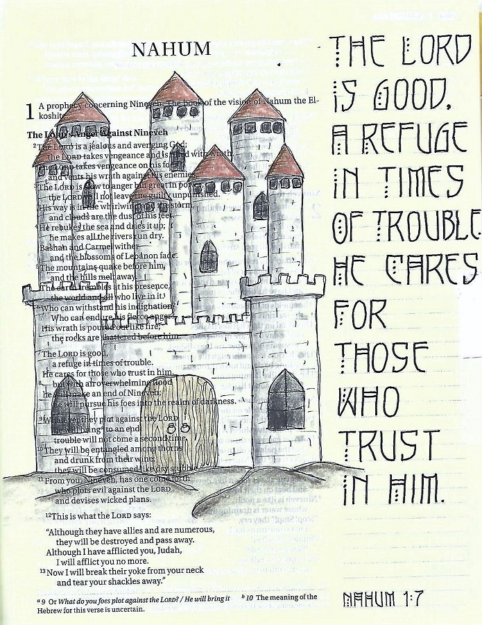
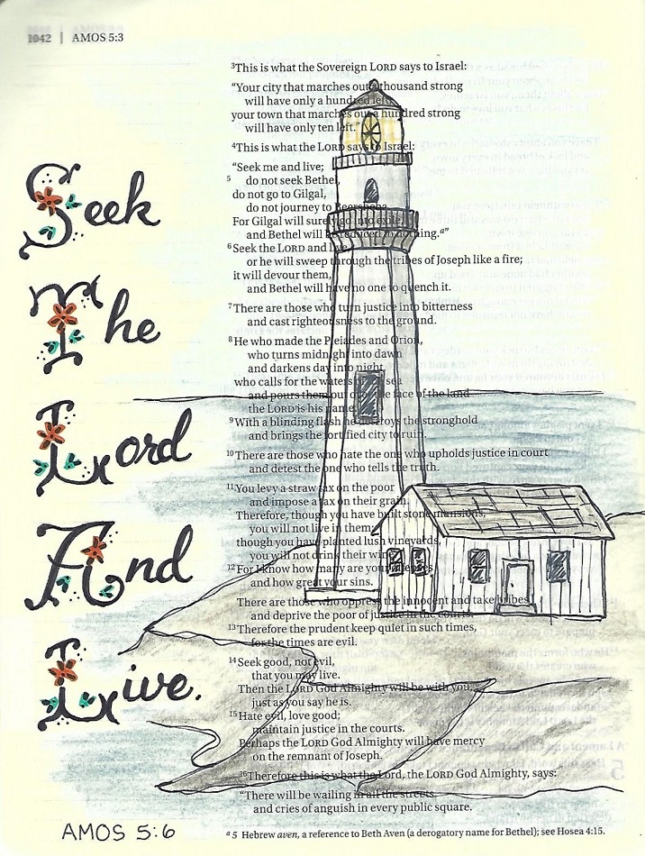
ROMANS: Day #5 – U-Turn Font – Bible Page
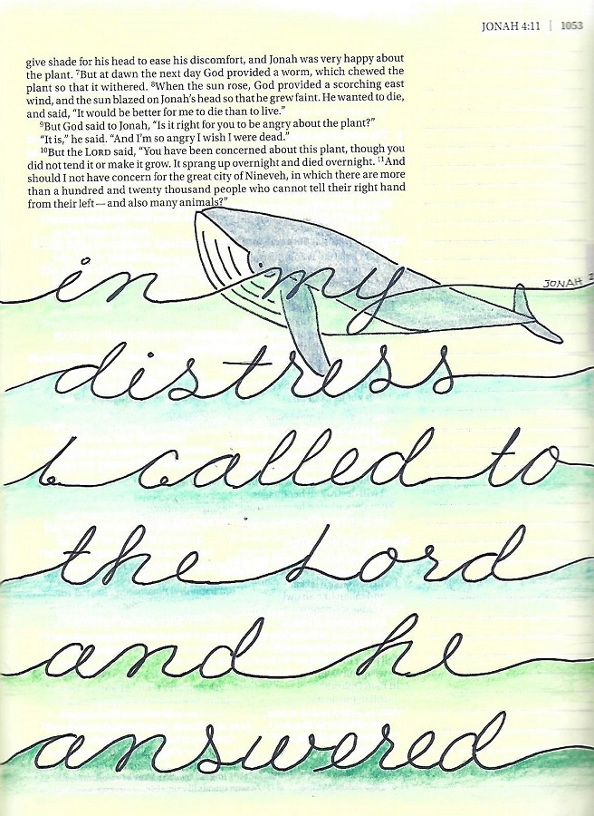
Today we get to use the new font in our bible. I will point out that I broke one rule right away! I pulled the x-height up to the midpoint. It was much easier to get the lettering consistent as I could utilize the lines printed in the margin for alignment.
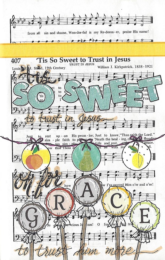
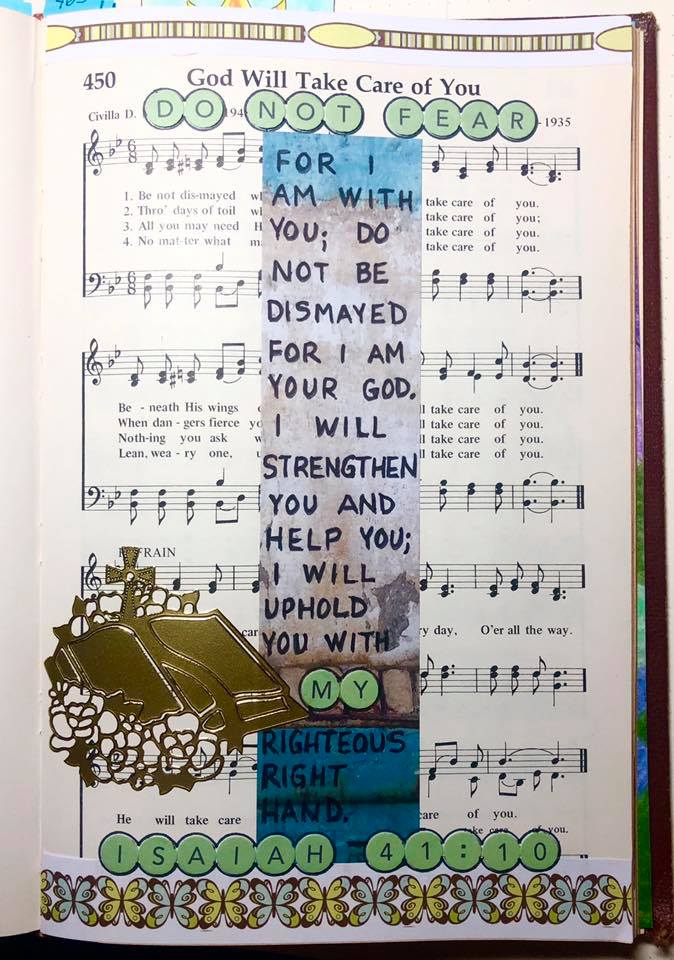
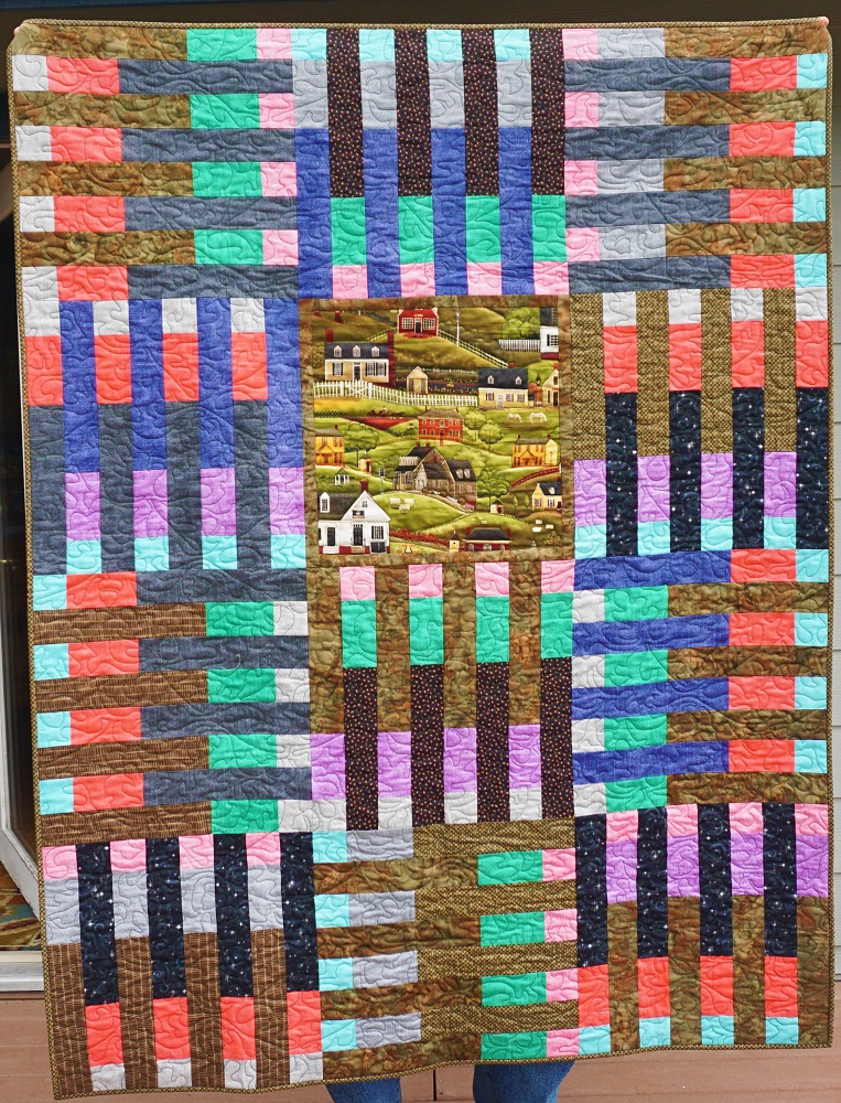
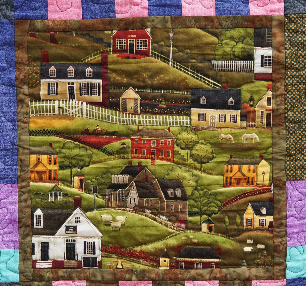
I combined my verse with the camera from the Drawing Room lesson for this week.

This is actually a revisiting of a font that I taught back in 2018. But it is worth another look.
Ddd