« November 2019 »
S M T W T F S
1 2
3 4 5 6 7 8 9
10 11 12 13 14 15 16
17 18 19 20 21 22 23
24 25 26 27 28 29 30
You are not logged in. Log in
Entries by Topic
All topics  «
3D paperwork
A - Z challenge 5
A - Z challenge 7
A - Z challenge round 4
A to Z challenge round 3
A to Z round 2
A to Z round 6
A-Z round 1
Around the House
Art Challenges
Artist Trading Cards
Backgrounds
Beads
Bible Journaling
Books
Boxes
Collage
Color Challenge
Coloring
cookbook
Die Cuts
Digital Projects
Digital Stamps
Drawing
Dry Embossing
Fabric Stuff
Fantastic Folds
Field Trip
Home Decor
How Does Your Garden Grow?
Hymnal Art
In The Kitchen
In the studio
Jewelry
Lettering
Links
Multi-Technique
Music to Work By
Musings
Nail Art
New Work
Online Class
Other Hobbies
Other Projects
Painting
Paper Embroidery
Paper Piecing
Photo
Pretty Paper
Quilting
Random
reading
Scrap Recovery
scrapbooking
Sewing
Sketch Challenge
Some Backlog
Stamping
Stencils
Stickers
Supplies
Teabag Folding
Techniques
Testing
tips and tricks
Tutorial
Web resources
Welcome to my Blog
Work By My Friends
workflow
Writing
Blog Tools
Edit your Blog
Build a Blog
RSS Feed
View Profile
Group One
In & Out of Studio 3D
Friday, 15 November 2019
Blooming Stars Quilt
Topic: Quilting

Last year I bought a couple of fat-quarter stacks that had a wide range of values of in a single colorway. Each stack had the same abstract prints with gold paint features - dots, swirls, circles, and more.There was a magenta stack and a teal stack.

I set these aside until I found a pattern using these same colors so I cut out the parts for that and set them aside to sew up later. The leftovers went into this quilt as those colors enhanced a floral print I had leftovers of.

I called this quilt Blooming Stars to describe the flowers coming in the center of the stars.

There are white background, floral cornerstones, and dotted sashing throughout.


Purple borders pull up color from the florals.

The quilting was done on the longarm using a paper pantograph.

Binding is a lighter shade of the teal and it also is of a shimmery nature.

Ddd


Posted by studio3d@ccgmail.net at 12:01 AM PST
Sunday, 10 November 2019
Art In My Hymnal - Count Your Blessings
Topic: Hymnal Art

The decoration for this page is interlocking block lettering of a scripture done with markers plus script stickers to list my blessings.


The bushel basket is also done in markers as is the heart.

Ddd


Posted by studio3d@ccgmail.net at 12:01 AM PST
Saturday, 9 November 2019
Lettering in the Book of Romans
Topic: Bible Journaling

Right on time for a lettering lesson working in the book of Romans. Here are the lessons for the week:


ROMANS: Day #1 – U-Turn Font – Introduction

It’s been a couple of years since this font was introduced on CBJ but it is unique and I thought it was time to see it again. Today we will just write out the bible book name in upper- and in lower-case. To assist in this, there is a set of instructions at the bottom of the page that defines the ‘rule’ for drawing out this style.


Anywhere you would normally create a loop in a letter or re-trace the path of a stroke, it becomes a side-by-side double stroke.


ROMANS: Day #2 – U-Turn Font – Alphabet

Remember the basic rule from yesterday?  Anywhere you would normally create a loop in a letter or re-trace the path of a stroke, it becomes a side-by-side double stroke. Also note the shape of the leading stroke on many of the letters (F, H, I, J, K, V, W, X, Z) and practice this separately until you can reproduce it consistently. There is another less complicated beginning stroke on others (B, D, M, N, P, R) and another on U and Y.

Your overall letter height is 5 units and the x-height is at 2 units. The descender is at -2 units. It is not as important to make your letters this tall as it is to keep your x-height below the midpoint.


ROMANS: Day #3 – U-Turn Font – Loop Practice

Because the consistency of the loop width is the most important feature of this font, today we’re going to work only on that. The drill will be to create flowers and leaves using consistently spaced looping lines.


ROMANS: Day #4 – U-Turn Font – Scripture Writing

Now that we’ve got consistent looping lines and have practiced on those leading features, it’s time to put this font to work.

Use the U-Turn Font to write out a scripture from Romans. Mine is chapter one, verse sixteen.


ROMANS: Day #5 – U-Turn Font – Bible Page

Today we get to use the new font in our bible. I will point out that I broke one rule right away! I pulled the x-height up to the midpoint. It was much easier to get the lettering consistent as I could utilize the lines printed in the margin for alignment.

I combined my verse with the camera from the Drawing Room lesson for this week.


This is actually a revisiting of a font that I taught back in 2018. But it is worth another look.

Ddd


Posted by studio3d@ccgmail.net at 12:01 AM PST
Sunday, 3 November 2019
Hymnal Art - Tis So Sweet To Trust In Jesus
Topic: Hymnal Art

I really used a LOT of stickers on this page.

The headline, the ornaments and the lollypops are all stickers as is the colored band that separates this song from the previous one on the page.

I completed the other text with fineline and brush markers. These got a wash of color from markers.

I used fineline markers to turn letter circles into the celophane on the lollypops and added white pen to create some highlights throughout.

Ddd


Posted by studio3d@ccgmail.net at 12:01 AM PDT
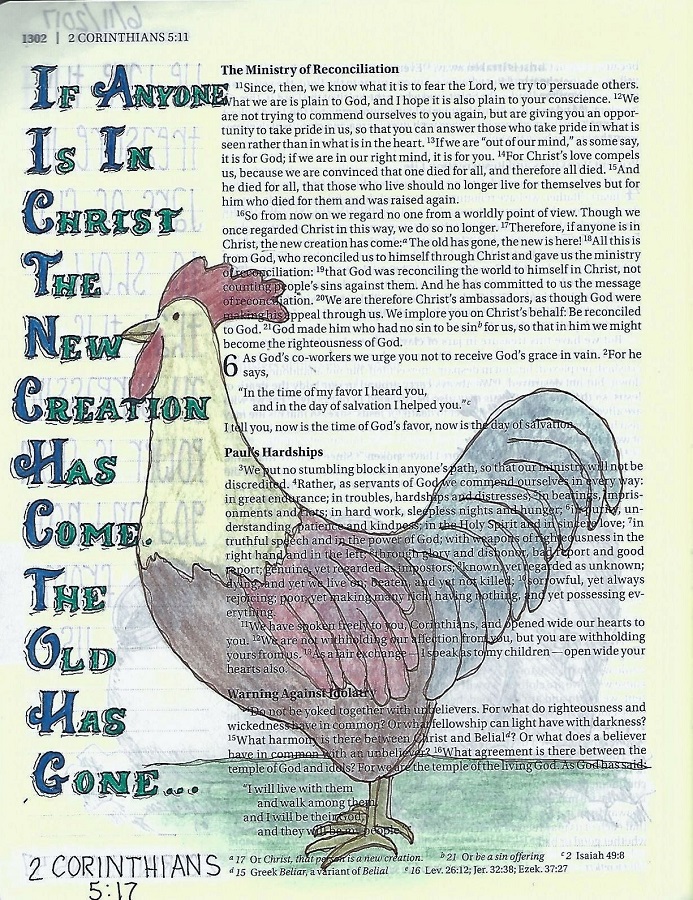
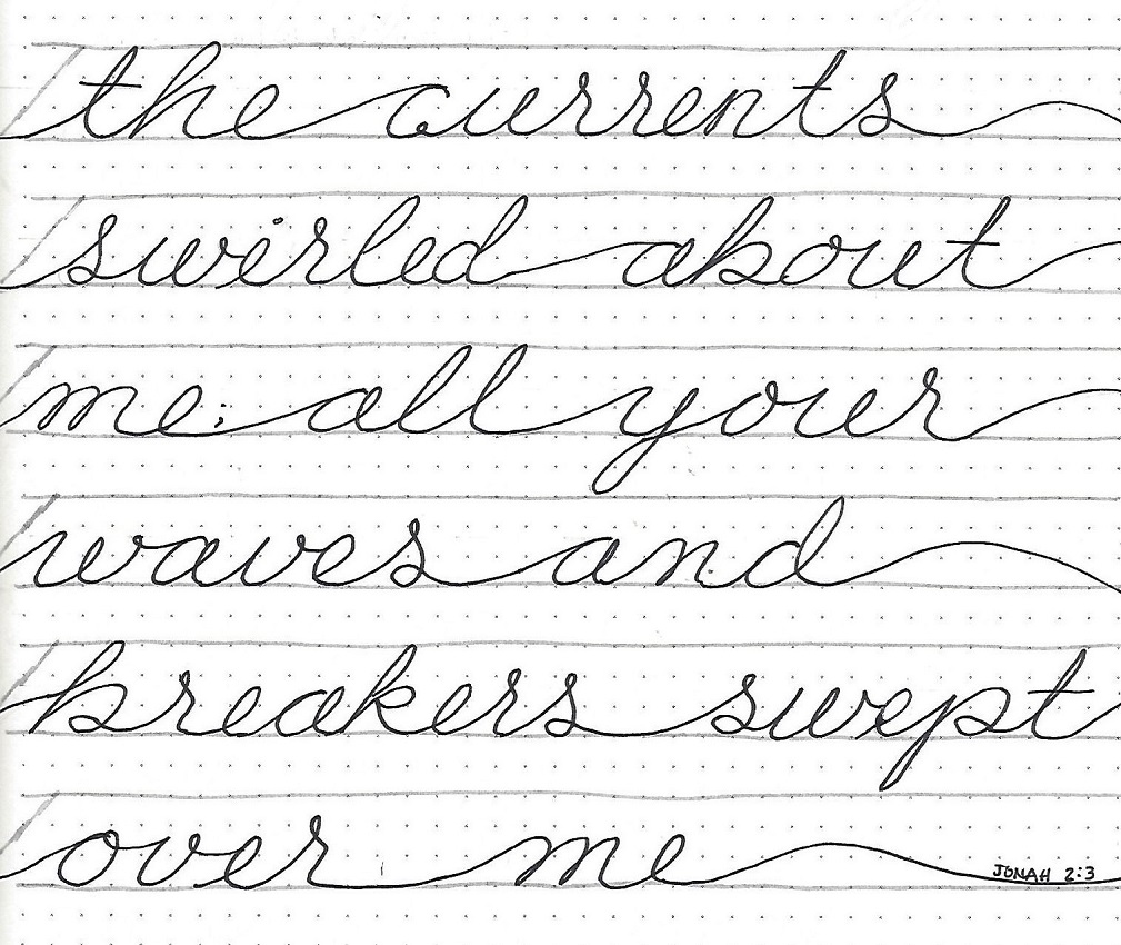
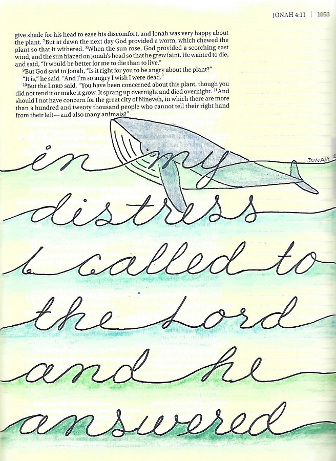
Lettering in 2 old testament books
Topic: Bible Journaling

Trying to cover 66 books of the Bible in 52 weeks means that sometimes books have to be combined. Occastionally these were books like 1 Kings and 2 Kings, but sometimes it was just shorter books without enough meat to do a whole study on.

This was one of those times where 2 old testament books were combined. Here are the lettering lessons:

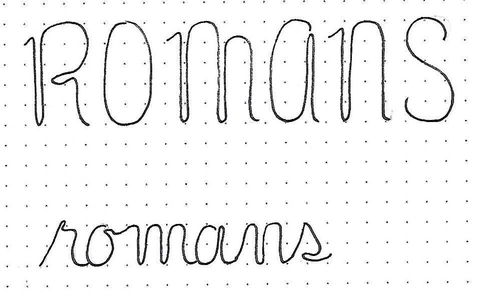
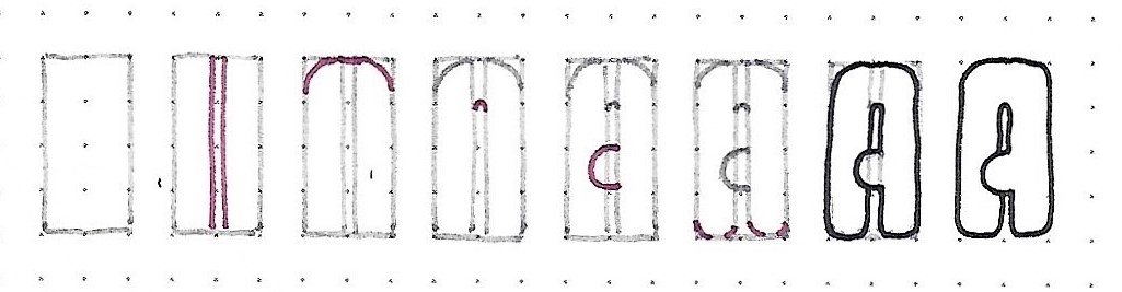
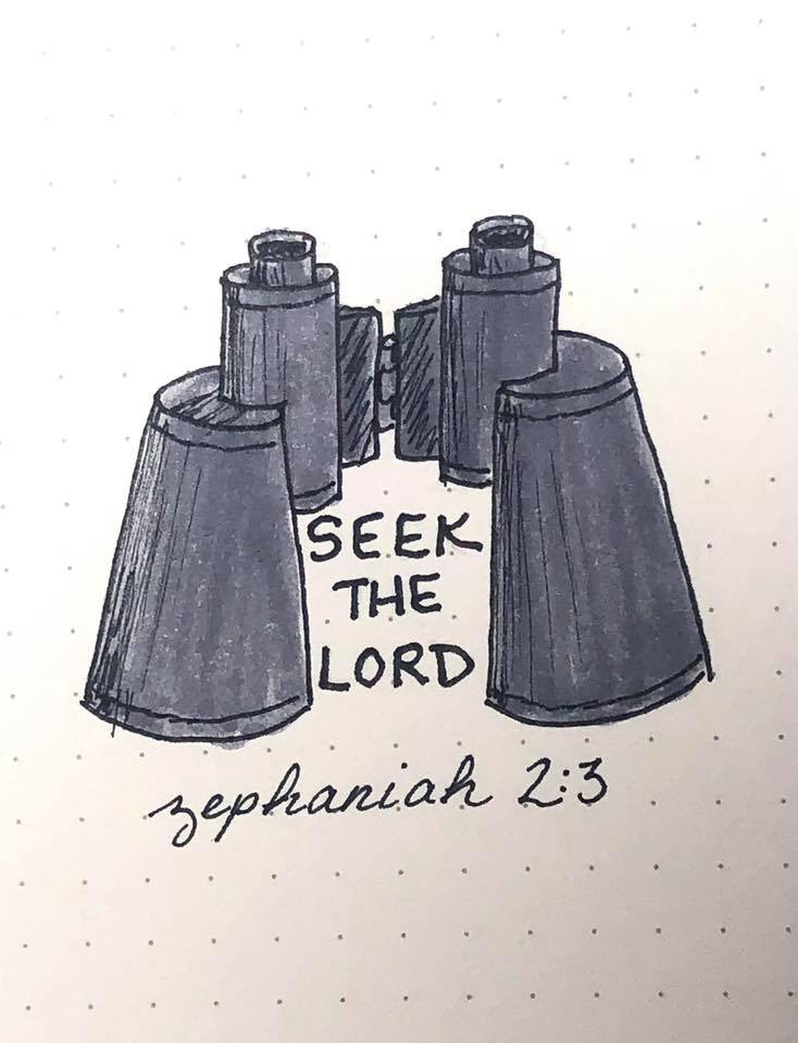
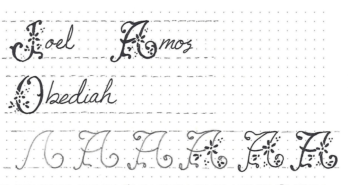
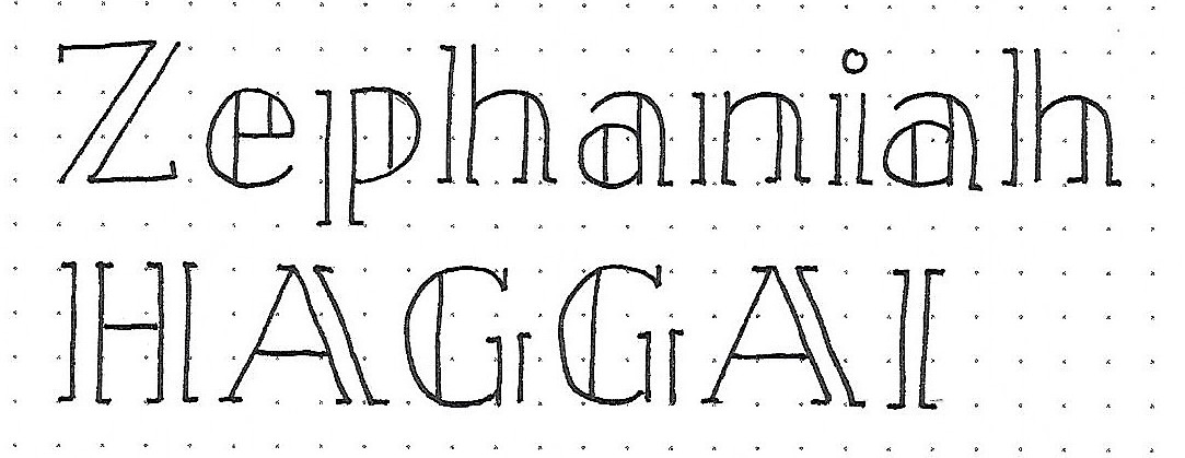
Zephaniah/Haggai: Day #1 – Split Column – Intro

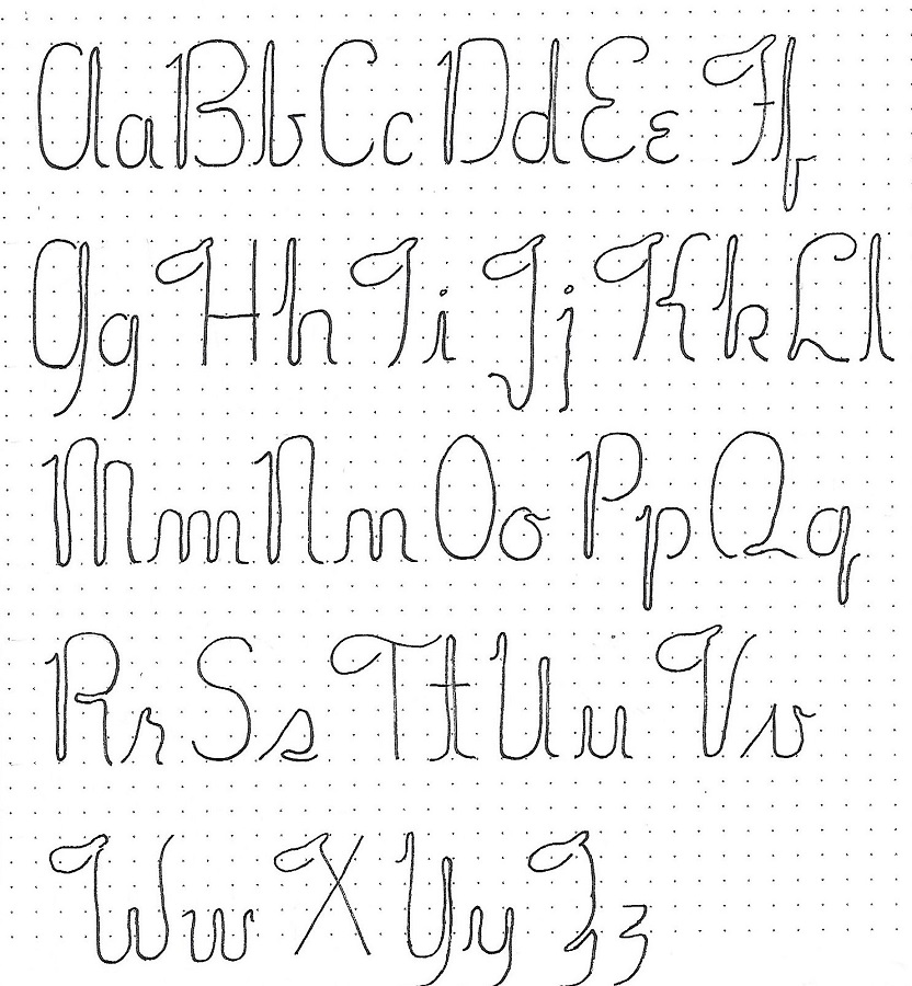
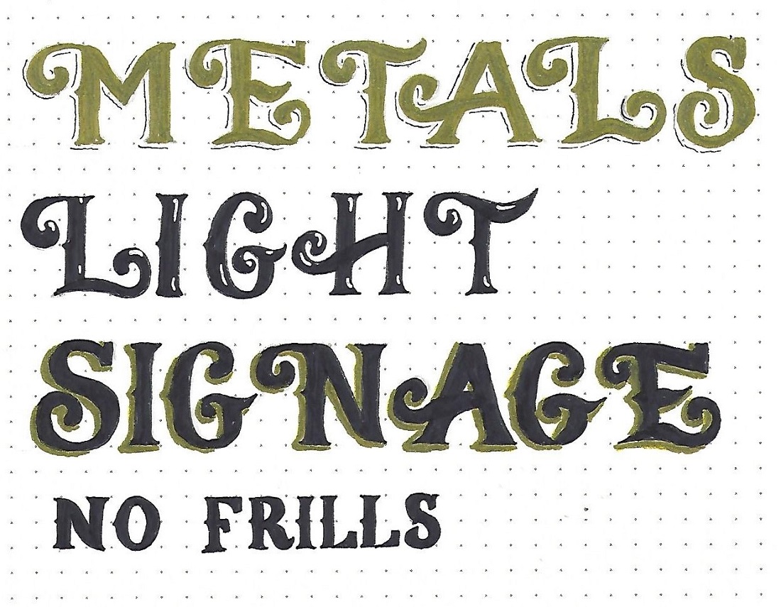
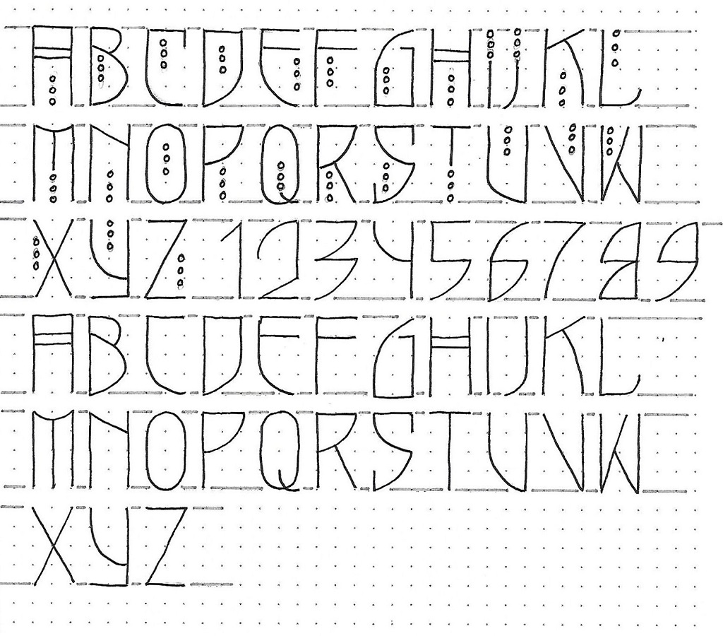
This is a three-unit font with round bowls. It is based on the basic round print we learned the first week of 2019 (Genesis). This informs the shape of the base letters. Then the upright strokes are split into an open column (closed columns on curves) and are finished with small serifs.

Practice on these two bible books while you study the letters for styling details. Try to identify as many as you can on your own and we’ll have a quiz tomorrow and the next!


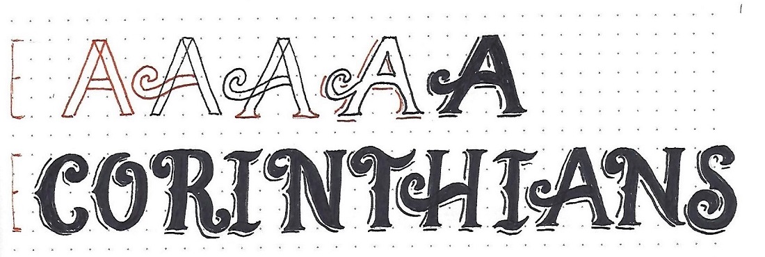
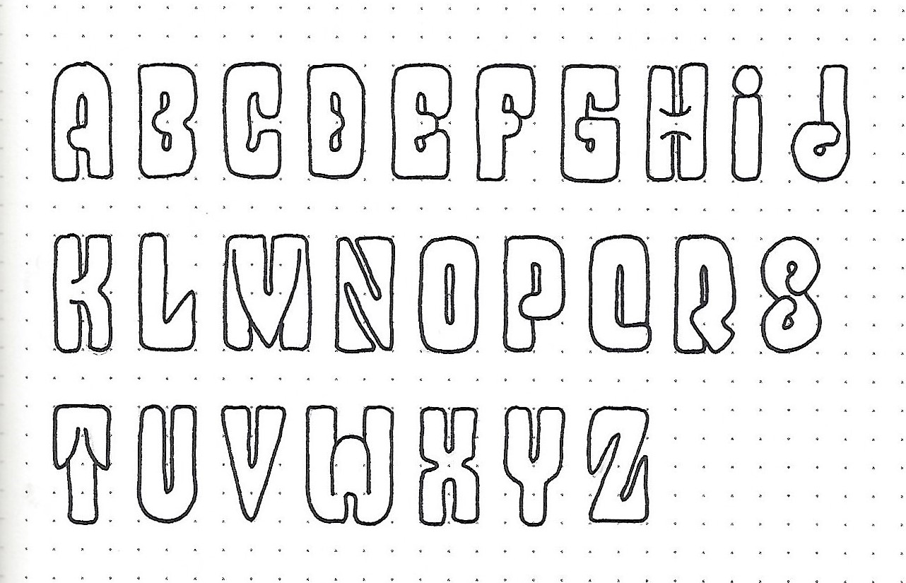
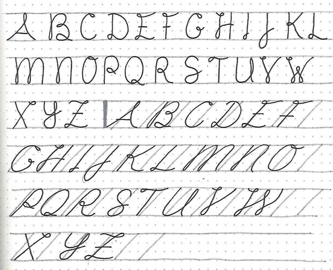
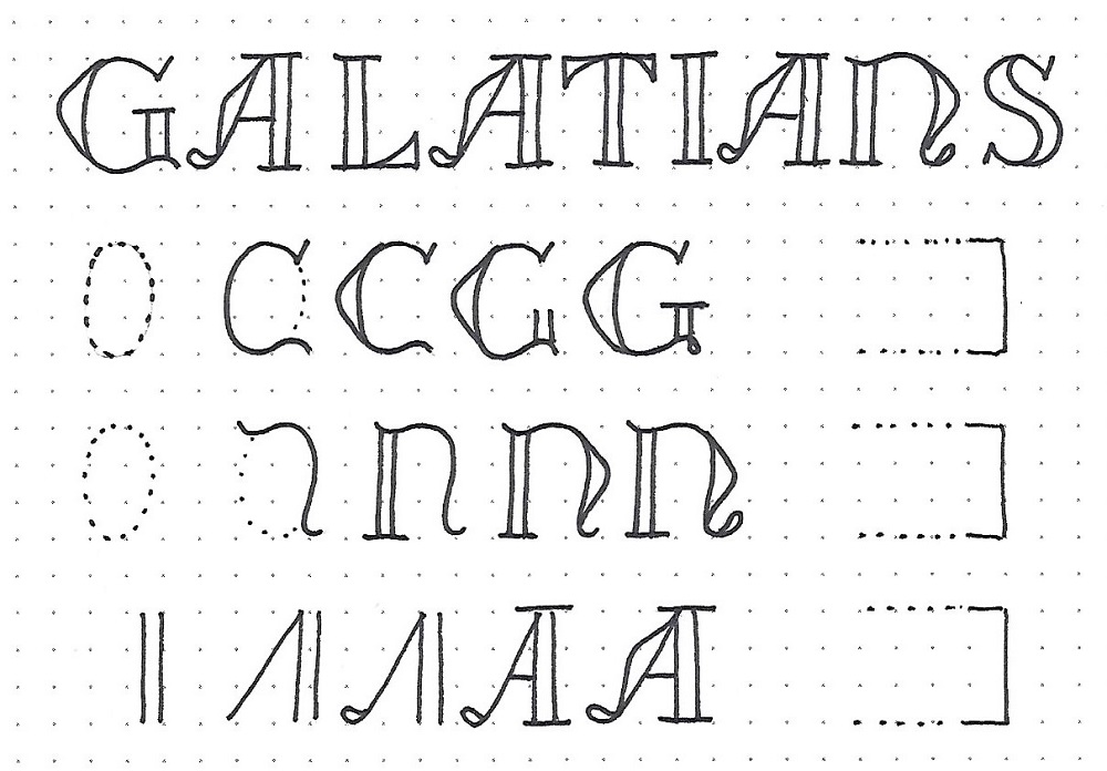
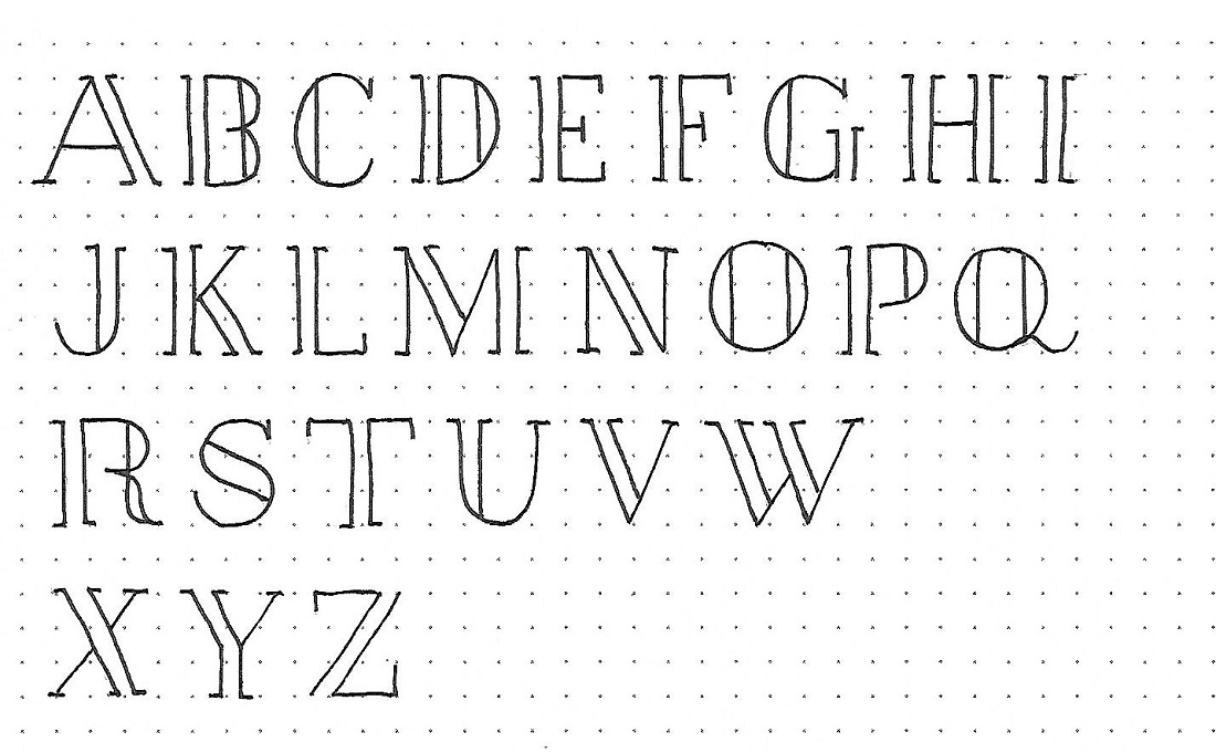
Zephaniah/Haggai: Day #2 – Split Column – Upper Case

Did you work on identifying styling details as you practiced yesterday? Let’s see how you did…

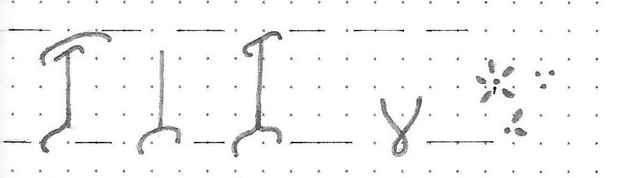
-          All upright columns have (open/closed) ends.

-          Curved columns have (open/closed) ends.

-          Size of serifs is (large/small).

-          Overall letter height is (2/3/4) units.

-          Serifs extend (inside/outside) columns.

OK, these are kind of obvious when shown this way, but it does get you to inspect the letters.

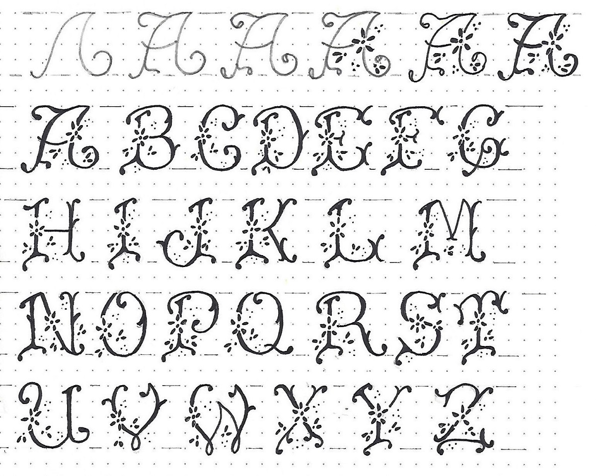
Practice the upper-case alphabet from the sample.


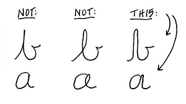
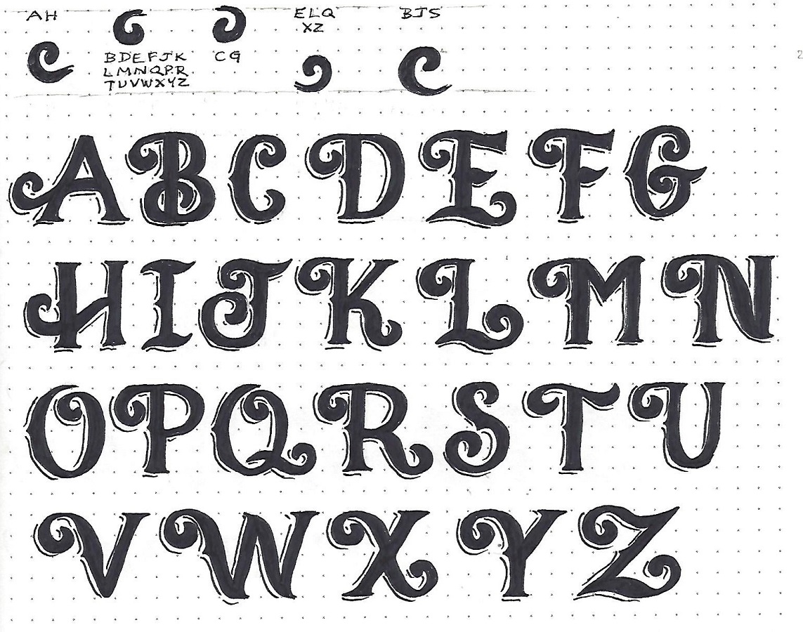
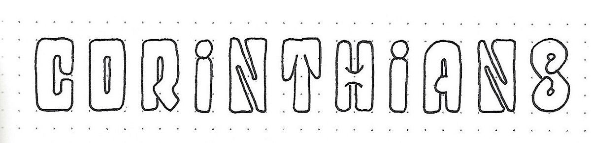
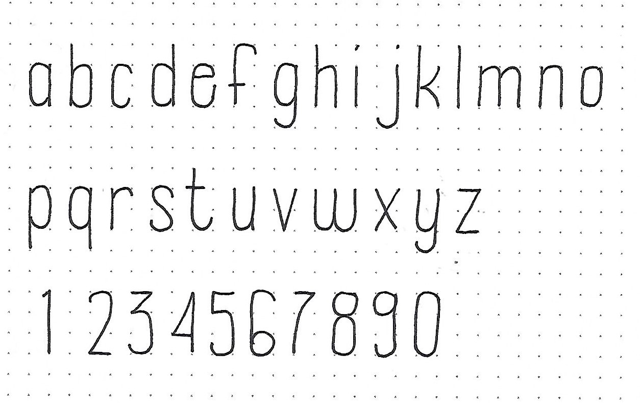
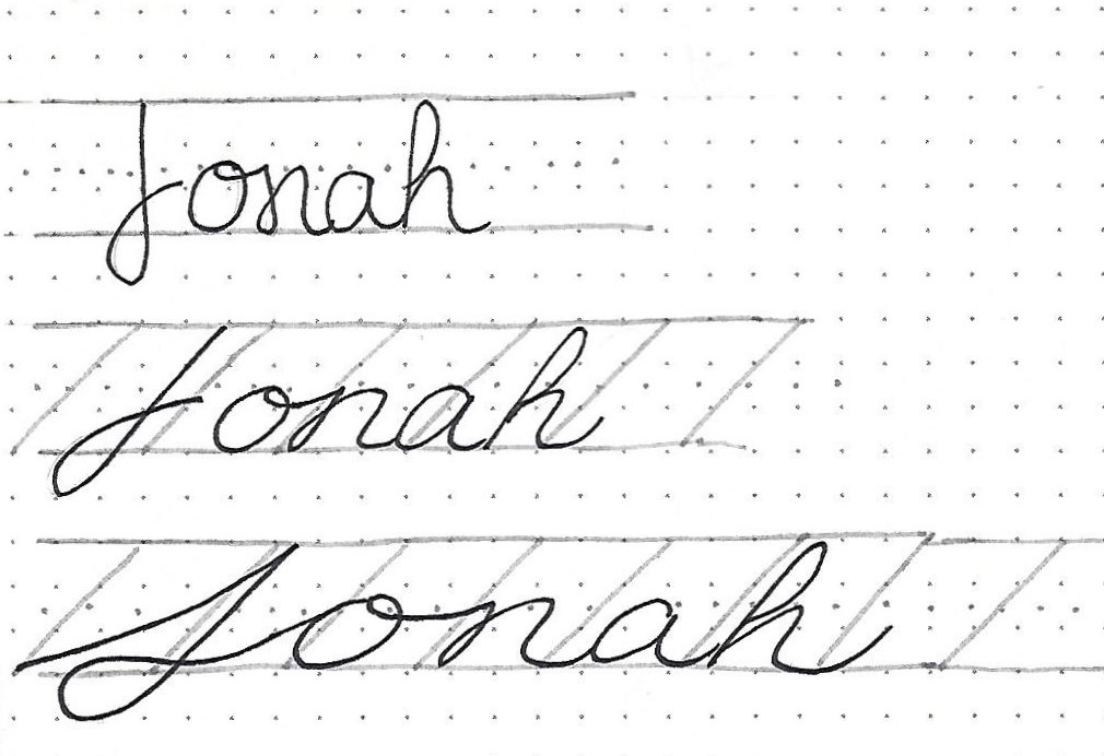
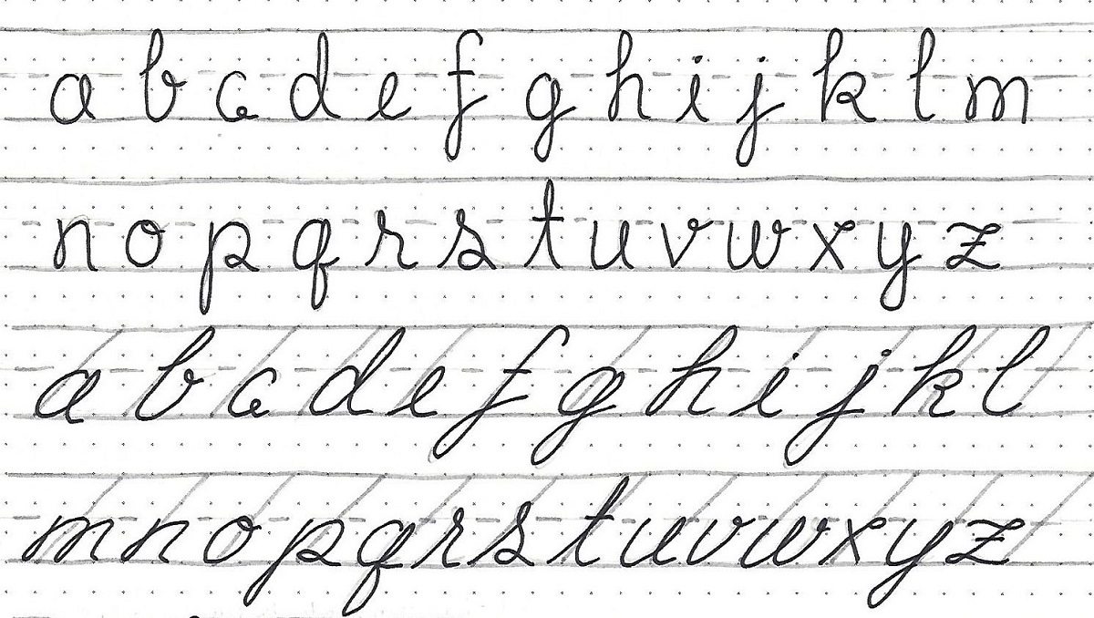
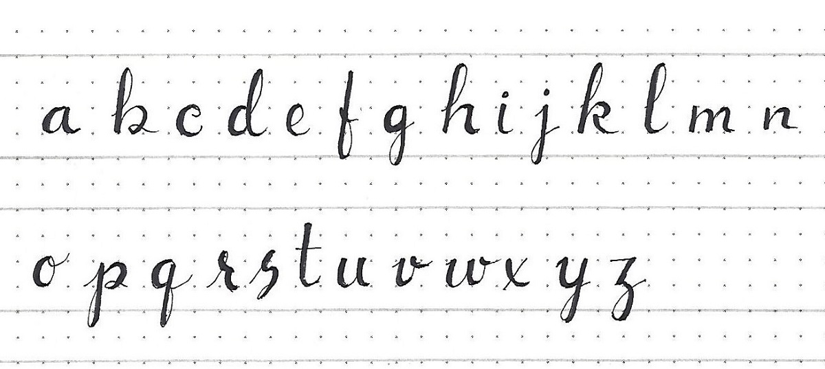
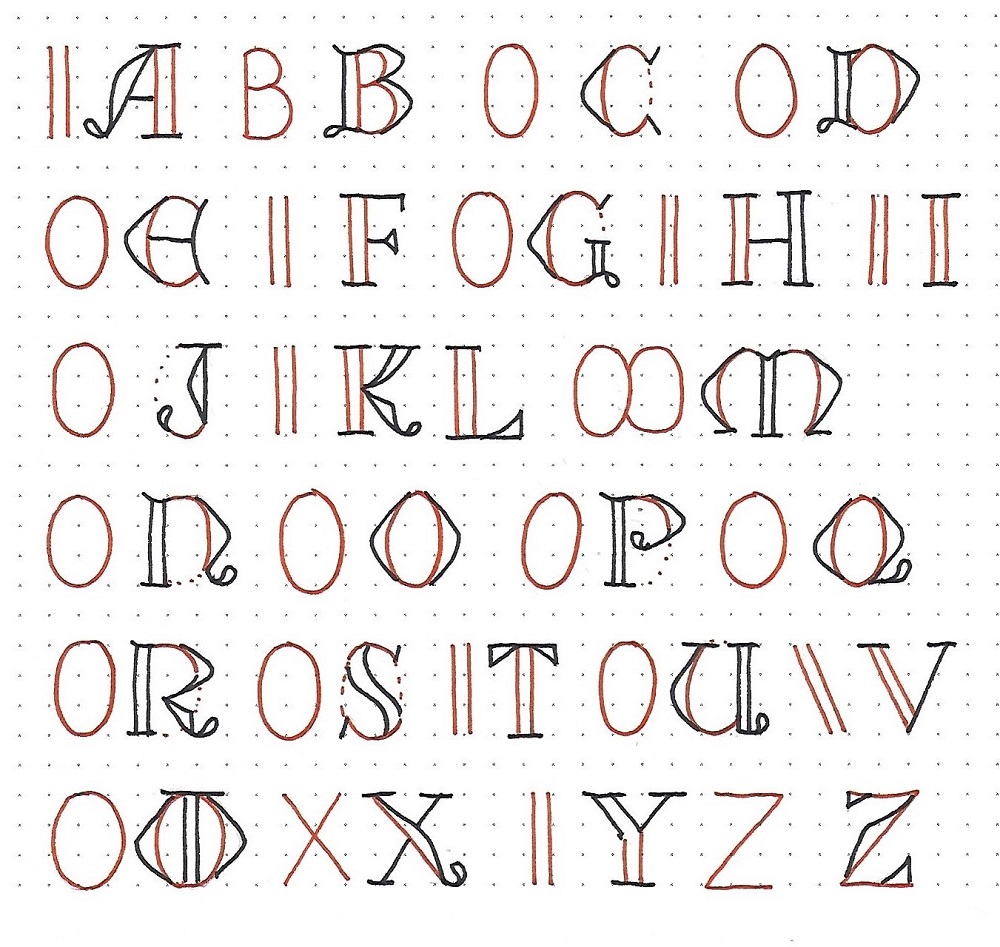
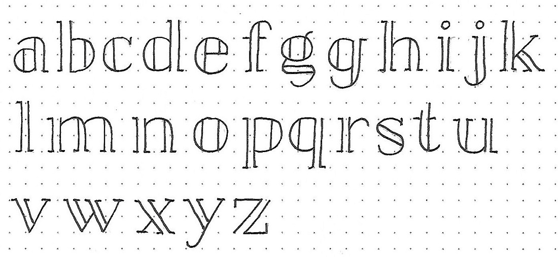
Zephaniah/Haggai: Day #3a – Split Column – Lower Case

Ready for your second quiz? This one may be a little harder.

-          The overall letter height is (2/3/4) units.

-          The x-height is at (2/3/4) units.

-          The descender is at (-1/-2) units.

-          The straight ends of columns are (open/closed).

-          The curved ends of columns are (open/closed).

-          The upper-right serifs are (longer/shorter/missing).

-          The bowls of the letters are (round/oval).

-          I can refer back to the lesson in (Genesis/Revelation) for the basic round font.

-          I know of different letter forms for (a/g).

Now practice writing the lower-case. How much of it can you write correctly by ONLY looking at your quiz notes instead of the sample?


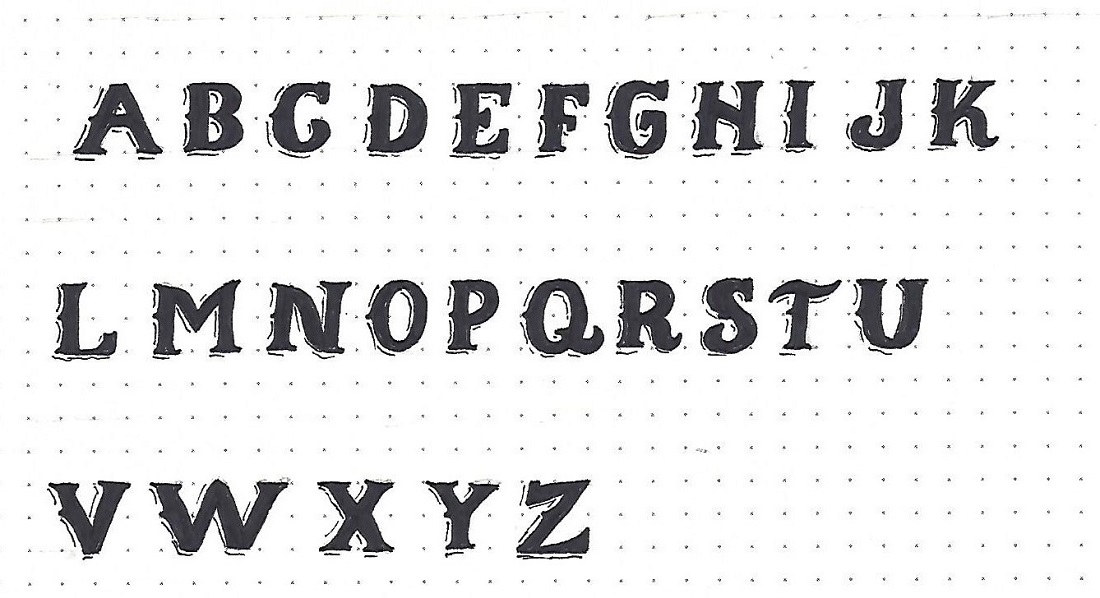
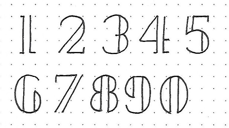
Zephaniah/Haggai: Day #3b – Split Column – Numbers

Here is a bonus for day 3 – a set of numbers. I followed SOME of the rules and broke some of the rules to combine elements of both upper- and lower-case letters.

The numbers are the same height as the upper-case (3 units) but are more oval in shape than the round letters.


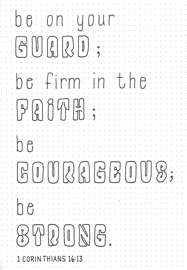
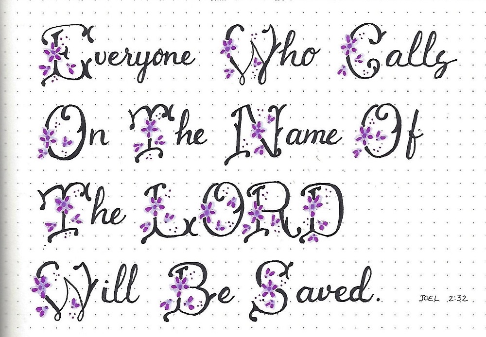
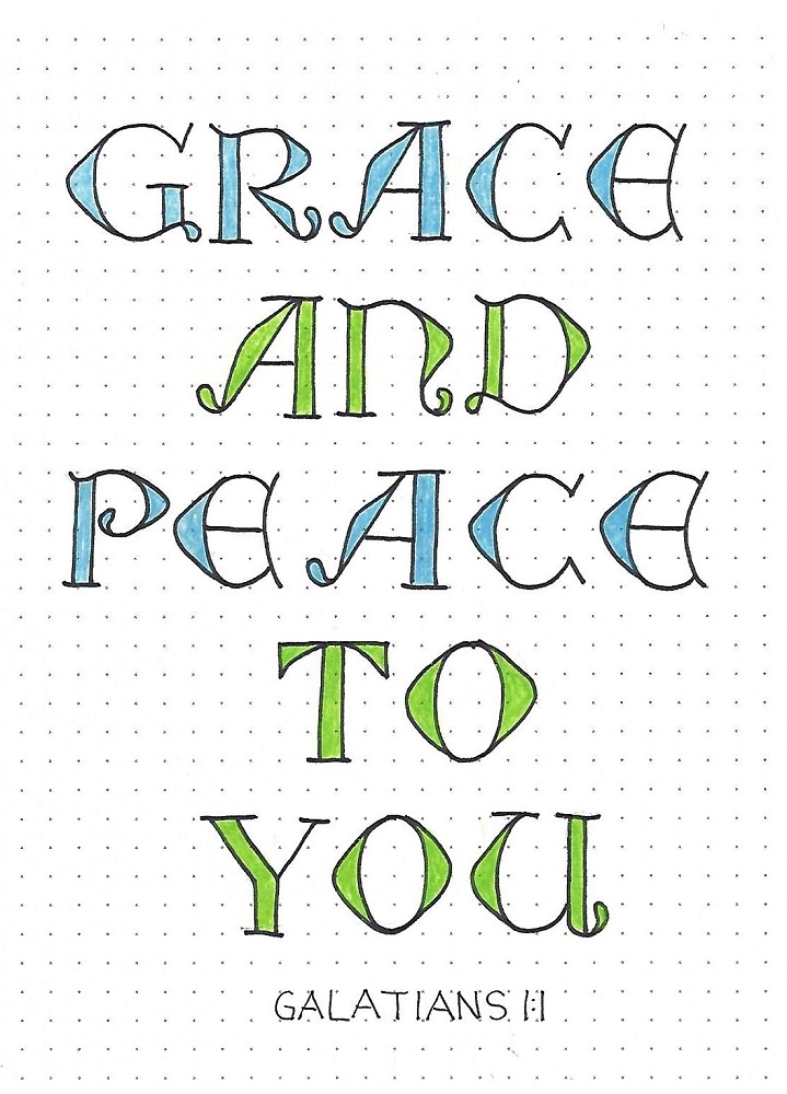
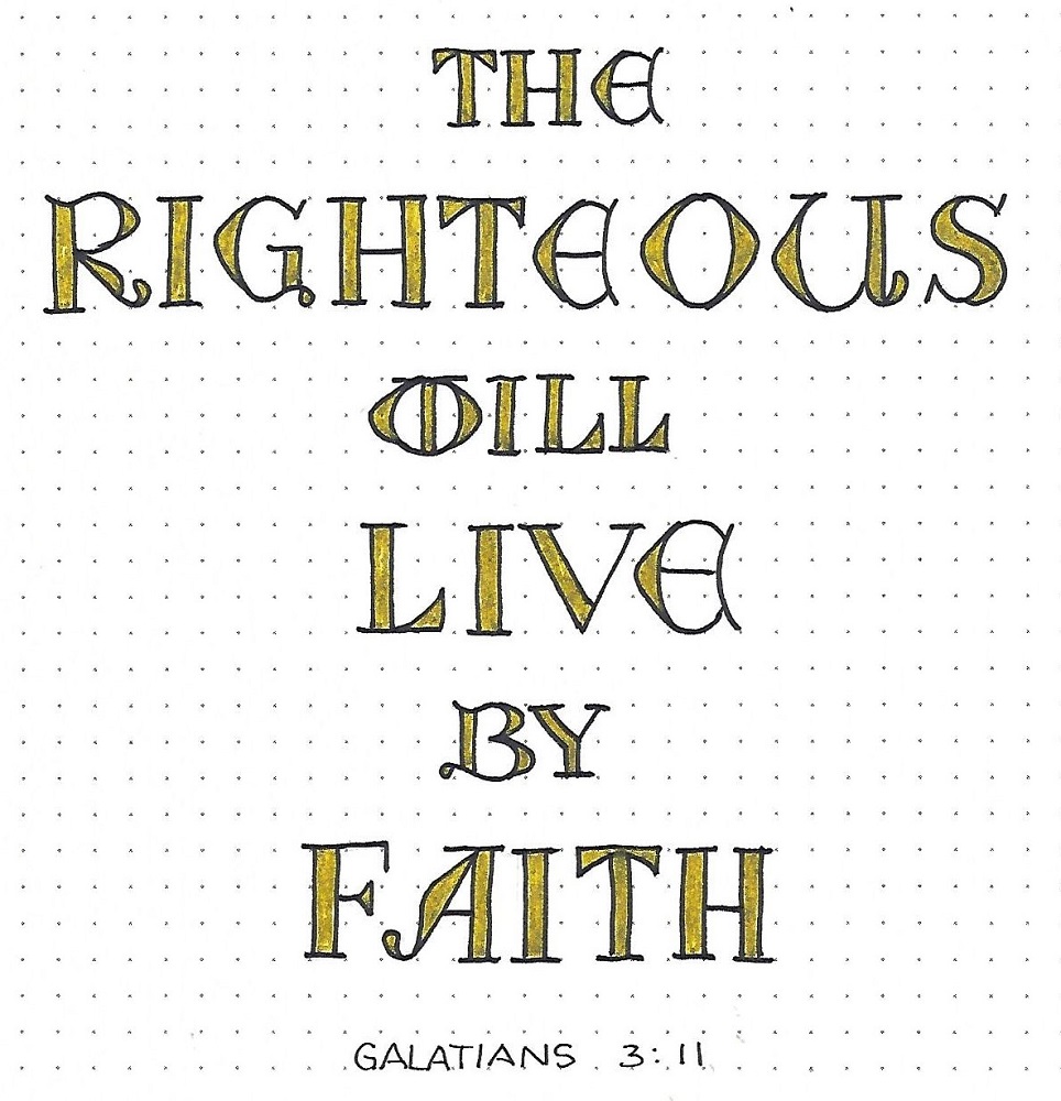
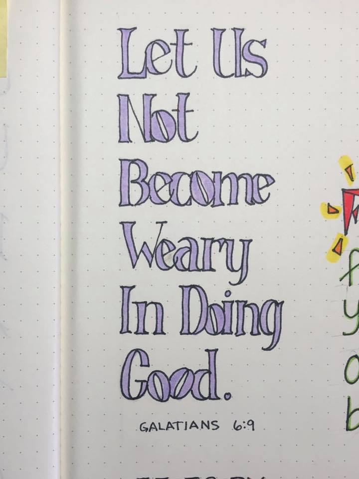
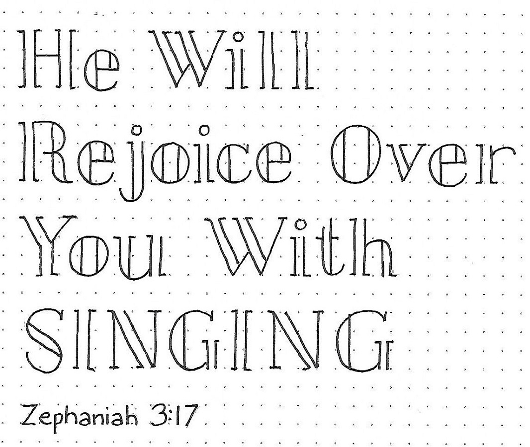
Zephaniah/Haggai: Day #4 – Split Column – Scripture

Now that we know all the theories and the rules and have practiced on the alphabets, we’re going to use our Split Column font to write scripture.

I chose a verse in Zephaniah and combined upper/lower case words and a full upper-case word. I used basic round font for the reference and it looks perfect with this text.


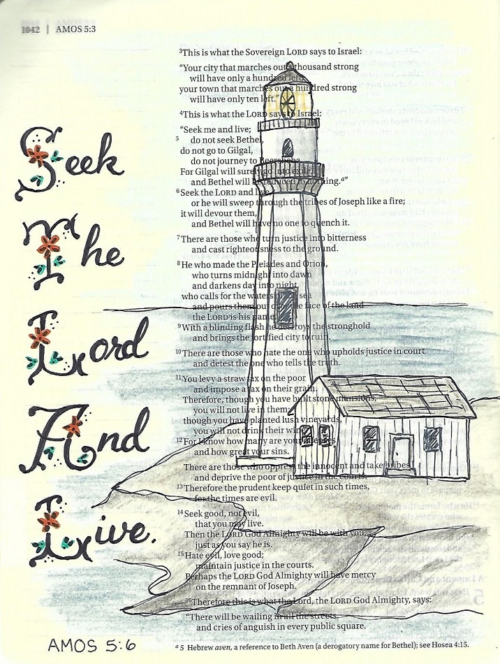
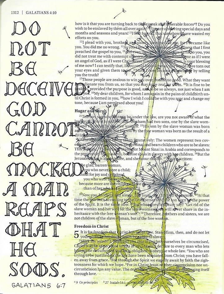
Zephaniah/Haggai: Day #5 – Split Column – Bible Page

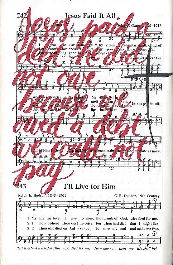
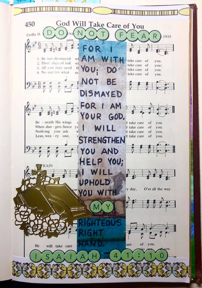
It’s the day to use our new font in our bibles. Today we’re going to Haggai 2:4.

Because I was including birch trees as a background illustration, I used tiny shading dashes across the columns from the right to the left to mimic the bark. Now my lettering becomes tiny birch trees!


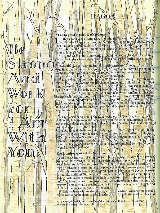
Aren't these neat trees? I taught how to draw them on the Creative-Bible-Journaling.com website in the Drawing Room.

Ddd


Posted by studio3d@ccgmail.net at 12:01 AM PDT
Friday, 1 November 2019
That's A Big Plus
Topic: Quilting

I saw this quilt tutorial on Missouri Star Quilt Company and immediately thought of a couple of stacks of 'stone look' charm squares. Combined with while cotton for the background fabric and some tone-on-tone blacks for the trim this turned out exactly how I envisioned.


I also got a new paper pantograph for the longarm and I think this quilted up beautifully.

Ddd


Posted by studio3d@ccgmail.net at 12:01 AM PDT
Sunday, 27 October 2019
Hymnal Art - Jesus Paid It All
Topic: Hymnal Art

Here is another hymn I decorated in my hymnal. I love doing these artistic representations of the old hymns I grew up with.


In this case I used a red brush pen and bounce lettering to write a quote that fit the theme. A black brush pen was used for the cross.

Ddd


Posted by studio3d@ccgmail.net at 12:01 AM PDT
Saturday, 26 October 2019
Lettering in 2 Corinthians
Topic: Bible Journaling

On to 2 Corinthians with the lettring lessns. Ready?

2 CORINTHIANS: Day #1 – Signage Font – Intro

This is another font that looks complicated but is actually easy, although time consuming. To get you going on this style we start with a step-by-step guide.

1)      Working with 4-unit letters, draw (in pencil) the basic block letter.

2)      Add the curls for that letter.

3)      Give the letter the indicated triangle serifs. Except for the A and the H the left side of the letter also gets a pointed protrusion at the mid-line.

4)      Add broken shadow lines to the left and bottom of all elements.

5)      In the letter and fill. Erase pencil.

Use these steps to complete all the letters in the book name. I did not label this as 2nd Corinthians since there are no numbers in this font.


2 CORINTHIANS: Day #2 – Signage Font – Alphabet

Before tackling the full alphabet, I want you to practice the common curl formats. They are similar but vary in their placement, orientation and size. I have indicated the letters that each curl will be used on. Scan through the alphabet and identify them.

Make some guidelines 4 units high and mark the midline at 2 units. The latter will indicate where your left protrusion is placed and will also assist in getting the correct size for the curls.

I make each letter completely in pencil down to the last detail before moving on to the next letter. Then I scan the entire alphabet for consistency and. Finally, I ink the whole page.


2 CORINTHIANS: Day #3 – Signage Font – Lower Case

The lower-case for this style is still all caps. But these do not have curls on them and they are half the height of the upper case.

Follow the same steps to design your letters as with the upper case. These letters still have the serifs, left-side protrusions and broken line shadows.


2 CORINTHIANS: Day #4 – Signage Font – Options

With just a few changes you can spice up your letters for a whole different feel. Use the samples below to try out some options.

1)      Trace and fill your letters with metallic pen (perhaps gel pen?). Use a very fine black pen for the broken lines. You can’t tell on this scan, but the gold metallic pen is colored over with glitter gel pen.

2)      Do not add any broken lines. Instead, use white pen to add small highlights to the upper right of the elements. This adds dimension.

3)      Instead of thin broken lines, use a thick metallic shadow on the left and bottom.

4)      Use the lower-case letters without any shadow lines. This almost has a western feel to it.


2 CORINTHIANS: Day #5 – Signage Font – Bible Page

When using the Signage Font in my bible, I used upper- and lower-case together. The upper-case is filled with blue glitter gel pen and the lower-case with green. This was to reflect the colors in the illustration.

The illustration is frcolored with metallic colored pencils.


I have been having so much fun finding fonts to teach.

Ddd


Posted by studio3d@ccgmail.net at 12:01 AM PDT
Sunday, 20 October 2019
Crown Him
Topic: Hymnal Art

Another page done in my hymnal. This one is Crown Him With Many Crowns.

For my artwork I drew a stack of different kinds of crowns using Prismacolor fine marker and colored with markers.

The colors are not as bright here as I adjusted to make the dingy brownish-yellow out of the page background.

Ddd


Posted by studio3d@ccgmail.net at 12:01 AM PDT
Saturday, 19 October 2019
Lettering in 1 Corinthians
Topic: Bible Journaling

1 CORINTHIANS: Day #1 – Foldover Font – Intro

It may be a challenge to tackle this word without some guidance on letter formation so here are some things to watch for: 1) The letters are 4 units high and usually 2 units wide. The I is only one unit wide and the M and W are 3 units wide. 2) There are no sharp corners. They are either gently rounded or very rounded. 3) There is usually a center spine that is very thin. 4) The structural elements of the letters are just narrower than 1 unit.


Here is a step-by-step on forming one letter. All of the letters will be formed with these same steps: a) draw a guide box 2x4. b) draw in a thin spine top to bottom. c) draw in any deep curves on the outline. d) define the ends of the spine. e) draw in foldovers. f) gently round ends of elements. g) trace letter in ink. h) erase pencil.


1 CORINTHIANS: Day #2 – Foldover Font – Alphabet

Use the pointers and the lettering guide from yesterday to write out the full alphabet. There is no lower-case in this style so we will learn a complementary lower-case tomorrow.


1 CORINTHIANS: Day #3 – Foldover Font – Lowercase

This is the font we will be using as the lower-case. Here are some things to note: 1) the letters are 3 units high at the ascenders and 2 units at the x-height. 2) letters are generally 1 unit wide. Exceptions are the ‘I’ and ‘l’ at a single line as well as the ‘m’ and the ‘w’ at 2 units. 3) crossbars are unnaturally high or low on the ‘e’, ‘f’, ‘t’.

   I have also included some 3-unit numbers and they also feature unnaturally high or low elements.


1 CORINTHIANS: Day #4 – Foldover Font – Practice

For practice, create a page using both the Foldover font and the lower-case we learned this week. You can either do like I have done in using one style for each whole word or by using the Foldover for the first letter on every word with the rest of the word in the lower-case.

Use a scripture in 1 Corinthians for your practice.


1 CORINTHIANS: Day #5 – Foldover Font – Bible Page

Today we will use these two fonts in combination on a Bible page in 1 Corinthians. Yes, it is hard to scale those foldy letters down to only two lines in the margin. The best thing to do is go through and draw ALL of your guide boxes to work on your spacing. Then work through the Foldover letters step by step but to not ink. Draw the lower-case letters and THEN ink everything.

If you wish, use color medium to do a fill on your Foldover letters.

I think this font is so much fun!

Ddd


Posted by studio3d@ccgmail.net at 12:01 AM PDT
Saturday, 12 October 2019
Lettering in The Old Testament
Topic: Bible Journaling

This week we covered three books of the old testament with one lettering style. Here are the lessons:

3 O.T. BOOKS: Day #1 – Shield Font – Alphabet

We usually start our lessons with practicing just the name of the book but there are so many of the letters contained in these (9 of the 26) that I decided to go straight to the alphabet today and have you use the book names as practice tomorrow.

This alphabet is 4 units high and 2 units wide. The exceptions are the I and J, as usual. There are a few tight curves (B, O, Q) but most of them are large sweeping curves. The A and H feature double crossbars.

The upper case is distinguished by three small circles. These mostly sit inside the letter but in a few cases replace a portion of a line (I, J, M, T). Numbers have similar characteristics and the lower case has no small circles.


3 O.T. BOOKS: Day #2 – Shield Font – Word Practice

Here are the three books of the Old Testament that are covered this week. This practice page will give you a feel for using the ‘upper-case’ only as the leading letter in each word.

I think the C, U, E are all good examples of why I named this font ‘shield’.


3 O.T. BOOKS: Day #3 – Shield Font – Play Time

Today I want you to practice your letters while adding some variety.

1)  -    Use colored markers to write the letters in a variety of hues. I used a rainbow order for mine.

2) -     Use a standard plain color (black or gray) for the letters and colors for the dots.

3) -     Use the full-size letters for capitals and shrink by one unit for the lower-case.

4)  -    Draw an arched top and a straight baseline then stretch your letters vertically to fill the space.

Your lettering never has to be boring!


3 O.T. BOOKS: Day #4 – Shield Font – Scripture

For more practice, choose a scripture in one of the featured books to write out in the Shield Font. Use any form of the alphabet that we practiced this week. I used all-caps and filled my circles and crossbars with color


3 O.T. BOOKS: Day #5 – Shield Font – Bible Page

This is the day we take the new font to our Bibles. I got quite a bit of text fitted in by using two lines in my margin guides. For longer words you may have to change the scale slightly, making the letters skinnier than the norm. If you do that, be consistent throughout.


I used the same lettering for the scripture reference on this page, too.

Ddd


Posted by studio3d@ccgmail.net at 12:01 AM PDT
Saturday, 5 October 2019
Lettering Through Jonah
Topic: Bible Journaling

I really love finding new fonts, studying them to identify the features that make them unique and figuring out how to reproduce them in hand-lettering. Then I like finding just the right place to use it in my bible.

Here is another lesson that I produced to do just that:

JONAH: Day #1 – Watery – Introduction

It may not be obvious but all three of these lines are the SAME script! We are working on a 3-unit grid with the x-height at exactly the center.

First, write the word standing upright in its natural stance. Then on another set of guides, draw some slanted lines at an extreme angle. These are at 45 degrees. Use these slanted guides to get the slant of the script consistent when writing out the focus word: Jonah.


JONAH: Day #2 – Watery – Alphabet Uppers

First, write out the upright version of the upper-case letters to learn the letter formation. Note all the little curls on these! Then, make your slanted guidelines and rewrite the alphabet with the letters slanted with the guides.


JONAH: Day #3 – Watery – Alphabet Lowers

Today’s lesson is the same as yesterday’s except with the lower-case. The curls are much more prominent on the lower-case alphabet.

Draw the guides and the upright letters. Then draw the slant guides and use them to tilt your script alphabet.


JONAH: Day #4 – Watery – Stretched Script

Now that we have learned the letter formations we are going to write with the script in its slanted form.

Begin each line with a curved leader and continue the line between words. Finish with a curved tail.

Make the word transitions stretched out and smooth.


JONAH: Day #5 – Watery – Bible Page

We get the big finish as we use this watery script in our bibles. Use the slanted, stretched out script to write out a scripture. You’ll note that some letters are unrecognizable in the connected state (upper-case I). If you wish, try making another form of the letter you like better.

Use a range of light-to-dark teal and blue pencils to make solid coloring directly under the words, fading as you go down. The tops of the words are not colored, nor are the insides of loops.


Amazing how this looks like waves in the water!

Ddd


Posted by studio3d@ccgmail.net at 12:01 AM PDT
Monday, 30 September 2019
Final Five
Topic: Lettering

Final five days of #30DaysOfBibleLettering are done. As much as I enjoy doing these, I am always relieved when the month is over and I have more time freed up for other projects. This time it will be some online art classes I have been putting off.

September 26 - Proverbs 4:23


September 27 - Zephaniah 2:3


September 28 - Psalm 100:5


September 29 -Isaiah 6:8


September 30 -Jeremian 17:7


30 days of bible lettering and this project is done.

Ddd


Posted by studio3d@ccgmail.net at 12:01 AM PDT
Sunday, 29 September 2019
I Heard The Voice Of Jesus Say
Topic: Hymnal Art

Another hymn was chosen for art that was indeed in my book but that I had never heard. We obviously grew up with a limited repertoire and a different one than some others. I wonder if the distinction is regional. It isn't denominational as the book I am using is the hymnal from the denominationn in which I grew up.

In any case, I focused on the aspect of prayer and chose a scripture to reinforce this. 

I lettered over the musical staffs and then added several stickers to fit the theme.


In celebration of Psalm 116:1-2

Ddd


Posted by studio3d@ccgmail.net at 8:53 PM PDT
Saturday, 28 September 2019
Three In One
Topic: Bible Journaling

As our group is working on journaling in the bible 'cover to cover' the goal is to have something done in every book by the end of the year. We are alternating between Old Testament front to back and New Testament back to front. Since there are many more Old Testament books, sometimes a set of short ones will be combined into one week. So this week we did various activities in Joel, Amos and Obadiah. (I misspelled Obadiah in several places throughout my samples!)

Here is the lettering lesson for the week:


JOEL/AMOS/OBADIAH: Day 1 – Flourish – Introduction

This is probably the fanciest font we have introduced here in the Lettering Lodge. But it, too, is not really as complicated as it looks – just several steps to get you there.

Follow along with the basic building process shown on the letter ‘A’.

1)      Sketch out the basic letter skeleton

2)      Add the flourishes

3)      Make teardrop ends where indicated

4)      Sketch in flowers and trimmings AND ink them

5)      Ink rest of letter without actually touching the flower

6)      Thicken midlines but not the ends of lines

Do the same steps on the ‘J’ and the ‘O’ and write in the rest of the words in script. Note relative size and placement of script letters.


JOEL/AMOS/OBEADIAH: Day #2 – Flourish – Alphabet

The Flourish alphabet has a few elements that are common across multiple letters. These are the bones that make the alphabet cohesive. First practice these structures – you will recognize them when you are making your letter skeletons. Follow the step-by-step shown for the letter ‘A’ as you draw EVERY letter in the alphabet.

1)      Used on B, D, E, F, P, R

2)      Used on H, M, N, T, Y

3)      Used on I, J, K, L

4)      Used on V, W

5)      Used on ALL LETTERS


JOEL/AMOS/OBADIAH: Day #3 – Flourish – Lower-Case

The lower-case alphabet used with the Flourish capitals is a delicate script with faux-brush styling. Note that this is built on the same framework as the upper-case (4 units high) but the baseline is raised one unit and the x-height is at the midline. The ascender is ½ unit lower than the full 4th unit.

Draw base letter with pencil, ink it, then draw a second line along the downstrokes and fill in with pen. Erase pencil.

When this is combined with the Flourish font it creates an elegant word.


JOEL/AMOS/OBADIAH: Day #4 – Flourish – Practice

Today, select a verse from one of the three featured books and letter it using the Flourish font. Don’t you love the way this looks?

I made the flowers and trimmings with a dark purple marker and brushed over them with a lighter purple to create a ‘glow’. This was done before inking the letters.


JOEL/AMOS/OBADIAH: Day #5 – Flourish – Bible Page

Create a bible page in one of the featured books using the Flourish font. My words were short so I was able to keep the original scale of 4 units using the lines in my margin.

For the flowers and trimmings, I drew them in using black and then used a bleed-free marker to color over them.

The lighthouse is from this week’s Drawing Room.


Whew! That is some intensive lettering - doable but time consuming. But isn't it awesome when it is done?

Ddd


Posted by studio3d@ccgmail.net at 12:01 AM PDT
Thursday, 26 September 2019
Blue Birds Converge
Topic: Quilting

From my stash of fat quarters I selected 4 that looked good together to create another Convergence quilt from the instructions created by Ricky Tims.  I truly love how these come together.

I wait until the center is constructed before selecting material for the borders as so much depends on the final layout.

For this one I chose a small border of tiny houndstooth followed by a dark teal print with browns and golds in it.


I used a paper pantograph and teal thread for the quilting.


The whole thing is brighter than this appears but I could not adjust the color intensity enough without totally skewing the look of the quilt. This will have to do.

Ddd


Posted by studio3d@ccgmail.net at 3:30 PM PDT
Wednesday, 25 September 2019
After This We're Down To Five
Topic: Lettering

Wow, this series is going so quickly!

September 22 - Ephesians 2:8


September 23 - Exodus 14:14


September 24 -Hebrews 12:14


September 25 - Lamentations 3:23


This last one is my favorite so far, too!

Ddd


Posted by studio3d@ccgmail.net at 5:22 PM PDT
Monday, 23 September 2019
God Will Take Care Of You
Topic: Hymnal Art

My hymnal is really looking good as I add more artwork to it. This week the assigned hymn was 'God Will Take Care Of You'.

I pulled out my envelope of stickers and created a sticker collage on this page. Instead of using the song lyrics I chose a scripture with the same theme. The letter dots are stickers, outlined in ink. Then I lettered the rest of the verse over the sticker bookmark using Prismacolor marker.

More stickers for borders and a gold sticker for the open bible.


Doesn't Isaiah 41:10 fit this hymn perfectly?

Ddd


Posted by studio3d@ccgmail.net at 12:01 AM PDT
Sunday, 22 September 2019
Lettering In The Letter... To The Galatians
Topic: Bible Journaling

After using this style of lettering on a couple of recent projects I decided I wanted to do a full set of lessons so that YOU could do it too!

GALATIANS: Day 1 – Unicals – Introduction

This week’s lettering is an old-fashioned style that looks complicated to duplicate. But it is really based on a basic oval. And since the flourishes share common elements it is really quite easy to accomplish.

Here are step-by-step guides to get you through writing the sample word for this week: Galatians.


GALATIANS: Day 2 – Unicals – Alphabet

For this alphabet you can see there are basically the ‘round’ letters and the ‘straight’ letters. I’ve given you a red guide for each that will show you what your basis will be. This is followed by the addition of the elements that turn it into a completed letter.

There are a few things to point out that unify the letters. The curved letters have a bulging line that comes to a rounded point along the midline. Only a few straight lines have a bulge (A, K, X, Z). These are always on a single line, not a double. These letters have serifs. Sometimes they are dipped (tops of B, D, N, M, P). Some are angled (C, G, S). Then there are triangles (L, T, Z). Watch for the teardrop ends on A, B, D, G, J, K, N, P, R, U and X.

Finally, there are two letters that are truly unique but are in keeping with the original uncial alphabet. These would be E and W. If you truly don’t like these, change them up. The E could have the long right bar removed and replaced with two angled ends like the C. The W could be replaced by an inverted M.


GALATIANS: Day 3 – Unicals – Practice Words

Practice writing a phrase or scripture with the new alphabet. In your Pencil-Ink-Erase methods, actually draw in the ovals and the posts to begin with as it will help with not only your letter formation, but your spacing as well. Try using a color fill on your letters.


GALATIANS: Day 4 – Unicals – Scripture Writing

Work on making larger and smaller versions of the letters as well as centering. Do you find it easier to write the letters now? You should be getting a feel for where the various style elements fit in which will make it easier to write. Did you change out those Es and Ws?

Do you have a gold gel pen? If so, use that for your letter fills. This is a style that will especially benefit from it.


GALATIANS: Day 5 – Unicals – Bible Page

Because of all that practice, the writing of this long block of text went fairly quickly. I did compress some letters in ‘deceived’ and ‘mocked’ so I would not cover too much of the text. This time, I used a silver glitter gel pen for the letter fills.

Find a scripture in your bible, Galatians if possible, to use this font. This page also uses the dandelions from the Drawing Room lesson of the week.


Give this one a try!

Ddd


Posted by studio3d@ccgmail.net at 12:01 AM PDT
Saturday, 21 September 2019
Just Three Days
Topic: Lettering

I'm only posting three days of lettering today. There's plenty left to come, though.

September 19 - Psalm 126:5


September 20 -Colossians 3:16


 September 21 - Galatians 6:9


I promise to make up the shortfall on days later on.

Ddd


Posted by studio3d@ccgmail.net at 12:01 AM PDT

Newer | Latest | Older