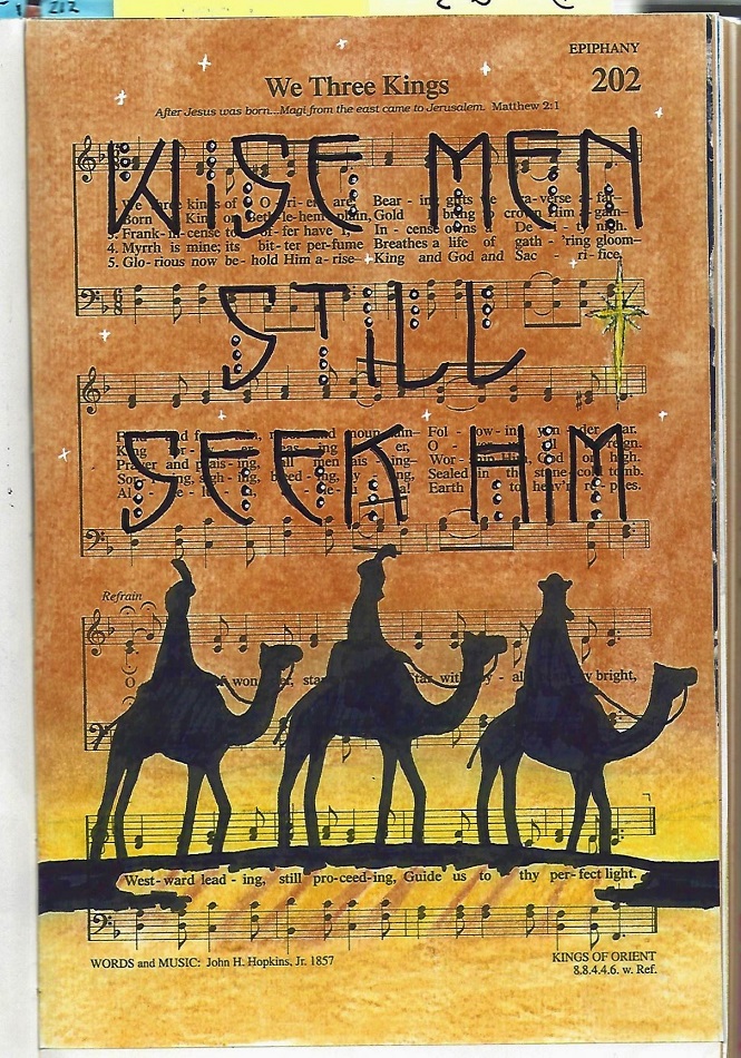
Lettering in the Book of Malachi
Topic: Bible Journaling
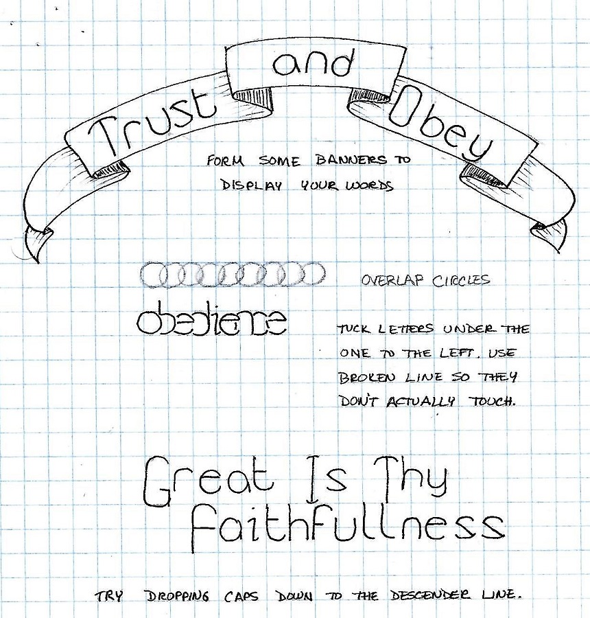
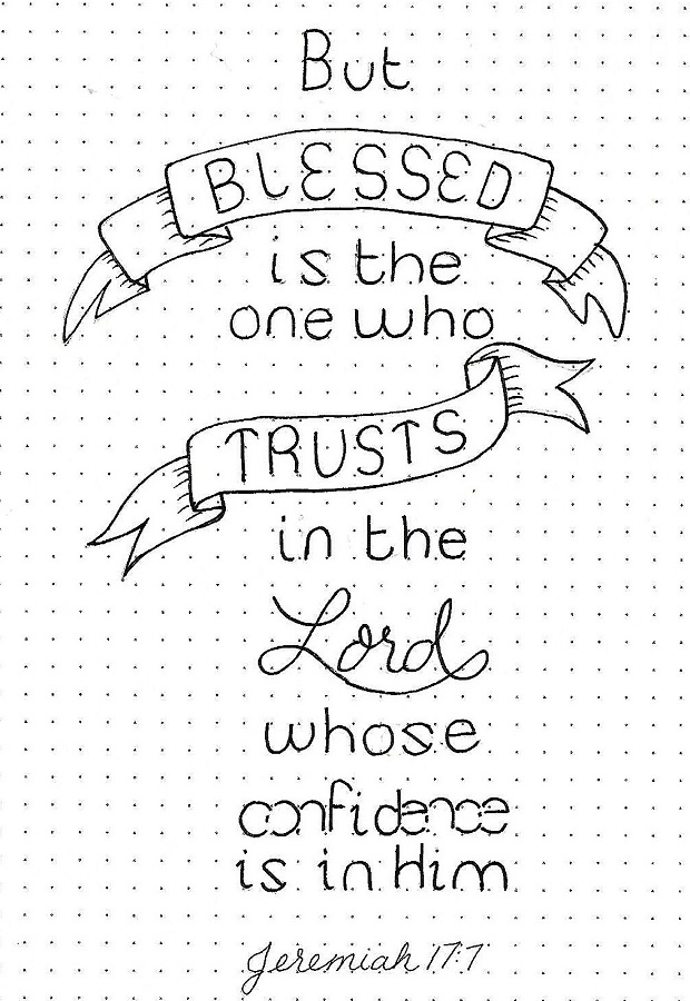
Last week the font was very formal in the base style. This week it is loose and informal. Here are the lessons:
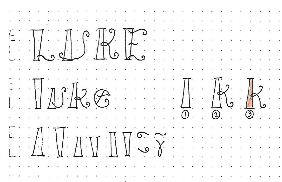
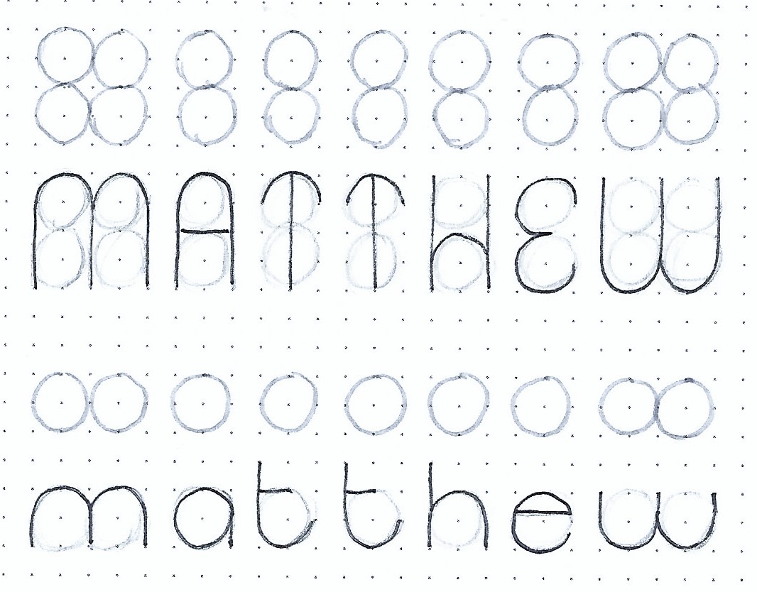
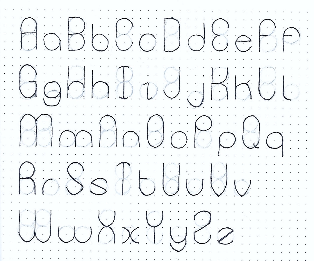
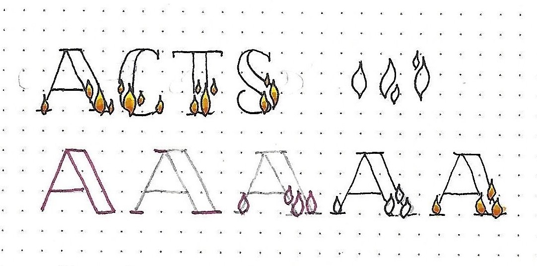
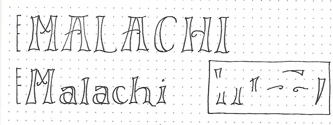
MALACHI: Day #1 – Hollowed – Introduction
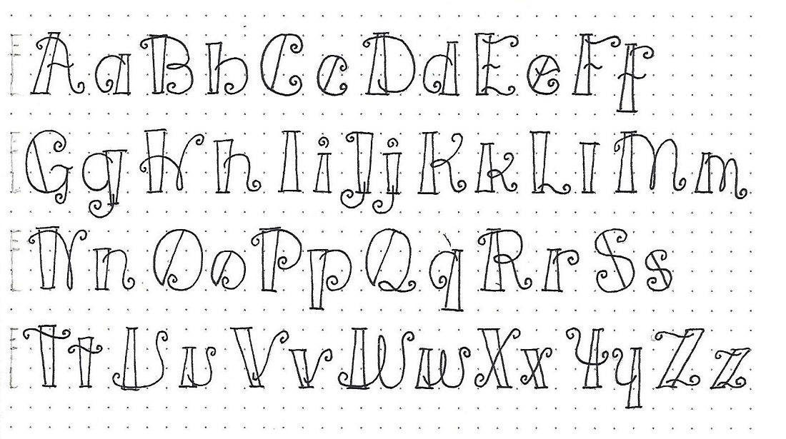
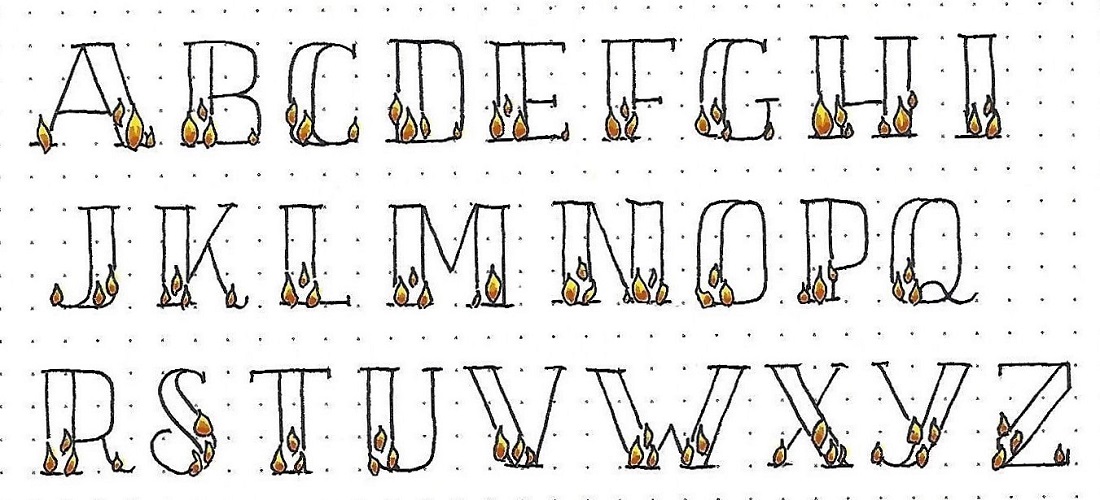
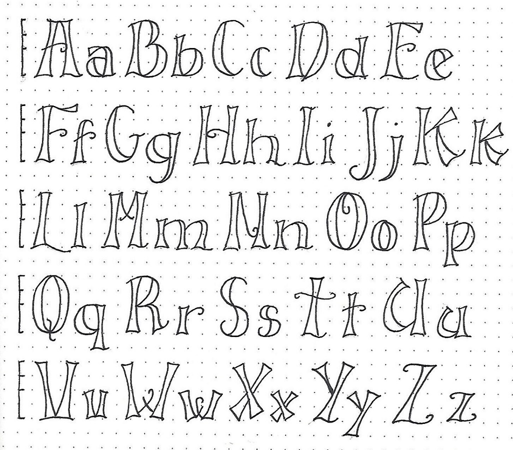
We’ve covered several fonts in the Lettering Lodge that feature doubled lines. Some were based on a Basic Block Print and some were thickened on downstrokes like a faux brush script.
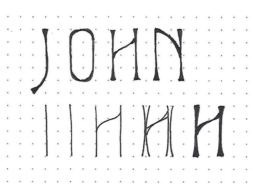
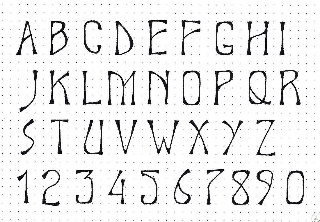
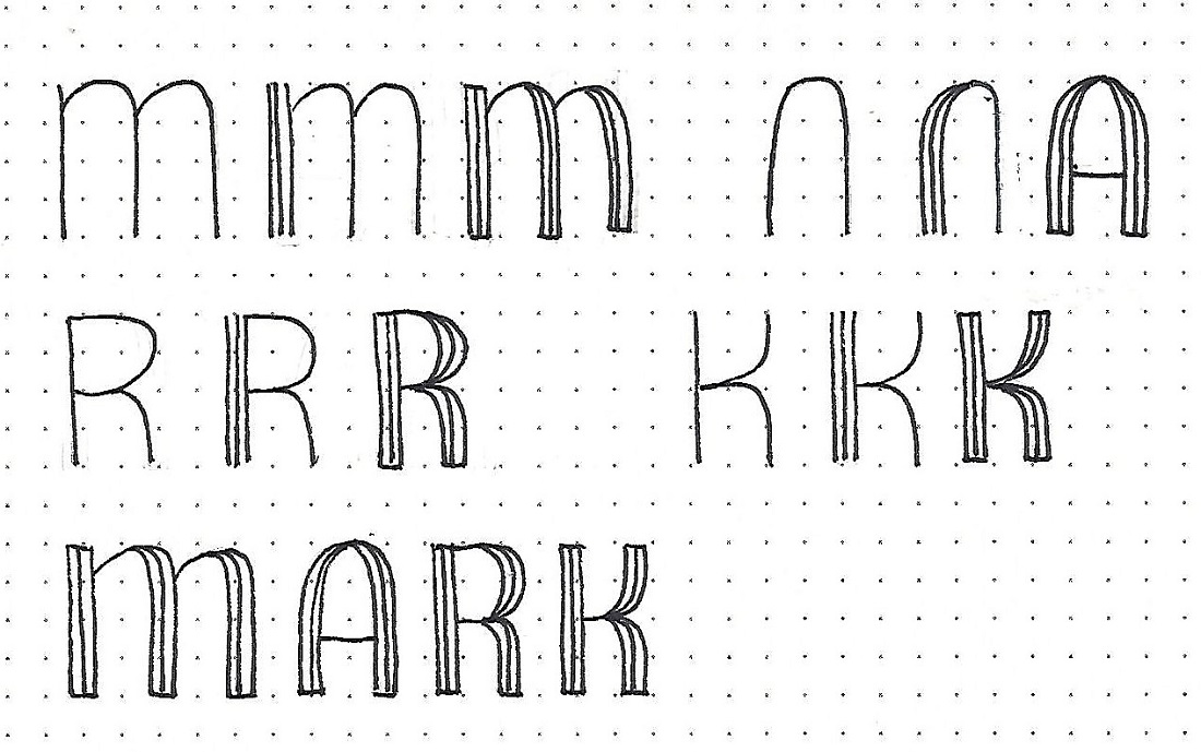
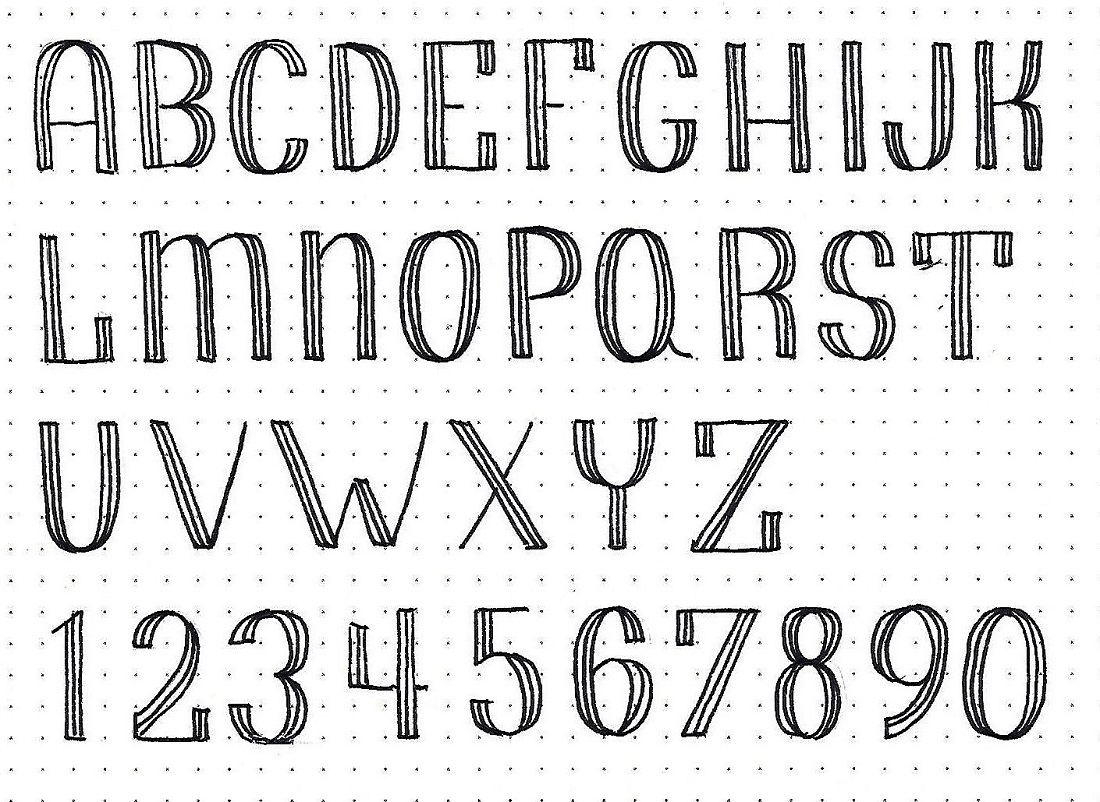
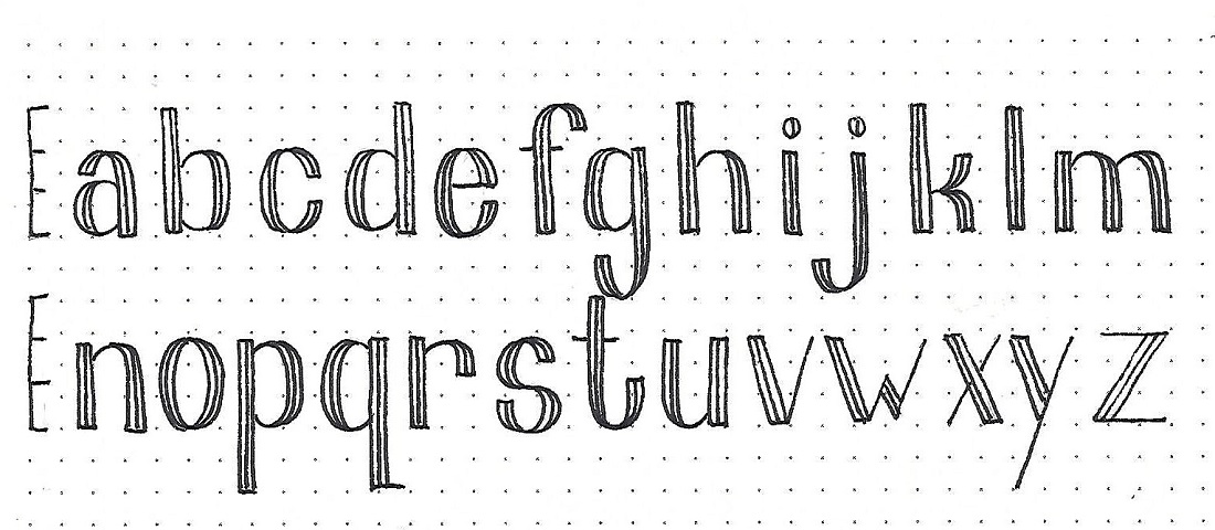
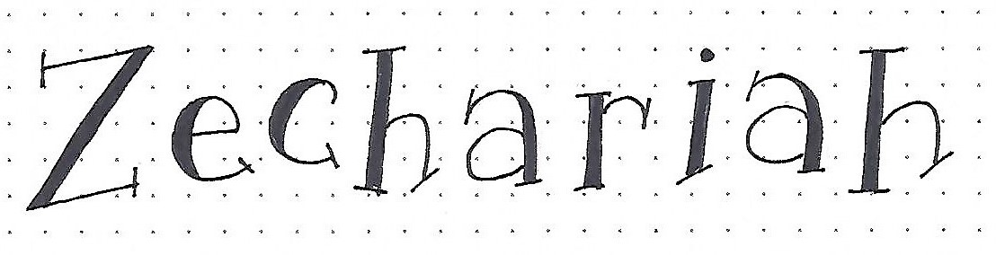
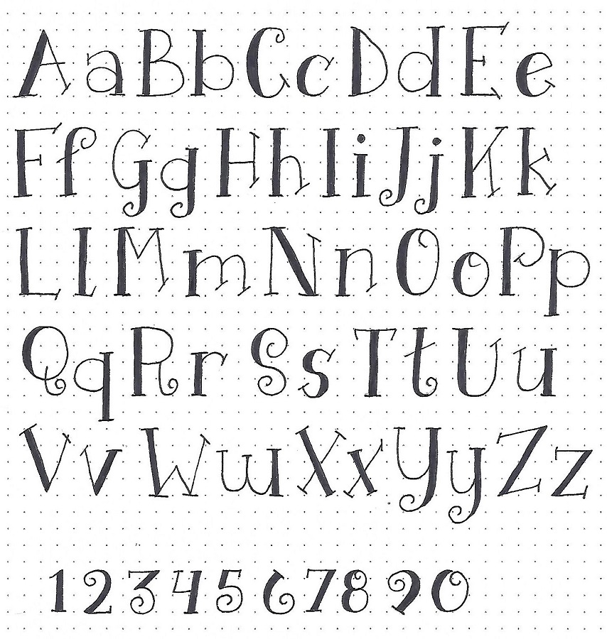
This one is based on a Basic Oval Print. But the twist is that the sides of the resulting posts are concave and are wider at the top than the bottom. They remind me of bell-bottom pants!
Another feature is the crossbars that are made of single-line curls and the concave line ends. Take a look at the inset box for the common marks you will be using. Practice these until you are comfortable forming them and then use them to write Malachi in both upper- and lower-case.
Note the size markings on the left side. The top line is the size of the caps, the next down is the ascender line for the full height of the lower-case. The third line is the x-height and the last one is the baseline. Although it is not marked here and not used on this introductory word, the descender line is at -1 unit.
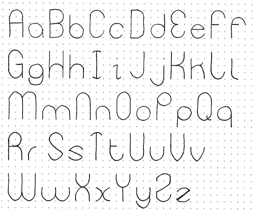
MALACHI: Day #1 – Hollowed – Introduction
We’ve covered several fonts in the Lettering Lodge that feature doubled lines. Some were based on a Basic Block Print and some were thickened on downstrokes like a faux brush script.
This one is based on a Basic Oval Print. But the twist is that the sides of the resulting posts are concave and are wider at the top than the bottom. They remind me of bell-bottom pants!
Another feature is the crossbars that are made of single-line curls and the concave line ends. Take a look at the inset box for the common marks you will be using. Practice these until you are comfortable forming them and then use them to write Malachi in both upper- and lower-case.
Note the size markings on the left side. The top line is the size of the caps, the next down is the ascender line for the full height of the lower-case. The third line is the x-height and the last one is the baseline. Although it is not marked here and not used on this introductory word, the descender line is at -1 unit.
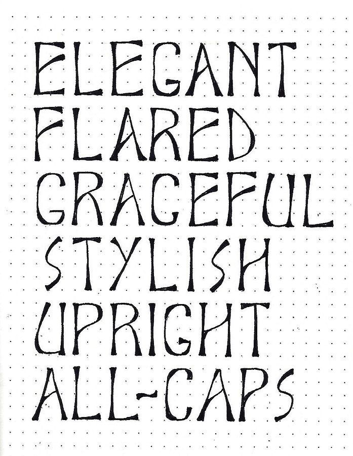
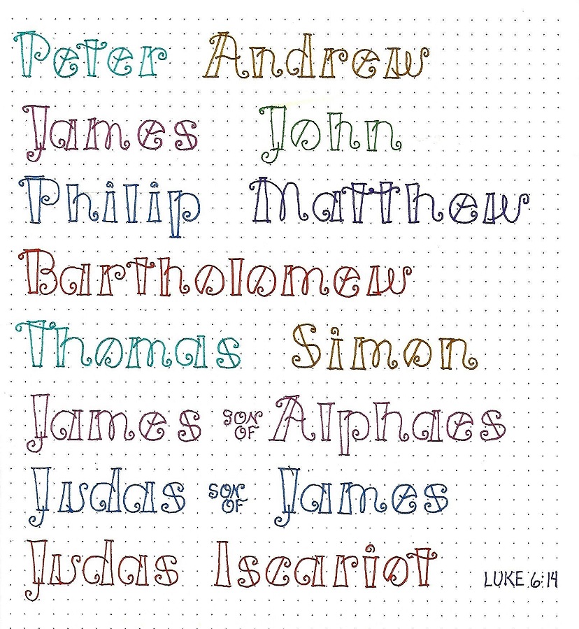
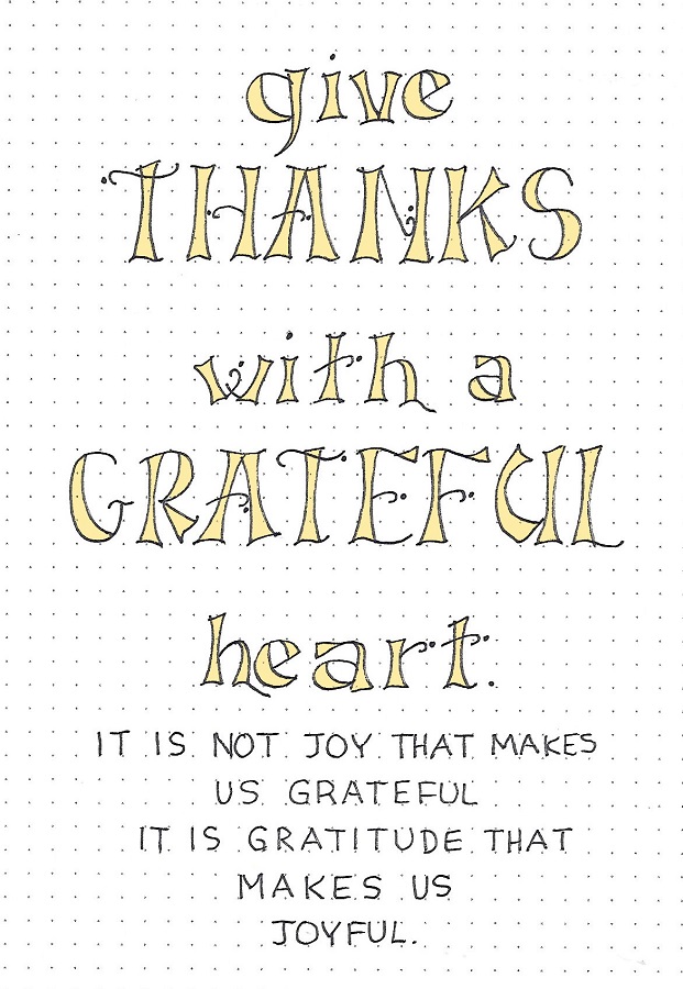
MALACHI: Day #3 – Hollowed – Word Play
Today we are going to write a quote about gratefulness to celebrate Thanksgiving week. Practice with both the upper-case and the lower-case letters.
I centered mine and colored inside the letters. One other thing – I made the curl too short on the first H so I added a little dot to close the gap. Then to make that dot look like it belonged, I added a dot at the end of every curl! Now it looks planned.
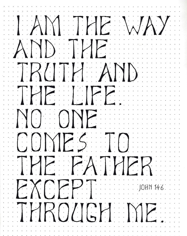
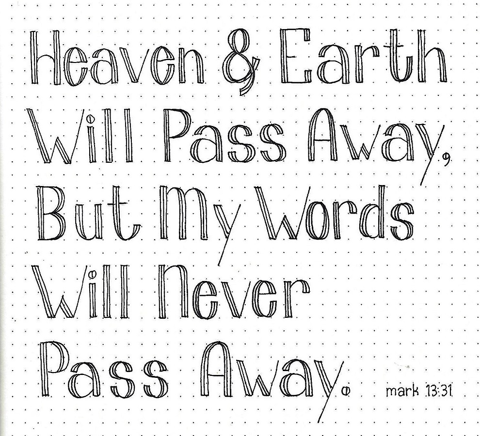
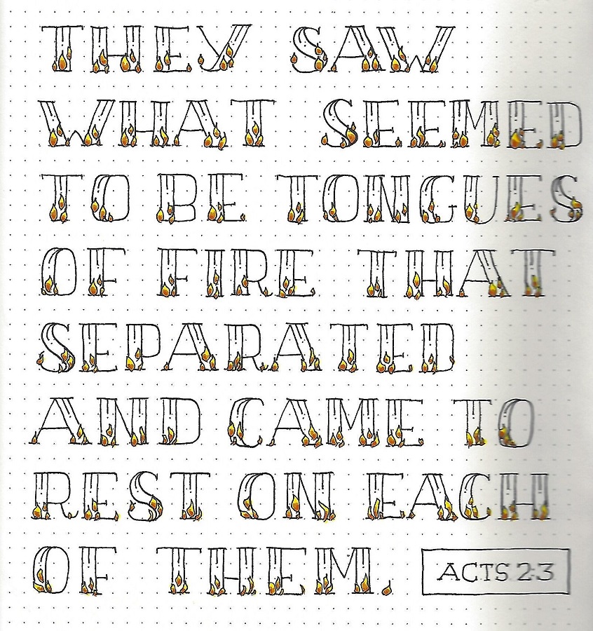
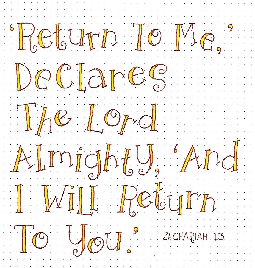
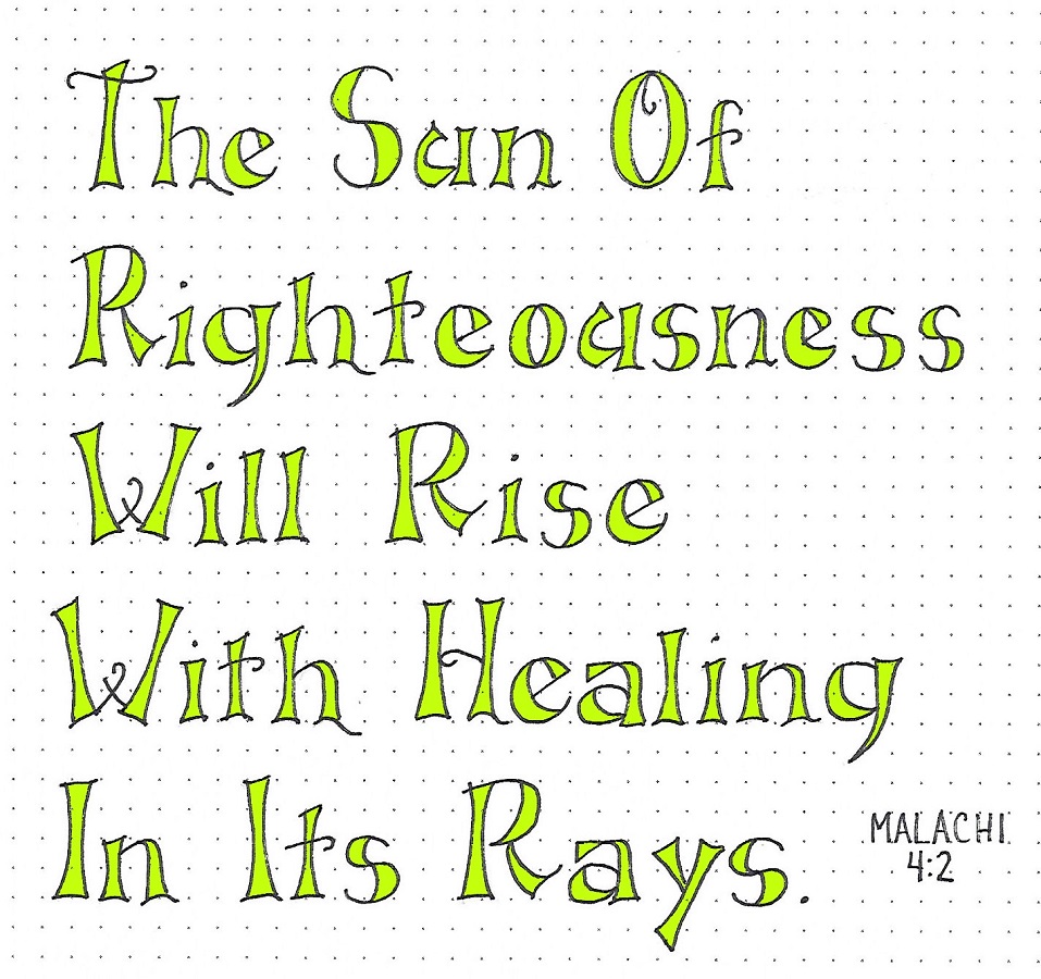
MALACHI: Day #4 – Hollowed – Scripture Writing
The Cover2Cover book this week is Malachi so I found a scripture from that book to write out for practice. I didn’t try to center these phrases but I went back to my usual style of using a capital letter on every word.
I filled the letters with color again.
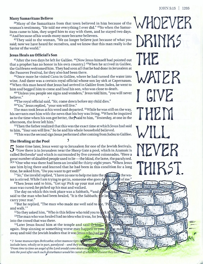
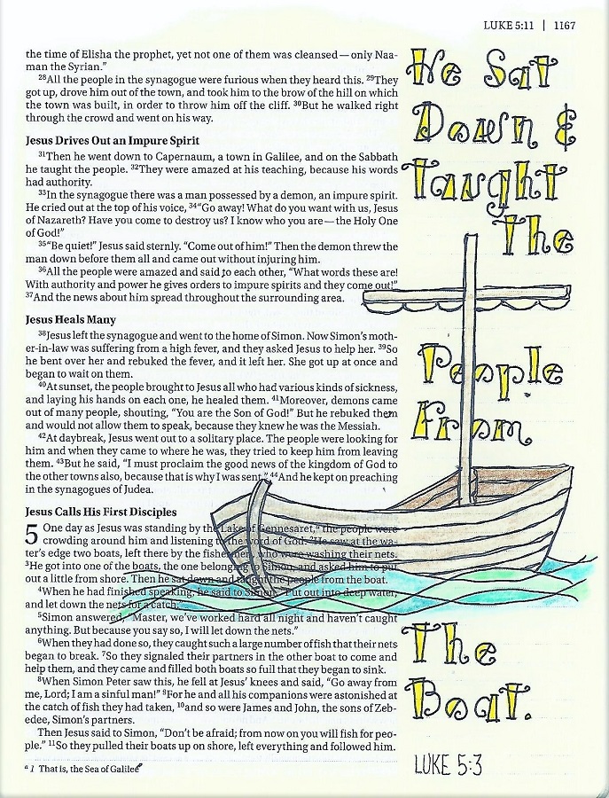
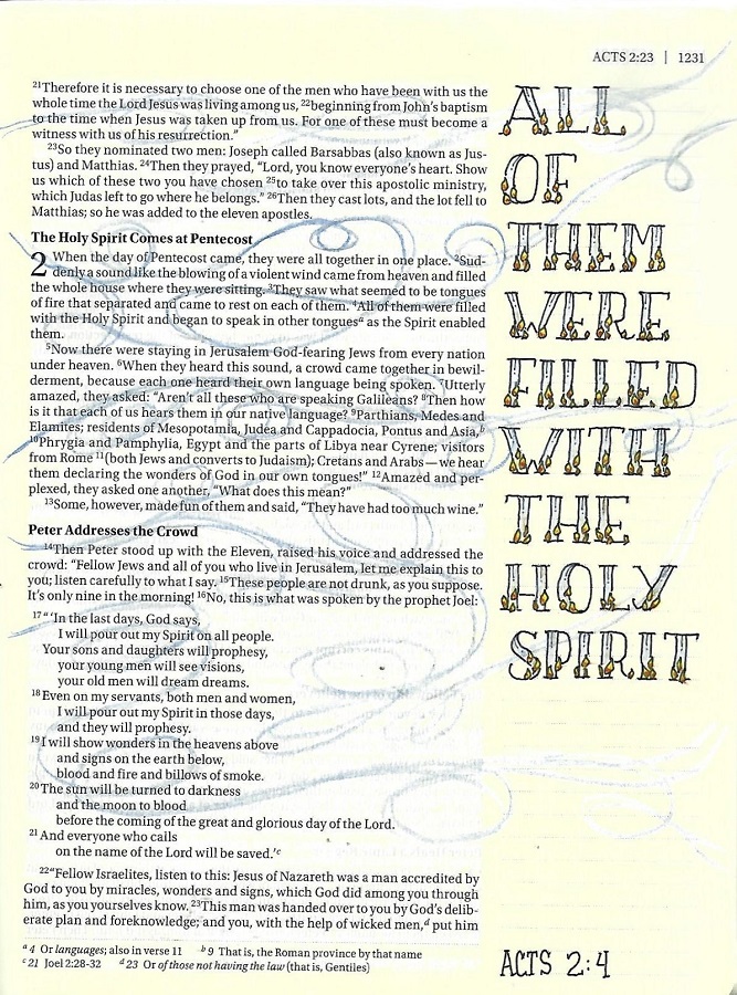
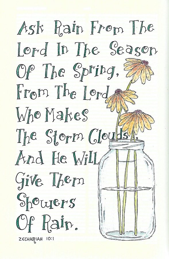
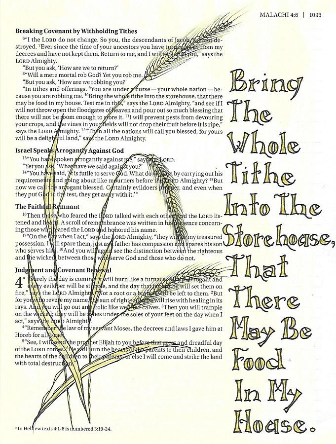
MALACHI: Day #5 – Hollowed – In Your Bible
Friday is the day we use the new font we have learned in our bible – this time in Malachi.
Do you notice anything different about the lettering? I was using the lines printed in the margin of my bible as guides and forgot to make the ascenders for the lower-case at ¾ of the font height. After I got the whole scripture penciled in, I assessed how it looked and decided that it was acceptable to leave them taller.
Remember, YOU get to decide if there are changes you want to make to a lettering style. Just make sure you are consistent within the piece you are working on. I would not want to have some of the ascenders tall and some shorter. Keeping them all the same lends authority to the choice and makes it look like it is supposed to be that way.
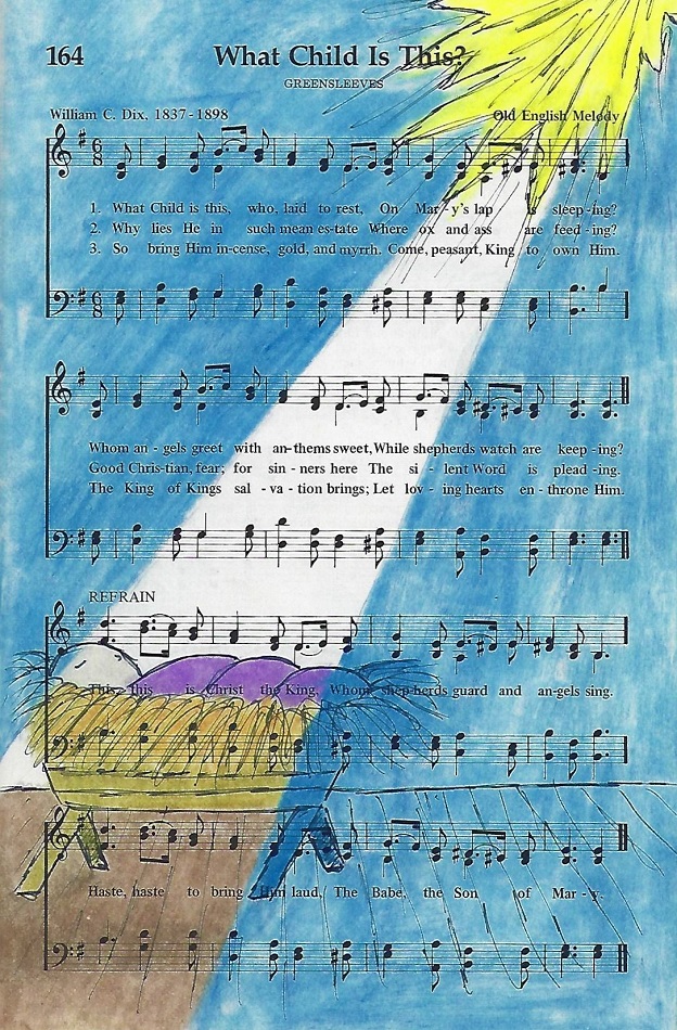
The stalks of wheat were inspired by the Drawing Room lesson for this week.
I used colored pencils to make the lettering match the illustration.
Is ANYONE making use of these lettring lessons? Anyone? Anyone?
Ddd
Posted by studio3d@ccgmail.net
at 12:01 AM PST