Topic: Bible Journaling
I thought it was fun to use the sword drawing as a paragraph divider on this page in Matthew.
This was one of the drawing tutorials I designed a couple of years ago.
« | July 2020 | » | ||||
S | M | T | W | T | F | S |
1 | 2 | 3 | 4 | |||
5 | 6 | 7 | 8 | 9 | 10 | 11 |
12 | 13 | 14 | 15 | 16 | 17 | 18 |
19 | 20 | 21 | 22 | 23 | 24 | 25 |
26 | 27 | 28 | 29 | 30 | 31 |
I thought it was fun to use the sword drawing as a paragraph divider on this page in Matthew.
This was one of the drawing tutorials I designed a couple of years ago.
The lettering style called 'Come' was assigned to the book of Matthew.
I love the little curls inside the letters and that the letters are still easily readable despite the details. This is a casual font rather than formal.
Ddd
Today's page is actually a combination of three assignments: 1) the 'walk' font 2) drawing a dragonfly and 3) journaling in the book of Malachi. I often will split assignments into two but these all combined well.
The dragonfly actually has nothing to do with the verse or the font but fills the spae and gives a focus on the page.
I used a handful of pastel colors of colored pencils on the wings which make them look glassine and quite lovely.
This is a nicely shaped italic print font that features graceful curves in the upper-case letters.
Ddd
For this hymn that says 'thou art the potter, I am the clay' I chose to recreate artwork I did of two pots in a drawing class last year.
I did the drawing with fine-line markers and did the shading with colored pencils.
The original art did not have titles on the books but I added them to this piece so they would make sense in this context.
Ddd
Well, I think I am done rooting in the 'orphan blocks' bin for a while! The 'Mitered Mania' quilt I made in January yielded 5 extra blocks and 2 additional strip triangles that did not match up. So I tore apart the 5th block into two triangles and made an arrangement with four blocks in the center with two triangles placed on each end.
Strange shape. I pulled out some recently used backing fabric to add corner triangles and then side borders (blue floral).
Still needing to grow this I looked in my drawer of fabrics with a variety of colors in them. Eureka! I found a piece of butterfly fabric with all the right colors. It was then that I noticed that the green strips in the blocks had butterflies. I used this new fabric (leftover from my sister's stash) for uneven borders to expand the width more than the length.
To keep expanding the size I pulled out another recent backing fabric (the yellow pinstripe was back for all of the last three quilts I finished) and added another round of uneven borders.
Now with a 'theme' of butterflies emerging I decided to quilt with loops and butterflies. I used a fine, light yellow thread for this.
The binding is the same as the backing used on this quilt.
Ddd
I first learned to draw this flower from a book of daily doodles. It is so simple to do and has such a great effect. Some day I want to try the same concept to draw hydrangea blossoms since they have the same basic construction (just different flower shapes).
For this page I combined the art with a scripture in Zechariah written in a simple script.
The Sweet Osmanthus comes in different colors - most common are orange, white and yellow. I like the orange best and it combines well with the bright lime green even though the real leaves would be darker - artistic license, ya know.
Ddd
Having used up all the squares I could get out of the recent strip sets I found that I still had an upright triangle that could be cut from each end of each set. I did this and when I opened them and rotated two of them together on the long edge they made little hourglass units.
Of course now I am dealing with true leftovers and having created all these units I had to figure out a way to set them together to create a quilt top. I measured the hourglass units and discovered I could sliver trim them and get 5 inch squares. This meant I could set them alternating with charm squares for a perfect fit.
The question was, 'do I have any charm squares?' Yay, the answer was, 'yes'!
I had leftovers of a couple of stacks in a range of orange/golden/rust that I set in a gradiant arrangement and alternated with the hourglasses turned this way and that to form a secondary pattern of diagonal squares.
How those metallic finish warm colors changed the look of these scraps (again). I accented the teal in the blocks by adding a narrow inner border.
Here you can see the metallic finish on the squares and the brown border as well as the edge to edge quilting.
I truly used up every scrap of these orphaned strip sets after cutting all I needed for that first quilt, 'Get To The Point'.
Ddd
The reason for naming this quilt as I have is a direct result of the block origins.
You will remember the last quilt entry was titled 'Get To The Point' - an arrangement of mountain-like peaks. Well, when cutting the tube strips for that quilt one must match up identical squares. But it you cut more blocks to the end of the strip set you end up with one extra block that does not match anything. In fact, you could get one extra from each side making TWO mismatched blocks.
So I cut all those extras and then arranged them as pinwheels with no matching combinations. This was not large enough and I wanted some sashing so I went back to the orphan blocks bin and found several black and white blocks from my late sister's stash. These I cut into sashing for the verticals and then I cut whole black and white strips for the horizontal sashing.
A couple of borders brought it up to a small lap size.
Look how the orange border transforms the 'theme' from gold and gray of the previous quilt to a lovely orange and black, perfect for a fan of the Oregon State Beavers.
Even though the pinwheels are all straight lines and points I wanted to make the quilting in swirls to show their potential for movement.
This is a pantograph from Urban Elementz.
Ddd
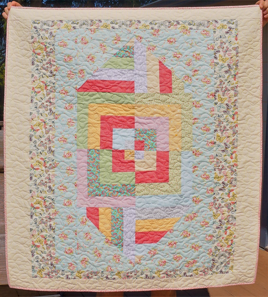
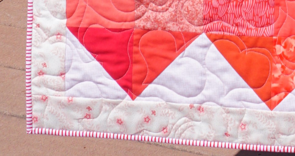
This quilt has been languishing in the longarm pile because I couldn't decide how to do the quilting on it. I ended up doing a lot of research while other quilts jumped the line to get completed first. Sometimes it just happens that way.
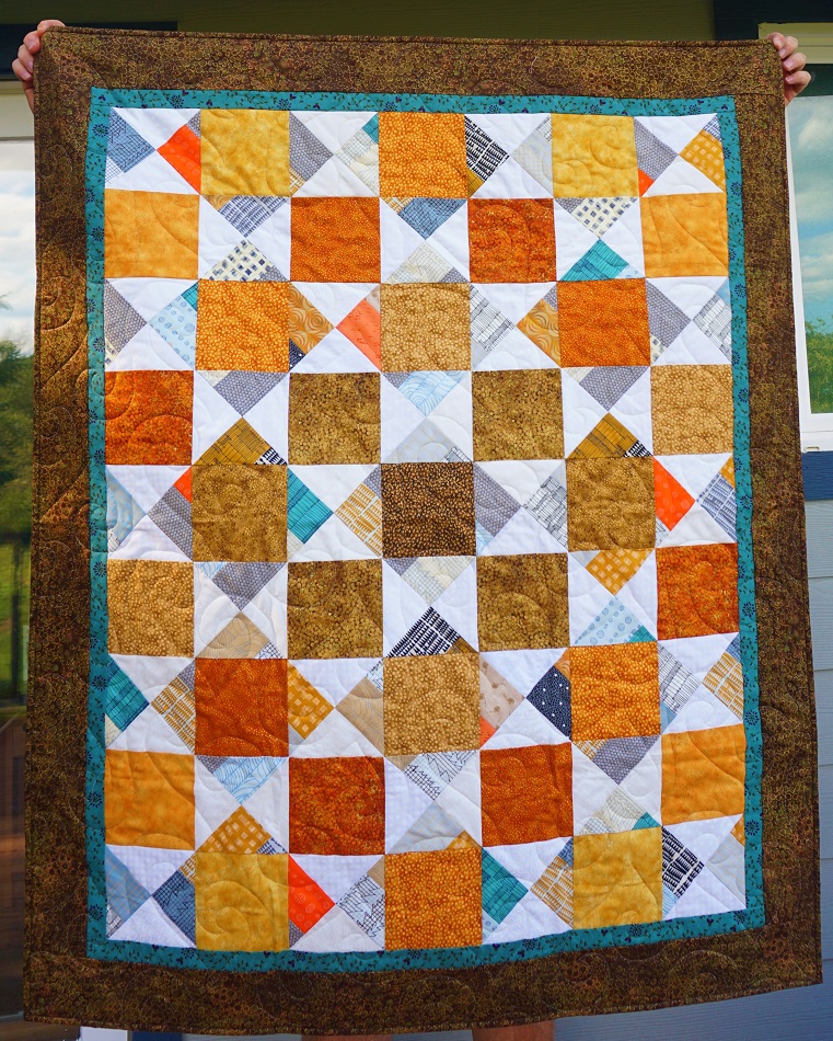
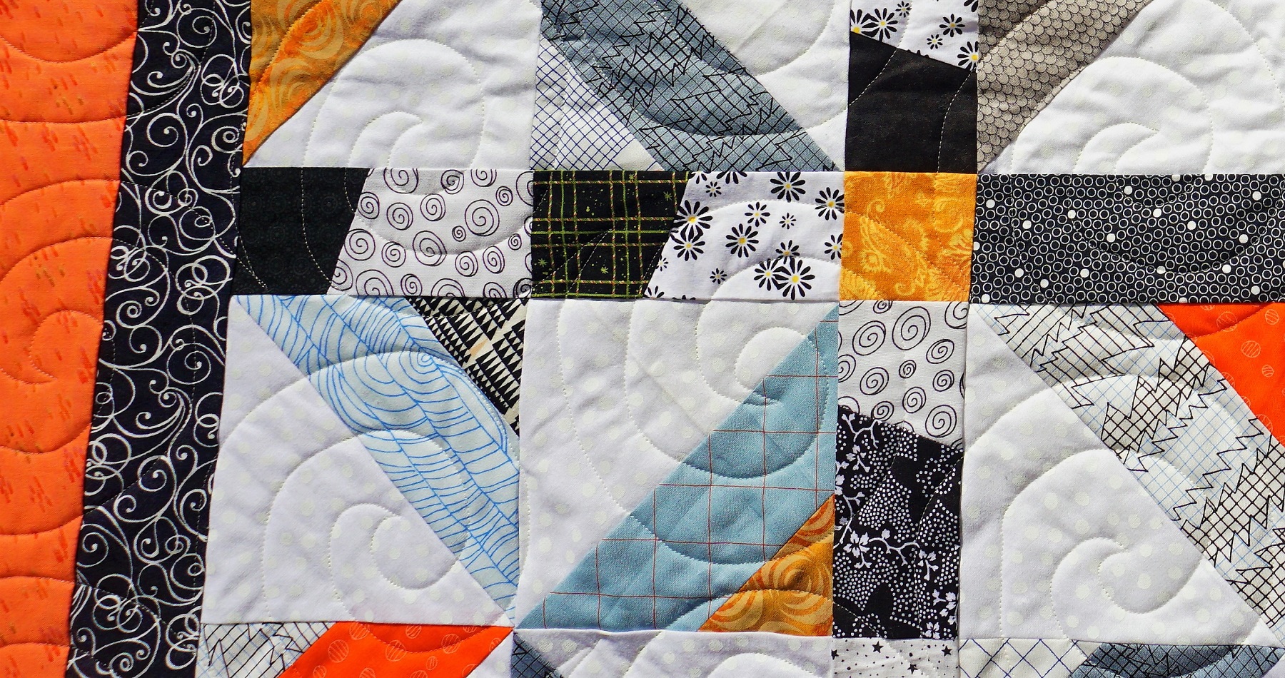
The pattern for this was from an online blog entry and is a 'tube quilt' I used a jelly roll I picked up at a quilt guild's stash-buster sale for $10. I didn't really like the prints in the roll but for $10 I couldn't leave it there!
A tube quilt like this starts with two strips sewn together side by side, then laid on a wide strip of the background fabric and stitched up both sides, creating a tube.
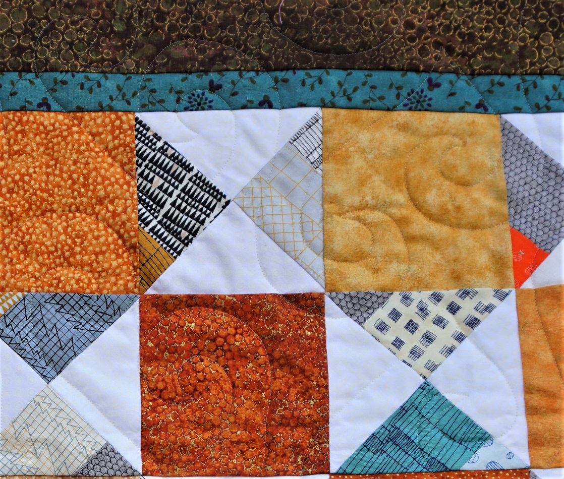
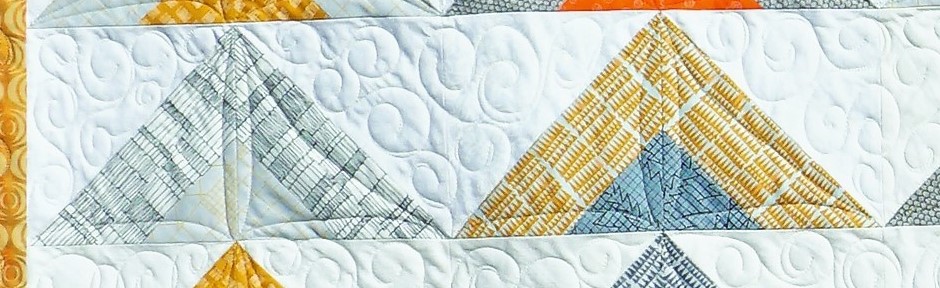
One then cuts triangles from alternate side seams and, when they are pressed open they become a half-square triangle block with two colors in the one side and a solid background in the other. (Got that?)
As you move down the tube you get two block colorways depending on the side of the strips you car cutting from. Match up two that are the same and rotate one of them and you create a mountain.
These are placed side by side to create rows which are then stacked for the overall layout.
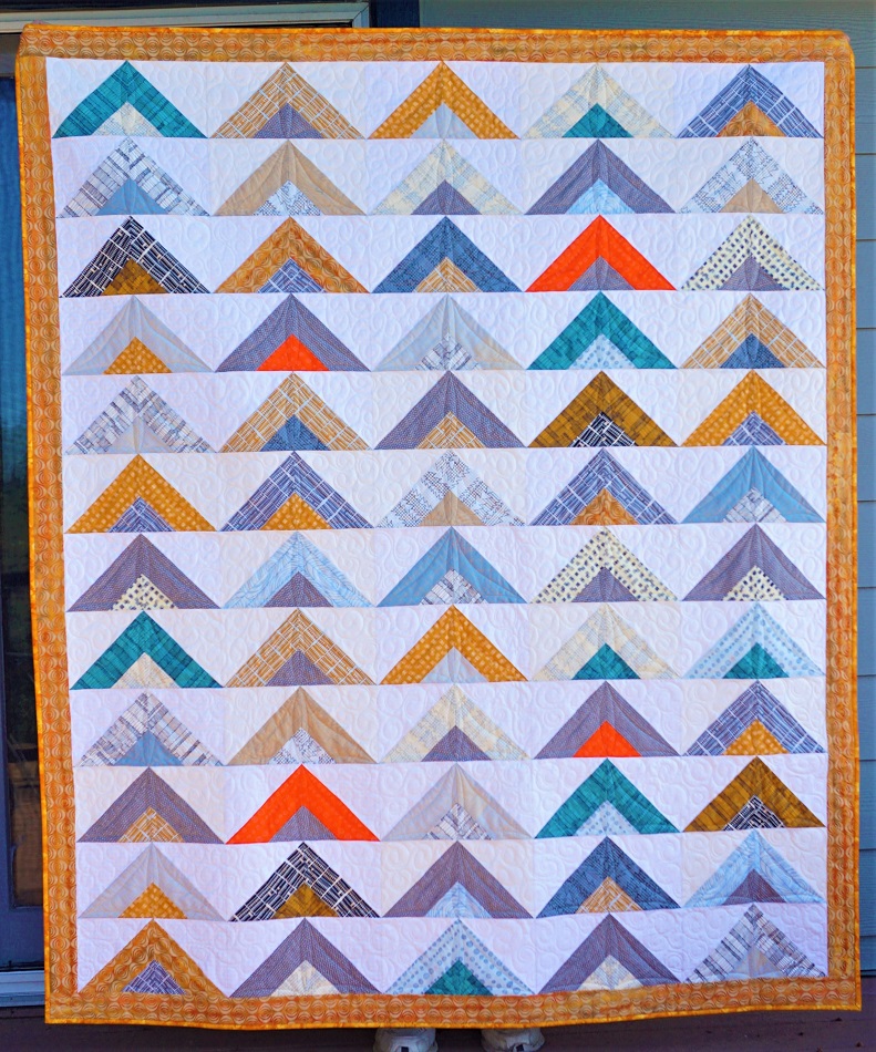
The jelly roll was not enough to complete enough matching sets so I threw in a few strips from my stash. The background is made up of a mixture of white-on-white fabrics.
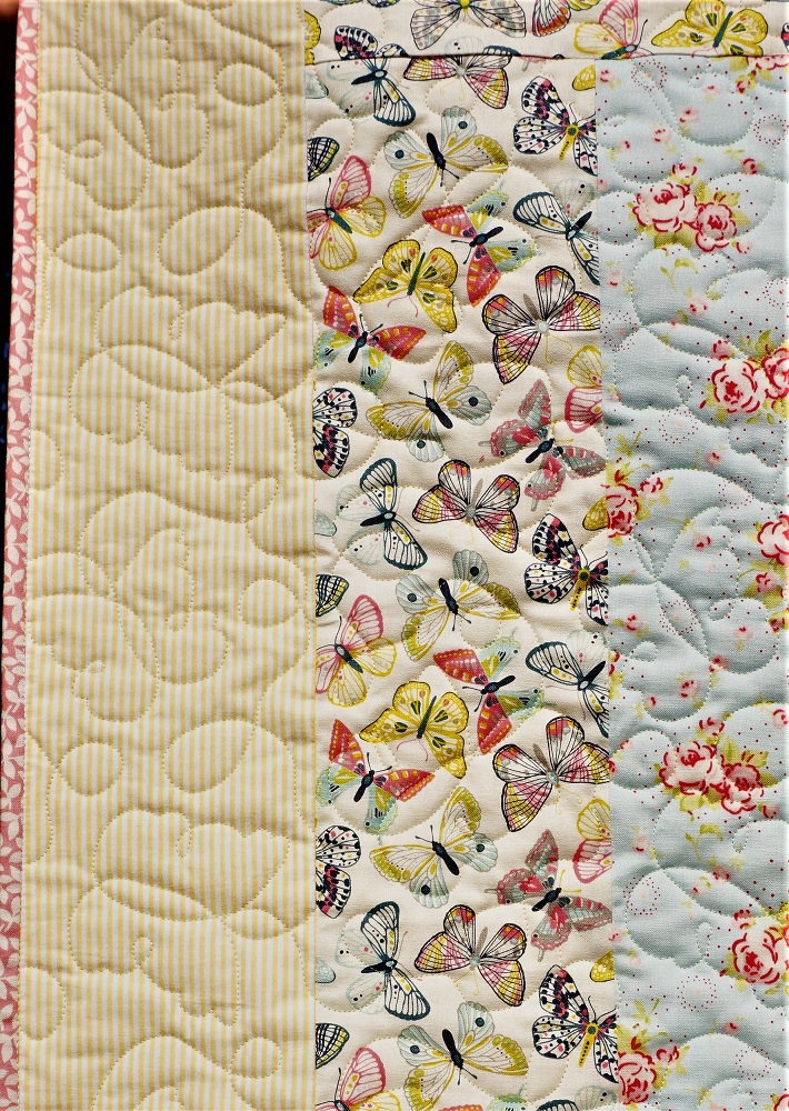
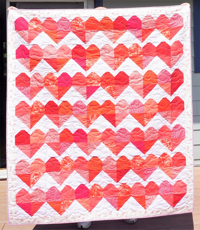
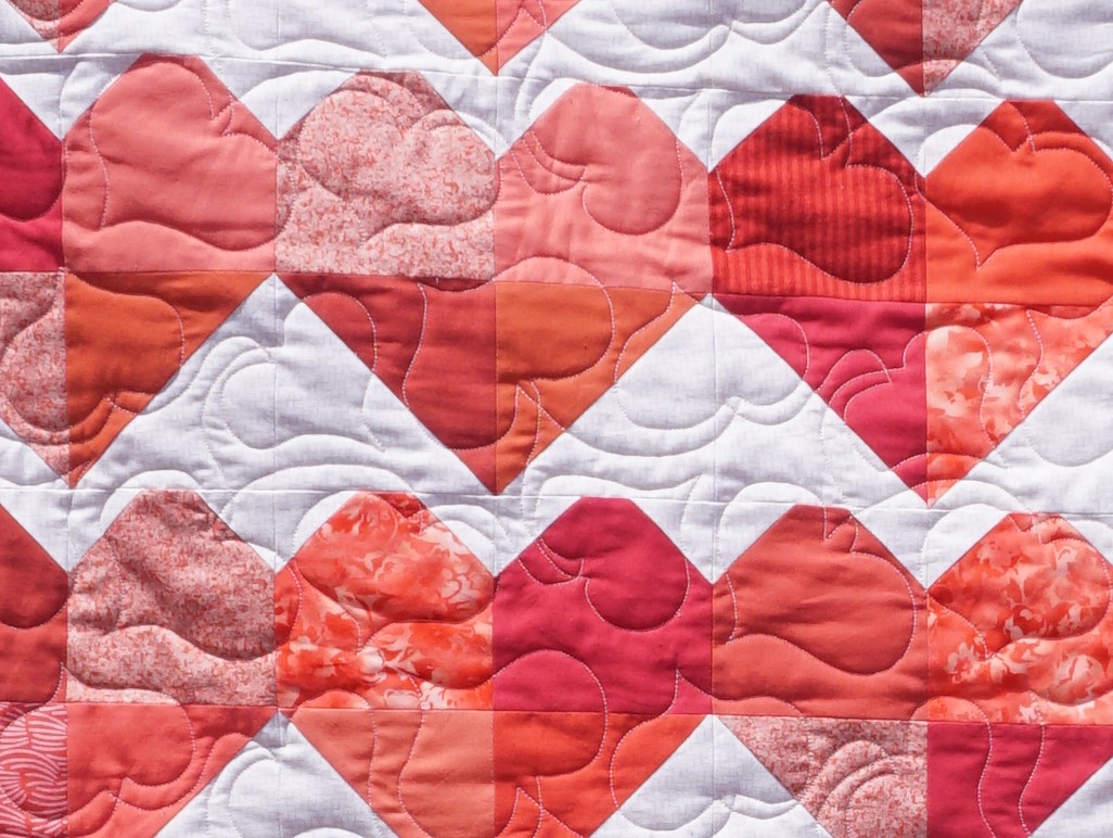
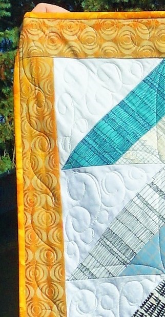
When it came to the quilting I did not want to use an overall edge to edge design. This stumped me for quite a while but I finally settled on swirly clouds for the background and point to point arcs for the strip sets.
This was all done with free-motion quilting as was the continuous pattern in the borders.
This was a totally new process for me as I waited until all of the other quilting was done and then rolled the quilt forward and back on the machine to complete each section.
The binding was just a bit brighter than I would have liked but it was what I had on hand.
Ddd
Just revisiting a font from a couple of years ago that is designed to mimic branches. I combined it with a scripture referencing the word 'branch'.
In our Cover 2 Cover bible journaling plan we've reached the book of Zechariah. That means we are almost up to starting the New Testament!
On this font there is the option of leaving the letters open, filling with color or filling with solid black.
This font does not have a lower case.
Ddd
This quilt was FOURTH on my list to finish. I had the first three already pieced, matched with backing and batting and ready to go on the longarm.
Then I caught a new glimpse of the supplies for this one and I just had to pull it out and work on it.
The supplies included two charm packs of coral solids that I got on sale for less than $5 each. I had cut four fabrics from my stash to have enough for the pattern. Speaking of that, the pattern was only a magazine ad for a fabric line from 3 years back and I couldn't find the actual pattern for it. Fortunately, it was a simple thing to see that I just needed half-square triangles and blocks with two snowballed corners.
The background fabric was from my stash, a print with a little basket-weave look to it.
As usual, my camera colors are off - this is much too orange. Think pink!
I used a new pantograph for the quilting pattern - hearts! and used pink thread top and bottom.
I had originally planned to bind with the same fabric as the outer border, but it just looked unfinished. So I pulled out a red and white stripe and I am SO glad I did.
This is a 52x60lap quilt that will be an engagement gift.
Ddd
The assigned hymn for today was another that was not in my hymnal. In fact, I had hever heard it before (still haven't) so I am working strictly from the lyrics.
What those lyrics reminded be of was Philippians 4:13 - "I can do all things through Christ who gives me strength".
Then I looked up that scripture online and found a great idea for the illustration.
I started by doing the brush lettering then sketching the illustration in pencil. When coloring in the mountain in brush marker I left a little border around the lettering so it stands out.
This is all done on a print of a digital copy of the music which I then trimmed to exact size and glued into the hymnal at the gutter.
Ddd
OK, the assignment was to use the 'deer' drawing in the book of Habakkuk. And there is a wonderful scripture at the end that is the perfect place for this.
However, I had already done a different deer in that space. What to do, what to do?
Imagine my surprise to discover that the scripture in Habakkuk (3:19) was exactly the same as one in 2 Samuel (22:34)!
So I used the page in 2 Samuel for my art and referenced the matching verse in Habakkuk.
Assignment done....well, sorta.
Ddd
Sometimes, with the right style, one does not need any artwork to evoke the spirit of the verse being highlighted.
Such is the case of this bounce brush lettering in Habakkuk 3:18.
I have a hard time getting the thin lines when I am using a brush marker. So I often write the text with a heavy marker (.08 nib in this case) and then add the wide brush marker to the downstrokes.
Gett in the transitions just right is still hard.
Ddd
One group I belong to is illustrating a hymn to go with every book of the bible as we work ourselves through the year. Today we are up to the book of Nahum.
The hymn assigned to this book is Rock of Ages.
I found several paintings where a woman was hanging onto a stone cross as it was being lashed by a stormy sea and I got the idea to make the cross from stacked stones rather than the solid carved version used in the paintings.
I also left off the woman and the sea to keep it simple.
I have three sets of gray colored pencils in several shades each. One set is true gray, one set leans toward the blue and one set toward the brown.
As I look at the photo I see that my perspective is off by a bit as it goes down the rignt lower side, but It is standing solid in my mind.
Where the text crossed over the notes it was a bit hard to distinguish the lines so I used a bit of white gel pen to blot out the background a bit.
Ddd
It is fun to try to come up with some kind of art to represent the lyrics of the hymns that our group has assigned.
Sometimes I have no clue what to do so I search for a phrase in Pinterest and scan for ideas. A sketch of Christ holding a lamb was one of the results on such a search so I drew my own version and traced it into my hymnal.
Rather than writing the lyrics on the page I used a scripture around the outer edge of the illustration. "The eternal God is your refuge and underneath are the everlasting arms. [leaning, leaning] Deuteronomy 33:27
All the artwork was filled with colored pencil.
Ddd
The assigned illustration for the book of Micah was the lightbulb. The tutorial for this was done in 2018 originally.
I used colored pencils and fine line markers for this illustration.
A basic italic print style is clear but does not compete with the artwork.
Ddd
Throughout the month of June I had four fonts that I reiewed from previous years' lessons and used in my bible.
These are the practice sheets I did in my Happy Planner for each of them:
PATH was used in the book of Hosea
GENERATIONS was used in the book of Joel
I probably mention every month in these lettering reviews how much I like the pink dot-grid paper in my Happy Planner!
Ddd
The Bible page I did in Micah relies just on the beautiful text font without the addition of artwork. Actually, the letters are each a little piece of artwork on their own.
How about a little music today?
I decorated this hymn with a hot air balloon pulling a little stick man our of the 'angry waves' mentioned in the hymn lyrics.
Of course, the balloon is labeled 'love' lest anyone claim it is anything else lifting him up.
My colored pencils were blended with odorless mineral spirits to get that smooth finish.
Ddd